One of your best posts to date. Thank you.
Five Sure-Fire Ways to Get Rid of Bullet Points
December 24th, 2013
I’m not sure if you’re aware of this, but bullet points get a lot of bad press. Apparently they contribute to bad courses. Although, I’m not sure they do. I tend to think that poor instructional design leads to bad courses.
There’s a place where bullet points make sense. They help break up information and make it easier to digest. However, we do have a tendency to over inform and thus the complaints about bullet points.
Here are a few tips on how to disguise bullet points. So that you get the value of the bullet point without all of the belly aching.
Convert each bullet point to an individual slide.
Does it matter if you have five bullet points on one screen or five screens with one point each? By breaking the points into separate screens you can focus on a single idea rather than multiple ideas on one screen. This eases cognitive load and can help the learner recall more.
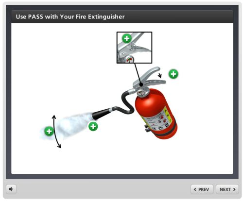
Convert bullet point into labeled graphics.
Find an image appropriate to your content and then instead of bullet points, use labels to present the information. Find a descriptive single word title for the label and then add the bullet point information inside the label when active.
In this example I used the labeled graphic interaction in Engage. Because it’s a form-based authoring tool it’s easy to build yet offers a much more dynamic media experience.
Click here to view the labeled graphic.
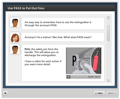
In fact, you really could convert each bullet point to almost any of the interactions. Here’s an idea that’s a bit novel. Instead of using bullet points use characters and the conversation interaction.
Click here to view the conversation interaction.
Keep in mind that it’s best to keep these ideas in context to the course objectives. The wrong information doesn’t become better because it’s interactive or novel.
Convert bullet points to interactive video labels.
This is one of my favorite techniques and works great for procedures or content appropriate to videos. Here’s an example from a previous post on how to create interactive videos.
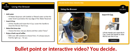
What I like about this approach is the learner can watch the video, but if at certain points needs more information, she can click on one of the labels (which essentially is the bullet point content). This could even be used to enhance those standard talking head videos where the label bullets augment the lecture.
Convert bullet points to icons or thumbnail images.
Replace the bullet point text with an icon or image that represents the bullet point content. This type of visual connection to content is what makes sites like Pinterest popular. How interesting would the same pages be if they were just lists of links?
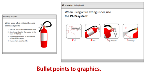
Below are a couple of ways to enhance the conversion of bullet points to graphics. Place the graphics in a context that is more aesthetically engaging.
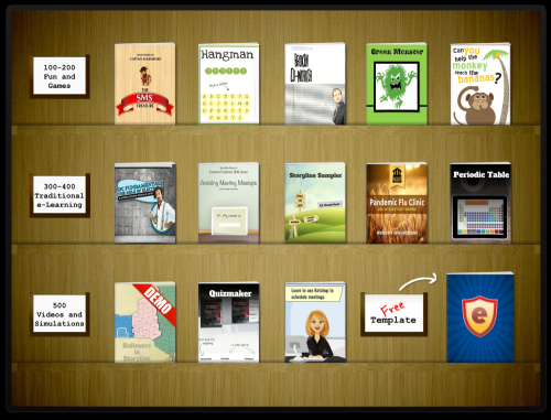
Interactive bookshelf. Each shelf could represent the slide; and each book icon a bullet point. If you like the bookshelf idea, you can download the free template from the links below.
Click here to view the interactive bookshelf.
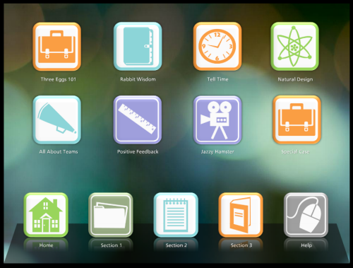
Mimic a mobile tablet interface. This is similar to the bookshelf idea, except the bottom shelf could represent each slide. And the icons are the bullet points. Click an icon and open an area to add more content.
Click here to view the mobile interface demo.
Bullet points aren’t necessarily bad but because there is a lot of negativity around them, it’s a good idea to find other ways to share the same information. How else can you convert the bullet points?
Events
- Everyday. Check out the weekly training webinars to learn more about Rise, Storyline, and instructional design.
Free E-Learning Resources
 |
 |
 |
|
Want to learn more? Check out these articles and free resources in the community. |
Here’s a great job board for e-learning, instructional design, and training jobs |
Participate in the weekly e-learning challenges to sharpen your skills |
 |
 |
 |
|
Get your free PowerPoint templates and free graphics & stock images. |
Lots of cool e-learning examples to check out and find inspiration. |
Getting Started? This e-learning 101 series and the free e-books will help. |
9 responses to “Five Sure-Fire Ways to Get Rid of Bullet Points”
I was examining some of your posts on this internet site and I believe this site is really instructive! Keep posting.
I have never been a great fan of bullet points, and reading them can be a distraction when other visuals are presented on the screen simultaneously. One thought that did come to mind: if you break up bullet points by placing one bullet point per slide, the learner can lose sight of how the information in a series of bullet points relates to a whole, or a category. Thanks for your interesting points!
Great post! You provide some creative ways to remove bullets from presentations.
Merci Tom!
C’est fort intéressant, tes idées de présentation du contenu m’inspirent.
Bonne année à tous!
That’s quite a smart idea for getting rid of bullet points. Using something inventive and practically useful, like acronyms can heighten not just the writer’s but the reader’s interest too!
Like usual Tom a lot of great ideas!
You say that, “bullet points get a lot of bad press. Apparently they contribute to bad courses.” I think they get a lot of bad press also due to the use of them in presentations and this has carried over into eLearning. Anyone can open up a PowerPoint file and type some words onto a slide and of course a bullet point automatically appears. And I think stakeholders expect more than bullet points from an instructional design professional, at least we hope so, right? So, there are a lot of dynamics at play here.
Hi Tom: Thanks so much for posting these great examples. We have been wanting to create a fire extinguisher module online. I was wondering where you found the videos (the video portions that are played after you click on each green + button) and if you have any recommendation on how to find similar videos?
Thank you!




0
comments