Wonderful content as always, Tom. But what thrilled me even more was the non-flat graphic clipboard at the top!!! Maybe it’s because I’m old, but the current preference for graphics leaves me cold. Is the clipboard an forerunner of a new cycle in illustration?
Five Ways to Engage Learners in Online Training
November 17th, 2015
One of the big challenge in crafting a learning experience is figuring out how to engage the learners. This is especially true for a lot of corporate training that is compulsory and not always connected to performance expectations.
Today, we’ll review 5 ways to engage your learners and build a better learning experiences.
Engage Learners with Relevant Content
Engaged learners need content that is relevant to their needs. If it’s not, then they’re less apt to be motivated which leads to less engagement. It forces you have to do a lot more to increase their motivation and guide them through the content.

I discuss relevant content quite a bit throughout the blog and make it one of the key building blocks for interactive elearning.
Engage Learners with Just-in-Time Delivery
At a previous organization, we installed a new phone system. We had to train so many people on the new system that the first groups were trained months before the system rolled out. By the time the phones came online, a lot of what they learned was lost. That was OK, because we had some cheat sheets and quick tips that offered help for the most common tasks.

Instead of a big course delivered months in advance it would have been easier to build lighter modules (similar to the cheat sheets) that delivered the necessary content at the point of need. I like to call these micro-learning modules, coursels (as in course morsels).
With YouTube and similar media services, people are conditioned to search for what they need when they need it. Why can’t the online training follow suit? Focus less on sharing every piece of content and more on context; and then work towards making it easy to search and access bite-sized training at the point of need.
Engage Learners with the Look & Feel
Learners perceive a product as more usable than it may actually be if the design is aesthetically pleasing. This is known as the aesthetic-usability effect. It’s also possible that they may reject a product that is actually better because it may not be as aesthetically pleasing.

Even if you build basic courses, place a lot of focus on getting the right look and feel. There’s a visual context that works for your course as well as a way to create novel and engaging interactions. These don’t replace good instructional design, but they do contribute to the perception the learner has of the course and its value. And that’s critical to the initial engagement.
Engage Learners with Interactive Content
Most courses are linear with little, if any, interactive elements. That’s fine for consuming information. But it doesn’t make for engaging learning experiences. An easy way to engage learners is to add interactive elements to the course.

Generally, there are two facets to interactive elearning. The first is getting the learner to interact with onscreen elements. These interactions are clicking, mouseovers, dragging, and/or data entry. The second is getting the learner to process and interact with the content. Usually this involves some Socratic questions or more involved interactive, branched scenarios.
Engage Learners with Free Navigation
One of my pet peeves is locked navigation. We all know why it happens: the customer wants to make sure that the learner sees all of the information. Otherwise, how else would they learn it?
Obviously, this is a false assumption. People don’t learn just because you expose them to content. And making it mandatory to see content is not an appropriate way to assess knowledge.
Instead of locking content down, give them the freedom to access and explore the content. If you want them to learn more, provide a challenge that causes them to pull in the content and make decisions. This is a much better mechanism than you pushing it out to them.

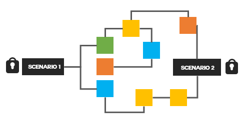
If you want to ensure they have learned something, then instead of locking the navigation, lock the course at decision points. Give the learner freedom to move around the content and explore. However, for them to advance, provide decision-making scenarios that require an understanding of the content. This gives the learner more control and the course owner some assurance that the learners know the content.
There are many ways to implement these tips to create engaging and interactive learning. The key is to engage the learner and create an experience that is memorable and enjoyable as well as educational.
Events
- Everyday. Check out the weekly training webinars to learn more about Rise, Storyline, and instructional design.
Free E-Learning Resources
 |
 |
 |
|
Want to learn more? Check out these articles and free resources in the community. |
Here’s a great job board for e-learning, instructional design, and training jobs |
Participate in the weekly e-learning challenges to sharpen your skills |
 |
 |
 |
|
Get your free PowerPoint templates and free graphics & stock images. |
Lots of cool e-learning examples to check out and find inspiration. |
Getting Started? This e-learning 101 series and the free e-books will help. |
7 responses to “Five Ways to Engage Learners in Online Training”
I like the bit on free navigation. I usually enable content once the student has fulfilled certain conditions within the learning management system, this occurs in increments and student cannot proceed to the next bit of course content unless they’ve fulfilled the condition of the previous one. Is this what you meant by “However, for them to advance, provide decision-making scenarios that require an understanding of the content”. My decision making scenario involves a quiz.
Hi,
Thanks for publishing a very interesting article about Five Ways to Engage Learners in Online Training. This is very useful information for online blog review readers. Keep it up such a wonderful posting like this.
Regards,
XcelFrameworks.
Funny, just yesterday I read about the ideal school concept Elon Musk, and the school he developed for his children. This concept is nothing new, in fact we educators already saw this for some time, but the traditionalism of the institutions did not allow us to develop these concepts.
Now with the advent of internet, everything has changed, it is easier to find the target audience for its methodologies and the educational concept has evolved greatly. Interactivity will be the queen of global knowledge in a few years.
Thanks for the content! Our team worked on a project based on locked navigation. The student acesses a “scenario”, views the content, but he only can go forward if he answer a mid question. I don’t think this way can guarantee the student will read and learn the content before answer the question. I prefer a scenario where the student can navigate, go back and forward, and tests remain visible… until he decides it’s time for evaluation (before deadline, obviously, haha), or a game-based scenario that keeps the student moving, thinking, solving problems.


0
comments