[…] The right background can offer a visual richness that makes the content more inviting.”Via http://www.articulate.com Valora esto: Me gusta:Me gustaSé el primero en decir que te gusta esta post. […]
Here’s Some Background Information for Your Next E-Learning Course
February 28th, 2012
During the year I conduct dozens of elearning workshops. I dedicate a large part of the workshop to graphic design because based on what I see, it’s an area that challenges many elearning developers.
Most of the people I meet have a training background. They may have some graphic design skills, but they usually find their roots in training. So they tend to be stronger in instructional design than graphic design.
Elearning courses are mostly a visual medium which means that graphic design is a key part of building effective elearning courses. In fact, it’s one of the three core considerations in the design of elearning courses:
- What will the course look like?
- What content needs to be in the course?
- What will the learner do with the content?
Regardless of how you approach your course design, the course has to look like something. Even if you decide to do nothing but a white screen with black text, that’s a design decision.
In today’s post I want to offer a simple trick to help you get past the standard PowerPoint design or that template-screen look. It’s not going to make the instruction in the course better (you still need instructional design) but it can definitely make it a bit more visually engaging.
Change Your Background Image
It’s amazing what a nice background can do for the look of your screen. The right background can offer a visual richness that makes the content more inviting.
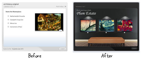
Many rapid elearning developers will use the application’s default background or a pre-built template. That’s a fast way to go, but it doesn’t always work with your content. Instead of a template, try adding a background images that matches the content of your course. It’s a step in the right direction and requires very little effort.
The image above shows a quiz using the default background and one that uses a richer one. That background is a simple stock image and makes a perfect way to show off the art work in a museum.
Find the Right Background
Determine to put the learner in a context that matches the content. For example, in our elearning workshop we walk through the Hoh Rainforest design makeover. The goal is to craft a visually immersive experience. What can we do to get the person into the rain forest? For us it starts with finding a rain forest background image and then we add other complementary elements.
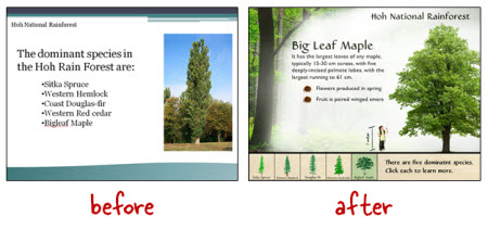
Below is another example. As you can see we took what’s a typical looking slide and converted it to one that has more visual appeal. Since the topic was how to change a tire we went with an automotive theme. Contextually it’s a better fit with the content than the template.
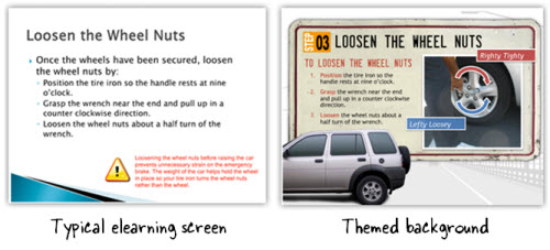
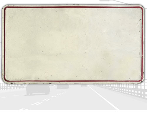
The background is a bit more structured. It consists of a highway backdrop (grayed out stock image) and the content area is a license plate (another stock image). The content on both screens is the same, but which course looks more inviting?
The license plate theme was designed by David for a free starter course we offer in the elearning community. He walks through the process of creating it. But what if you don’t have the graphic design skills to create something like this?
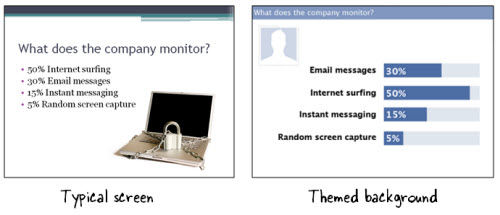
One solution is to find inspiration from other sources. In the example below, the course topic is how an organization monitors Internet usage. Using the Internet to access Facebook at work is very common. So instead of the typical screen, we designed a screen that mimics the Facebook look by using similar colors and lines.
An even easier solution is to settle on a single image background. Think about your course content. What is the one design element that says “this is the topic?” In the Hoh Rainforest demo, we found a single rain forest background image that lets us “step into the rain forest.”
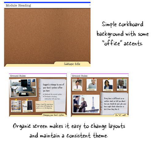
What is the one background image that you can use to bring people into your content? Here are some ideas that are simple and offer flexible layouts. In the corkboard example, the background is the corkboard image.
Corkboards typically have paper and notes tacked to them. I like that type of background because it helps build a single visual theme but gives a lot of freedom in how the content can be laid out. You can also do something similar with a desktop or whiteboard.
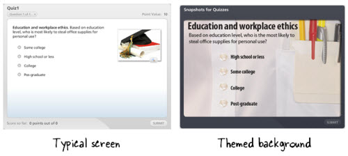
Below is another example. We’re asking questions about workplace ethics. Instead of the default background that comes with the application, we found a shirt that matches a corporate look. It’s just a simple background image. Nothing fancy. But it really adds some nice texture and interest to the screen.
As you can see, you don’t need to modify the image to create a rich-looking background. The quiz example below is just a picture of a shirt pocket.
The first step is to determine a single image that represents the essential theme of the content. Then do a search for an image using Microsoft’s site or a stock image site like istockphoto or fotolio.
Here are a couple of ideas for inspiration. I like to look for wallpaper images. They tend to be a little out there, but used the right way can add a nice touch to your courses.
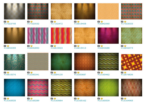
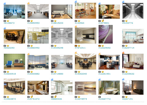
Here’s a link to an idea that probably works better for you. They’re interior images. They’d make great backgrounds for all sorts of elearning courses. You don’t need to buy the expensive images either. I usually get the small versions which just cost a couple of dollars.
Going back to what I stated earlier, your course is going to look like something. You just have to decide what this is. We’re not all graphic designers but as you can see it doesn’t take much to move from the basic white screen or template to something that fits your content better and has a richer look.
Find the one image that represents the essence of your content and then build from there.
Events
- Everyday. Check out the weekly training webinars to learn more about Rise, Storyline, and instructional design.
Free E-Learning Resources
 |
 |
 |
|
Want to learn more? Check out these articles and free resources in the community. |
Here’s a great job board for e-learning, instructional design, and training jobs |
Participate in the weekly e-learning challenges to sharpen your skills |
 |
 |
 |
|
Get your free PowerPoint templates and free graphics & stock images. |
Lots of cool e-learning examples to check out and find inspiration. |
Getting Started? This e-learning 101 series and the free e-books will help. |
16 responses to “Here’s Some Background Information for Your Next E-Learning Course”
Great post Mr. Kuhlmann!
I am a recent graduate in Instructional desgin and new to e-learning. I follow your blog regularly and have learnt a great deal from you.
I know you listed a few sources such as istockphoto and fotolia to search for images, but I wanted to know if you know of any websites where I can find images for free.
I am working on creating a portofolia for myself to share with potential employers, and it can get expensive to purchase images or have subscriptions to these websites.
Thank you!
I wanted to do this with a “newspaper” background, but I got complaints about the “newspaper” words were too distracting. Any suggestions on how to make that work?
[…] Visit link: Here’s Some Background Information for Your Next E-Learning Course » The Rapid eLearning Blog […]
Yes man this what most great rapid elearning need
thanks mush
You are the best! Outstanding post as usual.
I agree with you in principle, Tom, but I can also relate to Ted’s comment. I’ve suffered through e-learning with backgrounds so busy and loud that I literally couldn’t read the required information or find navigation elements. Your examples are very well done, but some of the images you provide as possible backgrounds could be badly mis-used by an instructional designer (or more likely a subject matter expert or stand-up trainer) with little background in visual design or understanding of cognitive processes. What recommendations do you have for avoiding the “lost” content problem?
Thanks Tom! I have a project that I need to do as part of my re-accreditation.
Because it’s not a work project, I’ve got ‘carte blanche’ – which for most of us is truly an unusual thing.
My content is all good, I’ve been playing around with design concepts – your post is very timely!
[…] Here’s Some Background Information for Your Next E-Learning Course […]
[…] Background Information for Your Next E-Learning Course […]
Background is the most important thing in e-learning. Good background will create a good feeling for the e-learning user…
I really like the background example you showed with the look of an art gallery. Any chance you have instructions for how to recreate that look?
@Susan – We have the art gallery example in a blog post with Screenr tutorials. You can learn all about that project here: http://bit.ly/WOXUyI






0
comments