Hi Tom, your July 1, 2008 article (Using Inexpensive Stock Photos to Create E-Learning Characters) linked to a tutorial on using Paint Shop Pro to separate characters from backgrounds. That link is broken and I’m hoping the tutorial still exists somewhere. Thanks so much for all the great information!
Here's Why Contrast is an Essential Part of E-Learning Design
February 23rd, 2010
Contrast is a key part of your course design. In fact, it’s one of the foundational principles in visual design. Many people know the acronym, CRAP (or CARP if you’re an ichthyolatrist) which stands for: contrast, repetition, alignment, and proximity. They are the four essential design elements.
Contrast allows you to distinguish the content on the screen. It helps the learner navigate what’s there, discern relationships, and determine what’s most important. There are a lot of ways to create contrast. Let’s look at a few simple examples.
Contrasting Text
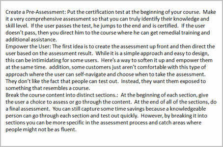
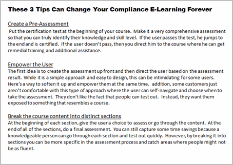
The images below are from a previous where I discussed a few graphic design principles. Both images have the same information. However, by creating titles, body text, bold text and underlines I’m able to organize the information and provide direction for the learner. Without more than a few design elements I communicate how the information is organized.
Contrasting Size & Proximity
There are other ways to create contrast—size being one of them. One way is by changing the font size. You can see it in the image above and in the text of this blog post. The heading title is larger than the rest of the text. This lets you quickly scan the titles and make an assumption about how the information is organized and what it contains.
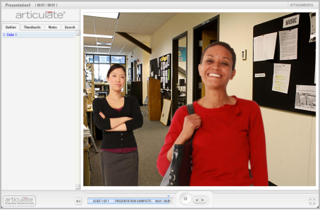
In the image below, there are two characters. However, most people are first drawn to the lady in the front because of her position and size in relationship to the other person. She is the focal point of the scene and can communicate being the main character. Most likely the first question is, “Why is she so happy?”
Contrasting Color
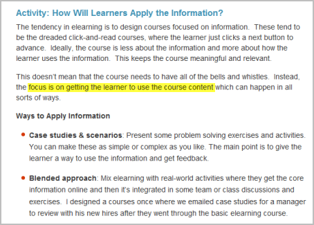
Another great way to create contrast is through the use of color. In the example below, I used the bright yellow highlight to focus on a single point of information. This could be a good technique for those times when your client gives you a text heavy slide and isn’t willing to budge. This would really work well combined with animation and audio.
To show how color can change the meaning of the content, let’s revisit the earlier image. By turning the color off of everything but one character, the point of focus now is the colorized person. So instead of asking why the first lady is happy, we might be wondering what’s wrong with the second lady and why she appears upset.
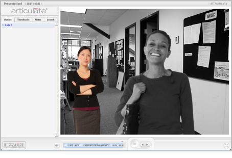
A bonus tip is emotion. In the image one person is happy, while the other has a smirk. What’s the story there?
Contrast is a powerful way to communicate ideas and an effective way to use your graphics. There are all sorts of ways to use contrast in your design, and not just with your graphics. With your next course, make a deliberate attempt to use it and see what happens.
What are some ways you’ve used contrast in your elearning design? Do you have any good examples? Feel free to share them via the comments link.
Events
- Everyday. Check out the weekly training webinars to learn more about Rise, Storyline, and instructional design.
Free E-Learning Resources
 |
 |
 |
|
Want to learn more? Check out these articles and free resources in the community. |
Here’s a great job board for e-learning, instructional design, and training jobs |
Participate in the weekly e-learning challenges to sharpen your skills |
 |
 |
 |
|
Get your free PowerPoint templates and free graphics & stock images. |
Lots of cool e-learning examples to check out and find inspiration. |
Getting Started? This e-learning 101 series and the free e-books will help. |
19 responses to “Here's Why Contrast is an Essential Part of E-Learning Design”
Another principle in sound instructional design is that of consistency – so that learners form a good mental model of the course and content. However, in long courses I am sometimes concerned that this ‘mental model’ may stagnate, i.e. the learner sees the same layout on screen after screen, and may mentally switch off.
So a technique I have used is to suddenly change the layout – not just for the sake of changing, but at a point where I really want the learner to focus. I believe that when the learner sees a contrasting layout it will trigger the sub-conscious and they ask – Why is that different? This action of asking results in them focusing on the content I want then to pay attention to.
Maybe I am expecting too much? Maybe it works – I have not followed up with learners for some time
Tom,
Here are a couple of Screenr samples of how I like to use contrast (and how to do it in PPT). Great post.
Contrast with backgrounds:
http://screenr.com/yFx
Contrast with characters:
http://screenr.com/9Qx
Dear Tom – THANK YOU SO MUCH – these principles are the key to effective learning!! It’s great to be reminded of them!
Things like, selecting your examples carefully and clearly showing, through the design of the learning materials, the features that differ are critical if we are to teach abstract concepts!
Many concepts, in schools and in businesses, are abstract (rather than concrete) – so to teach them, we need to clearly set the boundaries between examples of that concept – and those that are a “different” concept.
As effective instructional designers, whether on e-learning or not, we select conceptual examples – AND it’s these examples, their features, and how we present them – these are some of the MOST critical components of effective learning!
thanks again for the reminder!!
cheers
Gail B, Sydney, Australia
Nice article bringing attention to the basic principles of graphic design (I love your posts that give importance to visual design part of our work – often times it is difficult to convince people of it’s importance when their background and strengths are in instructional design).
A few things to keep in mind regarding contrast when using fonts and font attributes…
Too many variations removes all contrast: if everything is different or there are too many different font sizes/colors/types used, there is nothing to set the standard to bring out the contrasting element.
Underlining for web-based content should be limited to links: if you are creating content to be delivered via the computer, avoid using underlining for font contrast as underlines are a standard indicator of a hyperlink. Your learners will not know if you are underlining for emphasis or a link and it will detract them from your content.
@Anne – What a great point re: consistency. Sometimes “consistency” can be rigidly applied to the point everything looks and feels the same to the learner.
I like your idea of mixing up the layout. I often create 4-6 layouts for each course. This way I’m always designing around my content rather than forcing content into single design layout.
Another option I’ve seen is to use multiple graphic styles in courses. Photos for content screens, illustrations for scenarios and pop-art style designs for quizzes.
I created a forum thread in our community: http://is.gd/929np to flush this out some more.
David
Nice article – thanks. I recently had text-based, bullet-style .ppt from client saying that there were 85000 dust particles per metre-squared when you brushed up dirt, and only 7500 when you wet-moppped.
I ended up using a stock photo of a spotlight shining onto a black background obliquely in from “stage left”, and dust in the air in front of it. The only words were 85K, fading out with 7.5k fading in. I made the font sizes represent the percentage reduction, and the small one appeared in the the beam of the spotlight. Visually it worked very well (IMHO), and the principle of contrasting size worked nicely.
Bruce
[…] Tom Werner on February 24, 2010 Nice post from Tom Kuhlmann about contrast as a design […]
[…] Here’s Why Contrast is an Essential Part of E-Learning Design […]
Tom – As a student instructional designer, I’ve never thought of contrast in this way. Thank you very much for the easily readable and understandable article on contrast. I see myself using that acronym in the future.
Like the last person to leave a comment, I am also a student of instructional design. A professor of a writing class I took introduced me to the CARP acronym last semester, and is something that really fits in well with what we do. As instructional designers, we need to find ways to make sure that we reach the learners, and taking Contrast into consideration is one way to do that. You provided some fantastic ideas on how contrast can be used as a tool, and gave me some things to keep in mind while working on client projects. Thank you for this great post. I look forward to reading more.
Tom,
I am following you on twitter as part of my e-learning class, and I figured I would check out your blog. I love your style of e-learning and I am currently using it to build most of my projects for the IIT department at Bloomsburg University. We have been breaking down every level of your style, which really helps me learn the information. Keep up your twitter blogs because they are very informational! Thanks
I agree with Elly that too much of contrast will take away the innovativeness of the style. The trick is to use it in such a way to create the interest and depict the content correctly rather than just have it to catch the attention of the learners.
But yes, Tom, using contrast is a great way of breaking the monotony of the course and visually represent a concept easily. Thanks for the tips.
I am also a student and like the previous students really appreciated the information of this post. I never thought about the impact contrast has on courses, but I am definitely going to include it in my future course designs. Thanks.
After reading your post, I thought that visual contrast is definitely on the right track because we tend to appreciate and attend to variety in almost anything we view or hear. I began to think of the importance of contrast in audio narration as a result. Remembering to avoid monotone is likely an equally important form of contrast.




0
comments