[…] on http://www.articulate.com Share this:TwitterFacebookTumblrPinterestLinkedInDiggEmailLike this:LikeBe the first to like this […]
How to Create Interactive E-Learning
May 1st, 2012
I get a lot of questions about interactivity from those who are just getting started. Typically they begin with a lot of subject matter content and they’re not quite sure how to make the course interactive.
There’s a lot to consider when it comes to building interactive elearning. But if someone’s just getting started here are the three tips that I usually share:
Make it Relevant
The first step to interactivity is relevance. The worst thing is having to take an elearning course that is completely meaningless. I’ve never had a job where I’m in a position to be bribed. Yet in many of the organizations I’ve worked, I’ve had to take courses on how not to receive bribes. What a waste of time!
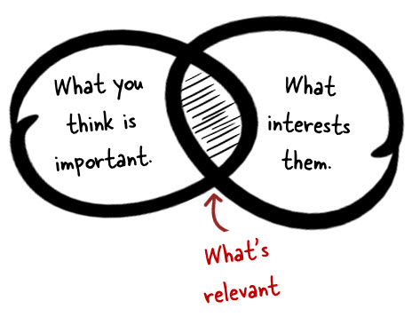
And many of us experience this type of irrelevant elearning. We’ll get an email in November reminding us to complete a bunch of courses by the end of the year. When that happens, I contact the HR person to see if I can get around those requirements. But unfortunately the person’s already taken the course on how not to get bribed. So I’m usually out of luck.
While relevance doesn’t equate to interactivity, it does equate to an engaged learner. And an engaged learner is more apt to learn and not be dependent on interactive gimmicks (which is what we usually start with when we try to make the course interactive). So before you look to build interactive elements in your course, determine how to make the content relevant to the learner.
Tips:
- Talk to your potential audience and let them share ideas on how they’d use the content. Their ideas are a good resource for scenarios.
- Interview new people who may have recently experienced the training to get feedback on what worked and what didn’t and how they feel the course relates to the real world.
Let the Learner Explore
A large part of learning is about forming a hypothesis and then testing it out. Often we fail, but the process of reflecting on an idea and then testing it is how we learn, whether we’re right or not.
There’s a lot of opportunity in elearning to let the person explore the course content and provide places for them to reflect and test ideas—“What happens if I make this choice and click here?”
Another value in exploration is that it allows the learner to determine what information is relevant or not. For example, if I know how to do something I can skip over that content and get to the content that I’m not sure about.
Unfortunately most of the elearning courses I see are linear and not very interactive. Linear isn’t bad on its own. Sometimes it’s preferable to get the information in a simple linear process. But what tends to make the linear course unbearable is when the course navigation is locked. And we tend to lock it because we’re worried that the “learner will not get all of the information.”
That’s faulty thinking which we’ll cover in the next section. For now, look at your content and determine how you can craft an environment where the learner can explore and get to the information she needs.
Tips:
- Instead of creating a linear path of information, look for ways to let the learner find information or access it in different ways. At a minimum, give them some control over how they choose to get the information.
- Get the learner to “touch the screen.” It’s interactive because it engages a different sense and it forces YOU to find new ways to present information.
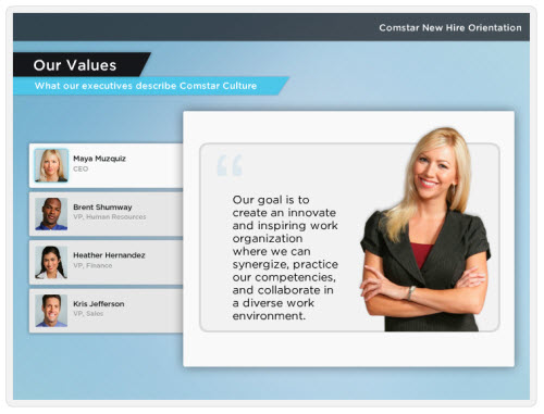
Here are a couple of simple examples:
In this first example, we could just create four screens and have the learner go through them in order. But instead we give them the freedom to select a tab. This does two things: it lets them touch the screen and they get to choose what they want to review. It’s simple, but it’s an easy way to convert your click-and-read content to something more interactive.
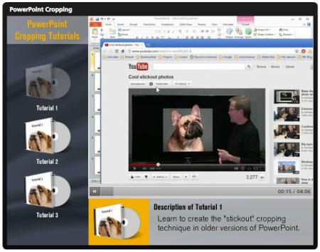
In the next example, you’re required to view three tutorial videos. Like the example above, I could have had the learners click on each video link and go through it in linear order.
But instead I freed up the navigation by letting the learners choose a video and then drag it to be played. By having them drag the video I get them to touch the screen. And I also give them the freedom to choose the video they want to watch. If this were a real software course, the learners may not need all of the tutorials. So why would I want to lock them into a linear path?
The two examples above are simple, but if you couple this type of interactivity with relevant content, you’ll be on your way to building an interactive elearning course.
Get the Learner to Pull Content
Relevant content is good and mixing it with screens that allows people to click and explore helps. But probably the single biggest thing you can do to transition from non-interactive to interactive elearning is craft an environment where the learner has to pull information in rather than us push information out.
The easiest way to do this is to craft decision points in the course. Force the learner to make decisions and then give them a way to collect the resources they need.
Some people won’t collect anything. They’ll jump in and make some educated guesses. Sometimes they’ll be right and sometimes not. That’s OK. They’re fine getting feedback and making adjustments. Others will not make any decisions until they’ve done an exhaustive search of every piece of information. That’s OK, too. In both cases you’re engaging the learner and giving them the freedom to make decisions and learn in a way that engages them.
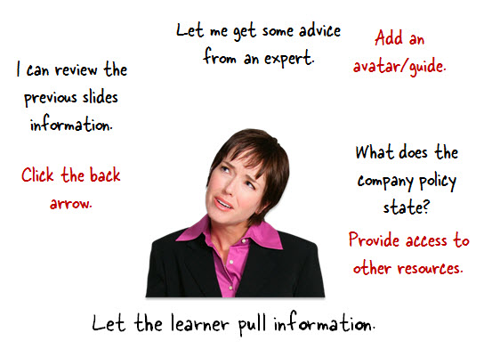
The key to this approach is in how you structure access to the content. There are a number of ways you can get the information to the learner (which addresses the argument for locking slides).
- Set the stage by providing some contextual information.
- Create decision points where the learner is challenged to demonstrate their understanding. We don’t want them just reading or listening. We want them to reflect and process. Getting them to make decisions is a good way to get them there.
- Provide a means for them to collect information (this is where exploration comes in handy).
- Give them feedback based on the decisions they make.
As you can see, in all four instances you have an opportunity to provide the information that would normally be part
of your linear click-and-read content. They get information when you set the stage. They can get more information as you force them to a decision. They get even more information as they explore and try to fill in the gaps prior to making a decision. And then of course you can provide information in the feedback process.
Normally we push content out, but if we think about how to get the learner to pull the content in it forces us to craft relevant scenarios and decisions. And we have to move our course design away from linear and towards more open exploration and interactivity.
And at that point you’ll have a much more engaging and interactive elearning experience.
Countering the Locked Navigation Argument
To those who have to deal with the locked navigation argument, you can still lock the course. The ultimate goal isn’t locking navigation and making sure people look at slides. The goal is that they’re able to do or understand something.
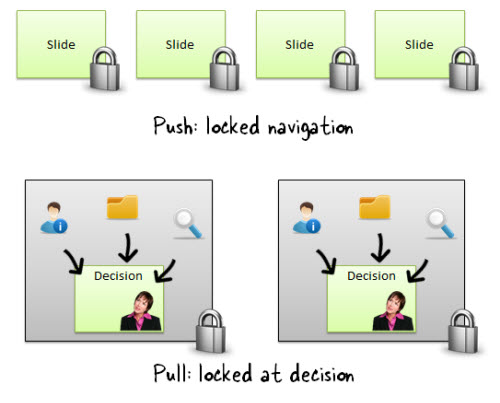
So you counter the argument by showing that a course that has decision points allows the learner to demonstrate their understanding of the content more so than forcing them to view a slide. Plus, you can still lock the course at the decision points. The learner is free to move around within the decision, but can’t advance until he’s demonstrated his understanding.
These three tips will help you move your content away from linear, click-and-read content and towards something more interactive and engaging. The next time you get some course content, ask how you can create a pull situation rather than pushing it out. And you’ll find that gives you a lot of ideas on making the course interactive.
Events
- Everyday. Check out the weekly training webinars to learn more about Rise, Storyline, and instructional design.
Free E-Learning Resources
 |
 |
 |
|
Want to learn more? Check out these articles and free resources in the community. |
Here’s a great job board for e-learning, instructional design, and training jobs |
Participate in the weekly e-learning challenges to sharpen your skills |
 |
 |
 |
|
Get your free PowerPoint templates and free graphics & stock images. |
Lots of cool e-learning examples to check out and find inspiration. |
Getting Started? This e-learning 101 series and the free e-books will help. |
41 responses to “How to Create Interactive E-Learning”
[…] on http://www.articulate.com Valora esto: Me gusta:Me gustaSé el primero en decir que te gusta esta post. […]
Awesome summary of a critical (and usually overlooked) isight about e-learning.
Thanks for sharing!
[…] View post: How to Create Interactive E-Learning » The Rapid eLearning Blog […]
As always, thanks for the post and tips.
Frustration — your link re Storyline has no product info; still waiting to hear anything. How can you be presenting workshops on a product no one can get???
Great ideas about interactivity but I’m quite frustrated by our firm’s internal process that states that course navigation has to be completely locked (ie every slide must be done in strict sequence) because it’s a NASBA/CPE requirement. Is this true? If so, how do other people in the US deal with this?
How did you create the drag and drop feature in the tutorial demo?
Nice summary Tom. I am curious about the “drag” presentation you illustrated. I may be missing something that may be very simple, but how do you create a drag feature using powerpoint? It’s a very interesting feature, I see alot of use for. Can you elaborate a bit on this in a future post? Thanks again.
I am also interested in the drag feature that you used for them to drag which video they wanted to watch. I actually have to create something just like this where the users should watch 3 separate short videos and this would be perfect!
So, how DID you create the drag & drop feature in this tutorial? I’d really like to use that!
Thanks in advance!
Thanks Tom! I’m also curious about the drag and drop! Have been wanting to do something simiar.
Hi Tom,
Loved the doggie-drag-and-drop. That’s one of the nice thinks about visiting these forums and blogs, to see something that you’d normally do on a mundane basis and seeing the same thing all spiffed up! Thanks for the ideas!
Michael
Hi Tom
I’m going to chime in with the others and ask about the drag and drop. Loved the effect, and would like to know how it was created. Thanks.
Loved the drag and drop and I would also love to see how that was done. Thanks.
I need help figuring out how to create a fillable form inside a powerpoint course in order to include a Course Completion Certificate the learner can fill in their own name and print at the end of the slide show.
Any tips?
You suggest ‘Interview new people … to get feedback on what worked and what didn’t….’
Sometimes that’s difficult to do. I try to follow a lead from Bill Horton of asking in a quick survey of their reaction during their participation in the module — or in a longer University class at the end of the week. The questions are the same and always net good info for future development and allows the learner to give solicited, yet anonymous, feedback. And, if I tweak the questions a bit asking how they’ll use the content or why they would NOT be able to use the content, I get low level ROI.
Judith @ eLearnovations
Great post Tom! Helpful information for beginners like me. Drat! (on the drag and drop the video being done in Storyline and not in PowerPoint)
Excellent advice! Love the fresh tips to turn us around from pushing training to learners pulling. Keep them coming!
Hello,
The post is really nice and informative to read because we are often stuck in the mundane linear navigation courses and seek ways to make content interesting and interactive for our audiences.
I too like the drag and drop interactivity and would like to see the screencast.
The question that comes to my mind is that while giving learners the freedom to pull information, don’t we run in the risk of them missing out on key information? Typically, if we were to give a interactivity like the decision screen example shared by, my ID reviewer would like me to retain the navigation lock till the learner clicks all the items on the screen may be in any order. If I suggest the pull theory, I’d be rebutted with the statement that you should ensure that the learners don’t miss out on any key information. What to do in such cases?
Nice tutorial thanks ! How did you get rid of the large bottom bar of the player in storyline ?
Your described attempts to bribe HR was very witty. You have style!
Thanks for the post. Linear or not depends on the kind of the learner. The olders one do not like to click all the time and prefer linear.
What about gamification? It seems like some of these examples could be enhanced through some of the triggers that games use. The motivation towards choice in terms of points or unlocking to enhance an online profile level. When a person unlocks a certain amount how can their online profile show this? Could any of that be integrated effectively?
Nowadays E-Learning has become very popular among students.They are really very excited about this type of education.I loved your post as it shows us how we can make it better and interactive.Thanks
[…] How to Create Interactive E-Learning […]
Hi Tom! I always find really useful your tips in building rapid e-learning courses. I’m using now Storyline and let me say that it is the Frankenstein in e-learning software! I’m amazed about how the software works and boosts my creativity! I’d like to see some tips using Articulate Storyline! See you Tom!
Great ideas and examples to make e-learning interesting. good point on letting the learner explore and “decide which information is relevant or not”.
[…] their recent blog post “How to create interactive e-learning”, Activate employee Tom discusses how to stop boring click-click-click linear e-learning. Most of […]
Thank you so much for sharing! As someone who is just getting started in the ID and e-learning field this was very helpful!
Instructional Design and Interactive E-learning.
I am fairly new to the Instructional Design field but have designed curriculum and course content for online courses I teach. This quarter I have really tried adding additional tools to help my learner’s learn by giving them the choice in how they learn. I really like your examples that allow your learner’s to “touch the screen” and is something that I really want to work on to possibly add to a future course and appreciate your examples and tutorial videos.
I added Twitter accounts, Facebook fan pages, created Weebly websites, use Educreations to create mini-lectures, and also created weekly games for my students to use as additional tools to aid their learning. What are your thoughts on adding additional Social components to online learning? Are there ideas that are currently being used that really help online learners?
I might have gone overboard this quarter in adding all of these external tools but thought by doing so that I would give students additional choices in how they learn as I think this concept is extremely important to today’s learners.
Although I teach an online accounting course, I am constantly trying out new technologies to add that additional learning component to each course. I thought that by adding several additional tools that I would be “meeting” my students using an environment that they are familiar with and thought by adding various additional social media components this would add to their learning.
I found this article and really think it relates to your post and how interactive E-learning is important to today’s learners:
I really enjoyed reading your blog post on how to create interactive E-learning and think this is what is lacking in my online accounting courses and look forward to using new technologies including Articulate Storyline and wish one of your events were closer and would definitely attend!
[…] How to Create Interactive E-Learning […]
[…] we’re worried that the “learner will not get all of the information.” This quote comes from How to Create Interactive E-Learning …but what if you’re stuck with linear? Check out this video for some […]
Just read this and its given me a few ideas.. i’m new to designing e-learing materials, the idea of getting learners to pull content rather than us pushing it, now i’m looking at my course differently as i was afraid it was just all info and not too engaging – thanks
One point that I haven’t seen in posts in various blogs is that writting a good test is a way to ensure that the learner didn’t miss important information. If the learner can recall the required information or select the correct response then why force them to review the content? The “old school” approach is to develop the objectives, the exam questions and THEN the content. I don’t know many designers who do that now because of the perception that it takes too long. I admit that due to time constraints when “training” is mandated as check-the-box response to an issue with unreasonable time constraints I don’t do it that way either. I write the exam after the content is developed and then if I have time go back and cut out extraneous information that is necessary to pass the test or to make the content flow from one topic to the next. Using testing as means to SHOW the learner “got the information” may help convince a customer to relent from a forced march through the content.
[…] Selmet lasta õppijal etteantud materjale läbi töötada, loo talle võimalused ise vajaminevat infot leida ja analüüsida. Selleks paku neile küllaldaselt taustainfot ja püstita ülesanded, mis võimaldavad omandatud teadmisi esitada ning reflekteerida. Kindlasti anna õppijatele jooksvat tagasisidet. Loe uudist algallikast. […]




0
comments