
As I was surfing the web, I came across Nicholas Carr’s recent article in which he asks if “Google is making us stupid.” It’s an interesting read. He discusses the impact that the Internet has on our reading habits and ultimately on the development of who we are and our ability to think.
I’m not thinking the way I used to think. I can feel it most strongly when I’m reading. Immersing myself in a book or a lengthy article used to be easy. My mind would get caught up in the narrative or the turns of the argument, and I’d spend hours strolling through long stretches of prose. That’s rarely the case anymore.
Now my concentration often starts to drift after two or three pages. I get fidgety, lose the thread, [and] begin looking for something else to do. I feel as if I’m always dragging my wayward brain back to the text. The deep reading that used to come naturally has become a struggle.
I could have written those words! I’ve also developed this habit of quickly scanning for key points and moving on. In fact, just this week my wife got a book on parenting and asked if we could read it together. The Olympics were on and I’m not a big fan of men’s synchronized diving, so I picked up the book and spent about 15 minutes skimming through it. That was enough for me. I got the key points and now I’m ready to go discipline my kids in a new way. In fact, one of their punishments will be to watch men’s synchronized diving.
So what does this have to do with elearning?
It is clear that users are not reading online in the traditional sense; indeed there are signs that new forms of “reading” are emerging as users “power browse…”
Carr’s article raises some issues that could impact how we design our elearning courses. Our learners are being conditioned to process online content a certain way. It impacts how they see, retrieve, and process information. If these reports are correct, and we’re developing a new way of reading (or retrieving information), then this needs to be a consideration as we design our elearning courses.
Here are some points I jotted down as I read the article. Actually, I had to read it a number of times because I kept skimming through it. 🙂
Accommodate the “power browsing.”
Instructional designers need to consider web surfing habits. Whether it’s right or wrong, people who are online have been developing habits that they bring to the elearning course. Design courses to accommodate these power browsing habits. If you don’t, chances are you’ll lose a connection with the learner which will make the course ineffectual.
Steven Krug’s book, Don’t Make Me Think: A Common Sense Approach to Web Usability, is an excellent starting point. He has a lot of good before and after examples that are very relevant to how you’d design your online learning experience.
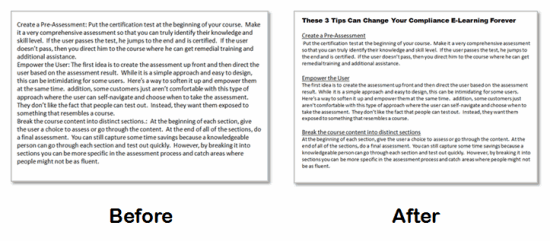
Pull main ideas and critical points into focus.
When people are online, they tend to look at the screen and quickly scan for information. They’re not changing that habit for your course. Structure the information so that it is easy to recognize the critical pieces.
I discussed this in a recent post on basic design. There’s no need to bury important information and force the learner to find it. Instead make sure the important parts are evident and then build follow up information around it.
Move from linear to exploratory.
Most elearning courses are focused on a linear presentation of information. Real learning doesn’t happen when you give the learners information. Instead it happens when they use it. So your instructional design needs to become less about presenting information and more about getting the learners to use it.
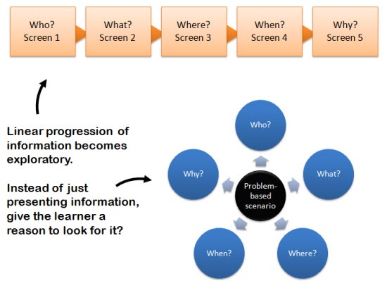
Free up the way learners navigate the information. Instead of linear presentation, give them a reason to need your course content, and then the freedom to find what they need. Based on how you build your course, you’ll be able to assess their understanding and give them the feedback that is appropriate to their needs.
You won’t have to fear that they miss something because you’re not controlling the navigation. In fact, if you look at the image above, you’ll notice that all of the same information is available to the learner, it’s just not delivered the same way. The instructional design is not in the information but how YOU design the course for the learners to use it.
Pull the learner into the real world.
The following statement reminded me of a lot of the issues we tend to have with our clients and subject matter experts.
The more pieces of information we can “access” and the faster we can extract their gist, the more productive we become as thinkers.
Too much focus is on the information and not enough on the use of it. In fact, one of my pet peeves about elearning is that because we can efficiently give people information, we tend to abdicate our responsibility to coach them through using it. For all of the elearning courses I had to take over the years, I can only recall a handful of follow up conversations with my manager about them. It’s a lost opportunity to set expectations and build the social relationships that are so critical to our success.
When we read online we tend to become “mere decoders of information.” Our ability to interpret text, to make the rich mental connections that form when we read deeply and without distraction, remains largely disengaged.
It’s time to engage the learners and connect them to the real world. There are a number of ways that you can blend the content from the online course with learning activities outside of it that are relevant and meaningful to the learning process. Here are a few ideas:
- Use case studies or problem-solving scenarios. At a minimum, build them into your elearning course so that the learner knows how to apply the information to a real-world context.
- Incorporate the course with real-world discussions. Instead of solving the case study online, have the learners solve it and then discuss the solution with their peers or managers. Of course, this depends on the type of course, but it can be very effective. I used to use it in peer-coaching environments.
- Create real-world activities. I’ve built courses with activity journals. The course would cover certain information and then the learner was required to locate that information at their site and document it. For example, if part of the environmental policy was to locate and review the site’s emissions log, we
had the learner actually do that and then report on the finding or use that information elsewhere in the course.
The main point is that just because you do a course online, doesn’t mean you can’t blend the course content with offline activities.
Leverage all forms of media.
Too many elearning courses are dependent on just the text or narration. If you want your course to be effective, you have to make full use of your tools. And this doesn’t mean you have to be an expert multimedia programmer or Hollywood producer.
Combining easy-to-use digital technology with rapid elearning software gives you all sorts of capabilities. You can incorporate graphics, video, audio, interactivity, and web-based technologies. It really just depends on getting the most out of the tools.
Here’s a list of previous posts that discuss ways you can get the most out of what you do:
There are those who cringe at some of this and equate it to the dumbing down of our courses or learners. That’s not the case. It’s just that we have to build elearning courses that connect with the way our learners receive and process information.
For example, if they speak Spanish, we build Spanish courses. Since our learners are developing a sort of techno-language, we need to build courses that the learners can translate and use. I’m sure we’ll be reading more about this in the years to come.
I’m interested to hear what you think. Add your thoughts by clicking on the comments link.
Events
Free E-Learning Resources





0
comments