Great post again. I was thinking on how I could define some guidance for my SME’s and the steps you list can pretty much do that. Excellent.
Jeff
Many people are stuck in the world of linear, click-and-read content. Sometimes it’s because that’s all the organization wants. And sometimes it’s because we’re not quite sure how to make something more interactive. It’s probably the subject I’m asked about the most. One of the most frequent questions I get. The cool thing is that regardless of the tools you use, you can still build interactive content.
One of the best ways to learn to build better courses is to find some good examples, break them apart, and then try to build something similar. This way you get some hands-on practice, which is a lot more valuable than reading about interactive elearning.
So in today’s post, we’ll look at a popular example and talk through a few ideas on interactivity.
In large part interactivity requires a shift away from pushing the content out (which is common) and instead creating an environment where the learner pulls content in. A good way to get them to pull information is creating a situation where they need to make an informed decision.
I usually recommend throwing people in the pool. Instead of dumping them with a pile of information, dunk them in a pool of opportunity. Let them deal with real-life situations and learn through their decision-making.
Put them in the types of situations where they need to make the decisions you want to them to make. That creates the opportunity for them to demonstrate their understanding and if they’re deficient in understanding they’re motivated to pull the information they need to make an informed decision.
When I learned to create videos, I’d record TV commercials and then break them down scene by scene. Commercials are great because they’re very effective in communicating essential ideas and they’re short. It’s a lot easier dissecting a 30 second commercial than a 2 hour movie.
After viewing the commercial I’d create storyboards for each scene. Then I’d analyze the scenes, how they were edited, and consider the motivation from one shot to the next. This process of dissecting the commercial slowed it down for me and helped me see what was happening better. The same can be done with elearning courses.
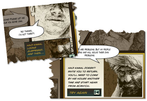
Today we’ll look at a popular example that Cathy Moore shared a while back. We’ll do a simple break down of the module. This is a good example because it’s interactive, engaging, and it’s short enough to go through it a few times.
Click here to review the module first.
Basic breakdown of the course:
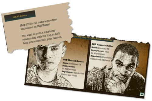
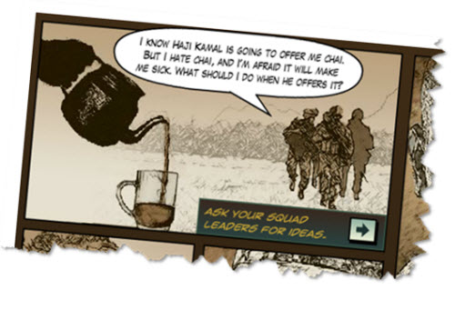
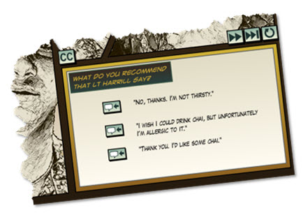
As you can see, breaking down the scenario is a great way to come up with a formula that could work for your own scenario.
Without too much focus on the great visual design of the course, take note of how you can navigate through the module. There’s always a place to restart and also quickly advance through the modules. This gives the learner freedom and control. It also encourages going through the course a few times. My guess is that most people go through the module at least twice if not more. Would that be the case if every screen was locked like they are in many courses?
Cathy discusses the scenario in more detail on her blog. But before you look at it, do this. As you go through the course try to map out the flow. How many individual screens are there? Go through it a few times. You’ll start to see a pattern and realize that the structure of the program is not that complicated and easy enough for you to do, regardless of your authoring tool.
The secret is taking the time to analyze the course and then creating a model that you can repeat with your own content.
Here’s another cool scenario-based module that’s been making the rounds. It’s a good one to dissect. Do the same thing; make some notes on what you like and how it flows. Try to create your own outline of the course. Then use that structure as a guideline for your own scenario.
Click here to view the interactive scenario.
If you want to look at other multimedia examples for inspiration, David does a great job collecting them at his elearning examples site. Most of them are smaller interactions so they’re perfect to break apart.
Perhaps you can take one of your linear courses and convert it to an interactive scenario using the same structure and outline as the soldier scenario. It’ll be good practice and I’m sure you’ll wow them at work.
If you do rework a course and make it more interactive, feel free to share the link. We’d love to see what you do.
 |
 |
 |
|
Want to learn more? Check out these articles and free resources in the community. |
Here’s a great job board for e-learning, instructional design, and training jobs |
Participate in the weekly e-learning challenges to sharpen your skills |
 |
 |
 |
|
Get your free PowerPoint templates and free graphics & stock images. |
Lots of cool e-learning examples to check out and find inspiration. |
Getting Started? This e-learning 101 series and the free e-books will help. |
Great post again. I was thinking on how I could define some guidance for my SME’s and the steps you list can pretty much do that. Excellent.
Jeff
[…] Traduzione autorizzata tratta dal post originale di Tom Kuhlmann sul “Rapid E-Learning Blog”. Il post originale è disponibile qui […]
Leggi la traduzione autorizzata in italiano del post qui:
This is very well done. I really appreciate that you suggest solutions rather than complaints and criticism.
[…] View original post here: Let Others Inspire Your Interactive E-Learning. Here’s How. » The Rapid eLearning Blog […]
Tom, excellent breakdown & model to use.
The Haji Kamal module & Cathy Moore’s scenario articles were definitely inspiration for us when developing Broken Co-worker.
Dissecting the work of others is important, and I would suggest, if starting fresh on a project, consider the time required to find inspiration & ideas. Either from surfing the web, a video game perhaps, a kiosk, or even menus in Blu-ray movie. This shouldn’t take long, but at least find something that sparks an idea beyond bullets and stock photography.
eLearning developers need to get out of their comfort zone, and shouldn’t be discouraged if they can’t match the quality of their inspiration.
For Anna Sabramowicz and I, we decided on a comic theme, even when we knew we had no illustrator, never attempted a comic before, had no clue about comic panels, dialogue, or captions. But you learn & adapt as you go.
We were able to fill those gaps with a simple Flip cam & reading free comics at marvel.com … creating a unique scenario in the process.
Is it perfect? No. But James Cameron’s first film wasn’t Avatar either… I guess this is our Terminator 😉
Tom,
Thank you for this post, the Soldier scenario was definitely an inspiration, and we did find ourselves analyzing and dissecting it in much the same way you did here.
I do think there are a lot of critics out there and not enough developers. The lessons learned from creating something of our own actually added meaning to our Quality Assurance process and those “best practices” we are always talking about when developing eLearning. Also, now we actually have something we can refine until we feel it is “perfect” – it’s a great feeling.
Take care,
Anna
[…] If you work in eLearning, read Tom Kuhlman’s latest post. He provides an excellent development breakdown on using inspiration to build exceptional courses […]
[…] […]
[…] […]
The lesson is excellent. The artwork is simply superb. The approach is a take-off on military instructional books on field tactics from the Boer War, and the 1st Iraq war. Both books take the reader into a scenario and route to another page in the book based on the choice the reader makes. There are some illustrations and maps, but nothing as artful as this work.
Now for a question.
Someone please correct me on this, but isn’t this lesson actually built in the quiz module? I’m not adept at use of the branching logic in the application.
Thanks!
[…] Let Others Inspire Your Interactive E-Learning. […]
Excellent examples, as always. Could you please provide the names of the 2 vendors who built “world war fighters” and “broken worker”?
[…] Let Others Inspire Your Interactive E-Learning. Here’s How About Michael M Grant Dr. Michael M. Grant is a passionate professor, researcher, and consultant. He works with faculty members, schools and universities, and districts to integrate technology meaningfully and improve teaching and learning. When 140 characters just won't work, then he blogs here at Viral-Notebook.com. He has a beautiful wife and three equally beautiful daughters, who will change the world. Visit Michael M's Website. View other posts by Michael M Grant –> No Comments Yet – be the First! Leave a Reply Click here to cancel reply. Name Required: […]
Tom, thanks for highlighting the Haji Kamal scenario. It was one of my favorite projects to work on.
Pete, the military scenario was built using custom flash, but it would have been possible to do it with almost the same features in PowerPoint. Other scenarios in the project were done in PowerPoint or even in text-only printouts, with instructions at each decision point to turn to page so-and-so. These lower-tech versions, and the discussion about the Haji Kamal scenario, were done in face-to-face sessions with soldiers.
From my experience, the intellectual challenge of a branching scenario is far more important than the media it’s produced with. With the soldiers, the text-only, printed scenarios seemed to generate as much discussion and debate as did the multimedia ones.
So once you have a compelling storyline with challenging, non-obvious choices, you should be able to produce an effective version of the scenario using your choice of tools.
There are a couple of samples of text-only branching scenarios in this post on my blog.
This is definitely some great info Tom. I could probably learn from dissecting a few commercials and definitely from experiencing top notch eLearning. I have my own challenges in that most of my teaching is in technical skills or programming but I have to learn to think of ways to break the concepts away from the skills and try to make those into interactive images or scenarios.
[…] Let Others Inspire Your Interactive E-Learning. Here’s How […]
[…] […]
I was inspired by this blog and Cathy Moore’s example to re-create a portion of a course for my portfolio. Thank you! I always learn something new from your blog.
An excellent read. Thoughtful demonstration of a real problem with some elearning. There is a problem of too much content which is far from engaging, making the student less likely to want to continue.
[…] Them to Pull Information Let Others Inspire Your Interactive E-Learning. Here’s How. » The Rapid eLearning Blog Rapid eLearning Professional creating blogs or webpages ELEARNING elearning tools [+] […]
Thanks Tom. This is some good stuff. People can easily learn and absorb knowledge the interactive e learning way. I agree that people must not be piled up with a bunch of information because a person’s average attention span will only last for a few minutes. In your way, learning can be both fun and educational.
[…] Let Others Inspire Your Interactive E-Learning. Here’s How. » The Rapid eLearning Blog Get Them to Pull Information In large part interactivity requires a shift away from pushing the content out (which is common) and instead creating an environment where the learner pulls content in. A good way to get them to pull information is creating a situation where they need to make an informed decision. So in today’s post, we’ll look at a popular example and talk through a few ideas on interactivity. […]
[…] while back I shared how to be inspired by others and included links to two comic-style elearning courses. Based on the feedback, the examples were a […]
[…] while back I shared how to be inspired by others and included links to two comic-style elearning courses. Based on the feedback, the examples were a […]
[…] в другом посте http://www.articulate.com/rapid-elearning/let-others-inspire-your-interactive-e-learning-heres-how-2… я рассказывл о том, как получать вдохновение, наблюдая […]
[…] Inspiration for Simulation Design http://www.articulate.com/rapid-elearning/let-others-inspire-your-interactive-e-learning-heres-how-2… Clip Art for scenarios or storyboards […]
0
comments