The Rapid Elearning Blog

I love to watch the TED videos.  I usually watch them on the plane when I travel.  What I like about them is that the subject matter is really interesting, the videos are just about the right length, and I always learn something.

Recently I was watching Gever Tulley’s TED presentation, 5 Dangerous Things You Should Let Your Kids Do.  If you haven’t seen it I highly recommend it.  His five dangerous things are:
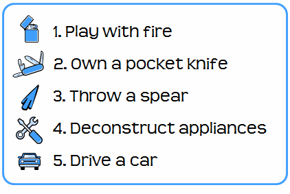
The Rapid E-Learning Blog - 5 Dangerous Things You Should Let Your Kids Do

After watching the video, I decided to get my seven-year-old son a small tool kit for Christmas so that we can work on dangerous thing number four and take some stuff apart.  My wife’s not too keen on him throwing spears or driving a car…or worse yet, throwing a flaming spear (that he sharpened with his pocket knife) out of a moving car.  So deconstructing appliances is the family-approved danger for now.

This past weekend we took apart an old toaster.   As we were dismantling it, we discussed how the toaster worked and what the different parts did.  It’s really kind of cool taking apart old appliances.  I was amazed at the simple yet effective design of the toaster.  There are things I wouldn’t know about it had I not taken it apart.

The Rapid E-Learning Blog - future rapid elearning designer

There’s a lesson in here for us instructional designers.  Sometimes the best way to learn is by taking apart the stuff other people have built.  And if that’s not possible, at least try to replicate it.

When I was learning video production, I’d record TV commercials and then break them down frame by frame.  I wanted to know how the edits were made and try to figure out what motivated them.  It proved one of the best learning processes for me.

I do something similar with elearning courses.  If I see a really good course that I know required some programming skills to build, I’ll try to rebuild it using PowerPoint and the rapid elearning software.  I want to see what I am able to do within those constraints.  In fact, one of the best ways to enhance your creativity is to work with constraints.  It forces you to problem solve and think in new ways.

Not everything can be replicated but it’s a great way to learn new techniques and to think through what makes a good course good.  If you want to learn how to use your rapid elearning tools better or to build more engaging courses, I highly recommend that you deconstruct those courses you find to be really good.

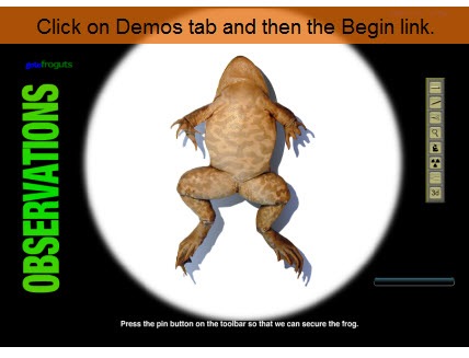
At a recent conference I was talking to someone who lamented that she was “stuck using PowerPoint” and didn’t have a Flash programmer.  I asked her for an example of what she’d like to do.  She pointed me to the Froguts.com demo
The Rapid E-Learning Blog - Froguts.com demo

Click here to view the demo*

If you haven’t seen it, check it out.  It’s really well done and a great way to avoid killing frogs for school experiments.

I told her that while she couldn’t replicate that type of course completely, she could definitely make a similar course with her rapid elearning software.  Not only that, it would probably be easier to make and take less time.

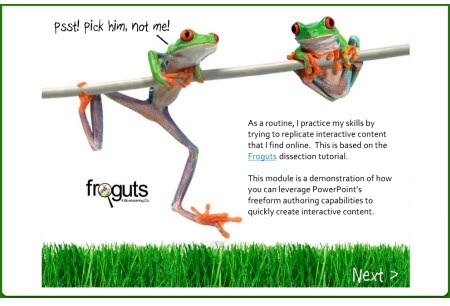
She didn’t buy that.  So I took up her challenge and built a quick mock up to show her how I’d approach this type of course.  Take a look at the demo I built below.  Once I had the assets, it took me about 5 hours to pull it all together.  It’s built entirely in PowerPoint.

*I did notice that the demo on the Froguts site has been updated, so the one I built is a little different.  However, it doesn’t change the essence of this post.
The Rapid E-Learning Blog - deconstructed frog demo

Click here to view demo.

While there are some limitations when you work in PowerPoint, I think you’ll agree that the version created in PowerPoint is a viable solution. There were some challenges trying to replicate the drag and drop functionality.  You’ll see what I did to overcome them. I also learned a few things while doing the demo that will make my next project go a little faster.

The main point here is that by trying to replicate good courses you’ll learn techniques that you can apply to your own elearning courses.  They’ll make your courses better and help you be more productive when building them.  You don’t even need to replicate the entire course.  For example, in this demo I could have just focused on the drag and drop functionality.

In next week’s post I’ll go through the version I built and discuss what I did and some of the things I learned that I can use the next time I work on a course.

Let me know what you think by clicking on the comments link.

Events

Free E-Learning Resources

Want to learn more? Check out these articles and free resources in the community.

Here’s a great job board for e-learning, instructional design, and training jobs

Participate in the weekly e-learning challenges to sharpen your skills

Get your free PowerPoint templates and free graphics & stock images.

Lots of cool e-learning examples to check out and find inspiration.

Getting Started? This e-learning 101 series and the free e-books will help.


69 responses to “Now You Can Design E-Learning Courses Like a Pro”

Hi Tom,

while I wouldn’t want to dissect a real frog (something that’s not on the curriculum in German schools), I watched the Froguts demo with a certain fascination – much less icky than I would have thought. 😉

I’m looking forward to your follow-up postings.

One question is still open, though: What did the person who originally pointed you toward that site think of your mock up?

Kirsten

Very good! The only constructive criticism I have is of the final “identify the organs” portion. The hand cursor only appears over the correct answer, so you don’t really need to know which organ is which, you can just wiggle your mouse around until you get the hand cursor.

January 6th, 2009

Tom,

Great lesson for instructional designers to look around for examples to replicate. I, too, watch TED talks – many of which are not on topic, but which nonetheless provided inspiration and new ideas nearly every time. You provided a great example of how to use rapid development tools and to operate within constraints in order to create meaningful and interactive courses. Thanks for another outstanding lesson.

Last week I ordered the book, The Dangerous Book for Boys for our little girl. Most of the topics are gender neutral (building go-carts, swings, tree houses, periscopes, paper water baloons).

Interesting book and reminds me of my time in the Scouts. I like seeing the renewed emphasis on stepping away from the computer.

David

Tom, this is great stuff… I’d like to see more stuff like this. Thanks. Also, enjoyed the first part about what to let a child do. I have a 4-year-old granddaughter and passed this on to her parents.

Great demo! You’ve really challenged me to be more creative within the constraints of PowerPoint to create better presentations. I look forward to you follow-up post.

Tom,

You are so talented and I always enjoy when I see that one of your blog entries has arrived in my inbox. This was a great post. And we didn’t even have to get our hands dirty. 🙂

Would you mind sharing what the font is that was used on your next button in the lower right and in much of your text?

Bonni

Tom,
I am looking forward to next week’s update to see how you accomplished the drag and drop in Power Point. I havent been able to figure that one out yet.

Great demo! I can definitely see building that into a great learning experience, exploring the organs more, etc. Like it a lot – I read through and enjoy all your emails. Thanks

Hi Tom

Great post!

We use Flash a lot and while it is a great tool it certainly takes longer and is not always necessary. Your demo is a great example of using the right tool for the right job.

Cheers

Jon

Hello Tom,

Again, another great post! I always enjoy your insights and tips. As someone new to e-learning and the use of rapid e-learning, I am finding that I am feeling more confident in developing on-line courses.

Thanks very much and all the best with your great work.

Michelle
Toronto, ON

Tom,

Great job – I have accessed froguts.com before and was impressed by how they took this type of activity into an online course. I am impressed at how you were able to replace the activites built within. Can you please explain how you made the PowerPoint interactive? For example clicking the pins or the knife. Did you build links to the specific areas? My mind has hit a speed bump and I can’t visualize how to build this.

Any help would be appreciated! Thanks again!

That was an outstanding port from froguts to PowerPoint – point well made. The problem I typically run into is a finding compelling e-learning courses to attempt to replicate.

That said, does anyone have any links to e-learning courses that have really blown their minds?

Tom,

you say that you try to rebuild good courses using Powerpoint and the ‘rapid elearning software’. I assume you mean Articulate Rapid E-Learning Studio ’09 by that ?

I would be interested to know what else you had to do once you created the Powerpoint presentation.

Rgds,

Chris

Great reminder to not confine your development of e-learning to exactly how others have done it.

To stick with the theme there are lots of ways to skin a cat.

As usual, an inspiring post. I hope you will do some step by step instructions for us who need the basics on how you accomplished the interactivity in powerpoint. Thanks.

Great post Tom. I use Flash for most of my work. The problem is that I know that using Flash can be overkill in many eLearning applications (the frog example for one), however, finding the right tool is sometimes baffling. Your example is a great one in that helps solve the problem of “what do I use for this?”.

I still struggle with this question. Flash is more time consuming, yet I still gravitate towards it for all of my work. I’d love to incorporate a “simpler” application that has the capability of ‘Flash-like” interactions.

Enough ranting. Great post!

ps – can you share the .ppt file so we can “dissect it”? no pun… =)

January 6th, 2009

Awesome Demo Tom!

The animations and content are great. What version of Powerpoint did you use? I’m having some problems trying to learn 2007. Also, was your demo created just using Powerpoint?

Thanks for all that you do. I’ve always worked in Powerpoint and Paint Shop Pro (graphics), but really need to learn more about using Articulate within Powerpoint. I hope that I stated the last point correctly.

I loved the tongue-in-cheek humor throughout (e.g.”Pick him.”) It engaged me as a learner and made an anticipated unpleasant topic–approachable. I also liked the additional tips you included, such as “turn the scissors” so that the organs underneath aren’t damaged. Yes, maybe the flash effects in the original learning experience were smoother, but I’m all about content and your version of this particular segment met an objective of identify… and demonstrate…and encouraged a positive emotional response. I too am looking forward to the behind the scenes tour.

Tom-

Thank you for this great example of how you can use powerpoint to build an interaction. So many times people think that you can only put bullet pointed text on a screen with powerpoint. I will forward this to people new to developing elearning courses as an example of great design.

Well done!
Tara

Thank you for helping us remember that we can take a fresh approach to an existing subject. I find that many of my clients have solid eLearning experiences that just need a facelift, and your post shows some fast and effective ways to do that.

I have not upgraded to the new suite of products. Is there anything you did in this that can NOT be done in AP v5?

I’m looking forward to next week’s post.

Thanks again,
Stephanie
http://www.linkedin.com/in/stephanieeskins

Enjoyed the lesson for the “kids” today, good lesson to learn. It reminds me of when I was a kid and would take things apart to see how they worked, (or didn’t when I was done). Nice to see an application to our e-learning. I could almost smell the formaldehyde…

January 6th, 2009

A real eye opener for people who think they are just stuck with PowerPoint.

I am however, disappointed with the production value (audio) of the TED video.

This is an excellent inspiration to be more creative with instructional design, (which I thought I was doing until I saw this!) I can’t wait to try this myself, and then see your process next week.

As always, anxiously awaiting your next blog…

Tom,

I thought your version of the froggut.com module was excellent. I think very little learning value was lost by your version. I liked the screen layout better and the text was easier to read. Like the others that responded, I need to challenge myself to get away from the bullets of powerpoint and use each screen as a blank canvas. Thanks so much!

Susan

Thanks for the comments. In next week’s post I’ll walk through what I did for the demo. So that will provide a lot of the detail.

To answer a couple of questions. I initially built this prior to the launch of the ’09 software, so everything would be the same if you used Presenter 5. The only difference is that disabling the player feature is easier and the screen fidelity is better in 09. Although it all looked find in v5.

All of this was built in PowerPoint. Outside of publishing to a Flash output, the rapid elearning software wasn’t required to create the course. In some cases, the rapid elearning software is required. For example, I use the mini cooper demo based off of a part in one of Michael Allen’s courses. I can replicate the same module in Engage and build it in about 10 minutes or less, versus spending a few days doing it.

I’ll be doing more of these types of deconstructions this year. They’re a great way to learn how to use the tools. By the way, if you find some cool courses and want to pass them my way, I’ll see if I can use them in the posts.

Tom,

Great inspiration! This is a fun demo, and I have a couple of responses to two commentors:

Greg Friese:
I know “to skin a cat” is a common American phrase, but our household feline takes exception, and offers up the dogs next door. 🙂

Ryan Herr:
Good point about the cursor hand, however, I think Froguts is aimed at the higher grades of K-12, based on their earning an award from Technology and Learning magazine, focusing on K-12 education. For older learners (high school, for example), I agree with you that I’d try and find a way in PPT 2007 to eliminate the cursor hand “hint”. And, I’d get rid of the grassy lawn below to increase the size of the frog image. I could hardly see the organs, but I don’t have the eyes of a teenager or elementary school kid. 🙂

To all…upgrading to PPT 2007 and Articulate Studio ’09 is well worth the money. Especially with Quizmaker…the upgrades are amazing.

Tom, keep up the great work! I am still blown away by your Steve Jobs red-and-black intro screen. Sadly, I can’t find it any more.

In the past, have you posted blogs that point us to PPT tutorials, especially of advanced PPT skills? Can you give us all a list of URLs for taking our PPT skills to more advanced levels?

—-
Jenise
http://www.RidgeViewMedia.com
http://www.LinkedIn.com/in/jenisecook

Tom-

As mentioned many times..”great job”. As I was watching the dissection I was thinking of how I could actually use that in technical training. Then the light went one. Dissection of programs and code! Or better yet, for me, it would be the dissection of how a mechanical component was modeled! Select on the features of the 3D model and up comes the directions on how to use the function!

Ryan

I agree about the frog image being larger and redoing the internal organs piece. I grabbed the image from the original demo so I was kind of stuck with what I had to work with. I basically replicated the way their demo worked and that’s how they did it. The version online now is an upgrade to their first one.

A good place to learn more about PowerPoint is to track the blogs of some of the PowerPoint MVPs. The Steve Jobs piece was in reference to this site, PowerPoint Heaven. There are a few tutorials. The tips and tricks are probably a little more advanced and some of them don’t translate to rapid elearning conversion.

However, you can see that PowerPoint is a pretty cool application and can do a lot more than most people think about it.

Very cool Thank you.

Impressive and FUN! The organs were hard to see, but the point is well taken that there is a lot that can be done when thinking outside of the “bullet point box” in using PowerPoint.

As always Tom, Great Post!

I have a thought to get around the cursor hand “hint”… how about highlighting the remainder of the frog parts with hyperlinks that simply return the user to this same page. This way, when the user hovers over the frog, they would always see the “hand”. However, they would have to click the correct hyperlink in order to answer correctly.

Thanks again.
Bill

[…] Tom’s session, learn first-hand how You Can Design E-Learning Courses Like a Pro by seeing how […]

I am really looking forward to your next posts. I love learning shortcuts.

Facinating! Deconstruction (or “back engineering” as it is sometimes called) is a great way to learn anything. So is “replication” for that matter.

Can’t wait to see how you pulled it off!

@Bonni: the font used in the demo is boopee. The link shows where to purchase it. There are also links to similar fonts.

“Outside of publishing to a Flash output….”

Huh?

Excellent post. I can’t wait to check out PowerPointHeaven!

Thanks again!

January 6th, 2009

Tom,

Instead of launching into a series of posts where you tell us how you did this or that, why not just make the PowerPoint available to us, and let us dissect/decontstruct YOUR frog/appliance. Let US make the discoveries and report back to the class.

Give me a fish (frog, toaster, whatever) and I will eat for a day. Teach me to fish and I eat for a lifetime.

@Dave: Some were wondering if you needed the rapid elearning software to create the demo content. The demo is built entirely in PowerPoint. However, to get the output you see in the blog post, I published it with Articulate Presenter, which converts the slide to Flash files and creates the player infrastructure.

@Jim: Good point. Of course you can do that now. It’s all created in PowerPoint. Figure out how to do it and then report back. You might actually come up with a different way. I’ll share the file next week so people can deconstruct play around with it. I’ll still write the blog post to head off the many emails I get asking how to do it. Plus, I wouldn’t have a job if I didn’t write the blog posts. 🙂

January 6th, 2009

Fantastic, I cant wait for the information on how you did the drag and drop!!

Loved it! I really enjoy your site – can’t wait for the next blog with the deconstruction of the PowerPoint.

Last year, I viewed the OHS tutorial you recommended and recreated parts of that using powerpoint. I ended up with a usuable elearn that looked way funkier and more in line with my company’s branding. I’m going to take your advice and do more of this ‘self-paced’ learning.

And for those wondering about PPT 07 – it’s sooooo much better. It takes most users between 1-2 weeks (for a fairly regular user) to be able to use it efficiently. Check out the Microsoft site – there are some great online tutorials there. There is also a neat function which you can download from Microsoft if you don’t use PowerPoint that regularly. It allows you to click a button to revert back to the old version and point to the function you want to locate – it will then direct you to find the function on the new version. Cool.

Cheers
Jen

Tom, you ROCK! Not only at rapid e-learning, but blogging. Nice job!

To David Anderson: My daughter and I downloaded free plans for a playhouse. She and i went to HOme Depot together and she picked out all the lumber and her first real hammer. We’ve got the platform finished and its been a blast to work with her on it.

To…someone else: Google Virtual Knee Surgery for another killer example similar to froguts…but on humans…eeoooooooohhhh 😉

I’ll also take this opportunity to encourage your readers to submit a solution for the gLearning Contest for Annual Gathering 09. The submission for is not ready yet, but your readers can get a head start by simply creating their BEST elearning solution using only Google Apps. Choose your own topic, audience, and modality…and go for it!

Cheers!
Brent
elearndev.blogspot.com

[…] » Now You Can Design E-Learning Courses Like a Pro The Rapid eLearning Blog (tags: _to_read) […]

January 6th, 2009

Tom, that’s really impressive. But gross. I’ll never eat frog again. I’m looking forward to meeting you at Articulate Live ’09. We should put you up against Cliff Atkinson on a PowerPoint challenge. I think you’d give him a run for his money.

[…] » Now You Can Design E-Learning Courses Like a Pro The Rapid eLearning Blog […]

January 6th, 2009

Happy and Prosperous New Year to you Tom and very Educative year to every one who follow Tom’s “e-Learning” Blogs. Thats what already happened (Educative)to all who follow your blog issues. I am becoming wiser and wiser after reading and implementing the tips you have provided. Year 2008 was so to me and with this blog year 2009 also started putting more muscle to my aged brain. Thanks Tom.

I always look forward for your email.

Diwakar B

This is a great example! Very inspiring. I appreciate your suggestion that we use models that we like and do our best to integrate those components into our own modules.

I have one question about the time it took you to create this example. How long would you estimate it took you to gather the assets? I find in making estimates of time it will take to develop a new course, I’m not good at estimating that gathering step. If I have everything in front of me, I can sit down and focus on that project. Getting to that point is half my battle.

January 7th, 2009

Great job Tom, your point about how one can use PowerPoint “powerfully” is well-made.
I look forward to more “behind the scenes” on this one.
Bruce
PS – there are a couple of reference on this Topic to “skinning a cat”. I assume this is a seperate interactive eSeminar that you have produced, and look forward to receiving the appropriate link 😉

Urgh, Tom! Did you really have to use such a stomach-churning example?!

That said, great post and many thanks. I think I can just about figure out what PowerPoint tools you used (I’ve been reading your posts for a while), but look forward to hearing this for certain in your next post.

M

Thanks for sharing your wonderful thoughts and for promoting useful information. ALL THE BEST

http://iridiuminteractive.com

It is great.Looking forward to your email

[…] Tom Kuhlmann shows how to approximate Flash-type animation by creating in PowerPoint and publishing using rapid e-learning software (presumably Articulate Presenter). […]

Great work. It is really amazing to see how refined and sophisticated the output is. Is a link to the PowerPoint slides available anywhere? If not can you post/send it please? Would like to understand how it is done.

I am new at e-learning and have learned so much from your posts, so thank you first of all! I am intrigued by this recent post and would very much like to have access to the PowerPoint presentation of the frog dissection if at all possible. Please keep up the great work!

January 7th, 2009

Tom,

No, I don’t think I can download your Powerpoint. At least in my browser, it is only in Flash in an HTML document.

I actually thought yours was better than frogguts.

Thanks Tom for a very interesting technique. I look forward to the Powerpoint file which you have promised to share next week. My fingers are already itching to dissect the Powerpoint file.

Manoj

January 8th, 2009

Tom, you have reinspired me to continue my quest to practice and hone my e-learning skills. My company has removed my e-learning tools that I used in 2008, and I was feeling very lost and defeated at the start of 2009. But, with your ppt demo of a semi-complex issue (disection of frog), I feel inspired to not give up. I am going to continue my practice in e-learning, thanks to you, with the help of ppt. Thank you very much for inspiring and reinspiring us and sharing your talents and knowledge, so that we may create interesting e-learning and be one day rid of “info-dump” e-learning.

Dana

Great thought of trying to recreate other people’s work. Thanks, Tom.

I stopped the demo after the first scapel cut. The unpleasant memory of my “analog” frog dissection in 1974 still haunts me. Your work has the distinct advantage of no formaldahyde vapors!

Tom,
You created such a clean tutorial! My 14 yo homeschool ds intuitively followed every step. Great! Can’t wait to see how you did it.

What I thought was neat Tom was the idea of thinking outside of the box. I will often do the same. I wish I knew Flash better. However, what I have discovered is that more and more of the rapid e-learning tools out there provide ways “”around the mountain.” Thank you. When you have an idea and hear someone else validate it, it is special.

Maryann

Thanks again Tom for another great post. I have learned so much from your blog. You are so right about using replication as a learning tool. I had a MAJOR technical breakthrough some time ago when I replicated one of your earlier demos of the braking mechanism of a Mini (not sure if that’s the same demo you referred to in one of your comment replies above).

To everyone else – don’t be a wuss and wait for Tom’s instructions. Have a go at doing it yourself! You’ll feel a much greater sense of achievement than if you just work through instructions.

[…] to do and then try to replicate them.  That’s what we discussed in the previous post Now You Can Design E-Learning Courses Like a Pro.  By doing this, you learn new production techniques, think through instructional design […]

Hi Tom,
Well, I thought I would be one of the last to chime in on this blog. Very Good! It might surprise some of your viewers that I actually dabbled with Powerpoint at one time and it remains one of my ole’ time favorite elearning tools. In the days of low bandwidth however, it was a bloated monster for the web. I guess times have changed though. So really we at froguts were kinda flattered at the deconstruction. But it should be pointed out that we were coincidentally upgrading our demo to be a little more reflective of our actual product too. Within a week or so, you should now see 3d, narration, fullscreen playback.

And now some froguts tips on Powerpoint: Don’t forget you can embed animated gifs, quicktime movies, and even flash into your projects. I realize that not everyone has the tools, but truly as content designers you should know that you don’t need one program like PP to do all the work, especially when PP was designed to embed media. Sometimes methods can be like breaking in a horse, when you could just hail a cab and be more efficient in your project management.

However, for newbies and for a concise instructional guide to Powerpoint practices, the examples you did Tom are fantastic, and inspirational! I look forward to reading more articles.

Sincerely, Richard Hill – froguts inc.

Don’t forget to check out http://www.froguts.com for the new frog demo next week. Oh and thanks Tom for the inspiration in getting our new stuff out the door too.

HI YALL

I AM WORKING ON A MATH ELEARNING….I WANT TO SIMULATE SOME ONE SOLVING A MATH PROBLEM ON A PAPER. AMY ONE GOT ANY IDEAS. I WANT IT TO LOOK REAL RATHER THAN ALREADY TYPED NUMBERS

THANKS YALL

@Nana, you could use a handwritten font and then use some animations like a wipe. If you add a hand and motion path (in PowerPoint) you could make it look like the person is writing. How much time you spend on it depends on how much value that animation actually adds to your course.

[…] fact, the frog dissection post I did a few months ago came as a result of a conference discussion.  I wanted to show that […]