Triggers
in general triggers are’nt converted in flash: we can use others tricks to simulate a trigger, but it is not the same…: an interesting feature (ex. for quick deepening) we cannot use.
Here's Why PowerPoint 2007 Helps You Build Better E-Learning
March 17th, 2009Last week was a blur. Monday started with Articulate Live ’09 and ended with the eLearning Guild’s Annual Gathering. In between, I delivered three presentations, met hundreds of people, and we announced the winners of our Guru Awards 2009.
While it was an exhausting week, I love meeting you all and learning about what you do. Thank you to all who came by and said hello.
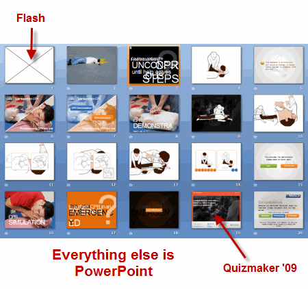
Speaking of the guru awards, I was looking at the source files for the CPR demo and was impressed to see that it only contained twenty PowerPoint slides. Looking at it, I assumed that it had more slides and a few more bells and whistles. But that’s not the case. For the most part it’s all PowerPoint.
The first slide is a Flash animation and the CPR simulation was created in Quizmaker ’09. Other than that, the rest of the course content was built in PowerPoint. I think it’s a perfect example of how you can use PowerPoint to build effective and engaging elearning courses.
That’s why I want to look at PowerPoint 2007 and how it can help you build better courses and save time building them. But before we look at PowerPoint 2007, let’s do a quick review of what’s happening when you build rapid elearning courses with PowerPoint.
A lot of people confuse building a PowerPoint presentation with using PowerPoint to build an elearning course. There’s a difference. When you build a rapid elearning course, what you’re really doing is using PowerPoint’s easy authoring environment to build Flash movies without requiring you to learn Flash. PowerPoint’s giving you a blank screen to create what you want. When you publish the course, the slide with the audio, images, and animations is converted to a Flash movie file (.swf).
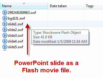
The secret to using PowerPoint to build your rapid elearning courses is getting the most out of PowerPoint. That means knowing how to work with objects on the screen and using the animation feature. As you figure this out, you’ll build better courses and you you’ll build them a lot faster. And that’s why PowerPoint 2007 is going to give you a lot of value.
With PowerPoint 2007, you’ll be able to increase your productivity.
- Built-in graphics and design features will speed up the production of many of your images and objects.
- Layer controls makes it easier to work with layered objects. That means you can add more complexity to your slides because you have better management of the objects on the screens.
- Swap images on the screen. This is one of the biggest time saves. Now you can pre-build all sorts of animations and content using placeholder images. Insert one of the pre-built elements onto a slide and then quickly swap the placeholder image with a real one. And you’re all done.
Let’s take a close look at PowerPoint 2007 and what it has to offer.
Ribbon Toolbar
The ribbon’s not going to add a lot to your course development, but I thought I’d mention it because it’s one of those love/hate features. And I know that once I talk about PowerPoint 2007 I’d hear complaints. So this is to get those out of the way.
I’ll admit it. When I first started working with the ribbon toolbar, like many of you, I couldn’t stand it. But I’m a fan now. While there are some things that still bug me a little, I do find it much more intuitive and I actually prefer it over the previous versions.

Graphics formatting & design themes
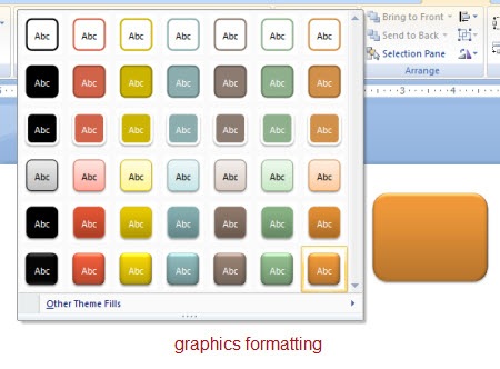
You get a lot of nice graphics formatting features that will speed up making some of the images you’ll need for your course. There are a number of presets and customization options. You can format shapes, pictures, and text.
I find that I spend less time in other graphics applications because PowerPoint gives me a lot of what I need. That is where the time savings comes in, especially if you don’t have a graphics application to build buttons and other visual elements.
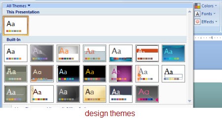
You can create design themes built around colors, fonts, and format effects. Using the theme settings lets you quickly apply universal changes to your course content. Gone are the days of changing individual objects on each slide. Again, this is a very powerful feature and another time saver.
Layer control
PowerPoint’s animation feature lets you build some pretty complex animations. However what usually holds people back is that managing the animations and the layers on the slides is a hassle. It’s just not worth the time.
That’s all changed with PowerPoint 2007. Now you have better control of your layers. You can turn them on or off and change their order. You can even rename them so it’s easy to identify what the different objects are.
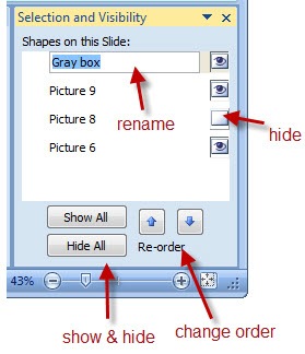
Now that you have this layer control, you are free to do more with the objects on your slide. Another benefit is that if you disable the layer, then it doesn’t show up when you publish the slide.
Swap pictures
The most powerful feature in PowerPoint 2007 is the ability to swap out images. All you do is right click on the picture and select “Change Picture.” That’s it. What makes it so powerful is what that lets you do.
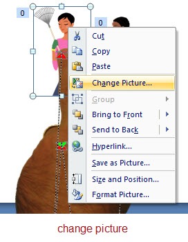
The reason you save all of that time is because the animated sequences stay intact. The only thing that changes is the image. In the previous versions of PowerPoint, you could build some nice animations, but if you wanted to edit the image or your client wanted a different looking shape, you had to break it apart and rebuild it. That cost a lot of time.
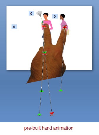
Here’s how I use this feature. I pre-build a lot of my animations with placeholder images. Then when I want to use that animation on a slide, I copy and paste it. Right click and swap the image. And then I’m done. Easy as that. The first animation might take me some time to build, but reusing it only takes me a few seconds.
That means you can reuse a lot of your content which will save you hundreds of hours in development time. A good strategy
would be to pre-build some animations and then you have them available to use when you need them. In a future post, I’ll give away some pre-built animations.
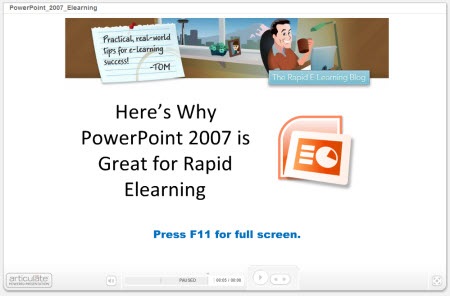
Here’s a quick demo that shows some of these ideas in action. I broke them into chunks so that it’s easier to navigate. If anything look at the last one where I demonstrate how easy it is to use a pre-built animation.
As you can see, I can pre-build my content in PowerPoint and then easily modify it using the PowerPoint 2007 features that I described above. By doing so, I save time and money and still have an opportunity to build effective elearning.
PowerPoint’s a great authoring platform for elearning because of it’s easy to use and many people already have the basic skills to get started. It’s just a matter of learning to make the most of the tools. The returned value is that you can commit more time to the course content and building better learning experiences.
PowerPoint is a very capable tool that can be used to deliver effective, engaging, and interactive elearning at an affordable cost and at the speed of business. In this economy, that’s a winning solution.
Let me know what you think by clicking on the comments section. If you have some PowerPoint 2007 tips and tricks, feel free to share those as well.
Events
- Everyday. Check out the weekly training webinars to learn more about Rise, Storyline, and instructional design.
Free E-Learning Resources
 |
 |
 |
|
Want to learn more? Check out these articles and free resources in the community. |
Here’s a great job board for e-learning, instructional design, and training jobs |
Participate in the weekly e-learning challenges to sharpen your skills |
 |
 |
 |
|
Get your free PowerPoint templates and free graphics & stock images. |
Lots of cool e-learning examples to check out and find inspiration. |
Getting Started? This e-learning 101 series and the free e-books will help. |
62 responses to “Here's Why PowerPoint 2007 Helps You Build Better E-Learning”
Great, Tom
your lessons always are phantastic.
regards
George
Tom,
It was great meeting you last week! As I mentioned in the forum, I continue to be amazed at appreciation y’all have for the community of users. That is hard to find these days. Your posts are always amazing and presented in such a way that even simple minds like mine can take them and understand! Thanks for all of the great tips!
Great stuff!
Tom – what “screen capture” software do you use to record the screen movements etc? Is there a piece of software the is recommended as “Articulate-friendly”?
Bruce
Really well done!
Oh, man – how I have struggled with layers, only to learn today about the Selection Pane. Thank you, thank you! There’s even a demo of how it works in PowerPoint Help. I just didn’t know the function was there.
The Cardio-Pulmonary Resuscitation PowerPoint is a perfect example of why you need to not only know design but CONTENT. As a Basic Life Instructor (aka CPR instructor), I found the presentation misleading as well as INCORRECT. Misleading because in the simulation you’re given a visual of EMTs/Paramedics and an ambulance already on the scene and you’re asked what you would do first as a CPR responder. Well… the correct answer is to always call 911. BUT, in this case “911” has already arrived. The visual confuses the viewer. I looked at the visual and thought, “OK, the emergency response system is in full bloom here. What do I do NEXT?”–and I therefore got this “answer” wrong.
The INCORRECT information? You NEVER EVER EVER move someone with unwitnessed unresponsiveness without stablizing their neck and with help from someone who knows how to do this!
This presentation is a perfect example of being in love with the way it rolls out visually and not giving a s*** if it’s the right info.
One more question for you — I am sure you have mentioned this in an earlier post, but what do you use for your screencasts?
Tom thanks for the hints in this Blog. I have a neat trick that I use.
First I create a drag and drop shape the size of the screen, set No Outline from Shape Outline. Then select from Shape Fill Texture, More Textures, which opens the Format Shape window. Now I import a picture as the texture.
Here is the tip. I make two copies, for one I leave it as is. For the second I set the transpariency at 75% which is a slider in the Format Picture window. With a dark slide background like black or dark grey I use the picture with 75% transparency as the base layer then I fade it in using the Custom Animations while fading out the “non-transparent” one. It is a neat effect that makes for a great backgroud as I explain different parts of a screenshot.
As always – Your da Man!
Tom,
Your blog is AWESOME! Keep them coming. BTW, where did you get your hand photos for use in the slides?
Tom,
Just a quick note to tell you thank you for the tips and tricks. I have many new things that have enabled me to develop richer more engaging e-learning. Keep up the good work!
Tom, I love your posts. I have learned so much about PPt and you’re a model of clear instruction. Thank you so much.
Hi, nice presentation. I was curious why powerpoint was not used instead of articulate to drive the point home. Thanks, David
Tom,
Awesome tips. The layer control tip alone is worth the “price of admission.” I’ve used PPT for more years than I care to admit, but recently took a new job and was thrown into using PPT 2007 at that point. So I have not had much time to explore the new features as I have spent most of my time figuring out how to do the things that I knew how to do in the older versions. I too was not a fan of the “ribbons” but I also prefer them now that I have gotten used to them. Your tips are invaluable to me.
Keep them coming!
Tom, This blog was in perfect timing. We just purchased Articulate and PowerPoint 2007. This was my first experience reviewing your blog and looks like I’m in good hands. Can you refer me to any other resources for using PP 2007?
Thank you.
This was excellent. I was aware of many of these features, but not all. More importantly, I had not connected the dotted lines and grasped the big picture of how to put all this together into a neat end result like you did. In a few words and pictures you gave me some very important and powerful tools. Thank you very much.
I agree that PP 2007 is a great leap forward from its predecessor. The layer management and image swapping are a huge boon, as are some of the other new features. However, I still loathe the Ribbon. Nothing ever seems to appear where I expect it to. And time doesn’t seem to be healing the hurt – it’s only adding to the angst.
And Microsoft REALLY needs to learn an important Apple concept: sometimes what you *remove* is just as important as what you add. Please, Microsoft, DUMP some of those horrifically dated design templates, clip art images, Word Art effects (*shudder*), etc. Leaving them in only tempts people to use them.
And people seem unable to resist those temptations…
I must have missed the CPR demo, Like Betsy I also teach it, actually she shouldn’t grizzle about your knowledge of CPR because she also got it wrong…Nevertheless I would like to see your demo could it be forwarded to me as I am always looking at new ways to improve my presentations etc. Keep up the good work I have learnt quite a bit since looking at your emails……Steve
A great demonstration of the benefits of PowerPoint 2007 – this is the kind of thing that Micrsoft should have been doing.
Anyway – one question – can I just check that you created your entire screencast / presentation usign Articulate? The quality is fantastic.
Tom,
I always learn something new and important with your tutorials. Thanks.
Fred
Great PPT 07 tips and love the reusable animations.
The real question as many have asked is what screen casting tool do you use that integrates so well with Articulate?
Fantastic post.
We currently don’t use PPT07 but after seeing your demo and the CPR demo, we will be pressing our boss for the new version.
Keep up the great work.
Hi Tom,
Great post.
Also a small feedback. It would be nice if you can add a concluding slide in your demos something like ‘You have reached the end of this demo/section’. I somehow keeping waiting for something to pop up and after some time realize that there is nothing more coming up.
Finally, I look forward to some new posts from you on building aimations in PowerPoint 2007.
Thanks,
Veera
@everyone:
Camtasia is one screen casting tool among others; Camtasia seems to have the largest usage.
I do wonder which tool Tom uses; if he uses Camtasia? Tom? 🙂
One note… Video Encoder ’09 is very easy to use. I tried it for the first time last week, and easily converted my Apple iMovie to FLV using Video Encoder. The import into my presentation was equally easy.
Thanks Articulate!
Tom,
I know how you like to deconstruct things. Here’s something I call extreme PowerPoint:
http://office.microsoft.com/en-us/templates/TC103382641033.aspx?CategoryID=CT103366151033
I was blown away by the snowflakes and the flower petals.
Hey – this was realy incredible valuable information. I’ve used the Custom Animation pane in ppt07 for a while and its new features are realy good. The Selection and Visibility pane was unknown for me, but now i see that it will be at least as valuable. And the Change picture… option – that was realy useful information too.
THANK’S A LOT!!!
As a few others I am interested in what screen capture program you are using. Is it something that you will add to the Suite? I’ll bye it directly…
Kind regards,
P-O
A great salute to Mr.Tom!.I am using all the tips you provide in this column and all are useful to me……..
I have 2 questions Tom:
1:-Why there is no provision available in MS 2007 ppt to incorporate ‘pattern’ in any of the shapes we create? (Right now I am doing the same in ‘word’ doc., and copy/paste in ppt)
2:-I have the habbit of downloading any video clip-either from You tube,web,from my own dvd collections-in the desktop first,view it, edit it if necessary by using VCD or DVD cutter and then ‘inserting’ into my ppt by selecting -insert movie-from file-from desktop…oops I do’nt get it.
But if I allow the downloading to take by default selection it goes to c.folder to my video and oops get selected-I enjoy playing it.Is there any way out to solve my problem?
3.THE LAST BUT NOT THE LEAST.
I TRIED ‘NARRATION’ BY NARRATING WHATEVER I SEE IN MY PPTS WHILE PLAYING IN ‘SLIDE SHOW MODE’ AND THE ITEMS THUS DONE IS USED IN MY TRAINING PROGRAM (WITHOUT ME)…My only concern is that the voice gets blurred..Could you help me Tom?
I am not a PC savvy-am 70 yrs old, retired production manager from a tyre factory and now re-employed as a Training manager for the fresh supervisors/Engineers trainees-
So please let me have a step by step procedure for whatever you want me to do .
Hail Mr.Tom for the service.
Thangarajan.Chennai.India
This post, while amazing in its content, depresses me because I’m stuck with PP 03 at my job. I do nothing except build e-learning courses and the tips you mentioned today would save me sooooooo much time, especially swapping pictures. Bravo Tom!
Tom. I love your posts and find them really helpful. We are thrilled with the improvements of PPT 2007 which has allowed us to stretch the creativity side of our courses a lot. One little issue is that when we convert PowerPoint’s SmartArt, the text looks a bit ‘bitmappy’. Don’t know what that’s about, but it’s made us cautious about using the SmartArt in the future.
Tom- This post is always incredible… Thanks for all the great ideas/instructions… I do have one question though. I work for a company that will not be upgrading to PowerPoint 2007 anytime soon, so our team is stuck using PowerPoint 2003 in the meantime. You mentioned that 2007 includes many great features (Bevel, reflections, etc…) that you needed to use other applications to create in the past, for those of us stuck in the past, what applications were you using? Thanks again. This blog is always worth reading. – Chris
OK, I’ll ask, where exactly do get the Layer Options from ? (i.e. where in PPT 2007 is it)
@donsmith
Layers (the Selection Pane):
http://office.microsoft.com/en-us/powerpoint/HA102557111033.aspx?pid=CH100819721033
Help for PPT 2007:
http://office.microsoft.com/en-us/powerpoint/FX100648951033.aspx
Jenise Cook
http://www.RidgeViewMedia.com
OK — I’ve finally had someone tell me a reason that I want to change to Office 2007. Both the idea of layers and swapping images would make it worth moving to the completely non-intuitive world of ribbons. Maybe I’m finally ready.
It’s amazing that I haven’t ever heard any of this from Microsoft!
Thank you very much for your insightful post. Inquiring minds would love to know which screen capture tool you used to demonstrate the walk-through. Sharing is caring!;} Thank you again for your assistance.- Jen
Tom,
You’re probably sick of hearing it, but well done! I can happily say with ‘hand on heart’ that I always learn something valuable when I visit your blog.
I am also continually amazed at the capabilities that powerpoint actually offers! It has moved far beyond the ‘marketing presentation tool’ that was originally delivered by Microsoft. It allows you to create the architecture of pretty much anything, learning object, webpage, presentation, you name it. Thanks again for pointing out the benefits! – Matt
[…] Here’s Why PowerPoint 2007 Helps You Build Better E-Learning […]
Silly me, looking something called “layers” when it is called “selection pane”. 🙂
@JRZ – and others stuck with PPT 03 for awhile…
Before I upgraded to PPT o7, I used a PPT plug-in called PowerPoint Xtreme. They have a few products, but the Edit product is only $50, and it allows you to apply the same position and/or animation from one object to another. That’s how I used to re-use animations before I upgraded. Hope you find it useful. BTW…I also used the $20 Color Picker plug-in, which I loved.
Hi Tom, the CPR is another great eLearning example!
However, I’ve always have this thought – why are Articulate pages always framed? Even by having every single attributes in the player template in white, there is still this ultimate grey frame with a slight dropshadow.
I’ve seen this completely frameless example before:
http://www.articulate.com/community/guru/2009/Hippa/
What have HIPPA done to completely get rid of the Articulate frame?
And the buttons are not the standard player buttons. They completely gel into the design!
Can shed some light on how to have a seamless customised design?
Rdgs – Jo
[…] Here’s Why PowerPoint 2007 Helps You Build Better E-Learning – The Rapid eLearning Blog […]
Tom- You rock. I look forward to these posts so much. It is perfect learning experience for me- a little at a time. It is easy to fit into my schedule and I always take away something I can use immediately. Thanks so much.
-Abby
I looked at the CPR e-learning course, and really love it! I’m curious how they put the movie in the navigation bar, instead of the presenter info? Like they did on Slide 3?
HI,
Here’s a tip I just discovered. It is probably obvious to many, but it wasn’t to me. If you increase/decrease the size of a rounded rectangle, you will change the radius of the corners. You can adjust the radius of the corners by moving the small yellow diamond that appears on the upper left-hand side.
hi!
i would like to know, how to use macros using Powerpoint 2007 and how many possible macros are there??????
help me tom!!!!!
[…] Here’s Why PowerPoint 2007 Helps You Build Better E-Learning […]
[…] Here’s Why PowerPoint 2007 Helps You Build Better E-Learning […]
[…] Here’s Why PowerPoint 2007 Helps You Build Better E-Learning […]
[…] PowerPoint 2007 and Quizmaker. And speaking of PowerPoint 2007, you should definitely check out this blog post, where Tom Kuhlmann gives even more tips for using PowerPoint 2007 to build great […]
Within Powerpoint, when I ‘publish’ a presentation, it does not convert the presentation to a .swf file. In your sixth paragraph of this blog, you indicate that it does convert it to .swf. I’m missing something; you’re using articulate to convert it to .swf, right? Powerpoint alone doesn’t do that…correct? Thanks!
Hi Tom-
I love some of these new features of ’07 that you highlight here, but there’s one change that annoys me enough to make me stick with ’03: When you click an off-slide object in ’03, the screen shifts slightly to re-center on the clicked object. No matter where the object is, the slide pane is always fully visible on the screen. In ’07, if the object is far enough away from the center of the slide pane or very large/small, most times the slide pane is only partially visible on the screen. If I click a small object off the slide and want to place it on the opposite side of the screen ON the slide, half the time the area I want to put isn’t visible. I have to move the object halfway there, click another object closer to where I want to place it to recenter the slide pane enough that the area is visible again, or mess with the scroll bars. This can get highly annoying when I need to place dozens of items a minute. Would you happen to know a way to turn this new ‘feature’ off? The only thing I can think of is to zoom way out to have more screen real estate (which makes it hard to be precise, and even harder when the objects are barely discernible at that size), or get an even larger monitor (I’m already using a 24″)
Sorry to complain, just hope you can help! Thanks!
[…] I get a lot of questions about upgrading to PowerPoint 2010. Most people who ask are still using PowerPoint 2003. Starting with PowerPoint 2007, there are many features that make the rapid elearning process much more efficient. I detailed some of those features in this post on why PowerPoint 2007 helps you build better elearning. […]
[…] […]
[…] Some info about PP 2007 – How PowerPoint 2007 Helps You Build Better E-Learning […]
[…] Here’s Why PowerPoint 2007 Helps You Build Better E-Learning […]
Great information about layering tools and changing images. Just when you think you know everything about PowerPoint! Thank you for the useful information – just love your blogs!



0
comments