Social comments and analytics for this post…
This post was mentioned on Twitter by articulatebrian: RT @tomkuhlmann: The Truth About Rapid E-Learning http://bit.ly/at6X0j…

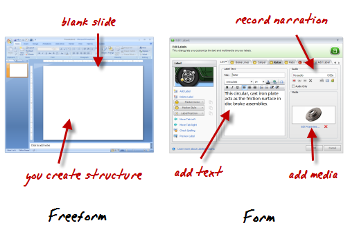
Rapid elearning tools generally fall into one of two groups: freeform and form-based authoring.
PowerPoint-to-Flash publishing is freeform. You start with a blank slide and then build your structure and interactivity. And the other type of tool is form-based where the application has a pre-designed structure and the developer only needs to add content like text, narration, and multimedia. Hit publish and you have clean, professional output.
Most rapid elearning courses use a combination of form-based modules and PowerPoint. A good example of this is the Pallet Jack demo. It combines content created in PowerPoint (freeform) with interactions built in Engage (form).
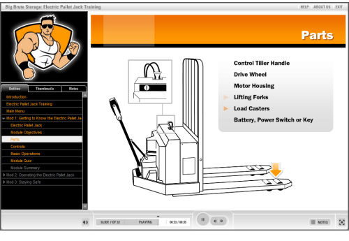
Click here to view the Pallet Jack demo.
As you can see, it doesn’t have that “PowerPoint” look and the integration between form and freeform generated content works well.
Most PowerPoint criticism is misguided. It’s not hard to find critics of PowerPoint because it’s an easy target. Who hasn’t had to sit through boring PowerPoint presentations? Unfortunately, much of the criticism is off target because bad content is the result of poor design and not the application you use.
Books like Beyond Bullet Points and Slide:ology have done more than enough to show how to use PowerPoint for more than bullet point presentations. If you’re critical of something created in PowerPoint tell the person who created it and spare us the tearing of shirts and sprinkling of ash as you lament the inevitable collapse of our industry. 🙂
PowerPoint is a multi-faceted application and used for more than presentations. So a carte blanche dismissal of PowerPoint is ridiculous. As proof to PowerPoint’s versatility you don’t need to go very far. In recent posts, I’ve shown how to use it to build graphics as well as interactive elearning. I even met someone recently who used PowerPoint to publish a book.
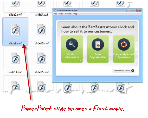
Here’s what’s true about PowerPoint and rapid elearning. Your slide starts as a blank slate. You can add animations, narration, interactivity, and multimedia to create a pretty dynamic elearning course. When you publish your course, that PowerPoint slide becomes a Flash movie.
Do you build the Flash movie in Flash? Or do you build the Flash movie in PowerPoint?
Here’s the deal, you can learn Flash and actionscript to build elearning content. Or you can leverage PowerPoint’s flexible and easy authoring environment to create Flash-based elearning. Either way, the output is still Flash. The only difference is that with PowerPoint you get to create your Flash movie (with animation and audio) in an environment you already know. All without having to be a programmer.
While actionscript programming does provide more control over the Flash content, rapid elearning generally gives you a lot more convenience. And for most courses, I’ll take the convenience over the time and cost associated with the extra programming. It’s part of the rapid elearning strategy I recommend and similar to what Kevin Maney discusses in his book, Trade-Off.
Keep in mind that while rapid elearning gives you the ability to create good courses at a fraction of the cost and time, it doesn’t mean that you skip instructional design. Regardless of your tool, the course is only going to be as good as you designed it. But because you use rapid elearning tools doesn’t mean that you can’t build a quality elearning course.
If you read this blog, then you know that there are more than enough examples to show how you can build high quality elearning using rapid elearning tools. In fact, here are a couple of quick examples I built based on the demos in Michael Allen’s Guide to E-Learning. The first uses a form-based module and the other is built entirely in PowerPoint. They both demonstrate the power of rapid elearning and that you can create viable courses without being a programmer.
Form-based Authoring Example
The example below is an excerpt from one of the Allen Interaction courses. The original is an information-based interaction. I replicated the interaction using Engage, a form-based rapid elearning tool. It took less than 10 minutes to build it.
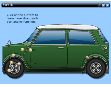 Click here to view the rapid elearning demo.
This form-based example demonstrates the benefits of the rapid elearning approach. You don’t need any advanced programming skills, yet you can still create a rich media experience. In addition, because you cut the programmer out of the process, you cut out all of the associated meetings and project reviews. That’s a big time savings.
Click here to see a comparison between the Flash and rapid elearning versions.
In the comparison video, you’ll see that working in a form-based application is pretty easy. That’s because everything’s pre-built and you just need to add content. The key to using the interaction effectively is in how you structure the learning experience.
PowerPoint E-Learning Example
The first example is more like reading through a manual than active learning. You get good information, but you don’t really do anything with it. This second demo has more interactivity.
Here’s the original built by Allen Interactions. Typically this type of policy training would be your standard click-and-read course where you see page after page of corporate policy about workplace violence. I like the way Allen Interactions built the course. It’s designed in an environment that’s more real life and relevant. Instead of reading about workplace violence, you are a manager who has to analyze the situation, make a threat assessment, and then refer the people to right departments. It’s a great learning environment.
Below is the demo version I that I built in PowerPoint. I scaled it down a bit because I was less concerned about the content and more focused on showing that you can craft a very similar learning environment. I also challenged myself to use only PowerPoint for the graphics so that it was all done in a single tool.
Click here to view the rapid elearning example.
When you compare the two examples, you’ll notice that the original offers a drag and drop; and there’s some logic built into the questioning process. I had to modify that a bit in PowerPoint because of the limitations when converting PowerPoint to Flash.
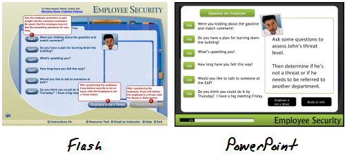 Click here to view a comparison between Flash and PowerPoint versions.
However, I can live with the differences because the course content and learning interaction are essentially the same. Don’t believe me? Ethan Edwards from Allen Interactions said, “…even with the compromises, the PowerPoint piece still has 90% of the impact of the original or more.”
I can live with the compromises. Here’s why and where I make up for it.
We’ll assume that the same effort was applied to the instructional design regardless of the tool used. So that’s a wash. Once I had the content and course structure, it took me about 10 hours to build the prototype from scratch. That includes building all of the graphics, which was most of the time.
A less experienced person would require a bit more time, but in the long run you still get easy authoring at a good price. And that’s where rapid elearning shines.
Rapid elearning doesn’t mean you skip instructional design and the process of designing a good learning experience. That still has to happen. But it also doesn’t mean that you can’t design a good learning experience. Even if all you have is PowerPoint, there’s no reason why you can’t build engaging and effective elearning courses. All it takes is a little practice.
 |
 |
 |
|
Want to learn more? Check out these articles and free resources in the community. |
Here’s a great job board for e-learning, instructional design, and training jobs |
Participate in the weekly e-learning challenges to sharpen your skills |
 |
 |
 |
|
Get your free PowerPoint templates and free graphics & stock images. |
Lots of cool e-learning examples to check out and find inspiration. |
Getting Started? This e-learning 101 series and the free e-books will help. |
Social comments and analytics for this post…
This post was mentioned on Twitter by articulatebrian: RT @tomkuhlmann: The Truth About Rapid E-Learning http://bit.ly/at6X0j…
Genious!
The Employee Security example is absolutely stunning. Thank you Tom!
So many capabilities i didn’t even noticed…
I will try to be more creative from now on!
Very slick use of branching and motion paths to create a “flash” experience. I think very little is lost in the learning experience in your PPT version. It’s great to see you and others pushing PPT to the next level. I look forward to the next posts with the lessons and source files. 🙂
Rapid e-Learning is the real deal in terms of rapid development. Agreed that you need good design on the front end. Great post!
Yes, our company does quite a lot of custom flash conversions to popular rapid e-learning formats (including Articulate), and I have seen only a few (very few!) instances where Flash provided better instructional value than materials created with rapid authoring tools (because rich animated menus provide zero educational value, we all know that).
Interestingly, this is not because Flash isn’t more powerful than Articulate. This is because most corporate e-learning designers only use very limited set of ideas/schemes/tools, most of which are already available in rapid authoring suites.
In other words, 99% of the time, e-lerning is limited by lack of creativity, time pressure and corporate fear of unconventional learning schemes, not by available technology. To prove my point: Tom showcases better, more engaging, more creative materials done with PPT and Articulate than most expensive custom-built flash courses.
Oh, one more thing. The office security course above is probably the most amazing e-learning I’ve seen in this blog so far (maybe rivalled by that frog disection course 😉
yes, great post. A question over here. like the example you give here, you have more than 10 questions. If you use branching to do the click and feedback, you will have lots of slides. The publishing will definitely be very slow. How will you solve this problem?
Tom, you are my e-learning design hero! The Employee Security demo is truly awesome and is the kind of thing I strive for. What’s mostly holding me back, however, is my graphics capability (or lack thereof). Until your “Extra Note” I was going to ask how you created these (or what sources you know of for free graphics!); instead, I’ll look forward to those posts!
Thanks for all you do to make us all better at what we do!
Tom,
I agree with what you’ve written here. I used to take pride in being able to develop all my E-Learning from scratch, in Flash. But the development times to do that are much longer than using these tools. And, the end product didn’t look nearly as professional. I confess that anything I’ve done so far in Flash, can be done in Presenter and Engage. These rapid tools, like Articulate’s suite, get the technology “out of the way.” It leaves developers’ time and talent to write a great course and engineer new approaches. (And no, I’m not being bribed or cajoled into this endorsement, other readers.)
You’ve hit the nail on the head with this one. The limiting factor is not the tool, but the knowledge of how to use it, the instructional designer’s skills, and the creativity of the designer. Time and money are not an issue with this approach and corporate restrictions are a factor, but not insurmountable.
I was blessed with a project where I had almost total design freedom and enough time. I had to create eLearning about how to use our new records management software – if you can think of a duller topic speak up!
In the first reviews with beta testers one reviewer started paging through while talking to me, then stopped talking, then said “you really have to think about this”. Another’s ‘criticism’ was that people would do the eLearning instead of doing their work. My thought was “The elearning about the records management software is so compelling that people can’t get their work done? Exactly where is the down side?
The project got enthusiastic reviews from management, and no suggestions for change.
Julie
Way to go, Tom, for demonstrating how PPT and rapid e-learning tools can rival or surpass expensive Flash-built courses. Maybe those who think PPT is evil will be ‘enlightened’ after seeing the Employee Security example here. If not, then we have less competition as they miss the boat entirely. :o)
[…] Tom Werner on April 6, 2010 A nice post from Tom Kuhlmann about how good instructional design can be accomplished using rapid-authoring […]
Hi Tom, I come from a background of developing game-based elearning using some of the ‘other’ tools…and am now in an environment in which “rapid” calls for PowerPoint, Articulate, etc. While I fully agree with the message you present, I do have to say that I still miss the ability to work with variables and create more responsive learning experiences.
This is not at all a slam against PowerPoint or Rapid E-Learning, but just me missing the ability to more actively track learner performance and create more engaging responses to their decisions. But it’s the nature of the beast when time is critical.
Thanks for another interesting post!
John
Awesome tips. I developing a course now and got some great ideas that will make my course better. I have a programmer/graphic artist working with me. I can’t wait to see how you built the simulation in PowerPoint.Thanks so much.
As I purposefully and pretentiously type this comment on my new iPad, I can’t help but wonder about whether Apple really will marginalize Flash, and how Articulate, whom I love, will adapt.
Thanks for a great post as it reaffirms my pragmatic approach to getting the job done well, quickly, under budget and on time. The Content and design are the king and queen of all communications and training projects. Folks who don’t understand that, and force content to fit fancy tools, make me a nervous wreck.
A good article and I agree that most of the bad Powerpoint we see out there is a result of bad design, poor imagination and low budgets. One can do a quality presentation in Powerpoint as long as your eLearning stays within the boundaries of what Powerpoint is capable of.
What is missed in this discussion is Flash (and Actionscript) as a tool to build simulations– which can be an essential, powerful and engaging part of any eLearning presentation. Simulation is a critical training component when safety is involved…
How do we train pilots on a new piece of avionics? Through simulation or in the cockpit at 20,000 feet?
How do we train nuclear power technicians to respond to emergencies? Through a simulation or on a live control panel?
How do we train hotel clerks on hotel property management software? Using the software in a simulation environment or by watching video, graphical or audio content about the software.
Flash can be a great tool for building these types of simulations. Simply presenting Powerpoint versus Flash as is done in this blog entry is reductionistic as it imagines that Flash has only the capabilities that Powerpoint has that truly make Flash a comprehensive platform for interaction, presentation and simulation.
Perhaps simulation doesn’t fall in to the “Rapid Development” paradigm, but I often wonder are we trading speed and ease for efficacy….
I agree that that PowerPoint is a fine tool. But that doesn’t alter the fact that it’s the most abused tool in web marketing and so called “tutorials.” It’s widespread abuse seems to arise from it’s ease of use.
Your ideas are excellent Tom. But you should see the serial abuse of PowerPoint that clutters up my emails almost every day by people you wouldn’t trust with a flip chart and a felt tipped pen.
It makes you believe that old Marshall Mc was right. The medium is the message. And the message is that PowerPoint is King and that learning and competence are mere serfs.
Regards
Leon
Hello Tom,
Thank you so very much for taking the time to show me and others what can be done using Powerpoint. I have been struggling the past few months trying to develop a course and this helps so very much.
I read the blog every time you post a new article and I love everything you have shown thus far.
I look forward to viewing the process it took you to build such a beautiful course. Thanks again and I will keep on watching you.
Well talk about just in time training!! I’ve been brain-storming some new ideas for an upcoming project today……and then your blog post came in and voila…a whole new set of ideas started running around in my head. I tell you its like a game of bumper cars up there right now with all those new ideas bouncing around in my head!! (That’s the good of kind of “bouncing ideas” that don’t require aspirin!) I’m very much looking forward to your next blog on the topic and playing around with those files for myself!
Tom, Thanks so much for this and all the other useful information you share. It is refreshing to know that there are others in the field who beleive that the lowly PowerPoint still holds value. Although it may not produce quite the same elegant interactions as its more robust fellows in the instructional designer’s tool box, PowerPoint is a viable tool. Instructional designers who really know how to tap the power of PowerPoint can use it to create effective and engaging learning experiences.
Thanks again!
In addition to ‘Death by PowerPoint’ – now we have ‘Death by eLearning’.
I have been participating in a Linked In discussion called ‘Is PowerPoint the Kind of eLearning?’ (here’s the URL for anyone interested: http://www.linkedin.com/groupAnswers?viewQuestionAndAnswers=&discussionID=14650036&gid=152456&commentID=14091899&goback=.hom&trk=NUS_DISC_Q-subject#commentID_14091899).
What has disturbed me about this discussion are two things:
1) The lack of PP knowledge – most of the anti-PP participants claim that PP can’t do this or that. PowerPoint certainly has it’s limits, but it can do around 90% of the things that the anti PP comments claim it can’t.
2) The belief that the tool drives the learning experience – not the Instructional Design.
What we have now, is a lot of poorly designed – but graphically beautiful – eLearning modules.
The tool is not the problem – as Tom points out – it’s the learning principles that do or don’t get applied. There is precious little difference between a badly designed face-to-face session, a badly designed PowerPoint and a badly designed Flash presentation. They all result in the same thing: little to no learning transfer.
I say no to ‘Death by eLearning’!
Great ideas Tom, as usual.
Could you tell me how you inserted the progress bar in Powerpoint? I loved the idea but I’m not figuring out how to do it. Keep refreshing our minds with your wonderful ideas.
Tom,
The Screenr player window didn’t appear on the page though, of course, the rest of the page loaded.
Ok that’s nice I must say, but the only thing it proves is that the most valuable part of e-learning is an idea how to create an interaction, not the tool or methodology you are using.
It is impressive that PP is a tool that let you do such thing, but what will happen if :
a) quick and frequent update is required
b) learner tracking is a need
c) you need to localize the content
those 3 areas can be done easily when you have single-sourcing approach and xml (xliff) as a basis of your content.
I agree 100% with this post. I attended two courses with Allen Interactions and came away with the same thoughts – these are great courses and awesome ideas, and yes, even I can do most of them in Captivate. The point is that you don’t need programmers or expertise at Flash or Authorware (or whatever) to do great elearning. You need to be a good designer! Then, if needed, learn the additioanl tools that will help turn your ideas into reality.
A tool is a tool is a tool. The design is separate. You can create brilliant elearning with PowerPoint and you can create crap. It’s the design that’s the difference, not the tool. You have to know your limitations and be creative. That’s what makes good elearning regardless of the tool.
Elliot Masie sent out a post several months ago about an Army General (I think) complaining that planning and project management had gone to hell in a hand basket because of PowerPoint. Puhleese! It’s a tool. If that’s happened you allowed it to happen by being sloppy about your process. The tool didn’t make you do it, you did.
Hi Tom – another great post!
[…] Rapid elearning tools generally fall into one of two groups: freeform and form-based authoring. PowerPoint-to-Flash publishing is freeform. You start with a blank slide and then build your structure and interactivity. And the other type of tool is form-based where the application has a pre-designed structure and the developer only needs to add content like text, narration, and multimedia. Hit publish and you have clean, professional output. Original post […]
[…] […]
@Tom: I must agree that for cheap version of e-learning Powerpoint is ok, but isn’t just e-learnining design dying with this kind of solutions ? like in this article http://www.smashingmagazine.com/2010/04/08/the-dying-art-of-design/ ?
Rapid Authoring tools can certainly help reduce the develpment effort AFTER the instructional design has been done. It is critical to spend required time/efforts on instructional design though. Thanks for sharing!
[…] The Truth About Rapid E-Learning […]
Tom:
Can the Employee Security example be published in Articulate? It seems to use Triggers, which don’t translate into Articulate. Or is it all branching? I’m trying to imagine how it all works.
[…] my point about the power of PowerPoint, I wrote a post for the Rapid E-Learning Blog that shows how you can use PowerPoint to build effective and viable elearning courses. You’ll still need to start with good instructional design. However, if all you have […]
We made great animations in PowerPoint, but now decided to use Flash because all the graphics you create inside Flash are vector based and therefore use less space.
About the same subject rosetea wrote: “The publishing will definitely be very slow. How will you solve this problem?”
I wonder how you handle this problem, Tom.
Tom,
I am new to Articulate and had to teach myself how to use the softare. Amazing! It’s difficult with no instructions at work, but your blog has helped me advance quickly. Thanks for all the great information.
-jamie
[…] at http://www.articulate.com, Tom Kuhlmann has done a good job explaining the advantages and disadvantages of using different […]
[…] a previous post, I showed that when you use rapid elearning tools (as well as PowerPoint) you can build effective elearning courses. I’d even argue that PowerPoint provides some extra benefits because of its easy authoring and […]
Here I am stuck with my corporate office 2003 version..
[…] The blog entry can be found here. […]
[…] a fact that you CAN build effective elearning with rapid elearning tools. You’re not locked into linear, click and read content. All it requires is that you […]
Hi Tom,
I found this e-learning course from CISCO, and it reminded me of that simple office scenario you showed off in this post. Same thing, only with more bells and whistles. What do you think?
See it at official CISCO page: http://www.cisco.com/assets/global/FR/solutions/smb/zegame/CiscoPDG.swf
[…] The Truth About Rapid E-Learning […]
[…] at http://www.articulate.com, Tom Kuhlmann has done a good job explaining the advantages and disadvantages of using different […]
[…] Thanks to everyone in the Articulate community for all the sharing, exchanging, conversing (and in some cases the banter, goofiness, and things that make you go “hmm“) that happen all the time around here. Here’s to even more e-learning awesomeness in the second half of 2010! […]
[…] screencast was inspired by an image of a man’s arm coming out of a computer. I saw the effect on Tom’s blog and knew it was possible with Photoshop – masking, clipping paths, selections – but not […]
Hi Tom,
The security demo has given a great idea for an elearning for my previous employer. Thanks again for the hard work
[…] a previous post I mentioned that the PowerPoint-to-Flash tools convert your slides to Flash movies. So any animations, text, and narration you have on the slide becomes part of a Flash movie […]
[…] vuoi. Usa PowerPoint per creare filmati Flash e illustrazioni In un post precedente ho detto che gli strumenti che ti consentono di convertire da PowerPoint a Flash trasformano le tue slide in film…. Quindi qualsiasi animazione, testo, narrazione tu abbia sulla slide diventa parte di un filmato […]
Thank you very much! You always give such great ideas, and you write clearly and organize things well.
I’m looking forward to your additional posts (and I know you’ve done some in the past, need to look them up) on how you built the course and graphics. If you (as you said) challenged yourself to do the graphics in PowerPoint, then I’m afraid I have little hope! I’ve tried to duplicate a few of your other graphics, and I found it very difficult and frustrating. I’m sure there’s a lot I can learn, but I suspect that natural ability also plays a big part.
If you can recommend some very basic books or even online resources on whatever principles and techniques you consider most necessary for simple and effective graphics, I (and I’m sure many others) would be very grateful.
[…] Rapid elearning tools generally fall into one of two groups: freeform and form-based authoring. http://www.articulate.com/rapid-elearning/the-truth-about-rapid-e-learning/ […]
[…] The Truth About Rapid E-Learning In a previous post, I shared some free handwritten fonts . Today, we’ll explore how you might use them in your elearning courses. […]
[…] The Truth About Rapid E-Learning […]
0
comments