[…] This post was mentioned on Twitter by Brian Batt, Snare The Job and CiberAjuda, Justin Wilcox. Justin Wilcox said: RT @tomkuhlmann: These 12 Tutorials Teach You How to Build an Interactive E-Learning Course http://bit.ly/cYTWeL […]
It’s a fact that you CAN build effective elearning with rapid elearning tools. You’re not locked into linear, click and read content. All it requires is that you craft a sound learning strategy and get the most out of your tools.
To demonstrate this, I deconstructed an effective elearning course originally built in Flash and then built a mock up in PowerPoint. In a previous post I shared how to create the graphic elements for that course in PowerPoint.
In today’s post, we’ll look at how to assemble the course and some of the production techniques I used. While you may never build one exactly like this course, you can still learn a lot about how to build elearning courses using PowerPoint and your rapid elearning tools.
While the tutorials give you a quick tour of what I did to build the prototype, your best bet is to download the PowerPoint file and break it apart to see how it was assembled. So let’s get started by looking at the general course structure.
Deconstruct the Course Structure
The course places you in a situation where you determine the threat level of various employees. The goal is to find the most threatening person. When you look at the course elements you have three basic stages: review, interview, and refer. Let’s look at them in more detail.
Review
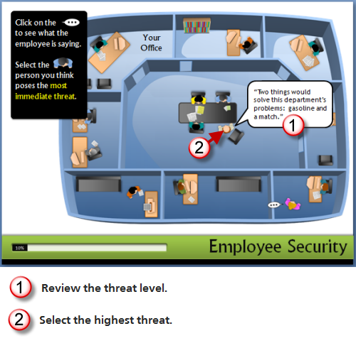
The first stage is the overhead office where you review the threat level of all of the characters. The actions are to review the statements and then select a person that is sent to the office for an assessment interview.
Production notes:
-
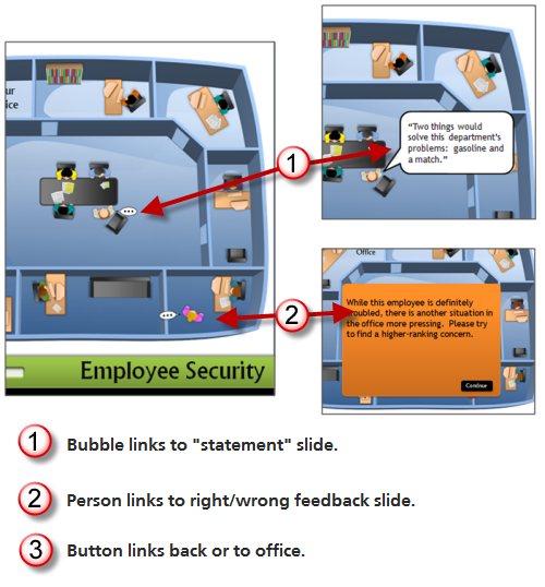
Clicking on the text bubble links you to another slide with the character’s text on it.
-
Clicking on the person links you to a slide with a feedback box. The feedback box has a link that either takes you to the next step (correct) or back to the scene to make a different choice (incorrect).
Interview
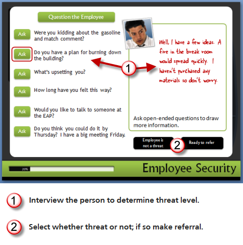
The second stage is the office interview, where your goal is to determine how much of a threat the person is. The actions are to click on interview questions and then determine to refer or not.
Production notes:
-
When you make a correct choice, you are advanced to a slide where you can select interview questions.
-
Clicking the “ask” button links to different slides that provide answers.
-
Clicking on the two black buttons link to different feedback slides.
Refer
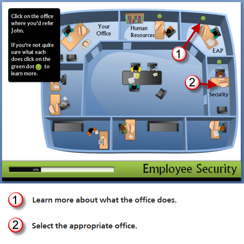
The third stage is to refer the threatening person to the best department. You actions are to review the departments and make the appropriate selection.
Production notes:
-
Clicking on the green dots links you to a slide with information about that group.
-
Clicking on the office links to a slide where the character (using a motion path animation) moves to the office for feedback.
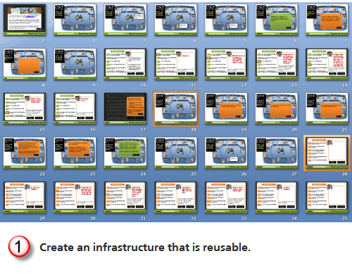
As you break down the PowerPoint file, you’ll notice that while the learner only sees one screen, you might actually be linking to a number of screens that look the same. The interview questions are a good example of this. It’s made up of seven slides, but when the learner reviews the questions it only looks like one slide.
Leverage the Master Slides & Layouts
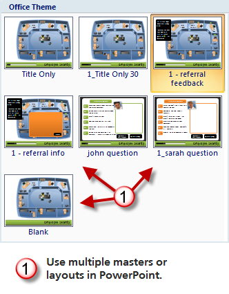
You can decrease production time and make it easier to maintain and update the course by using master slides and layouts. The first thing is to consider what content is persistent across the slides. That’s the content you want to place on the master slides. Keep in mind; you can have as many masters as you want. You’ll notice that I have a few different layouts.
Click here to view the tutorial.
Use the Slide Titles to Identify Slides
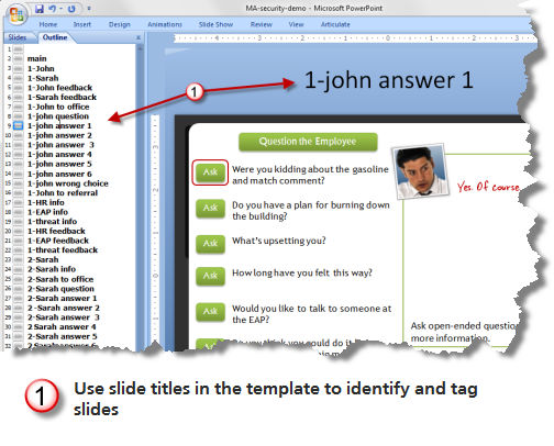
I like to move the slide title up and off the screen. Then I can use it to identify the slide and add notes. This comes in handy when I have to add hyperlinks and work with slides that all look the same. It also makes it easy to work with groups when you’re building scenarios because you can quickly scan the slides in outline mode.
Because it’s off screen, the learner will never see the notes and titles.
Click here to view the tutorial.
Think of Slides as Layers
The original course had rollovers. Since this isn’t possible in PowerPoint-to-Flash, I used hyperlinks to branch to slides that looked the same, but had different data. This was used in a number of plac
es. Doing this lets you create a trigger that can reveal new information or animations.
I used it in the first stage where you click the text bubbles or the people, as in the image below. I also used it when you click on the interview questions to get the employee’s answers.
You can hide the layer slides so that the learner never sees them in the menu (if you use one). In Articulate Presenter, you can do this via the slide properties manager.
Click here to view the tutorial.
Create Reusable Content
When you break the course into chunks you can see that there are a lot of areas where you can reuse the content or structure. The interactions with the characters are a good example. Each character has a series of events:
- Click on text bubble.
- Click to choose.
- Interview character.
- Send character to the office.
When you review the PowerPoint file you’ll see that once I built the first character slides, all I had to do was copy them, change the slide titles, and swap out the character-specific details and content to have a series of slides and interactions specific to the character.
Click here to view the tutorial.
Adding a new character to the module would only take a few minutes. The key is to map out what you want to do first and then build the content so it’s easily reused. Another consideration is building an infrastructure you can use in other courses by just copying and pasting the slides. It takes a little practice, but once you build that way you’ll find that it’ll save you time. It also helps you build more interactive content because you’ll know how.
Here are some other tutorials that help you learn some of the production techniques used in the prototype:
- Create triggered slides part 1 and part 2.
- Hyperlinking in PowerPoint for rapid elearning with a follow up on transparent boxes.
- Animate characters in your elearning courses.
- Create a lightbox effect.
- How to control branching and hyperlinking.
Building these types of courses is not difficult. But you’re not going to develop the skills to do so if you don’t practice. Go through the tutorials, break down the PowerPoint file, and play around with your own ideas.
Since the questions about some of the production techniques might be a little bit more involved, we started a thread in the community forums. It allows for better discussion than the blog comments.
Events
- Everyday. Check out the weekly training webinars to learn more about Rise, Storyline, and instructional design.
Free E-Learning Resources
 |
 |
 |
|
Want to learn more? Check out these articles and free resources in the community. |
Here’s a great job board for e-learning, instructional design, and training jobs |
Participate in the weekly e-learning challenges to sharpen your skills |
 |
 |
 |
|
Get your free PowerPoint templates and free graphics & stock images. |
Lots of cool e-learning examples to check out and find inspiration. |
Getting Started? This e-learning 101 series and the free e-books will help. |
46 responses to “These 12 Tutorials Teach You How to Build an Interactive E-Learning Course”
This is a great example of how rapid e-learning is an approach, not a formula. Overall, there wasn’t a single template to just plug information into, but you were able to find a number of course components that were reusable. Thanks for sharing the tutorials!
Great this is very nice! By the way, is it useful to stay in the email as I get a faster update on twitter, or RSS?
Many thanks,
Great examples. I’ll have refer our clients to these. (the donut looks really good, btw).
David,
Looking forward to seeing you and Tom in Austin at E-Learning Symposium 2010. Do you need us to pick up donuts or would breakfast tacos with chorizo be better (it is Austin!).
Oh on the email/twitter/RSS issue, I set up a daily email using Feedburner for @learningcouncil’s Twitter feed. I tend to put a lot of useful links for E-learning (including to this blog) on the @learningcouncil Twitter feed and there are a bunch of folks that like to get that in email so they have a record of it later.
Nice demo Tom… So will you be at ASTD ICE? There will be a couple of us from PEMCO there and we’ll be stopping by the booth to say “hi”
Willthis work with PPT 2003?
@sanjay Let’s have a contest… who has better breakfast tacos with chorizo… Texas or California! Wish I were going to Austin to meet you all in person.
Tom, once again, a practical post. You’re a great resource for educators and non-profits who don’t have the budgets of large corporations.
I just finished a freelance project for clients who needed everything built only in PPT 2007 and Articulate Studio ’09. They were very happy with the results, and I had applied many techniques from your previous blog posts.
@jenisecook
(Can you ship me one of Sanjay’s breakfast tacos?)
Thanks for this!
We have no artists working on our materials, so it is really nice to see that my team can create graphics using their PowerPoint skills. I consider myself to be an advanced PPT user, but time and again you use techniques that I know exist but would never think to use in the way you use them – every blog post refreshes my creativity!!
Regarding RSS, I have 1 folder filled with sub-folders for different RSS feeds in my Outlook. The joy in this is that I can visit it whenever I have some down time as opposed to the feeds filling up my inbox. This blog is one of the few that I get sent directly to my inbox so that I can save it for future reference (which I often do).
And yes, I agree, after staring at that donut in my inbox all day, I had to Google the closest Krispy Kreme.
@Sanjay – thank you for the offer! I’m a big fan of local foods so if you have a favorite breakfast taco shop you like, I’m into it:-)
Looking forward to meeting you later this month. This is going to be a great e-learning event.
Can you please share where you got your graphics from in the security course? I’ve been looking everywhere to find graphics like this to be able to use. Thanks!
[…] This post was mentioned on Twitter by weknowmore.org, joygayler. joygayler said: RT @weknowmore 12 Tutorials To Teach You How to Build an Interactive E-Learning Course http://ow.ly/1GMHt #elearning #edtech […]
Hi Tom,
Many thanks for these useful tips.
Somewhat out of topic: How do you edit a screenshot like this:
http://www.articulate.com/rapid-elearning/wp-content/uploads/2010/05/image13.png
Thanks in advance!
[…] Tom Werner on May 5, 2010 Tom Kuhlmann has been blogging the details of how he built a PowerPoint version of an e-learning course […]
[…] This post was mentioned on Twitter by Ted Spalding. Ted Spalding said: These 12 Tutorials Teach You How to Build an Interactive E-Learning Course » The Rapid eLearning Blog http://is.gd/bY3KZ […]
[…] These 12 Tutorials Teach You How to Build an Interactive E-Learning Course […]
Thanks for sharing these tips on designing an e-learning presentation using power point. Is it possible to add music to these presentations? What is your opinion in the use of elearning experiences in different levels of instruction? For example: Elementary School.
Hi Tom, I really like the blog. I listen to it frequently as well on hear-a-blog. I thought awhile back you mentioned a tool you used to create the cartoon text bubbles on you images and I can’t remember what it is. If I am wrong, I just wondered what you were using.
Joe
This is an absolutely fantastic resource. This has made me completely re-evaluate all the tools available in ppt & get creative with how I use them. Thank you so much for this, excellent work with really great instructions.
You demonstrated creating a master where you moved the title place holder above the top of the slide. I can’t figure out how to do that. When I try to drag the title placeholder, it won’t move. I’ve tried in outline and in slide master. What works?
Tom – As always I leave your blog far richer in knowledge than when I arrived!! Thanks so much for all the helpful tips and the files to get us started! You really don’t mind us using them to build training for our clients — even when they are going to charge a fee for the training? We don’t want to get into hot water over copyrights with one of our favorite bloggers!!
The up arrow worked! Thanks so much.
Wonderful news – thanks again!
[…] These 12 Tutorials Teach You How to Build an Interactive … […]
Hi Tom,
what’s the advantage to making this interaction in power point vs doing it in Flash?
This post was very helpful to me. I’m developing some elearning modules for onboarding new staff and need to include a lot of facilities information. One of the links near the end of this page took me to a Screenr video about animating characters viewed from above as they walk through a building layout. Can you tell me if there is another tutorial — or a template file — about creating the background layout for that animation tutorial?
[…] 12 Tutorials Teach You How To Build An Effective E-Learning Course – nice collection […]
Tom – When I downloaded MA-security-demo.pptx and previewed the file, the “office” background does not show at all. What am I doing wrong? Thanks!
[…] (RT @russeltarr: Create an interative game using PowerPoint: http://t.co/tjJIFGuZ…)…Show original Like this:LikeBe the first to like this post. Leave a […]
I always raise an eye-brow when people mention PowerPoint as an eLearning tool, but having been passed your site today by a contact, I’m actually really impressed, and hooked.
[…] As you break down the PowerPoint file , you’ll notice that while the learner only sees one screen, you might actually be linking to a number of screens that look the same. The interview questions are a good example of this. It’s made up of seven slides, but when the learner reviews the questions it only looks like one slide. Leverage the Master Slides & Layouts Clicking on the office links to a slide where the character (using a motion path animation) moves to the office for feedback. You can decrease production time and make it easier to maintain and update the course by using master slides and layouts. These 12 Tutorials Teach You How to Build an Interactive E-Learning Course » The Rapid eLearning Bl… […]
[…] It’s a fact that you CAN build effective elearning with rapid elearning tools . You’re not locked into linear, click and read content. All it requires is that you craft a sound learning strategy and get the most out of your tools. These 12 Tutorials Teach You How to Build an Interactive E-Learn […]
[…] These 12 Tutorials Teach You How to Build an Interactive E-Learn […]
Heya i am for the first time here. I came across this board and I in finding It really useful & it helped me out much. I am hoping to give one thing back and help others like you aided me.
[…] Tutorial: learn to build the overhead office interaction […]
[…] These 12 Tutorials Teach You How to Build an Interactive E-Learning Course […]





0
comments