
The Rapid Elearning Blog

emoji for e-learning header

Emojis are the today’s hieroglyphics. I can imagine thousands of years from now as archaeologists try to reconstruct our culture. They’ll spend years collecting emoji messages and then additional years to decipher them. And after all of that time, they’ll come to learn that we worshiped the goddesses known as Kardashians.

It’s a frightening thought indeed, but one we can counteract in how we use emojis in our training programs.

What Are Emojis? 😕

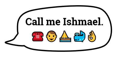
The first emojis started in Japan. It literally stands for picture character. They’re often used to add emotional context to messages. Although, often they’re combined to communicate more than quick emotional cues. There’s even an emoji version of Moby Dick.
emoji moby dick for e-learning

You can learn more about emojis here:

Emojis for E-Learning Require Context to Communicate 💬

The emoji is a tiny graphic that can be used to reinforce a point, add some emotional context, or a visual bookmark. Be careful when using them to communicate ideas because you may not communicate what you really intend.

Emojis are ambiguous and open to all sorts of misunderstanding and the emojis will appear different based on the device.

If you follow any of the heated discussions around emojis you’ll notice that they comfortably sit in a nest of political correctness. This is something to keep in mind when you deal with gender, skin tones, and cultural differences. You don’t want the emoji to distract from your message.

Emoji for E-Learning Examples 💻

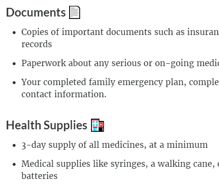
Here are a couple of examples of how I used emojis in a recent Rise training session. In the image below, I used the emoji as a visual cue to add some context to the title. It also makes scanning the screen easier because the emojis do add contrast. It’s a simple use where the emojis adds something to the screen but doesn’t conflict with the content and is less open to misinterpretation.

One challenge, though, is that there may not be an emoji that works for the topic at hand. Then you have to get creative. Which goes back to the warning about miscommunication and ensuring that your creative use of the emoji still communicates what you intend.

In the “Health Supplies” title, I couldn’t find a first aid kit emoji so I used the hospital. It’s not perfect but does work.
emoji e-learning

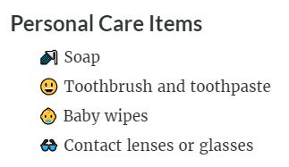
In the next example below, I used the emojis as bullet points. I like this as it adds a bit more visual interest and shows each point as distinct. But again, the same issue exists when it comes to finding the emojis that work with your content.

There was no emoji for soap or toothbrush. So I went with shower and smiley face with nice teeth (and I assume healthy gums). And there’s not a lot of options for baby wipes thus I selected the baby.
emoji e-learning

As you can see, given the right content and some thought, emojis can play a role in your e-learning course. I’m curious if you’ve used emojis in any of your courses. If so, how? And also, how was it received? Feel free to share in the comments.

Events

Free E-Learning Resources

Want to learn more? Check out these articles and free resources in the community.

Here’s a great job board for e-learning, instructional design, and training jobs

Participate in the weekly e-learning challenges to sharpen your skills

Get your free PowerPoint templates and free graphics & stock images.

Lots of cool e-learning examples to check out and find inspiration.

Getting Started? This e-learning 101 series and the free e-books will help.


13 responses to “When to Use Emojis for E-Learning”

January 16th, 2018

Ok… I don’t get it. emojis are just graphics. Instructional designers have used graphics ever since the beginning of PowerPoint and before.

The fact that this rated an article and that Articulate users would think this “new” or innovative is disheartening. I have been doing some sort of training for 30+ years now and have always used graphics (where appropriate) to help with getting the point across. Emoji finger from now was just a ‘clip art’ finger back then. Having emojis is just another resource – and with the poor resolution of many, can be a less then optimal choice when creating materials.

Using this resource may be a quick way to attract the attention of some users who are used to them in their own personal lives and thus there is value – I would think it would be of very limited value for them to be a primary resource when designing and developing.

January 16th, 2018

We get some requests to use emojis in our training. Our staff has mixed feelings about them. Some don’t like using them because we feel they clutter the screen. And they seem more faddish than practical.

On the other hand, some of our younger staff like them and feel that when appropriate they work well.

I think your advice is right one as far as when to use them. We haven’t used them often, but when we’ve used them, people seem to like the playful nature of emojis.

January 16th, 2018

Good write up. We’ve had a few requests for emojis but haven’t used them. I don’t find a real value, but looking at the two examples you share in the post, those would work for some of our content. I do like the bullet points.

Paul, there’s a difference between an emoji and a graphic file like a .jpeg. The emoji is part of the in-line text and typed in. In that case there wouldn’t be image degradation or poor quality. It should render with the same quality as the text does.

I like the color that it adds to the text. Haven’t used them before but will think about it.

January 16th, 2018

Re: Paul, thanks for the feedback. I do get questions about emojis in the workshops and through the blog, so I think it’s a fair topic to discuss. Also, I don’t think the use of emojis was presented as innovative or even new (although their widespread use didn’t start until the early 2010s).

I do agree it is a graphic element but it’s not created or used in the same manner as other graphic elements like clipart.

Personally, I have mixed feelings about the use of them but I think they work when used subtly. In the examples I shared, they’re a bit more conservative and something that I think works well in conjunction with the text. I haven’t seen any quality issues, they look just as clear as the text when the courses are published. Again, they’re not inserted as graphics but are part of the text body.

I will very likely ask a very dumb question now, but how do you add emojis to your text in Rise? Do you simply type them in? Can you select them from the Content Library?

I see this as being very much a generational thing. Younger people use lots of emojis in their communications, but even lots of older people are getting in on the act too.

We have to look at who we are designing the courses for? Is the audience going to be mainly older or younger people? What is the subject, is it a soft skill or a serious subject?

There are many Instructional Designers who are happy in their ways and who design courses with old software and all looking the same. They are in their comfort zone and do things because they have always been done that way. Look to the future and make decisions based on an individual course and don’t be afraid to push the boundaries, it may prove to be just they change that is needed.

I have not used emojis as text, although we have used emoji graphics at various times. Recently had a line-up of emoji ’emotions’ and asked staff to choose the emotion best matching the mood of their last customer. That was quite effective.

I think we would have issues with accessibility. We have a significant number of staff accessing our eLearning who use screen readers, and I’m not sure how meaningfully the emoji would be translated for them. Would need to do some investigation with our local accessibility experts first.

January 17th, 2018

@Jillian: good points especially regarding accessibility

January 17th, 2018

@Annie: that’s my follow up post for next week. In Windows 10 you can hit Windows Key + . and that will open the emoji window to type it in. I offer a few additional tips in the follow up post.

Great concern! Well written and really imperative one.
Keep sharing such useful information.

January 31st, 2018

The impression of education is not restricted to characteristics but to Use Emojis for E-Learning. This has a big power in rural areas where students are not certainly local. Emojis benefits the student stay on top of their educational profession.

January 31st, 2018

The impression of education are not restricted to characteristics but to Use Emoji’s for E-Learning. This has a big command in rural areas where students are not certainly local. Emoji’s benefits the student stay on top of their educational line of work.