If you want to learn to be a better elearning designer, look for good examples of what you’d like to do and then try to replicate them. That’s what we discussed in the previous post Now You Can Design E-Learning Courses Like a Pro. By doing this, you learn new production techniques, think through instructional design ideas, and gain confidence in your skills.
In today’s post, I’ll take you through the Froguts demo that I replicated and talk about some of the things I learned. But first I want to cover two critical parts of successful rapid elearning design when working with PowerPoint.
Get over the PowerPoint stigma. A screen’s a screen. No one cares if what they see was built in PowerPoint or Flash. All they care about is what it looks like and if it works. Besides, when you build something in PowerPoint and you publish it with your rapid elearning software, it becomes Flash. So instead of using Flash to build a SWF, you’re using PowerPoint to build a SWF.
Think in layers and not linear. People are always asking me about how many slides a course should have. This is the wrong approach when you’re building elearning courses. Don’t think slides. Think content.
You’re building an elearning course and not a presentation. Even though you might be using PowerPoint to build both types of products, when you build an elearning course you need to think in a different way.
Think of slides as layers of information that you bring to the screen. In other elearning applications, you have a screen with a layered play track. Each object on the screen sits on its own layer.
As an example, here’s a screen shot from Quizmaker ’09. You see a single screen with layers for each object on the screen.
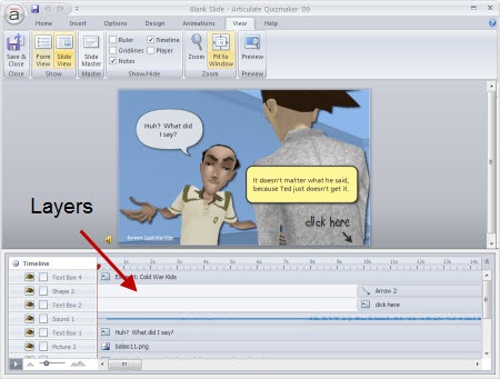
While PowerPoint’s interface is different, you want to think of each slide as a layer of information. Some screens might consist of one slide of information and some might be ten slides of information.
Here’s a demo from my post, 10 Sure-Fire Tips to Becoming a Rapid E-learning Pro…Rapidly! It’s a good example of how you see a single screen that’s actually made up of more than one slide. The learner doesn’t care about slide count. She’s just focusing on the interaction.
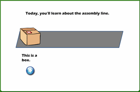
Click here to view the demo.
Once you start to think in layers rather than linear, it really opens up what you can do in PowerPoint. But most important, it gets you to think about what you can do in different ways. It’s all just a matter of figuring out how to do it. And that’s what learning’s all about.
Here’s the Froguts demo. Below that is a tutorial that is more show and tell.
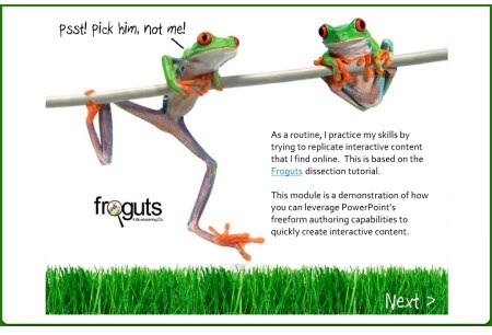
Click here to view demo.
There are some things in the demo that I would have changed if it was a real project but I left them because I can talk about what I’d do different. Here’s a quick rundown of what I cover in the tutorial.
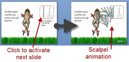
Duplicate slides that are linked can create interactivity. One of the main challenges when working with PowerPoint was trying to replicate the drag and drop interaction. Since you can’t build those in PowerPoint, what I did was duplicate the slides and use a combination of PowerPoint hyperlinks and custom animation. When you click on a linked object it goes to the duplicate slide that starts the animation.
Use PowerPoint masters for images that you use a lot. Originally, I had the frog images on all of the slides. When I published the files, I ran into some alignment issues plus it took a little longer to publish because of all of the extra objects.
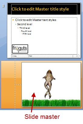
I fixed that by putting the main frog body on a master slide. Then all I had to do was drop the dissection pieces on the slide. The frog body was always in place and I didn’t need to worry about accidentally moving it. It was also one less object on the screen to worry about during production.
PowerPoint slides can look like anything you want. Since PowerPoint is a blank screen and you can move objects around freely, you can pretty much create or recreate any look you want. PowerPoint 2007 has some nice graphic effects so all of the drop shadows and reflections you see in the demo were created with PowerPoint.

I like a more open feel, so I opted to change the darker spotlight effect of the original and went with more white space. I also used a “fun” font. I think the white screen with a little color from the grass is fresh. That (and the font) gives the demo a lighter feel.
It’s important to consider the tone you set with your course. The fonts, color schemes, and placement of objects on the screen all contribute to that. The tone you set for you course contributes to the impression people have of the course. It gives you a chance to say something before you actually say something.
That’s a quick overview. For more detail and to see some of the techniques in action, click on the tutorial below. I’ve also included the PowerPoint file for you to download and deconstruct.
Here are some relevant tutorials from previous posts:
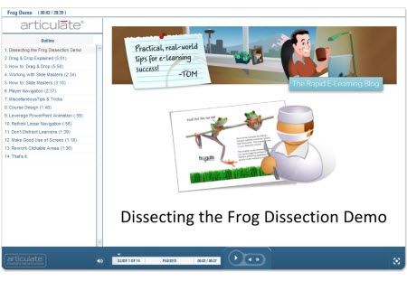
Click here to view tutorial.
As you can see, there’s a lot to learn by deconstructing the elearning courses that you see. And it doesn’t require that you replicate the entire course. Perhaps it’s just a matter of figuring out how to get a certain type of interactivity or effect. You’ll run into some challenges when you work with PowerPoint. But by making a habit of doing this, you’ll learn new production techniques and you’ll come up with new ways to approach your own elearning courses. And most of all, you’ll become more confident in your elearning skills.
I’ll be doing more of these types of posts this year. Let me know what you think and feel free to share your own ideas and tips in the comments section.
Events
Free E-Learning Resources





0
comments