The Rapid Elearning Blog

The Rapid E-Learning Blog - where's the next button

A question I’m asked quite often is whether or not to offer instructions on course navigation.  It’s a good question because while many courses do have instructions, sometimes they just don’t seem necessary.

I addressed this in a previous post where I asked if you need instructions on how to use an elearning course.  In today’s post we’ll take a look at some real examples of how people have dealt with the course instructions.

Examples of E-Learning Course Instructions

When I was reviewing the recent Articulate guru submissions I was struck at the many different ways that people introduced their courses and how they offered navigation tips.  Sometimes the best way to know what’s right for your course is to look at how others approach this. Perhaps these examples will prompt some ideas for your next course.

The Interface Tour

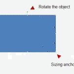
This is probably one of the more common approaches to course navigation. In this case, they used a screen capture of the course and annotations to highlight the main components of the player. This type of approach works well for those who aren’t familiar with elearning courses.

The Rapid E-Learning Blog - a demo of elearning navigation using a standard approach

Click here to view the demo.

One potential issue with this approach is that a detailed overview of the navigation bogs the course down from the start.  This is a shame because the course has some engaging elements.  Of course this is easily remedied if the screen can be advanced by the user and not locked until it’s complete.  If a new user needs the information, they get it.  However if they don’t need it, they can just click to advance.

Some client demand this type of introduction to the course.  My advice is to defer to the person with the checkbook.

No Instructions Please

This is my preferred approach for a course that uses a conventional interface like those that come with the rapid elearning players.  The players are simple and follow normal conventions.

In this first example the page doesn’t advance until the user clicks the blinking play button. During pilot testing, if you notice that the person hasn’t figured out how to advance the course by clicking on the button, make a note for that person’s personal record and then forward to HR for appropriate disciplinary action.

The Rapid E-Learning Blog - a demo of elearning navigation

Click here to view the demo.

In this second example, they use a custom player rather than the one that comes with the software.  The buttons are easy enough to understand so no need to explain what they do.  Besides, if you’re not sure, just click to see what happens.

The Rapid E-Learning Blog - a demo of elearning navigation

Click here to view the demo.

Just Tell Them to “Get Started”

In the following two examples, there are no real instructions on navigation because the courses mostly auto advance.  What they do that’s a little different than the examples above is that they offer a “get started” instruction.

In addition, the second example below introduces some icons that they use as links to specific sections throughout the course.

The Rapid E-Learning Blog - a demo of elearning navigation

Click to view the demo.

The Rapid E-Learning Blog - a demo of elearning navigation

Click to view the demo.

Keeping with the getting started theme, the course below offers a choice of two sections and from there you just jump into the course content.  What’s a bit different than the previous examples is that they offer a player navigation link at the top of the player.  This is a good way to offer additional help but not include it in the course flow.  Because the label is clear, it’s easy to find help on player navigation if needed.

The Rapid E-Learning Blog - a demo of elearning navigation

Click here to view the demo.

Keep the Instructions Simple

It’s not always a good idea to offer no instructions at all.  You never know who’s viewing the courses and it’s hard to assume how comfortable they are navigating them.  An easy workaround is to offer some simple instructions so they know what to do without being burdened by a five minute pre-course elearning course.

Outside of doing nothing, the example below is about as simple as you can get.  There’s just some text that says to click next.  After the first time, you kind of get what that button with the little arrow does.

The Rapid E-Learning Blog - a demo of elearning navigation

Click here to view the demo.

Another way to keep it simple is with arrows as in the example below.  If you want to advance you make one choice.  And if you want to learn more, you make a different one.

The Rapid E-Learning Blog - a demo of elearning navigation

Click here to view the demo.

The following example starts with a screen that has audio and instructs you to adjust it.  Notice that there are no instructions on where to find the volume control?  As long as it’s easy to find the volume control, that works fine.  If it was buried on the player and hard to locate, you need to tell them where to find it.

Another interesting example in this demo is that the course progressively reveals instructions as they are needed.  You can see this on the third screen with the reference to the “common terms” link.  That’s a great way to provide course instructions but not have to do so at the forefront.

The Rapid E-Learning Blog - a demo of elearning navigation

Click here to view the demo.

Novelty Helps

Here they use a video to introduce the navigation.  What I like about this is that the video is a bit different than what we normally see and it makes the course seem much more personal, which is a good touch.

The Rapid E-Learning Blog - a demo of elearning navigation

Click here to view the demo.

Unconventional Interfaces

Most of the examples above use the default elearning player.  Because of that they probably need fewer instructions.  The two examples below follow less conventional players.

In the following demo there are no navigation instructions other than some text telling you to select a client for the interview.  This works because the areas that are clickable are clearly defined.  And while they didn’t use the default player, they did follow some convention with the top menu bar, which makes it easier to locate information and choices.

The Rapid E-Learning Blog - a demo of elearning navigation

Click here to view the demo.

One of my favorite guru submissions is the example below.  I like it because it used a game-like approach to show a less conventional use of rapid elearning tools.  However, because it is an unconventional interface, it’s important to offer navigation instructions, which he did.

The Rapid E-Learning Blog - a demo of elearning navigation

Click here to view the demo.

How you decide to instruct the user on the course’s navigation can vary.  As you can see from the examples above, there are many ways to approach it.  The main concern is that the navigation process is intuitive and doesn’t interfere with the learning process.  You want people to remember the course and not how frustrating it was to navigate it.

Two final points:

  • If you have to spend a lot of time training people how to use your course, you may want to rethink the interface design.  There really is no reason why a course that uses a simple interface needs a five minute training module.
  • If you do offer navigation instructions, do so upfront.  I see plenty of courses that don’t teach me how to navigate the course until slide 7.  Odds are that if I made it to slide 7 the navigation instructions are kind of pointless.

What are ways that you’ve built navigation instructions in your courses?  Feel free to share your thoughts by clicking on the comments link.

Events

Free E-Learning Resources

Want to learn more? Check out these articles and free resources in the community.

Here’s a great job board for e-learning, instructional design, and training jobs

Participate in the weekly e-learning challenges to sharpen your skills

Get your free PowerPoint templates and free graphics & stock images.

Lots of cool e-learning examples to check out and find inspiration.

Getting Started? This e-learning 101 series and the free e-books will help.


28 responses to “More Than a Dozen Ways to Navigate an E-Learning Course”

Some good examples here. I tend to not bother with navigation instructions and opt for making things clear. Most people these days know how to use a media player, and Articulate’s player functions echo this functionality. On some occasions, I just put a box at the bottom of the introduction slide that points at the play, forward, and backwards buttons.

Either this or I use Next and Previous buttons to aid navigation and work on the slide only view.

Sometimes I will build a complicated game-like course(it’s just a game),I will make a simple little game first to help user to get start.

May 17th, 2011

A timely post for me since I was just discussing this yesterday with a couple of my instructors who are using a couple of ‘not often used’ tools in their courses and were wondering how easy or difficult it would be for students and if the tool would interfere with the learning. I found your point about making the tutorial optional a good one. Made me think of how frustrating it can be on some movie DVD’s when you have to sit through the previews before getting to the main menu- “Not Permitted”. We decided to develop a couple of short tutorials (both printable PDF’s and short videos created with Camtasia Relay), and place them prominently next to the activity instructions with a note that says something like, “Click here for instructions on how to use this wiki/blog”. Then, perhaps follow up with students to see who used the tutorials and how useful they found them.

May 17th, 2011

Tom, this is a great post. I have had many discussions with my customers about this topic. One question I do have is how do you get the navigation interaction in the the menu area of the presenter and what are the steps.

Great stuff as always.

[…] Originally posted here: More Than a Dozen Ways to Navigate an E-Learning Course » The Rapid eLearning Blog […]

May 17th, 2011

In a course I developed a while ago I did offer instructions as a separate module, but only because of some interesting features I added. The module was optional, could be accessed at any time, and took only 2 to 3 minutes. It also included some FAQs that were optional, like “why are we doing this” and “how long will it take”.

Basic navigation had the usual forward/back/GoTo options and I used a very standard set of controls, so no instructions needed. All controls had a mouse over that described them.

The additional course features were:
a notepad, with an option to print the notes,
a glossary that defined terms used in the lesson and linked to a page on our intranet for more definitions,
a help button that offerred hints and a link to our intranet for FAQs and contact info, and
an offer on the last page of each lesson to rate it which linked to a page on our intranet.

Without the instructions they might not have discovered these options. All the testers rated the additional features, and the lesson on using them, as being very useful.

May 17th, 2011

These are awesome examples! I love this blog and thanks so much because you continually provide me with new examples that help me to stretch myself when developing courses.

May 17th, 2011

Okay, the last example is amazing – I have no idea how long it took them to build that! How did they build that??? It looks like a combo of Engage and Quizmaker … but HOW? This will drive me crazy… Great blog this week – love all the ideas for course navigation instructions. We are just starting our first course built in-house, so these ideas will provide some thoughtful discussion.

May 17th, 2011

Does anyone have any creative examples on how to make learners aware the narration tab is available for 508 compliance?

@Nicole: We have a write up on the demo. David’s also very active in the user community, so you can probably connect with him for more details.

Hi Tom, great post and thanks for the mention!

@Nicole Y – The main menu is an engage interaction, the transition is a PowerPoint animation and the activity itself is all quizmaker (because you can only put video behind a png in quizmaker).

Hi Tom, nice post as always… I have used a flash file to explain the navigation… the snapshot of the course introduction page as the background and when the user hovers the mouse over the screen elements, an explanation of the same appears… I wish I could share the same here but I dont think I can upload anythin here…

Tom, those are great examples. Thanks a lot again and again.

Hi,

Interesting post, however, the examples all seem to be for the same product (or, the same e-learning framework) so, no matter what they all seemed to be a little bit samey. The same navigation almost always appears, and there are very *subtle* differences. Now, it might be this is the intention (sorry, i’m pretty new to your blog) and you really only focus on your own software?

However, thanks for the info, very informative

@Chris: right, these demos are all examples from the Articulate guru awards which I mention in the blog. However, the ideas can be applied in other contexts regardless of software.

Thanks for the great tips on navigating e-learning courses. I’ve found that simpler and more straigtforward instructions are always better. I do this at the very beginning of the course and take no more than 2-3 minutes to explain. With a very diverse workforce that has some employees who speak English as their second language, I find that using more visuals (arrows, symbols, etc.) than words to explain navigation is easier for our employees to understand.

@Elaine: good point. I’m always reminded to think less about my personal preference and more about those who are less experienced going through courses

May 24th, 2011

When reviewing the examples, I could not figure out how a particular slide was produced. Slide 14 of the second example seems to be an embedded excel worksheet. Is this the case? I have an older version of Articulate, and I seem to not be able to do this. Or is there another way of reproducing a worksheet within Powerpoint which will come out as a worksheet when published? If you have a blog entry that explains how this is done, that would be great too.

@Stephane: my guess is that it’s an HTML form inserted as a web object.

Awhile back there was a example posted of using an Engage interaction as a tab for the navigation instructions. I created one and use it each each time in a course and refer to it on the first slide. It saves me time by not having to recreate it each time and the user references it only if they need to.

Hi I am interested in viewing the demo mentioned above using quiz maker with animations and audio to create help instructions but the links above display a blank page…is there a new link where I could view this.

@Wendy: the link is working fine; perhaps it’s just taking a bit to load. Also, it requires Flash, so if you’re viewing on an iPad it won’t work. Let me know if you still have issues getting it to play for you.

In the 4th example above it appears that Articulate was used and the screen shows an active button available. How can you add a navigation button to an articulate piece?

@Dana: the button on the screen is an image that has a hyperlink to a specific slide. If you want to do something similar, make sure to set the slide to advance by user (to avoid auto advancing).

There’s a great TED talk by Tom Chatfield that describes why people learn effectively when they are gaming. His comments complement this blog post quite nicely. This is the link:

http://www.ted.com/talks/lang/eng/tom_chatfield_7_ways_games_reward_the_brain.html