Tom
just to let you know how much your blog has helped in my way becoming a great elearning developer.
You are for real my Yoda here!!
keep on and thanks!!
Mariana
Since 20,000+ people read this weekly blog, odds are you weren’t one of the 100 or so who attended my recent presentation at the Elearning Guild conference called, “Becoming a Rapid E-Learning Pro…Rapidly!”
I’ve recapped the session for everyone in the form of a snazzy blog post. It’s a combination of how to think about rapid elearning and then how to get the most out of your tools. So, here they are.

Rapid elearning is a misleading concept. You’re not a rapid traveler because you use the Internet to book travel. You’re just a person who uses technology to make booking travel easy.
The same goes for me as I write my blog posts. I’m sure that I could hand code my blog with HTML, but I don’t. Instead, I use Windows Live Writer, a WYSIWYG editor. Do you know why? It saves a lot of time.
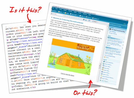
I shouldn’t have to be a programmer to write a blog post. Since the software takes care of the HTML code, I’m free to focus on creating the content. This doesn’t make me a rapid blogger. It makes me a smart blogger.
The same can be said for rapid elearning. There’s no reason why you should have to be a programmer to build elearning, especially when there are tools to help you build your courses. Rapid elearning is less about being rapid, and more about being smart.
Learning is a complex process. And, elearning is just one piece of that process. Think of it like a brick in a wall. As you go through life learning, you keep adding more bricks.
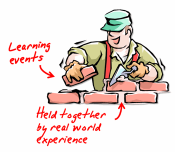
Each experience in the real world provides context to what you learn and is like the mortar that holds all the bricks together.
Your learners are staring at a blank computer screen and could care less how you authored the content to fill it. If that screen has text on it, they don’t care if the text was hand coded HTML, created in PowerPoint slide, or developed in Flash. That goes for animation, as well.
The same goes with watching a video. You think they care if it’s an .FLV, .SWF, .MPG, .AVI, or .MOV? Heck, no! All they care is that when they click the play button it plays.
In that sense, think less about how you’re authoring the course and more about how to build great content. And then choose the tools that will help you build it.

I used to come back from the training conferences and tell my Flash programmers about all of the cool courses I saw and how I wanted us to build ours like that. Then reality set in.
To build some of those highly interactive courses requires a lot of money and time. In fact, some of those courses cost well over $100,000. I’ve worked on a lot of elearning projects and I can’t ever recall getting the budget for a $100,000 course. I usually have to fight tooth and nail just to get $40 for some stock photos, let alone $100,000.
The only places I’ve seen with the resources to build elearning like that are vendors who build custom elearning. So it makes sense that they go to conferences and show off what their talent and your bags of money can build.
The reality for a lot of those who build elearning courses is that they have to fend for themselves, and elearning is just one of their many responsibilities. In fact, the last three places I’ve worked were multibillion dollar organizations and I was lucky if it was more than me doing the bulk of the work.
I’m glad I had access to rapid elearning tools to do my job effectively and save my organization time and money.
Many of you are just getting started. Your first task is to get used to using the tools. Don’t worry about what the experts say about engaging elearning. I’ll let you in on a secret. Those same experts are the ones who created boring elearning to start with. Only they charged a lot more money back then.
You just focus on the basics and then build from there.
You can create a nice looking and effective course that doesn’t need to be overly complicated with just a little practice.
Once you get a handle on using the tools and building basic courses, start to present the content in a different manner. For example, people always like a good story. Find a way to relate it to the learner’s world.
Here’s a quick example from a conversation I had with someone at a previous conference. The first set of images is typical of a lot of elearning. It’s just information and it looks like a PowerPoint slide. The second set of images takes the essence of the course and starts to build a story.
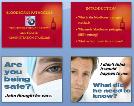
Which approach is more engaging? Making this type of change isn’t difficult. In this case, I changed the wording a little and used real people to make it seem less clinical. Ask, “Why is this important to the learner?” and then build a story around it.
Here’s a common mistake. When people complain about “boring” courses, by default we tend to think it needs to be more interactive. However, the problem with a lot of courses isn’t the lack of interactivity. Instead it’s that the course is meaningless and not very relevant to the learners.
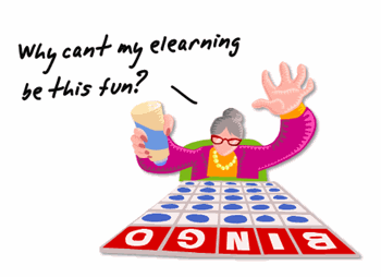
I have yet to hear someone sit at the computer complaining that Google is “boring and there’s nothing on the screen but text.” There are no complaints about the lack of interactivity because what they’re looking at is relevant to the person at that time.
The more you can put the course content into a context that is relevant, the less you have to create interactive bells and whistles. People would rather have a simple line of text on a plain white screen that gives them meaningful information, than play yet one more long and drawn out Jeopardy game.
I get a lot of emails asking how to do more advanced elearning using the rapid elearning tools. The secret is practice. One thing I do is see if I can replicate the courses and interactions I like. Sometimes it works, sometimes it doesn’t. Either way, I get good practice and develop new techniques.
Find courses you like and then try to replicate them. At a minimum, find out what you like about the course and try to replicate just that part. Here’s a challenge. See if you can replicate the Building a Sod House course in nothing but PowerPoint. I’ll do the same, and do a post on it later.
The point is less about getting everything right and more about learning to use the tools in a new way. You’ll come up with all types of ideas and get really fast at doing them.
PowerPoint gets a bad rap. You build a text-heavy bullet point elearning course and all the pundits will trash PowerPoint. However, you do the same thing in Flash and the focus shifts to poor instructional design. Don’t blame the tool for its misuse.
Repeat this three times: “PowerPoint as a presentation tool has nothing to do with elearning. PowerPoint as a free-form authoring tool is great.”
Just like Flash, PowerPoint is free-form authoring tool. You start with a blank screen and build from there. For example, you can bring in all sorts of graphics and objects, animate them, create interactivity, and easily build branched scenarios.
There are two secrets to getting the most out of PowerPoint as an authoring tool.
Here’s a quick example of how you can use slides as layers. This is a simple demo and only took me about 5 minutes to build and publish.
Click here to view layers demo.
When you look at PowerPoint from this perspective you can see the power of its free-form authoring. You get a blank screen that has layers and on each layer you can add layered animations. That’s pretty powerful! On top of that, once you learn some tricks, you can build some of your content in a fraction of the time it takes to build the same thing in Flash. That will save you time and money.
Rapid elearning tools empower you to build courses that just a few years ago would have required a lot of time, money, and specialized skill. You can combine all sorts of multimedia, learning interactions, and even some of the new collaborative web technologies like a wiki or forum. That’s something even Flash won’t give you easily.
In fact, even if you didn’t want to use PowerPoint to create content, the tools will still give you a SCORM-compliant player with built-in navigation and controls. At that point you can drop in custom Flash pieces, interactions, or web objects and just use the player.
To get the most out of your rapid elearning tools, you’ve got to step outside of the PowerPoint slide box and think of the tools in a new way. Here are some tips and tricks that I’ve covered in previous posts.
As you can see, the tools empower you to do build effective and engaging courses. It provides the right blend between meeting your elearning goals and still working with your time and money resources.
I look forward to your thoughts on this. Feel free to post them in the comments section.
 |
 |
 |
|
Want to learn more? Check out these articles and free resources in the community. |
Here’s a great job board for e-learning, instructional design, and training jobs |
Participate in the weekly e-learning challenges to sharpen your skills |
 |
 |
 |
|
Get your free PowerPoint templates and free graphics & stock images. |
Lots of cool e-learning examples to check out and find inspiration. |
Getting Started? This e-learning 101 series and the free e-books will help. |
Tom
just to let you know how much your blog has helped in my way becoming a great elearning developer.
You are for real my Yoda here!!
keep on and thanks!!
Mariana
Thanks for the blog posts. You always provide useful information. Thinking of PowerPoint slides as layers is unique and I can see how it changes the use of PowerPoint as an elearning tool.
Thanks Tom,
I’m a newbie at this so – not only is this great information, but it is also very encouraging!
Marian
I work for a software company and create e-learning courses teaching people how to use our software. I love your ideas, but a lot of the tips are more creative than the things I can incorporate in software training. I am wondering if you have any ideas/suggestions for incorporating some of your techniques in software training
That was your best post ever – particularly I laughed out loud at this:
“So it makes sense that they go to conferences and show off what their talent and your bags of money can build.”
So very true.
Keep up the good work!
Thanks!
I particularly like:
3. Your Learners Don’t Care How You Authored Your Course
6. Make the Content Human by Telling a Story
Tom,
Your 10 tips are great! Thanks so much! My courses are beyond dull but you have given me some fuel to help get them fired up.
Great job on the blog. Lots of practical ideas that can actually be implemented.
maaan,…this is why I love your blog. :))
my weak link is that I tend to get all mixt up in details, and step aside a bit from the main road, hugging the tree, instead of saving the forest. if I do a software course, I try to plan a lot of practice, to emphasise functionality and direct learning, but then , while working, I realize it’s way to much, too little time, and I slowly take a more passive – information delivery approach than I would have wanted in the first place. any good thoughts on that ? 🙂
thanks 🙂
Tom, this is the best e-learning blog around. Thanks for your genrosity in sharing information!
Sue
I just wanted to drop you a note and let you know that I read your blog every week and I think it’s great. I learn a lot of tips from you.
Hi Tom!
I’ve heard WONDERFUL things about your session at AG|08.
I’m sorry I wasn’t able to listen in, but your blog post here is AWESOME! I love every point!
These are perfect tips to surviving the changing world of elearning.
Cheers!
Brent
Excellent thoughts .. well written. You rock, Tom!
I certainly agree with #6, all teaching is a story and the stories that are told the best are the ones that get remembered.
I want to do an annotated translation (to spanish) of this on my blog. Is that ok for you?
Your blog, tips and recommendations are very awesome. And, especially, the freshness of your words.
Congratulations
Thanks Tom for an excellent down to earth post. I have shared this with my students who are studying elearning at undergrad level. It fitted in well with a short section on using free tools and ppt to create simple content for K-12.
[…] 10 Sure-Fire Tips to Becoming a Rapid E-learning Pro…Rapidly! – The Rapid eLearning Blog (tags: elearning rapid-development) […]
Hi Tom,
Great post and Great tips.
Thanks 🙂
[…] This time Tom has
Tom, kudos once again for another great blog. I am glad that you have not turned your nose down on PowerPoint. Many people do not realize the great potential it has on it’s own and the way it integrates well with other rapid elearning tools. I love your blogs and have tried some of your suggestions and made my work a bit easier. As for the Sod House, I will attempt to create it in PowerPoint alone.
Cheers!
Tom,
Excellent post. I am just finishing up a MSIT degree and have noticed that rapid elearning does seem to get a bad rap. After reading this post I realize that there a huge difference in rapid prototyping and rapid elearning design. Obviously the focus of the MSIT program is larger instructional design projects but I can see where companies such as the ones that you mentioned working for would not want to regularly spend big bucks on instructional design projects but have a need to get information out to employees quickly and cost effectively. I really appreciate your focus on meeting the need and focusing on objectives before a fancy package. The fancy package will come with time and experience.
Thank you.
I really enjoyed your post. Like Tim, I am finishing up an MSIT degree. I have never been particularly versed in development, though I try my very hardest. I am so thankful for tools to make designing and developing instruction a little easier.
Great post Tom, I am very new to the e-learning (in fact overall learning) game and you have made me think more about what it is I am actually doing. It is comforting to know that I have utilised some of the tips to create content using powerpoint already so I am on the right track.
Regards
Andrew
Nice job and your 10 tips are excellent. I got a little confused about the SCORM compliance. Were you saying that PPT can create SCORM compliant courses? More importantly, for me, can PPT keep track of responses, i.e. interface with a database to collect right and wrong answers to the questions?
“People would rather have a simple line of text on a plain white screen that gives them meaningful information, than play yet one more long and drawn out Jeopardy game.”
Bless you, my son.
The infestation of Jeopardy and its ilk stems in part, I think, from people not believing they can be original. If you know what’s important for the learner to do, often you’ll find it’s not “answer in the form of a question.”
Your deconstruction idea is excellent. Look at models like the free stuff that Thiagi has on his web site… and he’s just one example.
Hello, Tom!
I do use Flash and Captivate SWFs inside Articulate. However, your last several posts are really making me think!
From what I’m reading, I am hearing you say that we can consider our PPT slide decks like Layers (Photoshop, Fireworks, etc.) and Frames (Flash, Captivate)?
I understand your Layers concept. How about Frames? (Maybe they’re one and the same?)
For example, I have a course PPT desk with 2 persona photos on each screen. For their conversations, the text bubble above each photo fades in and out.
Is it a best practice in this case to first create the “Fade” Custom Animation on each persona’s text bubbles…then do a Copy | Paste from 3-4 screens onto one screen? (After the “conversation”, then the learner clicks Next to move forward.)
If yes, then I will need to have 2 PPT decks, right?: the “editable”, development one and the to-be-published one that will have fewer slides and several fading text bubble animations on one slide.
Why will I have 2 decks? Because I tried one of your wonderful ideas, and it was hard for me to click on and find an object when I needed to modify it. Especially when two objects are close together, as they need to be in the publish version.
Or, do you have a suggetion/work around for that issue? If yes, I’ve love to read about it and use it!
(The client wants to avoid having just two text bubbles, one for each persona, and the “click Next” situation per screen. So, we’re trying to have more “conversation” on one slide before clicking forward.)
Tom; I really enjoyed you recent vector clip art tutorial. I am a newby to Articulate (not to PPT but I did learn a couple of things from you). I am interested to find out how you did the screen capture recording within Articulate. In the past I embed a captivate file within Articulate. Is that hoe you did it? I just want to make sure I know all my options.
Thanks again and grat job. Fred
[…] a demo from my post, 10 Sure-Fire Tips to Becoming a Rapid E-learning Pro…Rapidly! It’s a good example of how you see a single screen that’s actually made up of […]
The example from pt 6.Make the Content Human by Telling a Story
used in the “10 Tips ” blog was very good, it really demonstrated how good graphics can change the whole appeal of the presentation and that is an important element of getting “buy-in” from the users of eLearning packages.
I was sent to the wrong hyperlink when i tried to open the above “Building a Sod House’. Can you help me on this?
Also when I do a hyperlink to an email, is there anyway to add content into the body of the email?
Tom,
Here’s the current URL for the Building a Sod House tutorial.
http://americanhistory.si.edu/ourstory/f/sodhouse.html
[…] 10 Sure-Fire Tips to Becoming a Rapid E-learning Pro…Rapidly! […]
[…] […]
Hello!
I look so forward to each and every email that you send! However, in this issue I was not able to view the ‘Building a Sod House’ demo in Section 8. Become an E-learning Deconstructionist. I am able to open the OurStory page when I Click to view the demo. The graphic of the donkey with the title of ‘Build a Sodhouse’ is there, but when I click on Play the game>>, I receive this message: The page cannot be found…..HTTP Error 404 – File or directory not found.
Where else can I find this demo? I would love to view it.
Can hardly wait,
Cindy
Hello,
I did just notice Mary Ellen’s post and I’ve tried that link and I am now able to access the game!
Thanks everyone!
Hello Tom,
I’m new to e-learning. In fact I’m still taking courses and this semester, for my final project, I need to take my design document and create a rapid prototype. It’s a distance class and the instructor doesn’t communicate concepts/ideas well, in my opinion and I’m struggling with where to start to create this. Can you recommend some steps to get started, software (if other than articulate and powerpoint) to use, or a step process for creating a rapid prototype for e-learning?
Thanks for your help!
Cheryl
0
comments