[…] This post was mentioned on Twitter by Brian Batt, Ryan 2.0's blogroll, Aprendemasonline, Jose Lozano, Justin Wilcox and others. Justin Wilcox said: RT @tomkuhlmann: 10 Tips on Using Tables in Your E-Learning Courses http://bit.ly/8YxCgs […]
10 Tips on Using Tables in Your E-Learning Courses
June 15th, 2010
I had a blog reader ask about the best way to animate a table in her rapid elearning course. Like a lot of things, it’s usually less about the best way and more about understanding the many ways that you can do something. Once you know what you can do, it’s easier to choose the best option that meets your objectives.
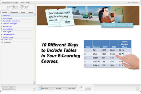
Her question did cause me to think about some of the different ways you can use tables in an elearning course. So I put together ten ideas that may help the next time you need to add a table to your course. Below is a quick demo that shows them in action. I explain more below.
Click here to view the table demo.
The No Frills Approach
Just add the table and do nothing else. Add some narration that explains the table. If you want to make it a bit more interactive, ask the learner to look for information. One challenge with this approach is that there are no visual cues. The learner could easily lose track of the narration and where it’s at on the table.

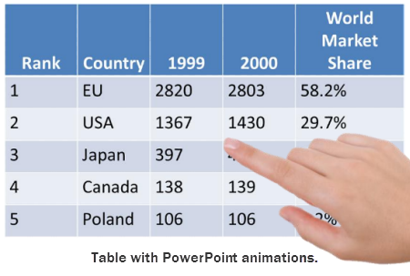
Simple PowerPoint Animations
Use PowerPoint shapes or images to point out things on the table. Add on-click animations to the objects and you can sync the animations to your audio. This provides good visual cues and helps direct the learner’s focus.
A downside to this approach is the time it takes to build the animations and get them just right. Also, if you want to print out the PowerPoint files, you have to remove all of the animations from the slide. Otherwise, they’ll cover up the content.
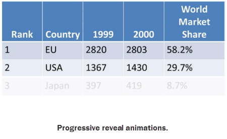
Progressive Reveal Animations
Another way to use on-click animations is to cover the table with rectangles. Set them to fade out on mouse click. Then as you talk and click the animation, the box fades away. It looks like the table is actually fading in.
This looks nice and is a bit easier to build and manage than the other types of PowerPoint animations. You still have to remove the objects if you want to print the slides.
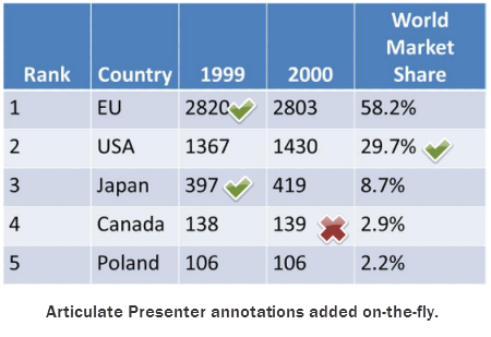
Just-in-Time Annotations
Articulate Presenter has that cool annotations feature. They look great and can be added on the fly. So there’s no building of animations or cluttering your slides with content you have to remove prior to printing.
Annotations are probably my favorite solution. I just like the way they look and using them is really no different than how you might use a laser pointer. Of all the solutions it’s probably the easiest.
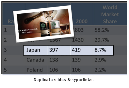
Duplicate Slides & Hyperlinks in PowerPoint
If you want to get a little trickier and add more content than just audio narration, then this approach may work for you. Essentially you make a duplicate slide for each category. Then add hyperlinks to those slides.
The benefit to this approach is that it makes the entire slide area open to you as you focus on a single point of information. In the demo, I show a few different ideas. The negative to this approach is that it requires a lot more work. But if you have the right type of table and content it is a neat way to do it.
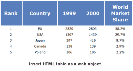
Create a HTML Table
Sometimes the table content is dynamic and can change more frequently than you choose to publish the course. Using the web object feature is a great way to avoid a bunch of extra work.
What you do is create the table as a HTML file; then place it on a server. Insert the URL as a web object and publish your course. You can update the table on the server and it’
s automatically updated in the course.
Adding Interactive Multimedia
Sometimes, tables are just boring. It’s cool when you can augment the table’s information with audio, images, and videos. So I played around with a few ideas in Articulate Engage. What I like about this approach is that you can make the information more interesting and relevant to the learner.
For example, what if each cell included a video of a subject matter explaining how the information impacts the organization in a real way? That could be impactful. It definitely would make the table more engaging and possibly help the learner connect it to the real world.
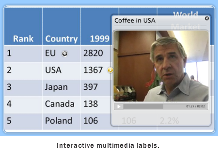
Add Interactive Multimedia Labels
The labeled graphics interaction lets you insert an image of the table. From there, you can add labels on top of the image. The labels can contain audio, images, and video or Flash files.
What I like about this approach is that I can add a label over each cell. It allows the learner to explore and click on only the area of interest. Combine that with an interactive Flash file (such as the one in my demo) and you have a pretty dynamic multimedia table.
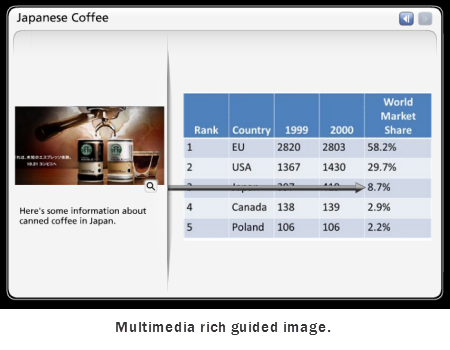
Use a Guided Image with Multimedia
The guided image interaction is similar to the labeled graphic because you can add text, audio, and multimedia. However, it’s more of a linear presentation of the information. Personally, I like to give the learners more control so I’d probably go for the labeled graphic over the guided image.
You do have the option of having the arrows come from the top, bottom, or either side. While the guided tour isn’t as interactive as the labeled graphic, it does look nice and much easier to work with than a PowerPoint slide if you want to augment the information with some multimedia.
Let the Media Tour Progressively Reveal
This one’s similar to the progressive reveal in PowerPoint. However, instead of adding the rectangles and having them exit on click, you insert multiple images. When the learner advances, the table builds.
The media tour lets you add an image (or other media) and some audio. You also get the text are on the bottom. For this example, it’s probably not the option I’d select, but it is a different way to display the table in your course. And that’s the main thing.
Understand the tools you have and what they can do. Then look at all of your options and match the best option to what you hope to accomplish in your course. My favorites are the annotations (because of ease) and the labeled graphics (because I like to give the learners control).
Can you think of other ways to add table to your elearning courses? If so, add your ideas by clicking on the comments link.
Events
- Everyday. Check out the weekly training webinars to learn more about Rise, Storyline, and instructional design.
Free E-Learning Resources
 |
 |
 |
|
Want to learn more? Check out these articles and free resources in the community. |
Here’s a great job board for e-learning, instructional design, and training jobs |
Participate in the weekly e-learning challenges to sharpen your skills |
 |
 |
 |
|
Get your free PowerPoint templates and free graphics & stock images. |
Lots of cool e-learning examples to check out and find inspiration. |
Getting Started? This e-learning 101 series and the free e-books will help. |
24 responses to “10 Tips on Using Tables in Your E-Learning Courses”
Darn if everytime I read one of your posts it doesn’t cause me to rethink my latest training and how I can use the information to make it better. You keep messing with my deadlines. ha-ha
I like the web objects capability….that way we can maintain the files outside of the server. Awesome for data that changes or product images. thanks for reminding me!
In your table demo you mentioned the users being able to “scrub” through the table if you have that option selected. What am I missing? I have no idea what you mean by that!
Thanks, Tom. Great blog, as usual!
Is it too easy to make the table an image and use mouse roll-over hotspots to display more information?
Hello, Great post as always. I tend to use ‘build slides'(duplicated slides where data is progressively added). Similar to Tom’s rectangle fades, but without having to coordinate animated objects.
I use build slides a lot as it makes adding additional notes, graphics, audio and animation really easy and quick to add. To the learner, it looks like one slide.
Cheers
Jen
As side point – thanks for Crystal Xcelsius demo. hadnt come across that software before.
Gav
I have no words,Tom, to express my appreciation for sharing your very useful ideas with your students, including me (I am 72 years). If I say “Thanks”, it is coming from my heart.
Kudos to you, Tom.
Diwakar
Really interesting, as always!!
It’s very impressive! I just started to learn making the on-line course! I work in China and e-learning just started to be popular here. Thanks Tom for the teaching and I will come back frequently to learn 🙂
[…] 10 Tips on Using Tables in Your E-Learning Courses | 15 June 2010 […]
its very good information for using tables in E-learning.I started my e-Learning course yet and these tips are very helpful for me.Thanks for that
Ezine
This is great article and even though I don’t use Articulate (might have to look into it now, though) this gave me a lot of ideas on how to make tabular data more engaging.
Question: Would the linked/inserted video and pop-up text and images and other added animations (the animated pointers and such) create a file that is 508 complaint? It’s great to be able to do all of that, but if can’t be blessed by our 508 reviewers, we can’t use it.
thanks again!
[…] 10 Tips on Using Tables in Your E-Learning Courses […]
Another great post, Tom. Thank you for so many pearls of wisdom. I have an ID’s treasure chest full of those pearls and you keep adding more. 🙂
If you enjoyed this post and would like more info on creating interactive tables, please check out this community thread: http://is.gd/daifE
We have a start-to-finish tutorial series that includes source files. Hope to see you there!
Hi Tom!
this is just what I was needing!!!
As somebody already said: I also have no words to say thank you for sharing your useful ideas, perspectives and tips with us. I’m always learning a lot with each one of your posts!
Gracias!!!
Vero
I find tables confusing so this helped me alot. thanks, viccy
Very good and informative.
Thanks for sharing this information 🙂
[…] 10 Tips on Using Tables in Your E-Learning Courses Plus de 45 Bulles gratuites pour faire parler vos cours e-learning Si vous ajoutez des personnages à vos cours e-learning, il est problable que vous ajouterez aussi des bulles de légendes. PowerPoint vous founit la possibilité de créer vos propres légendes, mais je préfère utiliser des bulles plus fantaisistes, plutôt que celles livrées avec PowerPoint. J’ai essayé de créer les miennes. J’ai créé quelques bulles de légendes à l’occasion d’un projet récent et je vous les mets à disposition. Inspirez-vous de ce modèle e-learning gratuit pour vos prochains cours e-learning Cet article écrit par Tom Kuhlmann est extrait/traduit du Blog d’Articulate . J’ai beaucoup voyagé récemment, ce qui veut dire également que j’ai passé beaucoup de temps dans les aéroports. Donc en attendant, je m’occupe à griffoner et jongler avec différentes idées. Décision Elearning – Formations elearning gratuites à Captivate, Articulate, Totem, SCORM, rapidlearning, mobile learning ,bande dessinée interactive, serious games | Les outils de l'elearning Articulate : comment regrouper simplement plusieurs présentations au sein d’un même menu Petites choses à savoir pour la création de graphismes personnalisés Articulate Rapid E-learning : type de microphone recommandé pour la narration Ajouter de la vidéo dans Articulate Presenter Tutoriels / Didacticiels – Daveperso – Le Blog Articulate En Français ! Voici un modèle PowerPoint plutôt intéressant (et il est gratuit!) Tutoriel de formation à Character Builder Articulate Articulate , 1 Kit and Shelf eguilbeault [+] Innovative_Learning generator Tutoriels enregistrée outils web 2 nierie Tutoriels didacticiels bienvenue tools global music Exerciseur RapidLearning source e-learning solutions elearning roadmap articulate freezes secrets presenter CONSEILS TUTORAT FAD formations Rapid eLearning outils Professional mobile elearning Rapid Learning software elearning distrisoft ELEARNING gateway creating blogs or webpages glogster rosamartinez study resource anxiety elearning tools woopid animation video ECPD moodle shona source E-Learning rapid tools teachers Blogs, Articles, Papers elearning TIC learning veille générale e-learning software cammy récit e-Learning Blogs instructional mobile thoughts e-learning design learning elearning Online Tools puzzle simplify slidestaxx e-learning rapid powerpoint in English janet clive Educational Websites teaching tools Infos better icons Blogs 2 storytelling E-Learning-Blogs elearning mouth rapid Developpement personel people shares Articulate Development multimedia mouth Resources international Blogs quotes tweetdeck scorm courselab online simulations Rapid Learning powerpoint elearning Learning blogs frame goals wikipedia smart setting lms niche social t@d tutorat revue Tutoriels askunce formation trouver Articulate Studio e-learning home • contact • blog • fb • twitter to experience pearltrees activate javascript. […]
I think the Let the Media Tour Progressively Reveal is the most effective approach, and you run the risk of detracting from the lesson with too much whizz and flashy effects. Whatever you use should be used to emphasise key learning points and not just to add pizzazz to your lesson. What do you think?
I remember back when I was looking for online distance learning degrees and one particular company had a proprietory system that required the learner to click every time to reveal each tiny bit of information. It was just overkill and I just ended up clicking loads of time at the start of the online lesson to show the full table. One the other hand, I have seen some subtle but effective use of focus and highlighting effects to draw the attention to the specific cells (it was a webinar so we could only hear the lecturer’s voice and see his screen.) This was a much better approach, as he treated us like adults and didn’t spoon-feed us the data bit by bit, but instead showed us the whole picture and how various aspects tied into it.
What do you think? When is it appropriate to use these effects for teaching vs. just nice to have?






0
comments