The Secret to Creating Your Own PowerPoint Templates for E-Learning
December 17th, 2007Most PowerPoint templates are designed for standard bullet point presentations. They’re not really designed for elearning courses. This means that you’ll have to create your own templates that work better with the rapid elearning software.
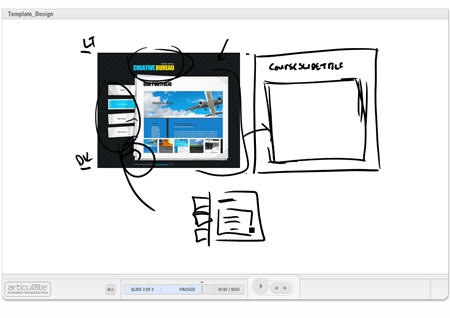
This post will share with you my secrets for creating custom templates in PowerPoint. And since we’re in this gift giving season, you can have the templates I designed for this demo. Click the link below to see an explanation of how I get inspired by other web site designs.
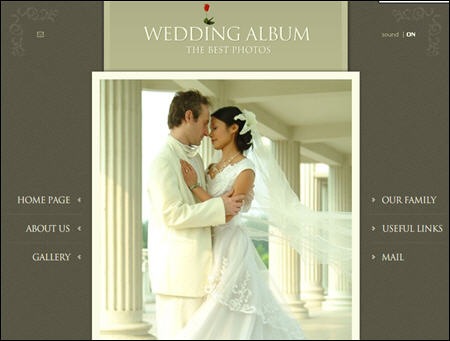
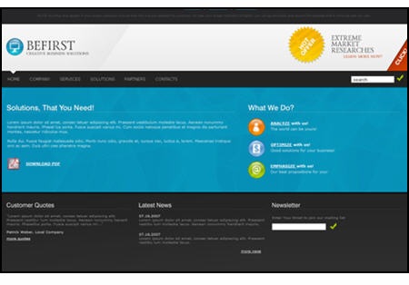
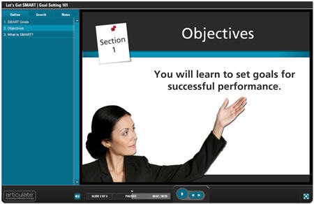
Here are three templates that I created for this blog post. Take a look at the image that inspired it and then click the demo link to see my template applied to an elearning course.

Click to see a demo of the template above.
Click to see a demo of the template above.
Click to see a demo of the template above.
Let’s quickly review the key points of this post.
Focus on white space.
Create a design that gives you as much real estate as possible. You also need to make sure the design doesn’t conflict with your course content and images. Try not to overcomplicate it with a bunch of background designs.
Make a few variations of the template.
I don’t typically create a PowerPoint template. Instead I create the background images to use in my PowerPoint slides so it’s easy to just swap out the background. Of course, you can always pre-build a template and save it as template.pot.
I usually make four screens for my elearning courses.
- Title or section screen
- Main body screen
- Wide open screen to maximize the real estate
- Footer screen, in case I want to create my own navigation
Find layout and color scheme ideas from other sources.
Look at best of breed web or graphic design sites to get ideas for the way you want your screen to look. Do a search for CSS templates and you’ll find all types of sites that have unique ideas.
The idea’s not to steal a design. Instead the idea is to look at new ways to structure the screen with different visual elements and color schemes. Deconstructing what someone else does well will help you learn how they created their designs. This will increase your ability to come up with your own.
Use graphics tools to help you build your templates.
Many of you already use tools like Photoshop to create your graphics. However, there are a lot of free resources available to help you fine tune your templates, as well.
- Pixie: quickly pick colors from an image
- Kuler: create custom color schemes.
- GIMP: solid Photoshop alternative
- Paint.net: solid Gimp or Photoshop alternative:)
This should be enough to get you started. Remember, don’t be afraid to play around. Find some style ideas you like and then see what you can do. If you feel brave, create some templates and send them my way. Perhaps they’ll find their way onto the blog.
As promised, click on the link to download the templates I created for this demo.
Events
- Everyday. Check out the weekly training webinars to learn more about Rise, Storyline, and instructional design.
Free E-Learning Resources
 |
 |
 |
|
Want to learn more? Check out these articles and free resources in the community. |
Here’s a great job board for e-learning, instructional design, and training jobs |
Participate in the weekly e-learning challenges to sharpen your skills |
 |
 |
 |
|
Get your free PowerPoint templates and free graphics & stock images. |
Lots of cool e-learning examples to check out and find inspiration. |
Getting Started? This e-learning 101 series and the free e-books will help. |








54
comments