The Rapid Elearning Blog

Archive for April, 2008


Since 20,000+ people read this weekly blog, odds are you weren’t one of the 100 or so who attended my recent presentation at the Elearning Guild conference called, “Becoming a Rapid E-Learning Pro…Rapidly!”

I’ve recapped the session for everyone in the form of a snazzy blog post.  It’s a combination of how to think about rapid elearning and then how to get the most out of your tools. So, here they are.
    The Rapid E-Learning Blog - 10 sure-fire tips to becoming a rapid e-learning pro...rapidly!

1. Rapid = Smart

Rapid elearning is a misleading concept.  You’re not a rapid traveler because you use the Internet to book travel.  You’re just a person who uses technology to make booking travel easy.

The same goes for me as I write my blog posts.  I’m sure that I could hand code my blog with HTML, but I don’t.  Instead, I use Windows Live Writer, a WYSIWYG editor.  Do you know why?  It saves a lot of time.
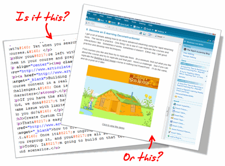
 The Rapid E-Learning Blog - Do you handcode HTML or us a tool to do it for you?

I shouldn’t have to be a programmer to write a blog post. Since the software takes care of the HTML code, I’m free to focus on creating the content.  This doesn’t make me a rapid blogger.  It makes me a smart blogger.

The same can be said for rapid elearning.  There’s no reason why you should have to be a programmer to build elearning, especially when there are tools to help you build your courses. Rapid elearning is less about being rapid, and more about being smart.

2. E-Learning is Just One Brick in a Very Big Wall

Learning is a complex process.  And, elearning is just one piece of that process.  Think of it like a brick in a wall.   As you go through life learning, you keep adding more bricks.
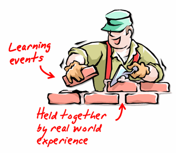
The Rapid E-Learning Blog - Become an elearning mason

Each experience in the real world provides context to what you learn and is like the mortar that holds all the bricks together.

3. Your Learners Don’t Care How You Authored Your Course

Your learners are staring at a blank computer screen and could care less how you authored the content to fill it. If that screen has text on it, they don’t care if the text was hand coded HTML, created in PowerPoint slide, or developed in Flash.  That goes for animation, as well.

The same goes with watching a video.  You think they care if it’s an .FLV, .SWF, .MPG, .AVI, or .MOV?  Heck, no!  All they care is that when they click the play button it plays.

In that sense, think less about how you’re authoring the course and more about how to build great content.  And then choose the tools that will help you build it.

The Rapid E-Learning Blog - The learners don't care how you authored your elearning course

4. Let’s Keep It Real

I used to come back from the training conferences and tell my Flash programmers about all of the cool courses I saw and how I wanted us to build ours like that.  Then reality set in.

To build some of those highly interactive courses requires a lot of money and time.  In fact, some of those courses cost well over $100,000.  I’ve worked on a lot of elearning projects and I can’t ever recall getting the budget for a $100,000 course.  I usually have to fight tooth and nail just to get $40 for some stock photos, let alone $100,000.

The only places I’ve seen with the resources to build elearning like that are vendors who build custom elearning.  So it makes sense that they go to conferences and show off what their talent and your bags of money can build.

The reality for a lot of those who build elearning courses is that they have to fend for themselves, and elearning is just one of their many responsibilities.  In fact, the last three places I’ve worked were multibillion dollar organizations and I was lucky if it was more than me doing the bulk of the work.

I’m glad I had access to rapid elearning tools to do my job effectively and save my organization time and money.

5. If You’re Just Getting Started, Don’t Listen to the Experts

Many of you are just getting started.  Your first task is to get used to using the tools.  Don’t worry about what the experts say about engaging elearning.  I’ll let you in on a secret.  Those same experts are the ones who created boring elearning to start with.  Only they charged a lot more money back then.

You just focus on the basics and then build from there.

  • Download one of those simple PowerPoint training templates and use that to get started.  Focus on clear objectives and finding a way to meet them in your course.
  • Create a consistent and clean look. Nice colors.  Same graphic style.
  • Don’t crowd the screen with text and graphics. Maximize the screen’s white space.
  • Use consistent fonts. No more than two styles.
  • Use the same animation effects.  Something subtle like Fade. Make it look professional.

You can create a nice looking and effective course that doesn’t need to be overly complicated with just a little practice.

6. Make the Content Human by Telling a Story

Once you get a handle on using the tools and building basic courses, start to present the content in a different manner.  For example, people always like a good story.  Find a way to relate it to the learner’s world.

Here’s a quick example from a conversation I had with someone at a previous conference.  The first set of images is typical of a lot of elearning.  It’s just information and it looks like a PowerPoint slide.  The second set of images takes the essence of the course and starts to build a story.
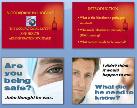
The Rapid E-Learning Blog - Create stories for your elearning to make them more human

Which approach is more engaging?  Making this type of change isn’t difficult.  In this case, I changed the wording a little and used real people to make it seem less clinical.  Ask, “Why is this important to the learner?” and then build a story around it.

7. Make It Relevant

Here’s a common mistake.  When people complain about “boring” courses, by default we tend to think it needs to be more interactive.  However, the problem with a lot of courses isn’t the lack of interactivity.  Instead it’s that the course is meaningless and not very relevant to the learners.
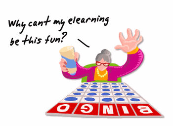
The Rapid E-Learning Blog - Do people really want to play lame games?

I have yet to hear someone sit at the computer complaining that Google is “boring and there’s nothing on the screen but text.”  There are no complaints about the lack of interactivity because what they’re looking at is relevant to the person at that time.

The more you can put the course content into a context that is relevant, the less you have to create interactive bells and whistles.  People would rather have a simple line of text on a plain white screen that gives them meaningful information, than play yet one more long and drawn out Jeopardy game.

8. Become an E-learning Deconstructionist

I get a lot of emails asking how to do more advanced elearning using the rapid elearning tools.  The secret is practice.  One thing I do is see if I can replicate the courses and interactions I like.  Sometimes it works, sometimes it doesn’t.  Either way, I get good practice and develop new techniques.

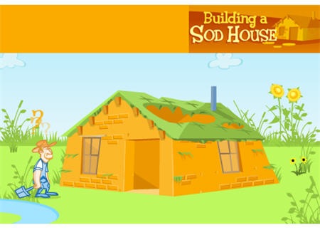
Find courses you like and then try to replicate them.  At a minimum, find out what you like about the course and try to replicate just that part.  Here’s a challenge.  See if you can replicate the Building a Sod House course in nothing but PowerPoint.   I’ll do the same, and do a post on it later.

The Rapid E-Learning Blog - Link to sodhouse demo

Click to view the demo.

The point is less about getting everything right and more about learning to use the tools in a new way.  You’ll come up with all types of ideas and get really fast at doing them.

9. PowerPoint is a Powerful Free-Form Authoring Tool

PowerPoint gets a bad rap.  You build a text-heavy bullet point elearning course and all the pundits will trash PowerPoint.  However, you do the same thing in Flash and the focus shifts to poor instructional design.  Don’t blame the tool for its misuse.

Repeat this three times: “PowerPoint as a presentation tool has nothing to do with elearning.  PowerPoint as a free-form authoring tool is great.”

Just like Flash, PowerPoint is free-form authoring tool.  You start with a blank screen and build from there. For example, you can bring in all sorts of graphics and objects, animate them, create interactivity, and easily build branched scenarios.

There are two secrets to getting the most out of PowerPoint as an authoring tool.

  • Drop the templates and start with a blank screen.
  • See the slides as layers that stack information rather than a way to keep the content linear.

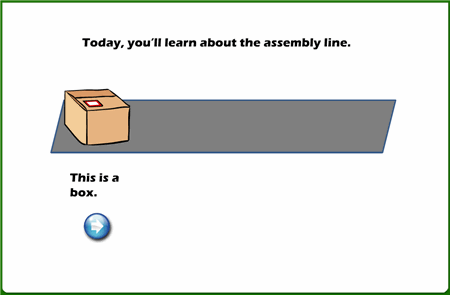
Here’s a quick example of how you can use slides as layers.  This is a simple demo and only took me about 5 minutes to build and publish.

The Rapid E-Learning Blog - PowerPoint slides as layers

Click here to view layers demo.

When you look at PowerPoint from this perspective you can see the power of its free-form authoring.  You get a blank screen that has layers and on each layer you can add layered animations.  That’s pretty powerful!  On top of that, once you learn some tricks, you can build some of your content in a fraction of the time it takes to build the same thing in Flash.  That will save you time and money.

10. Get the Most out of Your Tools

Rapid elearning tools empower you to build courses that just a few years ago would have required a lot of time, money, and specialized skill.  You can combine all sorts of multimedia, learning interactions, and even some of the new collaborative web technologies like a wiki or forum.  That’s something even Flash won’t give you easily.

In fact, even if you didn’t want to use PowerPoint to create content, the tools will still give you a SCORM-compliant player with built-in navigation and controls.  At that point you can drop in custom Flash pieces, interactions, or web objects and just use the player.

To get the most out of your rapid elearning tools, you’ve got to step outside of the PowerPoint slide box and think of the tools in a new way.  Here are some tips and tricks that I’ve covered in previous posts.

As you can see, the tools empower you to do build effective and engaging courses.  It provides the right blend between meeting your elearning goals and still working with your time and money resources.

I look forward to your thoughts on this.  Feel free to post them in the comments section.

Events

Free E-Learning Resources

Want to learn more? Check out these articles and free resources in the community.

Here’s a great job board for e-learning, instructional design, and training jobs

Participate in the weekly e-learning challenges to sharpen your skills

Get your free PowerPoint templates and free graphics & stock images.

Lots of cool e-learning examples to check out and find inspiration.

Getting Started? This e-learning 101 series and the free e-books will help.


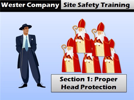
Has this happened to you?  You’re building an elearning course on site safety and need a woman in a hard hat?  Yet when you search your clip art, all you can find is the same people you’ve used in your previous courses. 

Now you’re left with the only clip art you haven’t used–a man in a Zoot suit and a Cardinal.  You put them in your course and pray that no one notices the characters’ hats are not hard hats at all.

The Rapid E-Learning Blog - Zoot suit and Cardinal caps

Building scenarios for your elearning courses is a good way to engage your learners and it helps place the course content in a real world context.  However, when using clip art to build your scenarios you run into a couple of challenges.  One is having enough characters and the other is having the right characters.

If you have the skills, you can draw your own characters.  But most of us don’t have those skills, and even if we did, we don’t have the time.  The next best step is to buy clip art packages.  But eventually you run into the same issue with limited characters and you most likely don’t have the budget to keep buying more clip art.  So what do you do? 

Create Custom Clip Art

That’s easy.  You can create your own characters.  In a previous post, I explained how to create your own clip art.  You start by inserting a clip art image and then you ungroup it.  Once it’s ungrouped, you can modify the clip art by taking away or adding to it.  When you’re done, you regroup it, and you’re all set with a custom image to meet your needs.

Today, I’m going to build on that technique and share how to create custom characters for use in your elearning courses and scenarios.

Start with Images in the Same Style

Go to the clip art available through PowerPoint and Microsoft Office Online.  Do a search for "people."  At this point, don’t worry about an exact image.  Instead, look for clean styles that have a variety of people. 

When you find an image you like, locate its style and then download all of the images from that style.  What I usually look for is body parts, facial expressions, and items that I can use in my scenarios.  I’m not really concerned if the image is an office worker or an Eskimo as long as there’s something in the image that I think I can use.

The Rapid E-Learning Blog - Clip art style1280

You’ll notice that in style 1280 above there are some images that are obviously good and some that appear to be useless, unless I’m doing a course on ancient Egypt.  Regardless, I download them all.  You never know what you’ll need and having the same style makes the custom images look like they belong together.

Save Your Clip Art in a PowerPoint File

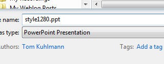
Spread the clip art over a series of slides so that you can quickly scan the images.  Then save the file as style1280.ppt.  Now you have a basic repository of all images from that style.  It’s easy to open that file and quickly scan the slides for the images you like.

The Rapid E-Learning Blog - Save clip art style1280

Create a Library of Spare Parts

Once you have all of the clip art saved, start to take them apart.  Separate the people from the backgrounds.  You can have whole people, or do like the Jacobins, and take their heads off. This way you always have bodies to which you can easily add heads.

 The Rapid E-Learning Blog - Pull characters from the clip art

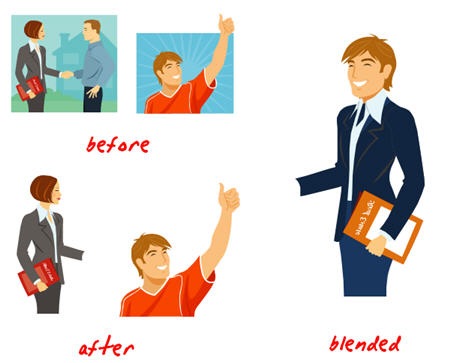
You can go as far as pulling body parts from the characters.  Suppose you need a hand, just grab it from your hand slide.  Or an arm that’s pointing up?  Same thing.  A slide with just heads is good because you can quickly grab a head and put it on a different body to create variations of the same character, as I did in the blended example above.

The Rapid E-Learning Blog - Separate heads from bodies

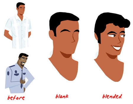
I do the same thing with facial elements such as the eyes, mouth, and nose.  Then I can use them to create more expressive characters.  As you’ll notice, style 1280 has characters that all look like they’re sleeping or have some sort of personality defect that prevents them from looking the other clip art in the eyes.  I don’t want my clip art sleeping and not paying attention to what’s going on in the scenario.  So I quickly add eyes.

Here are the basic steps:

  • Find a character you like
  • Remove the facial features to create a blank face
  • Add the facial features

If you need more facial features than the style provides, find other clip art images that are more expressive, ungroup them, and just pull the features you need.  They don’t always have to be from the same style since you’re only using a small part.

 The Rapid E-Learning Blog - Create custom faces 

Create Your Characters

Using the approach above let’s you create hundreds of characters for your elearning courses.  You’re no longer constrained by the clip art and you have the freedom to position them in ways that work for you perfectly for your scenarios.  By having spare body parts, especially heads and facial expressions, you can create exactly what you need, when you need it.

In the image below, you can see a before and after example.  By cleaning up the character and getting rid of the purse and newspaper, I’m able to create a multi-use character for my scenarios. 

Here’s what I did with the character below:

  • Added the facial expression from one of the faces above
  • Repositioned the character’s head and arms
  • Changed the color of the clothes

The Rapid E-Learning Blog - Before and after character  

Now, if I am going to build a scenario and quickly need a character, I just copy and paste the woman from the slide into the scene. 

In the example below, the lady’s arm position was changed.  I also placed her head on another character’s body.  This allows me to use the same character in a different scene on a different day.  It’s like a virtual wardrobe, only without the cost or dry cleaning.

The Rapid E-Learning Blog - Character wardrobe change

If you go through a clip art style and separate the characters, you can quickly create a character library for use in your elearning courses.  As a best practice, take some time to pre-build characters for future courses. 

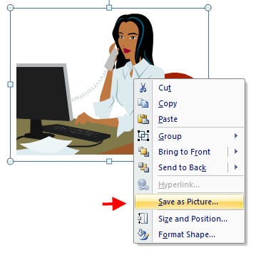
For example, with the lady above, I might name her Cynthia and then create a "Cynthia" folder.  I’d make multiple versions of her on the PowerPoint slide.  To save her as an image, just right click on her and select "Save as Picture."  Over time, you’ll have a collection of clip art characters you can easily use in your courses.

The Rapid E-Learning Blog - Right click to save character as an image

While the techniques take a little practice, they are easy to do and it’s a quick process.  Once you master them, you’ll never be at a loss when it comes to any characters you might need for role playing, case studies, or elearning scenarios. 

If you have any ideas or would like to share some of your own experiments with the clip art, feel free to add your feedback to the comments section of the post.

Events

Free E-Learning Resources

Want to learn more? Check out these articles and free resources in the community.

Here’s a great job board for e-learning, instructional design, and training jobs

Participate in the weekly e-learning challenges to sharpen your skills

Get your free PowerPoint templates and free graphics & stock images.

Lots of cool e-learning examples to check out and find inspiration.

Getting Started? This e-learning 101 series and the free e-books will help.


toolbox

A lot of people asked me how I built the little scenario in my recent post on not wasting your learner’s time. This post tells you how I did it and provides you with the PowerPoint files so you can learn to do it yourself.

A Quick Review

I’ve already shared some of the tips and tricks I use when designing elearning courses with PowerPoint. Here are three that are relevant to this post.

Now, I’ll show you how to combine the tips from the posts above to create a complete scenario.

Create the Flow of Your Scenario

flow_scene

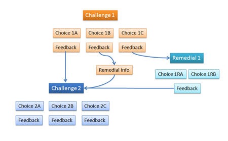
I start by mapping out the flow of the scenario.  Generally, it goes like this: 

  • Present some information that challenges the learner to make a decision.
  • The learner is presented with choices and selects one.
  • The learner receives feedback based on the choice made and then moves on.

This branching process can be as simple or complex as you want it to be.  It all depends on your resources and the course’s subject matter.  But as you can see it’s basically just a flow chart where the learner is directed based on choices made.  How you create the flow is entirely up to you. 

There are number of ways to manage how you flow chart your scenario content.  I like to use a mind map.  I won’t go into all of the advantages of mind mapping, but I will tell you it is a quick way to organize your thoughts when building the flow for your scenarios.

There are a number of fine mind mapping tools.  Personally, I prefer MindManager for two reasons.  Because it’s integrated with Microsoft Office, I can easily link my course content from the subject matter experts to the mind map objects.  Also, MindManager quickly converts my mind map to PowerPoint slides which saves me a lot of time.  This is an especially nice feature if you have a complex scenario because once it’s mapped out, you’ll have all of your placeholder slides in just a few mouse clicks.

Gather the Content for the Scenario

Once you’ve mapped out the flow of the scenario, you’ll need to populate it with draft content to get a good sense of how it works.  The scenario and the subsequent decisions and feedback need to feel right to the learner.  It should also be challenging and not necessarily easy to guess, otherwise you run the risk of just wasting the learner’s time.

  • Create the text-based content for the scenario, choices, and feedback.
  • Determine the environment for the scene.  Will it be an office? Production floor?
  • Collect the assets you need, such as images, graphics, and other multimedia.

At this point, you have your content, the flow of the scenarios, and the relevant assets.  Now you just start putting it together.  The great thing with building it in PowerPoint is that it’s easy to review and edit.

Build the Scenario

Now that you have a basic overview of the process, I’m going to show you how I built the scenario below.  I’m focused less on the content and more on the mechanics of working in PowerPoint.

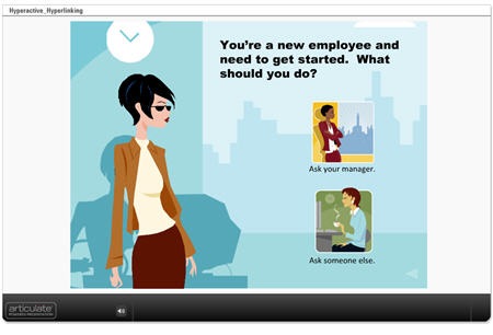
If you haven’t already done so, review the scenario below.  As you go through it, pay attention to following elements; they’re the ones I get a lot of questions about.

  • There’s a subtle back arrow in the lower right corner. This will take you to the beginning of the scenario.
  • What happens when you make a choice and come back?  The first choice is grayed out.  Test it and try the other choice first.  Same thing.
  • After you make a selection, the woman moves forward and then the scene changes.

You can also download the PowerPoint file for this scenario.

The Rapid E-Learning Blog - Human Resources Scenario

Click here to view demo scenario.

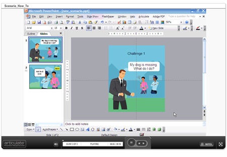
Now that you’ve viewed reviewed the scenario, let me show you how I built it and give you some quick pointers.  In the tutorial below I cover how I built the scenario above and I will actually walk through building one with you.

You can also download the PowerPoint file of the second scenario for reference as you practice building your own.

The Rapid E-Learning Blog - How to build an elearning scenario in PowerPoint 

Click here to view the scenario building tutorial.

That’s basically it.  The process is generally easy:

  1. Map out your scenario flow.
  2. Create your slides with content.
  3. Set your hyperlinks. 

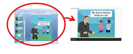
The Rapid E-Learning Blog - Convert your PowerPoint to a rapid elearning course in Articulate

Here’s a link to download the PowerPoint file for the missing dog scenario and here’s a link to see the published version of the scenario.

I hope that answers your questions and helps you build engaging scenarios for your own elearning courses.  Now that you see how it’s done, the secret is to practice it.  Once you’ve done a couple, you’ll feel like a pro.  Feel free to share your feedback and ideas in the comments section.

Events

Free E-Learning Resources

Want to learn more? Check out these articles and free resources in the community.

Here’s a great job board for e-learning, instructional design, and training jobs

Participate in the weekly e-learning challenges to sharpen your skills

Get your free PowerPoint templates and free graphics & stock images.

Lots of cool e-learning examples to check out and find inspiration.

Getting Started? This e-learning 101 series and the free e-books will help.


The Rapid E-Learning Blog - boy playing video games 

Did you know that most slot machines have pay-outs greater than 90%?  That means that for every dollar you put in, 90 cents gets returned to the player.  While those aren’t the best odds, they’re still better than putting your money into Transmeta.  Trust me on that one. 

Most players don’t mind the risk of losing 10% because they think that there’s a potentially large jackpot in the mix.  The reality is that even if you do win 90% of what you put in, you stick it back into the machine and lose 90% of the 90%.  This repeats until you have 90% of zero, which my daughter (who is a multiplication pro) tells me is zero.  The gambling industry calls this the grind, because they eventually grind you down to become a "loser sausage."

Despite the obvious fact that you’re guaranteed to lose, people still play the slots.  The reason is because the machine pays out a little bit here and a little bit there, so you always feel like the big one is just around the corner.  However, it rarely is.  With its spinning fruit and close calls, the machine conditions us to hang in there even when we’re losing.

The thought of being close to success, but not quite there is a great motivator.   Good video games work in a similar manner.  They get you to a certain level right before they kill you off.  You get close enough to the next level of achievement that it creates an irresistible force to continue.  Even though you don’t have the skills or expertise to succeed yet, you’re so close that you’re convinced it’s only a matter of time.  So you sit there for hours playing and trying to get to the next level.  Eventually your wife gets ticked off and goes out to eat by herself. 

Can we create the same type of tension in our learning environments?

One of my favorite learning experiences was during the first week of my Master’s program at Pepperdine University.  One of our learning activities was to create Lego Mindstorm vehicles for a competition at the end of the week. 

To accomplish the task, we broke into teams and had to deal with interpersonal issues.  We also had to learn a simple programming language and figure out the physics of building these robot vehicles.  It wasn’t an easy challenge.  However it was extremely rewarding and fulfilling.  So much so that most of us stayed late to work on the Lego vehicles and also came in early before classes started.

Here are three reasons the Pepperdine challenge worked and how you might be able to apply similar principles to your elearning courses.

Learners Need to Be Challenged 

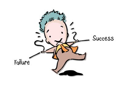
The Rapid E-Learning Blog - tension between success and failure in elearning course

The Lego exercise worked because it really was challenging.  None of us were quite sure what to do and how we’d approach it.  At the same time, we felt comfortable enough with the Legos that it definitely seemed like something we could accomplish, albeit not easily.

Many times our elearning courses go through a less than engaging sequence of information, where the learner just clicks from one screen to the next.  That usually happens because we just quickly convert classroom content for online delivery.  And, we do this with little regard to how this information is used by the learner.

Information is good and most likely there’s some value.  However, just presenting the information is not the same as learning.  Find a way to challenge your learners.  What if instead of an information dump, you presented some sort of problem where the learner has to find a solution?  Then you provide the information as a resource and let the learners figure it out on their own.

A Safe Learning Environment Makes Room for Success AND Failure

The Rapid E-Learning Blog - I have a next arrow...now what?

Slot machines and video games work because they create a tension between success and just missing the mark.  Design your courses so that the learners are challenged out of their comfort zone, but not so much that they can never move forward.  You want them engaged but not frustrated. 

We often err on the side of being too easy because of the negative feedback we get from learners at the first sign of the unknown.  When I worked for an IT group, I was always amused when people (who were trusted with multimillion dollar IT centers) had problems clicking a next arrow because I didn’t give them an elearning course on clicking next arrows. 🙂

If it’s planned and part of the learning process, there’s nothing wrong with having the learner fail or struggle through the course content.  Not knowing is good and critical to real learning.  It creates reflective thinking and helps us process our understanding. 

The challenge for you is to make it real and engaging so that the learner is lured into the challenge.  You also need to find good ways to provide feedback that lets the learner make adjustments and feel successful in the process.  Many times the only feedback they get is at the end of the course in an all-or-nothing final assessment.

Curiosity is Critical to Learning

The Rapid E-Learning Blog - make adjustments while you learn

I spend a lot of time watching my children learn.  Inevitably a lot of their learning is wrapped around this basic question, "What happens if I do this?"  Normally this is OK unless it involves knives and the wood posts in my basement.  Put them in front of a computer and they’ll have no qualms about clicking all over the screen to see what happens.

On the other hand, adult learners are a little slower to embrace that type of freedom in learning.  As we gain experience, we become more inhibited and less inclined to "click all over the screen."  We’ve been conditioned to avoid the risk that leads to discovery.

That’s why the point about having a safe learning environment is critical.  If you are going to challenge your learners, they need a safe place to fail.  Once you have this, you open the door to discovery.  And with that, you can leverage a person’s curiosity. 

One of the great values in elearning is that you can create a safe environment.  The learner is not restricted to time and place and has freedom to learn without losing face.

Create a problem or opportunity for the learner to play around and test ideas.  It doesn’t need to be overly complicated.  It can even be something as simple as the way Prometheus used the Engage interactions as mini assessments (slides 11-15).  What’s neat about the self assessments is that they’re designed so that regardless of what you initially choose, you can always ask, &
quot;What would have happened had I clicked here?" 

You can create engaging elearning courses if you find a way to challenge your learners.  The key is to instigate problem-solving, provide feedback, and allow for adjustments.  With some forethought, there’s no reason why you can’t apply similar concepts to your next elearning course.  Make that your challenge.

I’m interested in your ideas and feedback.  Feel free to share them with the community in the comments section.

Events

Free E-Learning Resources

Want to learn more? Check out these articles and free resources in the community.

Here’s a great job board for e-learning, instructional design, and training jobs

Participate in the weekly e-learning challenges to sharpen your skills

Get your free PowerPoint templates and free graphics & stock images.

Lots of cool e-learning examples to check out and find inspiration.

Getting Started? This e-learning 101 series and the free e-books will help.


History is filled with unsung heroes.  Everyone knows about Thomas Edison and his contribution to the world.  Yet few people know Christopher James Kelly.  While Edison was busy building his light bulb, it was Kelly who decided to create electrical outlets.  Without Kelly’s contribution, Edison would have just been standing there holding his cord with no place to plug in his lamp.

The elearning industry has its very own unsung hero, Dr. Werner Oppelbaumer.  Dr. Oppelbaumer is a pioneer in the elearning industry and has committed his life to advancing online education. 

I recently interviewed Dr. Oppelbaumer and asked him to present five practical tips to help you succeed and grow as elearning professionals.

The Rapid E-Learning Blog - Dr. Werner Oppelbaumer

Tom: You have made many contributions to our industry.  Which one do you think has had the most impact?

Dr. Oppelbaumer: In the early days, learners would start an elearning course and just sit there on the first screen and wait for something to happen.  We found that we created these really good courses with many screens and a lot of information, but no one thought about how to get the learner from screen one to screen two. 

While my colleagues sat around trying to figure out what went wrong with their ADDIE model, I looked out the window and noticed an arrow pointing down the road.  That’s when I suggested we place a next button shaped like an arrow on the screen.  Elearning has never been the same since.

You’ve been looking at emerging trends in elearning.  Where do you think the industry is going?

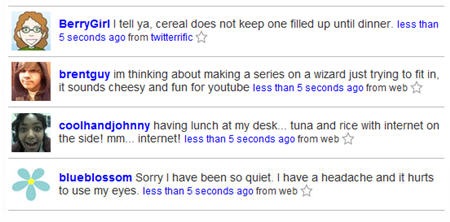
There are many interesting things happening with technology.  I am very impressed with the social media tools.  For example, years ago we were much more disconnected.  That’s not the case today.  With tools like Twitter and Facebook, I can be kept up to date on the most important advances in human history. 

I see a lot of potential in all of the important data created by these social media tools.  It will help us create elearning that is better targeted to meet the real needs of our learners.

 The Rapid E-Learning Blog - example from Twitter

I’m also excited by what I see with virtual worlds such as Second Life.  I think it is a great platform for people whose social skills were developed by playing video games.

What advice would you give to someone who wants to get into the elearning industry?

Buy a thesaurus.  People don’t want to waste time, so it is critical that they find value in your courses.  What motivates and engages learners is when they know that the content is perspicacious.  You need to move beyond words like "nice" to describe complex information.  It’s all a matter of how sapient you are. Using the right words tells your learners that this course is serious and will not waste their time.

Also, it never fails that you’ll waste hours crafting your mission statement without access to good words.  And as we know, it is critical that all training and elearning teams have a clearly defined mission statement.

For example, we were struggling with our own statement, until I pulled out my thesaurus and found the right words.  By the way, you are free to use our statement so as to not waste your own time.

We exist to provide elearning content that is both rational and emotional by applying adult learning principles.  We achieve results oriented achievements through proper alignment to the organization’s performance initiatives and by leveraging the existing expertise within the organization to develop innovative elearning courses that help our customers meet their needs.


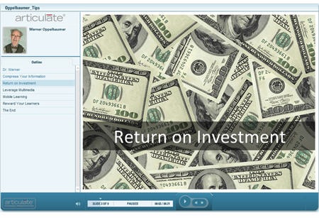
In the presentation below, Dr Oppelbaumer shares the types of wisdom and insight that you can only get from a seasoned professional who’s been in the industry from the very beginning.

The Rapid E-Learning Blog - Dr. Oppelbaumer shares five tips for elearning success

Click here to view the Dr. Oppelbaumer’s presentation.

If you want to learn more about Dr. Oppelbaumer, he has a soon-to-be released book, Using Your Brain & Heart to Make This World Smart.  I’m sure that it will be beneficial and full of his no nonsense approach to elearning.

Feel free to share comments and questions for Dr. Oppelbaumer in the comments section.  Have a wonderful day!

Events

Free E-Learning Resources

Want to learn more? Check out these articles and free resources in the community.

Here’s a great job board for e-learning, instructional design, and training jobs

Participate in the weekly e-learning challenges to sharpen your skills

Get your free PowerPoint templates and free graphics & stock images.

Lots of cool e-learning examples to check out and find inspiration.

Getting Started? This e-learning 101 series and the free e-books will help.