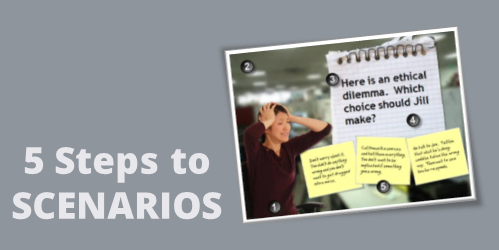
In a previous post, I wrote about a simple way to structure a scenario by using the 3C model.
- Challenge: This could be something as simple as a question or a very involved case study. The goal is to get the learner to think through the content and make a decision.
- Choice: Once the learner is ready to make a decision, you provide choices. A good scenario is nuanced and not completely black or white. You want to engage the learner and really get them to think through the scenario. You don’t want the choices to be too obvious. If they are, then a scenario might not be what you need for the course.
- Consequence: Each decision the learner makes produces consequences. At this point you can provide feedback. It could be simple text with instructions to continue. Or you could advance the learner to another decision-making challenge.
The 3C model is an easy way to build the scenario infrastructure. You can save this as a scenario template. That’s easy enough to do. Where a lot of people struggle is how to create the visuals for the scenarios. That’s because most of us don’t have the technical skills to build out the right graphics.
To make the task easier, I broke the graphics for scenarios into five parts: characters, environment, text, containers, and buttons. Using that approach makes it easier to think through the visual design.
Here’s a quick overview. The image below shows a scenario screen with the five elements. You have characters. The are in an environment. The scenario usually has some text. It’s either going to be on the slide or in some sort of container like a box or callout. Then you’ll have the choices for the learner to activate. These can be actual buttons or hotspots.
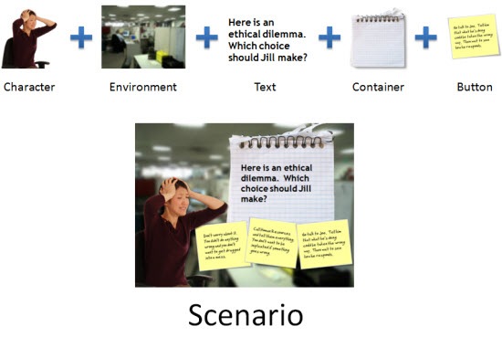
Those five parts together make up the visual elements of your scene. Now let’s look at them in a bit more detail.
Interactive Scenario: Characters
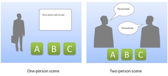
Characters are the people or avatars you use for the scenario. You can have a single character or multiple characters. I prefer to build a few different templates from which to work. In the examples below, there’s a single person scene and one that represents two people talking. As you can see, nothing fancy, just a bunch of placeholders.
Interactive Scenario: Environment
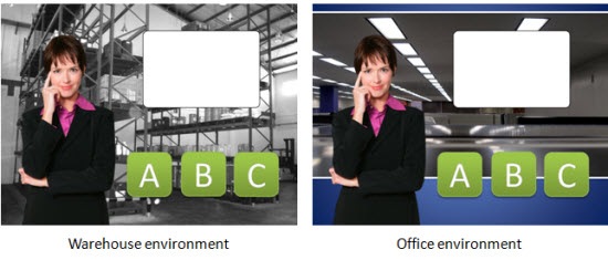
The environment is the backdrop for the scenario. Is the character in an office, public area, warehouse, or a production environment?
The environment sets the tone for your scenario. If you add some ambient background noise, that will lend to the reality of the scene. For example, if it’s a business environment you could add some office machine sounds or people murmuring the background.
Interactive Scenario: Text
In most cases you have onscreen text. There are all sorts of ways to add the text so you want to consider the font you use and how it’s positioned onscreen.
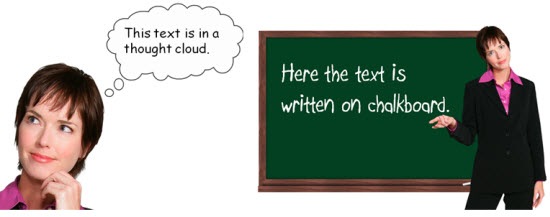
Keep in mind, the text not only conveys the written word, it’s also a graphic that conveys its own meaning and helps set the tone for the scenario. For example, in the thought cloud below, I used Comic Sans because it’s more personal than something like Times New Roman. It fits a text bubble. On the chalkboard, I used a handwritten font to look like it was written on the board.
Interactive Scenario: Containers
Containers are the boxes you use for the text or scenario-specific content. For example, a text bubble or call out is a container. You might have other containers on the screen such as an instruction box, or one of those text boxes that contains key points or a call out. These containers will change based on the layout and look of your course.
In the examples below you can see a number of containers from paper strips to a picture frame. There’s really no limit to the type of container you can use.
To keep with the visual theme make sure to pick images and fonts that go with the theme. You want everything to be cohesive and look like it belongs together.

Interactive Scenario: Buttons
A button is where the learner clicks to activate the choice. It could be an actual button or it could be a place on the screen where the learner is going to click (like a hotspot). If it’s a hotspot, you usually have to design a unique graphic or text that indicates that is part of the choice.
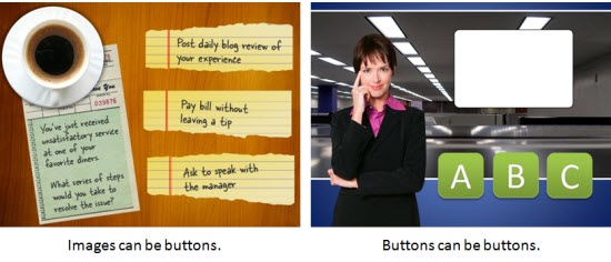
In the first example below, the “button” is actually a hotspot over the paper strips. However, in the second image, I used real buttons.
I use this simple framework to build my scenario templates which contain placeholders for all of the five visual elements. When I know that I am going to use a scenario template, then I know what elements I have to custom build for that scenario. Once they’re built, all I have to do is swap the placeholder graphics with the real course assets. However, it doesn’t mean that the screen is going to look exactly like the placeholder. Look at the example below and compare the placeholder screen to the final screen. You’ll notice that while all five elements are represented, the layout isn’t verbatim.
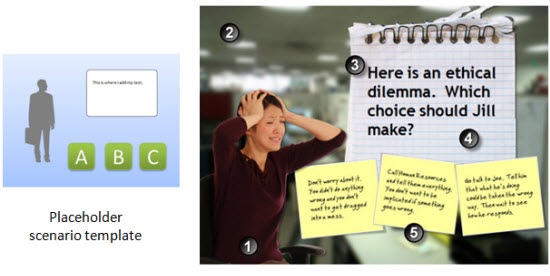
- Character: The character isn’t full body like the placeholder.
- Environment: I added an office environment. I blurred the image so you can tell it’s in an office, but I didn’t want too many details that might distract.
- Text: I pasted in my content.
- Container: In this case the container isn’t a text box. Instead I chose to go with a note theme and used the grid pad for the container and sticky notes for the choices.
- Buttons: The buttons are made to look like sticky notes. The learner clicks on them to make a choice.
Here are some considerations:
- You want to be able to right click and swap out the placeholder content without a lot of tweaking. Because of that, make sure your assets are the same size. Otherwise, when you make the switch, you’ll have to scale and move the inserted assets around.
- On the other hand, it’s just a template. The template is just a guide. You’re not locked into the way it’s initially designed. Don’t worry about having to move stuff around or changing your content. Feel free to delete items you don’t need. Or adding additional assets.
- Keep it simple. Don’t over complicate the scenario. Remember, the elearning course is just one facet of the learning process. I’d rather build a simple scenario and get it out to my learners in a few days, then spend weeks (or months) building out a more complex scenario.
- Remember good visual design. It’s easy to add too much to the screen when building a scenario. Only add what you need and make sure that it’s clear to the learner what you want them to do.
Building elearning courses can be quite the undertaking. Most people I know are one person shops or work on small teams with few resources and usually no graphic design support. Hopefully these tips will help you the next time you need to build out a quick scenario.
Events
Free E-Learning Resources






85
comments