Here's Why Contrast is an Essential Part of E-Learning Design
February 23rd, 2010
Contrast is a key part of your course design. In fact, it’s one of the foundational principles in visual design. Many people know the acronym, CRAP (or CARP if you’re an ichthyolatrist) which stands for: contrast, repetition, alignment, and proximity. They are the four essential design elements.
Contrast allows you to distinguish the content on the screen. It helps the learner navigate what’s there, discern relationships, and determine what’s most important. There are a lot of ways to create contrast. Let’s look at a few simple examples.
Contrasting Text
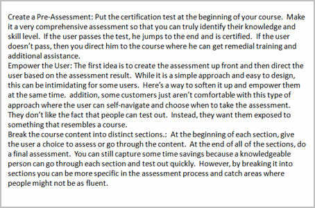
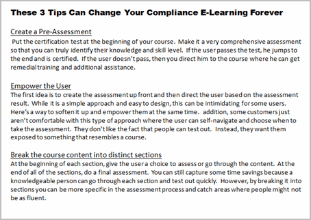
The images below are from a previous where I discussed a few graphic design principles. Both images have the same information. However, by creating titles, body text, bold text and underlines I’m able to organize the information and provide direction for the learner. Without more than a few design elements I communicate how the information is organized.
Contrasting Size & Proximity
There are other ways to create contrast—size being one of them. One way is by changing the font size. You can see it in the image above and in the text of this blog post. The heading title is larger than the rest of the text. This lets you quickly scan the titles and make an assumption about how the information is organized and what it contains.
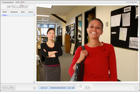
In the image below, there are two characters. However, most people are first drawn to the lady in the front because of her position and size in relationship to the other person. She is the focal point of the scene and can communicate being the main character. Most likely the first question is, “Why is she so happy?”
Contrasting Color
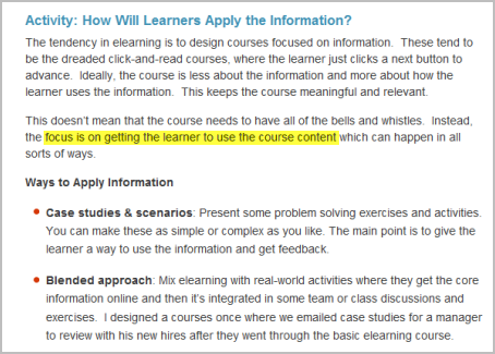
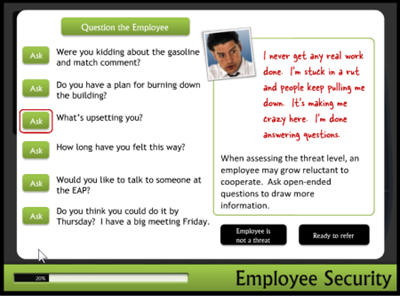
Another great way to create contrast is through the use of color. In the example below, I used the bright yellow highlight to focus on a single point of information. This could be a good technique for those times when your client gives you a text heavy slide and isn’t willing to budge. This would really work well combined with animation and audio.
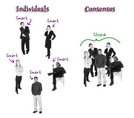
To show how color can change the meaning of the content, let’s revisit the earlier image. By turning the color off of everything but one character, the point of focus now is the colorized person. So instead of asking why the first lady is happy, we might be wondering what’s wrong with the second lady and why she appears upset.
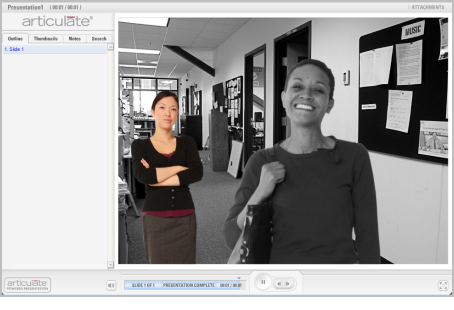
A bonus tip is emotion. In the image one person is happy, while the other has a smirk. What’s the story there?
Contrast is a powerful way to communicate ideas and an effective way to use your graphics. There are all sorts of ways to use contrast in your design, and not just with your graphics. With your next course, make a deliberate attempt to use it and see what happens.
What are some ways you’ve used contrast in your elearning design? Do you have any good examples? Feel free to share them via the comments link.
Events
- Everyday. Check out the weekly training webinars to learn more about Rise, Storyline, and instructional design.
Free E-Learning Resources
 |
 |
 |
|
Want to learn more? Check out these articles and free resources in the community. |
Here’s a great job board for e-learning, instructional design, and training jobs |
Participate in the weekly e-learning challenges to sharpen your skills |
 |
 |
 |
|
Get your free PowerPoint templates and free graphics & stock images. |
Lots of cool e-learning examples to check out and find inspiration. |
Getting Started? This e-learning 101 series and the free e-books will help. |










19
comments