The Rapid Elearning Blog

Archive for March, 2010


The Rapid E-Learning Blog

Just got back from the Learning Solutions Conference in Orlando.  It was a great time.  By nature, I’m a little introverted, but I can tell you that I am truly energized when I get to meet the blog readers.  I love the excitement people have for what they’re doing and glad that we can help.  I also like hearing about the different projects and learning how people with limited resources get their jobs done.  So for all of you who attended the sessions or came by the booth, it was great meeting you and thanks for the encouragement.

One of the questions I get asked a lot is about graphics and visual design.  Most of the elearning developers I meet have to wear multiple hats.  So they’re doing all of the instructional design and graphic design, too.  And they have to work with limited resources. Which means if they can’t create it, it won’t get done.

Here’s what I shared with those who came by the booth and asked about improving their graphic design skills.  I also built a couple of mock ups.  I’ve included the PowerPoint templates for you to download and use as you wish.

Look for Inspiring Design Ideas

When I find something I like, I do a screen capture and save the image to a “design ideas” folder.  For example, I recently installed Skype and came across their welcome screen.  I liked the layout and colors.  There’s a lot on that screen that could be used in an elearning course template.
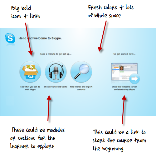
The Rapid E-Learning Blog - Skype inspired design

Recreate Good Design

The best way to learn about design is to recreate the design you like.  But your focus isn’t really on a literal recreation.  You don’t want to copy the design.  Instead, you want to think through what it is that you like about it and why.  Then try to use those things you identified and build out your own design.  Doing this has a few benefits:

  • You’ll become more fluent at different design ideas.  This is important because we tend to get good at something and use it over and over again.  Eventually all of our designs start to look the same.  To keep your work fresh you need to be exposed to different creative ideas.
  • Your production process becomes more efficient.  For example doing a few of these templates in PowerPoint will help you get faster using the drawing tools and master layouts.  That will help you in other areas of your elearning course development, as well.
  • Your designs will stay fresh.  A few years ago, bevels were all the rage.  But today, those courses look stale.  Then the Apple gel-look was hot.  Now, it seems like the hot thing is a flatter look.  By being inspired by fresh, new design you’ll always have a contemporary look.
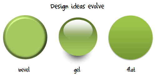
The Rapid E-Learning Blog - graphic design evolves


Create Your Own Interpretations of the Design Elements

Once you build out a prototype based on the original, feel free to play around with the colors and layouts.  I usually move the various elements around to create my own ideas.

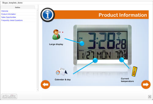
For example, in the images of my prototype below you can see how the first image looked close to the original design.  Then I moved the icon circles around to create a different look.
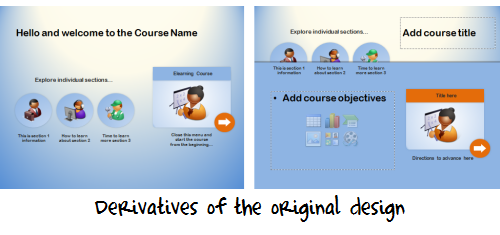
 The Rapid E-Learning Blog - elearning derivatives

I created a quick screencast that walks through the process of how I built the prototype and some of my considerations when I work in PowerPoint.

Since I had time on the flight from Orlando to Seattle, I played around with the prototype template a bit more and came up with the design you see below.  I added some course content to it so you can see how it might work in a real course.

image Click here to view the demo.


Since this is a bit more complete of a design, I created a second screencast to walk through how it’s built and what you might need to do if you wanted to customize it yourself.  I’ve also included the PowerPoint templates for you to download.

Click here to view the PowerPoint template tutorial.


The reality for many who design elearning courses is that they have to wear multiple hats, and one of those is graphic designer.  It’s hard to be great at everything.  But by following the techniques above, you can develop skills that will be good enough.

You’ll have fresh designs, learn new production techniques, and approach your courses a different way each time.

If you want to download the templates, you can do so here.  If you use the template design and can share them, feel free to add a link to the comments section.  Or better yet, create your own template and share it with the rest of us via the comments link.

Events

Free E-Learning Resources

Want to learn more? Check out these articles and free resources in the community.

Here’s a great job board for e-learning, instructional design, and training jobs

Participate in the weekly e-learning challenges to sharpen your skills

Get your free PowerPoint templates and free graphics & stock images.

Lots of cool e-learning examples to check out and find inspiration.

Getting Started? This e-learning 101 series and the free e-books will help.


 The Rapid E-Learning Blog - 3 free tools for elearning courses

Who doesn’t like a free application that’s going to make work easier?  Today, I’ll share three free applications that might come in handy as you work on your elearning courses.

Two of the applications come courtesy of a couple of screencast tutorials I saw the other day.  And one comes from a need I recently had publishing a SCORM course.  These three applications are a great complement to this post I previously shared on nine free tools to build better elearning.

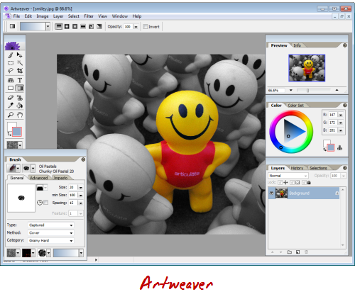
Artweaver

Artweaver is designed as a “painting program,” but for basic graphics editing it’s more than capable and works great.  It lets you control layers, create transparent backgrounds, add text, and apply filter effects.  After making edits, you can save the images in all standard image formats.

The Rapid E-Learning Blog - Artweaver

So if you’re on a budget and looking for a free graphics editor, give Artweaver a try.  Brian Batt has a couple of Artweaver tutorials: creating a transparent background and applying a blur effect.

Karen’s Directory Printer

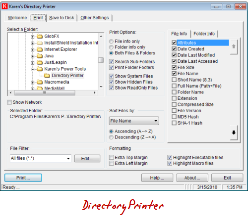
The other day I had to add a bunch of data files to a course that was already published to SCORM.  Adding the files was easy because all I had to do was open up the data folder and drop them in.  The challenge was adding the folder contents to the resource manifest which is a list of all of the files in the SCORM package.

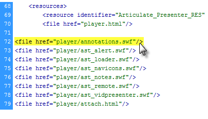
The Rapid E-Learning Blog - ims manifest

Each file in the data folder has a line like the ones in the image above.  Adding one line is no problem.  But in my case I was adding almost ten multimedia elements which equated to about one hundred separate files.  That would have been a lot of tedious work.

My challenge was to create a list of the all of the files I had in the separate data folders and then modify that list with the <file href=”__________”/> code.

The Rapid E-Learning Blog - Karen's Directory Printer

That’s where Karen’s Directory Printer really came in handy.  It let me create a list of the folder contents.  I saved it as a .txt file and then did a quick Find & Replace to add the required <file href…> code.  It made a cumbersome task very easy and fast.

So if you ever have to create a list of the files in a folder, Karen’s Directory Printer is a great way to go.  Here’s a quick screencast to show you how it worked for me.

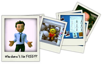
Poladroid

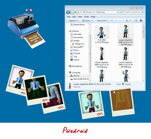
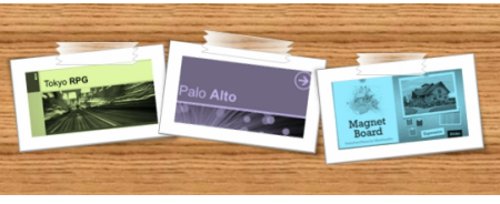
Use the free Poladroid application to create a Polaroid™ image that you can use in your elearning courses.  The application’s really easy to use.  Basically, it opens a camera on your desktop.  All you have to do is drag and drop pictures on the camera and then wait a few minutes as it develops.  Click on this demo to see it in action.

The Rapid E-Learning Blog - Poladroid

Once you have the image you can easily use it in your elearning courses.  It would work well with that folder template I shared a while back.  If you do use the Poladroid application, be sure to look at these two tutorials to get ideas on dressing up the images:

The Rapid E-Learning Blog - folder demo

So those are three free applications for which you can probably find real-world practical uses when building your elearning courses.

What other free applications would you recommend to those who build rapid elearning courses on a budget?  Feel free to share them in the comments section.  Include a practical tip on how you’re using it.

Events

Free E-Learning Resources

Want to learn more? Check out these articles and free resources in the community.

Here’s a great job board for e-learning, instructional design, and training jobs

Participate in the weekly e-learning challenges to sharpen your skills

Get your free PowerPoint templates and free graphics & stock images.

Lots of cool e-learning examples to check out and find inspiration.

Getting Started? This e-learning 101 series and the free e-books will help.


 The Rapid E-Learning Blog - tarred and feathered elearning developer

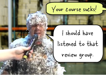
It’s amazing how fresh eyes can find things you might have overlooked during production. So, before launching your elearning course, it’s a good idea to have others review it.  You want to discover any hidden issues before the big launch.  

Most of the times you find simple issues like typos or broken links.  However, there are times where you run up against larger technical issues.  In either case, it’s good to expose those issues prior to releasing the course for consumption, where you could be exposed to ridicule, and possibly tarred and feathered.

In this post, we’ll explore some ideas around the review process and getting your course ready to go.  Keep in mind that we’re at the end of the production process.  Ideally, somewhere at the beginning of your project you created a prototype course.  This is where you present the general flow and content of the course, and your client affirms that it’s all good.  It’s also when you want to invite some learners to review it as well.

You’ll always have to make some adjustments, but during the final review, there really shouldn’t be any major surprises.  It’s more about a final quality review check, making sure the course is tight, and that everything is going to be ready for the live implementation and launch.

Client Project Review

Prior to piloting the final course with your learners, the elearning developer, client, and subject matter experts should go through the course.  At this point, you’re almost done, so there shouldn’t be major changes.  What you’re looking for is stuff like this:

  • Are there any typos and grammatical errors?  You should do this before you meet with the client so you don’t appear sloppy.  But when you look at the same content over and over again, it’s easy to miss those things.  I’ve also found that sometimes you’re better off having a couple of “missed” typos to distract the client so they don’t nitpick things or throw a wrench in the process by suggesting additions.
  • Are links and external resources working? Is the contact information correct?  All links working and going to where they should?  Review anything that the learner will click on outside of the course content to make sure they work and go to the right places.
  • Is all of the content there?  There are some things you don’t learn about the course until you’re almost done.  This is especially true of some clients who don’t fully understand what’s going on until they see the final product.  Make sure the flow is right and that the course content supports the information in the course.  I’ve been on projects where we found that too many assumptions were made about the content and we didn’t see the gaps until after the course was ready to go.
  • Is the content accurate?  Sometimes information changes prior to the course launch.  This is especially true of policy and compliance training.  I was on a project once where some regulations changed near the end.  I’ve also been on projects where we were building technical training at the same time as developing the technology.  In that environment, sometimes the content is a moving target.
  • Are implementation plans in place?  What has to happen once you have a complete course ready to go?  Each organization is different but there’s usually some sort of marketing component that goes with a course launch.  You also need to make sure that the IT or LMS folks are onboard.  There’s nothing worse than delivering a really cool elearning course and learning that none of the PCs are equipped with speakers or headsets yet.

If you’re lucky, the client review will be smooth and you’ll make minor adjustments.  Unfortunately, these types of projects can start to get screwy at the end.  To avoid some of this, set clear rules.  The first being that at the forefront of the project you get an official sign off on what will be delivered and by when.

Another suggestion is to not bring in a new person for the final review.  Here’s a common situation.  The client is so happy with the course that she invites her boss to attend the review.  During the review, the boss who has not previously looked at the content starts to recommend changes.  Since he’s the boss, you’re kind of stuck.

Learner Project Review

The review you do with your client is going to be different than the one you do with your learners.  With your client, you review the project goals and agreed upon deliverables.  On the other hand, when you review the course with your learners you’re testing the course’s effectiveness.  Here are some things to pay attention to:

  • Is the navigation clear?  Does the learner know how to go from A to B?  While you don’t need to go overboard with instructions, you need to make sure that it’s clear what the learner has to do to advance through the course.
  • Have you provided the right instructions?  If you want the learner to do something that’s a little different than the normal navigation, make sure to provide clear instructions.  This is especially true of interactions and scenarios where they need to make choices or interact with content on the screen (like a drag and drop).
  • Is your course too sexy for its body?  Sometimes we want to go outside the box to create something unique.  While there’s nothing wrong with that, using non-conventional navigation and course structure can be confusing to the learner.  If you have to build a training module on how to use your course, that might be a sign to revisit the user interface.  In either case, be careful to listen to your learners if they complain about the structure. What’s obvious to you might not be to them.
  • Watch the learner go through the course?  Often we solicit feedback by sending a course link and having the learner forward their thoughts.  However, it’s valuable to sit and watch them go through the course.  You can see how many times they click, what they look at, and get a sense if anything in the design is confusing.  At a minimum, find at least one person who you can watch go through the course.
  • Does the course meet the learning objectives?  I’m not a fan of waiting to test this on the final run through.  Your best bet is to prototype the course and test its effectiveness before investing the time building it.  However, you want to make sure that the final product produces results.  Does the learner meet the learning objectives?  Does the assessment provide the information you need? 

A challenge with learner reviews is that they can be ego crushers.  You put in a lot of time to craft the course, perhaps trying a few new things.  And in just a few minutes, all of your joy comes crashing to the ground at the first criticism. 

Because of this, it’s tempting to discount the feedback you get from the reviewers, especially since they’re not “trained instruc
tional designers” and probably don’t always understand what you’re trying to do.  Don’t fall for it.  Be humble and really consider their feedback.  It’ll help you build better courses.

Even if all you have is one person with which to test your course, that’s fine.  My advice is to find someone who has no interest in elearning and might even be a bit technically challenged.  Definitely stay away from people who build courses or know something about UI or usability design.  They tend to complicate things with their professional opinions. 

These are some basic tips for your final project review.  I see the client review as a way to do one final quality control check and to celebrate your success; and the learner review as a way to test that everything works as planned for those who have to take the course. 

Like I said earlier, you don’t want to wait until the end of the project to find out if your course works or not.  A good practice is to quickly mock up the course in PowerPoint and then test out your ideas, navigation, and flow of content.  If there are any major issues, they’ll surface there.  That will save you a lot of time down the road.

What are some of your experiences during the final review process?  What types of issues have you run into and what would you have done differently?  Please share your thoughts by clicking on the comments link.

Events

Free E-Learning Resources

Want to learn more? Check out these articles and free resources in the community.

Here’s a great job board for e-learning, instructional design, and training jobs

Participate in the weekly e-learning challenges to sharpen your skills

Get your free PowerPoint templates and free graphics & stock images.

Lots of cool e-learning examples to check out and find inspiration.

Getting Started? This e-learning 101 series and the free e-books will help.


The Rapid E-Learning Blog - who should decide

The Learning Solutions Conference & Expo is only a couple of weeks away.  And I can say that I am really excited!  A few weeks ago, I wrote about how you can change the world by volunteering to build an elearning course for one of the LINGOs organizations. 

Thanks to all of the blog readers who volunteered.  From what I understand, they’ve filled all of the requests and have gotten hundreds of thousands of dollars in free course development.  That’s what I call changing the world!  I’m anxious to see all of the LINGOs courses.   

Rapid E-Learning Blog - LINGOs link

David Anderson and I also took on the challenge and volunteered to help.  Just like many of you, we had a short period of time to assemble the content and build an elearning course.  It was interesting to collaborate with a client who was in a different country and we were both working from different locations.  I can say we learned a lot on this project.  You’ll hear more about that after the conference. 

However, during the design process we had an interesting discussion about some course navigation and when to provide access to resources during a decision-making scenario.  It’s a conversation that’s common to course design so I thought I’d share the gist of it. 

The Set Up

Part of the course puts the learners in a situation where they have to make decisions.  At this point they might not know all of the information to make the right choice.  That’s OK because it’s kind of like real life.  We’re always faced with decisions where we don’t have all of the information.

However, we did want to create a way for the learner to get information prior to making a decision.  So we added a “learn more” feature.  We liked the flexibility.  A confident learner could skip the information and go right to making a decision.  But if she wasn’t confident, she had resources available to make an informed choice.

Before deciding on our path, we wrestled with when and where to offer access to additional information.

Here’s the Dilemma

Suppose you create a similar type of interaction.  You want the learner to make a decision.  The decision will produce feedback that provides more detail.  Here are your design choices:

  • Give the learner access to “more information” prior to making the decision.  But don’t provide it afterwards outside of the feedback.
  • Don’t provide access to information prior to the choice.  Force the learner to make an educated guess.  Add a “review information” option after the decision.
  • Offer access to additional information before and after the learner makes a choice.

Option 1: “More information” available prior to choice

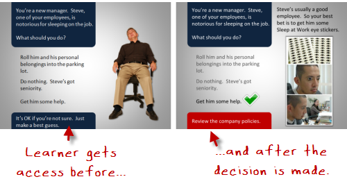
In the image below, you are challenging the learner to make a decision.  Some people already know what to do (or think they do) so they’ll just go ahead and make a decision.  Others aren’t sure, so they’ll want to look up the organization’s policies and then make their decision.

The Rapid E-Learning Blog - offer access first

What’s good about this approach is that the learner gets to assess her level of understanding first and then determines whether or not she needs additional information.  And a more experienced learner isn’t required to go through a bunch of extra information prior to making a choice.

After the choice is made, you provide feedback with no offer for additional information.  If the learner gets it wrong, you provide the right information in the feedback and encourage her to make “more informed decisions” on future decisions. 

The Rapid E-Learning Blog - offer access after

If you have the right type of scenario, you can use this approach to reinforce being certain of decisions prior to making them.  My guess is that the learner would become more aware of her uncertainty and want to research her choices prior to making a decision.  It allows her to assess what she knows and then build the level of understanding she needs to continue. 

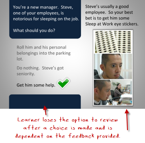
Option 2: Add a review option only after a choice is made

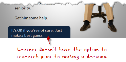
This next option is to not provide a “more information” feature prior to the choice.  The learner has to make a decision based on her current level of understanding.  If she’s not sure, she has to make an educated guess.  This ambiguity creates some tension which you can leverage to encourage learning.

 The Rapid E-Learning Blog - don't offer access

It’s not easy to make a choice like this because it puts the learner in a vulnerable position.  No one likes the risk of being wrong.  However, that risk is motivation to learn.  And there’s nothing wrong with a little tension and uncertainty.  You should have the freedom to fail in an elearning course.

Many elearning scenarios and choices are kind of lame; and the learner can quickly spot the correct answers.  But if you created choices that are challenging and not easy to guess, it causes more reflection on the viability of the choices.  This in itself is a great learning vehicle, regardless of whether or not the right choice is made initially. 

Option 3: Provide information before and after the choice

This third option is the safest.  You provide a feature to access additional information for the learner who wants to make an informed decision first.  And after a decision is made, you provide access to additional information.  Thus, the learner always
has access to the information and resources to help her learn.  And that’s a real benefit.

 The Rapid E-Learning Blog - offer access before and after

This approach definitely helps with navigating the course content.  The truth is that many elearning courses can be tedious.  In most cases, the learner’s not asking to take the course and just wants to complete it.  So it makes sense to provide as much freedom to the learner as possible.  And offering access to additional information at all stages in the course is valuable.

Personally, I like the ambiguity angle.  Life isn’t tidy like the third option.  And many of us just tend to make decisions and then learn from the consequences.  Given the right type of scenarios and course content, I prefer a “throw them into the pool” approach, where they make decisions and learn through the consequences.

Which approach do you prefer?  When would one be more valuable than another?  Share your thoughts by clicking on the comments link.

Events

Free E-Learning Resources

Want to learn more? Check out these articles and free resources in the community.

Here’s a great job board for e-learning, instructional design, and training jobs

Participate in the weekly e-learning challenges to sharpen your skills

Get your free PowerPoint templates and free graphics & stock images.

Lots of cool e-learning examples to check out and find inspiration.

Getting Started? This e-learning 101 series and the free e-books will help.


The Rapid E-Learning Blog - become a rapid elearning pro, fat wallet not needed

People are always asking me about how to get better at building elearning courses.  They want to know which books to read, which classes to take, which school to go to, etc.  It’s like they’re walking around with these big fat wallets wanting to spend money.

While all of the aforementioned options are valuable, there’s a way to learn that doesn’t cost you a dime.  All it requires is some time and willingness to share what you’re learning.

Here are three cool experiences that demonstrate a great way to learn and the value in sharing what you know.  You’ll even get some practical tips to boot.

Find Free Tips & Tricks

Stephanie Harnett of ICE shows a cool tip for creating a transparent tape effect in PowerPoint.  The effect is easy enough to learn and practice in a few minutes.

The Rapid E-Learning Blog - transparent tape effect in PowerPoint

There are also a lot of uses for the effect.  For example, you can combine it with the notebook template I shared a while back.  Or use David’s Polaroid idea and “tape” them to a wall on your elearning course screen.

Click here to view the tape effect tutorial.

There are a lot of free tips and tricks like this on the internet.  Probably the best place to start is the user community.  There you can connect with like-minded people.  So, become a member of your software’s user community.

If you’re a rapid elearning developer, you can find a bunch of great demos and examples on Screenr.  If that doesn’t work, look for a local user groups, connect with people via Twitter or follow personal blogs.  Here’s a great example from Sumeet Moghe where he walks through the process of creating a course on a limited budget.

If you’re an Articulate rapid elearning developer, we’ve got a lot of help in our community tutorial list (and there are new ones almost daily).  In either case, the first tip is to find and follow the people who can teach you new skills.

Practice, Practice, Practice

Watching tutorials and reading blog posts will only get you so far.  You have to practice the things you learn from them.  Otherwise, what’s the point?

If you practice what you learn, not only will you learn new techniques, odds are you’ll also become more efficient at what you do.

The Rapid E-Learning Blog - Pallet Jack elearning demo

Click here to view the Electric Pallet Jack demo.

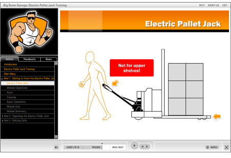
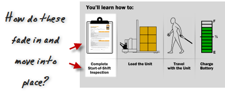
Here’s an example from a recent conversation I had with David Anderson.  The other day someone in the community forums asked how Prometheus had built the Electric Pallet Jack demo above.  Specifically, they wanted to know how they built the animation effect on slide 19.

The Rapid E-Learning Blog - use ascend and descend animation

David wanted to do a quick screencast.  So he looked at the example, came up with an answer, and then proceeded to practice it.  Initially, he tried to combine the fade in and motion path animations.  However, they just didn’t look right.  So he tried a few things before he stumbled upon the often overlooked ascend and descent animations.

What David found was that his initial solution wasn’t the best approach.  But he only realized this after practicing the technique. Once he had a good solution, he built a quick prototype and created a screencast to share with the community.  You can see his solution right here and learn to build a similar effect for your own elearning courses.

The main point here is that when you see something (or have an idea) practice doing it.  You might not have it down the first time, but eventually you’ll come up with a solution that works.  And you’ll develop a production process that helps you become faster and more efficient.  That’s what happed with David. And it’s also what I advocate in posts like this where I discuss building templates and graphics to better learn PowerPoint.

Share What You Learn

You don’t have to be a recognized guru to share what you know.  Stephanie’s tape tutorial doesn’t require a Master’s in Graphic Design.  Yet it offers real practical uses.  And that’s more important than some abstract tip from an 80-year old elearning sage.

I’m sure that there are plenty of tips and tricks and things that you’re learning right now that can benefit others.  Why not do a quick tutorial?

Here’s an example of how sharing what you know makes the community stronger and contributes to you learning more and expanding your skills.

The other day, Tracy Hamilton shared a quick tip on how to nudge PowerPoint objects by pressing the ALT key and dragging with your mouse.  She used the technique while creating a mitered frame look.  Watching her demo, made me wonder about different ways you could build a picture frame.  So I played around with some ideas.

What’s cool about this is that Tracy shared what she knew.  It prompted some ideas to play with. And I created this screencast to share what I learned.  It’s a great example of how we learn by sharing and building off of each others’ ideas.  The same could be said of Sumeet’s post above.

Here’s one final example that really speaks to the power of community and offers some good tips for your next elearning course, too.  It combines the folder template I shared with Jeanette’s hands animation to create a completely new tutorial with additional tips that you can use for your next elearning course.

Click here to view the folder tutorial.

While going to school is good, there’s no reason why you can’t learn a lot of what you need to know from your community of peers.  All it takes is a commitment to learn, practice, and a willingness to share with others.  If you do that, you’ll probably learn a lot of stuff you wouldn’t have learned in school anyway.  And it’s all free!

What rapid elearning tips do you have to share?  They don’t have to be long and drawn out.  They could be real quick like Tracy’s and Stephanie’s.

Events

Free E-Learning Resources

Want to learn more? Check out these articles and free resources in the community.

Here’s a great job board for e-learning, instructional design, and training jobs

Participate in the weekly e-learning challenges to sharpen your skills

Get your free PowerPoint templates and free graphics & stock images.

Lots of cool e-learning examples to check out and find inspiration.

Getting Started? This e-learning 101 series and the free e-books will help.