The Rapid Elearning Blog

Archive for September, 2010


The Rapid E-Learning Blog - lift off using PowerPoint's motion path animation

PowerPoint has some great animation features.  They’re simple and easy to use.  I covered animation tips in a previous post, but want to focus a little on motion paths in today’s post.

Using the motion path feature is straightforward.  However, it can be challenging when you want to add to a motion path. For example, it’s hard to discern where the object is at the end of the animation.  So you end up doing a bunch of manual tweaks which can be a bit frustrating.

Today, I’d like to introduce you to a simple PowerPoint add-in that makes working with motion path’s a cinch.  Before we get started, let’s look at how motion paths work for those unfamiliar, and then we’ll look at the add-in.

PowerPoint Motion Paths 101

The motion paths are found in the animation section of PowerPoint.  There are a few pre-determined paths and then you have the ability create your own custom path.

The Rapid E-Learning Blog - motion path animation choices

Once you add a motion path, it’s like any other animation.  You can easily change the settings in the animation pane.  There you can determine when the animation is triggered, how fast you want it, and the timing.

The Rapid E-Learning Blog - PowerPoint's animation pane

A few things to keep in mind when working with motion paths:

  • The motion path start and stop points are always centered on the object.
  • You can click and drag the motion path to where you want.  You can also click and drag the start and stop points.
  • The object’s motion starts at the beginning of the motion path regardless of where the object is on the screen.
  • Right click on the motion path to edit its points.

Here’s a quick tutorial that shows how to create and edit motion paths in PowerPoint.

Click here to view the tutorial.

Get More Control of PowerPoint Motion Paths

Working with motion paths can be a challenge because it’s not always easy to align the stop point of one to the start point of another.

For example, let’s say on slide one, you want an image to move from one side of the screen to the other.  Then on slide two, you want to start with the image in the new position.  Figuring out what that position is can be a hassle.  Or at least it used to be.

PowerPoint MVP Shyam Pillai created a PowerPoint add-in for motion paths.  It lets you do three things:

  • Add a duplicate object at the end of the animation.  The add-in will duplicate your object at the end point.  You can copy and paste that onto the next slide and the object will be aligned to the end point of the animation on the previous slide.

The Rapid E-Learning Blog - motion path stop point

  • Align motion paths.  You can quickly connect the start and end points of your motion paths for one smooth animation.

The Rapid E-Learning Blog - motion path aligned

  • Convert multiple motion paths to a single path.  Let’s say you create an object using three different motion paths.  But you want them play in sequence.  You don’t really need three paths.  Instead combine them to a single path and you’re all set.

The Rapid E-Learning Blog - motion path consolidated


Here’s a quick tutorial that shows how to install and use the motion path add-in.

Note:  When you install the add-in, you may get a macro security warning, just click ok to install it. 

Click here to view the tutorial.

I think you’ll find that this motion path tool really comes in handy when building your rapid elearning courses.  It definitely takes a lot of the trial and error out of aligning your animated objects.  Be sure to thank Shyam for his generous contribution to the PowerPoint community.

How do you use motion paths in your PowerPoint files? Feel free to share your thoughts via the comments link.

Events

Free E-Learning Resources

Want to learn more? Check out these articles and free resources in the community.

Here’s a great job board for e-learning, instructional design, and training jobs

Participate in the weekly e-learning challenges to sharpen your skills

Get your free PowerPoint templates and free graphics & stock images.

Lots of cool e-learning examples to check out and find inspiration.

Getting Started? This e-learning 101 series and the free e-books will help.


I get a lot of questions about how to get started with building e-learning courses.  I’ve covered that a bit in previous posts on why you need to create a portfolio and simple ways to get started.  I’m also a big advocate of participating in your learning community to build relationships and improve your skills.

However, in today’s post I want to introduce a simple framework to help develop your elearning skills.  It’s based on what I see as a common evolution in the skills of the people I meet at conferences.

Let’s start with what I like to call the “Rapid E-Learning Story.”

Put This Course Online

You get a PowerPoint file that was used in the classroom and are asked to convert it to an elearning course.

The Rapid E-Learning Blog - original course from the subject matter expert

The Rapid E-Learning Blog - simple but viable elearning course

So you clean up the slides a bit because it’s wordy and full of odd clip art.  Then you publish it to quickly convert it from PowerPoint to Flash.  Once published, it’s uploaded and released the world.  Everyone’s happy and you’re the hero.  In fact, your hands hurt from all of the high-fiving.

Make This Course Look Better

After a while people tell you that the courses all kind of look like PowerPoint slides.  They want something that looks different and “less PowerPointy.”

You put on your graphic designer hat and start to make courses that look really good.  No one would know that the courses were ever built in PowerPoint.  Once again, you’re the hero.

The Rapid E-Learning Blog - a visual design that fits the elearning course

We Need More Interactivity

While they love your elearning courses, you start getting requests for more than presentation of information.  They want courses that focus on action and help people do something better.  They ask for more interactivity with a focus on performance.

This means that you shift your focus away from presentation and more towards learner-centric interactivity.

The Rapid E-Learning Blog - interactive elearning course

Steps to Getting Started

When I talk to people, they usually have a similar evolution of skills.  They start by pulling content together in a clean and logical structure.  Then they improve their graphic and visual design skills.  And eventually they start to focus on more interactivity.

If you want to learn how to build elearning courses, I think it’s a solid framework from which to start.

  • Do the basic things as you learn to use the software.
  • Focus on creating the right aesthetic and immersive visual design.
  • Build interactive and learner-centric courses.

1. Do the Basics

Start with a simple framework.  The goal here is to learn how to pull content together and organize it.  What are the learning objectives and what do you need to do to meet them?

I recommend starting with a simple training structure like the ones you find in those generic training-specific PowerPoint files at the Microsoft Office site.  It’s not going to be the world’s most sophisticated training, but it’s a start and a place from which to build.

The Rapid E-Learning Blog - start with a basic course template

Don’t stop there, though.  Interact with others and read some books.  Here’s a good forum thread about instructional design with lots of good ideas and meet other instructional designers.  While there are a lot of good elearning books, if I could only recommend one, it’s William Horton’s E-Learning By Design.  I like it because he covers a lot of the core areas and it’s practical.  It’s definitely a good book for those just getting started.

At this point you want to focus on organizing content and learning to use your authoring software.  When you feel comfortable, focus on the visual design.

2. Visual Design

The look and feel of your course plays a critical role to its success.  It contributes to communicating the message and it pulls the learner into the content.  This isn’t about eye candy and only making the content look good.  Instead, you want a course where the visual look and feel are immersive and match the course’s context.

This isn’t always easy because it’s part technical skill and part artistic ability.

Start with the basics of graphic design and visual communication.  Practice using them in your slide design.  To learn the art of design, find designs you like and try to replicate them.  This helps you learn your software and build some of the artistic skills.

The Rapid E-Learning Blog - create the right look and feel for your elearning course

Here are a few good resources to get started:

  • David offers great ideas on mindmapping the visual design for you elearning courses.
  • A must-have book on basic graphic design is Robin Williams’ Non-Designer’s Design Book.
  • If you want to learn more about visual communication, you can start with Dan Roam’s Back of the Napkin where he talks about selling ideas.  There are a lot of parallels between his ideas and elearning design.

3. Create Interactivity

Good elearning courses are meaningful to the learner.  They’re relevant and interesting.  A great way to accomplish this is to frame the course from the learner’s perspective.  What will they do with the course’s information?

When I start working on a course, I visit the learners and ask them how they’d use the information.  Then I take
their comments and use that to build decision-making scenarios that frame the course around their day-to-day lives.

This type of interactivity can be simple, branched decision-making scenarios to complex, real-world simulations.  It all depends on your time and resources.  At the most basic level, take the learner right into an environment that mirrors how they’d use the course info.  Instead of telling them what the information does, give them an opportunity to practice using it.

Here are a few posts where I share a bit more on building simple scenario-based interactions:

Cathy Moore’s action mapping is a good way to focus on this.  She also shares a nice scenario-based course on which she recently worked.  While I believe her example was built in Flash, there’s no reason why that couldn’t be built in a rapid elearning tool.

The Rapid E-Learning Blog - example of an interactive scenario from Cathy Moore's blog

Some Final Thoughts

Some people might ask, “Why not just jump into the interactivity part of the design?”  That’s a good question.  You can do that.  But what I’ve found is that many elearning course authors are one or two-person teams.  They have limited resources and usually no formal training.  They have to wear multiple hats that include instructional design, graphic design, and course authoring.

Jumping right into building interactive content is a challenge because it requires both good instructional design and more advanced familiarity with the authoring software.  Considering this, I recommend starting with the basics and building from there.  But you can start from the place where you’re most comfortable.

I like to think of it like learning a sport.  You’re not going to be a pro the first time you pick up a basketball.  You have to learn how to dribble and some of the other basics first.  Eventually, it all comes together and you develop into a good player.  The same goes for elearning.  Learn the basics and build from there.

How did you develop your elearning skills?  What would you recommend for the one-person team who has limited resources?  Share your thoughts via the comments link.

Events

Free E-Learning Resources

Want to learn more? Check out these articles and free resources in the community.

Here’s a great job board for e-learning, instructional design, and training jobs

Participate in the weekly e-learning challenges to sharpen your skills

Get your free PowerPoint templates and free graphics & stock images.

Lots of cool e-learning examples to check out and find inspiration.

Getting Started? This e-learning 101 series and the free e-books will help.


The Rapid E-Learning Blog - get more life out of your clip art

The truth for a lot of people is that if it weren’t for Microsoft’s clip art library, you wouldn’t have any graphics to work with.  So the trick is learning to get the most out of your limited resources.

In earlier posts, I’ve shared how to ungroup clip art to create your own images.  I also showed how you can use a clip art style to create a custom elearning template in PowerPoint.  Those are two examples of how you can get more out of the limited resources you have.

Another way to get more life out of your clip art is to modify it using simple filters found in most graphics editors.  Here are a few ideas to help you think about clip art in a new way.

Create a Hand Drawn Look

Hand drawn and organic designs are very popular today.  So why not apply that type of look to your clip art? 

Ungroup the clip art and break it down to a few basics pieces.  Then, save it as an image file (preferably .PNG).  After you save it as an image, you can apply a filter to it.

The Rapid E-Learning Blog - original clip art images

In this case, we’re looking at filters that convert the image to something hand drawn.  In the example below I used PowerPoint 2010’s pencil drawing filter.  But you can use almost any graphics editing program to do the same since that type of filter is standard.

One you have some hand drawn images, place them on top of a piece of paper and you could have a pretty cool interface design for your next elearning course.

The Rapid E-Learning Blog - modified clip art images

If you need some inspiration for designs that could work with this approach, check out this collection of hand drawn templates. Combining hand drawn images with the original opens the doors to all sorts of cool design ideas.  With some practice, you could become the elearning version of the 80’s mega band, a-Ha.

The Rapid E-Learning Blog - David Anderson's favorite band from the 80'sClick here to watch video or a better one.

Don’t stop with the hand drawn look!  Play around with other filters and see what you get.  Remember, contrast is a foundational graphic design technique.  By including some filtered images with originals you can help direct what the learner looks at.  That’s what I discussed in this post on the blur filter.

There are all sorts of ways you could use these modified clip art images in your elearning courses.  Perhaps you could use them as a progress meter where the hand drawn image is the start and it builds a more complete image as the learner progresses.

To help you get started, I took one of the template ideas from the link above and created a notebook-style PowerPoint template for you to use.  Click here to download the PowerPoint file.  Feel free to use it as you wish.

The Rapid E-Learning Blog - example of a notebook PowerPoint template

By applying simple image effects to your clip art, you can extend your resources.  Your only limitation is your creativity.  What are some other ways this could work for you?  Share them by clicking on the comments link.

Events

Free E-Learning Resources

Want to learn more? Check out these articles and free resources in the community.

Here’s a great job board for e-learning, instructional design, and training jobs

Participate in the weekly e-learning challenges to sharpen your skills

Get your free PowerPoint templates and free graphics & stock images.

Lots of cool e-learning examples to check out and find inspiration.

Getting Started? This e-learning 101 series and the free e-books will help.


The Rapid E-Learning Blog - handpicked resources

It’s hard to believe that we’re approaching the last quarter of 2010.  This year seems to have flown by. I’ve had fun with travel across the country and getting to meet so many blog readers at various conferences.

This past week I dedicated a little bit of time trying to catch up on some reading.  As I looked over my feed reader, I realized just how much good stuff I missed.  If you’re like me, you’ve probably been busy, as well.

Odds are that during the summer months elearning wasn’t on the top of your list.  So I decided to weed through some rapid elearning information and pull out a few posts that you may have missed.  They’re full of practical tips that you can use.  And of course, there are some free PowerPoint elearning templates, too.

Handpicked E-Learning Tutorials

  • 50 practical how-to tutorials. At the recent ASTD conference we demonstrated a bunch of elearning tips and tricks.  For those who couldn’t make the conference, you can view the tutorials here.

Going into the Articulate Guru Awards, I thought it would be a good idea to put together some information that would help those who weren’t sure what to do.  I also wanted the tutorials to be somewhat generic so they’d have value outside of the guru awards.  Here are the links to those posts framed in a new way.

Free PowerPoint Templates

Let’s face it: everyone loves free stuff!  So here are links to some free PowerPoint templates.

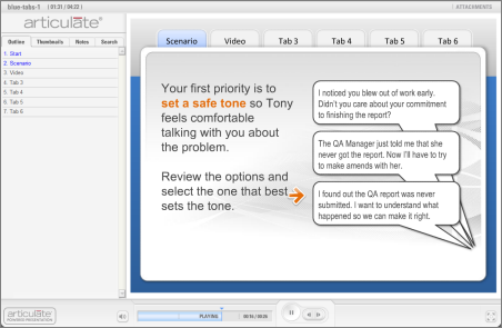
Tabbed PowerPoint Template

The Rapid E-Learning Blog - tabbed template demo


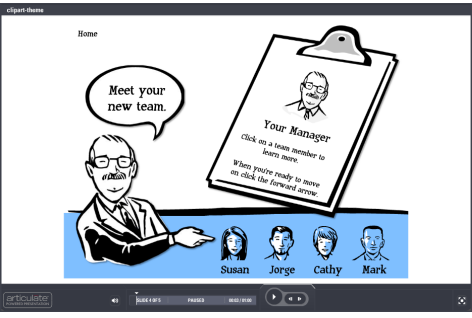
Clipart-based PowerPoint Template

The Rapid E-Learning Blog - elearning tutorial using PowerPoint clip art style 802


Flip Card PowerPoint Template

The Rapid E-Learning Blog - flip card PowerPoint template

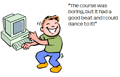
10 Free Audio Applications

The Rapid E-Learning Blog - the elearning course was boring, but it had a beat and I could dance to it

Following are the ten audio sites that I profiled.  You can get more detail from the original post.

Remember if you want good audio, starts with a good mic like the Samson Go Mic (a deal at less than $50) and then learn to do some basic audio production.

From the Community

If you’re an Articulate user and want some free templates and resources, check out these following discussion threads from the community forums.

Vegas-inspired Flash Cards

The Rapid E-Learning Blog - Vegas style Quizmaker demo

Click here to view the demo.

Free Navigation using Icons

The Rapid E-Learning Blog - icon-based navigation panel

Click here to view the demo.

Animated Image Assessment

The Rapid E-Learning Blog - Animated image in Quizmaker assessment

Click here to view the demo.

This is one of my favorite Quizmaker demos.  I like the way David used the slide view to create an image-based assessment.  The technique can be used in a number of ways.  Like the two previous examples, the community discussion has all of the tutorials and files you need to replicate this.

It’s been a busy summer.  I’m looking forward to helping you and seeing many of you as the conference season starts in September.  What’s one thing you’ve learned from the Rapid E-learning Blog these past few months? Share by clicking on the comments link.

Events

Free E-Learning Resources

Want to learn more? Check out these articles and free resources in the community.

Here’s a great job board for e-learning, instructional design, and training jobs

Participate in the weekly e-learning challenges to sharpen your skills

Get your free PowerPoint templates and free graphics & stock images.

Lots of cool e-learning examples to check out and find inspiration.

Getting Started? This e-learning 101 series and the free e-books will help.