The Rapid Elearning Blog

Archive for August, 2011


Many elearning developers are working with limited resources.  So any time you can find a free solution, you’ve won. The other day I was playing around with Urtak.  The site lets you build simple surveys.  The value is its simplicity and how the questions engage people.  It also lets you, the survey taker, to ask additional questions—another way to engage.

The Rapid E-Learning Blog - example of Urtak

Ask Questions to Engage Your Learners

Most elearning courses I see are info-centric and just push content out.  Often there’s little concern about how relevant the information is to the learner.  Thus the learner is usually not engaged and has to wade through a lot of information.

A great way to switch from an info-centric course to one that’s learner-centric is by asking questions. These aren’t quiz questions.  Instead they’re questions to get the learner to reflect on the content.  Good questions can challenge the learner’s understanding and perspective.  This is something an information dump can’t easily do.

And once you challenge what they believe, people tend to be engaged.  In addition, the process of having to create engaging questions forces us as course developers to put the content into a context that’s relevant to the learner.

If even you don’t use the Urtak site, there’s something in how it’s structured that can help in your own course design.

Engage Your Learning Community

Now let’s go back to Urtak and discuss how we could use a free tool like this in elearning.  As I mentioned before, Urtak provides an embed code.  This means you can easily add your survey to your elearning course.

In the example below, we created some information about student/teacher ratios.  And then we followed it with an embedded Urtak survey.

The Rapid E-Learning Blog - elearning example of Urtak survey in a rapid elearning course

Click here to view the demo.

In this example, we asked some questions about public education.  We purposely asked questions where we know people have strong opinions.  The goal isn’t to ascertain their understanding of the content.  Instead it’s to engage them in the process.

The problem with yes/no questions is that you can’t fully qualify your opinion. It begs another format to strengthen your position and discuss it in more detail. Thus the questions are a great way to prompt reflection for further discussion offline or in an online community.

Urtak would work great in a blended course where you combine elearning and facilitated discussion.  Create an elearning course and then use the survey to ask questions that spur some thought and engage the learners.  The trick is to ask questions that you know will elicit strong opinions.  Use them to prime the pump for further conversation outside of the course.

What questions can you ask that are controversial or engage strong opinions in your elearning course?

YOUR E-Learning Survey

How often do you get to ask a question in those industry surveys about elearning?  Well, now’s your chance.  I used Urtak to create an informal industry survey.  For the sake of simplicity, I started the survey by only asking 20 basic questions.

You can also add your own questions.  What do you want to know?  For example:

  • Want to know about gender?  Are you female? Are you male?
  • Want to know about income?  Do you make between $50K and 60K? Do you make between $60K and $70K?

What do you want to know about your peers?

Click here to view the survey.

Once the community’s answered some questions, click on the “results” page and see how they were answered.  You can also compare two questions.

Here’s a quick tour I did of the Urtak site to point out how it works.

Urtak’s a cool application that could be useful in elearning courses or your online community.  What are ways that you’d use a tool like this? Share your ideas via the comments link.

Events

Free E-Learning Resources

Want to learn more? Check out these articles and free resources in the community.

Here’s a great job board for e-learning, instructional design, and training jobs

Participate in the weekly e-learning challenges to sharpen your skills

Get your free PowerPoint templates and free graphics & stock images.

Lots of cool e-learning examples to check out and find inspiration.

Getting Started? This e-learning 101 series and the free e-books will help.


The Rapid E-Learning Blog - 7 Secrets to getting the Graphics You Need for Rapid E-Learning

I had a great time in Atlanta last week.  It’s always so much fun getting to meet the blog readers and learning more about what people do in the real world.  Two things always stand out during these trips:

  • There is no one way to do elearning.  We use the same words, but we don’t always mean the same thing.  Some people build courses, some create marketing material, and some use the rapid elearning software to create multimedia information.
  • People don’t have money.  It doesn’t matter if you’re from a big company or small; odds are you are working on a limited budget.  That means you’ve got to be creative with the resources you have.

One of the sessions I did in Atlanta was on how to get the graphics you need for your rapid elearning courses.  So I thought it a good idea to share the presentation with the rest of the blog readers.

Understand Graphic Formats

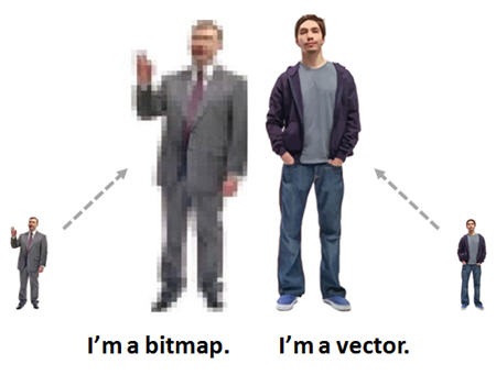
You don’t need to be a graphics artist, but you should know the difference between a bitmap and vector image because they play a role in the quality of what you see on the screen.

You’ll notice that some graphics will scale up and remain crisp and others get pixelated.  The reason is that they’re two different types of graphics.  The ones that get pixelated are bitmap images.  When you scale the image, you’re scaling the pixel.  Thus the pixels themselves get larger and become apparent.

The Rapid E-Learning Blog - know the difference between bitmap and vector images

The images that don’t pixelate are vector images.  When you scale them they remain nice and crisp.  They can be scaled because instead of pixels the image is based on a mathematical formula.

It’s Not about the Images

Before investing a lot of time finding the right graphics, invest time in learning basic graphic design.  Graphic design is about using screen elements to communicate meaning.  So it’s important to not only know how to create screen the elements (like your graphics) but also how to create meaning with them.

The E-Learning Heroes community has a great exercise that walks you through getting the right look and feel for your elearning course.  It’s worth spending some time on this because it will help you create the right visual context for your course content.

The Rapid E-Learning Blog - visual design for rapid elearning

In addition, it’s important to understand basic graphic design.  Many people are familiar with the C.R.A.P. acronym which stands for contrast, repetition, alignment, and proximity.  Those are basic design principles that help direct the learner’s eye and use the visuals to assist in the communication process.

The Rapid E-Learning Blog - understand basic graphic design

You can do a search online for “CRAP design” and find all sorts of free help.  If you want a book, then try the Non-Designer’s Design Book or any basic graphic design book.  In either case, learning the principles will help you build screens that look good and are effective.

Now let’s look at some tips and tricks to get the graphics you need.

You Already Have What You Need

If you’re building rapid elearning courses, then most likely you’re using PowerPoint.  And in that case, you already have an application that lets you do quite a bit.  Despite all of the lamenting about bad PowerPoint presentations, the fact remains that PowerPoint the application is quite powerful and offers a lot of flexibility (and capability).  So you should be able to create much of what you need.

Microsoft Provides Free Resources

They just updated the Office Online site and have some partnership with providers like Fotolio, iStockphoto, and iCLIPART.  So you should be able to find most of what you need to get started.

The Rapid E-Learning Blog - working with clip art styles

A good tip is to try and find images of the same clip art style.  This way you can maintain consistency throughout the course.  Just click on the style number under the image properties and you’ll get all of the images in that style.  Keep in mind that not all images are grouped in styles.

Customize the Clip Art to Meet Your Needs

I’ve covered this in the past, so you can check out the following posts to learn more.  The main point is to ungroup the vector clip art images and then add or subtract the elements you need to create the right images for your course.

The Rapid E-Learning Blog - ungroup clip art

The Rapid E-Learning Blog - create custom people from clip art

The Rapid E-Learning Blog - create scenes from your clip art

As you can see, you ungroup the clip art to pull out characters or props, modify the people, and create custom backgrounds.

Create Your Own Illustrated Objects

I’m not a trained illustrator.  What I do know I learned by copying what others do.  This has helped me develop some basic illustration techniques and taught me how to get more out of PowerPoint.

I’m a big advocate of visiting some of the illustration tutorials online and applying them to PowerPoint.  You’ll find that you can do much of what illustrator does and you’ll learn how to do a lot more with the tools you have.

The Rapid E-Learning Blog - create custom illustrations in PowerPoint

Here are a few previous posts where I show you how to use PowerPoint to do your own illustrations.  It takes a little practice, but soon you’ll find that you can create quite a bit on your own.

If you don’t want to learn to do the illustrations, you’re more than welcome to download them from the community since I’ve made them all available for free.

Take Your Own Photos

If you have a budget you can buy stock images, but if you don’t AND you don’t want to use clip art then taking your own photos is easy enough, especially nowadays with the digital cameras.

Some things to consider:

  • Get a signed release so that you have permission to use the images.
  • Try to get as much light into the scene as possible. You’ll never get better quality than the starting image.
  • And read this post that offers more tips and tricks.

Fixing the Bad Stuff

Clip art can seem boring and trite, and if you take your own photos most likely they’ll look a lot different that the pro quality images you can find on stock sites.  So here are some tips to help you fix some of the bad stuff.

Use Image Filters to Convert Boring Clip Art & Bad Photos

Most graphics editors (and PowerPoint 2010) offer simple filters that help you convert your image.  In the example below, I applied a pencil filter to a common piece of clip art and added it to a piece of paper for effect.  Here’s a post that offers more detail and a free PowerPoint template.

The Rapid E-Learning Blog - apply filters to clip art and pictures

You can do the same thing for pictures when the lighting is off or you want to have the essence of the image, but not all the detail.  The cool thing is that if you have PowerPoint 2010, you already have most of the features you need to make these types of edits.

Create Silhouettes

Silhouettes are the hot thing.  They’re the Lady Gaga of images (only more discreet).  You see them all the time in advertising.  They work great for elearning because they represent objects without any detail.  It’s easy enough to take photos in-house and then convert them to silhouettes.  This way you can make up for fading fashion styles, bad lighting, or blurry images.

The Rapid E-Learning Blog - create silhouettes in PowerPoint

You can also create silhouettes out of clip art, which is another way to get more life out of something many people fine old and overused.  Here are some posts that teach you how to create silhouettes:

Most of us aren’t trained graphic designers, so we’re scrambling to find the tools and resources that help us get the job done.  The tips above are easy enough to apply and don’t really cost much more than time to learn.  The good thing is that once you learn how to apply some of these tricks, it goes faster the next time.

The Rapid E-Learning Blog - download free graphics and templates in the E-Learning Heroes Community

And as I mentioned earlier, if you don’t want to build them, then feel free to jump into the community and download the stuff that’s already there for you to use.

What tips do you have for creating your own images?  Feel free to share them with the community.

Events

Free E-Learning Resources

Want to learn more? Check out these articles and free resources in the community.

Here’s a great job board for e-learning, instructional design, and training jobs

Participate in the weekly e-learning challenges to sharpen your skills

Get your free PowerPoint templates and free graphics & stock images.

Lots of cool e-learning examples to check out and find inspiration.

Getting Started? This e-learning 101 series and the free e-books will help.


A lot of rapid elearning hinges on PowerPoint.  That means your success building courses is influenced by how well you know PowerPoint.  To help you learn more about PowerPoint I pulled together a solid list of PowerPoint resources.

From The Rapid E-Learning Blog

Here are a few posts that cover some of the essentials tips and tricks required for successful PowerPoint-based rapid elearning.

The Rapid E-Learning Blog - free PowerPoint tips and tricks

From the PowerPoint Team Blog

One of the best places to go for help with PowerPoint is from the makers of PowerPoint.  Many don’t know it, but Microsoft has a number of really good PowerPoint resources starting with their PowerPoint Blog.

The Rapid E-Learning Blog - PowerPoint tips and tricks from the PowerPoint team

Of course, many of the tips on the blog are specific to the product and not necessarily relevant to rapid elearning.  So I went through the blog posts and pulled out the ones that I think provide the most relevant content for building elearning courses.

Tips on Presentations & Organizing Content

There are a lot of similarities between creating content for presentations and elearning courses.  The following tips provide ideas on organizing your content and connecting with those who look at the slides (or elearning screens).

Tips on Using PowerPoint

The more you know about PowerPoint, the better you’ll be at creating your courses.  Here are some tips to help you learn more about the PowerPoint features you’ll need for successful rapid elearning.  Even if you don’t use the specific tips in the posts, you will learn more about some of the PowerPoint features, so it’s worth a look.

More Resources and Free Templates

The Rapid E-Learning Blog - free PowerPoint templates

Free PowerPoint Templates

Good PowerPoint Books

The Rapid E-Learning Blog - good PowerPoint books

  • Beyond Bullet Points: What Cliff Atkinson shares for presentations is just as relevant for elearning courses.  He addresses some of the same multimedia design principles as Ruth Clark does in her book, e-Learning & the Science of Instruction and provides a solid blueprint for applying them.
  • Better Than Bullet Points: Jane Bozarth shares a lot of practical tips and tricks to help you get the most out of PowerPoint.
  • Speaking PowerPoint: To be honest, I haven’t read the book yet.  However the author, Bruce Gabrielle, shares a lot of good practical tips in the PowerPoint blog.  So I am going to assume the book offers the same approach.

The links to Amazon books may produce a slight commission.

PowerPoint Resources

  • PowerPoint MVPs: A great resource for PowerPoint tips and help.  The PowerPoint MVPs usually have blogs with all sorts of tips and tutorials.
  • Microsoft’s PowerPoint Forum: Get specific answers to PowerPoint questions from the makers of PowerPoint.
  • PowerPoint Online Help: Microsoft updated the Office Online site and offers all sorts of tips and tricks.

PowerPoint’s been around for a long time, so there are all sorts of free resources and help available online.  The secret is to take advantage of them and soon you’ll be a PowerPoint pro, too.

Events

Free E-Learning Resources

Want to learn more? Check out these articles and free resources in the community.

Here’s a great job board for e-learning, instructional design, and training jobs

Participate in the weekly e-learning challenges to sharpen your skills

Get your free PowerPoint templates and free graphics & stock images.

Lots of cool e-learning examples to check out and find inspiration.

Getting Started? This e-learning 101 series and the free e-books will help.


The Rapid E-Learning Blog - 10 tips to help you get started

I get lots of questions from those who are just getting started with rapid elearning.  They want to know what they can do to build good elearning.  In today’s post I’d like to offer a few tips to those of you who have the same question with links to some books and previous posts.

1. You are where you are.

When I first pick up a video camera, I don’t expect to create Hollywood movies.  The same goes for elearning.  Accept where you are in your current skills.  You won’t necessarily build world-class elearning the first time you build an elearning course. But you can build a decent and viable course. And if you want to get better, you can. It’s just a matter of learning, which entails practicing your craft.

Good books to get started:

The links to Amazon books may produce a slight commission.

2. Learn to use the tools.

It never fails that when I show people a few tricks in PowerPoint that they’ll say they never knew that was possible.  If you don’t know what the tools can do, odds are that you’ll minimize what you can do with your courses.

The more you know about the tools you have the better you’ll be at building courses.  Understanding the features and what they allow will open the door to all sorts of creative ideas and interactivity.

Learn more:  If you’re an Articulate user, there are two good books and the user community with hundreds of tutorials and thousands of active members.

3. Click & read isn’t bad.

I hear so many complaints about boring click-and-read elearning.  But the only ones I hearing complaining are those in the elearning industry.  I don’t hear it from the learners.  In fact, I routinely ask people I meet what types of elearning they take at work and what they think.

What they complain about isn’t that the course is linear or click-and-read.  Instead, they complain about content that is irrelevant to what they do.  So they’re not bored with the course structure; they’re bored with information that they don’t need.

4. Treat elearning like a textbook

Learning is a complex process.  The elearning course isn’t the end-all to the person’s learning experience.  It’s just part of it.  Often we treat the course as if it’s the only way a person’s going to learn.

Think of your elearning course more like a text book.  Some texts require that you read and reflect.  And some are like workbooks.  You get some information, apply it, and then see how you did.

In either case, elearning is just part of the process.  You’ll have more success if you focus attention on performance support prior to and after the course is completed.

5. Make it meaningful.

Like I stated earlier, people complain about courses that are meaningless.  The first step towards success is to create courses that are meaningful to the learners.  Many times the courses we build are information dumps.  Instead of an information dump, create situations where the learners have to use the information to make decisions relevant to what they’d do in the real world.

7. Get rid of stuff.

One of the best things you can do is take information out of the course content.  Often we put too much information in the course, more than the learner needs.  Focus on just the information you need to meet your goals.  All of the other information can be pulled out and placed in addendums, reference links, or in downloadable job aids.

8. Focus on objectives.

Determine your learning objectives.  Figure out what you need to do to meet them.  Then figure out how you’ll assess that the objectives are met.  Simple as that.  Ideally your objectives are focused on action.  What will they be able to do when they complete the course?

9. Develop a simple style guide.

I’m not in favor of style guide fascism where all course have to look the same.  However, when you build a course, you should develop a style guide to go with the course.  This will help you build a consistent design where you are intentional in colors, alignment, fonts, and overall look and feel.

Templates are great for this. They help with the general course structure and get you pointed in the right direction. You can create templates to guide the look and feel as well as templates that help guide the interactive components.

As you build skills, you’ll rely less on the templates. You’re better off with a basic course that is well designed than one that has every bell and whistle but doesn’t work well for the learner. Plus if you’re just getting started, a more elaborate course will take more time to build.

10. Apply sound graphic design.

People are drawn to things that look good.  So you can start engaging them by creating a course that has the right aesthetic appeal.  Will a nice looking course be enough?  No.  But it’s a start.

Graphic design is also about directing the flow of information and how the eye scans the screen.  This contributes to the successful transmission of the content.  In addition, it’s important to have the right contextual design.  Ideally you’re able to craft a visual context that matches the course content.

These tips and resources should help point you in the right direction.  Build your first course and then do a post assessment when you’re done.  Reflect on what went well and where you could make improvements.  Then the next time you build a course, work on those areas.  And in no time at all you’ll be a rapid elearning pro.

Events

Free E-Learning Resources

Want to learn more? Check out these articles and free resources in the community.

Here’s a great job board for e-learning, instructional design, and training jobs

Participate in the weekly e-learning challenges to sharpen your skills

Get your free PowerPoint templates and free graphics & stock images.

Lots of cool e-learning examples to check out and find inspiration.

Getting Started? This e-learning 101 series and the free e-books will help.


The Rapid E-Learning Blog - 70 Rapid E-Learning Tips

I like to keep things simple so I usually package ideas around three key points.  It all started when I was taught that there are three steps to getting things done:

  • Prepare to do the job. 
  • Do it.
  • Then clean up when you’re done.

Did this give me all the details I needed to do the job?  No.  But it did provide some clear steps to guide me.  And that’s what I see as my mission with this blog.

I like to provide some simple steps to help you move in the right direction.  Of course there’ll be some gaps between the steps, but that’s OK.  They’ll get filled as you apply what you’re learning and gain more experience.

For this week’s post I decided to review all of the posts where I provided three steps to do something.  You’ll find them below with a summary (and of course loosely organized in three groups).

General Thoughts on Rapid E-Learning

The Rapid E-Learning Blog - elearning stunt double

The Rapid E-Learning Blog - free tools to build elearning

Instructional Design

The Rapid E-Learning Blog - interactive elearning

Graphics & Course Design

The Rapid E-Learning Blog - build interactive branches

The Rapid E-Learning Blog - community resources

So there you have it.  Seventy rapid elearning tips that will help you get started, save time, and find the resources you need to build better elearning.

What three tips do you have?

Events

Free E-Learning Resources

Want to learn more? Check out these articles and free resources in the community.

Here’s a great job board for e-learning, instructional design, and training jobs

Participate in the weekly e-learning challenges to sharpen your skills

Get your free PowerPoint templates and free graphics & stock images.

Lots of cool e-learning examples to check out and find inspiration.

Getting Started? This e-learning 101 series and the free e-books will help.