Avoid the Curse of the Frankencourse
June 26th, 2012
A while back I got an email from a blog reader who was excited about her first elearning project. She said that she had used every single tip I ever shared on the blog. Sure enough, she did. In fact, her product was less elearning course more Rapid E-Learning Blog museum.
I mention this because something she did in her course was common to many of the courses I see. It’s what I like to call the Frankencourse. And it’s something that’s easy enough to fix.
On the surface Frankenstein looked like a person, albeit partially decomposed. But he really was a bunch of people cobbled together—an arm here, a leg there. And in a similar sense instead of looking like a single course, many elearning courses look like a bunch of courses cobbled together.
Tools within Tools
Most rapid elearning tools are like Articulate Presenter and convert PowerPoint slides to Flash (and soon HTML5). And they can be augmented using a series of form-based tools like Quizmaker and Engage. Or if you’re using other products you’ll add the Flash output to the PowerPoint slide.

On one hand this is really cool and convenient and is what makes rapid elearning so popular, especially the form-based authoring. On the other hand it introduces some design challenges that you’ll need to consider when building your courses.
Each tool you import also exists as a standalone product. That means it has its own player and distinct look. This is especially true of form-based tools where you have less control over the look and layout because the software creates it for you.
Because of this, it’s important to be intentional about the design of the course. If not, you run the risk of having that cobbled look instead of a cohesive product that looks like everything belongs together.
Be Consistent with Intentional Design
In a previous post we looked at how to be intentional in the course design. This is probably the single biggest way to avoid the Frankencourse. Be intentional about what goes on the screen. Nothing’s there by accident.
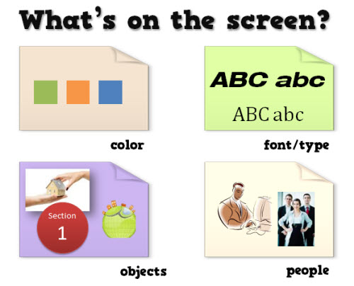
There are only so many things you can put on the screen. Which fonts are you going to use? How many? Which colors are in your course? Will all of your shapes be the same? Are you going with vector objects like clip art and shapes or you going to use photographs?
The screen is going to have some content and that content is going to have a look, whether you plan it or not. To avoid the Frankencourse, be intentional about what goes on the screen and why.
Understand the Authoring Tools
The more you know about the tools, the more you’ll be able to do to avoid the discordant look of the course. Many of the rapid elearning applications are form-based so they come with a specific look.

Often people go with the default settings. However the default settings aren’t necessarily aligned to your course’s look. In the example below, you can see that the default quiz that’s inserted in the course doesn’t have a layout or color scheme that matches the course image above.

- Make your templates match. When adding content from other applications match the color schemes and design elements used in the course. This way they’ll look like they belong together.
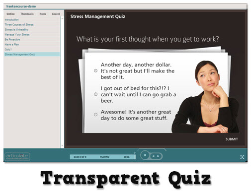
- Blend the different applications. Create a transparent player for the application you insert. This way you get the functionality of the inserted application and it pulls in the background from the course screen.
In the example below, I used the same quiz as above. But instead of going with the default, I made the quiz player transparent and matched the color scheme and design elements so it looks like it’s part of the course design. It’s the same quiz, but I think you’ll agree that it looks much better in the course.
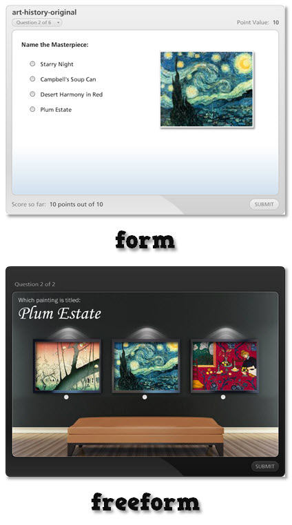
Many form-based tools, especially quizzes have that blocky form look. One of my favorite features in Articulate Quizmaker is being able to switch to slide view. This provides a freeform screen to compose your own look.
Compare the two before and after images below. The first image is the default quiz form and the second is the exact same question composed in slide view. As you can see slide view gives you freedom to create the look and feel you need and still offers the easy authoring of rapid elearning.
Of course when you use a tool like Storyline much of this changes because everything’s part of a single application. But if you do combine PowerPoint-to-Flash with other applications, you’ll need to examine the tools. And then see where you can make edits so that the content you pull together all looks like it belongs together.
In either case, whether you use rapid elearning tools or a more custom approach there are things you can do to avoid the Frankencourse. The main point is to be intentional about what you want and then to make sure that the design decisions you make are applied consistently throughout the course.
*Frankenstein icon via yootheme
Events
- Everyday. Check out the weekly training webinars to learn more about Rise, Storyline, and instructional design.
Free E-Learning Resources
 |
 |
 |
|
Want to learn more? Check out these articles and free resources in the community. |
Here’s a great job board for e-learning, instructional design, and training jobs |
Participate in the weekly e-learning challenges to sharpen your skills |
 |
 |
 |
|
Get your free PowerPoint templates and free graphics & stock images. |
Lots of cool e-learning examples to check out and find inspiration. |
Getting Started? This e-learning 101 series and the free e-books will help. |





27
comments