How to Build an E-Learning Template in 30 Seconds
August 28th, 2012
When building courses, many of you are in the role of instructional designer AND graphic designer. This can be a challenge when you don’t have the graphic design skills.
An easy way to get around that is to look for places in your organization where they’ve hired graphic designers. Then use their work as a guide to inspire yours. This post on how to build an elearning template offers some good tips on where to look.
Once you have a source of inspiration, it’s usually easy enough to mimic the screen design because they tend to be basic shapes filled with colors and gradients. For example, the image below is a screenshot of the Articulate Storyline website. I noted those areas that I could incorporate into an elearning course template.
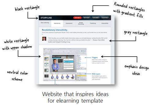
In the following image, you can see my mocked up screen and one way I could use it for an elearning course. It’s not a verbatim copy of the website, but as you look it over you’ll notice many similarities and how I worked elements of the web design into my rapid elearning template.

Building the template didn’t take too long. But I still had to add all of the shapes and then figure out the gradients and shadows. That does take some time and if you’re not efficient with your elearning software, it could take a while to get it all to look right.
The good news is that there’s a cheater’s way to create the same type of template. Here are the steps to create an elearning template in 30 seconds.
- Start with a screenshot of your inspiring website. Here’s a post that shows you how to use some tools you probably already own take your screenshots.
- Crop the screenshot to a clean sliver so that you pick up all of the elements of the template but none of the page’s information.
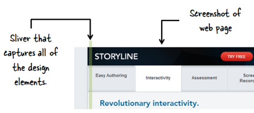
- Copy and paste the sliver onto your course slide.
- Stretch the sliver to fit the slide. You may to do some clean-up to get rid of artifacts.
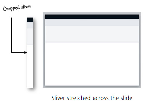
Super easy, huh? Depending on the site you use for inspiration, creating a template can be just a matter of a few seconds. It’s a good start for those who have limited time or access to graphic designers. And it helps meet any of the branding requirements you may have in your organization.
Once you have a sliver, play around with different layouts. I like to scale them large and small to create different layouts. I also like to flip them to give me a different look, but one that’s still consistent with the overall design.
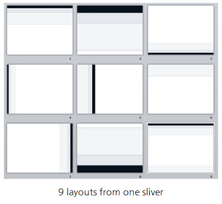
A few things to consider:
- Look for clean slivers that can be stretched. Gradients that go up and down work. But gradients that go across the screen usually don’t. Patterns also don’t work well.
- Experiment. Scale the image after you stretch it. Or use a color filter to recolor the image and you end up with something that looks different. See what happens when you flip it or turn it upside down.
- Make sure you have rights to the original screenshot. If it’s your company’s site, that’s probably OK.
This is a simple technique, but one that’s quite effective if you’re stretched for time and resources. If anything, it’s a great way to build a quick prototype of a background or layout you want to try for your elearning course.
Events
- Everyday. Check out the weekly training webinars to learn more about Rise, Storyline, and instructional design.
Free E-Learning Resources
 |
 |
 |
|
Want to learn more? Check out these articles and free resources in the community. |
Here’s a great job board for e-learning, instructional design, and training jobs |
Participate in the weekly e-learning challenges to sharpen your skills |
 |
 |
 |
|
Get your free PowerPoint templates and free graphics & stock images. |
Lots of cool e-learning examples to check out and find inspiration. |
Getting Started? This e-learning 101 series and the free e-books will help. |






16
comments