The Rapid Elearning Blog

Archive for May, 2013


Articulate Rapid E-Learning Blog - elearning and online training is cool

Here are some answers to questions I get from blog readers. Many of the ideas for my blog posts come from these questions. However, sometimes there are questions that don’t warrant a full post, but may be of interest.

So today’s an FAQ post where we look at answers to a few common questions I’ve gotten recently.

How to Create an Animated Puzzle in PowerPoint

Apparently animated puzzles are the Justin Bieber of online training. They’re popular, but no one wants to admit liking them. I’ve gotten a lot of questions about them recently. So here are answers to help you build a puzzle-themed elearning module.
Where can I find that puzzle piece you used in your rapid elearning blog post?

Answer: The puzzle piece I used in the post on how to create an animated puzzle image should be easy to find by searching for “puzzle” from the clip art search in PowerPoint. However, you won’t find it on the Microsoft office online site. Not sure why, but that’s OK because it does show up if you look for it from the clip art search feature inside of PowerPoint.

Once you put it on the slide, you can ungroup it and break it into individual pieces.
How can I chnage my picture into an animated puzzle using PowerPoint

Answer: There are a few ways to convert the image into a puzzle using PowerPoint.

  • Use the shape fill in PowerPoint. Since the puzzle piece is a vector shape you can fill the piece with an image. That works great for single pieces but not for an entire puzzle image.
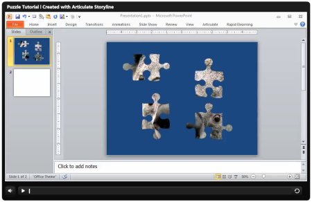
  • Do a progressive reveal by subtracting the image. Put the image in the background and then put all of the puzzle pieces on top of the image. Then fill them all so they are solid color. Remove the puzzle piece to reveal the image. That’s what I did in this tutorial on how to create an animated picture puzzle.
  • Fill the puzzle piece with the slide background. This technique gives you the most freedom and options. Make the slide background the image. Then add a solid shape on top to hide it. Fill the puzzle piece with the background image. It will pick up the background wherever it’s placed. Save the image so you now have custom puzzle pieces.
How do I create an animted puzzle

Answer: There are a couple of easy ways to create an animated puzzle. Do a progressive reveal where you subtract pieces that sit on top of the image. It will look like the puzzle pieces are being added.

The other option is to fill the puzzle piece with the slides background. Make the image your slide background and then fill the puzzle piece with the backgrounds. Then save the piece as an image. This second choice gives you the most freedom because each piece is a unique shape. At that point you can apply an animation to the piece.

Here is a tutorial that walks through the tips above.

Click here to watch the PowerPoint tutorial.

Animated GIFs for Online Training Courses
 

What do you think about animated .gifs

Answer: I don’t.

Should I use animated .gifs in my elearning courses

Answer: Truth be told, I’m not a fan of animated .gifs. I think they look kind of cheesy, especially most of the ones you find in the PowerPoint clip art. For the most part they serve little purpose other than having some decorative animation. So if you’re feeling nostalgic for the 1990s then use them. But otherwise, I say no.

With that said, animated .gifs are making a comeback. So there may be a way to work them into your content. They could work if you’re showing a series of steps or procedures like the demos below that show how to make pencils or ice cream sandwiches.
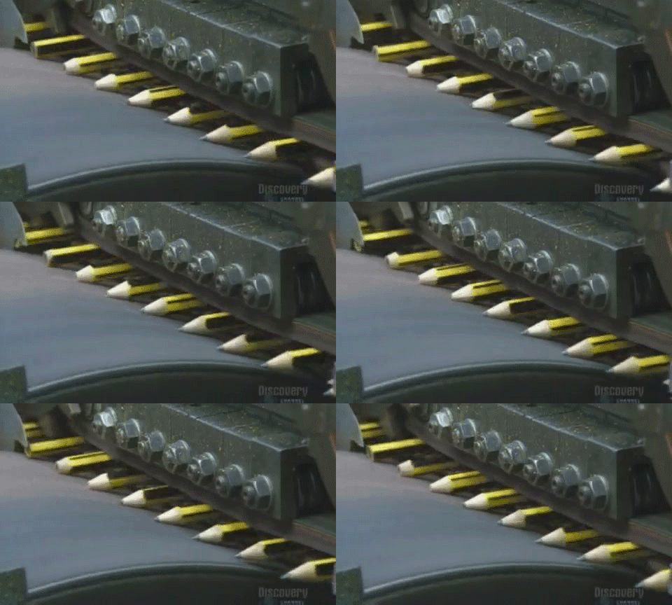
how to make pencils animated gif

how to make ice cream sandwich animated gif

In addition, people love optical illusions. If you distract them enough they may not even realize that they’re taking a compliance course.
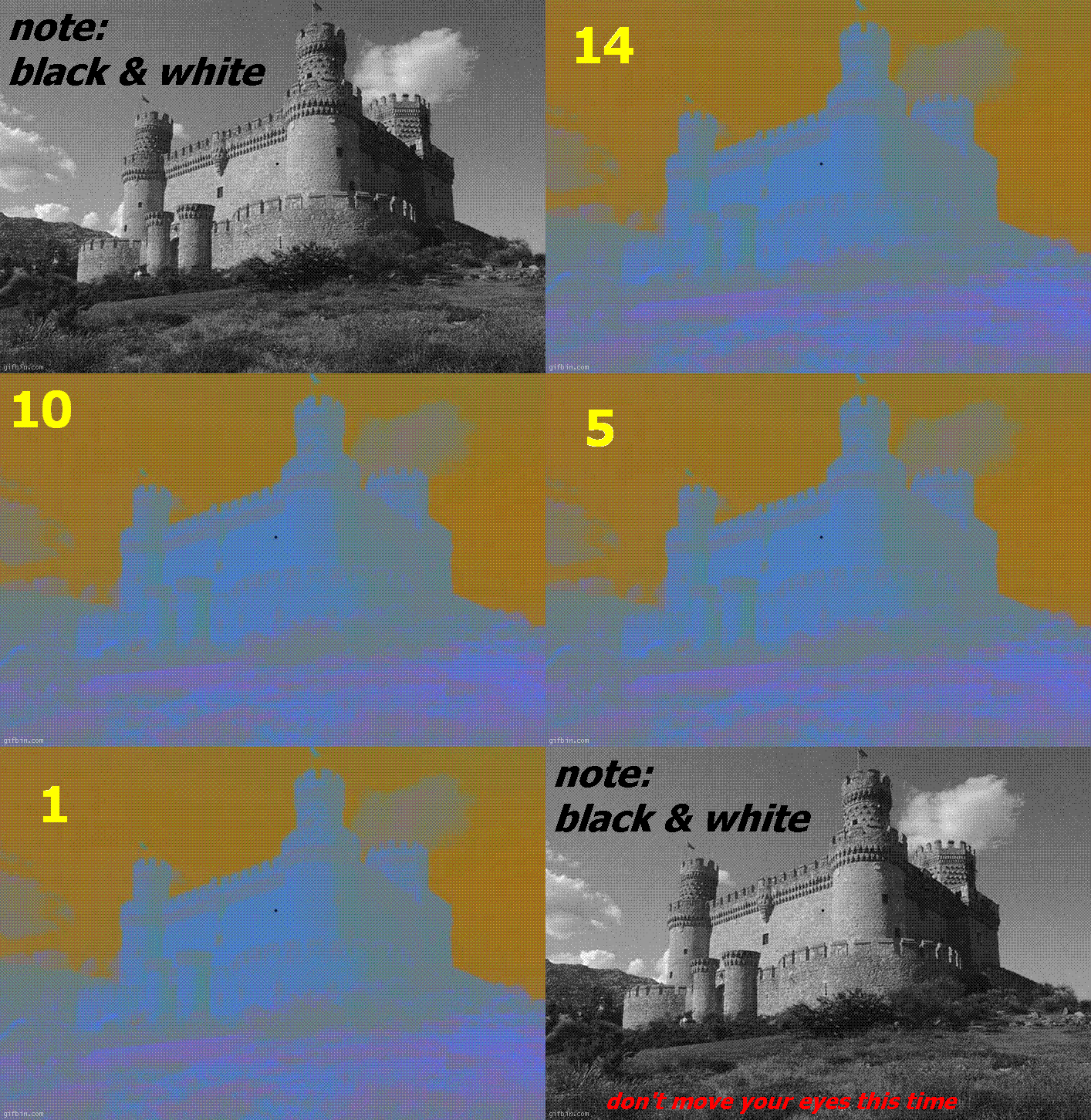
optical illusion animated gif

Favorite PowerPoint Clip Art Style?

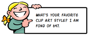
what is your favority clip art style

I’m not sure I have a favorite clip art style. But I do like the ones that let me do the most editing.

  • Style 647 is a good one. That’s how I made the image tags above.
  • Style 599 has a sleek b/w look that could come in handy.
  • Style 1285 has nice hand-drawn lines.
  • Style 629 has kind of a retro comic look.
  • Style 43 works if you get rid of the colors and just need heads.

The key thing when using clip art is to look at the lines and other elements within the image that you can use. For example, many of the clip art images aren’t usable out of the box. But when ungrouped, there may be pieces of the clip art that have value.

Those are answers to some common questions. If you have any of your own elearning questions, feel free to contact me and I’ll try to point you in the right direction.

Events

Free E-Learning Resources

Want to learn more? Check out these articles and free resources in the community.

Here’s a great job board for e-learning, instructional design, and training jobs

Participate in the weekly e-learning challenges to sharpen your skills

Get your free PowerPoint templates and free graphics & stock images.

Lots of cool e-learning examples to check out and find inspiration.

Getting Started? This e-learning 101 series and the free e-books will help.


Articulate Rapid E-Learning Blog - how to use PowerPoint to create custom stock images

Many of the blog’s readers are forced to work with limited resources especially when it comes to building the assets for their elearning courses. As many of you have discovered, when working with limited resources we have to MacGyver much of our production.

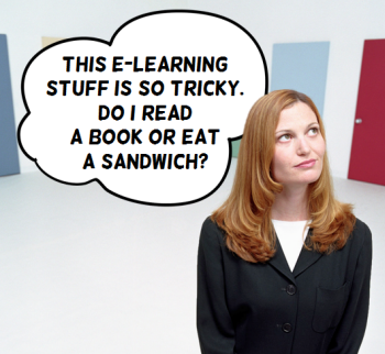
In a recent post on how to create templates for online training, I used the image below. While the image is simple, it is a combination of three graphics and all of the editing was done in PowerPoint.

Articulate Rapid E-learning Blog - example of a customized image built in PowerPoint


Today I’ll show you how to use PowerPoint to modify your stock images.

Free Stock Images from Microsoft Office

Microsoft Online has all sorts of great stock images. In fact, many of the for-pay services provide images through the Microsoft site. They’re not the high-quality choices you’d find on their own sites. But I’ve found that for most of the elearning courses I design, the free images work fine.

Articulate Rapid E-learning Blog - Microsoft office online

Of course you can use any image for the tips I am going to show below, but if you’re using PowerPoint and you have limited resources, then taking advantage of the free resources that Microsoft provides is a no-brainer.

How to Modify Free Stock Images

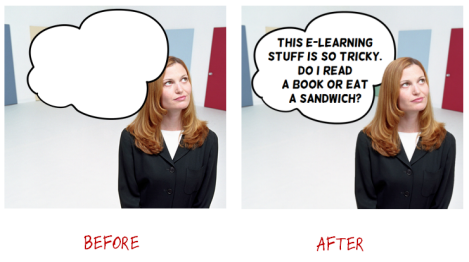
In the example below, I have an image of a woman thinking. I wanted to add a thought bubble to the image. But to add a bit more depth, I wanted the thought bubble to be slightly behind the woman.

Articulate Rapid E-learning Blog - before and after versions of images customized in PowerPoint

Here’s how I created the image using PowerPoint:

  • The final image is layered. I duplicated the woman thinking image. One sits on top and one on the bottom. In between the two images is the thought cloud graphic.
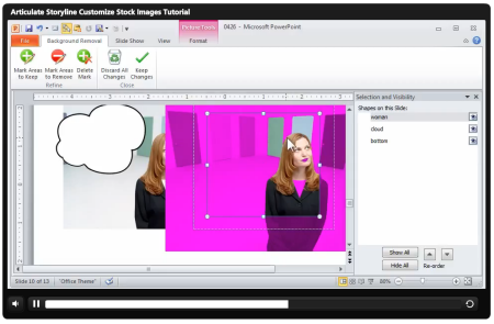
  • To get the thought cloud behind the woman’s head requires that we remove the background of the top woman image. Use PowerPoint’s remove background feature to isolate the woman. Don’t worry about it being perfect. There’s a duplicate image on the bottom that will hide the imperfections.
  • Add the thought bubble and text. And then place the thought bubble behind the top image and above the bottom image.

Tutorial: Use PowerPoint for Basic Graphic Design

Here’s a tutorial that walks through the steps that I outlined above.

Articulate Rapid E-learning Blog - tutorial of how to create your own stock images in PowerPoint

Click here to view the tutorial.

As you can see, PowerPoint’s valuable for more than presentations and rapid elearning courses. It’s a great tool to meet some of your basic graphic design needs, too.

How are you using PowerPoint to create your own images? Share your thoughts here.

Events

Free E-Learning Resources

Want to learn more? Check out these articles and free resources in the community.

Here’s a great job board for e-learning, instructional design, and training jobs

Participate in the weekly e-learning challenges to sharpen your skills

Get your free PowerPoint templates and free graphics & stock images.

Lots of cool e-learning examples to check out and find inspiration.

Getting Started? This e-learning 101 series and the free e-books will help.


Articulate Rapid E-Learning Blog - elearning hero that rocks the world

Okay, if an elearning template’s going to rock your world you need to get out of your cubicle and go take a walk outside. Enjoy the life around you. Then come back and finish reading this blog post. I’ll be waiting.

Ready?

Now that things are in perspective let’s drop the hyperbole and look at what it takes to build the world’s best elearning template.

Create a Starter Template

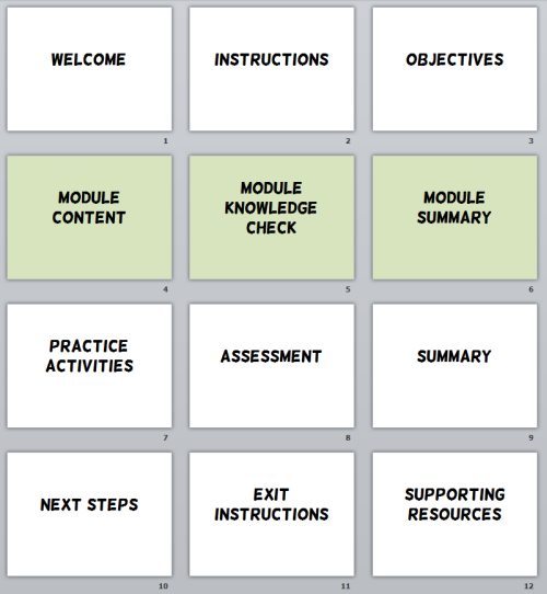
Earlier we looked at how to create an elearning template that works. In that post we discussed how to build a starter template for your online training courses by identifying the major parts or elements of an elearning course that are common to most courses. Then we create a placeholder slide for each part.

Articulate Rapid E-Learning Blog - starter template for online training and rapid elearning courses

This serves two purposes. The first is that it becomes the framework for a course template. The other is that this starter template serves as a simple project guide. It helps those just getting started consider all of the major elements. Often some of these elements are an afterthought in the development process. By starting with a starter template, you ensure that all of the major parts of the course are considered.

A key point here is that there is no graphic design or visual treatment to the screens. They’re just blank placeholders to remind you that these common elements need to be considered during the production process.

What Goes onto the E-Learning Course Screen?

Unless you take a constructivist approach where the learner is expected to construct the course content from blank screens, odds are the screens in your course will have content on them. And when it comes down to it, there are really only so many things you can put on the screen. I like to keep it simple and group all of those things into two buckets—text and media.

  • Text is all of the written text that is meant to be read. That can include things like titles, headings, captions, and body text.
  • Media is basically everything else like videos, pictures, charts, tables, illustrations and graphics.

Where Can You Place Onscreen Elements?

Considering those two onscreen elements, the next question is where can they be placed? There really are only so many ways you can layout your onscreen content. For example, body text, where can it go? Up, down, left, or right. The same goes for media. Where can you put the pictures on your screen?

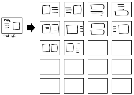
In some of our workshops we have people brainstorm different layouts. I keep it simple. Squiggly lines are text and boxes represent media. Then I create a bunch of boxes and play around with potential layouts as you can see in the example below.

Articulate Rapid E-Learning Blog - brainstorm some template ideas for your online training and rapid elearning courses

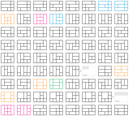
Dubberly Design Office has an interesting post where they show 892 unique ways to design a 4×3 screen. That’s a lot of screens and should give you some ideas. I usually just look for about 15-20 or so to get started. Too many choices make it hard to move forward.

Articulate Rapid E-Learning Blog - 892 layout ideas for a 4x3 screen

Create Common Screen Layouts

Now that you know what goes on the screen, the goal is to develop some layouts that you can use. In the exercise above you brainstormed a bunch of different layout ideas. Now you want to select a few for your starter template.

Create a number of layouts that you can quickly use in your screen design. Of course you can create as many layouts as you’d like, but the goal isn’t to create 5 million layouts. Instead it’s to create a number of common starter layouts to go with your starter template. You want enough variety to keep it interesting and flexible, but not so many that it’s a pain trying to work with them.

Articulate Rapid E-Learning Blog - create your layouts in PowerPoint or Articulate Storyline

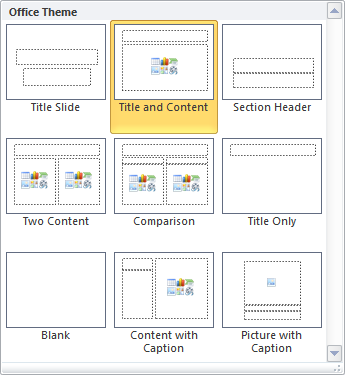
Once you’ve decided on the layouts, add them to your starter template. In PowerPoint and Storyline, you can add the layouts via the master slide template. That makes it really easy to select a starter slide and then apply a layout from one of the many prebuilt choices.

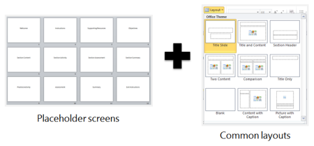
When you’re all done you should have a starter template with a number of content placeholder screens. And then within the template you have 20 or so good layouts that can be applied to any of the screens. That gives you a great place to start when building your rapid elearning courses.

Articulate Rapid E-Learning Blog - combine starter templates with pre-built layouts for simple elearning design

And again as a reminder, there is still no look applied to the screens. So the visual design of your course is still open-ended. But what you’ve done is make sure that you have considered most of the common screens required in a course and have set up a number of usable layouts.  This will speed up a lot of your production.

Which screen layouts do you like best?

Events

Free E-Learning Resources

Want to learn more? Check out these articles and free resources in the community.

Here’s a great job board for e-learning, instructional design, and training jobs

Participate in the weekly e-learning challenges to sharpen your skills

Get your free PowerPoint templates and free graphics & stock images.

Lots of cool e-learning examples to check out and find inspiration.

Getting Started? This e-learning 101 series and the free e-books will help.


Articulate Rapid E-Learning Blog - how to create your own graphics with free clip art

At a recent workshop I was showing someone how I make some of the graphics I use for the blog. As I was showing her an idea, she said that while she already knew the basic steps what she really found valuable was watching me do it and then explain why I did what I did.

I think she’s right. It is helpful to not only know how to do something, but to also know what the person’s thinking while doing it. So in today’s post, I’ll show you how I created some graphics for a few recent blog posts. You’ll learn some production tips and gain some perspective on the choices I make.

Modify Existing Clip Art to Get What You Need

I’m not the biggest fan of clip art because some of the images tend to look cheap and dated.  Another problem is that while there’s a lot of clip art to use, there’s not a lot of usable clip art.

While I’m not a fan of clip art, I am a fan of inexpensive assets that I can customize. And that’s where clip art wins the day. There are quite a few things you can do to make it work for your courses.

And the reality is that many elearning developers are limited to the free clip art images they get with Microsoft Office. So if that’s the constraint you work with, today’s post will give you some ideas on how to customize your existing clip art graphics.

Example 1: How to Customize Clip Art for E-Learning

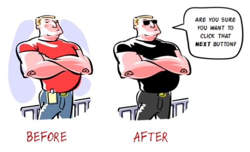
In the post titled, Sometimes It’s Good to Stop Your Learners Before They Get Started, I wanted an image of a locked gate. But I couldn’t quite find what I wanted so I decided on a bouncer image.

Articulate Rapid E-Learning Blog - before and after versions of customized free clip art

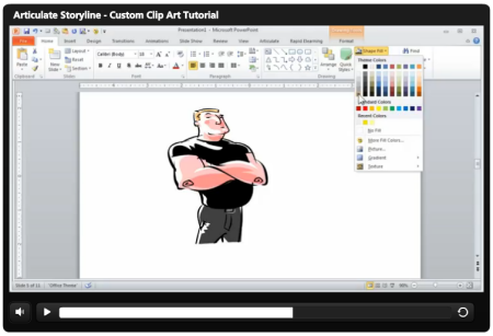
I liked the look of the art work I found, but I didn’t really want the background or the original clothes colors. I wanted something a bit more menacing. So I opted for a dark shirt and then added the glasses.

View the tutorial below to see how I modified the clip art and learn more about some of the decisions I made in the process.

Articulate Rapid E-Learning Blog - how to customize free clip art

Click here to view the tutorial.

Free assets:

Example 2: How to Customize Clip Art for E-Learning

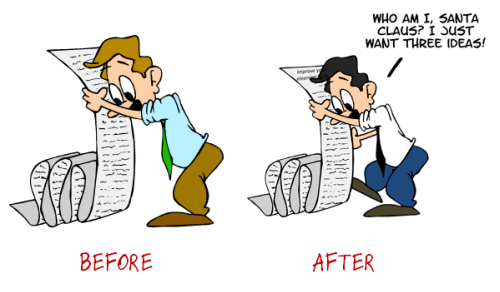
Here’s a slightly different type of modification. In the post titled, 3 Ways to Improve Your E-Learning Design Skills, I wanted an image of someone holding a list. The options were a little slim so I went with the image below.

Truth be told, I’m not really fond of this clip art style. But if it’s all I have then what can I do to make it work better for me?

Articulate Rapid E-Learning Blog - before and after versions of customized free clip art for elearning

I can’t fix the art style, but I can tone down the colors. I made his clothes color a bit more conservative—dark tie, light shirt, and darker pants. I also made his hair a bit darker. In this image it looks like he’s missing an arm and leg. So I added a bit of depth to the image by adding an arm and leg.

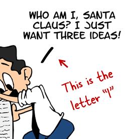
Now here’s a trade secret, you can’t share this with others. You’ll also notice that in lieu of a chat cloud I just went with a line that connects the text to the character. The font is kind of a cartoony font and a bit organic. So it doesn’t have straight lines. If I used a regular line for the callout, it wouldn’t look quite right because it would be too straight.

Articulate Rapid E-Learning Blog - how to create a callout

So to get the line I need, I used a letter “i” from the same font and increased the size a bit. Now I have an organic line that matches the style of the font.

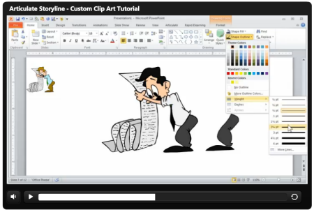
Here’s a tutorial that show how I modified the clip art and added the extra leg and arms.

Articulate Rapid E-Learning Blog - how to customize free clip art for online training

Click here to view the tutorial.

So there you have it—a few simple ways to create your own graphics using existing clip art images. This really comes in handy if all you have is clip art. You may not always like the starting image, but with a little practice you can virtually build any image you need.

To learn more about working with clip art, check out some of the tutorials below. One of my favorites is how to create an elearning template using a single clip art style.

Events

Free E-Learning Resources

Want to learn more? Check out these articles and free resources in the community.

Here’s a great job board for e-learning, instructional design, and training jobs

Participate in the weekly e-learning challenges to sharpen your skills

Get your free PowerPoint templates and free graphics & stock images.

Lots of cool e-learning examples to check out and find inspiration.

Getting Started? This e-learning 101 series and the free e-books will help.