The Rapid Elearning Blog

Archive for October, 2013


Articulate Rapid E-learning Blog - how to find free stock photos and clip art

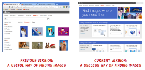
I was leading a PowerPoint workshop last week and noticed that Microsoft recently changed the way images are searched on their site. That impacted part of my workshop and some of my blog posts where I show how to find free clip art images online.

I’m sure you’ll run into similar issues if you haven’t already. For those who depend on the Microsoft site for free stock photos and illustrations, the recent change makes it challenging to find the right images.
Articulate Rapid E-learning Blog - searching online for free clip art and free stock images

Bookmark This Link to Get Free Stock Photos & Illustrations

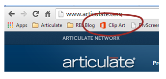
Following is a direct link to the site that allows you to search and find the free clip art and stock photos you need. Bookmark it because unless they change their site back, there’s no easy way to locate the same images which I show below.

Articulate Rapid E-learning Blog - bookmark the link to save time finding free stock images

Bookmark this link.

The link will take you to a search results page that will state “Sorry, no results found for…” That’s OK. This is just a blank search results page. From here you can access the image search by typing in the image you need.

In fairness to Microsoft, they do a make a lot of free stock photos and illustrations available to those who use their tools. And many of those can be found from inside the Microsoft Office applications. But the online search from their site is lacking and their solution with Bing doesn’t work to find only the free stock photos that are part of the office suite.

How to Find Free Stock Photos & Illustrations

If you search for clip art and pictures using the feature inside of PowerPoint (or the other Office applications) you’ll get a good list of images. But there are a few issues compared to the online search. Let me explain.

Fewer search results. The first issue is that it’s not an exhaustive list. You don’t get as many search results in the clip art box in PowerPoint as you do searching the same thing online. Make sure to bookmark this link to search online for free stock photos and illustrations.
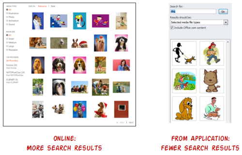
Articulate Rapid E-learning Blog - how to find the free stock images you need

Can’t search image properties. Online you can view the properties of the free clip art and free stock images. From there the search can be fine-tuned based on the keywords because they’re linked. You can’t do the same when viewing the keywords from inside of PowerPoint.
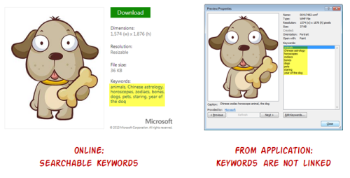
Articulate Rapid E-learning Blog - finding free stock images online is a easier

No way to find free images of the same style. A lot of clip art is related to a specific style. One of my favorite tips is to use the free clip art of the same style. This helps build a visually cohesive course. Online you can find images of the same style. That doesn’t work offline inside of PowerPoint because there’s no indication that the clip art or free stock photos are linked to a specific style.
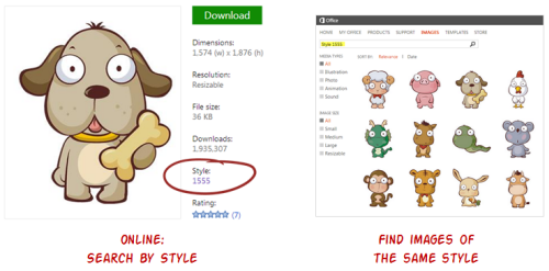
Articulate Rapid E-learning Blog - find free stock images and free clip art using the style search

No connection to similar images. A feature I really enjoy on the Microsoft site is searching similar images based on “visual style and shared key words.” This really comes in handy.
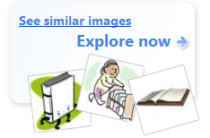
Articulate Rapid E-learning Blog - find similar free stock images

Many of the free stock photos or illustrations that Microsoft makes available aren’t catalogued by a specific style. However, when using the “see similar images” feature there are a lot of options from which to choose.
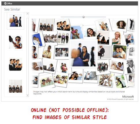
Articulate Rapid E-learning Blog - an easy way to find similar free stock images online

Do you use the free clip art and free stock images from Microsoft? If so, save this post and bookmark the link. Be sure to share it with your co-workers or anyone else you know who may be frustrated with the recent changes to the site. It’ll save them some time looking for free stock photos and illustrations.

Events

Free E-Learning Resources

Want to learn more? Check out these articles and free resources in the community.

Here’s a great job board for e-learning, instructional design, and training jobs

Participate in the weekly e-learning challenges to sharpen your skills

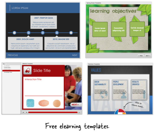
Get your free PowerPoint templates and free graphics & stock images.

Lots of cool e-learning examples to check out and find inspiration.

Getting Started? This e-learning 101 series and the free e-books will help.


Articulate Rapid E-learning Blog - challenge to build better elearning and online training

A lot of teaching and elearning focuses on sharing information and pushing it out. Sure, that’s part of what’s required. But learning is more than acquisition of information. Learning involves processing the information and applying it. Then seeing what happens and making adjustments.

So when building your online courses, consider how the learner can apply what’s being shared. But let’s shift the focus to our own development. What do we do to develop our own skills? How do we learn new things?

Today I’d like to offer a simple way to help you improve your skills.

A Simple Way to Develop Your Skills

For the past few weeks, David’s been running small challenge activities to help people practice their skills. We try to keep the challenges simple and short enough so that they’re something you can do without a big time commitment.

The objective of the challenge isn’t to build the fanciest demo or module. Although, it is a great way to show off your skills. Instead the goal is to learn new techniques and practice using the tools. It’s also a way to inspire ideas and help others think through their own projects.

Here are a couple of things I learned from the recent challenges:

  • Diverse ideas expand our horizons. Three different people will come up with three different ideas even if they’re looking at the same thing. It’s a reminder that there’s not only one way to do things. It also shows the benefit of getting different perspectives. That’s why the elearning community is such a value especially if you work by yourself and don’t get a lot of feedback.
  • Production tips abound. I can’t list them all, but many of the demos had me open up Storyline to see if I could replicate the effect. I was an engaged learner as practiced some new techniques and played around with my own ideas. This interactive squares demo is one example that got me thinking.

Below are a few examples from a couple of recent challenges. One was on how to create some comparisons between images. And the other was on creating a tabs interaction.

E-Learning Challenge: Show Meaningful Comparisons

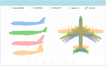
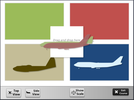
The objective of this challenge was to compare one object to another. David used this airplane graphic from Wikipedia as the starting asset. Here are some of the submissions from the community:

Articulate Rapid E-learning Blog - example of a weekly elearning challenge

Click here to view the elearning example.

  • Montse Posner Anderson showed a nice clean design which makes it easy to distinguish the differences when doing the comparison. The top and side views are on a single screen.

Articulate Rapid E-learning Blog - example of a weekly elearning challenge

Click here to view the elearning example.

  • Blair Parkin’s example lets me isolate the planes and then I can compare one to another or multiples. And at any point I can clear the screen to start over.

Articulate Rapid E-learning Blog - example of a weekly elearning challenge

Click here to view the elearning example.

  • Tricia Ransom has a slightly different take. In her example, you drag and drop the planes to compare them. People like dragging interactions so the novelty can pull them into the module better than the standard click.

What I love about these demos is that each is a bit different. It shows that there’s not a single approach for most problems. Can you imagine the results if they teamed together and had more time?

E-Learning Challenge: Create a Tabs Interaction

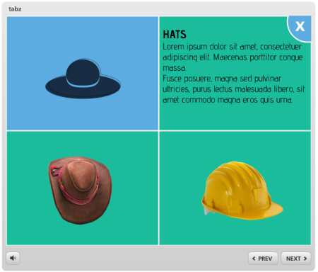
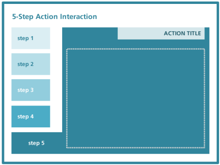
In a recent post I shared a number of free PowerPoint elearning templates to download. They were different types of tabs interactions which are common to many online training courses.

David used that post as inspiration to practice building your own tabs interaction. Below are some of the demos. You can click here for more details on the weekly elearning challenge.

Articulate Rapid E-learning Blog - example of a weekly online training challenge

Click here to view the elearning example.

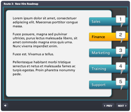
  • Heather Steckley offers up a right-side tabs interaction built for a new hire road map.

Articulate Rapid E-learning Blog - example of a weekly online training challenge

Click here to view the elearning example.

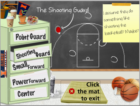
  • Tricia Ransom went for a less orthodox tabs interaction. In her example, the tabs are on a file cabinet and the drawers open when clicked.

Articulate Rapid E-learning Blog - example of a weekly online training challenge

Click here to view the elearning example.

Articulate Rapid E-learning Blog - example of a weekly online training challenge

Click here to view the elearning example.

  • Kevin Thorn cleaned out one of his recent client projects and then made his tabs interaction available as a download, too.

Articulate Rapid E-learning Blog - example of a weekly online training challenge

Click here to view the elearning example.

  • Montse Posner Anderson opted to decapitate the office team and put their heads on the tabs. Salome and Henry would be proud. This is a good reminder that tabs don’t always need to be text-based.

Articulate Rapid E-learning Blog - example of a weekly online training challenge

Click here to view the elearning example.

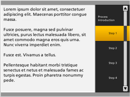
  • Heather Steckley shows another variation of the side-tabs interaction. Her demo has to examples. I love the faux scrollbar look. Very clever.

Articulate Rapid E-learning Blog - example of a weekly online training challenge

Click here to view the elearning example.

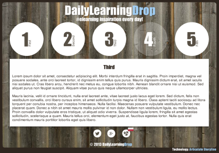
  • Andrej Rudnik uses circles as tabs (we can be a bit loose on these demos). I like the transparent circles with the sliding pages. Pretty cool design.

Articulate Rapid E-learning Blog - example of a weekly online training challenge

Click here to view the elearning example.

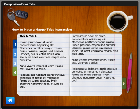
  • Jenise Cook leveraged some of the free downloads in the community to create her overhead desktop tabbed notebook. She also shares her template for you to use.

I love seeing what other people create and how they do it. I also find that when I review these demos they prompt my own ideas on how I’d approach the same thing. Sometimes it’s easier to learn when deconstructing someone else’s work than it is to start your own.

Like any profession, building expertise requires practice. These weekly challenges are a great way to connect with the elearning community and a great way to practice building your skills.

Are you ready to take up the challenge?

If you want to learn to build better courses, connect with the elearning community, or practice using your authoring tools, then take up the challenge. It’s not too late.

These challenges are fun and simple enough to do. And you don’t need to worry about things being perfect. They’re just quick hit prototypes.

This week’s challenge is creating an elearning template based on a single clip art style.

Events

Free E-Learning Resources

Want to learn more? Check out these articles and free resources in the community.

Here’s a great job board for e-learning, instructional design, and training jobs

Participate in the weekly e-learning challenges to sharpen your skills

Get your free PowerPoint templates and free graphics & stock images.

Lots of cool e-learning examples to check out and find inspiration.

Getting Started? This e-learning 101 series and the free e-books will help.


Articulate Rapid E-Learning Blog - build your elearning skills

Many elearning developers are challenged because they work with a lack of resources, formal education, and experience. In a recent post I asked whether or not one needed an instructional design degree. That prompted some really good discussion.

While pursuing a formal education is great, it does take time and money. So what can you do to build skills today? Here are a few tips to nudge you forward.

Let Others Inspire Your E-Learning Skills

If you’ve been reading this blog for a while, then you know that I routinely stress the need to find inspiration from others. This helps you glean design ideas and production tips. Once you have them it’s a matter of practicing and applying them to your own projects.

We recently released Articulate Studio’13. One of the things I like when we do a product launch is that some people from the community share quick examples using the tools. The examples are a great source of inspiration for those just getting started.

Below are three of the examples. They’re not full-fledged courses but they give you some ideas of what you can do with the rapid elearning tools you use.

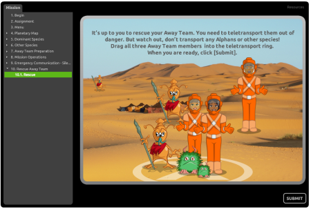
E-Learning Example: Space Training Mission

Articulate Rapid E-Learning Blog - elearning example of a PowerPoint-based course

Click here to view the elearning example.

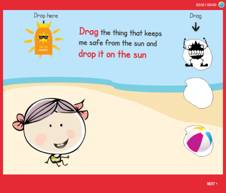
E-Learning Example: Kids Sun Safety Game

Articulate Rapid E-Learning Blog - online training sample of a PowerPoint-based course

Click here to view the elearning example.

E-Learning Example: Journey as a Sea Turtle

Articulate Rapid E-Learning Blog - elearning sample of a PowerPoint-based course

Click here to view the elearning example.

Coming from the perspective of inspiration, here are some tips I pulled from their demos:

  • Avoid the Frankencourse. Rapid authoring tools are powerful because they remove a lot of the programming requirements. But because they often use media created from multiple applications the courses tend to get that disjointed Frankencourse look. In the examples above, most combine PowerPoint slides with inserted quizzes, interactions, and a Replay video. But it’s not easy to see where one starts and the other stops. Part of it is the new integrated player in Studio ‘13, but most comes from the course designers who found a way to make all the tools work together. Regardless of the tools you use, focus on creating an integrated look.
  • PowerPoint is still powerful. There are plenty of critics of PowerPoint and rapid elearning. But they’re mostly wrong. As you can see in the examples above, with some creativity you can do quite a bit and produce great results. Essentially PowerPoint is a blank screen. What you put on the screen determine how it looks.
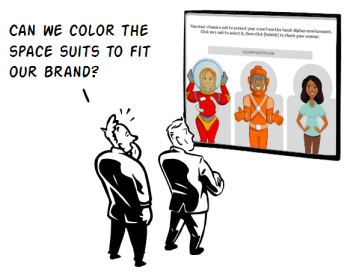
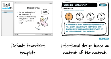
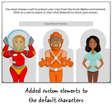
  • Don’t stick with the defaults. By default you get a standard player with a sidebar menu. But you don’t need to stick with the defaults. You’ll notice each demo had a custom look. That means they ditched the default PowerPoint templates, the default blocky quizzes, and the default player settings. The same can be said for how the vector characters are used. I really like the way Prometheus added the space suits to the characters and integrated them into the course. That gives the characters context and makes them more meaningful to the content.

Articulate Rapid E-Learning Blog - avoid the default settings in PowerPoint

Articulate Rapid E-Learning Blog - create customizations in your PowerPoint course

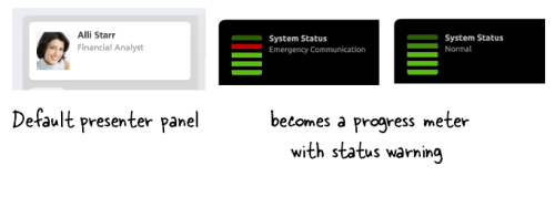
  • Out of the box thinking. One thing that stood out to me was the way the space training demo used the presenter panel. It’s designed to display the course presenters. But they used it as a way to show progress in the course. Instead of inserting presenter images and names, they inserted the “System Status” and level. Pretty clever. This is the type of stuff you’ll only learn from other users and a good reason why connecting with other users is important.

Articulate Rapid E-Learning Blog - custom presenter panel in PowerPoint course

Be an Active Voice to Develop Your E-Learning Skills

Communities of practice are built on the foundation of sharing and learning from each other. When people ask how they can learn more about elearning one of my first responses is to be active in the community. Ask questions when you need to learn. But also commit to sharing what you know.

Articulate Rapid E-Learning Blog - free templates for elearning and PowerPoint-based course

Tim Slade is a great example. He’s an active community member who regularly shares what he knows. And it’s in that sharing he’s grown quite a bit in his own skills. Here are a few examples of how he’s involved in the community and how it’s helping him develop his elearning skills:

  • Be present. Tim is an active presence in the community, helping people. A lot of people find being active a chore. But if you want to stay connected and learn, then being part of the community is important.
  • Share what you know. Tim shares free elearning templates which you can find here, here, here, and here. As he shares in this forum post: they’re simple to build and a great way to practice your skills. By sharing these templates and helping in the community, Tim is building his reputation and authority.
  • Write a blog. A great way to learn is to commit your thoughts to paper. Don’t worry about writing a blog to get subscribers. Instead write a blog to capture your learning. In turn you’ll share your expertise and help others. I like the way Tim’s blog has evolved from when he first started to where he’s even doing product reviews. He can do that because people trust him. He’s developed his credentials in the community by showing a commitment to their needs. How do you think this helps his professional prospects going forward?

Tracy Parish is another good example of someone who is active in the community and regularly captures her thoughts to make her learning journey public. Even Prometheus has gotten into the act. They’ve started a series showing how they built their Space Training Demo.

You don’t need a polished blog like Tim’s and you don’t need to build free templates to develop your skills. The main point is to be connected to the community and share what you know with others. Many of the other elearning developers are in the same boat—working under sever time constraints with limited resources. So any help and advice is appreciated.

Finding inspiring ideas and applying them to your own courses will help you build better elearning courses. But better yet, be active in the community. You’ll grow in your skills and build a network of peers.

What do you do to practice and develop your skills?

Events

Free E-Learning Resources

Want to learn more? Check out these articles and free resources in the community.

Here’s a great job board for e-learning, instructional design, and training jobs

Participate in the weekly e-learning challenges to sharpen your skills

Get your free PowerPoint templates and free graphics & stock images.

Lots of cool e-learning examples to check out and find inspiration.

Getting Started? This e-learning 101 series and the free e-books will help.


Articulate Rapid E-Learning Blog - 100 free callouts

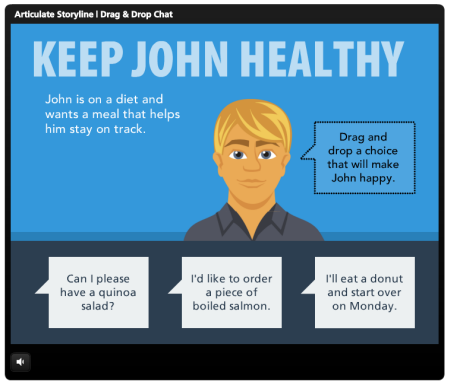
If you build online training courses then odds are you’ll need some text callouts. In a previous post, I shared 45 free hand-drawn callouts. They’re great to use in your elearning courses, especially for interactive scenarios as in the simple example below.

Articulate Rapid E-Learning Blog - example of interactive callouts

Click here to view demo.

Someone emailed me the other day looking for some of the free callouts in the community so I thought I may as well create a single post with links to all of the free callouts currently available in the community.

100 Free Callouts & Text Bubbles

Below are links to the free callouts. You’re free to use them as you wish.

Hopefully you’ll find some use for the free assets.

Here’s a question. What do you call these? Sometimes I call them speech or text bubbles. Some people call them chat clouds. What do you call them?

Events

Free E-Learning Resources

Want to learn more? Check out these articles and free resources in the community.

Here’s a great job board for e-learning, instructional design, and training jobs

Participate in the weekly e-learning challenges to sharpen your skills

Get your free PowerPoint templates and free graphics & stock images.

Lots of cool e-learning examples to check out and find inspiration.

Getting Started? This e-learning 101 series and the free e-books will help.


Articulate Rapid E-Learning Blog - how to build effective online training

Many organizations are starting to really ramp up their online training programs. And that creates a lot of conversation about online training and what makes it effective.

In a previous post we looked at whether or not you’re building the right type of elearning. Today, I’d like to expand on it.

Where’s the Learning in Online Training?

We have a definition problem. Not everything we call “elearning” is about learning. We buy an “elearning” application to build our “courses” so we end up calling everything an elearning course. But the reality is that the elearning applications let us build interactive multimedia content that may or may not have the objective of learning.

For example, many of the courses I’ve had to build in the past were more about concepts and information. The information was important, but it wasn’t tied to an immediate or specific performance expectation. In that sense, the course I built was really more like a multimedia ebook than a course intended to train somebody.

On the other hand, I’ve also built courses that had very specific performance requirements. Those involved crafting real-world experiences and helping the learners make decisions similar to what was expected in the real world.

In both instances, we called it elearning. But the reality is that they weren’t the same. One was more like e-marketing or e-information and the other e-performance.

My remedy is to break the types of “courses” or multimedia content into one of two buckets. To me, the course is either content to support performance or it exists to change performance.

Performance Support:  These are mostly information courses that support performance requirements.

For example, the organization has an online training program that trains new managers on the organization’s bonus plan.

A performance support course goes over the specifics of the bonus plan. But it doesn’t really ask the learner to do much more than acquire the information. There may be a simple quiz at the end, but that doesn’t really measure much more than general knowledge. It doesn’t effectively measure the person’s understanding. That’s OK because in this type of course is more about sharing information than changing performance.

Many compliance courses and those created by subject matter experts fall into the performance support bucket. The information is important to the learning process, but it’s not always tied to actionable performance.

Performance. A performance course is actionable and asks the learner to assess a specific situation and make decisions that mirror the decisions required in the real world. This forces a consequence and the means to provide relevant feedback.

In the case of the bonus training program, a scenario where a manager has to assess the employees and determine who’s qualified for a bonus makes more sense than a bunch of information about the bonus program.

Understanding the type of course you build helps you determine whether it’s effective or not.

Online Training: Effective Performance Support

Performance support is mostly about the information and appropriate content. Here are some ways to determine its effectiveness:

  • The right content at the right time. I was in a store once and asked the sales person a question. He pulled out a tablet, looked over some material, and offered an answer. In that sense, he didn’t need to take a product training class to meet my needs. He just needed a means to get the information at the point he required it.
  • Able to easily find and access the content. A lot of online training is mostly existing content repackaged so it’s easier to find or understand. In that sense, performance support is about providing context to existing content and then bundling it to it’s easy to locate and use.
  • Efficient creation & distribution of the content. Even simple courses used to cost a lot to produce. That’s no longer the case. So the effectiveness of a performance support course could be evaluated by the cost to create and distribute the content compared to how it used to be done. Going from classroom to online training is one example.

Online Training: Effective Performance

Performance-based courses are designed to change performance or behaviors. The ultimate measure of effectiveness is how well the performance goals are met.

  • Content relevant to the user’s experience. You can impact performance when courses are meaningful and relevant to the learner’s needs.  
  • Mimics real-world decision-making and consequences. If you’re trying to get someone to do something a certain way, then you should design the learning experience to mimic what it is you desire.
  • Measurable impact. If the customer says they need to create a course to improve sales, and it was determined that the course is the means to accomplish it, then increased sales is your sign of effectiveness. If you didn’t increase sales, you didn’t meet your goals no matter how good the course appeared to be.

If you’re focused on changing behaviors, then a course that helps a person change behaviors makes sense. It’ll complement the expectations required in the real world. In that way, the course is effective if you can measure changed behavior.

On the other hand, if the course is merely a means to bring attention to some information, then the effectiveness is better measured at cost and time effectiveness coupled with access and use by the learners.

What are your thoughts?

Events

Free E-Learning Resources

Want to learn more? Check out these articles and free resources in the community.

Here’s a great job board for e-learning, instructional design, and training jobs

Participate in the weekly e-learning challenges to sharpen your skills

Get your free PowerPoint templates and free graphics & stock images.

Lots of cool e-learning examples to check out and find inspiration.

Getting Started? This e-learning 101 series and the free e-books will help.