The Rapid Elearning Blog

Archive for January, 2014


Articulate Rapid E-Learning Blog - how to build a drag and drop interaction

A few years ago building a drag & drop interaction required some programming skills. Because of this, those who didn’t have programming skills often didn’t include drag & drop interactions as an option in their course design.

That’s no longer the case because building a drag & drop interaction is relatively easy. In fact, building an interaction with today’s software can take less than a few minutes; so the focus now is on how to use them and not whether or not you can build one.

Click here to view the tutorial.

Since building them is so easy there’s no reason why they shouldn’t be part of your interaction tool chest. But if you’ve never built a drag & drop interaction there are a few basic things to know.

Do You Need a Drop Target?

Generally there’s a reason why the person is required to drag an object on the screen. In most cases a decision is required which forces the learner to select an object and then drag it to a specific location. We call the location the drop target.

So when building your first interaction:

  • Understand what decision needs to be made
  • Which objects can be dragged
  • Where are the objects dropped

Common Types of Drag & Drop Interactions

There are a many creative ways to use drag & drop interactions. However here are the most common types:

  • One to one: a single drag object goes to a single drop target
  • One to many: a single drag object can be correctly dropped on multiple drop targets
  • Many to one: multiple drag objects go into a single drop target

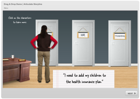
Here is a simple example that shows those three common drag & drop interactions:

Articulate Rapid E-Learning Blog - drag and drop interaction

Click here to view the elearning example.

Distractions Are Good

Ideally the elearning course and its interactions are aligned with the types of real world decisions the person faces. Often the challenge in making good decisions means we’re faced with alternatives (some viable and some not so good). These alternatives can distract us from the best decisions.

When building drag & drop interactions it’s good to add in a few distractors. They can be used to provoke common misunderstandings or some of the nuances of the required decision-making.

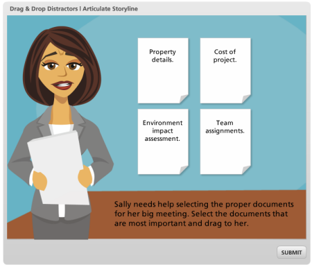
Articulate Rapid E-Learning Blog - example of a drag and drop interaction

Click here to view the drag & drop demo.

Above is an example where more than the correct answer choices can be selected and dragged. By making more than just correct choices available the learner has to demonstrate a deeper understanding of the content and the decisions required.

I’ve seen many drag & drop interactions where only the correct options can be dragged. That makes it easier to guess through the decision. Distractors help remove some of the guessing.

There’s a lot more to crafting good drag & drop interactions. But the above tips are a good starting point.

Do you use drag & drop interactions in your courses? If so, what types?

Events

Free E-Learning Resources

Want to learn more? Check out these articles and free resources in the community.

Here’s a great job board for e-learning, instructional design, and training jobs

Participate in the weekly e-learning challenges to sharpen your skills

Get your free PowerPoint templates and free graphics & stock images.

Lots of cool e-learning examples to check out and find inspiration.

Getting Started? This e-learning 101 series and the free e-books will help.


Articulate  Rapid E-Learning Blog - elearning design branding your course

I probably review at least two hundred elearning courses each year. Most of them are designed by people just getting started so they then to look for feedback that can cover a broad range of topics.

Many of the courses I review have common design issues. Often it’s those little issues that make the difference between a course that looks like it’s built by a beginner and one that’s a bit more polished.

In a previous post I highlighted three common design issues and offered tips to fix them. Today’s tips are based on some things I see quite a bit related to the branding of courses.  

Draw attention to the subject of the course and not the brand.

While I don’t necessarily agree with all of the branding that happens in many online training courses, I understand why organizations do it. However, often the branding goes beyond common sense.

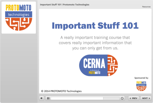
Articulate  Rapid E-Learning Blog - logo in course design

Look at the example above, how many times do you need to see the organization’s name or logo? It’s in the title, the logo panel, and on the screen at least three times.

What’s the point of this? Does all of this branding even do anything positive? I can’t imagine that it actually makes people feel better about taking courses or being part of the organization. What’s next, a company tattoo?

With all that said, the copyright is a good idea. Don’t want anyone to steal that design.

Limit branding to a single screen.

If you have to add the branded items to your course then try to limit when you do so. A few simple ideas may be to make the logos smaller or watermark them so they’re less obvious.

Something I’ve done in the past is create an animated splash screen that I can add to the beginning or end of a course. It’s a bit more elegant and consistent with the brand requirements, but it doesn’t interfere with the course content. By moving the branded elements off your content screens you’ll have more room for the important stuff.

Brand the player instead of the screen.

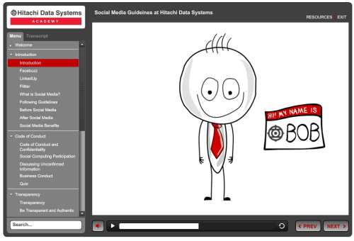
If you need to add branding to your course, then do it where it makes sense. Most authoring tools have a place for you to add a logo and you can also add brand colors to the template and player.

Articulate  Rapid E-Learning Blog - elearning example

Click here to view the elearning example.

In the example above, a course on social media guidelines, Hitachi customized the template (and course colors) to match the branding in the logo. This helps meet the organization’s guidelines and still gives more control over the content on the screen.

Get rid of production credits.

I’m sure this will upset some people, but one thing I can’t stand about going to a kid’s play is that the play may only be 45 minutes long, but then after they spend another 30 minutes thanking everyone who helped out. That’s all good and I truly appreciate those who volunteered, but come on! No one came to the play for the credits. Do all of the back patting at a cast party.

Articulate  Rapid E-Learning Blog - lots of branded screens

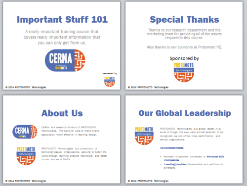
The same can be said for elearning courses. Seems like I’m seeing more and more courses that begin with a series of screens like the ones above that are more like commercials and production credits. They have little to do with the course content so it’s probably a good idea to drop them.

If you do need to add all of that information, then take it off of the course screen. A simple solution is to create an “About Me” tab to hold all of that type of information. It’s in the course for those who want it, but it’s not part of the content flow.

Also, here’s a bonus tip. If you create a live action video don’t use the outtakes to create a gag reel. Unless you’re a master comedian like Emo Philips odds are the gag reel isn’t as funny as you think it is.

Make good use of your screen space.

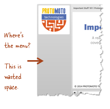
You don’t need to use all of the features in the player template that comes with your software. Here’s an example: many elearning templates offer a side menu. However, that feature can be turned off if it’s not needed.

In the example below, the only reason the side menu area exists is because the developer inserted the branded logo. Other than that, all of the space below the logo is wasted. It’s also confusing. If the learner is used to a side menu and then sees this example, she may think that something’s broken.

Articulate  Rapid E-Learning Blog - side menu and logo panel

If you’re not using the side menu, a more elegant solution may be to get rid of the logo panel. This gives you a different course profile that doesn’t have a big empty area.

Like it or not, branding requirements exist. The key is to work them into your course design so meeting them makes sense. What do you do to deal with branding requirements that may interfere with your course design?

Events

Free E-Learning Resources

Want to learn more? Check out these articles and free resources in the community.

Here’s a great job board for e-learning, instructional design, and training jobs

Participate in the weekly e-learning challenges to sharpen your skills

Get your free PowerPoint templates and free graphics & stock images.

Lots of cool e-learning examples to check out and find inspiration.

Getting Started? This e-learning 101 series and the free e-books will help.


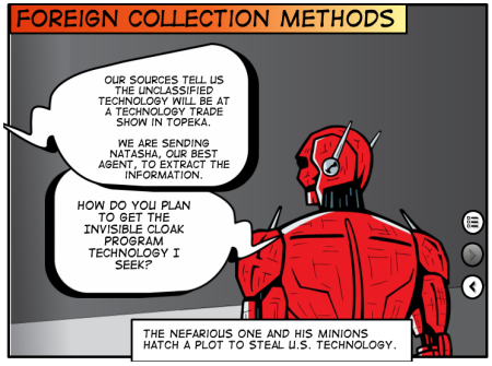
Articulate Rapid E-Learning Blog - comic book elearning examples

At a recent workshop someone asked how to get better at designing elearning courses. My first response is to practice building courses. Which prompted the follow up question: “What should I practice?”

One way to practice is by becoming fluent with the tools you use and learning new techniques. A few weeks ago, David put out the challenge to create a comic book inspired design. These challenges help you learn the tools and think through different design ideas.

What I Like About Comic Book Designs

I’ve written about comic book designs in the past and showed a simple way to create a comic book template.

Articulate Rapid E-Learning Blog - comic book elearning examples templates

What I find most valuable about this type of design is that it forces the content to be restructured. You focus more on story. These courses also look different and that in itself can be engaging.

Comic Book E-Learning Examples

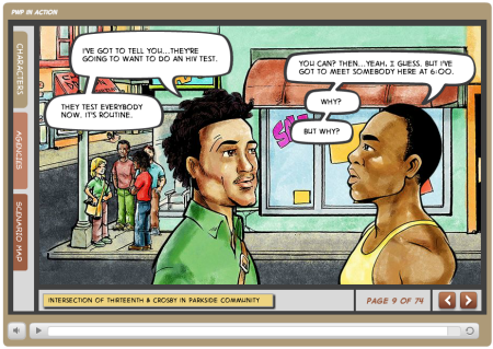
Prevention with Positives in Action by HIV PWP

Articulate Rapid E-Learning Blog - comic book elearning examples HIV sample

Click here to view the elearning example.

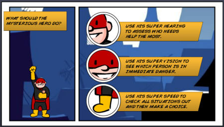
Here are some of the elearning examples from the weekly challenge. Keep in mind they’re not intended to be complete courses. The idea of the weekly challenge is to practice something new or different, so a lot of them are quick mock ups.

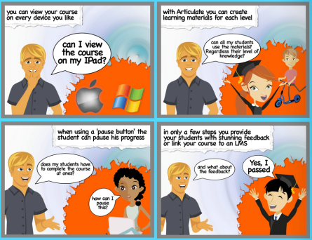
Jeff Kortenbosch shared a neat example. What I like about his example is that it shows you can create quite a bit with PowerPoint. And you may even recognize some of the clip art.

Articulate Rapid E-Learning Blog - comic book elearning examples using PowerPoint sample

Click here to view the elearning example

Paul Alders built a series of panels that zoom in and out. He explains his demo here.

Articulate Rapid E-Learning Blog - comic book elearning examples zooming sample

Click here to view the elearning example

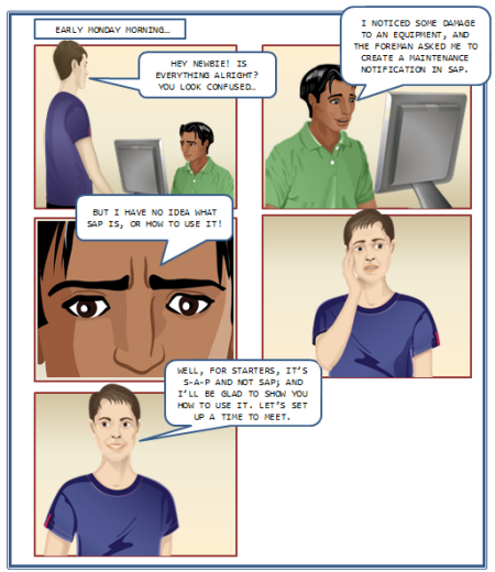
Lawrence Williams shows off a comic style course. I like the idea of clicking on the panels to navigation.

Articulate Rapid E-Learning Blog - comic book elearning examples click navigation sample

Click here to view the elearning example.

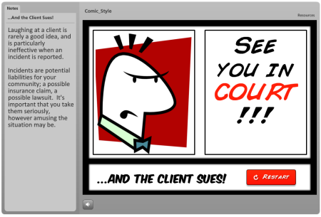
Nancy Woinoski shares a comic style course that was actually the first project she built in Storyline.

Articulate Rapid E-Learning Blog - comic book elearning examples Storyline sample

Click here to view the elearning example.

Examples of Comic Book Templates & Layouts

Yewande Daniel-Ayoade shared a storyboard that she created. I also like the forum conversation and some suggestions from others in the community.

Articulate Rapid E-Learning Blog - comic book elearning examples storyboard sample

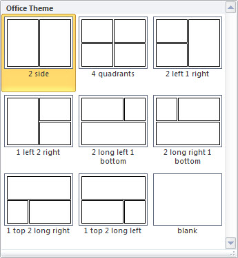
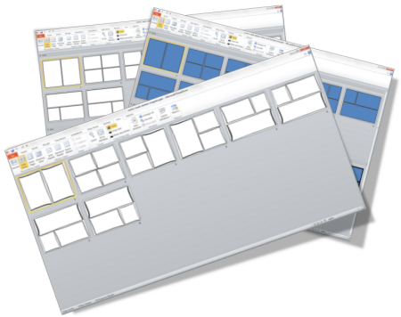
Ana Lucia Barguil shared some template layouts to help with the comic design. You can download the free template here.

Articulate Rapid E-Learning Blog - comic book elearning examples free template


Cary Glenn also shared a Manga style layout to use with your comic courses. He also provided a demo example so you can see how it looks with content in the layouts. You can download the files here.

If you’re stuck with click-and-read courses (or you want ideas to make them more engaging) then a comic book approach like this may come in handy. If so, these elearning examples should inspire some ideas.

*Comic-Con image via Kevin Dooley

Events

Free E-Learning Resources

Want to learn more? Check out these articles and free resources in the community.

Here’s a great job board for e-learning, instructional design, and training jobs

Participate in the weekly e-learning challenges to sharpen your skills

Get your free PowerPoint templates and free graphics & stock images.

Lots of cool e-learning examples to check out and find inspiration.

Getting Started? This e-learning 101 series and the free e-books will help.


Articulate Rapid E-Learning Blog - free templates

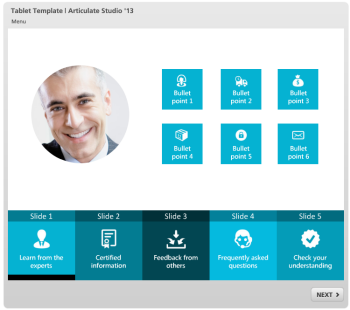
Here’s a recap of posts from 2013 where I shared free templates or assets to help you build your online training courses.

Do You Need an Instructional Design Degree?

This is probably one of the hottest questions of the past year. It comes up quite a bit and creates a lot of good conversation—both pro and con. If you haven’t weighed in with your opinion, it’s not too late.

PowerPoint Tips & Tricks

Many elearning courses are dependent on PowerPoint. The more you know about it, the better you’ll be at designing good courses. The tips below help you learn more about using the features so that you become more fluent with PowerPoint.

Articulate Rapid E-Learning Blog - free PowerPoint tips and tricks

Free Templates for E-Learning

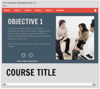
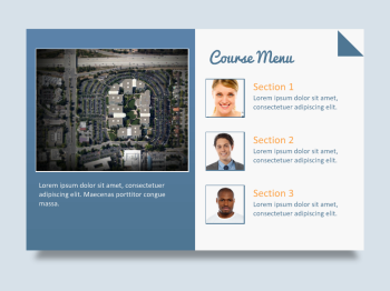
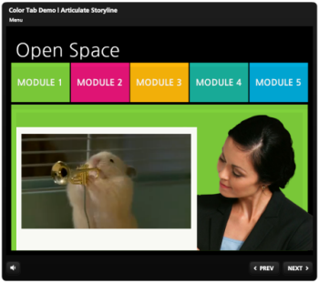
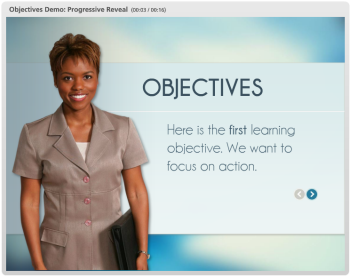
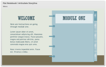
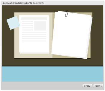
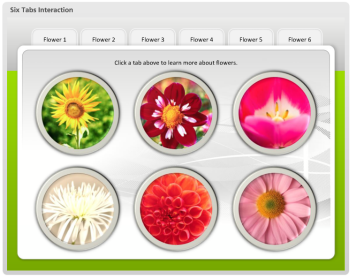
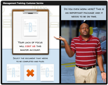
Templates are a great way to get started or transition existing content for online training. Here are a few to speed things up for your next course.

Articulate Rapid E-Learning Blog - free elearning template 1

Articulate Rapid E-Learning Blog - free elearning template 2

Articulate Rapid E-Learning Blog - free elearning template 3

Articulate Rapid E-Learning Blog - free elearning template 4

Articulate Rapid E-Learning Blog - free elearning template 5

Articulate Rapid E-Learning Blog - free elearning template 6

Articulate Rapid E-Learning Blog - free elearning template 7

Articulate Rapid E-Learning Blog - free elearning template 8

Articulate Rapid E-Learning Blog - free elearning template 9

Free Graphics & Media Assets for E-Learning Design

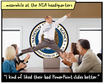
Articulate Rapid E-Learning Blog - compliance training meets Sharknado

Events

Free E-Learning Resources

Want to learn more? Check out these articles and free resources in the community.

Here’s a great job board for e-learning, instructional design, and training jobs

Participate in the weekly e-learning challenges to sharpen your skills

Get your free PowerPoint templates and free graphics & stock images.

Lots of cool e-learning examples to check out and find inspiration.

Getting Started? This e-learning 101 series and the free e-books will help.