The Rapid Elearning Blog

Archive for April, 2014


Articulate Rapid E-Learning Blog - Engaging e-learning courses can start with a case study

A few years back I worked for an organization that suffered through a number of workplace deaths. The company was fully committed to a safe work environment and already had sufficient training. However, they were concerned that people weren’t serious about the safety procedures which was the cause of the deaths.

So they put together some case studies where they told the story of how each death happened and how they could have been prevented. In all of the cases, the people disregarded the safety training and one person actually died right after giving a safety briefing and then ignored the precautions he just discussed.

To this day, I can recall many of the details and solutions that could have prevented the deaths because the way the cases were presented (and of course the emotional impact).

Here’s the point. Instead of building big interactive elearning courses to address the issue they created a series of case studies that were meaningful and real. Sometimes you don’t have time to build a big course. But at the same time you don’t want to get stuck with the typical click-and-read course. In those cases a case study is a great way to move past the information dump and create a meaningful course.

Engaging E-Learning Courses Are Relevant

A lot of elearning consists of mostly linear click-and-read courses. Those courses are fine for sharing information, but often they’re not very engaging or memorable. In fact, one of the things I’m asked most is how to get past the click-and-read course and make something more engaging.

My first rule of thumb is to make sure it’s relevant to the end user. If it’s not relevant, odds are you’ll resort to gimmicks to make it seem engaging.

For example, you may want to gamify it or build an interactive branched scenario. Those are all effective considerations when used appropriately. However those types of courses can also be frustrating if they are irrelevant and meaningless to the person taking the course.

So if you want to make engaging courses, first make sure that the content is relevant to the end user.

Engaging E-Learning Courses as Case Studies Take Less Time to Build

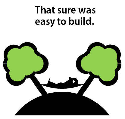
As we discussed earlier in the post on how to avoid boring courses one of the reasons why there are so many linear elearning courses is because they’re easy to build. With limited time, it’s a challenge to build an interactive and engaging course. It’s a lot easier to pull some information together and then publish it as a “course.”

But the reality is that those types of courses are more like electronic documents than they are courses. And that’s what we get—well documented (but less than engaging) elearning courses.

The good thing is that there’s a happy middle point—a way to transform the linear information dump into something more engaging without the time commitment to build a fully interactive course.

Engaging E-Learning Courses Can Start as a Case Study

If you don’t have time for a fully interactive course, and you don’t want to build an information dump, do the next best thing—transform your content from information dump into a meaningful case study.

Cases studies are still mostly linear (although you can make them interactive) but the content is framed in a way that provides context and meaning. Because of this, they get past the information dumping that plagues many courses.

A few considerations:

  • Find the relevant perspective. Courses don’t exist in a vacuum. Most compliance courses have some connection to the person’s day-to-day function. Find out what that is and then frame the content around that connection. A good place to learn more is by interviewing those who take the courses. Ask them when the information is important.
  • A case study is like a story. There are a lot of ways to tell a story. You can go from A to B to C. Or you can present it from a unique angle. The key is to tell a good story that is contextual to the person’s need. A common approach is the “day in the life of _____.”
  • Keep it simple. Don’t provide details that aren’t required. Not only does that take extra thinking to create but it could cause you to go on confusing tangents. Also, we’re not always the best story tellers so the simpler the better.
  • Flip the perspective. Tell the story from the perspective of the customer or someone other than the learner. Instead of telling the learner what they need to know. Show them how not knowing affects others.

If you’re stuck in a place where all you get to build is linear courses, on the next one try a case study. Pull your content into a story that is engaging and relevant to the end user.

A case study is still mostly linear, but I see it as a first step in an iterative process. It helps you move away from linear, click-and-read content to engaging and memorable content. The interactivity can happen later when you get more time, oversight, and technical skill. But in the mean time you are learning to reframe the information dump.

Have you used a case study approach to your courses? What’s worked for you?

Events

Free E-Learning Resources

Want to learn more? Check out these articles and free resources in the community.

Here’s a great job board for e-learning, instructional design, and training jobs

Participate in the weekly e-learning challenges to sharpen your skills

Get your free PowerPoint templates and free graphics & stock images.

Lots of cool e-learning examples to check out and find inspiration.

Getting Started? This e-learning 101 series and the free e-books will help.


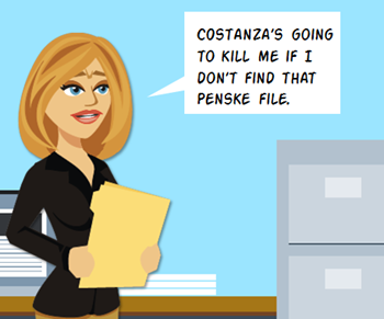
Articulate Rapid E-Learning Blog - Seinfeld's George Castanza needs the missing Penske file

An essential ingredient for interactive and engaging elearning is to let the learner explore and collect information that assists in making decisions. A common design concept to facilitate exploration of content is the interactive desktop where the learner can select desktop objects to collect information.

Today I am offering a free elearning template designed that can be used to craft an interactive experience.

Design Ideas for the Free E-Learning Template

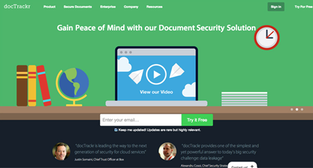
Here’s a flat desktop design I found a while back. It’s from the docTrackr site. I like the clean and simple design. It looks good and it’s really easy to build for someone with minimal design skills. They’ve changed their site since then but fortunately I kept a screen grab in my inspiration and ideas folder.

Articulate Rapid E-Learning Blog - free elearning template based on a flat desktop design

When I find a design I like, the first thing I do is try to replicate it. And then I try to add my own spin. This lets me learn to use the tools I have better and to think through the design structure and construction of the design elements.

Examples of the Free E-Learning Templates

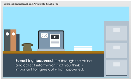
As I mentioned above, the desktop illustration is a great way to present content collection. So I took the desktop idea and then made it interactive. Below are some examples of the templates in action.

The first one is made in PowerPoint and the second in Articulate Storyline.

Articulate Rapid E-Learning Blog - free elearning template built in PowerPoint

Click here to view the PowerPoint elearning example.

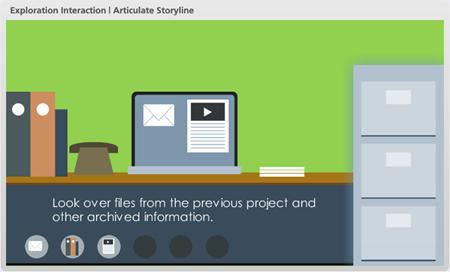
Here is the same interaction created in Articulate Storyline. Storyline offers more interactive capability so I included descriptions for each object, visited states, and a collection meter that triggers a completion response.

Articulate Rapid E-Learning Blog - free elearning template built in Articulate Storyline

Click here to view the Storyline elearning example.

Download the Free E-Learning Templates

Here are links to the free elearning template downloads:

Production Tips When Creating Your Own E-Learning Template

You are free to use the templates in your courses. However, I encourage you to create your own desktop designs. It’s a good way to practice and get better using your elearning applications.

If you do create your own templates or add content to the free elearning templates then here are a few tips to help design the illustration and the interactivity.

  • Keep it simple and don’t add too much detail to the objects. This makes production easy for you and the template will look clean.
  • Avoid clutter and allow for lots of white space to give your eyes a break.
  • Use clutter. So you want to ignore tip #2, that’s OK. Leverage clutter the same way you might for “I Spy” or one of those “Waldo” diagrams. This could work if it’s contextual but it could also be frustrating. Something to keep in mind.
  • Why be flat? The desktop used the classic floor-wall-baseboard technique. That helps center the eye and maintain a clean design.
  • After making a selection, where will the information show? You need a place to show the information. Another consideration is how will you show it? Will it be a click, drag, or hover?

If you create your own flat desktop, feel free to share it. I’d love to see what you do.

Events

Free E-Learning Resources

Want to learn more? Check out these articles and free resources in the community.

Here’s a great job board for e-learning, instructional design, and training jobs

Participate in the weekly e-learning challenges to sharpen your skills

Get your free PowerPoint templates and free graphics & stock images.

Lots of cool e-learning examples to check out and find inspiration.

Getting Started? This e-learning 101 series and the free e-books will help.


Articulate Rapid E-Learning Blog - what is instructional design

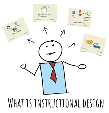
At the iDesignX conference in Australia I shared some tips on instructional design challenges. During my session, Blair Rorani from Ever Learning sketched his notes and then tweeted them during the session. They’re so cool I couldn’t just let them fade away.

So here are Blair’s sketches coupled with some quick notes from my presentation on instructional design challenges.

What is Instructional Design?

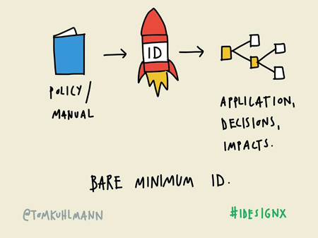
Instructional design is a loaded term and can mean many things depending on who’s doing the talking. In today’s elearning world an instructional designer tends to be synonymous with the person who builds elearning courses.

Articulate Rapid E-Learning Blog - what is an instructional designer and instructional design

In a general sense an instructional designer helps craft the appropriate learning experience whether they actually build the course or not. As the instructional designer, you want the learner to acquire information in a context that is relevant and have them make the types of decisions that are similar to what they’d do outside of the learning environment.

Know that Learning Happens Despite Instructional Design

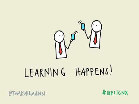
When I used to train instructional designers I always started with “learning happens” as a reminder that people learn regardless of what we do. And in many cases, we could be interfering with how they’d learn if we don’t do it right.

Articulate Rapid E-Learning Blog - instructional designers know that learning happens and keeps that in mind during instructional design

It’s important to keep this in mind as we design our courses. People aren’t just sitting around like empty pitchers of water waiting for us to fill them. They’re continually filling the pitcher themselves and we’re just one of the options they have as they learn.

Instructional Design Changes with Technology But….

Our industry has evolved quite a bit. And every day there’s some new technology to assist with learning. This can cause quite a bit of anxiety as we are stuck building boring click-and-read PowerPoint courses and feel the world passing us by. How do we keep up with it all?

Twenty years ago, as a young videographer I felt the same way. Video was going from analog to digital and I thought I’d never keep up. The other thing I thought twenty years ago was that someone would realize how easy this PowerPoint stuff is and I’d be out of work.

Articulate Rapid E-Learning Blog - technology changes but has the brain when it comes to instructional design

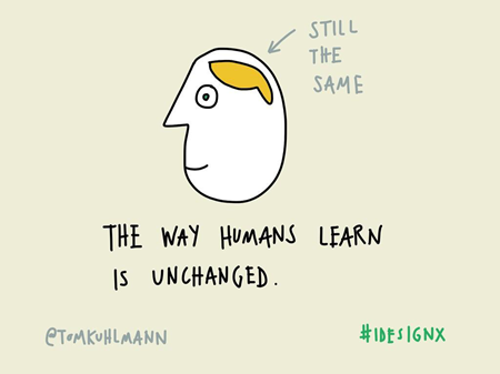
Guess what?!? Not that much has changed. After twenty-five years, PowerPoint is still a means of gainful employment. And while new technology has influenced the learning process, how people learn hasn’t changed much. Sure, we have all sorts of new ways to create, curate, access information and connect with people, but the innate way we learn isn’t much different. Generally speaking we get new information, process it, and make it part of our memory. We just have different ways to do that.

Instructional Design Faces New Challenges

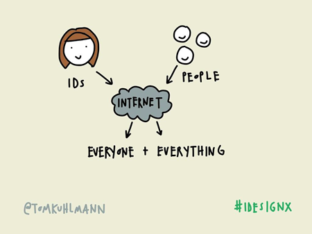
Years ago, formal training created constraints and limited access to information. In a sense, instructional designers and trainers were firewalls to acquiring information. It wasn’t as easily available then as it is now. Today there are all sorts of access to expertise and the tools needed to learn.

For example, I needed to repair all of the locks in my home recently. In the past I was dependent on a trained lock smith to do the repairs. Today that’s not the case. I was able to go online and find some videos that showed me how to do what I needed to do. I was taught at my point of need.

Articulate Rapid E-Learning Blog - instructional designers face new challenges when doing instructional design

Am I now a lock smith? No. But I am trained to do what I needed to do and didn’t need to participate in a formal training program to learn it.

If a corporate training group wanted to teach me the same thing, I would have learned about the history of locks, types of locks, and how locks worked. I may have even been given the steps to make the repairs. And if I was lucky, I would have had some time to practice repairing the locks as part of the training. And it would have taken 90 days to get that training built.

The point is that we are no longer the gate keepers of information and training. Technology has empowered people to find information and connect with others to learn in all sorts of ways. Let’s embrace that and leverage this to craft more efficient and effective instructional design.

Instructional Design Embraces Bite-sized Learning

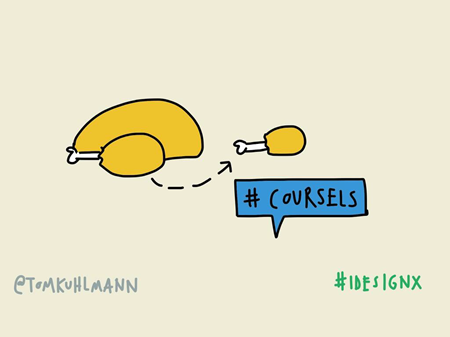
Building off the point above, instead of building large formal programs, try building smaller chunks of learning. I like to call them coursels, as in course morsels.

Articulate Rapid E-Learning Blog - instructional designers create bite-sized learning as part of instructional design

They’re smaller nuggets of learning that offer the flexibility larger programs don’t. They can be built faster and at lower cost. They’re great for those just-in-time training needs and easily shared. And they can be packaged into larger, more detailed training if needed.

Another advantage is that people tend to be more tolerant of lower quality if the coursel is relevant and helpful. They also tend to share the smaller nuggets more that large courses. So there’s a good chance the learning resources is passed around. The smaller nuggets are also effective for spacing the learning activities over time rather than having everything compressed into a single learning event.

And there you have it, the essence of my thoughts on instructional design. As I noted above, instructional design is loaded with lots of meaning and different definitions so there are many perspectives to consider. There’s obviously a lot more to it than what I shared and more to discuss regarding each topic on which I touched.

What are your thoughts on instructional design? What are you biggest challenges?

Events

Free E-Learning Resources

Want to learn more? Check out these articles and free resources in the community.

Here’s a great job board for e-learning, instructional design, and training jobs

Participate in the weekly e-learning challenges to sharpen your skills

Get your free PowerPoint templates and free graphics & stock images.

Lots of cool e-learning examples to check out and find inspiration.

Getting Started? This e-learning 101 series and the free e-books will help.


Articulate Rapid E-Learning Blog - how to build effective elearning and not boring courses

Linear, click-and-read courses are pretty common and usually held up as the worst of online training and cause of boring courses because they’re mostly information dumps with little focus on how the learner can actually use the course content.

They may be the worst of elearning. Or perhaps not. Let’s review some common reasons why these types of online courses exist and what we can do to fix them so that you’re not producing boring courses.

Boring Courses Exist Because They’re Pointless

Before we continue I’ll make the argument that not all click & read content is bad. And that often it’s an appropriate solution. But it has to be relevant to the training needs.

A lot of our online training programs are more like documentaries that share information to build awareness. In those cases, linear, click-and-read courses may be the best solution and they don’t fit in the boring course category.

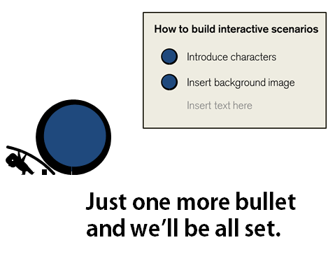
Keep in mind that linear doesn’t have to mean boring course. Bland, bullet point slides probably equate to boring courses. However linear courses don’t need to be boring or poorly designed. Videos are linear and so are books. And they’ve been successful learning tools for years. It’s not the mode of transmission that’s the problem. Instead it’s the quality of what’s being transmitted.

Articulate Rapid E-Learning Blog - courses need to be more than bullet points to avoid boring courses

In some blended training programs click-and-read courses are designed as a means to present content and they’re coupled with an interactive, hands-on process. In those cases the “course” may be linear but when blended with other activities the training program can actually be quite interactive and effective.

With all that said, many of the click-and-read courses could be more interactive but they aren’t. And courses that should focus on performance and decision-making are classic information dumps.

That can be changed. But we need to understand why those types of courses are built and look at some ways to get past them.

Boring Courses Are Easy to Build

Let’s face it. Many of us are under severe time constraints and looking for ways to do our work faster. It’s easy to take an existing PowerPoint file, clean it up a bit, and publish it for online training. This is usually the cause of boring courses.

Articulate Rapid E-Learning Blog - it's easy to build simple courses but they can become boring courses

It’s a lot harder to build interactive, decision-making courses. They require more analysis and resources. So if everyone’s none the wiser and appears happy, why not do a simple conversion rather than invest the time to build something more complex?

Solution:

To maintain ease of production and yet offer more interactive content, go with some prebuilt interactive models. Create the interactive structure and save them as templates. And then instead of going with the linear approach, use one of the already created models where all you have to do is swap out your assets and content.

One of the things I like about Storyline is that I can build mini interactions and save them as templates. They can be inserted into other courses and shared with other Storyline users. All of the interactive components remain so I just have to add my own content. That’s a big time saver and will help you not build boring courses.

Boring Courses Cost Less to Produce

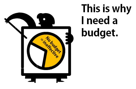
How many of you get a budget when building courses? My guess is that not many of you do. Not only does good elearning require time to build. It also requires money. Even if your organization doesn’t give you a budget, there’s a cost associated to building elearning that isn’t effective.

The reason consultants and elearning shops can complain about click-and-read courses is because they usually work with the part of the organization that’s willing to spend money for the appropriate training. But if you’re the one-person course design team, you don’t get a budget and often you’re not in a position to even influence the best way to build a course.

Articulate Rapid E-Learning Blog - get a budget to build better elearning and avoid boring courses

Solution:

Here are two quick tips to prevent boring courses caused by lack of a budget. First review the solution above. Save time & money by creating reusable models and templates. Take advantage of the free resources from the elearning community.

The second is to ask for a budget. It’s not outrageous to suggest a budget to build the appropriate course. Worst case, start small. “We need to purchase some stock images.” You’ll probably get some money and lets you build in the expectation for a budget on future projects.

Boring Courses Come from Lack of Experience

The authoring tools have made online training course construction a lot easier. That’s for sure. The challenge is that many people required to build courses don’t always have the depth of experience to build more than the presentation-style courses and that can lead to the classic boring courses.

And if all you see is presentation-style courses while you’re trying to learn, odds are that will inform your understanding of course design and you’ll build what you see and know.

Articulate Rapid E-Learning Blog - get some practice building better elearning so you don't build boring courses

Solution:

Make it a goal to build interactive courses and do what you can to get out of the click-and-read paradigm. Don’t get stuck building the same boring course one hundred times. Look at good examples for inspiration and if you’re just getting started participate in the weekly challenges.

If you wait until you need to build an interactive course, you may not have the time to trial and error your way through it. By making a habit of continual practice, you’ll develop some construction patterns and solutions that are more easily applied when it comes time to build an online training course.

Boring Courses Are Caused by the Customers

People only know what they know. Many customers only have experience with click-and-read type training. So that’s what they expect when they request a course be built.

I’ve worked on projects where I’ve shared ways to make the content more interactive and the customers would say. “That’s fine, but let’s do the interactive stuff after we’ve completed the real course design.” Their expectation was that a course was only a course if it was linear.

Articulate Rapid E-Learning Blog - learn to work with your customers so that they don't expect boring courses

I’ve also had customers specifically ask for click-and-read type courses so they could lock down the navigation and force the learner to look at each screen. Is this good? Obviously not. But it is a cause of some click-and-read content which leads to boring courses.

Solution:

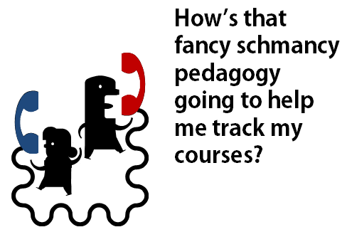
Help the customer see elearning in a different way. Don’t expect that they’ll understand all of your instructional design mumbo jumbo. If you throw in words like pedagogy and didactic, you’ll lose them.

Instead, show them some examples of good elearning and how you’d like to approach their course. Come prepared with three before/after examples so that you can demonstrate the difference between linear and interactive elearning. When they see it, they usually get it.

If you need to lock the course navigation, do it at key decision points and not at the screen level. They can validate that the learner “got it” if they get past the decision and not merely looking at screens of information.

Again, there’s a place for linear click-and-read content. But that’s a decision you should make. Don’t let it be the default strategy for your course design. Otherwise you’ll suffer from the curse of the boring course.

What are some things you do to avoid the curse of boring click-and-read elearning?

Events

Free E-Learning Resources

Want to learn more? Check out these articles and free resources in the community.

Here’s a great job board for e-learning, instructional design, and training jobs

Participate in the weekly e-learning challenges to sharpen your skills

Get your free PowerPoint templates and free graphics & stock images.

Lots of cool e-learning examples to check out and find inspiration.

Getting Started? This e-learning 101 series and the free e-books will help.


Articulate Rapid E-Learning Blog - instructional designers united with the serious elearning manifesto

Had a great trip last week to Sydney and got to meet many of the blog readers I’ve corresponded with over the years. If you haven’t attended an iDesignX conference, I recommend doing so. You get to meet many of your peers and sit in on some good presentations.

As I was returning home I ran into Dr. Werner Oppelbaumer at the Los Angeles airport. We had a few moments to chat about the state of the industry and what’s new in his research.

Articulate Rapid E-Learning Blog - tom asks about the serious elearning manifesto

There’s a lot going on in our industry. What trends do you see when it comes to online training?


Articulate Rapid E-Learning Blog - dr werner oppelbaumer explains the serious elearning manifesto

There is a lot of talk about MOOCs. The idea is very interesting but many of the courses are like old-school lectures put online. Their biggest challenge is a lack of identity coupled with reaching the next generation who have grown up on games.

At Werner Labs we’ve come up with a solution for both. As all trainers know, good training starts with a good logo. Don’t waste time trying to teach anything without an appropriate logo. Besides, if you don’t have a logo what will you put on your slides?

Articulate Rapid E-Learning Blog - MOOC logo

Werner labs created a prototype logo to build the MOOC brand and reach young people. We created a gamified logo to attract the young generation who only know how to play games and complain that their Red Bulls are too warm.

Articulate Rapid E-Learning Blog - tom asks about the serious elearning manifesto again

That’s interesting. I am sure that the gamification angle will pay dividends. Speaking of MOOCs, I’ve read that they have a very high drop off after initial enrollment. Any thoughts on how that can be fixed?


Articulate Rapid E-Learning Blog - dr werner oppelbaumer explains the serious elearning manifesto

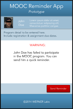
Yes. At Werner Labs we created a MOOC Collar™. When you enroll in a course we send a reminder collar which is connected to your course’s MOOC app. If participation drops, the instructor can send a friendly reminder. You can test the MOOC Collar™ app here

Articulate Rapid E-Learning Blog - MOOC iOS app

Click here to test the application.

Articulate Rapid E-Learning Blog - tom asks about the serious elearning manifesto and one more time

Speaking of courses, there’s been a lot of buzz in the elearning community concerning the elearning manifesto. It addresses some issues with the current state of elearning and seems to cover a lot of the key points you’ve been pushing the last 40 years. What are your thoughts?


Articulate Rapid E-Learning Blog - dr werner oppelbaumer explains the serious elearning manifesto

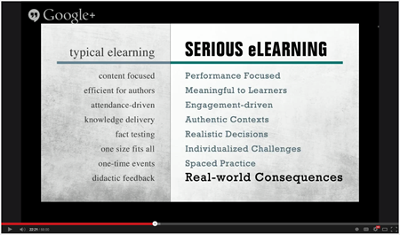
I actually just delivered a presentation concerning something similar. That’s why I was in Los Angeles. But here are a few quick thoughts. You can view my presentation below.

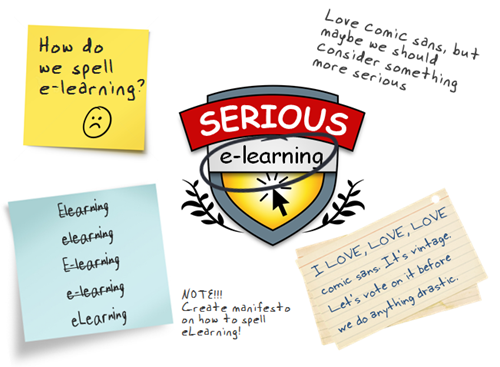
Impressive Logo. As I mentioned before, good training starts with a good logo. It looks like the manifesto team spent valuable time agreeing on a solid logo. I am sure that it was a challenge just getting to a consensus on the spelling of elearning eLearning.

Articulate Rapid E-Learning Blog - understanding the serious elearning manifesto

Great presentation. When I first heard the hoopla I was concerned that the elearning experts were going to take me through some sort of interactive asynchronous learning experience. But I was mistaken.

I’m glad they decided to go with the tried-and-true formula of a synchronous meeting where they lectured and read their slides. It was so refreshing. I just leaned back in the chair, closed my eyes, and soaked it all up.

Articulate Rapid E-Learning Blog - the serious elearning manifesto

I will add that they did miss a golden opportunity to create an acronym to help us better remember the principles.

Creative Commons. Since the manifesto is under a Creative Commons license we are free to use it as we wish, even for commercial purposes. As you know Werner Labs is a for-profit enterprise and we are already working on manifesto-licensed merchandise.

The first two products are a winter coat inspired by East German manifesto writers of the past and Manifesto Pesto, a nice tasty pasta sauce.

Articulate Rapid E-Learning Blog - the serious elearning manifesto gear

Articulate Rapid E-Learning Blog - tom asks about the serious elearning manifesto the last time

Interesting observations. As always, thanks for the time and letting me post your presentation below. I’m sure we’ll learn something new.

Articulate Rapid E-Learning Blog - dr werner oppelbaumer explains the serious elearning manifesto in this presentation

Click here to view Dr. Werner’s presentation.

Have a great day!

Events

Free E-Learning Resources

Want to learn more? Check out these articles and free resources in the community.

Here’s a great job board for e-learning, instructional design, and training jobs

Participate in the weekly e-learning challenges to sharpen your skills

Get your free PowerPoint templates and free graphics & stock images.

Lots of cool e-learning examples to check out and find inspiration.

Getting Started? This e-learning 101 series and the free e-books will help.