The Rapid Elearning Blog

Archive for February, 2017


e-learning screencast webinar tutorials

If you create software training then odds are you show a lot of keyboard shortcuts. If that’s the case you’ll like today’s tip where I share a simple tool that makes it really easy to display the keyboard shortcuts on-screen.

How to Display Keyboard Shortcuts during Screencast Tutorials

Meet Carnac the Magnificent. It’s a keyboard utility that displays keyboard shortcuts as they are used during your demos. This is perfect for webinars and screencast tutorials. It’s also great for live presentations where people in the back of the room can’t always hear or see what’s going on.

Here’s a quick tutorial where I show how it works and how it would look in your software training.

Click here to view the Youtube video.

  • You can download Carnac here. Read more about it here.
  • Once you download the file, double-click to install it.
  • You’ll see the purple Carnac icon in your system tray.

Once it’s active in your system tray and you use a keyboard shortcut, you’ll see the shortcut displayed on the screen as in the image below.
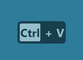
screencast tutorials example

How to Customize the Keyboard Shortcut Display for Screencast Tutorials

You can modify how the keyboard shortcuts display.

  • Double-click on the Carnac icon and it opens a setting window.
  • You’ll see the option to select monitors and where the object is displayed. You start by selecting the screen and then adjust how much you want to offset it.
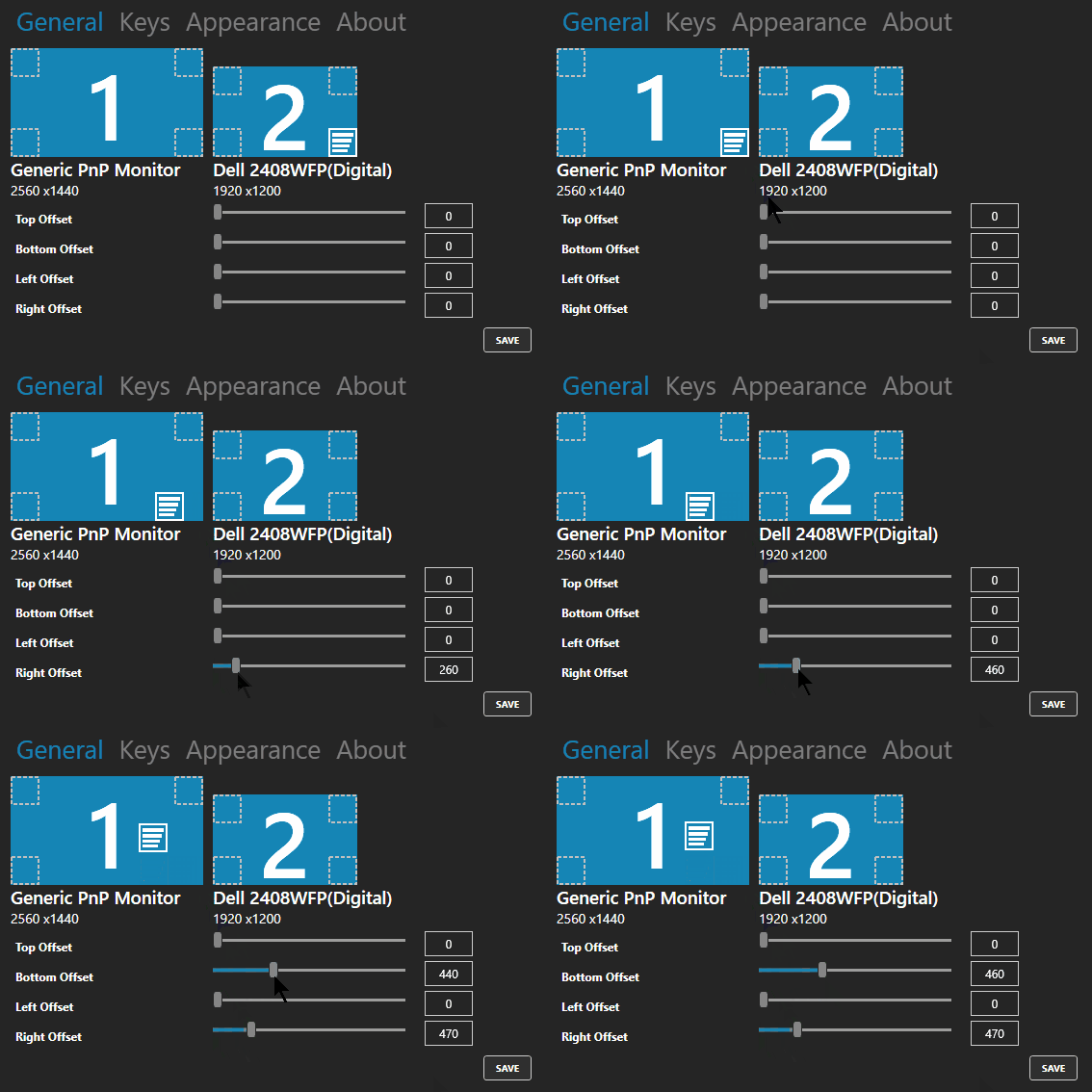
screencast tutorials set properties

  • You can also change the appearance of what’s displayed. This includes the width, font size, and color. I couldn’t get the sliders to work, but manually entering the values did work for me. Save your changes.
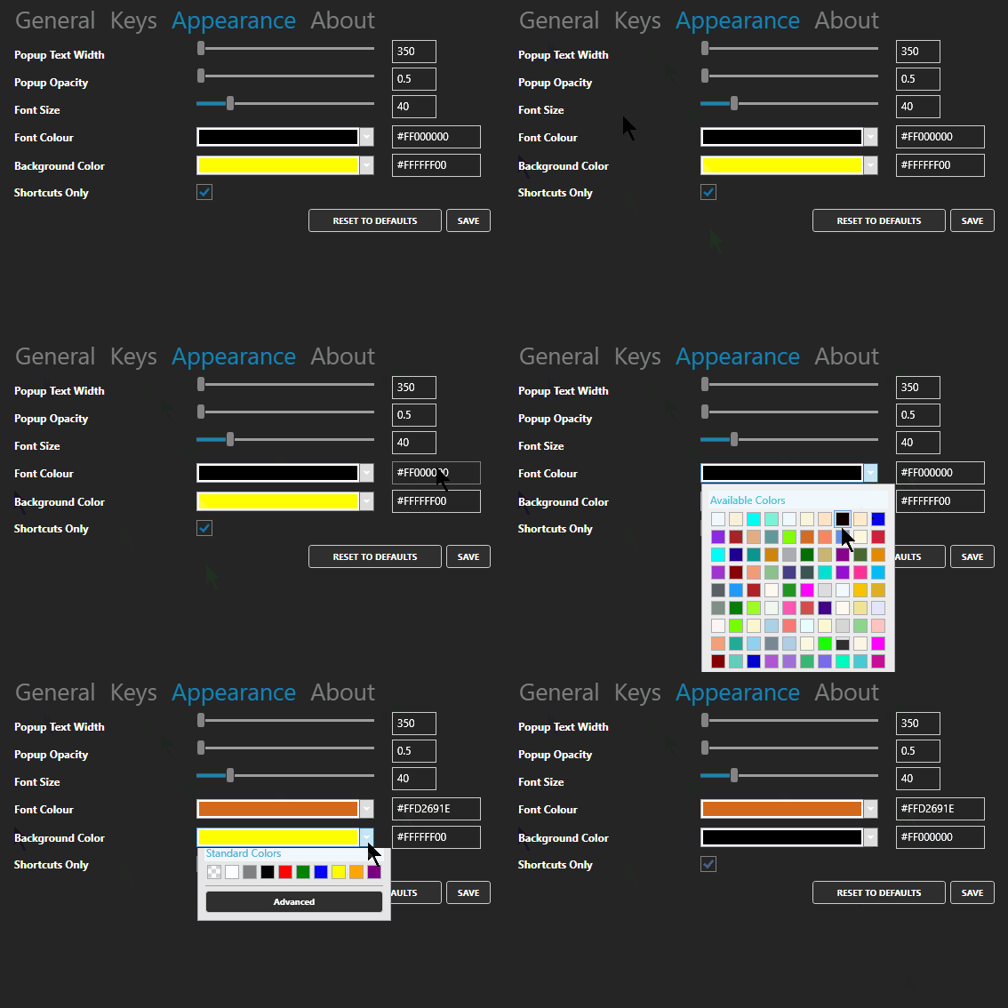
screencast tutorials change appearance

It’s a fairly easy to use and it’s free. But you get what you pay for, so if you need help, you’re stuck. But I’ve found it works fine and as expected.  If you need a way to display keyboard shortcuts, then this solution should work for you.

Events

Free E-Learning Resources

Want to learn more? Check out these articles and free resources in the community.

Here’s a great job board for e-learning, instructional design, and training jobs

Participate in the weekly e-learning challenges to sharpen your skills

Get your free PowerPoint templates and free graphics & stock images.

Lots of cool e-learning examples to check out and find inspiration.

Getting Started? This e-learning 101 series and the free e-books will help.


character templates for e-learning

Looking for just the right images is one of the most time-consuming activities we have when building our courses. It’s easy to get distracted and waste a lot of time. It’s gotten a lot easier over the years now that the software comes with professional templates and thousands of character poses.

As I build courses, I often use the same characters and a few common poses. Which means I don’t need to always search through all of the poses available. And I suspect many of you do the same. So today, I’m going to show you a simple tip to help speed up your production. It’s all based on assembling your own character templates. I walk through the steps below, but the video provides more detailed instructions.

Click here to view the video.

Create E-Learning Character Sets

Even if you have hundreds of characters, odds are you use the same handful over and over again. Here’s how to create some simple pre-built character sets that make it easy to use characters and repeat poses.

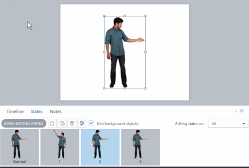
e-learning characters sets

  • Select a character and insert it on the slide.
  • Create multiple states of the character. This trick works if you only insert a handful of frequently used or common poses. Otherwise, it defeats the purpose of the template.
  • Name the slide the same as the character or descriptive of the type of poses. For example, you may insert only sign-holding poses. In that case, the slide could be titled, Brandon-Holding-Signs.

Create E-Learning Character Set Templates

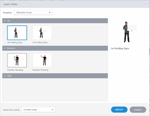
e-learning characters templates using sets

  • Once you have a slide with the character, save it as a template. This creates a template you can insert into your course. That’s it. Whenever you want to use that character, insert the slide and then copy and paste the character where you need it. Then set the initial state.
  • Ideally, you maintain one character template so it’s easier to manage. In that case, import the new character slide into the main character template file. And keep adding to it as you create custom character sets. This way it’s much easier to view and manage.
  • Bonus tip: you can do the same thing for custom interactions by saving them in a single interaction template.

Save Time Using E-Learning Characters

Now that you have some pre-built character poses, you’ll save some time in your production. When you need one of those characters, insert it from the template and then copy and paste the character into your slide.

The character will always include those starting states. You can set an initial state and use triggers to dynamically change it if you like. Another benefit is sharing the template with your team.

And you’re not limited to just the characters that come with the software. You can also do this with your own characters and the photos you take. Or you can do it for background images. Perhaps you want a template of production images, inside a warehouse, or the cubicle farm in the office. The process is the same.

The software already comes with characters so searching and inserting characters is easy enough. This tip works great if you use a few common poses and don’t want to spend time searching. Set up the templates and you have a good starting point.

Assuming that you want to create some character templates like this, what groups would you create? Talking poses? Sign holders?

Events

Free E-Learning Resources

Want to learn more? Check out these articles and free resources in the community.

Here’s a great job board for e-learning, instructional design, and training jobs

Participate in the weekly e-learning challenges to sharpen your skills

Get your free PowerPoint templates and free graphics & stock images.

Lots of cool e-learning examples to check out and find inspiration.

Getting Started? This e-learning 101 series and the free e-books will help.


subject matter experts relationship

This is part two of the series on working with subject matter experts when building e-learning courses. In the previous post, we looked at how to set expectations and some simple project management tips. I also shared a link to the free e-book, Essential Guide to Working with Subject Matter Experts.

Today, we’ll look at what it takes to build a good working relationship with your subject matter experts. I always take a short term and long term view. In the short term, I want to make sure that the project moves forward successfully. And the subject matter expert plays a critical role.

In the long term, it’s all about networking and building relationship within the organization. The more you know and the more people you know, the more valuable you’ll be to the organization. And you never know when you’ll need that person’s help on future projects. A good relationship proves valuable.

subject matter experts are your friends

When asked about working with subject matter experts, here’s what your fellow e-learning developers shared:

  • They are called subject matter expert for a reason – don’t be patronizing because without them we wouldn’t be doing this.
  • Be respectful of their time, especially if they’re not working on the project and only providing assistance.
  • Help them save time. You can do this by reducing their workload. Do some research and pre-work that helps them not have to provide all of the content.
  • Show that you care. They won’t care what you know until they know that you care.
  • Be nice. If that doesn’t work, then bribe with chocolate!
  • Make them feel important. They tend to have big egos. [Tom’s note: not all of them suffer from big egos unless you’re working with doctors and lawyers. 🙂 ]
  • The subject matter experts have a lot of knowledge to impart. They will be keen to ensure that the students have access to that.
  • Keep a poker face when you hear things you do not like or cannot do. Just listen and record. You can fix things later.
  • We may use the same words but they don’t always mean the same things. Make sure that terminology is understood by both developer and subject matter expert.
  • Define your role to them in concise, clear terms so it is less threatening for them (especially when it is time to cut out “nice to know info”).
  • Be ready for them not to recognize your skill set.
  • Praise, praise and more praise for their cooperation, input, and feedback.
  • Get their buy-in at every stage of the process (if they’re involved in that level of detail).
  • Face to face is better than an email sometimes.
  •  This is a different style of learning.
  • Let their managers know how much they’re contributing.

What do you do to manage the relationship with your subject matter experts?

Events

Free E-Learning Resources

Want to learn more? Check out these articles and free resources in the community.

Here’s a great job board for e-learning, instructional design, and training jobs

Participate in the weekly e-learning challenges to sharpen your skills

Get your free PowerPoint templates and free graphics & stock images.

Lots of cool e-learning examples to check out and find inspiration.

Getting Started? This e-learning 101 series and the free e-books will help.


instructional design tips e-learning tips

During a recent interview, someone asked about what I’ve learned over the years. It’s a question I get asked a lot by new designers. One point I always make is to not worry about what’s under the hood. Just worry about getting the output you need. All of the other stuff you’ll get as you gain experience and have to make edits.

However, here are a few key points I shared in the interview.

It’s Not Rocket Science

I know this statement irks some instructional designers, but come on, what we’re doing isn’t rocket science unless of course you’re working for NASA or some other space agency. Learning is innate to humans and while we may not all know how to build the best courses, we probably can do a decent enough job to get started. Besides, I’ve seen plenty of bad courses from people who have their fancy degrees (and some have even written books).

instructional design degree e-learning tips

So take a chill pill. Don’t worry about knowing everything about instructional design. Get that first course built. Focus on meeting some tangible objectives and you’ll be on your way. Odds are it won’t be the worst course our industry’s ever seen.

A Course is a Course Unless it’s Not a Course

Not everything we call a course is a course. Sometimes, they’re just more like awareness campaigns, like learning about a new company policy. Some courses do have larger performance expectations but practicing the performance happens outside of the course. And then sometimes courses are heavily focused on performance where real-world decisions can be baked into the course design. The key is knowing what

The key is knowing what type of course you’re building. This way you can commit the appropriate resources. No need to build an elaborate scenario when you all you need is a few screens and perhaps a quick quiz. At the same time, you don’t want to build a click-and-read course when the person needs to learn how to make good decisions. That type of course probably requires some sort of decision-making challenge.

e-learning tips sort by performance vs information

Looks Matter More Than Instruction

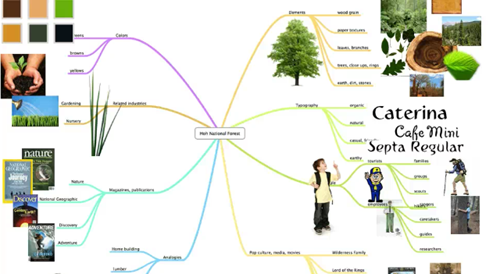
For all of our talk about building good courses, often the ones that get the most play are the ones that look good. And this makes sense because e-learning is a mostly visual medium. People are drawn to things that look good. It’s the initial stage of engagement. On top of that good visual design is a key part of communicating ideas.

e-learning tips design map

In either case, you get more traction when courses look good and are visually connected to the context of the course. This is something to keep in mind, especially when building a portfolio.

Maintain a Portfolio

It’s important to maintain a project portfolio. This is always easier to say than to do because it does take time. It’s a record of what you’ve done and it’s a way to promote your expertise.

Here’s a common dilemma: a person gets laid off and needs to start applying for jobs. Lo and behold, all of the projects are locked behind a firewall and the person has nothing to show. On top of that, the person also doesn’t own the software to build new demos for a portfolio.

Focus on the Action

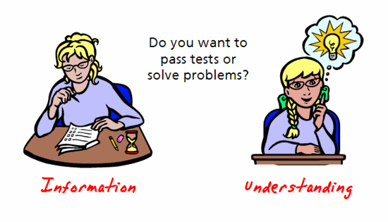
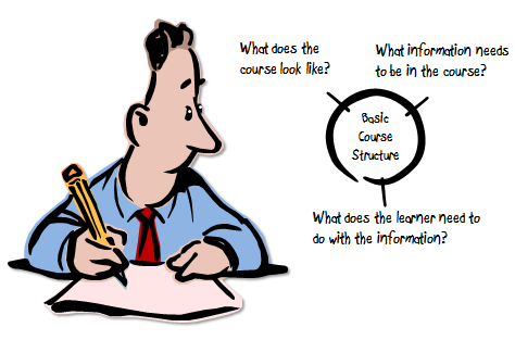
Many of the courses I see are mostly information dumps. Step away from the information and focus on the action. What are they supposed to do? How do they demonstrate that they know how to do it in the real world? What activities can you build in your course that mimic those real-world decisions and actions?

e-learning tips three step process

What content do you need to support learning to make those decisions? Build your courses using a backward design approach. Focus on the measurable action and build towards the information that supports it. This is better than a linear information dump. The book, Understanding By Design, is a good place to start.

Sometimes an Information Dump is All You Need

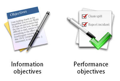
The reality is that a lot of courses are only awareness campaigns or they exist to meet some compliance requirement. In those cases, it makes sense to keep the course simple so that people can get what they need and then get back to work. When I meet with a client I always try to sort courses by their performance requirement. If there are no clear requirements, then it falls in the information bucket which means I spend less time building the course.

e-learning tips information vs performance

Five Meals a Day is Better Than One Big One

I’m not one to focus much on diet (unless it consists of donuts). However, I do see a lot of headlines that extol the virtue of smaller meals spread over time. The same can be said for e-learning. Building a big course takes time, requires more deliberation, and can’t easily be changed.

e-learning tips spaced e-learning microlearning

Often it’s better to build smaller modules and then space the content over time. The smaller modules are easier to build and deliver. They can also be modified much more quickly. And there’s a lot of good research that shows learning spaced over time is very effective.

What Do You Wish You Knew?

I’m leaving this section blank and asking you what’s the one thing you wish you knew when first getting started. Share your thoughts in the comments section.

instructional design tip you provide e-learning tips

Events

Free E-Learning Resources

Want to learn more? Check out these articles and free resources in the community.

Here’s a great job board for e-learning, instructional design, and training jobs

Participate in the weekly e-learning challenges to sharpen your skills

Get your free PowerPoint templates and free graphics & stock images.

Lots of cool e-learning examples to check out and find inspiration.

Getting Started? This e-learning 101 series and the free e-books will help.