The Rapid Elearning Blog

Archive for March, 2017


gamified e-learning gamification

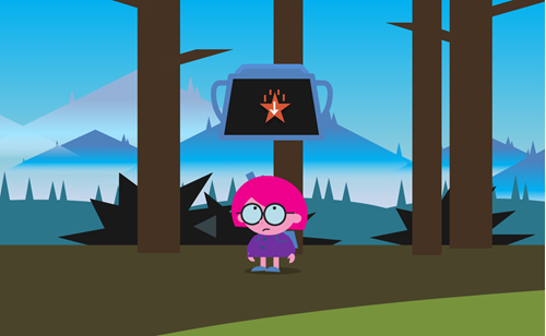
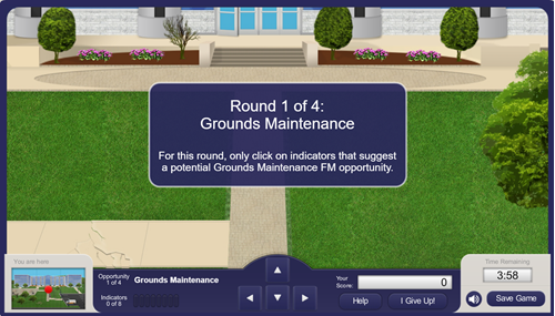
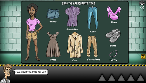
I hear a lot of people ask about gamifying their e-learning courses. And the examples they show are usually simple games modeled after shows like Jeopardy or Wheel of Fortune. Those are fine and have their places in e-learning, especially for quick knowledge checks. But they’re not the same as gamification.

In today’s post, I’ll share a few simple things to help get your brain muscles going.

What Do You Need to Know?

When it comes to building the courses in an authoring tool, you basically need to know how to use variables. Variables allow you to track and evaluate the user to provide relevant feedback, scoring, tokens, and all the other things that make up gamified e-learning courses. And once you know how to work with variables, you can build all sorts of things.
gamified e-learning

Here are some resources to learn more about variables:

Learn More About Gamification

You can do a search and read all sorts about gamification especially now that it’s also a buzzword. Essentially you are taking game concepts and applying them to a non-game context. As you play games, ask what about the game is compelling and what similar element could work in your next e-learning course.

I think the greater challenge in building gamified courses is less in constructing the mechanics and more in building a narrative that integrates gaming psychology. Building things in the authoring tools is relatively easy compared to understanding what to build.

Here are three good books on gamification.
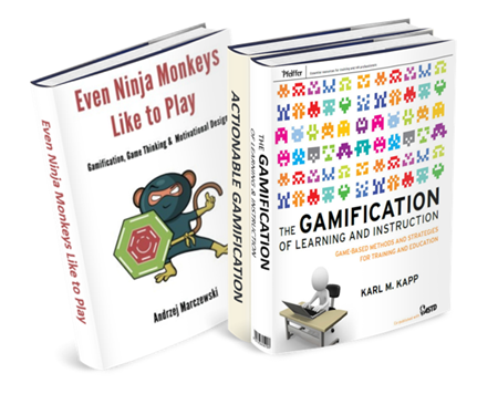
gamification books

The links to Amazon books may produce a slight commission.

What Can You Build in Your E-Learning Course?

When it comes to authoring the courses outside of a management system where you can track multiple users and build things like leaderboards, you’re confined to simple game elements such as:

  • Timers
  • Personalization
  • Progress meters
  • Tokens
  • Rewards management
  • Scoring
  • Autonomous navigation

You can make some very compelling courses that instructive and engaging. However, there’s a lot more to gamification than these simple elements above. How do you motivate learners and create the right tension between boredom and failure? Make sure you invest the right resources and develop a good strategy. Otherwise, your gamified course will transform from game to gimmick.

If you’re not quite sure where to get started, check out some of the cool examples in the community. They’ll give an idea of some of what you can do with the authoring tools. Here are three nice examples:

gamification example 1

Click here to view gamified e-learning course.

gamification-example-2

Click here to view gamified e-learning course.

gamification example 3

Click here to view gamified e-learning course.

And there’s nothing wrong with starting simple. If all you need is a Jeopardy-style quiz, then download this free file. It’s a great way to work with a context you know. But make a commitment to learn more about variables and start to add some of those gaming elements above to your courses.

Have you built any gamified e-learning? If so, share a link in the comments.

Events

Free E-Learning Resources

Want to learn more? Check out these articles and free resources in the community.

Here’s a great job board for e-learning, instructional design, and training jobs

Participate in the weekly e-learning challenges to sharpen your skills

Get your free PowerPoint templates and free graphics & stock images.

Lots of cool e-learning examples to check out and find inspiration.

Getting Started? This e-learning 101 series and the free e-books will help.


hotspot

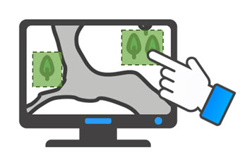
Hotspots are commonly used in e-learning course design. They’re invisible, yet functional. Today, we’ll explore some common use cases for the hotspot in your online training.

Invisible Button Hotspots

The most common use for the hotspot is the invisible button. Essentially it allows the developer to add an interactive choice on top of another object. This can really speed up production. For example, the image below starts with a single image of a world map. By adding separate hotspots over each continent there’s no need to create separate images with links. This really comes in handy when you start with a single image and don’t have the means to break it into smaller components.

hotspot interaction

Example Screen Space with Interactive Hotspots

The hotspot can also be used as a means to expand real estate via a mouseover interaction. A click interaction requires a click to activate and then an additional click to deactivate. Whereas a mouseover interaction is a bit smoother. Mouseover the hotspot to reveal content, mouse away to have it disappear.

mouseover hotspot

In the example above, I added access to additional content using a mouseover hotspot. This is content that doesn’t need to be persistent but does need to be available. The mouseover or hover interaction assigned to the hotspot is a great way to expand screen real estate with fluid precision.

Invisible Barrier Hotspot

The two examples above are pretty common and what you’d normally expect for hotspots since the hotspot is usually defined as an invisible button or interaction. However, the hotspot is also good as a barrier to avoid interactions. Think of it like plastic wrap over a piece of cake. You can see the cake, but you can’t touch it because the wrap is covering it.

Here’s a recent example where I used the hotspot as a barrier. In this anatomy interaction, each part of the digestive system is actually a slider connected to the main slider. It’s a great effect to move the pieces in and out of the body using a single slider. However, I only want the user to interact with the main slider, so I placed a hotspot over the body image and the other sliders. The hotspot serves as a barrier and prevents the user from interacting with what’s underneath.

Check out the two examples below to see the difference.

Example with No Hotspot Barrier

no hotspot barrier

Click here to view the demo of no hotspot barrier.

The first demo above has no hotspot barrier which means any of the other sliders are active. Grab one of the body parts and see what happens. It’s not as elegant.

Example with a Hotspot Barrier

hotspot barrier

Click here to view the demo of hotspot barrier.

The second interaction has a hotspot barrier over the body parts which prevents the user from interacting with anything other than the main slider. This makes for a much better user experience and a more elegant interaction.

So there you have it. You can use hotspots to trigger all sorts of interactions or you can use them as a persistent invisible barrier that prevents an interaction.

Events

Free E-Learning Resources

Want to learn more? Check out these articles and free resources in the community.

Here’s a great job board for e-learning, instructional design, and training jobs

Participate in the weekly e-learning challenges to sharpen your skills

Get your free PowerPoint templates and free graphics & stock images.

Lots of cool e-learning examples to check out and find inspiration.

Getting Started? This e-learning 101 series and the free e-books will help.


free fonts

In an earlier post, we looked at how to convert dingbat and wingding fonts into vector images that you can use in your e-learning courses and presentations. They’re great for creating icons or bullet lists.

Not that you know how to convert the fonts into vector images, you need some fonts to use.

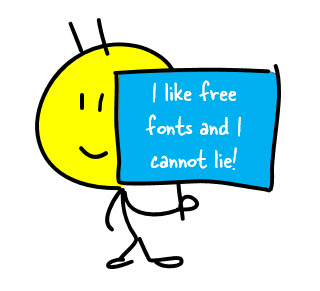
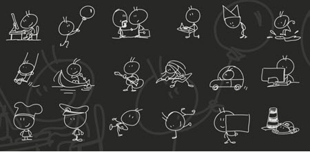
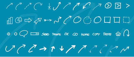
I reviewed a bunch of the free fonts and tried to sort to the those that are free for commercial use. If you want to search on your own, look for facefonts, dingbats, or wingdings. They tend to produce good results. Also, most of the free font sites have an assortment of these fonts.

As always when using free resources, confirm the licensing agreement and provide proper attribution. And it’s still good practice to give the owner props.

Free Faces & Character Fonts

free font icon

Free Icon Fonts

free font icons 2

Free Shape & Arrow Fonts

free fonts arrows

Are there certain fonts like these you like to use?

Events

Free E-Learning Resources

Want to learn more? Check out these articles and free resources in the community.

Here’s a great job board for e-learning, instructional design, and training jobs

Participate in the weekly e-learning challenges to sharpen your skills

Get your free PowerPoint templates and free graphics & stock images.

Lots of cool e-learning examples to check out and find inspiration.

Getting Started? This e-learning 101 series and the free e-books will help.


free icons PowerPoint

In the e-learning community, a number of people shared free icons and shapes. There’s a lot of variety from which to choose. And they’re great for your courses, so make sure to take advantage of all of those free resources.

Looking at the free icons reminded me of simple trick we show in our PowerPoint workshops. It’s one I’ve shared in the past when I showed how to create custom shapes in PowerPoint, but today I’m adding a bit more detail.

Convert Dingbat Fonts to Free Vector Images

There are two video tutorials below. The first one jumps right into the basics of doing the conversion of the dingbat font to a vector shape and the second one adds a little more detail and context for those not familiar with the feature.

View tutorial video  (short version)

Here are the basic steps. You can watch the video for more detail and nuance. You’ll need PowerPoint 2013 or newer.

  • Install a dingbat font or use wingdings (which should already be installed).
  • Add a character on the slide.
  • Duplicate it so you have two objects.
  • Select both and then go to Format > Merge Shapes > Fragment. This converts the font into a bunch of vector shapes. Again, you’ll need PowerPoint 2013 or newer for this.
  • At that point, you can edit and customize the vector as you desire.
  • When done, select all of the shapes and group them. Ctrl+G is the shortcut.
  • Right click and Save as image. I like to save as .PNG to preserve the transparency.

Here is a long form version of the video above with a more detail and context.

View tutorial video (detailed version)

This is super easy tip and a great way to take advantage of all of the wingdings and other symbol-type fonts available to you.

Events

Free E-Learning Resources

Want to learn more? Check out these articles and free resources in the community.

Here’s a great job board for e-learning, instructional design, and training jobs

Participate in the weekly e-learning challenges to sharpen your skills

Get your free PowerPoint templates and free graphics & stock images.

Lots of cool e-learning examples to check out and find inspiration.

Getting Started? This e-learning 101 series and the free e-books will help.