The Rapid Elearning Blog

Archive for August, 2017


screencast tips

Screencast tutorials are some of the most common forms of online training. This makes sense since a large part of e-learning is predicated on learning new software. One challenge is creating effective and engaging screencasts. So today, we’ll look at a few simple production tips to help you get started.

Screencast Tip: Establish Context Quickly

It helps to know what you’re learning and why. At the beginning of the screencast, introduce what you’re going to teach and why (or what the outcome should be). Many screencasts aren’t clear about what the value of the screencast is. They either jump into instruction with no context, or they spend too much time on non-essential content.

Screencast Tip: Get to the Point Quickly

The other day I was reviewing a product video for some new gadget. The video was about seven minutes long. I wanted to know how the gadget worked and what features it had but the guy in the video spent the first three minutes talking about a bunch of nonsense that had nothing to do with the video topic. As Archie Bunker used to say, “Get to the point, Edith.”

Screencast Tip: Don’t Focus on Features

Many of the screencasts I view go through a feature list. They spend way too much time on the user interface and the features buried within it. You don’t need to explain everything in the software or everything you can do with it. And not all features are created equal. Some are used all the time and some rarely. Skip the feature-by-feature dissertation. Focus on the key features and the ones most critical to the user’s objectives.

Screencast Tip: Focus on Action

What are people supposed to do with the software? Make a list of required actions or responsibilities. Then build your screencasts around actionable objectives and how to meet them. Give them real-life challenges and how the software meets them. For example, if I were teaching someone how to use a spreadsheet, instead of showing them how to to use specific features, I’d start with a real-world challenge: “You need to create a report using this data.” And then from there, I’d go through the process of instruction and focus on the features relevant to the objective.

Screencast Tip: Don’t Stop at One

People need multiple opportunities to practice. Many screencasts and the associated activities are built on a single action. This is fine. However, use the activities to reinforce a previous lesson as you introduce new skills. Give them opportunities to review and repeat the previous process.

The more practice, the more fluent they’ll be. This is really key with software training where you build on skills from previous training videos.

Screencast Tip: Keep it Short

Shorter videos are better. Stay focused and get to the point, as I noted above. It’s better to have a series of shorter videos than to have a single long one that forces the user to scrub through looking for relevant info. Try to stay focused on a single objective.

Screencast Tip: Provide Post-Screencast Resources

Because the screencast videos will be shorter and tied to specific actions there may be some learning gaps or other things the person wants to know. It’s always a good idea to curate a list of additional resources for the viewer to access after they’ve completed the screencast video.

Screencast Tip: Don’t Make a Screencast

Screencasts take time and some require multiple edits. And if the content changes (like a new interface or features) then they need to be redone. Often it’s easier to show a static screen and use labels to highlight specific areas. These are also easier to update when the subject matter is still in flux. And it helps you avoid long videos when they just need simple information.

I like this interactive screenshot prototype that David built a while ago. It looks good and it’s easy to build. It’s also available as a free download.

Here are some additional resources for those who want to create screencasts:

What tips do you have to share?

Events

Free E-Learning Resources

Want to learn more? Check out these articles and free resources in the community.

Here’s a great job board for e-learning, instructional design, and training jobs

Participate in the weekly e-learning challenges to sharpen your skills

Get your free PowerPoint templates and free graphics & stock images.

Lots of cool e-learning examples to check out and find inspiration.

Getting Started? This e-learning 101 series and the free e-books will help.


e-learning books summer reading fun

The end of summer usually serves as the beginning of the school year. In a sense, it also kind of serves as the beginning of the work year. It’s always good to come into a new year with a fresh perspective. Reading is one way to do that.

I’m always asked about good e-learning books from those just getting started who want to learn more.  Here are some new books I haven’t referenced in the past. I think they’re worth considering for your e-learning library. The links to Amazon books may produce a slight commission.

Microlearning Guide to Microlearning

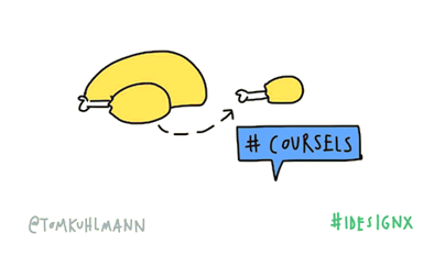
Microlearning is all the rage. Although I think short courses have always existed, it’s just today they have a trendy name. I like to call them coursels (as in course morsels). But that hasn’t taken off despite my efforts over the past twenty years. I guess my legacy will rest on something else.

coursels microlearning

If you want to learn about microlearning then check out Carla Torgerson’s Microlearning Guide to Microlearning.

microlearning book

Here are a few things that stand out:

  • The book presents each point as distinct micro ideas. There are 141 in the book. It may seem a bit gimmicky and some of the ideas are obvious, but for the most, part it works and the points are really good. Besides, the essence of microlearning is to distill ideas into smaller, single topic points. There’s nothing earth-shattering in the book, but it’s a fast read and has most of the core points you’d find in other books and articles on microlearning. Having them in a single resource is nice.
  • I still like to read paper books and end up having to write a lot of notes and my thoughts on the back cover because there’s no room in the margins. Because she presents single micro ideas in the book, there’s lots of room to reflect and take notes.
  • She offers the MILE model as a means to help guide the content development. Here’s the essence of the model: objectives, structure, resources, promote, and evaluate. There’s a lot more to it, but it’s a good model.

Overall, a good book and easy to get through.

Write and Organize for Deeper Learning

Many of you are probably familiar with Patti Shank. She’s a frequent speaker at industry conferences and has written a number of good books. And now she has a new one, Write and Organize for Deeper Learning. This is book one of the “Make It Learnable” series.

patti shank write and organize for deeper learning

Here are a few key highlights:

  • The book focuses on four key strategies built around the audience’s needs and ability to learn based on how the content is structured and presented.
  • She offers lots of ideas and tactics to help make the book’s content learnable and something you can apply.
  • I’m a simple person. I have plenty of big, thick books on instructional design and learning, but I like to fall back on thin, easy-to-digest books. This is a good one for beginners who are dipping their toes in the water and not sure where to start. It covers a lot of foundational content. And for those of us who are a bit more tenured it’s a fast read with lots of reminders.

Like Julie Dirksen’s Design for How People Learn, this is one of those books I’d recommend to someone just getting started.

Map It: The Hands-On Guide to Strategic Training Design

Cathy Moore’s done a great job taking course design concepts and making them easy-to-understand, especially for those just getting started. I always recommend her action mapping ideas to subject matter experts at the workshops and conferences I attend.

Now she has a book, Map It: The Hands-on Guide to Strategic Training Design, to go with everything else she shares.

cathy moore action mapping Map It: The Hands-On Guide to Strategic Training Design


Other Good E-Learning Books

Here’s a list of books I’ve recommended in the past and some from the community.

Do you have any good e-learning book recommendations?

Events

Free E-Learning Resources

Want to learn more? Check out these articles and free resources in the community.

Here’s a great job board for e-learning, instructional design, and training jobs

Participate in the weekly e-learning challenges to sharpen your skills

Get your free PowerPoint templates and free graphics & stock images.

Lots of cool e-learning examples to check out and find inspiration.

Getting Started? This e-learning 101 series and the free e-books will help.


PowerPoint animation tips

I’ve been reviewing a lot of the older PowerPoint tutorials that I’ve posted in the past. Most are still relevant, but a few have changed. In this post, we’ll do a refresh on the basics on PowerPoint animations.

PowerPoint Animation Basics

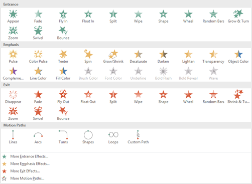
There are four types of animations in PowerPoint:

  • Entrance: object comes on to the slide
  • Exit: object leaves the slide
  • Emphasis: object remains in place, but animates to provide emphasis or become a focal point
  • Motion path: object follows a drawn path.

powerpoint animation panel

When selecting animations, keep in mind that there are additional animation choices at the bottom of the selection panel. And not all animations are supported when converted for e-learning. And one last tip, because you can animate doesn’t mean you should.

Triggering PowerPoint Animations

Animations are generally triggered by three things:

  • On click: object doesn’t animate until mouse click triggers the animation. This is what you need if you’re syncing animations with narration for your e-learning courses.
  • With previous: object animates with the previous animation. It also animates automatically if it’s the first object on the screen.
  • After previous: object animates after the previous animation.

When you select an animation and when it should start, you also have the option to set its duration and whether to delay or not. Once you understand how to time animations, you can compound them and create all sorts of effects.

You can also set triggers in PowerPoint to animate on other actions, such as clicking on a shape. These work great in PowerPoint by itself but are something I’d avoid when converting PowerPoint slides to an e-learning course.

PowerPoint Animation Pane

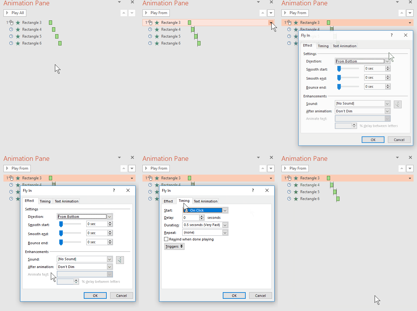
The PowerPoint animation pane gives you more control of the PowerPoint animations.

  • You can see the stacking order of animated objects.
  • How the objects are timed to the timeline.
  • Clicking on the drop down arrow exposes more advanced PowerPoint animation options such as start/stop effects and timing.

powerpoint-animation-panel

PowerPoint Animation Painter

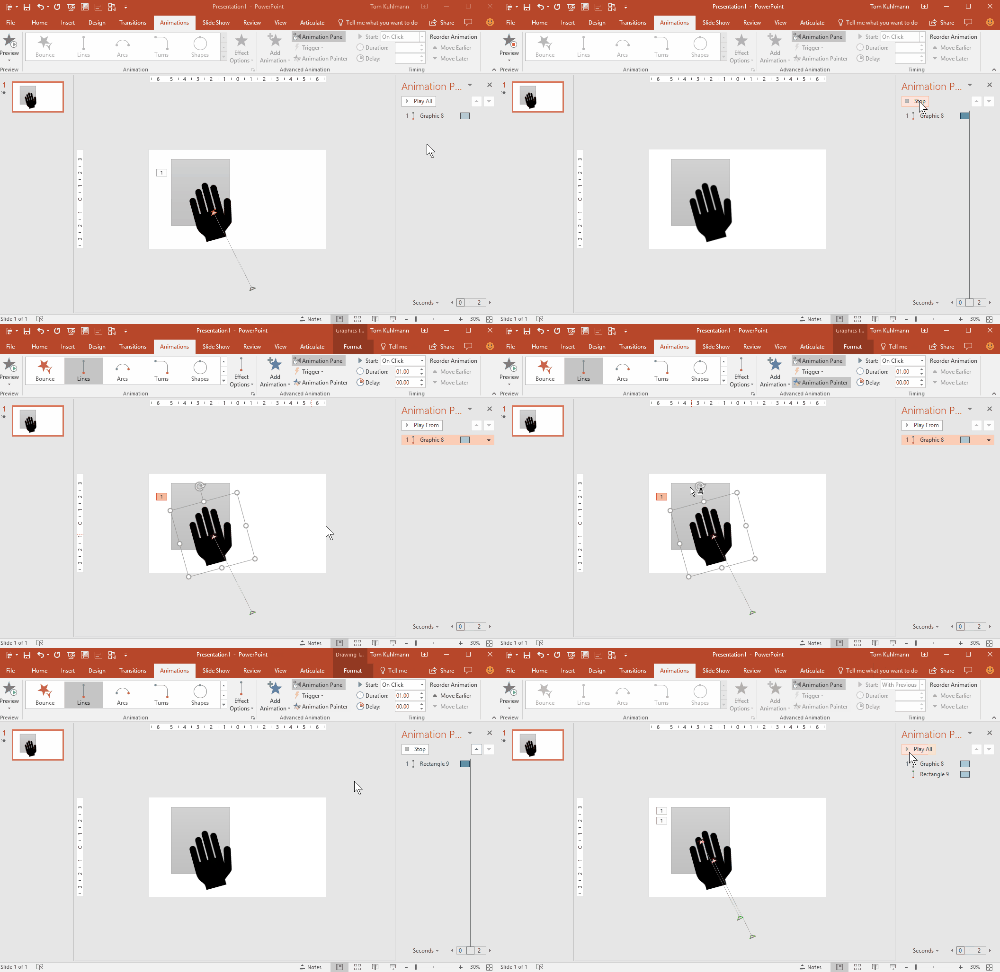
You can add multiple animations to a single object. This allows you to create all sorts of complex animations. However, this can also be a time-consuming process. One production tip is to use the animation painter to copy animations from one object to another. This is especially useful if you need to repeat an animation on a different object.

powerpoint animation painter

Here are a Couple of Bonus Tips

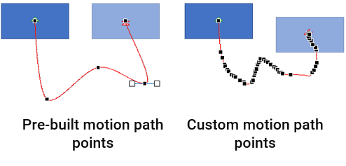
When using motion paths, select one of the pre-built motion paths rather than drawing your own. You’ll end up with fewer edit points which will make the animation along the path much smoother. If you do need to draw a custom path, use the curved shape tool and edit the points.

PowerPoint animation motion path edit points

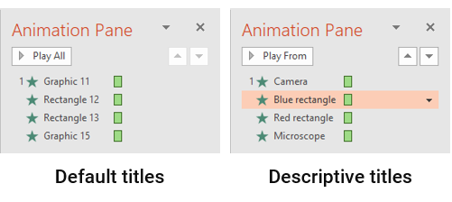
Use the selection pane [Home>Select>Selection Pane] to edit the names of the objects on the slide. It makes it a lot easier to understand what’s happening in the animation pane.

powerpooint animation selection pane

Here are some cool PowerPoint animation tutorials as well as a bunch more. They should spur all sorts of ideas.

Once you understand the basics of PowerPoint animations you’ll be able to create virtually anything you want and build e-learning courses in PowerPoint that won’t give away that they were created in PowerPoint.

Do you have any PowerPoint animation tips?

Events

Free E-Learning Resources

Want to learn more? Check out these articles and free resources in the community.

Here’s a great job board for e-learning, instructional design, and training jobs

Participate in the weekly e-learning challenges to sharpen your skills

Get your free PowerPoint templates and free graphics & stock images.

Lots of cool e-learning examples to check out and find inspiration.

Getting Started? This e-learning 101 series and the free e-books will help.


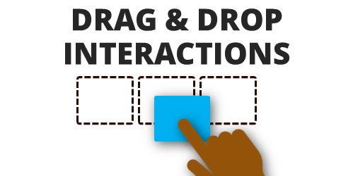
drag and drop interaction essentials

There are three main ways to interact with the course: click, mouseover, and drag. While click-based interactions are the most prominent, a good drag and drop interaction is usually more engaging. In fact, anytime I feature a drag-based interaction in a blog post, I’m always asked how it was created.

Drag and drops are engaging, they let the user “touch the screen” or lean into the course a bit, and they’re novel because they’re not used as often as the other types. With that said, here is everything you need to know about drag & drop interactions from previous posts:

essentials of drag and drop interaction

So there you have it, everything you need to know to get started building effective and engaging drag and drop interactions for e-learning. And if you want to learn to build them, check out these tutorials and take part in these drag and drop challenge activities: challenge #16 and challenge #21.

Is there anything you’d suggest when building drag and drop interactions?

Events

Free E-Learning Resources

Want to learn more? Check out these articles and free resources in the community.

Here’s a great job board for e-learning, instructional design, and training jobs

Participate in the weekly e-learning challenges to sharpen your skills

Get your free PowerPoint templates and free graphics & stock images.

Lots of cool e-learning examples to check out and find inspiration.

Getting Started? This e-learning 101 series and the free e-books will help.


e-learning portfolio

Recently, I’ve seen dozens of portfolios and work samples that are verbatim copies of the work of others. This isn’t a good thing, especially if you represent it as your own work. There’s a difference between being inspired by others and plagiarism. And not knowing this can hurt your career.

To protect the innocent I won’t mention the names of individuals (or companies) that have ripped off the work of others and represented it as their own. I’m sure some of it is intentional, but I suspect that most are just not aware that what they’re doing isn’t in their best interests.

Today I’ll share a few ways to find inspiration from others and use it build YOUR skills the right way. And then use those skills to show off what you can do. The end point should not be an exact copy of the source material. Instead, it should be a derivative work inspired by the source.

Step 1: Find a source of inspiration

Look for ways to be inspired. I focus on visuals and interactivity. E-learning is mostly visual, so it’s always good to learn more about graphics and UX design. And another main point of focus is learning to transition from static content to engaging interactions.

Keep an ideas folder or bookmarks for later reference. Here are some places I like to look for ideas:

  • Design sites like Dribbble where you can see what people are doing. Many will even share free assets.
  • Presentation sites like Slideshare where you can see how people are presenting their content. They also have an easy way to do screengrabs.
  • Mobile apps are a good source of inspiration. I regularly download different apps just to look at how they work and how users interact with them to get content. This gives me ideas for course design. Especially when I want some novel ideas on how to navigate a course.
  • Multimedia presentations are also valuable. News sites tend to build simple interactive multimedia demos for the hot news. Unfortunately, today it seems they spend more on the interactions and less on real journalism, but that’s a blog post for another day.
  • Template sites like Template Monster and Theme Forest are great to see different types of layouts and get ideas for screens and colors.

What are some sources of inspiration for you?

Step 2: Deconstruct your source of inspiration

One of the best ways to learn is by deconstructing things that interest you. Since I work mostly with Storyline, my initial thought is whether or not I can create what I see in Storyline.  Sometimes I can and sometimes I can’t. The goal is to play around with the idea as well as the software.

  • I deconstruct the source of inspiration and try to figure out what’s happening and why the creator may have chosen that approach versus something else. I make notes of what I like and what I may change.
  • I try to build a functional prototype. Sometimes the source content is an interaction I like and sometimes it may be a visual design idea. In either case, I try to replicate it in the software to learn what I can do. One side benefit is that I often discover some new production techniques.

At this point, the concern isn’t a final showcase product. It’s more about building a matching prototype.

Step 3: Apply what you learned to something original

Inspiration should lead to iteration. The goal isn’t to build copycat modules. It’s a small industry and people know when you cribbed an idea from another developer. Instead, the goal is practice and then apply what you learned to something original.

If there’s an animation you found interesting, how would you apply it to your own content? Are there layouts you can build into reusable templates? Can you make the interaction work the same way but in a different context?

A few things to keep in mind:

  • If you do borrow an idea from someone else and share it publicly, give them props. It’s good form and builds goodwill. It also alleviates any accusations when your work looks similar to someone else’s.
  • Share what you build. If you’re going to show off what you built (and it’s not proprietary) it’s a good idea to give something away. Share the source file, a how-to tutorial, or maybe a free template. This helps build your personal brand and expertise.
  • If you see something that looks like your work, understand that people will steal your work. Consider it a form of flattery. Also, people often have similar ideas at the same time. There have been few times I’ve had a blog post in the queue only to have someone in the industry release a similar post before mine’s been released. It shows that a lot of common ideas percolate and often we come to them at similar times. It’s just the way it is.

The end goal in this step is to use the deconstruction as a source of inspiration. And then create a derivative work that is uniquely yours.

Continue to practice and learn your craft. Find sources of inspiration and then apply what you learn to your own projects. And then show off what you can do in your portfolio.

Events

Free E-Learning Resources

Want to learn more? Check out these articles and free resources in the community.

Here’s a great job board for e-learning, instructional design, and training jobs

Participate in the weekly e-learning challenges to sharpen your skills

Get your free PowerPoint templates and free graphics & stock images.

Lots of cool e-learning examples to check out and find inspiration.

Getting Started? This e-learning 101 series and the free e-books will help.