The Rapid Elearning Blog

Archive for October, 2020


navigation.jpg

How do I create e-learning courses that are engaging and not boring?

This is the number one question I get from rapid e-learning developers. As I ask clarifying questions, I usually get something to this effect, “I don’t want click-and-read courses. Instead, I want to use more branching.”

To me this reveals some confusion about designing e-learning courses. In this post, we’ll explore if branches are really the magic solution to keep your learners engaged.
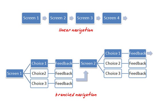
The Rapid E-Learning Blog: example of linear and branched navigation

Linear Navigation vs. Branched Navigation

When people say “click-and-read,” what they usually mean is linear, back and forward navigation. This form of navigation is typical of a lot of e-learning. Unfortunately, what’s also typical of linear e-learning is screen after screen of bullet points. I think people (incorrectly) assume that linear navigation and bullet-point e-learning are one and the same. That is why people complain about “click-and-read” courses.

When they talk about “branches,” what they usually mean is a course with more interactive decision-making. The learner is presented with some choices and then gets feedback specific to those choices. There are usually less bullet point screens in this approach, primarily because of the use of different screen layouts to facilitate the buttons for branching.

Thus, it might appear that linear courses are boring and e-learning courses that use branches are engaging. However, whether you use a linear or branched navigation, it’s really the same experience to the user. The user clicks something then views some content. They really don’t know (or care) if they’ve been branched somewhere else or whether the next screen was just next in the sequence.

So the type of navigation alone does not make for an engaging course. If you want your courses to be engaging don’t think your main focus needs to be on choosing between linear and branched navigation.

Instead, focus more on creating content that’s relevant to the learner’s world. The next section will show you how.

Create E-Learning for the Real World

How a person learns is more complex than just sitting them in front of a computer screen and taking an e-learning course. E-learning is just part of the learning process.

People take a course and then they go back to their daily routine, which involves doing tasks and interacting with others. Whatever they learned in the course is augmented by these other activities. If you design your course with this in mind, you’ll create courses that are effective. Here are five methods to get you started.

learninghappens.jpg

1. Make the content relevant to the learner’s daily routine.

If you read this blog enough, you’ll see this theme over and over again. One of the most important parts of e-learning success is whether the content is relevant to the learner.

If it’s not relevant it will always be boring unless you find a way to entertain the learner. While it is nice to be entertained, in most cases that’s not the goal.

2. Ask questions to guide them through the content.

There are several ways to use questions. It could be as simple as using a question as the title heading for your screen. It’s not dynamic, but it’s clear and purposeful. In addition, it’s easy for the learner to determine whether the content is relevant or not.

Another approach is to restructure the content like a frequently asked question page. Many people like the simple nature of frequently asked questions. They’re clear and they provide answers. Here’s a simple demo on copyright questions that I made to show you how that might look.

You can also use questions to build some clever interactive branches. What’s nice with this approach is that you can guide experts one way and novices another.

3. Create a course that mimics real world interactions.

When I have a dilemma at work, I don’t run to the legal department and look up corporate policies. Instead, I make a decision to solve the problem (and hope that it’s correct).

However, it never fails that when I take a course on some company policy, I’m exposed to a bunch of nonsensical legal gibberish. Instead of bombarding me with a bunch of legalese and corporate-speak, why not build the e-learning course that puts me in real world situations and then force me to make decisions?

I’ll probably make good ones and bad ones (if the course is designed well) which then allows me to get feedback that reinforces the intent of the policy. This is an excellent way to teach me the course content and make it relevant.

4. Blend the e-learning course into activities with real people.

You can use e-learning in conjunction with team building or group activities. Have learners go through a course together rather than by themselves. The main point here is that you can add an extra dimension to the learning process by adding some human interaction. The e-learning course allows consistent delivery of content and enhances the learning through collaboration and discussion with others.

5. Don’t overbuild the course.

Let’s get real. Whether we want to admit or not, a lot of e-learning is a waste of time and the content will never be relevant to the learner. We just don’t want to tell anyone because we love our jobs.

In those cases where the e-learning course is not relevant but still needs to be built, keep it simple and help the learner get through the course as fast as possible. Don’t build a bunch of games and interactive elements. Give them the facts and let them move on.

As you can see, you’re not going to get rid of boring courses by creating branched navigation. Instead, you can do so by building courses that fit into the real lives of the learners. Create content that is relevant and then find a way to connect the course to real world activities.

Events

Free E-Learning Resources

Want to learn more? Check out these articles and free resources in the community.

Here’s a great job board for e-learning, instructional design, and training jobs

Participate in the weekly e-learning challenges to sharpen your skills

Get your free PowerPoint templates and free graphics & stock images.

Lots of cool e-learning examples to check out and find inspiration.

Getting Started? This e-learning 101 series and the free e-books will help.


how to theme colors

When someone first starts to build an e-learning course, one of the first things I recommend is determining the colors they’ll use. And from there, create a template and assign the theme colors.

The benefits to theme colors is that they allow consistent use of colors throughout the course; and if one needs to change, it can be changed once, and that change is applied wherever the color is used.

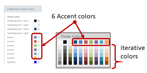
The next recommendation is to determine how to use theme colors. This is often confusing because, you get six theme colors and five derivatives per color. However, there’s no rhyme or reason in terms of how they should be used. They’re just six boxes that can be filled with colors. You can use those boxes anyway you like.

theme colors

But that’s not how you should use them.

I recommend that you define a theme color structure and then use them consistently. This way, every time you build a course the theme colors are set up the same and you can easily swap them out when needed.

How to Set Up Theme Colors

Here are a few ideas that may work:

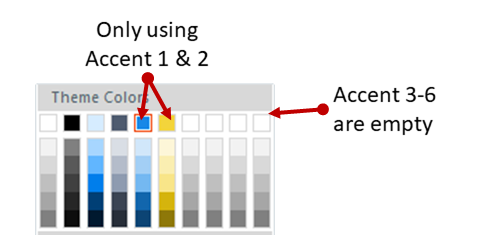
  • You get six theme colors. But you don’t really need to use all six.
  • Define how you do want to use the colors, whether it’s six or four or two.

theme colors

  • Use theme colors consistently in all templates you create.
  • Courses usually have a main color and an accent color. If you only used two colors, you’d have twelve to use because of the iterations. That may be all you need.
  • Most courses have some positive and negative feedback color, usually green and red. Use two of the theme colors for positive and negative feedback.

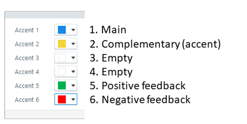
Here is one way you could define your theme colors:

theme color recommendation

  • Accent 1: base color. Usually this is your core brand color.
  • Accent 2: accent color. Most brands have an accent color. If you don’t have one, you can use a color theme site to create one. I typically will select a complementary color of the base color.
  • Accent 3: open. Why create a color you don’t need?
  • Accent 4: open.
  • Accent 5: positive color. Green pulled from the base color’s palette. Use this for quiz feedback or icons to show a good decision.
  • Accent 6: negative color. Red pulled from the base color’s palette. Use this for quiz feedback or icons to show a wrong decision.

For the two open colors, I may look through my organization’s web site and marketing collateral and see if there are other secondary colors used that I could add to the palette. Most of the times, two colors are all I need.

If every course is built with consistent use of theme colors, they can be swapped in seconds. This is a critical part of building and re-using interactions and templates. It’s a little more work upfront (which should be done anyway). But in the long-term it offers some time-saving benefits.

Do you have a strategy when using theme colors?

Events

Free E-Learning Resources

Want to learn more? Check out these articles and free resources in the community.

Here’s a great job board for e-learning, instructional design, and training jobs

Participate in the weekly e-learning challenges to sharpen your skills

Get your free PowerPoint templates and free graphics & stock images.

Lots of cool e-learning examples to check out and find inspiration.

Getting Started? This e-learning 101 series and the free e-books will help.


boring e-learning

In a recent post we looked at boring course content. I am not convinced that there is any boring content. I do think there are bored people.

Today we’ll look at how to deal with the bored people when building e-learning courses.

E-Learning Courses Should Be Relevant and Meaningful

There’s a lot to learn about instructional design with all the theories and models. But when it comes down to it, the key ingredient is that the course has meaning to the person who takes it. If you read this blog enough, you’ll see that repeatedly.

One of the challenges to this is that many courses have little to do with the learner or their needs. A lot of compliance and annual training falls into that category. The goal isn’t learning per se. Instead, it’s to track exposure. In that setting, it’s difficult to cater courses to relevant activities because the content tends to be general and not specific to function. And the goal is an end-of-year completion report.

boring e-learning make relevant

Assuming you do have control over the course structure, framing the content in a meaningful way is important. 

I always say, “Throw them in the pool.” 

Put the learners in the place where they need to know and use the course content. Don’t focus on the information, focus on the desired action. And then build a course around those activities where they can both learn by doing and demonstrate their understanding.

Skip the Course and Focus on Leading Questions

Do we really need a “course” to teach? Why not frame the content around relevant questions and then present the answers (hopefully desired actions) to them?

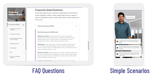
You could create a traditional FAQ type structure of questions with answers. It forces you to frame the content into a more meaningful context and not just focus on presenting information.

boring e-learning scenarios

Another way to deal with a question and answer structure is to build simple scenarios. No need to overbuild the course. They don’t need to be big elaborate media creations. They can be simple questions with a few real-world choices that lead to answers. 

Keep the Learning Where the Learning Happens

A great e-learning course may take a few hours for the learner to complete. But a work week is at least forty hours. And depending on the task, proficiency requires more than a couple of hours of practice. Probably at least a couple of weeks. 

Where is most of the learning going to happen? In your e-learning course? Or will it happen in their daily interactions with real people, making real decisions?

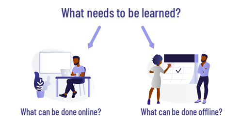
A good e-learning course is just part of the training solution. Blend the online activity with real-world activities. I like to use the online course to ensure consistent and timely delivery of the core content. And then create training activities in the real world. 

boring e-learning peer coach

An easy thing is to create a list of tasks that require proficiency. Then determine how they practice them and get feedback. I like to use learning journals and peer coaches. Regardless of how you do it, the learning happens mostly outside of the online course, thus it’s good to consider that when building the learning experience.

Remember, the course is a means to an end. The goal isn’t to take a course. The goal is that the course enables some practical learning which produces some measurable results.

Events

Free E-Learning Resources

Want to learn more? Check out these articles and free resources in the community.

Here’s a great job board for e-learning, instructional design, and training jobs

Participate in the weekly e-learning challenges to sharpen your skills

Get your free PowerPoint templates and free graphics & stock images.

Lots of cool e-learning examples to check out and find inspiration.

Getting Started? This e-learning 101 series and the free e-books will help.


boring e-learning

One of the top questions about e-learning is how to make boring course content more engaging and interactive. Considering the state of many e-learning courses, it’s a good question. But I’m not sure it’s the right question.

Is Course Content Boring?

I’m not sure the issue is that the content itself is boring as much as the content is meaningless and irrelevant to what the person needs. 

I do a lot of small home projects. Not being the most skilled, I spend a lot of time watching videos and reading articles online to learn what I need to do. As can be expected, the quality of the content varies. However, I don’t view the content as boring.

There is a lot of content not tailored to my specific needs. But that’s OK. I can quickly move on from that. I’m not locked into another twenty minutes of something that is completely meaningless.

What is a Boring Course?

There are boring courses. Much of it is regulatory or compliance training. We’re not going to get rid of it. It’s unavoidable in the world of e-learning. It’s not that the content itself is boring. Instead, it’s a bunch of information mostly disconnected from the learner’s world. 

Another source of boring content is that the course learning objectives are framed around the delivery of the content and not the actions related to it. We present a lot of information, but we don’t show how to apply the information in any meaningful way.

At the crux of it all is that the course content is irrelevant to the learner’s day or job. Thus, it’s meaningless.

I don’t have a job where I’m getting bribed. Yet I’m taking ethics training on not getting bribed. Boring! Put me in a job where I get bribed and then give me training to convince me it’s not worth it. 🙂

How to Avoid Boring Content?

Learning is complex and not just about information. Watching a presentation or e-learning course is just one part of the it. It’s the food we consume. But somewhere in the process it needs to be digested, converted to energy, and used.

In a typical day, people are engaged in all sorts activities. They interact with others and make decisions. A good course considers the real-world application of the content. 

How does the course content impact the interactions with other people? How does the content impact decision-making?

Build the course content in a context that addresses those things. Instead of pushing information without context, craft interactions that simulate real-world decision-making where the content is framed in a meaningful context.

Do that and you won’t have boring courses.

Events

Free E-Learning Resources

Want to learn more? Check out these articles and free resources in the community.

Here’s a great job board for e-learning, instructional design, and training jobs

Participate in the weekly e-learning challenges to sharpen your skills

Get your free PowerPoint templates and free graphics & stock images.

Lots of cool e-learning examples to check out and find inspiration.

Getting Started? This e-learning 101 series and the free e-books will help.