The Rapid Elearning Blog

Archive for October, 2022


e-learning job

The organization’s ultimate goal is not to build a course. Instead, the goal is to meet some sort of performance need. And in that sense, the e-learning course is a solution to meet an objective.

And this is where e-learning often falls down.

Effective training programs successfully meet learning objectives that aren’t fuzzy and non-measurable. On top of that, e-learning is usually just part of the overall training program. So it’s not the end-goal.

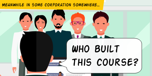
I’m often asked about how to build better e-learning. From my perspective, many of the courses I see aren’t very good. There are all sorts of reasons for this, but the main reason is that the courses share so much content that they present the illusion that they’re complete. But usually, they’re just content-heavy andnot tied to any meaningful objectives. Thus, they usually produce little to no tangible benefit for the organization.

If you didn’t see it, here’s an interesting article where training gets a large part of the blame for an organization’s $8 billion attrition rate. Is it fair that training gets the blame? I don’t know. But the key consideration for those of us in training is that we need to be aware of the perception and make sure that our programs are designed to actually meet objectives.

When we design e-learning courses, we need to think about the overall objective of the training program and design our courses to meet that objective. All too often, I see courses that are nothing more than glorified and interactive PowerPoint slides. These courses might be fine if the only objective is to provide information, but if the objective is to actually change behavior or improve performance, then these types of courses are doomed to fail.

The bottom line is that a course is only as good as the objectives it’s designed to meet. If you’re not sure what the objectives of your training program are, then you need to go back to the drawing board. But if you have a clear understanding of the objectives, then you can design a course that will actually help your organization meet those objectives.

And that’s the challenge for many of us who build courses. We build a lot of content that we call e-learning. But does what we build contribute to success? How do you know?

Events

Free E-Learning Resources

Want to learn more? Check out these articles and free resources in the community.

Here’s a great job board for e-learning, instructional design, and training jobs

Participate in the weekly e-learning challenges to sharpen your skills

Get your free PowerPoint templates and free graphics & stock images.

Lots of cool e-learning examples to check out and find inspiration.

Getting Started? This e-learning 101 series and the free e-books will help.


boring e-learning

I’m a big fan of e-learning! I’ve been in the industry for almost 30 years and I think it’s a great way to learn. I also think it’s a great way to keep people engaged in their work.

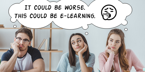
I recently had the chance to ask a group of people about their training experiences and I was surprised by how negative much of their feedback was. Don’t get me wrong, I’m not surprised that there are problems with many training courses. I’m just surprised that so many people have such negative things to say about them.

People complain about the courses they’re taking, the quality of the courses, and the fact that they’re often forced to take courses they don’t want to take.

I understand where this negativity comes from. Most people only take courses because they have to, not because they want to. And let’s be honest, a lot of courses are pretty meaningless. They’re boring, uninteresting, and poorly designed.

But I think there’s a way to change this. I think we can make e-learning more valuable for learners by making a few simple changes.

  • Make sure the courses we’re creating are actually worth taking. They should be interesting, engaging, and relevant. You’re asking a person to commit their time to the course, we should respect that.
  • Learners need a reason to take the course. We need to tap into what motivates them and give them a motivation to learn.
  • The courses should be an actual learning experience and not just content. It’s content with context. They should be interactive and engaging, not just a glorified brochure.

If we can make these changes, I think we can make e-learning more valuable for learners. And that’s something we should all be striving for.

Events

Free E-Learning Resources

Want to learn more? Check out these articles and free resources in the community.

Here’s a great job board for e-learning, instructional design, and training jobs

Participate in the weekly e-learning challenges to sharpen your skills

Get your free PowerPoint templates and free graphics & stock images.

Lots of cool e-learning examples to check out and find inspiration.

Getting Started? This e-learning 101 series and the free e-books will help.


interactive e-learning and learning experience design idea

I was wasting time with this activity where you create the next iPhone. Playing with the site reminded me of a few core principles that are often neglected when building interactive e-learning; so here are a few brief thoughts.

Traditional e-learning is basically boring.

I know there are some good courses out there. But I’ve seen thousands of courses from large and small organizations and they’re mostly bland and uninteresting. There are all sorts of reasons why, but the core problem is that these courses are created oblivious to the needs of those who take them (or are forced to take them).

I suspect, if the end-user had to pay for the courses (and the organizations needed that money) the courses would be made better. But until the organization sees the end-user as a consumer in the same way they see their customers, most e-learning is still going to be what it is today.

How to design good interactivity.

I always see interactive e-learning as two considerations: touch the screen and apply the content. How to pull the person into the course? The content should be constructed into a meaningful narrative that engages the person. But there’s also a place to get the person to “touch the screen” where they can interact with things onscreen. Turn the three bullet points into three tabs. Get rid of the next button and find a different way to navigate the course. There are all sorts of ways to do this, but the key point is to get them to interact with the course.

The second part, which is more than the novelty of the first, is to get the user to interact with the content. Most courses fail because the user only consumes content without being required to do anything with it or apply it in some meaningful way. Build real-world decision-making activities where they not only get content, but they use it.

What can I learn from the time-wasting activity?

Obviously something like the iPhone builder isn’t easy to build as an e-learning course. And the goal of a real course isn’t to waste time (unless it’s one of those time-based compliance courses). However, there are things happening on that site that we can glean that do relate to an online learning experience.

learning experience design idea based on an online interaction

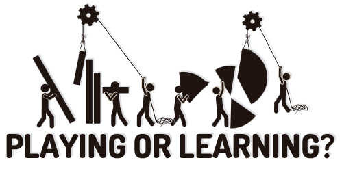
  • There’s fun in constructing the phone.  There’s value in construction. It allows a person to explore and play with ideas. Look at the last course you built. What type of meaningful play-around activity can be built in the course? This is probably tough for a lot of e-learning content, but may be more possible than you think. If you need ideas, ask in the e-learning community.
  • Identify the “what ifs.” One challenge with most courses is that we have to quiz and assess for the purpose of grading rather than understanding how the person is learning. If things in the course were open, we could let people play around with the “what ifs” during the learning. “What if I choose this option?” “What happens if I add too much of this, or respond with this type of answer?” Give people options to test other answers or make bad decisions to see what happens.
  • Don’t give them all the answers. Instead, present a challenge and let them figure it out. Give them resources. Give them tips. Give them prompts. But let them figure out what they need to figure out. Obviously, somewhere in the process you have a check-in to see what’s going on and what they’ve learned. But what if the course was more an exploration with an expectation of a certain result and you just give them the tools to get there?

I know that’s a lot to think about for many e-learning courses. Some of it is a bit novel. Some of it is probably too radical. But if we don’t push things a bit, we’ll be where we are now, which is pretty much where we were thirty years ago.

Events

Free E-Learning Resources

Want to learn more? Check out these articles and free resources in the community.

Here’s a great job board for e-learning, instructional design, and training jobs

Participate in the weekly e-learning challenges to sharpen your skills

Get your free PowerPoint templates and free graphics & stock images.

Lots of cool e-learning examples to check out and find inspiration.

Getting Started? This e-learning 101 series and the free e-books will help.