[…] post originale di Tom Kuhlmann sul “Rapid E-Learning Blog”. Il post originale è disponibile qui jQuery(document).ready(function($) { […]
3 Things to Consider When Building Interactive E-Learning
November 13th, 2012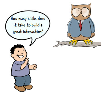
In a recent post, I built a drag and drop video player where you can select and drag a video title to load a video tutorial. I got lots of questions about how I built the player. Most of the questions were about how I built the drag-and-drop player. So I put together some tutorials and made the file available for download.
- Tutorial 1: create the framework
- Tutorial 2: add layers and links
- Tutorial 3: create the drag and drop
- Tutorial 4: design tips
- Downloads: file and free font
One reason why the post generated so many questions is because of the novelty of dragging the choice button to load a tutorial video. This makes sense. In most cases this type of demo would have been a click and reveal interaction; but the drag and drop choice added some novel interactivity.
However, was using a drag and drop button the best way to do it? That’s what we’ll explore today.
Core Interactivity
Essentially you have three types of onscreen interactions: click, hover, and drag. We discussed that in the previous post on interactive building blocks.
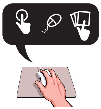
Often the interactive elements are interchangeable. But that doesn’t mean that they work equally the same in your interaction design.
In the original interaction, the user reviewed a list of videos and then dragged the choice to a box. This loaded information about the video. Then the user clicked a play button. It was a novel way to play videos, but was it the best way?
In today’s post we’re going to revisit the drag and drop player to look at a few other options we had in the design.
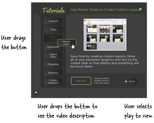
Drag & Click: Novel Interaction Can Engage Users
One of the reasons the player generated so much interest is because it was a novel way to design a tutorial module.

Normally, this type of demo would be a simple “click the button” type tutorial. But instead the user could drag the choice to another location. And this novelty is kind of fun because it’s different.
Click here to view the drag & click demo.
Novelty is a great way to engage people and draw their interest. But, novelty wears off really fast. If there were only 2-3 choices, this type of novelty is probably fine. In the case of the demo, it’s probably a little too much because there are a lot of buttons to choose and the dragging interaction is tedious.
Click & Click: How Many Clicks Does It Take?
Click and reveal interactions tend to be the most frequently used. The most often we see them is when we click “next” buttons.

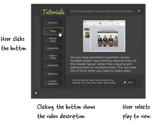
In the second example below, the user clicks the tutorial button to load the description of the videos. And then she can choose to click the play button to view the video.
This is a typical type of interaction. The value in clicking to load the information is that unlike the dragging, you don’t have to move the mouse. It’s a little more efficient and it locks the information on the screen until another user action.
Click here to view the click & click demo.
The downside is that it requires a lot more clicking and since the play button is across the screen, it requires a lot more mouse movement. Again, if there were fewer buttons that would probably be OK. But in this case, it’s too many clicks and mouse movement.
Hover & Click: Efficient & Intuitive Movement is Key
Hover (or mouseover) interactions are nice because they allow access to additional information with very little mouse movement.

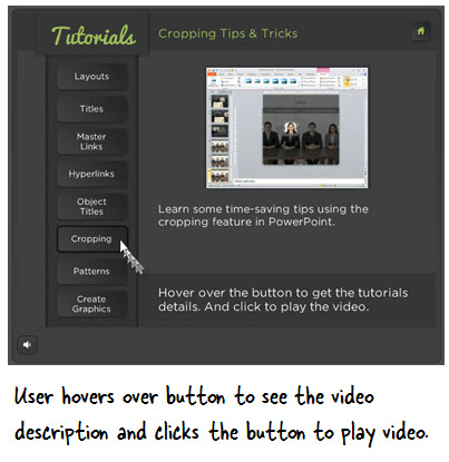
In the third example below, the user hovers the mouse over the tutorial button which exposes the video description. At that point, she can choose to click and watch the video or hover the mouse over a different button.
Click here to view the hover & click demo.
This is a much more efficient way to navigate because everything’s in one place with minimal movement. One negative though is that with the hover interaction you can quickly lose information. Unlike a click interaction which freezes the screen until another click, the hover loses it as soon as you move to something new.
As you can see there are pros and cons to each interactive building block and much of it is subjective. The main point is to make it as efficient and intuitive for your users as possible. If you have to spend a lot of time explaining what to do, you should revisit your design.
Also keep in mind that novelty is great to engage them, but it’s important to not exhaust and frustrate the users with excessive novelty.
I mentioned this before. If you’re building interactive elearning it’s important to learn more about usability and designing user experiences. Here’s a link to some resources and book recommendations.
I also just started reading Undercover User Experience Design. I like its practical approach to UX and the book’s not too long (a plus for me).
What are your thoughts? Feel free to share them by clicking on the comments link.
Events
- Everyday. Check out the weekly training webinars to learn more about Rise, Storyline, and instructional design.
Free E-Learning Resources
 |
 |
 |
|
Want to learn more? Check out these articles and free resources in the community. |
Here’s a great job board for e-learning, instructional design, and training jobs |
Participate in the weekly e-learning challenges to sharpen your skills |
 |
 |
 |
|
Get your free PowerPoint templates and free graphics & stock images. |
Lots of cool e-learning examples to check out and find inspiration. |
Getting Started? This e-learning 101 series and the free e-books will help. |
16 responses to “3 Things to Consider When Building Interactive E-Learning”
Leggi la traduzione autorizzata in italiano del post qui:
[…] What are your thoughts? Feel free to share them by clicking on the comments link. […]
[…] Read more here: 3 Things to Consider When Building Interactive E-Learning » The Rapid eLearning Blog […]
As with http://www.articulate.com/rapid-elearning/here-are-the-3-building-blocks-for-interactive-e-learning-2/ it’s important to note that your choice of interaction will be more limited if you are trying to create interactions and content that are accessible to people with visual limitations and who therefore use a screen reader, or who use keyboard navigation due to mobility and fine motor skills constraints (picture Stephen Hawking for example).
Namely, stay away from drag and drop. A blind user can’t figure out where to drop, or even know where they are on the screen, and “click and drag” can’t be done with a keyboard as far as I know. Storyline’s own VPAT mentions this constraint. http://www.articulate.com/rapid-elearning/here-are-the-3-building-blocks-for-interactive-e-learning-2/
[…] on http://www.articulate.com Tu voto:Me gusta:Me gustaSe el primero en decir que te gusta. […]
[…] on http://www.articulate.com Share this:TwitterFacebookPinterestLinkedInTumblrStumbleUponGoogle +1DiggRedditEmailPrintLike […]
[…] 3 Things to Consider When Building Interactive E-Learning » The Rapid eLearning Blog […]
[…] on http://www.articulate.com Gostar disso:GosteiSeja o primeiro a gostar disso. Por progdan […]
I agree with you. The drag and drop button makes the thing easy. And it is the best way to do it. Very Smart ! 🙂
[…] I built the player. Most of the questions were about how I built the drag-and-drop player.See on http://www.articulate.com Share this:TwitterFacebookLike this:LikeBe the first to like this. Published: November 19, 2012 […]
[…] 3 Things to Consider When Building Interactive E-Learning […]
Can you please identify if the topic/idea is Storyline. I have been doing a lot of reserach and think I have found a great idea, only to find it is Storyline. This is frustrating and very time consuming.
Thank you in advance for directing me to just Articulate 9 articles/tutorials, etc. I don’t think I’ll be gettting Storyline in the near future, so, I have to maximize 9.
My next project is policy/regulatory updates. I have been charged with including gaming concepts that engage, motivate, accelerate and increase learner retention. I have been scouring every blog and tutorial you have. I can use quizmaker – RSI w/ point value that builds by answer; but, this still seems to be pretty linear.
I have to submit my gaming model tomorrow (11/27).
Thank you so much for responding to my questions.






0
comments