The Rapid Elearning Blog

I was working with a student intern the other day.  We reviewed his first attempt at a rapid elearning course.  For this review, we focused on the course’s visual design.

Overall, he did a great job, especially for someone just starting out.  However, he made some mistakes that are common to many of the courses I see.  I thought I’d do a quick rundown of what they are and provide some tips on how to prevent them.

1. Not Considering the Impact of the Visual Design

Good elearning design is as much about visual communication as it instructional design and learning theory.

When I learned video production years ago, we were always told that everything in the frame means something.  It’s the same with the computer screen.  You’re building the screen and adding content.  Everything you add conveys a message, whether it’s your intention or not.

Look at a company like Apple.  They build good products.  But they also tell a compelling story.  There is a consistent message between the products they sell and the way they pack it visually.  It all adds to the Apple experience.

In the same sense, your course is a story.  The content design and structure is part of it.  But are you committed to a visual design that reinforces the key message and emotions?
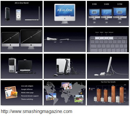
The Rapid E-Learning Blog - Apple is a good example of communicating with design.

It’s not about just making the screen look good.  Visual design sets the tone for the course and that shouldn’t happen by accident.  Everything on that screen communicates something.  It’s your job to make sure that it’s communicating what you want it to.

2. Lack of Unity

Your course has a central idea or objective and the visual design should be built around that.  In addition, where you place the elements on the screen should be consistent and related to one another.  You want the learner to recognize the placement and anticipate where the new information will be.  It gives everything a sense of order and continuity.  The visual design should complement the learning experience and not compete with it.
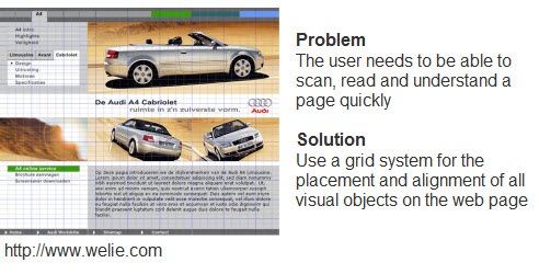
The Rapid E-Learning Blog - Click here to read a quick overview.

Many web designers will use a grid structure to map out the page design.  That’s a good way to plan how to place content on the screen.  For rapid elearning design, it’s a good idea to use a grid structure to design your PowerPoint template and the layout of your screen.  It’s a great way to maintain unity.  Here’s a good presentation about grids and how to use them.  It’s more about web design, but many of the principles are the same for elearning.

3. Graphics Don’t Match

The intern’s demo had some really nice use of photos to support the course.  However, there were some places where he used vector images and clip art.  While they weren’t superfluous and did fit the context of the course, they just didn’t seem to belong to it.

The first rule for using graphics in your elearning course is to make sure that they’re not just decorative.  They should contribute to the content on the screen.  This includes the learning experience as well as the look and feel of the course.  Again, it’s not all about the learning content.  There’s also the aesthetic consideration that is part of visual communication.
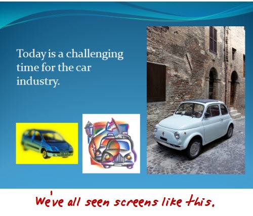
The Rapid E-Learning Blog - Avoid graphic designt hat is sloppy and confusing.

The second rule is to use graphics that belong together.  This ties into the previous point about unity.  It also conveys a sense of professionalism.  You want your graphics to look like they belong together and are part of a whole.

Even if you’re stuck using clip art, you can find images from a similar style and then modify them to fit together.  I show you how to do that in this post on creating your own custom characters out of clip art.

4. Confusing Use of Contrast

When it comes to visual communication, contrast is one of the most critical elements.  Your job is to help guide the learner’s attention.  Contrast allows you to do that because it highlights the differences.  People are drawn to the contrast naturally.

I get to look at quite a few courses and many people do a good job with adding contrast to their screens.  The only problem is that a lot of it is unintentional.  That means you could be distracting the learners or getting them to focus on the wrong things.

There are all sorts of ways to add contrast to your screens.  You can change the size or shape of elements.  Play around with colors or the placement of objects.  What fonts are you using?  How are you using their size and color to bring contrast?

Andrew Houle of My Ink Blog has a good example of contrast.  “Do the eye test on this site. What do you notice first? More than likely it’s the star on the box…they’ve created a focal point using a large image and limited color.”  Also notice the way they used the fonts?  This could just as easily be the design for an elearning course slide.  Check out this post from My Ink Blog for more good design tips.  And here’s another about contrast.

The Rapid E-Learning Blog - Contrast is a great way to draw attention to the screen's content.

5. Misuse of Fonts

I’ve seen some courses that must use about twenty different fonts.  As Arthur Fontsarelli would say, “That ain’t cool.”

Fonts serve a few purposes.  First, they’re used to display text for reading.  That means you have to consider which font style is going to work best on your screen.&#160
; It has to be the right type of font and the right size.  In most cases, a san serif font works best for the computer screen.

The Rapid E-Learning Blog - Heeeey...bad fonts ain't cool.

Fonts also should fit into the overall theme and design of your course.  If you’re doing a traditional or serious course, Comic Sans probably isn’t your best bet.  At the same time, if you want to set an informal tone, you’ll probably stay away from something like New Times Roman (unless you’re a financial analyst).

So you should view the fonts on the screen as text that is to be read AND as a graphic the communicates additional meaning.  To learn more about different fonts and their personalities, check out the Font Conference.

The Rapid E-Learning Blog - Font conference video.

  Click here to view Font Conference video.

There really is a lot more to say about visual design and elearning.  I’ll be doing some additional posts where I break down some of these ideas here and also explore some other ideas that I didn’t mention today.

What do you see as common visual design mistakes in elearning courses?  Click in the comments section to add your thoughts.  Also, what books would you recommend?

I’m a fan of Robin Williams and her two books, The Non-Designer’s Design & Type and Design Workshop.  They’re both good for learning the basics.  I’ve also enjoyed Slideology.  Nancy Duarte covers a lot of key design ideas with good examples.  Add your recommendations to the comments, as well.

If you liked this post, you might find these of value:

Events

Free E-Learning Resources

Want to learn more? Check out these articles and free resources in the community.

Here’s a great job board for e-learning, instructional design, and training jobs

Participate in the weekly e-learning challenges to sharpen your skills

Get your free PowerPoint templates and free graphics & stock images.

Lots of cool e-learning examples to check out and find inspiration.

Getting Started? This e-learning 101 series and the free e-books will help.


53 responses to “5 Common Visual Design Mistakes”

Great points Tom. I don’t think you can emphasize enough the importance of consistency.

One of the mistakes I see new designers make is looking at their e-learning courses as single slides rather than a series of slides.

Many times new designers improvise or experiment during development. It’s almost like they get bored during production and look for ways to make it more interesting. It’s the most common yet easiest design mistake to correct.

Great post Tom. #3 is my biggest irritant. 5 images of exactly the same thing using wildly different styles screams “amateur hour.” Pick a single *format* (vector or raster) for your *entire* presentation. Then pick a single *style* in that format. Then resist the urge to include multiple images of the same object on the same slide unless it’s necessary.

And regarding fonts: Comic Sans must die. My new boss at work uses Comic Sans for *all* her documents. Hold me…

June 24th, 2009

Good topic and great information.

Fonts and colors are one of my pet-peeves on slides. Font selection help set the tone of the message (serious or informal) just as you stated. Color selection is another where the text may be very difficult to read and become more of a distraction than a learning experience.

And these apply not only to e-learning but also to web pages and even print.

Thanks.

I guilty of this myself, but too many people skip the storyboard process. Creating your page designs in a storyboard can help determine what is going to work and what won’t. It is also a easy medium to get other’s input prior to spending a lot of development time only to have to go back and redesign. Here is my spiel on storyboards – http://minutebio.com/blog/2009/01/13/to-storyboard-or-not-to-storyboard/

June 24th, 2009

Thanks for another great post, Tom, and for the links to more information about this topic.

A common mistake I’ve seen is trying to fit too much on one screen, whether it’s four or five paragraphs of text, a collage of several photos, or popup overload.

In our organization, we have an informal rule about not going over twenty screens in a lesson. Unfortunately, that sometimes leads to designers trying to cram as much as they can onto each screen (rather than perhaps rethinking the overall course structure and breaking up some long lessons).

Very well summed up. Just take care of these basics and you’re fine as a designer.

Thanks for the post Tom…good information and so very true! I started following you on Twitter about a month ago…nothing but good stuff posted here.

Lack of unity/consistency and mismatched graphics are the two biggest mistakes I see all the time. I think a big part of this is either the lack of a QA process to catch inconsistencies or companies just don’t take the time to review a course and catch these obvious issues.

As an old time typographer I take issue with your recommendation that “sans serif type faces work well. Many years ago I spent some time with the creator of “Times” and his message still holds true. He was concerned with “readability” and “retention”; studied how the brain processed images; and didn’t believe that the human eye ball was created by Jobs or Bill when Steve and Bill made sans serif type the default for their computer screens. Yes, the old computer screens (pre-1990) did not handle serif type well but for more than 15 years we have enjoyed typefaces like Georgia which were designed to optimize both the computer screen and our ability to read.

I personally conducted “performance tests” for “working operators” and found that serif type faces allowed operators to “out perform” THEMSELVES when they had the same screens use sans serif fonts. Our problem today is that the so-called “experts” are not concerned with performance standards let alone retention.

If the younger computer operators have indeed discovered a source for new “eye balls” I could use them. I am over 70 and not as sharp as in my younger days but I still know typography.

I also recommend Garr Reynolds: Presentation Zen for visual design tips.

June 24th, 2009

Tom:

One of aspects of fonts, font color, and images to remember is that of the issue of colorblindness. As an educator, it is important that everything I develop understand and implement for the needs of users who are colorblind.

Many people think anyone labeled as “colorblind” only sees black and white – like watching a black and white movie or television. This is a big misconception and not true. It is extremely rare to be totally color blind (monochromasy – complete absence of any color sensation). There are many different types and degrees of colorblindness – more correctly called color vision deficiencies.

For some color deficient individuals, the names red, orange, yellow, and green are simply different names for the same color. The same is true for violet, lavender, purple, and blue. Among the colors most often confused are pink/gray, orange/red, white/green, green/brown, blue green/gray, green/yellow, brown/maroon, and beige/green. Pastels and muted tones are difficult to distinguish. The color vision defect may be so bad that the affected person cannot distinguish brown socks from green socks, a red traffic light from an amber one, or green grass from brown soil by color alone.

It is estimated that between 10%-20% of individuals have some form of colorblindness. So, remember them when you are designing your material. Pay attention to how your fonts, font colors, and images will look to all users.

Thanks for the feedback.

@Jeffery: storyboarding is a good way to help map out the look and feel of the course. As David says, a lot of people seem to design on the fly.

@Anton: you bring up some good points about fonts. You’re correct that serif fonts usually do provide better reading and retention. However, most of the stuff I’ve read still promotes san serif fonts over those with a serif. Also, font style is only one consideration when using them on screen and in a visual presentation. The same studies that compared reading and retention indicated that many of the readers assigned a personality to the fonts and rated “attractiveness over likeability” which could impact how a person even perceives the screen before reading it. In either case, you make some good points. Perhaps I’ll do a blog post on this as it warrants more discussion.

June 24th, 2009

Absolutely fascinating work!

Who would have thought that with some focus on the appearance and design, good web/blog content can have more impact and be more memorable, more effective.

There is obviously more to read up on here. I’ll be back!

Great to see your post, Tom. Tuesday went by, and I began to wonder if you were okay. LOL

Everyone above added great comments and URLs. I, too, love Robin Williams’ design books.

When appropriate, I use a visual technique borrowed from photography: the 1/3, 2/3 “rule”. This means that your main object of visual focus should “never” be in the center of the view finder, or screen/page for e-learning. Place it either in 1/3 of the visual space, or in the larger 2/3s of the visual space, but never smack-dab in the middle.

This applies to visuals with accompanying text. If the visual is alone on the screen, then placing it in the middle (or at zero on the grid) is appropriate and the eyes expect that placement.

Glad you’re okay! I’m now programmed to think “Tuesday = Tomsday”.

Tom:
I have had several “drive-bys” to my blog and found that the “new wave” designers all promoted that I use a sans serif font. On further investigation, I found that an entire “readership” in cyberspace relates “sans serif” with “modern thinking” and if you don’t use them you are not “with it”. There are entire generations which never got into more than “does it look good to me”, not “does it work well AS IT COULD sfor me”. I welcome the thousands of typographers who promote “sans serif” because it keeps old-time typographers like me in business. In the same way, if these modern users fail to see a lot of “social networking icons” on your site they conclude that your site must not be any good. I have found that type font and the absence of icons discourage the “tire kickers” from taking up too much of my time or attention.

Most of the times, people who is not professional in visual design or similar, and who have to create presentations, don´t have all the tools, tips and resources for making a good one. Case 3 is the most irritating to me too, but I have found that they search for images on the web and don’t care about consistency because they don’t have have a source of images with same style for all the presentations.
I started to see presentations for online learning on 2002 and at that time, it was worst, because of the lack of free resources on the web.
Many institutions want to work with open source apps and don’t want to pay for images or videos, or other resources, because they think everything should be done with free resources.

June 24th, 2009

I was brought up in the “consistency is everything” school so we would always have several different types of templates for our screens and not deviate from those. Oh, the discussions (arguments) we had picking them apart, debating text and graphic placement, raising each others’ blood pressue, setting standards, etc. We had very consistent, “professional” looking screens that made up a cohesive course. Guess what? They bored the students to death!!! So much consistency and predictability put them to sleep. It’s like the teacher in front of the class who teaches the same way, every day. Now in my wiser years, I design an overall look and feel, but throw in some new elements now and then – to keep them interested and engaged. My students, by the way, are adults ages 30-60. I’m even experimenting with different style intros for different lessons. The Articulate player template I use for a course is the same and provides the consistent feel. So, anyother renegades out there who are bucking the consistency trend?

@ Lisa Ferris:

Perhaps the reason your consistent course bored the students was because it was consistently boring? 🙂 Using templates seem to guarantee learner indifference. Templates are a scourge.

That said, I don’t think you need jarringly inconsistent style to keep your learners in the game any more than a good film needs an animated black & white segment thrown into the middle to keep the viewers engaged. (Though some directors have certainly tried – and these attempts almost always come off as cheap tricks.)

Nickola, thanks for bringing the topic of color deficiency to the fore. I am one of those people and work very hard to keep the colors matched from screen to screen. Sure, it may be a bit boring, but then I can always change the color from lesson to lesson. I also use coworkers to assist in color choice and matching (and accept the good-natured teasing that inevitably comes with the questions).

It is really necessary that when using color to make comparisons, there are additional comparative clues; red versus green AND Arial versus Comic Sans. I may not be able to see the difference in the colors, but I can sure see different shapes.

Lisa, a change in the consistency of a design is fine, but, it needs to stay within the general schema. You really would not like to see a presentation with purple, red, blue, and green fonts scattered haphazardly. Of course, with me, I wouldn’t know the difference – lol

Tom, thanks for the post. The more information on visual design that instructional developers have, the better the instruction will be.

@Lisa – AWESOME comments!

You’re right on with your comment about mixing it up. Throwing in splashes of unpredictability is the perfect way to keep your learners engaged and “wanting to see what’s coming next”.

For example, I build most of my course designs with asymmetrical grids. This allows me to move content, media and interactions around based on the content rather than forcing content into my predefined layouts. My layouts change but my style guide remains consistent.

What I’m hearing in your comments, with which I completely agree, is mixing it up is an ideal way to keeping our learners engaged but mix it up “consciously”. Changing Heading styles in the middle of the course isn’t the same as incorporating an illustrated “Did You Know” scenario in a course designed with stock photo slides.

I’d argue most newer designers unconsciously make changes to their designs and that’s what creates the sense of imbalance.

Great comment:-)

David

Great article!!

While working with designers, I often noticed that designers crib about the limited liberty in creativity while they work on serious but informal elearning material. There are some courses wherein some sort of animation is being used while presenting content. Many a times such unnecessary animation seems distracting while reviewing course. I think the use of wrong / unnecessary animation should also be the part of above list.

June 25th, 2009

Dear Tom,

Very common sense based suggestions, if implemented by a designer, it should bring him success. Reading your blogs, I review in my mind as to what I do and compare with your suggestions. Most times it matches, but sometimes not. Then I make it a point to implement in my real-life work, which unfortunately is not always possible/ successful.

Regards,

Salil
91-9350505411

June 25th, 2009

Great points Tom. You have some really great blogs; this is just one of many:)

[…] struck me while reading a recent post on visual design mistakes I was reminded of the importance of applying good design principles – both aesthetic and structural […]

June 25th, 2009

Great show once again, Tom. I’d add these to your list:

1. Get help if you need it! Some folks will never have the visual skills to pull it off like a pro. A common misconception: I have the tools, I can do it right (right?) —> WRONG. No matter what that tool salesman tells you, it takes more than tools to get the job done right. I wince when someone asks ‘hey, you got an extra copy of PhotoShop or Flash?’ People underestimate the time it takes to master these tools and the principles associated with good design above a threshold that doesn’t look like a child did it.

2. Prioritize. Don’t try to make EVERYTHING shine. You’ll end up endlessly licking your project and it will not meet your expectations in the end (if everything is important then nothing is important). Pick the important stuff, prioritize resources (especially if you get outside help) to highlight / polish the activities that are important. If a few things shine, folks will get it and THAT is what they’ll remember. Better to have a pattern waveform that looks like a heartbeat than one that looks like noise. When you prioritize you apply the concept of contrast to your whole package.

To the fellow with the serif preference:) I too like serif fonts but will use them strategically and more in print than on screen. If I want someone to actually read something I’ll strategically use serifs. But, really, people don’t come to the Web to read – they scan. Personnally I find that serif makes a block of text more difficult to scan and ends up adding decorative detail to a page (looks like there’s more there than there actually is… partly because there is more there). Behind the scenes, I wonder if there’s a higher cognitive load with a serif font because of the added detail?

June 25th, 2009

I believe the more professional and engaging the visual design is, the more credibility the course has. I spend the extra time at the beginning of a new series of courses designing out the look/feel/tone of the course. Some clients want you to hurry up and just “get something out there”. But I believe with some experience and a day of effort, you can design a professional look that you can expand upon throughout development.

It cracks me up when I hear that it looks like a professional designed and developed a course. Aren’t we all professionals? 🙂

I know this topic is focused on visual design, but good design needs to be paired with an engaging audio script. I’m currently helping someone create their first short demo on how to complete a task in some software. Since I’ve been doing this awhile, I forget how hard it can be for a newbie to write a script that doesn’t bore you to death or sound like you’re reading from a law book.

Long live informal, conversational audio scripts! Without them, your beautifully designed course is equally as dull as a list of bullet points.

June 25th, 2009

Feeding the discussion. As Anton mentions, Georgia is a pretty nice typeface even for the screen. Have a look at the execution (and the read) here:

http://www.will-harris.com/verdana-georgia.htm

“Long live informal, conversational audio scripts!” – Heather

Amen!!!

[…] 5 Common Visual Design Mistakes – The Rapid eLearning Blog […]

[…] un nouvel article de son blogue, Tom Kuhlmann nous présente 5 erreurs fréquentes réalisées au niveau de la conception […]

[…] 9:42 am on June 26, 2009 Permalink | Reply Brief post today over at articulate.com about mistakes in creating an e-learning course. Tom considers that: Not Considering the Impact of the Visual Design Lack of Unity Graphics Don’t […]

[…] 9:42 am on June 26, 2009 Permalink | Reply Brief post today over at articulate.com about mistakes in creating an e-learning course. Tom considers that: Not Considering the Impact of the Visual Design Lack of Unity Graphics Don’t […]

The grid presentation doesn’t seem to work. It tells me the pdf file is broken. Can you provide me with another location to access the file?

[…] you’re drawn to the color and will look at that information first.  Contrast is a key visual design principle and effective in moving the learner’s eye across the screen.  You’ll notice that I also […]

Hey Tom,

Great post! I was only wondering about the use of serif fonts. Once I heard we should avoid their use. But you said just the opposite. So, what now?

@Guilherme: Years ago when screens were a little different, reading serif fonts on the PC was a challenge. So the recommendation was san serif. In most cases that still seems to be true. However the screen resolution is much better today, so some of those rules have changed.

Personally, I’d still go with a san serif. If I did use a serif font, I’d limit how small I’d make it. The key point is that the font represents both text and personality. So people read it and they also construe meaning from the context in which it’s used. So it acts as a graphic that also conveys meaning.

How about Impact all the time? ha ho.

In regards to the fonts and sans serif versus serif fonts like Times New Roman. Years ago when I was completing my undergrad in elementary ed I read a research study on this topic. They compared reading comprehension and speed on the same content using serif fonds and san serif fonts. For the US and the majority of European countries serif fonts had better readibility and comprehension. For a couple of European countries the sans serif fonts were higher. So the researchers set out to determine why it was different. The conclusion was that at that time the majority of print items in the US and the European countries were serif fonts. From the time individuals were learning to read and throughout their lifetime they were reading serif fonts. The countries that performed better in sans serif fonts had the majority of their printed materials in san serif fonts.

So it wasn’t a matter of one font being better than another just because of the type of font. One was better based on what you learned to read. So as more and more materials are designed for computers, and sans serif are cleaner and better on a computer, I would expect that we will see the trend that reading speed and comprehension will be better for sans serif fonts versus serif fonts.

October 20th, 2009

I teach computer skills as a volunteer and I talk about fonts when teaching Word, Excel and PowerPoint. My message is always the same:

Sans Serif fonts are simpler and you read them faster, but with more errors because there are fewer details. They are perfect for small chunks of text that you want people to read quickly and assimilate – great for ‘scanners’.

Serif fonts you read a little slower, but more accurately because those extra little details help you be certain about what the letter is. The serifs help break up vertical ‘rivers’ in multiple line chunks of text and help keep your eyes on the same line.

I then ask my students in Word which type of font would be better for a heading and which for a paragraph? I ask my Excel and PowerPoint students how many paragraphs of text they’re going to use and then ask which type of font they should use.

It’s my understanding of how fonts should be best used…
j

Hi Tom.

Great site!

Just wondering about your cartoon graphic of yourself & how you did it?

Cheers,

Jim

@Jim: I had someone draw it. There are sites that will create vector images or avatars for you. I just ran across this one today.

[…] 5 Common Visual Design Mistakes: Things to avoid when build out the slides. […]

[…] 9) Articulate – 5 common visual design mistakes […]

[…] 5 Common Visual Design Mistakes (The Rapid eLearning Blog) […]

[…] 5 Common Visual Design Mistakes outlines some basic errors that designers make. Of course, rules are made to be broken, but when […]

May 1st, 2011

On the subject of serif vs sans serif typography: Serif fonts are used more often in lengthy printed material (novels, magazines, manuals) because studies show that serifs help readers track lines better. This can seriously reduce fatigue when reading long blocks of copy. San serif is preferred for on-screen reading for a completely different reason. Monitors display letters in pixels (dots). A sans serif typeface has less variations in thickness, which translates into “less dots” on-screen to create the same characters. Some characters, like “i” and “L” in sans serif have no apparent dot at all. The result: sharper characters are considered easier to read on-screen. Improvements in monitor resolution have lessened the problem, though as a rule, serif type still look a bit more fuzzy.

As for European preferences, the promotion of sans serif typography has its roots in the “swiss style,” or minimalist approach to all things related to design. As Antoine de Saint-Exupéry put it, “Perfection is achieved, not when there is nothing left to add, but when there is nothing left to remove.”

[…] an excellent blog by Tom Kuhlmann 5 Common Visual Design Mistakes on Articulate’s The Rapid E-Learning Blog. It includes great tips on achieving cohesiveness and […]

March 6th, 2012

Tom, what a nice article!
I should say I am quite far away from that sphere, but still I love to learn something new from such articles as yours! I also want to thank you for that pictures. So, I guess the world of design is changing from every week. Probably I should delve deeply into this topic, cause that’s incredibly interesting. Tom, write more about that stuff.

Thanks a lot,
Hannah

[…] 5 Common Visual Design Mistakes » The Rapid eLearning Blog […]