Two other tips:
1. Hold shif-ctrl to resise circle or square
2. You can also edit points in clip art to modify its shapes.
Jim
Tools like Articulate Presenter are great for creating elearning courses. However, a lot of what you do depends less on the rapid elearning tool and more on your PowerPoint skills. In fact, I get so many emails asking about how to do this or that in PowerPoint, I decided to do a quick series on some essential PowerPoint tips and tricks.
So far we’ve looked at:
In today’s post, I am going to show some time-saving tips to use when working with PowerPoint shapes. You’ll learn to apply various formatting features, make custom edits, and create the shapes you want.
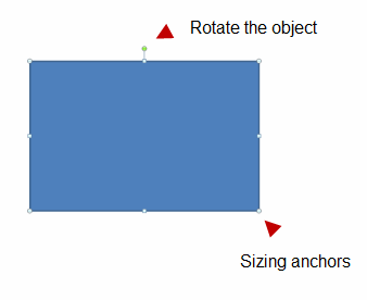
When you click on a shape, you get anchor points on the sides and in the corners. You can click and drag these anchors to resize your objects.
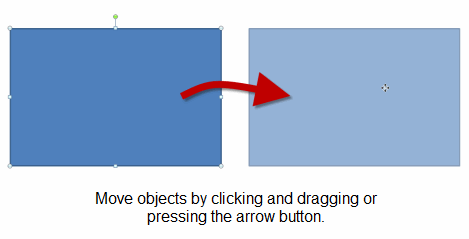
You can move shapes on the screen with the mouse or keyboard.
There are a number of formatting options in PowerPoint. For example, you can change the fill color, line color, and line style. I won’t cover those because they’re fairly straightforward. However, what I will cover is the format painter.
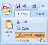
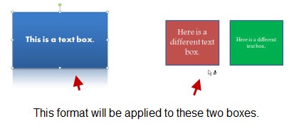
The format painter is a handy tool because it allows you to copy the formatting of one object and apply it to another. This will save a lot of time because you can create just the right formatting for one object and with a few clicks apply it to all of the others.

When filling shapes you have a number of options. You can fill with color, a texture, pattern, or picture. In addition to filling the shape, you can change its level of transparency. Today, I want to focus on two fill elements.
The image above is from a tutorial I did earlier this year. I used a gradient fill on the brown background. It’s a rectangle that goes from brown to white. I also used a fill on the egg shape to give it some depth.
PowerPoint gives you quite a few options when it comes to shapes. Most of the time, those are plenty. However, there are times when you want a certain type of shape and it’s just not available.
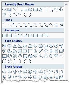
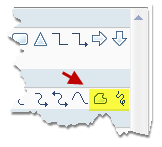
If you want a custom shape, you can draw one using the freeform tools. Just click on the tool and then start drawing.
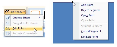
Another option is to use the edit points. It works a little different in PowerPoint 2003 than it does in 2007. However, the basics are generally the same. Create a shape and then modify the edit points. You can create straight or curved edges and make as many points as you need. It takes a little practice, but you’ll find that you’ll never lack for shapes again.
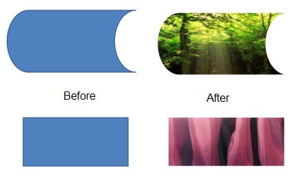
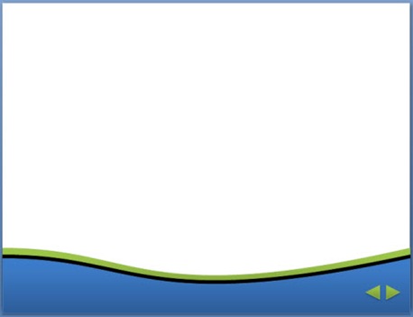
Here’s a simple example to show how you could use a custom-made object. In this case, I wanted to add a simple curved border. So I just converted a rectangle to a freeform object and edited the points.
There are a lot of things you can do with the PowerPoint shapes. The more you practice using some of these techniques the more creative you ca
n be. In addition, you’ll find that it speeds up your production time because you’ll be able to quickly make edits right inside of PowerPoint.
If you have some tips and tricks feel free to share them in the comments section.
 |
 |
 |
|
Want to learn more? Check out these articles and free resources in the community. |
Here’s a great job board for e-learning, instructional design, and training jobs |
Participate in the weekly e-learning challenges to sharpen your skills |
 |
 |
 |
|
Get your free PowerPoint templates and free graphics & stock images. |
Lots of cool e-learning examples to check out and find inspiration. |
Getting Started? This e-learning 101 series and the free e-books will help. |
Two other tips:
1. Hold shif-ctrl to resise circle or square
2. You can also edit points in clip art to modify its shapes.
Jim
Tom,
Excellent tips this week. I learned a great deal.
Thank you!
And one more…
Hold down Ctrl while drawing a shape makes it draw from the centre instead of from the top left corner. I don’t use it often, but it’s handy when you want to put one shape over another, or surround something with a circle.
You can combine this with holding down Shift so it draws a perfect circle or square or whatever the shape is.
How did you make the jagged edged graphics? Surely you didn’t use the freeform tools!
[…] Tom Kuhlmann has a series of posts about PowerPoint tips and techniques. […]
Excellent information. I think this one should be one of the first new designers try as they are simple tips that greatly enhance the look and maybe as important, the feel of the presentation. You can present up-to-the-minute presentations with good graphics but if the presentation doesn’t feel new and exciting, you are at a disadvantage in trying to convince your learners of it.
Another Format Painter tip is that you can double-click it instead of clicking it.
If you do, you can “paint” the format unlimited times until you click the format painter button again or press Esc.
Tom,
Your post reminds me of a very weird problem, not with Articulate, but with the user. And associate of mine had numerous text boxes in Powerpoint that, when published in Articulate, appeared with the text upside down. This had me quite stumped, but but gave me a laugh when I finally found the problem.
When I selected a suspect text box in his original Powerpoint, the little green “Rotate the Object” handle, normally on top of the text box, was underneath it. Apparently, perhaps because he liked the color gradients or something, he had flipped the text box vertically before entering in his text. And to make matters worse, I guess because he like his little text box, he copied it and pasted it into most of the rest of his slides, before entering any of their text.
Powerpoint saw this as an upside down text box with text entered, relative to the box, upside down. And two negatives equalling a positive, the text appeared in Powerpoint right side up.
But Articulate was less forgiving, and when published, all of his text was upside down.
To fix, he not only had to flip his boxes, but he also had to re-enter all of his text.
I don’t find a provision to make “patterns” in any of the shapes in PPTs (as it was with MS 2003).
Thanks for the great tips, Tom! I always learn something new from your blog.
To make the curved border, you said you “just converted a rectangle to a freeform object and edited the points.” I have Powerpoint 2003. How do I convert the rectangle to a freeform object?
Wow! Great powerpoint tips … have just created around 100 training slides for technical training on disk storage and I can’t wait to try out some of these techniques. You have literally answered some of those ‘I wonder if…’ questions, but on a deadline don’t have time to research right then and there. I’ve bookmarked this forum, it’s the best I’ve seen, and nice people with none of the atrocious behavior seen in so many blogs etc. Thank god for some PROFESSIONALs, what a breath of fresh air!
I don’t have Articulate yet, but I’m very enthused by what I see, it is unbeleivable how far these tools have come. I’m simply stunned by what can be done now.
[…] 5 Easy Tips to Whip Your Slides Into Shape […]
I find power point 2007 gradient filling very difficult to use. In 2003 I could choose which colours I wanted to mix, but now I can only choose 1 colour or preset colours. Do you have any tips? thanks!
[…] 5 Easy Tips to Whip Your Slides Into Shape (October 7, 2008) […]
[…] 5 Easy Tips to Whip Your Slides Into Shape […]
[…] Oct The Rapid E-Learning Blog has a post on 5 Easy Tips to Whip Your Slides Into Shape. It teaches you how to work with the PowerPoint shapes. These are great tips for […]
@Belen – 2007 is a little tricky, but in order to select different colors, you need to click on STOP1 for the dropdown. each stop is a different color, and you can add or remove stops as you like.
[…] 5 Easy Tips to Whip Your Slides Into Shape […]
0
comments