Great idea!!
Thanks Tom

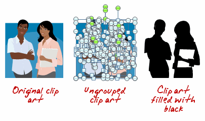
In a recent post, I showed how to easily create your own silhouette characters. Today I share show some ways to use those silhouettes in your elearning courses. Something to keep in mind is that the silhouette doesn’t need to be confined to people. You can use them on objects, as well.
As a visual cue, use silhouette characters or objects to create a progress meter. As the learners advance, the silhouettes change to real images. This lets them see their progress through their course and where they’re currently at.

Use silhouettes as a way to divide sections within the course. In the example below from Helmsmanship, you can see that the start of the section has the image and shares a core idea or theme. The following slides contain a silhouette of the core section image.
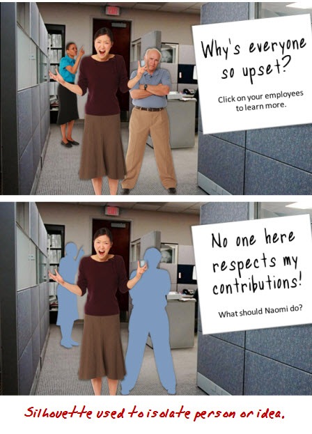
Silhouettes are great to draw the learner’s focus and isolate information. For example, in the first image I introduce a group. However, when I want to focus on just one character, I use silhouettes and only show the character of interest.

A great way to get a person’s attention is to create contrast. This is easy to do with silhouettes. I like the example below from a Goodwrench ad. By removing the car, you can tell something’s missing. You can apply the same effect to an elearning course.
First, the contrast draws your attention. Second, it can become a mechanism to find out what’s missing.

It never fails that when you build elearning courses, HR shows up to make sure no one’s offended. While there’s obviously a lot of value in diversity, it can still be one of the most frustrating parts of building courses as you navigate which ethnicity gets to represent the good manager and who gets to be the bad example. A good way to work around this is to use silhouettes for your characters. This way you can be race and gender neutral and make sure no one’s offended. 🙂

Creating silhouettes is pretty easy. And using them in your elearning courses can add a little bit more visual intrigue and help make your courses more engaging. What are some other examples of how you’d use silhouettes? Click on the comments link to share them with us.
 |
 |
 |
|
Want to learn more? Check out these articles and free resources in the community. |
Here’s a great job board for e-learning, instructional design, and training jobs |
Participate in the weekly e-learning challenges to sharpen your skills |
 |
 |
 |
|
Get your free PowerPoint templates and free graphics & stock images. |
Lots of cool e-learning examples to check out and find inspiration. |
Getting Started? This e-learning 101 series and the free e-books will help. |
Great idea!!
Thanks Tom
They are also great for button states, similar to your progress meter, but when a button is used/clicked the button only shows as a silhouette. This works great for single use buttons in games.
I also like to create a silhouette and manipulate it (changing the alpha and shape) to create a character’s shadow.
Thanks again for the post and ideas.
Very good info alot of this kind of stuff looks alot more difficult than it is
Fumbling around in moodle is not fun anyway The newest of the avatar stuffis very good.
Also the ease of dropping in your own video feed and slides now makes alot of the other stuff redundant.
I always find its the back office stuff that looks terrible with most of the cheaper lms stuff.
I love the silhouette demo. however, how do I create a silhouette on a picture. I can do that on clip art, but I am assuming I have to have a picture editing tool for the photo. Great!!
Great post Tom. We’re just now developing/designing a full character set for our simulation/scenario based courses. This provides some good insight into potential visual treatments we can use once developed.
Similar to a progress meter, we have used images to represent process phases or procedure steps. The silhouettes would either represent a down-state for a given slide (when the images are click-able) or a previously visited slide.
Hi Tom, I am using a MAC which I am fairly new user. Do you know if there is something similar to Clip Art for the MAC? I would love to be able to use this tool for my e-learning courses. Any help you can give, I would appreciate.
Fabulous! I’ve been using course progress meters where the buttons are coloured differently. Using silhouettes is a much slicker visual design. Perfect for a cours I’m currently working on.
Using this idea, I could also use silouettes for my main navigation page. The silhoutettes could be the ‘up’ button image and the real image appears for the ‘mouse over’.
Thanks
Great tips!
Jen
Hi Tom:
Good post. How do you create silhouettes?
Tom,
Here’s a mockup course I created in Articulate that uses the silhouette effect. I really like using silhouettes and shading to isolate the person who is speaking. I like your other uses too. 🙂 Great post!
Link to Mockup launch page:
http://www.elearningart.com/e_Learning_Simulation_Example_p/art04.htm
If that doesn’t work, link to directly launch course:
http://www.elearningart.com/v/vspfiles/files/GenY/player.html
Bryan
Thank for the tip .I did know the use of groupe and ungrouped and the others lesson . I will try filling in with color.hope that this work
I enjoyed reading your tips… There are very useful. I am wondering if have archived these tips and if you can forward them to me.
@Anne: Here’s the link to the video lessons Tom referenced. I did both within powerpoint:
Brightness method:
http://www.elearningart.com/silhouette_shadow_effect_powerpoint_p/art05.htm
Re-coloring method:
http://www.elearningart.com/grey_background_character_emphasis_p/art07.htm
Just wanted to thank you for the wonderful tips, ideas and advice in your Rapid eLearning blog. Good stuff and well done!
Wow! I appreciate the concrete examples. Super-creative. This info will proves to be timely and immediately valuable for me. Thx, Tom!
Hi Tom
Thanks for featuring our new Helmsmanship leadership course.
The design work was done by Chris Wirick – who deserves praise for his clever use of silhouettes. They also extend the range of each image (great if you are cash-strapped developers).
Cheers
Tess
I am a student who just recently started an online degree in instructional design. As part of my studies I have been following student blogs as well as others relating to instructional design. Through browsing student blog reviews I can across this blog.
It’s very interesting to see how the simple application of silhouette graphics can be so effective, and I am curious to learn about other effective techniques as well. I wish more teachers/professors/trainers would be thoughtful and strategic about the format and content of presentations.
I’ve found the “fade to silhouette” trick, like we used in the Helmsmanship course, to be a very effective way to simplify your on-screen design. Rather than try to work the text around the image, you simply fade the image to black and superimpose the text at the appropriate point in the narration. This gives you the full screen to work with for both your image and your text and focuses the viewer’s attention on the text-based visual reinforcement you are presenting and not the image. Plus it gives the content a more custom look, versus the standard eLearning “text on the left side, clip art image on the right” approach.
Great post. Can you create a demo on creating the silhouette progress meter? I would love to use this in one of my e-learning products.
[…] up the post above, here’s 5 Ways to Use Silhouette Graphics in Your E-Learning Course. In this post, you’ll learn different ways you can use silhouettes on your slides and in […]
Great hammer of Thor, that is powerfully helpful!
0
comments