The Rapid Elearning Blog

With a budget you can hire a graphic artist who can come up with some different design ideas for your elearning courses. But that’s not the case for many of us.  So we’re usually stuck with courses that all start to look the same.

One reason is the same person is designing all of the courses. For the most part, we tend to stick with the same design ideas and are limited by our graphic design skills.  And because of that, we get courses that all kind of look the same.

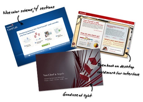
In earlier posts I’ve discussed how you can get around this by finding inspiration from other sources. I like to find inspiration at some of the template websites like template monster. What I look for is different layout ideas and color schemes.
The Rapid E-Learning Blog - find inspiration for your PowerPoint templates

Another great way to find some inspiration is via the new mobile apps available for the smart phones and tablets.  In many ways their screens are similar to those we might find in an elearning course.

As I was on the plane to Philadelphia jotting down some notes for upcoming blog posts, it struck me that the notes app in the iPad would make a great user interface for an elearning course.  You can see an example of the notes app below.

The Rapid E-Learning Blog - notes app for the iPad

The white section is great for key points and side notes.  But you could use it as a menu to navigate the course.  And of course the yellow paper area would house most of your core content.

Below are a couple of images from the PowerPoint template I quickly mocked up.  The template consists of a cover screen and two content screens.  I also duplicated the content screens without the side pocket.  This way if you want to add the pocket to the top of the actual slide you can tuck content under the pocket.  You can see an example in the demo below.

The Rapid E-Learning Blog - cover image

The Rapid E-Learning Blog - notebook image

Everything’s created in PowerPoint (another example of how great it is as an illustration tool).  If you want the template, you can download it here.

In previous posts, I shared some hand-drawn graphics and fonts. Those are also available in the downloads section and work well with this type of template.

The Rapid E-Learning Blog - demo of the notebook template

Click here to view the demo.

Feel free to download and use the template as you wish. Are there any other mobile apps that you think would make a great template for an elearning course?

Events

Free E-Learning Resources

Want to learn more? Check out these articles and free resources in the community.

Here’s a great job board for e-learning, instructional design, and training jobs

Participate in the weekly e-learning challenges to sharpen your skills

Get your free PowerPoint templates and free graphics & stock images.

Lots of cool e-learning examples to check out and find inspiration.

Getting Started? This e-learning 101 series and the free e-books will help.


25 responses to “Here’s a Noteworthy PowerPoint Template (and It’s Free!)”

Hi Tom,
sometime ago I shared a video where I take inspiration from one of the Lonely Planet iPhone app to create a mask for scrolling text (with fade effect) in PowerPoint.

Something available to be used in an elearning course.

http://www.screenr.com/DQa

Hope this will help someone! 😉

[…] Traduzione autorizzata tratta dal post originale di Tom Kuhlmann sul “Rapid E-Learning Blog”. Il post originale è disponibile qui […]

Leggi la traduzione (autorizzata) in italiano di questo post qui:

http://www.mosaicoelearning.it/blog/?p=1093

[…] More here: Here’s a Noteworthy PowerPoint Template (and It’s Free!) » The Rapid eLearning Blog […]

June 14th, 2011

Looking the same isn’t always a bad thing though. When I have to take training, I like to get in, learn, and get out. While I can appreciate cute, I prefer a standard template that’s optimized for efficiency. Sometimes a course can look like more effort was spent entertaining a bored ID rather than developing an effective transfer of knowledge.

For instructional designers who create training for corporate university, we are stuck with a standard template that is dated and must follow specific guidelines. If you want to make changes, even something as minute as updating the look of a button or where to move certain elements, it requires a proposal of new design options, a vote by committee, and then approval by upper management.

Reading your blog posts about creative designs and ideas help me stay inspired and vigilantly try to push for changes. Thanks!

Tom, great idea! I have an iPad and use the Notes app, but didn’t see it as e-learning inspiration, so thank you!

I’ll take a look at my apps and see what inspiration they offer.

P.S. Your kids must have a ton of fun with you and their dad. Loved the “Easter Egg” at the end of the demo.

@jenisecook

@paulkjohn: I can appreciate what you’re saying but at the same time, there’s a lot to be said about changing things up. I think knowledge transfer is more than getting in and getting out. Since it’s a visual medium, how the course looks plays a critical role. A template like this only takes a few minutes so it’s not like two weeks are spent building the template and two days on the course design.

June 14th, 2011

How did you edit the leather tab so you can put a picture in the flap. Did you do that in PPT? I used the remove background tool and was able to past that image on to to give a similar look but it was a bit fuzzy on the edges. Is there another way to do that?

June 14th, 2011

Hi Tom,
Thanks for sharing the template and the fun of learning it. The last slide, WOW! It was way cool.
Cheers and Regards.

@Chahat48

Thanks Tom- another great idea to sneak past the ‘Let’s have all our elearning module look the same!’ people.

@Stephen: The download should have an image folder with all of the images I created from PPT. You’ll find the flap in there. There are two layouts. one with a flap and one without so you can add your own flap. I’ll do another post showing how to create your own notebook.

June 15th, 2011

I will admit – I am frustrated and feeling very ignorant. I know I should know how to download the templates, fonts and great images you create and add them to PowerPoint – but I get the download – I unzip the file and drag it to my copy of PowerPoint. Sometimes I get an error message and sometimes I think it has worked – but when I open PowerPoint I cannot find the items I think I have added. I searched for a “how to download” document but was not successful. Thank you so much – Nancy K.

@Nancy: the files are all zipped. So after downloading, make sure to unzip or extract the folder first. If you’re still having problems, jump into the user community and connect with David or Jeanette and then can help you out.

Beautiful as always! If you put this template to use for mobile apps or use, it would be fun to link it directly to the Notes app – to encourage folks to take notes in real time to reflect on later, share with their colleagues or perhaps tweet!

[…] week I shared a free PowerPoint template that was inspired by the iPad’s notebook app.  Hopefully, you can find a use for the template.  If not, check out some of the […]

June 23rd, 2011

Great idea! Loved the last slide. You just reminded me once again that creativity has a special place in e-learning!

This is for Carmen – I created a screenr that deals with applying free tmeplates like this one that Tom has done into your corporate environment. Check it out at http://www.screenr.com/D7Hs

– Stephanie

June 27th, 2011

Hi Tom,

I like you notepad template. Thanks for sharing. Do you still have the image of just a sheet of yellow paper? I’m thinking of, after sketching notes on sheet, being able to tear it off and start a new blank page. I tried ungrouping in slide master, but it seems to be a single image. Thanks.

@Jim: on the road, but when I get back, I’ll see if I have it to upload.

Nicely done and a great idea for presenting. Some nice graphics work there.

[…] Here’s a Noteworthy PowerPoint Template (and It’s Free!) […]

January 16th, 2012

Hi, the graphics are fantastic and I have used this and several other templates. I use Captivate to insert click boxes and save as Flash files which I upload to Sakai LMS pages for elearning, it makes text based learning material a little more interesting. I can’t thank you enough for your generosity. I have three templates (not as skilled as yours)I created and use as described above. They have a white background as this is not visible on the Sakai page. I am happy to share these, please let me know how I can do this. I feel as if it is all take and no give at the moment.

[…] posts that highlight the portfolio template and shows off some rapid elearning tips and how to create the […]