I think the fact I now want to go create an emergency kit has me convinced that I need to rethink the traditional aims and objectives screen. Thanks for the great advice!
Here’s a Way to Make Your E-Learning Course Objectives Interesting
December 13th, 2011I’ve been working on a few demos for some upcoming blog posts and conference presentations. One demo is a module on having an emergency preparedness kit in case of a disaster.
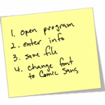
In the past I’ve built similar elearning courses for organizations that taught their employees about having these disaster kits. In most cases they started the courses with the standard objectives screen like the image below.
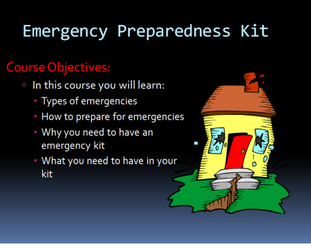
While there’s nothing wrong with creating a list to state learning objectives, there’s probably a better way to engage the learner emotionally. And this is important if you want to connect with the learner and motivate them to change their behavior.
Understanding Objectives
When I first learned to build elearning courses the rule was that you HAD to have a page that stated the learning objectives. Today that still seems to be standard. On top of that many organizations require that each course have an objective screen that has an explicit list of learning objectives. If that’s the case, then that’s what you have to do. But let’s step away from that for a second.
In a simple sense the purpose of the objective is to communicate why the learner needs the course and what they’ll learn or be able to do afterwards. We start at point A and at the end of the course want to be at point B.
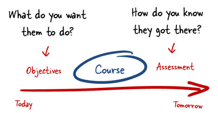
The easiest thing to do is create an objectives screen like one above where you tell the learner what the objective is and what they should learn. But that’s not the only way to present the objectives of the course. It also may not be the most effective way. And, it’s definitely not the most interesting way.
Crafting a Meaningful Objective
It doesn’t matter where you live; odds are that you’re in an area that at some point during your lifetime will experience a disaster. In the Pacific Northwest the most likely disaster that I’ll experience is a major earthquake.
I say this because everywhere I’ve worked part of our annual safety training was the need to have an emergency kit. We were told that it was just a matter of time before we had an emergency and to plan on being on our own for a while. They said we needed an emergency kit that could sustain us for at least 72 hours.
Know what? I always passed the safety training; yet I never had an emergency kit. Why is that?
While I KNEW that the kit was important, I was never MOTIVATED to actually have a kit. Outside of my natural proclivity to procrastinate, I think the elearning course was positioned as just one of many boring elearning courses that I had to take every year. All the organization cared about was making sure I had a check mark next to my name come December 31.
Essentially they did a poor job convincing me that the kit was essential. They could have done a better job by appealing to my emotions rather than provide a bunch of information.
Often we focus on the cognitive part of learning which is all about the knowing. But we don’t focus enough on the affective part which is more about the emotions. What motivates someone is subjective and tied to their emotional awareness. So creating an emotional connection to the content may be better than just a cognitive connection, especially at the forefront where we want to hook them.
Reworked Learning Objective
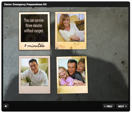
In the demo below I want to get away from the standard list of objectives. Instead I want something more emotional that matters to the person taking the course. I want them to know that this isn’t just information; instead it’s a matter of life and death.
Instead of creating the standard list of what you’ll learn I ask them to consider the ramifications of not having a kit. I also stepped away from work and made it more personal. This isn’t about some check mark to indicate completion. This is about taking care of your family.
There’s a lot more I could have done to flesh out the scenario, but I kept it simple on purpose. I want to show that even if you have limited resources and time you can build something like this. As you can see the demo is not very interactive—just a few images, text, and some audio.
Learning is a complex process and part of it is to connect with the learners in a meaningful way. Appealing to them emotionally is one way to do that. So the next time you build an elearning course, see if you can replace the bullet point objective screen with something different. Even if you can’t replace it, you can still do something like this to capture their attention.
Have some creative ideas? Share them by clicking on the comments link. Not sure how to rework the learning objectives in the elearning course you’re building? Jump into this forum thread that I started in the elearning community to get some feedback from others.
Events
- Everyday. Check out the weekly training webinars to learn more about Rise, Storyline, and instructional design.
Free E-Learning Resources
 |
 |
 |
|
Want to learn more? Check out these articles and free resources in the community. |
Here’s a great job board for e-learning, instructional design, and training jobs |
Participate in the weekly e-learning challenges to sharpen your skills |
 |
 |
 |
|
Get your free PowerPoint templates and free graphics & stock images. |
Lots of cool e-learning examples to check out and find inspiration. |
Getting Started? This e-learning 101 series and the free e-books will help. |
57 responses to “Here’s a Way to Make Your E-Learning Course Objectives Interesting”
Excellent demo! It surely shows the effectiveness in reference to those bullet point lists.
Excellent way to infuse the “what’s in it for me?” theme as part of the learning. Definitely means more to a person when you can emotionally connect them to the demo. My question is: You used “Articulate Engage?” I have not been able to do anything as creative with the product. I’m finding it very limited – as to the choices available, the customizations I can include. Is there any online learning specifically about working with Engage?
LOVE this approach! Heck, it even made me want to learn about emergency preparedness!
[…] […]
Love this! You always inspire me.
Awesome Post,
This is exactly why our favorite teachers would have also made fantastic sales persons. They are able to attach human meaning to an objective, or find interesting ways into motivating the learner.
I’m always amazed at these demos and the creativity…..so I never really comment. My main purpose for this one was to point out the April (Virginia) show an errant link from the line above March (Knoxville.
Hi Tom,
Great post again!
I love the demo. I’m one engaging the learner through emotion. What a better way to do it than at the beginning of the course. As i look at eLearning. I am always looking for a punch line to get me started. Most courses are your typical learning objectives and page turner. However, if the course shows how the learning experience will impact what I do or a real life experience I am hooked.
Most projects I’ve worked still want objectives displayed the traditional way. However, recently I have had an opportunity to work on a project with someone who feels strongly about not going this route. Rather he and I designed courses that describes in a few short paragraphs what the learner will experience and gain in the course. Then we started the course with a thought provoking scenario.
Nice. I was going to do a screenr outlining a few of my ideas, but um, well, now I need to go make an emergency kit. I also realize that my silly animations don’t really add much compared to this.
One question (the demo made me re-read and re-watch everything like 3 times already) I get almost everything here and can recreate almost all of it with no problem. I would like a screenr showing how the fly in “poladroids” become hovers. How did you make the hovers? I have an idea on how to recreate but wanted to see how you did it. Thanks for all you do for the community.
That’s excellent… but I do have a question!
How was the player template designed? I love the simplicity of it!
[…] Read more from the original source: Here’s a Way to Make Your E-Learning Course Objectives Interesting » The Rapid eLearning Blog […]
This is a great case for following a learning cycle when we design training. Descriptions of the learning cycle that we all follow when learning anything new are from Accelerated Learning (http://www.ialearn.org/ALCycle.php) and 4MAT (http://www.aboutlearning.com/). Leaving out this essential connection step in designing training – bridging the objectives with learners’ motivations and prior knowledge by capturing their interest and attention causes us to transmit information, but not necessarily learning. If change does not take place, learning has not happened.
I don’t see how this is a re-working of objectives, however.
I was going to ask the same thing as David – how did you make the hover states for the polaroids. I assume that is a feature of StoryLine? Is that possible using products in the Rapid e-Learning Suite?
As always, great post! I will use ideas from it within the next 60 minutes.
I just finished my first draft of my ‘Emergencies’ class! I will be posting it to the forums soon. For this draft, I quickly skipped over the objectives…
For my second draft, I will be incorporating some of the topics from this presentation.
I love this motivational approach to learning objectives – and kudos on the Arrested Development reference!
This is awesome…I am a font-aholic. Can I ask what font you used? I love the one in the demo.
Decided to give it a whirl. See what you think. Did I nail it? Simple steps. http://screenr.com/t0vs
This is such a wonderful way to get designers considering different ways to present objective! Way to go Tom! You never fail to inspire me!
Nice emotional response from the material – light years better than the standard bullet point list. I, like both Mike C. and David am extremely interested in how you created the polaroid hover effect.
[…] Here’s a Way to Make Your E-Learning Course Objectives Interesting » The Rapid eLearning Blog Often we focus on the cognitive part of learning which is all about the knowing. […]
I think that people forget that in this day and age of instant gratification and people watching 49 million hours a day of YouTube, e-learning MUST take the motivational approach.
Obviously, most employees don’t have a choice about whether or not they attend e-learning sessions…but they do have a choice in whether or not they’ll learn anything.
This demo is a good example of effective marketing: a headline that draws in the learner, appeals to a deep need in the learner, and allows them to engage in the material.
Would love to see more like it!
Nice Arrested Development reference… Thanks for this post. I’m also watching your webinar THIS minute. Love the portion on “using tools appropriately”. That can’t be stressed enough.
BONUS TIP: Distract people with dog images and blog posts……….
Tom,
Another Hall of Fame post! Combining objectives with potential consequences can also create a powerful Whiffem factor to motivate learning.
Many years ago, I saw a great CBT (eLearning wasn’t invented yet). I was about telephone pole safety. Began with a guy riding a pole down because he didn’t check it first. I have never climbed a pole in my life, but if I ever do, I will check the bottom of the pole with a screwdriver first, to make sure it’s not rotten.
Great Post!
Often course designers mistake instructional objectives for course objectives. I’ve seen many cases were long lists of detailed instructional objectives were “dumped” in the introduction of a course. Course objectives can be simple, high-level, and in many cases boiled down to a single sentence. In this case, the objective of the course was implicitly stated through the demo as, “This course teaches how to prepare for a disaster.”
This demo has made me want to rush out an get an emergency kit! Perfect example of the power that comes from connecting with people on an emotional level. Thanks for the creative ideas!
As Senior training developer for the New Zealand 2013 Census I really enjoy receiving your emails. In particular today your topic of being prepared for an emergency. Having just experienced 15 months of devastating earthquakes (7876 so far between magnatude 2 and 7.1 so far) being prepared is something everyone must do. We now have emergency kits stored in a tuff box outside the house (away from anything that can fall on it) and sneakers, warm clothes, bottles of water, first aid kit and snacks in our cars. At work I have my handbag withnin reach with my car keys inside it just in case you have to make a hasty exit from the building. Please do not take any advise on being prepared for an emergency for granted because one day you will need to use it.
Creativity. That´s your name!Congratulations!
Wow! Great post! I am speechless.
[…] December 13, 2011: Here’s Tom Kuhlmann’s take on objectives from the Articulate Rapid Eleraning Blog. […]
HiTom,
I’ve been following your blog for over a year now. Your articles are really inspiring and help me innovate in my designs. As a teacher I would always start the lesson with something that would touch a chord of my learners. It always worked better that way. My students were able to recall their lessons with the help of these tidbits.
This approach also conforms to Gagne’s learning events, both as gain attention and stimulating recall. It certinly is more interesting way of presenting the content.
However, my only concern is the amount of time I will spend to create a single screen on lesson Objectives. Or is the time spent is well worth, in terms of value addition to overall learning? Your thoughts please!
Tom – Wow! You really motivated me to get an Emergency Kit by appealing to my emotions, using five-senses writing, and storytelling. I’ll never look at course objectives the same way again!
Hey, Tom!
I really like the breathing sound that you used in the demo course… A small touch, but it adds a lot to the impact.
Did you get this sound from one of the standard stock photo sites?
~Christian
Tom……….. I live in a world of IACET certified training and unfortunately they have very rigid criteria for what objectives are and how they are stated. Any thoughts on how to modify your emergency preparedness objectives into ones which would work in a world where you have to actually tell the learner what they will learn?
PS…. Love your posts – always stimulating and get me thinking outside of my box…..
Richard
I love every bit of tips given on how to re-design our course objectives. I will definitely improve on this area next semester. Thanks to Susan Manning for taking us into another realm of extra learning. -Myrene-
Great example, could you tell us which fonts you used?
This is a great article that really highlights some interesting ways to present your message in a way that will resonate with your audience. Thank you for your wonderful example.
Nicely done, Tom! So, did you do the heavy breathing voice over? 🙂
[…] Here’s a Way to Make Your E-Learning Course Objectives Interesting […]
Your opening was cinematic and emotional. My last webinar had a boring slide. Hmm, how can I raise the stakes on Managing Millenials? A good puzzle…
[…] a recent post I shared some ideas on how to craft more engaging objectives. For the demo, I wanted my earthquake intro to feature a family huddled in the dark. […]
Great post, as always, Tom.
On a lighter note – Have you tried movie direction? If not, I strongly recommend that you do 🙂
[…] […]
[…] has some thoughts on writing meaningful and engaging Objectives screens for […]
What a nifty trick! Er…I mean…”illusion.”
Love the GOB reference.
[…] […]
Ok….aside from the fact that I love this blog, i’m also a huge Arrested development fan. Thanks for this image. Come on!
[…] while back I shared an example of how to create more engaging course objectives. It’s a great way to get past the bullet list of learning objectives that we often see in […]
Very creative and very interesting way of presenting objectives.
Thanks Tom!
Anna & I “borrowed” this idea. My shaking ground (like yours) looked horrible, so I opted to fade between before and after pictures of the Japanese tsunami – with the earthquake sound (with added wave crashing sounds too)…
Effect turned out really well, and it totally adds context to the topic/course.
Regards.
Ryan
[…] Here’s a Way to Make Your E-Learning Course Objectives Interesting […]
I made a 30 second late-night-cheesy-TV-commercial-style introduction and took a WIIFM approach to show why learners might be interested in the class, which conveniently covered the major agenda items. “Have you finally decided to update your old-fashioned branch with a cash dispense machine or cash recycler? Congratulations! Now you can concentrate on your member instead of counting cash. But yikes! You’ve never used one of these devices before! What do you do? In the Cash Automation class I’m going to show you… x, y, z… all this and much, much more!”
[…] Here’s a Way to Make Your E-Learning Course Objectives Interesting » The Rapid eLearning Blog. Share this: Pin ItShare on TumblrLike this:LikeBe the first to like this. […]






0
comments