[…] See on http://www.articulate.com […]
In a previous post we reviewed how to avoid the Frankencourse. These are courses that look like a bunch of modules that are cobbled together rather a single course. They’re also courses where the design of the course is all over the place and inconsistent.
One way to avoid the Frankencourse is to come up with a consistent design that is used throughout the course. For example, title fonts are all the same and the colors used in the course are defined. When you use a box, it looks the same on all the screens and it is used the same way.
I was helping someone the other day clean up a PowerPoint-based elearning course. She got it from her subject matter expert and the file was a mess. The subject matter expert used all sorts of fonts and none of the boxes on the screen were consistent. One time the box had rounded corners and then next time it was straight. Some boxes were yellow with drop shadows. And then some were gray with no shadows.
This file demonstrated common issues with many PowerPoint slides:
- Inconsistent use of design elements. The subject matter expert created boxes on the slides. None of them were designed the same way. There needs to be a reason why the boxes look different. Contrast is a design principle. When elements contrast with each other it implies that there’s a difference between them. The same with repetition. When you repeat elements, then it implies similarity. None of this was a factor in the original slides.
- None of the content was created using the slide master. That means that anything that needs to be changed has to be edited at the slide level. When you have 100+ slides that’s a lot of repetitive editing. When you can, build your content formatting in the slide master. It comes in handy when you need to make universal changes.
However you design your elearning courses, it’s important that your intentional about what goes on the screen and how those objects are used. This makes your course look more polished and it lets you leverage the advantages of good graphic design and visual communication.
In this post, we’ll create a design slide that you can use to quickly apply design formats to the content on your slides.
Step 1: Determine Common Content
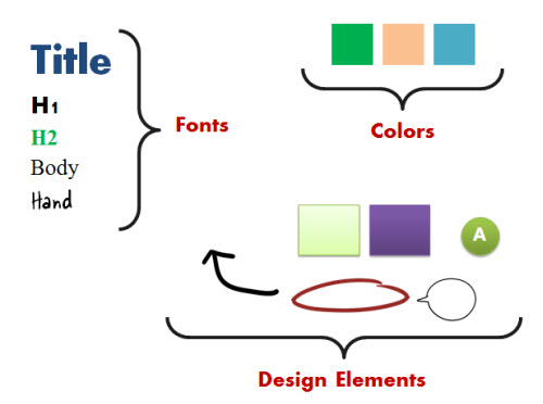
Determine what is common to most slides and then what those elements will look like. For example, slides usually have a title, body text, and then an assortment of common design elements like boxes, buttons, and callouts.
Step 2: Create a Design Slide
Once you know what common content you have, add them to a single slide. Then apply the appropriate format to each element.
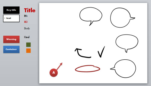
I call this my floating design slide. I move it along the course as I work on slides so I can quickly access a formatted object and paste it to the real slide when needed.
Step 3: Copy & Paste Formatted Objects
The design slide has all of the common elements you will use in your course. When you need to format something on your real slide, locate the formatted object on your design slide and then copy & paste it to the real slide.
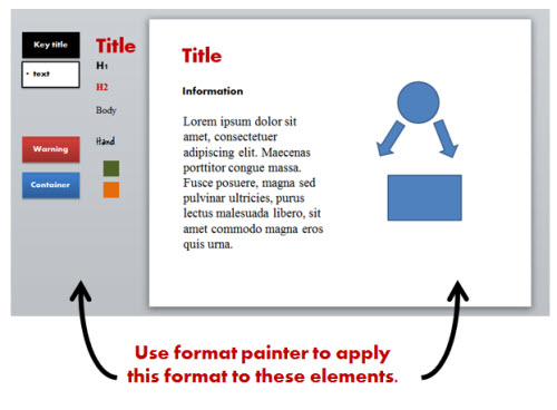
Once it’s pasted to the real slide, use the format painter to apply the design to the appropriate content.
- Here’s a tutorial that walks through the process of creating a design slide.
This is a simple technique. But it will help you quickly convert existing slides that may be a bit sloppy and inconsistent into something that looks better and is intentional in its design. The main point in all of this is that you’re consistent in your design and in how you’re using the elements in your course.
Events
- Everyday. Check out the weekly training webinars to learn more about Rise, Storyline, and instructional design.
Free E-Learning Resources
 |
 |
 |
|
Want to learn more? Check out these articles and free resources in the community. |
Here’s a great job board for e-learning, instructional design, and training jobs |
Participate in the weekly e-learning challenges to sharpen your skills |
 |
 |
 |
|
Get your free PowerPoint templates and free graphics & stock images. |
Lots of cool e-learning examples to check out and find inspiration. |
Getting Started? This e-learning 101 series and the free e-books will help. |
20 responses to “A Simple PowerPoint Technique to Make Your E-Learning Courses Look Good”
[…] View original post here: A Simple PowerPoint Technique to Make Your E-Learning Courses Look Good: In a previous post we revie… […]
Thanks for the useful tips.
Working smarter not harder is a good thing.
It’s funny that you posted this today… the other day I was working on a project and to get going, I created a “project slide” almost like yours just so I had a basic starting point. And what a time saver as well. I don’t know why I didn’t think of this before – the easiest solutions always seem to elude me…lol
[…] on http://www.articulate.com Share this:TwitterFacebookLinkedInTumblrDiggStumbleUponRedditLike this:LikeBe the first to like […]
I love the idea of the project slide— to collect all of your design elements. I shared this with my instructors- great tips!
[…] A Simple PowerPoint Technique to Make Your E-Learning Courses Look Good ImageSpike Créer des images interactives ImageSpike permet d’uploader une image, une photo puis d’y ajouter à l’endroit de votre choix des marqueurs dans lesquels vous allez pouvoir embarquer du texte, des liens ou même de nouvelles images. Lorsque un lecteur verra votre image interactive, il lui suffira de cliquer sur le marqueur pour lire le contenu multimédia embarqué dans l’image. […]
Thank you for these tips!!!
Thank you!
Great tip. I actually have a design slide show for all this stuff that I have open on one screen whilst I work on the real slide show on another screen – but the design slide is actually even better!!
And great for at home where I don’t have two screens!!
Thanks for the useful tips.
[…] teaching with technologyHelpful hints on designing a coherent and strong presentation.See on http://www.articulate.com Share this:TwitterFacebookLike this:LikeBe the first to like […]
Although I support the idea that a course design should be consistent but when it comes to SMEs things can get complicated. When they are very proud of what they do, it can be difficulty to make changes to their products. Take the PPT for example, I had one experience where the SME felt that the inconsistent designs were good for alert learners’ attention. His idea was that uniform was boring.
[…] A Simple PowerPoint Technique to Make Your E-Learning Courses Look Good […]
Thanks, Tom. Great input. Also the PPT tips are really useful.
Jane
In my view, PowerPoint slides continue to be relevant side by side with e-learning software, because those slides bridge the gap between SMEs and end users.
Great tips here. It can be a challenge not only to develop new learning materials, but to be able to integrate old elements into new PPTs, by client request. Our Director of Graphic Design recently wrote a post on typography and eLearning design. I think the typography tips fit into the realm of design on PPTs as well. http://www.allencomm.com/2012/07/typography-and-online-course-design-dont-contribute-to-the-arial-cliche/
[…] a previous post on making your elearning courses look good I showed a simple tip for creating a design slide. I call it my floating style palette because I […]
[…] should give you some ideas. The last slide of the template has the color scheming that I used. Use format painter to apply the format to your own shapes and text if you want to use the same […]





0
comments