The Rapid Elearning Blog

Archive for the ‘Articulate Storyline’ Category


closed captions in Storyline

[UPDATE: This tutorial is specific to Storyline2. Storyline 360/3 both have closed captioning as a feature.]

In a previous post we learned how to create closed captions text for your online courses. Now we’ll learn to use that text in Articulate Storyline.

Before we get started, let’s do a quick review of your closed captions source file. Regardless of the application you used to create the closed captions file, you’ll end up with the timing and the text for the captions. It should look similar to the image below.
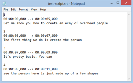
closed caption storyline SRT

Display Closed Captions in Storyline

Displaying the closed captions in Storyline 2 is a very straightforward process. All we need is a single text variable that is triggered to change to new text based on the timeline.

Here’s a video where I explain how easy it is to create the closed captions in Storyline 2.

Click here to view the closed captions YouTube tutorial.

Here are the basic steps to create the captions in Storyline 2:

  • Create a text variable titled “Caption.”
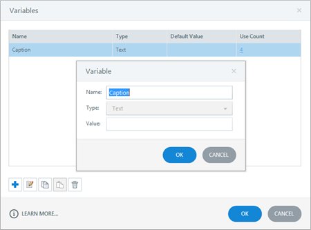
closed captions Storyline variable

  • Insert a text reference of the “Caption” variable so that the caption is visible on the slide. The caption displays the variable which will change at different points on the timeline.

closed captions Storyline text reference

  • Add a trigger to the slide that changes the value of the “Caption” variable at a specific time. The value and specific time come from the SRT file. The value is the text and the time is the starting time for each line. Storyline 1 doesn’t have the timeline trigger. The workaround is to add simple shapes (and move them offscreen) to represent the timing. And then trigger to the start of those shapes on the timeline).
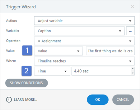
closed captions Storyline trigger

  • Copy and paste the trigger and then add the new values and timing by copying the text from the .SRT files.
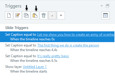
closed captions Storyline copy and paste trigger

As you can see, adding closed captions and syncing them to the timeline is pretty easy. Here are a few general tips when working with closed captions:

  • Show or hide the closed captions by adding a button that sets a variable to turn captions on and off.
  • Use a legible text, none of those fancy curly ones. A clean san serif font like Open Sans works well.
  • Come up with a format that is consistent. Because the screen content is constantly changing you want to ensure enough contrast so that people can read the captions. I prefer a semi-transparent black box with white or yellow text.
  • Create a uniform size. The text box that contains the closed captions is dynamic and will change based on the characters (that’s the nature of text variables). That means the font size may increase or decrease based on the character count. Do a test and create a box that accommodates the most text you’ll have at any given time. Then set the font size to that and it should look right as the character count changes.

That’s about it. With a single variable and one trigger you can quickly create as many captions as you need when using Articulate Storyline to build your online training.

Events

Free E-Learning Resources

Want to learn more? Check out these articles and free resources in the community.

Here’s a great job board for e-learning, instructional design, and training jobs

Participate in the weekly e-learning challenges to sharpen your skills

Get your free PowerPoint templates and free graphics & stock images.

Lots of cool e-learning examples to check out and find inspiration.

Getting Started? This e-learning 101 series and the free e-books will help.


The Rapid E-Learning Blog - did the Avengers skip their safety compliance training?

Comic book layouts are pretty popular. And they work well for elearning courses. For one, they look different. It’s that type of contrast that can hook your learners who might be bored with the standard-looking corporate elearning.

On top of that a comic-like layout breaks the content into panels which allows you to control the pacing and flow of information as each panel progressively reveals more. It’s a great way to still have the simplicity of a linear course, but make it seem more engaging.

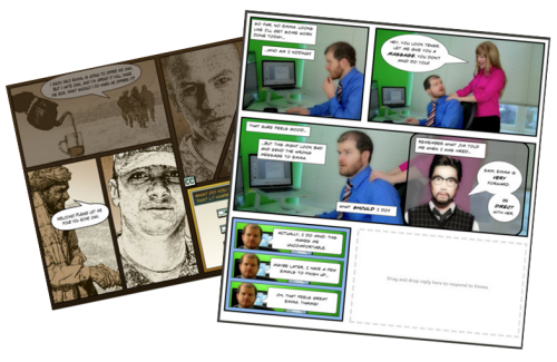
A while back I shared how to be inspired by others and included links to two comic-style elearning courses. Based on the feedback, the examples were a hit. I got quite a few emails asking how to build a similar type of course.

The Rapid E-Learning Blog - examples of comic book style elearning

In today’s post I’m going to show three ways to build a comic-style layout for your courses. To keep it simple we’ll use PowerPoint, but the ideas should work regardless of the tool you use.

Choose a Layout

Layouts are the key distinguishing feature for the comic book look. Typically they follow some sort of grid. The good thing is that there’s really no right or wrong way to create the grid. Some comics use straight lines and even sized panels. And some use an assortment of panel sizes.

The Rapid E-Learning Blog - layouts for comic book style elearning

If you’re looking for layout ideas, the first place to look is at comic books. You could attend a comic book convention, but you’ll probably have to wear a goofy costume. A better solution is to go to one of those comic creation sites and see what types of layouts they offer. Here are a couple of good sites:

You can also create your own layouts with existing clip art. Here’s an example I shared in this blog post on using Clip Art to create your elearning template. This also lets you build a layout that has that hand-drawn look.

The Rapid E-Learning Blog - build your own comic style elearning using PowerPoint clip art

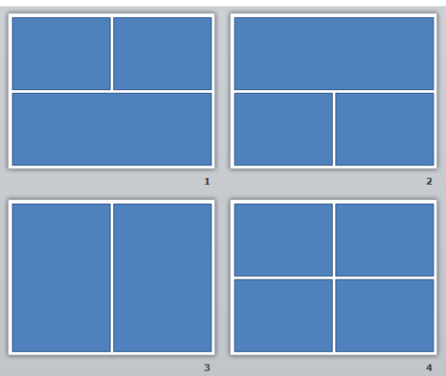
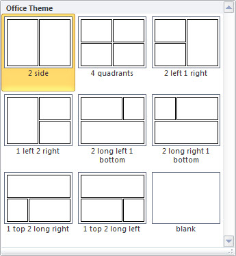
For this demo, we’ll use a few simple layouts. I created them as shapes in PowerPoint. As you can see below, creating the layout’s pretty simple. Feel free to create as many layouts as you want.

Keep in mind that too many choices can be overwhelming. Instead of building 200 possible layouts, stick with 5-10 common layouts.

The Rapid E-Learning Blog - comic style elearning layouts built in PowerPoint

Another consideration with layouts is determining how you’ll present the content. Review the two elearning examples above and notice how the layouts follow a consistent pattern. For example, you may have one type of layout for information, another for decision-making, and another for feedback.

Deciding how to use the layouts will help you best determine which types of layouts you need.

One last point, the more panels you add to the layouts, the less space you get. If you have too many panels the content make look cluttered and seem confusing. I’d err on the side of fewer panels.

Option 1: Create Master Slide Panels & Layouts

Use PowerPoint’s master slides to create the layouts. You can have as many masters as you like so the best bet is to create all of the possible layouts that you’d use in a single file. And then when you’re ready to go, select a layout for the slide and add your content.

The Rapid E-Learning Blog - build as many layouts in PowerPoint master template as you like

Two ways to work with the master layouts:

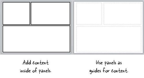
  • Create the entire panel look on the slide master. Then apply it to a slide and add content within the panel.
  • Create watermarked panels on the master slide and use them as guides to control placement of your content. The benefit to this is that you have the general layout mapped, but you’re not confined by the panels if your content doesn’t fit perfectly.

The Rapid E-Learning Blog - create two types of layouts

A few tips when working with these types of layouts:

  • Use thick lines and determine how colorful you want the panels to be. Think loud and in your face.
  • Not all of your content will fit perfectly in the panels. That’s OK. Build your content on the panel and get it to fit the best you can. Then copy and paste it as an image. Use the crop feature to perfectly crop it to the panel.
  • Tutorial: this tutorial walks through the template and shows a few production tips.

Option 2: Create Custom-Sized Slides for Each Panel

Instead of building the layouts on the master template, build them on the slides. This gives you more control over the panels because you have direct access to them since they’re not buried in the masters.

Build a master PowerPoint file that has all of the layouts you’d use. Then start with that file when you want to build a comic-inspired course. Make sure to save it with a different name. Duplicate the layouts you want and then add your content.

How to add content to the panels:

  • Instead of creating your panel shapes on the master slide, create them on the slide. This lets you manipulate the shape at the slide level. Add content on top of the panel shape.
  • Create panel shapes with thick lines and no fill color. Then place them on top of the content. The thick lines will cover up anything that doesn’t fit perfectly.
  • Fill the panel shapes with an image. I like this approach because the panels and content will always align perfectly. The only thing that changes is the fill image for the shape.

Bonus tips:

Option 3: Create a Master Panel Image

This is probably the easiest way to create a comic layout. Instead of messing with a bunch of images and trying to get everything laid out perfectly, just create a series of layout images that you place on top of your content.

Essentially, you have one image of the entire page. Then you cut a hole out of the page for each panel. All of the content sits underneath the page image and can only peak through the holes. This guarantees that everything is perfectly aligned inside the panel.

I like this approach because you can move each object in the panel and the overlaid master image masks any overflow to create the illusion of panels.

Extra tips:

  • Add your page images to the master slides so that you have a layout. This will act as a general guide. Your slide for each layout you provide should consist of a master slide with the same page layout and the page layout image on the actual slide that acts as the cover.
  • Be sure to use the selection pane in PowerPoint (starting with PowerPoint 2007). Hide the page image and add your content using the master as a guide. Then unhide the page layout on the slide when you’re ready to publish. Make sure the cover image is always on top in the selection pane.
  • Tutorial: How to create layout mask images to use as panel covers.

To help you out, I created a starter PowerPoint template pack. You can download it in the elearning community. It includes folders for each type of template. You can use them as they are or build your own.

The Rapid E-Learning Blog - example of the free PowerPoint template demo

Comic strip layouts are popular and a nice way to make your courses look a bit different. The trick is to determine the type of layout you want and how to get the content into the panels with the least amount of work.

There are many ways to layout the comic panels. Once you decide the type of layout you want, then you need to determine how you will get the content into the panels.

Events

Free E-Learning Resources

Want to learn more? Check out these articles and free resources in the community.

Here’s a great job board for e-learning, instructional design, and training jobs

Participate in the weekly e-learning challenges to sharpen your skills

Get your free PowerPoint templates and free graphics & stock images.

Lots of cool e-learning examples to check out and find inspiration.

Getting Started? This e-learning 101 series and the free e-books will help.