The Rapid Elearning Blog

Archive for the ‘Interaction Design’ Category


html5

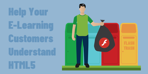
Before we get started: Flash is going away soon. And if you have a lot of older e-learning courses, it’s something that you should be dealing with now before it’s too late. Start pulling together the original source files because you’ll have to republish or maybe rebuild a few of the older courses. If you don’t have the sources files, a couple of the resources below should help.

What made Flash work is that everyone had the same player and, for the most part, things kind of worked the way they were supposed to. Without the Flash player, courses run through the browser. Thus the demand for HTML5 courses.

The challenge however is that you don’t have control over the browsers and devices people use to consume e-learning courses. Ten years ago, almost all courses were Flash-based and ran on a personal computer. Today, courses are accessed via computers and mobile devices (which could mean a tablet or smart phone).

There are thousands of different devices between personal computers, Android, and Apple. Each device has its own technical constraints such as memory, processor, and screen size. They can run on different operating systems and different versions of those systems.

Also, how many different browsers are there for these mobile devices and computers? And really, why is any organization still using Internet Explorer 11?

And here’s the main point in all of this: the browsers that have to display the e-learning courses are not all the same or created equal.

What that means for you is the course you build may not work as intended when accessed by someone on a different device using a different browser. That’s why it’s so important to test, test, and test.

As I mentioned in an earlier post, create a demo course with media, interactivity, and animations. And use that to test the user’s learning environment. You also want to test on multiple devices to make sure things work the they way you want.

Despite all of the testing, you’ll still have customers who have expectations that are outside your control. Some customers and clients just don’t know enough about this stuff so their expectations may not be aligned with reality. They may want a lot of media or animations, that may not work for their users.

In those cases, I recommend referring them to this site: HTML5 Test

What I like about the site is that it’s a great way to SHOW the differences in browsers and devices and use that as a way to discuss what needs they have, what can be be built, and how the courses may respond.

html5

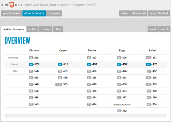
You don’t need to go into some long-winded technical explanation about HTML5. Use the site as a means to expose them to potential issues or constraints and ways to work around them. The last thing you want is a fancy product that doesn’t work in the end-user’s browser.

So, make sure you get prepared for the end of Flash and know how to set expectations for the courses you do build. The good news is that the technology is changing, the devices are getting better, and expectations and what you can deliver are converging.

Events

Free E-Learning Resources

Want to learn more? Check out these articles and free resources in the community.

Here’s a great job board for e-learning, instructional design, and training jobs

Participate in the weekly e-learning challenges to sharpen your skills

Get your free PowerPoint templates and free graphics & stock images.

Lots of cool e-learning examples to check out and find inspiration.

Getting Started? This e-learning 101 series and the free e-books will help.


course design activities

Here are a couple of fun activities around visual design. They’re not “e-learning” course design activities but they are relevant because e-learning courses have to be constructed using common design concepts and skills.

Go through the activities and see what you learn.

What Kind of Course Designer Are You?

course design activities designer

Click here to view the design activity.

Here are a few things that come to mind after the activity:

  • There’s a tension between being too organized and not being organized enough. I find that I am probably less organized than I should be and then I have to go back and fix things. A good example is naming objects as I go along rather than waiting to troubleshoot and find that not naming makes it harder to figure out what’s there. On the other hand, sometimes being too organized does constrain the creative process.
  • What inspires my designs? I like to use Dribbble and some other design sites to get ideas around layouts and using colors.
  • From a course design perspective, reflective questions are a great way to get people to process information. Generally, we push bullet point after bullet point. Perhaps there’s a way to reframe your slide content so that the information is delivered via reflective questions.

Course Design: What’s Your Font Style?

font style course design activities

Click here to view the font activity.

  • I like this type of activity for e-learning. Make decisions and move on without hitting a submit button. And then at the end get some sort of consolidated feedback.
  • My font was Ariata. I’m not sure how the activity is graded, but I played around with the quiz and often came up with Ariata. Which goes to how this type of activity could work in e-learning: you can show whatever you want at the end. So get your learner’s to read stuff during the selection process and then show them whatever you want at the end. The card selection is how you present what may have been bullet points or slides. And the end is your summary. Easy peasy.

What did you learn?

Events

Free E-Learning Resources

Want to learn more? Check out these articles and free resources in the community.

Here’s a great job board for e-learning, instructional design, and training jobs

Participate in the weekly e-learning challenges to sharpen your skills

Get your free PowerPoint templates and free graphics & stock images.

Lots of cool e-learning examples to check out and find inspiration.

Getting Started? This e-learning 101 series and the free e-books will help.


e-learning hero

Did you know that every two seconds, someone needs blood? And one donation can save up to three lives?

2020 has been a challenging year. And on top of it, the news media seems to focus on all the discord and hardship. Where’s the good news? What can we do to make a difference in our little part of the universe?

How to be an E-Learning Hero

Every week we feature various e-learning challenges. The goal is to use the e-learning tools in different ways. Move past the compliance projects we do at work and do something different.

This helps us gain mastery over the e-learning tools, play around with various interactive prototypes, and get inspiration from seeing what others can do.

If you don’t participate, you should. At a minimum, you should check out the round up that David does every Thursday. There’s always some creative ideas that may inspire something for your next project.

Recently, we did a challenge to promote blood donations. Here’s a link to the round up with a bunch of nice examples.

Here are a few key thoughts:

  • There’s more than one way to do things. What I love most about the challenge entries is that it shows there’s a lot of creative ways to do the same thing.
  • Keep your design clean and focused. We tend to be info-centric and push a lot of content out. Try to minimize content on the screen and control when and how it’s exposed.
  • Where’s the personality? Many of the challenges feature facts and various levels of interactivity. The ones that stood out to me are the ones wrapped around stories and people. What’s the story in your e-learning courses?
  • There are a lot of nice examples, my favorite is this one by Przemyslaw Hubisz. I like the simple and clean design; and that the activity is contextually meaningful. It makes me consider the point of the information being presented to me.

e-learning example blood donation

Click here to view the e-learning example.

If you want to grow your skills using the e-learning software and building interactions, the challenges are a great way to do that. If you’re a beginner or more advanced, doesn’t matter. The challenges work for where you’re at and it’s not a competition. It’s all about you.

How to be a REAL Hero

Blood and platelets cannot be manufactured. They can only come from volunteer donors. And not everyone can donate, so everyone who can plays an important role.

Can you donate?

e-learning hero blood donation

I’ll have to admit, it’s not always on my radar. But I was reading an article recently that reminded me how important it is. And while I can’t control a lot of what’s going on in the world today, I can control what I do and how I share what I have. Because of that, I’ve made a commitment to donate blood regularly.

Hopefully it’s something you can to do, too. Find out where you can donate blood today.

Join us in the e-learning challenges to grow your skills. Join us in donating blood to be a hero to someone who needs it.

Events

Free E-Learning Resources

Want to learn more? Check out these articles and free resources in the community.

Here’s a great job board for e-learning, instructional design, and training jobs

Participate in the weekly e-learning challenges to sharpen your skills

Get your free PowerPoint templates and free graphics & stock images.

Lots of cool e-learning examples to check out and find inspiration.

Getting Started? This e-learning 101 series and the free e-books will help.


e-learning assumptions

In a previous post, we looked at how context helps frame the learning experience. It keeps us from just doing an information dump as we add clarity about our learners and the learning objectives.

One way to establish context is by learning what the user already knows. Test their assumptions. This does two things:

  • Expose their current level of understanding. This helps them see what they do or don’t know about the subject.
  • Demonstrate what level of knowledge/competence is required to meet the learning objectives.

How to Test the Learner’s Assumptions

Generally, you can do one of two things to test the learner’s understanding and assumptions around a given subject.

Create a Pre-Assessment

The easiest thing is to create a pre-assessment. Usually, pre-assessments are used to filter the learner. Pass the assessment, go to the end. Fail the assessment, start the course.

For procedural training, that is step-by-step, the filtering makes sense. You either know the procedures or not. For principle-based training, we want to expose the understanding (or assumptions for experienced people).

In this case, we use the pre-assessment to help them understand where they’re at. We’re not using it to filter them away from the course.

Create a Simple Scenario

I like to throw people in the pool and get them to make real world decisions as soon as possible. So, I recommend some sort of early decision-making interactions. They don’t need to be big elaborate scenarios: just a few interactions that test their understanding and help them see what they currently know about a given situation. And then from there, work through the content.

In most cases, the learners already have existing knowledge and probably a pretty good idea of what the course will teach. With that comes some bias and possibly incorrect understanding. By getting them to make decisions related to the content, you expose to them what they know or possibly don’t know.

The main point in all of this is to get them to think about what they know about the topic before going through the topic. People can easily figure out and compare what they thought versus what they’re presented. But your interaction gets them set up to do so.

In either case, get them to test what they know before giving them the content.

Events

Free E-Learning Resources

Want to learn more? Check out these articles and free resources in the community.

Here’s a great job board for e-learning, instructional design, and training jobs

Participate in the weekly e-learning challenges to sharpen your skills

Get your free PowerPoint templates and free graphics & stock images.

Lots of cool e-learning examples to check out and find inspiration.

Getting Started? This e-learning 101 series and the free e-books will help.


animated gifs

Recently I shared some free animated gif resources: animated icons and backgrounds. If you’re using Rise or Rise.com it’s as simple as inserting an image. They’re great for novel attention-getters or simple instructional procedures.

free animated gif interaction

If you’re using Storyline 360, with triggers and state changes you can do a bit more to control how the animated gifs work in your course.

Animated gifs are great, but they do loop. Thus, when you insert them in the slide they just continue without end.

To make it more interactive, I like to insert a static image and then interact with the image to activate the animated gif.

animated gif

Click to view the example.

The demo above shows a few ideas:

  • Selected state is like an on/off toggle. Press on the image to toggle between the static version and animated gif.
  • Hover state allows you to mouse over the static image to reveal the animated gif and mouse away when you want to leave.
  • Down state is like the mouseover, but works by pressing down on the image to activate the gif, and releasing the mouse, stops it. I like this option the best.

Bonus idea: do the opposite and start with the looping animation and create an interaction where the animation stops when clicked.

  • Visited state indicates when an object has been clicked. Use the animated icons as markers and then insert the static image in the visited state. This provides a nice visual indication of what’s already been viewed.

View the tutorial on YouTube.

What’s cool about all of the choices above is that they’re super easy to build and don’t require any triggers. Sometimes the looping can be a bit distracting to start, so having an interactive option is nice. I like them because instead of a looping animation it allows the image to become interactive where the user can click to view it and activate the animation.

Events

Free E-Learning Resources

Want to learn more? Check out these articles and free resources in the community.

Here’s a great job board for e-learning, instructional design, and training jobs

Participate in the weekly e-learning challenges to sharpen your skills

Get your free PowerPoint templates and free graphics & stock images.

Lots of cool e-learning examples to check out and find inspiration.

Getting Started? This e-learning 101 series and the free e-books will help.


e-learning example

There are so many creative examples in the e-learning community. Many of them you can see in the weekly e-learning challenges. If you don’t have it on your docket to review them every week, you should. You can checkout the recap every Thursday for some good inspiration and often fun examples.

Here’s an e-learning example from Sarah Hodge that wasn’t part of the e-learning challenges but is a great example. Some of the things I like about this demo:

interactive e-learning example

Check out her example. And the next step is to try to figure out how it’s built. That’s a great way to learn to use your e-learning software.

  • Creative use of animations throughout, starting with the opening transition
  • Excellent use of simple graphics to create an engaging interaction
  • Good self assessment…not everything needs to be graded; and this could be used in all sorts of contexts
  • Reuses some items shared in the community
  • Visual prompts for right/wrong; learner self assess and the colors dynamically change on drag
  • Subtle (and appropriate sound effects); often we don’t use these

Sarah Hodge does great work and she has some other cool e-learning examples in the community. I love her How to Fight a Bear and Live demo (which I featured before) and this Mad Libs design, another fun assessment idea with a free download.

Events

Free E-Learning Resources

Want to learn more? Check out these articles and free resources in the community.

Here’s a great job board for e-learning, instructional design, and training jobs

Participate in the weekly e-learning challenges to sharpen your skills

Get your free PowerPoint templates and free graphics & stock images.

Lots of cool e-learning examples to check out and find inspiration.

Getting Started? This e-learning 101 series and the free e-books will help.


e-learning template

E-learning templates can be a bit challenging. On one hand, they speed up production. And then on the other they may introduce constraints in the learning experience design.

An e-learning course screen has a specific structure. It’s usually rectangular and contains text and imagery. The text and imagery are laid out on the screen and is constrained by up, down, left and right placement. Of course, the possibilities for layouts can be endless, but there are probably just a few dozen layouts that make sense for e-learning courses.

Here are a couple of recent posts where we discussed the anatomy of e-learning templates and how to get the most value out of templates.

E-learning Template Value

Templates work for repetitive processes because they can be used over and over again. For example, most courses have some sort of simple list of learning objectives. While the course content may change, those course screens are usually consistent.

E-learning Template Constraints

Courses consist of content that is contextual. And from a learning experience, that contextual content has specific teaching requirements. For example, if I teach how to use software, then the screens are dependent on screenshots. And if I teach how to interact with a customer, the visual context is best represented in a manner similar to how you may interact with the customer.

I may find some good general layouts for simple content, but as soon as I have to work with specific content, I find that there’s a lot of tweaking and adjustments made to the templates that may mean I save more time just starting from scratch.

E-Learning Template Hybrids

I like to separate my templates into three parts and find the most value in using templates in the first and third.

  • Entering the course
  • Course content
  • Exiting the course

Most courses have the same or similar starting points with welcome screens, instructions, objectives, sections, etc. And they also have similar exit points such as summary screens, next steps, and exit instructions.

Those two parts, the entering and exiting of courses, are perfect for templates. The templates are easy to insert, update, and contextualize. The middle part that deals with the actual course content is different.

Course content templates are great for simple text layouts. They break down as the content design becomes more specific. That’s fine, just use templates for the beginning and end and for simple text. But don’t waste time trying to force content into a template. Or worse, don’t create a template and force the course authors to make the content comply with a template.

Templates are great for e-learning. However, they exist to save time. Keeping templates for easy-to-repeat screens makes sense. Forcing content to fit templates probably doesn’t. But that’s OK. Just use the template screens where you need them and start with blank screens where they need customization. Don’t waste time fitting a square peg into a round hole.

Events

Free E-Learning Resources

Want to learn more? Check out these articles and free resources in the community.

Here’s a great job board for e-learning, instructional design, and training jobs

Participate in the weekly e-learning challenges to sharpen your skills

Get your free PowerPoint templates and free graphics & stock images.

Lots of cool e-learning examples to check out and find inspiration.

Getting Started? This e-learning 101 series and the free e-books will help.


e-learning storyboards

A couple of weeks ago, David posted a challenge where community members were asked to share their storyboard templates. As you can see, there were quite a few different storyboard templates shared for downloads. There are also additional free storyboards in the community downloads section.

What I found interesting was some of the conversation about storyboards. There are quite a few who don’t use formal storyboards. Instead they just build everything from inside their authoring tool.

Why There’s No Need for a Storyboard

Years ago when I first started working with e-learning, storyboards were really important. That’s mostly because it wasn’t just me working on the course.

The storyboard was how we determined how to construct the screen layouts and user interface. We determined where things were placed, how they animated, and what supporting media was required. Because more than one person worked on the course, the storyboard was really critical to communicate on the project design.

On top of that, working with customers and getting them to “see” what we were building was a challenge because it wasn’t as easy and quick to prototype the courses back then. Thus, we used the storyboard to walk through the course design with out clients.

This helped them understand what we were going to produce and get their agreement. It was also an easy way to show what other assets were required and the extra production required to deliver the course.

Rapid E-Learning Changed Things

A lot of this changed when we shifted from custom development in Flash and Authorware to Articulate Studio and PowerPoint. PowerPoint let me add all of the assets (or placeholders) and build animations quickly. Because I could prototype quickly in PowerPoint, I found I spent a lot less time working with formal storyboards. I suspect that’s common for many of you as well.

And it’s only easier with Storyline because there’s so much more interactive capability and one could build a quick prototype faster than it probably takes to complete a formal storyboard.

If you’re a team of one doing most of the production yourself, then a formal storyboard is less likely. Essentially, the prototype course really is a storyboard. It’s just in the authoring tool and not a separate document.

When a Storyboard Makes Sense

Throwing a bunch of slides and quiz together and calling it a course is one thing. In that world, what does a storyboard solve? However, when you start to build more complex learning experiences, you need to be more intentional about what you design. That requires a lot more planning. And most likely there’s a lot more media production.

In those cases, working with a storyboard helps you properly plan the course structure as well as the required content and media.

Also, when working with a clients (especially paying clients) it’s important to show them you’re organized. And a storyboard helps you walk through the project requirements before spending a lot of time prototyping and working on more time-consuming interactions.

There’s obviously a lot more that can be said about storyboarding. I find that people who’ve been in the industry a while, use storyboards more often than not. But people who’ve joined the industry over the past three years or so, don’t rely on them as much. Which makes sense, because the tools are so much easier to use.

I’m curious. Do you storyboard your courses? If so, how are you doing it? If not, why not?

Events

Free E-Learning Resources

Want to learn more? Check out these articles and free resources in the community.

Here’s a great job board for e-learning, instructional design, and training jobs

Participate in the weekly e-learning challenges to sharpen your skills

Get your free PowerPoint templates and free graphics & stock images.

Lots of cool e-learning examples to check out and find inspiration.

Getting Started? This e-learning 101 series and the free e-books will help.


powerpoint e-learning tips

Technically converting a PowerPoint file to an “e-learning course” is fairly easy. You can import the slides into Storyline or just publish them from inside of PowerPoint with Articulate Studio 360.

But is that really a course? Maybe, but probably not because it’s not about just putting content in front of learners.

Here are three things to consider when converting a PowerPoint file into an e-learning course.

Presentation content isn’t the same as an e-learning course. Sure, presenting content in your course is part of the process, but it’s a passive form of learning. The solution is to find a way to make delivery of the content more active.

PowerPoint presentations used in face-to-face training tend to have a PowerPointy look. An e-learning course doesn’t need to look like a PowerPoint slideshow. Use some of the Content Library templates to get away from the presentation look. You can even customize them to fit your organizational brand.

However, there is a look that fits the content and objectives of your course, and that’s where you want to put your energy.

Convert bullet points to interactive content. Instead of showing screen after screen of bullet points, why not convert them to micro interactions? For example, three bullet points could be three interactive tabs.

Those are three real quick tips when converting PowerPoint to an e-learning course. Of course, there’s more to it.

Events

Free E-Learning Resources

Want to learn more? Check out these articles and free resources in the community.

Here’s a great job board for e-learning, instructional design, and training jobs

Participate in the weekly e-learning challenges to sharpen your skills

Get your free PowerPoint templates and free graphics & stock images.

Lots of cool e-learning examples to check out and find inspiration.

Getting Started? This e-learning 101 series and the free e-books will help.


e-learning examples that are nice

Many of you know I’m a big fan of the e-learning challenges posted each week in the community. The intent is to get you to think about different ways to see the tools, be inspired by other examples, and practice using the software to learn new production tips.

I am always impressed with the diverse ideas that are demonstrated each week by both experienced and novice developers. On occasion I like to feature specific participants because they do really nice work and offer some creative ideas.

Today, I’d like to feature Andrzej Jabłoński. He really comes up with some interesting ideas and he often shares the files so that you can learn how he created what he did. This is the spirit of community in action. Here are a few of his recent challenge entries.

E-Learning Example: Leadership Template

This is one of my favorite demos in all of the challenges. There’s an elegance to the template structure and playfulness with the subtle animations. And yet, because he started with an existing graphic, it’s relatively easy to build something similar, especially for the person with minimal graphic design skills who has to work with stock imagery.

e-learning example 1

E-Learning Example: Paper Cutout Effect

I love the visuals in this one and the depth created with the paper cutout look. He always does a nice job with the animations in his demo and this one features some moving next buttons and bring content in and out of the screen.

e-learning example 2

E-Learning Example: Meet the Team Interaction

Great use of the flashcard effect with really nice animations. There are a lot of interesting production tips to glean from this demo.

e-learning example 3

E-Learning Example: Space Game Navigation

This mimics an older arcade style game. This is a great demo to deconstruct so you can learn more about working with keyboard-based navigation. And there’s an off/on audio toggle.

e-learning example 4

E-Learning Example: Miscellaneous

Scenario Ideas

Exploration Activities

These are great activities to build familiarity with content, especially imagery or terms. They’re simple game activities, but can be sued effectively in many e-learning course contexts.

Andrzej is just one of the many talented e-learning developers who regularly participate in e-learning challenges. I’ll feature more in the future.

Hopefully, you’ll be inspired to participate and share some of your own ideas. If not, at least make it a point to check them out each week to see what people share. And take advantage of the free tips and downloads that you can use to learn and build your own courses.

Are there any recent challenge entries you’ve enjoyed?

Events

Free E-Learning Resources

Want to learn more? Check out these articles and free resources in the community.

Here’s a great job board for e-learning, instructional design, and training jobs

Participate in the weekly e-learning challenges to sharpen your skills

Get your free PowerPoint templates and free graphics & stock images.

Lots of cool e-learning examples to check out and find inspiration.

Getting Started? This e-learning 101 series and the free e-books will help.


gamified e-learning template

Many of us are challenged to convert our linear content into something more interactive and engaging. I was digging through some old workshop files and stumbled upon one I built a while back but never ended up sharing it outside of the workshop. In the workshop activity, the objective was to not build completely from scratch. We started with an existing template that was shared in the community, and then we explored a few ways we could add some gamified elements to create something that is a bit more effective and engaging.

Here’s a breakdown of some ideas from the workshop activity.

From Linear Content to a Gamified Experience

We started with a nice clean template designed to meet the team. It’s interactive, in the sense that you click to learn about each team member. This is great for an exploratory interaction where you need to collect information.

Original Template Example

original meet team pre-gamified template gamify

See original template in action.

In our activity, we used the template as a mechanism to interview team members and collect information to make the right decisions. We also added some other elements to gamify it a bit.

Gamified Template Example

gamified template

Click here to view the gamified example.

Gamified Learning Challenge

The assumption is that there is some sort of challenge and the learner has to determine what to do. But first they need to collect information. They do this by interviewing the team members.

  • Each team member has something to say. Some of it is relevant, some not. That’s part of the learning experience. The learner will have to determine what’s what and whether the information is useful.

gamified e-learning interview

  • Each team member is assigned a point value. Some are low points and some higher.
  • You can only collect a specific number of points before you’re asked to stop. Thus, who you ask is important. You don’t want to waste time or opportunity. Another part of the learning experience.

gamified e-learning escorted out

  • The information you collect is added to a notebook and you’ll be able to review it later to make a more informed decision. Thus, the more information you have the better.

gamified e-learning notebook gamify

Gamified Template Modifications

Here’s a video tutorial where I walk through some of what I did to modify the template to go from the original meet the team structure to the gamified interaction. I’ve also included a download with the original and modified files.

  • There were ten possible interviews. We added a progress meter to track how many were interviewed. We used a number variable and added 1 for each interview.
  • Created a disabled state for each character so you can interview only once.
  • Collected information by clicking the star. This is tracked with a T/F variable that we use in the notebook to determine whether to display the interview content or not.
  • Added a notebook that shows which answers are collected. The notes have hidden states and the T/F variable is used to show the information that is collected.
  • Each character gets a point value. Too many points collected and you’re cut off. Used a number variable to track total points. Each interview adds X points to the variable. Once it exceeds 12 points, the interviews are stopped.

Gamified Learning Opportunities

There are a number of ways to create gamified learning experiences. Of course, this mock up isn’t complete, but here are a few things that I added to the template to increase engagement:

  • Put the content into a relevant context. Instead of just sharing information, frame everything around an event where the learner would use the information in real life.
  • Challenge the learner to make a decision. For the demo, it’s assumed something happened and the person needs to make a decision. To do so, they need to have all of the information. The more information, the better…maybe. Some of it could be false or irrelevant.
  • Create a means to explore and collect information. They can choose who to interview and what information is relevant and add it to the notebook for use later in the course.
  • Add risk and pressure. Choosing the wrong people means they collect less information and may not be able to complete the task. This is all part of the learning process: knowing what’s important and what’s not, and where to get the resources or correct information. Again, the demo isn’t completely developed, but you can see how this is important to decision-making opportunities.
  • The person gets to demonstrate their understanding of a given topic through the decision-making process and how they use resources. The decisions made produce consequences which create opportunities to add feedback and additional instruction.

I love doing this activity in the workshops. It forces us to work with the constraint of existing templates and find a few simple things we could do to make it a more meaningful and engaging learning experience.

Take the Gamified Template Challenge

Find a template (or a slide with content) that is mostly static or linear content. Convert that linear content into a decision-making interaction. What do you need to do? How do you do this at the speed of business where you don’t have the luxury of working from scratch or building the most complex gamified experience?

Events

Free E-Learning Resources

Want to learn more? Check out these articles and free resources in the community.

Here’s a great job board for e-learning, instructional design, and training jobs

Participate in the weekly e-learning challenges to sharpen your skills

Get your free PowerPoint templates and free graphics & stock images.

Lots of cool e-learning examples to check out and find inspiration.

Getting Started? This e-learning 101 series and the free e-books will help.


e-learning tip

I’m asked to review courses all the time and one of the most frustrating things is to go through the course and find the developer has locked every slide. This requires that I have to click through every screen, interaction, and quiz before I can get to specific places for review.

For those asking for feedback in the community, it’s extra frustrating trying to troubleshoot a course and having to click through everything to get to a specific place in it.

An easy solution is to create a secret menu that lets you, as the developer, gain access to any place in the course.

Two Ways to Create Quick Access Points

Create a shortcut button. I usually put a button in one of the corners that gives me quick access to slides. Sometimes, the button just skips the slide. I may do that if it has longer narration or animations. Other times, I may add a link to a menu area where I have access to all of the slides.

  • During production, I keep it visible so I remember it’s there or can easily direct reviewers to it.
  • After production, I either delete it or hide it by making it transparent or use a hotspot. It is nice always having access to it once the course is live.
  • Put the button on the master slide so it’s available on all the slides that use the layout.

Create a menu tab on the player. The benefit of a player tab is that the link to the shortcuts is available regardless of the slide and layouts. It’s ever present. And then when you’re ready to publish, just disable the player tab.

  • Create a slide with menu links. I usually create a separate scene and make sure it’s not visible in the player menu.
  • Insert a custom player tab and link to the secret menu slide.
  • Hide the player tab when the course is published.

One of the benefits of this over the slide master is that the slide master sits on the bottom. It’s possible that the slide content is on top of the button and not available on a given slide.

secret menu in e-learning course

Click here to view demo course.

Above is a demo course where you can see both options in action. I locked the sidebar navigation and each slide is locked for five seconds. The first three slides don’t have access to the onscreen shortcut button.

Create Quick Access to Variables

In a recent post, I showed how to do something similar with variables. Instead of going through an entire interaction (or course) to see if the variables are working properly, create access to a variables dashboard. There you can assign custom values to the variables for testing and to see if everything is working as it should.

e-learning variables dashboard

Click here to view variables demo.

Having quick access to specific slides or be able to jump to certain places in the course is a big time-saver when reviewing the course.

I’m curious how many course designers do something similar and what you do to create shortcuts.

Events

Free E-Learning Resources

Want to learn more? Check out these articles and free resources in the community.

Here’s a great job board for e-learning, instructional design, and training jobs

Participate in the weekly e-learning challenges to sharpen your skills

Get your free PowerPoint templates and free graphics & stock images.

Lots of cool e-learning examples to check out and find inspiration.

Getting Started? This e-learning 101 series and the free e-books will help.