The Rapid Elearning Blog

Archive for the ‘Multimedia’ Category


PowerPoint graphics

In a recent post, I showed how I use PowerPoint to build the graphics for my Rise courses. I had a few questions on how to create the person sticking out of the circle image (apparently that is popular).  So today’s post shows how to do this. It’s pretty easy.

How to Create a 3D Pop-Out Graphic in PowerPoint

PowerPoint graphics Content Library

  • Insert a character and crop it until it is square.
  • Insert a circle.
  • The circle and image should be a similar size.
  • Crop the image to a circle shape.
  • Position the character over the circle.
  • Scale it up to suit your need for the overhanging image.
  • Duplicate the character.
  • Crop the first image to fit in the circle.
  • Crop the second image and place on top of the first image to cover.
  • Group together so you don’t accidentally nudge them out of place.

PowerPoint graphic steps

As you can see, it’s relatively simple to do. Then whatever you build in PowerPoint can be saved as an image. Either right-click it and save as .PNG or save the slide itself as .PNG.

Watch the tutorial below to get more of the specific detail. And here’s a bonus tutorial on how I created the 3D pop-out header image above.

Click here to view the YouTube tutorial.

Events

Free E-Learning Resources

Want to learn more? Check out these articles and free resources in the community.

Here’s a great job board for e-learning, instructional design, and training jobs

Participate in the weekly e-learning challenges to sharpen your skills

Get your free PowerPoint templates and free graphics & stock images.

Lots of cool e-learning examples to check out and find inspiration.

Getting Started? This e-learning 101 series and the free e-books will help.


PowerPoint graphics

In a previous post, I shared how I built an interactive scenario in Rise. I’ve gotten lots of emails asking how I built the graphics like the headers and the flashcard interactions for the interactive scenario. So in today’s post, I’m going to show you a simple way to build graphics for your Rise e-learning courses.

PowerPoint graphics headers for Rise blocks

PowerPoint graphics flashcard interaction

Understanding the Image Blocks in Rise

Rise offers a number of blocks that support inserted images (such as image, gallery, and some of the interactions). Most them work perfectly in one of two aspect ratios:

  • 1:1 (square)
  • 16:9 (rectangle)

There are a few blocks that have text overlay where the image is scaled. Those are mostly decorative images so we won’t worry about them.

Understanding PowerPoint Slides

PowerPoint is easy-to-use screen and with some practice, you can build almost any type of visual. Because of this, I build my simple graphics in PowerPoint and save the slides as images.

In PowerPoint, we need to do two things: set slide size and then whatever we build we export as an image.

  • Go to Design>Slide Size and modify the slide size.
  • To save the slide as an image, go to Save As and choose an image format. You can save a single slide or all slides. I usually save in PNG format.

Create PowerPoint Graphics to Use in Rise

Since there are two aspect ratios, I create two PowerPoint files for my Rise graphics. One is 1:1 and the other is 16:9. You can see the PowerPoint files I created for the scenario demo.

PowerPoint graphics example of file

PowerPoint is a freeform slide. I can build virtually anything I need quickly. In the interactive scenario, I created 1:1 images for the flashcards. One side of the flashcard has the question text and the other has the feedback.

I used the various image editing features in PowerPoint to colorize the graphics. I also used the emjoi features to create some simple feedback graphics. While it’s easy enough to build these graphics with other tools I just find PowerPoint to be easy and fast. However you’re not confined to PowerPoint, you can use the tool of your choice.

PowerPoint graphics flashcard questions

PowerPoint graphics flashcard answers

The images above are relatively simple. The images below required a bit more work. I had to build it so the character extends out of the frame. You can see that I created a couple of versions. I opted for the lighter version because it made the Rise screen seem more open with more white space.

PowerPoint graphics header image

When you’re all done building your slides, save the slides as images rather than a .pptx file. Then you’ll have a folder of images that work with your Rise courses.

Bonus PowerPoint Graphics Tip

With Articulate 360, you get Studio 360 that includes Presenter and works with PowerPoint. That means you have access to all of the Content Library characters and templates. So if you want the same Content Library characters in Rise, use PowerPoint slides to build the graphics like I did above.

Here’s another example I mocked up for the blog post using the same techniques.

PowerPoint graphics interactive scenario 2

So there you have it. In the first, post we looked at how to build the interactive scenario in Rise. And in this one, we reviewed how to use PowerPoint to quickly build the graphics you need.

Events

Free E-Learning Resources

Want to learn more? Check out these articles and free resources in the community.

Here’s a great job board for e-learning, instructional design, and training jobs

Participate in the weekly e-learning challenges to sharpen your skills

Get your free PowerPoint templates and free graphics & stock images.

Lots of cool e-learning examples to check out and find inspiration.

Getting Started? This e-learning 101 series and the free e-books will help.


Use PowerPoint to edit images

Over the years, I’ve posted hundreds of tutorials using PowerPoint. Some of them to be updated. Today I am going to cover five ways to use PowerPoint as an image editor. This is great for quick image editing or for those who don’t have other image editors on hand.

Save PowerPoint Content as an Image

Since we’re talking about PowerPoint as an image editor, the first tip is that whatever you create in PowerPoint can be saved as an image.

I usually group the objects so it’s one group. And then I right-click and save as picture. I like to save as a .PNG so that the transparent areas of the image are still transparent. If you save as .JPEG, the transparent areas will become white.

In the image below, I used PowerPoint to create the sandwich stack and then right-clicked to save as picture.

PowerPoint as illustrator

Create Custom-Sized PowerPoint Slides

You can make a PowerPoint slide any size you want. By default, they’re 16:9. That and 4:3 are the most common aspect ratios. However, by going to the Design Tab you can set the slides to any size. That means they can be tall and skinny or short and wide.

PowerPoint as illustrator slide size

Why would someone want to do that? Check out the tip below.

Export PowerPoint Slides as Images

PowerPoint slides can be saved as images. That means you can add whatever you want to a slide, layer content, etc and then save that slide as an image. I do this quite a bit when I need to quickly build graphics for my e-learning courses.

For example, the flashcard interaction in Rise is a 1:1 aspect ratio. So I make a PowerPoint slide that is 1:1 and add my content to the slide. It’s a great way to add titles and images to the flashcards to make them visually richer.

Once I’ve completed the slide, I save the PowerPoint slides as images and insert them into the Rise interaction.

PowerPoint as illustrator

The images above were all created in PowerPoint as slides and inserted into the Rise course. You can see an example of the PowerPoint slide images in this demo course.

Using PowerPoint slides to create images is easy and it gives me more control over the images I use in my e-learning courses.

How to Extend a Photo’s Background

Sometimes you have images where the object is centered which makes it challenging to place other content on the screen. An easy way to fix this is to cut a slice from the image and stretch it. This lets you move the main object over and get some empty space for text or other content.

PowerPoint as illustrator to extend images

I also use this technique to quickly build slide layouts which I showed in this previous blog post on how to create a template from a single image.

Create PowerPoint or e-learning template from image

How to Remove the Backgrounds of Images in PowerPoint

Since PowerPoint 2010, you can use PowerPoint to remove backgrounds from your images. For the most part, it works well. Select your image and the remove background. You can select areas to keep and areas to remove. Once you’ve removed the background, you can play around with softening the edges to get rid of any obvious jaggedness.

How to remove background in PowerPoint

As you can see, PowerPoint is a great tool for building simple illustrations or using it for quick graphics editing.

Events

Free E-Learning Resources

Want to learn more? Check out these articles and free resources in the community.

Here’s a great job board for e-learning, instructional design, and training jobs

Participate in the weekly e-learning challenges to sharpen your skills

Get your free PowerPoint templates and free graphics & stock images.

Lots of cool e-learning examples to check out and find inspiration.

Getting Started? This e-learning 101 series and the free e-books will help.


edit SVG in PowerPoint

The good news is that now you can edit SVG images in PowerPoint. And that’s a big deal because we’re starting to see more SVG images every day.

In fact, one of the sites where I buy images has the option to download SVG images. This is great because they can be edited and customized. However, to edit them requires knowing how to do so with an illustration program. Unless of course, you know how to use PowerPoint.

Insert & Edit SVG Image in PowerPoint

This first step is really easy. Insert a picture by using Insert>Pictures on the toolbar. Locate your SVG image and insert it. Voila! I will add, that I’ve had a few SVG files that didn’t work, but for the most part it’s been smooth sailing.

SVG PowerPoint

The next step is also very easy. What you’ll do is convert the SVG image into an object that can be edited in PowerPoint. The newest version of PowerPoint has a “Convert to Shape” feature. If you don’t see it in your version of PowerPoint, you’ll need to upgrade to the Office 365 version.

  • Select the image
  • In the format toolbar (or via right-click) select Convert to Shape. It will ask if you want to convert it.
  • Once it’s converted, you need to ungroup the image. Right-click, and select Ungroup.
  • Now the image is broken into multiple shapes where you can edit them as you wish.

convert and edit SVG in PowerPoint

Once the image is ungrouped you can edit it. For example, I removed the background content and just isolated the guy on the computer. now I can insert it anywhere I want. You can regroup the object and right-click to save as an image. I like to save as a PNG file so that the transparent part of the image remains transparent.

edit SVG in PowerPoint computer man

How to Edit SVG in PowerPoint Video Tutorial

Here’s a video tutorial where I show how to convert and edit an SVG in PowerPoint.

Click here to watch the YouTube tutorial.

As you can see, it’s super easy to edit SVG files in PowerPoint. That should open the doors to all sorts of possibilities as you find free SVG files at those various sites that offer free stock images.

Events

Free E-Learning Resources

Want to learn more? Check out these articles and free resources in the community.

Here’s a great job board for e-learning, instructional design, and training jobs

Participate in the weekly e-learning challenges to sharpen your skills

Get your free PowerPoint templates and free graphics & stock images.

Lots of cool e-learning examples to check out and find inspiration.

Getting Started? This e-learning 101 series and the free e-books will help.


interactive video

This is part two of the series on working with 3D models and interactive video. In the previous post, we looked at how to create a video using 3D models in PowerPoint. Today, we’ll discover how to use them to create interactive videos in Storyline. And then of course, once you have an interaction you can also insert it into a Rise course, which is what I did in this Rise lesson.

Create the Interactive Videos in PowerPoint using 3D Models

If you want to create a different kind of interactive video, you can apply what you learn here. The process is similar. For this demo, make sure you understand how the video is created and how it plays all the way through because we’re going to add a trigger to pause it before it completes.

For this demo, I created a video where the object rotates in and then rotates back out. It was built using a three-slide PowerPoint file and exported as a video.

Tutorial: how to create a three-slide video using 3D models in PowerPoint.

A Teardown of the 3D Model Interactive Videos

There are a few nuanced steps in this process. Let’s review what happens and then we can look at how to create it in Storyline:

Interactive video in Storyline using 3D models in PowerPoint

  • User clicks on the side tab which shows a layer.
  • The layer plays the video we created in PowerPoint.
  • Since the 3D object in the video rotates in and out, we set the video to pause when the object is rotated in.
  • Then we add a trigger to resume the timeline (with a hotspot or button) which continues to play the video and shows the object rotate out as the video completes.
  • The completion of the media (the video) triggers the layer to hide which takes us back to the base slide with the side tabs.

Create the Interactive Videos in Storyline

The video I create in PowerPoint is the exact same aspect ratio as the Storyline file. For the most part, 16×9 is fine. But if you change the aspect ratio of your .story file make sure you do the same on the PowerPoint slide.

  • Go to slide 1 in PowerPoint and save it as a .PNG image. This image will be what the user sees on the base slide in Storyline and perfectly aligns with the videos that will be on the layers.
  • In the Storyline slide, insert the slide image from PowerPoint.
  • Create the appropriate number of layers based on how many interactive elements you have.
  • On each layer add the appropriate video. Each video should play automatically. I also recommend putting a hotspot over the video so the user can’t click on the video to start/stop it.
  • On the video layer, add a trigger to pause the video when it reaches either a certain time or cue point. I like to add cue points so I can nudge them without modifying the trigger. The video should pause at the apex of the object rotation.
  • Add a trigger to unpause the video. It could be a simple button or perhaps a hotspot.
  • Add a trigger to hide the layer when the media completes. This should take you back to the base slide.

Click here to view the tutorial on creating an interactive video.

That’s basically it. Of course, there’s a lot more you can do to decorate the layer or add additional content. It just depends on your needs. Practice the technique first and once you have it set, see what you can do.

If you do create something, please share it with us so we can see it.

Events

Free E-Learning Resources

Want to learn more? Check out these articles and free resources in the community.

Here’s a great job board for e-learning, instructional design, and training jobs

Participate in the weekly e-learning challenges to sharpen your skills

Get your free PowerPoint templates and free graphics & stock images.

Lots of cool e-learning examples to check out and find inspiration.

Getting Started? This e-learning 101 series and the free e-books will help.


3D models in PowerPoint

I shared a cool 3D interaction in a recent workshop demo and have had lots of people ask how I built it. You can check out the interaction in this Rise demo.

Creating the interaction is a two-step process:

  • The first step is creating a video of the 3D model as it rotates in and out.
  • The second step is to insert the video and add interactive elements in Storyline.
  • In the case of the Mars Rover module, there’s a third step because inserted the interactive Storyline module into Rise. This is pretty cool because it allows for really simple and fast authoring in Rise, and then when I need custom interactions, I just build them in Storyline. It’s a win-win.

Here’s a previous post where I detailed more of the construction of the Rise demo. For today’s post, I’ll show you how to create the 3D video you’ll use for a Storyline interaction. The tutorial below shows how to create the video using 3D models in PowerPoint.

Click here to view the tutorial on YouTube.

Insert 3D Models in PowerPoint

PowerPoint comes with a number of 3D models. It also supports inserting models shared by the community. You can also build your own 3D models and insert them using standard 3D formats

3D models in PowerPoint

Most likely you’ll want to insert your own 3D object. So it’s nice that PowerPoint supports the common 3D file formats. Here are the supported 3D formats for PowerPoint:

  • .FBX
  • .OBJ
  • .3MF
  • .PLY
  • .STL
  • .GLB

How to insert the 3D model in PowerPoint:

  • Create a slide and then select a 3D object.
  • Insert it just like you would a shape or picture.
  • Position the object on the screen.
  • Duplicate the slide (we’ll need this for the video).

Create the 3D Animation in PowerPoint

The first slide is the starting point from which the 3D object rotates. The second slide is the rotation point. You’ll need to rotate the object so that the position changes from slide 1 to slide 2. You can also move and scale it.

3D models in PowerPoint


  • Reposition the object by either scaling, rotating, or moving it on the slide.
  • Go to slide transitions and select a morph transition for slide 2.
  • Preview the slideshow.

3D models PowerPoint

On preview, you’ll see how the 3D object uses the morph transition to change positions. Pretty slick, huh?

Fine-tune Slide Transitions for 3D models in PowerPoint

That’s the essence of the 3D animation. Now it’s a matter of fine-tuning the animation by playing with the slide timings.

When all is done, the PowerPoint slides will be saved as a video file. That means the animations and transitions need to be automated.

3D models in PowerPoint 3D PowerPoint morph transition timing

  • In the Transitions tab, go to Advance Slide and select to advance after X time. That means the slide will automatically advance at a certain time and doesn’t require you to do anything to trigger the slide movement.
  • Slide 1 is just the starting point so it needs to advance as quickly as possible. I usually set it to advance after .25 seconds.
  • Slide 2 will trigger the morph animation. On slide 2 you can change the speed of the 3D animation by changing the slide duration.
  • Slide 3 (optional) is great if you want to create the sense that the object rotated in and out like the Mars Rover demo.

Save the PowerPoint file as a Video

When all is done, save the PowerPoint file as a video. You have two options: .MP4 and .WMV.

The MP4 format works well but I did find that when I use it with Storyline, the last part of the .MP4 always seems jumpy. It probably has to do with how the .MP4 is encoded by PowerPoint. So if I am using the video to build an interactive file, I save it as a .WMV. Then I let Storyline do the conversion. That resolves any issues you may experience.

That’s basically it for the 3D model video in PowerPoint. You create the two or three slides and save as video. Once you have the video, you can insert it into Storyline or anywhere else you use video. To make it an interactive video like I did with the 3D rover, you’ll need to tune in next week where I show how to create an interactive video in Storyline.

Events

Free E-Learning Resources

Want to learn more? Check out these articles and free resources in the community.

Here’s a great job board for e-learning, instructional design, and training jobs

Participate in the weekly e-learning challenges to sharpen your skills

Get your free PowerPoint templates and free graphics & stock images.

Lots of cool e-learning examples to check out and find inspiration.

Getting Started? This e-learning 101 series and the free e-books will help.


insert emoji e-learning

In a previous post, we looked at when to use emojis in e-learning courses. There some good tips and comments in the post. Emojis add clever visual cues, but it is important to use them in a way that enhances the learning experience and doesn’t confuse it. So that’s always something to keep in mind.

The next question is how does one actually find and insert emojis. Today, I’ll show you three simple ways to add emojis to your e-learning courses.

Insert Emojis Using Keyboard Shortcuts

insert emoji keyboard e-learning

In Windows, you can add emojis using the keyboard shortcut [Windows Key + .]. And with a Mac, it’s [CTRL + CMD + Space]. I’m not sure what it is for Linux, but odds are you’re just sitting in a basement not communicating with people, so it’s probably not as critical.

I find that it can be a bit of a challenge when adding emojis via the Windows keyboard because I have to first activate the emoji screen and then start typing. But if nothing comes up while I type, I have to search; and it’s easy to accidentally add text and an emoji to what you’re typing on the screen.

Insert Emojis Using the Onscreen Windows Keyboard

insert emoji onscreen keyboard e-learning

I believe the Windows shortcut above was added in a recent version of Windows 10. If it doesn’t work for you, try accessing the touch keyboard. That’s been part of Windows for a while now.You can add it to the taskbar and then just click the icon to open the onscreen keyboard.

insert emoji with keyboard

Insert Emojis Using a Browser Extension

Each browser is going to work different (and have different options) so you’ll need to learn how to do this in a browser other than Chrome which is what I use. I added the “Emoji for Google Chrome” extension to my browser. Whenever I want to insert an emoji, I just have to click on the icon and search. I then select the emoji which gets added to the holding cell and from there I just copy and paste it.

insert emoji with Chrome browser extension e-learning

One thing to keep in mind is that the emojis will look different on different devices. For example, what you see in your browser may be different than what you see on a mobile device, which will look different than what you see in your document. They’ll still be emojis, but may not be as dynamic as the ones you inserted.

insert emojis look different

Do you have a different way of inserting emojis?

Events

Free E-Learning Resources

Want to learn more? Check out these articles and free resources in the community.

Here’s a great job board for e-learning, instructional design, and training jobs

Participate in the weekly e-learning challenges to sharpen your skills

Get your free PowerPoint templates and free graphics & stock images.

Lots of cool e-learning examples to check out and find inspiration.

Getting Started? This e-learning 101 series and the free e-books will help.


emoji for e-learning header

Emojis are the today’s hieroglyphics. I can imagine thousands of years from now as archaeologists try to reconstruct our culture. They’ll spend years collecting emoji messages and then additional years to decipher them. And after all of that time, they’ll come to learn that we worshiped the goddesses known as Kardashians.

It’s a frightening thought indeed, but one we can counteract in how we use emojis in our training programs.

What Are Emojis? 😕

The first emojis started in Japan. It literally stands for picture character. They’re often used to add emotional context to messages. Although, often they’re combined to communicate more than quick emotional cues. There’s even an emoji version of Moby Dick.

emoji moby dick for e-learning

You can learn more about emojis here:

Emojis for E-Learning Require Context to Communicate 💬

The emoji is a tiny graphic that can be used to reinforce a point, add some emotional context, or a visual bookmark. Be careful when using them to communicate ideas because you may not communicate what you really intend.

Emojis are ambiguous and open to all sorts of misunderstanding and the emojis will appear different based on the device.

If you follow any of the heated discussions around emojis you’ll notice that they comfortably sit in a nest of political correctness. This is something to keep in mind when you deal with gender, skin tones, and cultural differences. You don’t want the emoji to distract from your message.

Emoji for E-Learning Examples 💻

Here are a couple of examples of how I used emojis in a recent Rise training session. In the image below, I used the emoji as a visual cue to add some context to the title. It also makes scanning the screen easier because the emojis do add contrast. It’s a simple use where the emojis adds something to the screen but doesn’t conflict with the content and is less open to misinterpretation.

One challenge, though, is that there may not be an emoji that works for the topic at hand. Then you have to get creative. Which goes back to the warning about miscommunication and ensuring that your creative use of the emoji still communicates what you intend.

In the “Health Supplies” title, I couldn’t find a first aid kit emoji so I used the hospital. It’s not perfect but does work.

emoji e-learning

In the next example below, I used the emojis as bullet points. I like this as it adds a bit more visual interest and shows each point as distinct. But again, the same issue exists when it comes to finding the emojis that work with your content.

There was no emoji for soap or toothbrush. So I went with shower and smiley face with nice teeth (and I assume healthy gums). And there’s not a lot of options for baby wipes thus I selected the baby.

emoji e-learning

As you can see, given the right content and some thought, emojis can play a role in your e-learning course. I’m curious if you’ve used emojis in any of your courses. If so, how? And also, how was it received? Feel free to share in the comments.

Events

Free E-Learning Resources

Want to learn more? Check out these articles and free resources in the community.

Here’s a great job board for e-learning, instructional design, and training jobs

Participate in the weekly e-learning challenges to sharpen your skills

Get your free PowerPoint templates and free graphics & stock images.

Lots of cool e-learning examples to check out and find inspiration.

Getting Started? This e-learning 101 series and the free e-books will help.


e-learning tools

Over the weekend, I was supposed to paint the house but was watching TV instead. My wife asked why I wasn’t painting and I told her I couldn’t because I lost the paint lid opener and couldn’t open the paint can. She handed me a screwdriver.

“No dice,” I said. “That’s for screws. I can only use a paint lid opener.”

Ridiculous, right?

E-Learning Tools from a Different Perspective

Here’s the deal, e-learning vendors make products and those products have a purpose. However, the products often do more than they’re designed to do. It’s just a matter of looking at the tools from a different perspective. I always tell people to look at the e-learning applications as a means to create multimedia content and not just to create e-learning courses.

For example, Articulate’s Quizmaker obviously is great for building quizzes. That’s why it’s called Quizmaker. However, if you step away from its title, the features allow it to create simple decision-making scenarios or pop-up videos. All of these are more than the quizzes promised by the software’s title.

The same with PowerPoint. It’s a great tool for presentations…and illustrations…and video production…and much more. In fact, years ago, I used to use PowerPoint to create posters that I’d print on large format printers. You just have to step away from PowerPoint as a presentation tool and see it as a means to create multimedia. And once you do that, you’ll get more out of the investment you’ve made in the software.

Here are few tips to help you get there:

  • Learn to use the tools. The more fluent you are, the more you’ll be able to leverage the features. We always promote the weekly e-learning challenges so that you can learn to see and use the tools in different ways. They’re also intended to push you a bit out of what you may do at work, especially since most work projects are the same ones over and over and over.
  • Understand the features and then think outside the box on how to use them. For example, years ago I came up with a simple formula for building interactive scenarios: the 3Cs…challenge, choice, and consequences. If there’s a place in the software where I can interact and expose content, there’s a place to create an interactive scenario. Common click and reveal interactions like tabs, accordions, markers, etc. become simple interactive scenarios. Are they labeled as interactive scenario features? No. But that’s what you can create with them.
  • Look at what other people build with the same tools. There are all sorts of great examples in the community, in the weekly round-ups, and in the challenge activities. Review what they did, deconstruct them, and try to build the same.
  • Find ideas outside of e-learning. Looks for any type of interactive content and ask if you can do the same with your software. You may not always be able to replicate what you find, but often you can and worst case, you still build something neat and learn a few new production tips that will help on your next e-learning project.

What do you do with your software that it wasn’t designed to do?

Events

Free E-Learning Resources

Want to learn more? Check out these articles and free resources in the community.

Here’s a great job board for e-learning, instructional design, and training jobs

Participate in the weekly e-learning challenges to sharpen your skills

Get your free PowerPoint templates and free graphics & stock images.

Lots of cool e-learning examples to check out and find inspiration.

Getting Started? This e-learning 101 series and the free e-books will help.


e-learning font style favorite font

I build a lot of templates and shareable files, so I often use system fonts. I do this so I don’t need to worry about fonts not being installed on the other person’s computer. Most of the time I stick with Open Sans. It’s a nice clean font family that has plenty of options. And it’s one people usually have.

When it comes to working with fonts, I’m not a designer, so I like to keep it simple. I usually look for a title, body, and maybe an extra one for emphasis. So I may have a style guide that looks like this:

e-learning font style guide

However, sometimes system fonts can get a little boring. And besides, we all have certain fonts that we really like, that is until they’re overused…like papyrus. Here are (were) some of my favorite go-to fonts. They’re ones I actually know the names of and can locate on my computer.

  • I like Skippy Sharp for handwriting. But it has gotten a bit old and a lot of people use it now. They need to make a Skippier Sharper font.
  • I use Action Man for comic style modules. But I may go back to the retro Comic Sans which is like the Stranger Things of fonts.
  • I like the slab fonts for headlines. Rockwell is a nice one. But again, it’s starting to get overused.
  • I used to like Pacifico, until others found it, too. Now my fonts aren’t making me special. I’m an iPhone 7 in an iPhone X world.
  • Franklin Gothic is a nice clean font family. As is Helvetica and the many knockoffs.

Today, I was thinking about how many of us have our favorite fonts that we like to use. In fact, if I see a project from someone on our team, I can usually guess who build it by the fonts used in the module.

When I’m in a pinch, I always know I can go with Rockwell for a title, the Open Sans family for body/emphasis, and Skippy Sharp for an accent.

So I was wondering what you use:

  • What’s your favorite title font?
  • What’s your favorite font combination?
  • What’s your favorite handwritten font?
  • What do you do to add emphasis to the text? Do you use a new font, bold, or recolor?

Feel free to share what you use in the comments.

Events

Free E-Learning Resources

Want to learn more? Check out these articles and free resources in the community.

Here’s a great job board for e-learning, instructional design, and training jobs

Participate in the weekly e-learning challenges to sharpen your skills

Get your free PowerPoint templates and free graphics & stock images.

Lots of cool e-learning examples to check out and find inspiration.

Getting Started? This e-learning 101 series and the free e-books will help.


share your e-learning courses header

This is a tip I stumbled upon this week and thought I’d share it because one of the most frequent questions I get from people trying to manage a work portfolio is how to easily share e-learning courses.

Let’s quickly review some of the options that we’ve mentioned in the past:

Today, we’ll look at another option. It’s not free, but it’s inexpensive and comes with other benefits.

Share Your E-Learning Courses with pCloud

I won’t bore you with all the details and benefits regarding pCloud because you can learn that on your own. To keep it simple, it’s a cloud-based storage service similar to Google Drive and Dropbox. What I like that’s different is that it works like a virtual drive so I don’t need to have all of the files on my computers like I do with Dropbox.

Examples of E-Learning Courses 

Anyway, I was testing out their public folder and loaded a few published Storyline courses to see if they work and guess what, they do. Here are three demos:

As you can see, the courses play fine. Thus making it a simple solution for those who want to easily share their courses.

Steps to Share Your E-Learning Courses

Here are a few general steps to share your courses using pCloud.

share your e-learning courses public folder

  • Create a folder inside of your Public Folder to share courses.
  • Copy your published course to that folder. pCloud looks like a drive on your computer so you just need to move the files to the pCloud drive.
  • The files are uploaded to pCloud.
  • Go to your my.pCloud.com site and access the folder where you saved your published course.

share your e-learning courses link

  • Locate the story.html and click on Share>Get Link. That creates a link to the HTML file which loads the course. You don’t want to share the HTML file itself because the user will only be able to see the HTML file and not see the course load and play.
  • Here’s a quick video tutorial that walks through the steps.

I did notice that when accessing the files from the mobile app, you can only share the file and not a link, so it looks like you can only use the share link from the desktop app.

I find pCloud to be a good solution for my online storage needs, especially since I don’t need to have all of the files on my computers like I do if I want to access them in Dropbox. I also like the upload folder option for people who want to share their files at workshops.

If you’ve tried pCloud to share your courses, I’d love to hear about your experience. Share your thoughts in the comments.

Events

Free E-Learning Resources

Want to learn more? Check out these articles and free resources in the community.

Here’s a great job board for e-learning, instructional design, and training jobs

Participate in the weekly e-learning challenges to sharpen your skills

Get your free PowerPoint templates and free graphics & stock images.

Lots of cool e-learning examples to check out and find inspiration.

Getting Started? This e-learning 101 series and the free e-books will help.


visual design mistakes

E-learning is a mostly visual medium which means a lot of what we communicate in our courses comes through how they’re structured visually. The challenge is that graphic design and visual communication are their own fields and it’s hard enough to be a good instructional designer let alone a good graphic artist.

I get the privilege of reviewing a lot of courses and understand that many people struggle with the visual part of the course. So in this post, we’ll review some common visual design mistakes that are easily fixed. They won’t make you into a graphic artist, but they should help make your course design a little tighter.

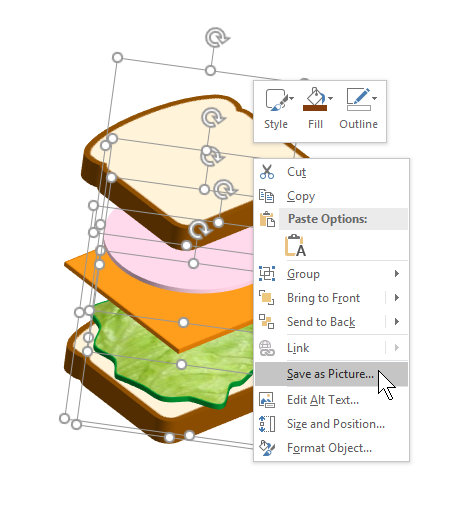
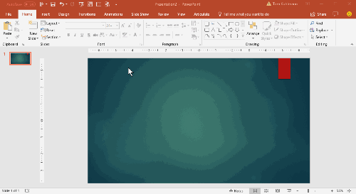
Visual Design Mistake 1: Images are Scrunched & Not Scaled

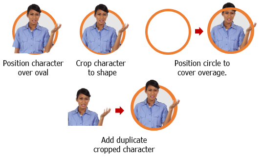
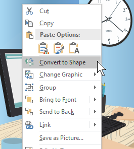
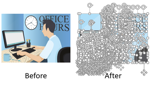
This is one of the most common mistakes and easily fixed. An image is inserted and then to make it fit or move it, it gets moved from the top or side anchors on the bounding box. This scrunches the image and makes it look a little off.

scale image from corner to maintain aspect ratio

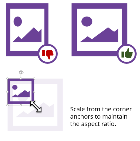
The fix is to drag it from the corner to scale it and preserve its aspect ratio. It most apps, you hold the SHIFT key and drag to keep it locked while you scale it up or down.

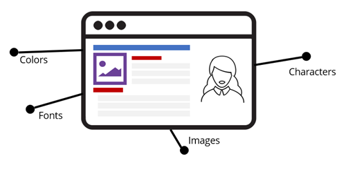
Visual Design Mistake 2: Not Sure Where to Focus

This is a general issue and I’ll address more specific fixes below. Essentially the eye moves across the screen in a pattern. Without a structured design, we tend to scan in a Z pattern. There are some things that disrupt the pattern like colors, size, whitespace, and an object’s relationship to another. That means we can help control eye movement. However, many times the course screens seem to just have a hodge-podge of things on it with lots of conflicting attempts to draw the eye’s attention.

z pattern when scanning screen

Here are two good fixes:

  • Learn more about basic design ideas like the CRAP (contrast, repetition, alignment, and proximity). I strongly recommend the book, The Non-Designer’s Design Book. It’s a must-have for the novice.
  • Everything on the screen should be there for a reason. I call this intentional design. If doesn’t help meet your objective, it probably doesn’t need to be there.

Visual Design Mistake 3: Inconsistent Visual Style

Ever take a course where each slide or screen looks different than the other? This usually happens because the developer is building slide to slide. I see this all the time in workshops. What happens is that they make design decisions at the slide level as they work. This leads to spending too much time reviewing every font installed on the computer looking for just the right one. Or going a stock photo site and trying to come up with ideas.

Other elements of visual inconsistency are:

style guide for e-learning

Again, I’ll reference intentional design and the need to have a plan around what will and won’t be on the screen. One easy solution is to do some sort of design mapping like the one David Anderson shares. It helps you consider the visual elements of your courses and make design decisions before you start building. Once you’ve narrowed down your intent you should put together a simple style guide. You’ll save time and have visual consistency.

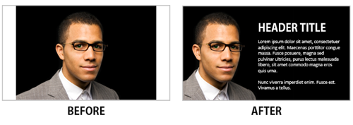
Visual Design Mistake 4: No Visual Hierarchy

This issue relates to the mistake above. If everything on the screen looks equal it’s hard to scan the content and even more difficult to figure out what fits where.

visual hierarchy adds context and makes it easier to scan

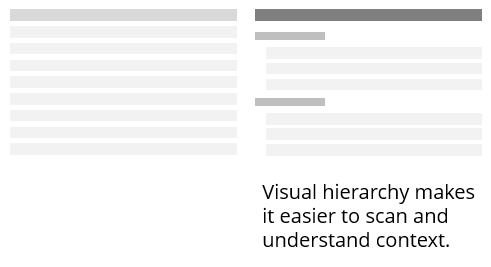
Having a visual hierarchy fixes this. It allows you to chunk content and makes it easier to discern context. The easiest thing is to create a simple style guide with headings, sub-headings, and body text.

Visual Design Mistake 5: Alignment Looks Sloppy & Out of Whack

There are some courses where the margins are all different widths and objects aren’t aligned properly. This makes the course look sloppy and a little out of balance or off kilter. It’s like walking into the room where the furniture doesn’t seem to be staged right and the pictures are crooked. You may not be a home decorator, but you definitely can tell when it doesn’t look right. The same goes with a visual design that is out of balance. It just doesn’t look right. And it may make it bit more challenging to understand the course content.

alignment woes in e-learning

This is easy to fix:

  • Have consistent margins.
  • Align objects, left justified is the most common. If you switch the justification, have a reason why.
  • Extra space between groups helps communicate that they’re grouped.
  • A lot of people use a grid system to keep onscreen objects aligned.

Those are common design mistakes that easily fixed and they help you avoid the Curse of the Frankencourse. If you want to learn more check out the visual design tips in the e-learning community, download this free e-book, and join us at one of our Roadshow workshops.

What do you find to be common visual design mistakes?

Events

Free E-Learning Resources

Want to learn more? Check out these articles and free resources in the community.

Here’s a great job board for e-learning, instructional design, and training jobs

Participate in the weekly e-learning challenges to sharpen your skills

Get your free PowerPoint templates and free graphics & stock images.

Lots of cool e-learning examples to check out and find inspiration.

Getting Started? This e-learning 101 series and the free e-books will help.