The Rapid Elearning Blog

Archive for the ‘Online Course Design’ Category


e-elearning project management

Managing all of the to-do lists and activities for your e-learning projects can be really time time-consuming and a pain. I’ve worked in organizations where it seemed we spent more time managing the bureaucracy related to the project than we actually spent on it.

Someone asked what I use to manage projects. Personally, I prefer a simple process with the least amount of friction as possible. I started using Sortd with my email account and that has really saved me some time. I may do a blog post on that down the road. But for my project management, I use Trello. It’s easy to use and free.

I’ve been using Trello for a few years and what I like best is that it keeps me focused on the actionable items and makes it easy to see the progress I’m making on projects.

Today, I’ll show a few simple tips. This isn’t a comprehensive overview but I’ll show a few of the basic things you can do. And you can take it from there.

Manage E-Learning Projects with Boards, Lists, and Cards
trello-board

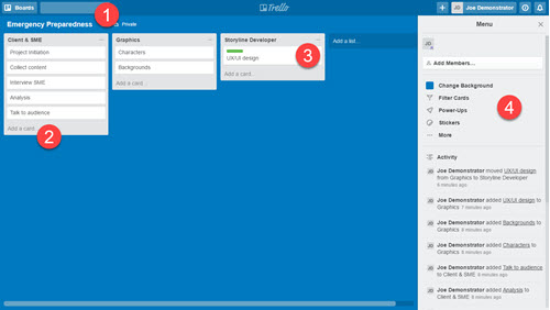
  • BOARDS: start by creating a project board for your course. Give it a name and you’re all set.
  • LISTS: inside the board, you create lists. I usually use lists to represent either clear milestones in the project or places where I need to hand tasks off to others.
  • CARDS: each list contains cards. Cards are great to house individual tasks. They contain checklists and details specific to the tasks. As you move through your project, you move cards from one list to another.
  • MENU: lets you see the activity and other settings within the board.

Here’s a video overview of using Trello to manage your e-learning projects to go with the instructions above.

Click to view the video on how to use Trello.

Some Bonus Tips

  • Combine Trello with Articulate Review and you have a really powerful way to not only manage projects but also manage the review cycle with your clients and subject matter experts.
  • Come up with a system that works and use it consistently. Initially, I found that I was a bit helter-skelter in my approach. This was fine when I only managed a couple of projects, but as I added more, it became less fun and more time-consuming.
  • Project management requires management. It’s not set and forget. Develop a routine to check on the progress of your projects. You can invite people as teams and assign cards to them, but you still need to stay on top of things.
  • It’s easy to get overwhelmed with your boards, cards, and lists. That’s why it’s important to come up with a process. Also, Trello is a great product as long as you keep it simple. But it can quickly get a bit complicated, especially if you have a lot of boards and cards. I know people who have boards to manage boards. To me, that’s too much. I love Trello for the simplicity and that’s the key: keep it simple.
  • Take advantage of the power-ups. The free plan gives you one power-up. If you’re a freelancer explore the options you have to append your Trello boards. For the most part, the free option should be fine.
  • Trello has a good guide that offers some instruction and help. If you want to learn more, check it out.

e-learning project management

 Also, check out this free e-book on how to manage e-learning projects. If you already use Trello, feel free to share your own tips and suggestions in the comments. If you use a similar low-cost or free solution, let me know.

Events

Free E-Learning Resources

Want to learn more? Check out these articles and free resources in the community.

Here’s a great job board for e-learning, instructional design, and training jobs

Participate in the weekly e-learning challenges to sharpen your skills

Get your free PowerPoint templates and free graphics & stock images.

Lots of cool e-learning examples to check out and find inspiration.

Getting Started? This e-learning 101 series and the free e-books will help.


hotspot drag drop interactions

In an earlier post, we looked at three ways to use hotspots in your e-learning courses. In most cases, hotspots are used as invisible buttons for interactive e-learning. But today we’ll look at ways to use the hotspot feature in your drag and drop interactions where the hotspot isn’t a button.

Drag and Drop Basics

Generally, there are two main components to drag and drop interactions:

  • an object that is dragged
  • a target to accept the dragged object

I covered this in more detail when we looked at how to create drag and drop interactions.

Use the Hotspot as a Catch-all Target

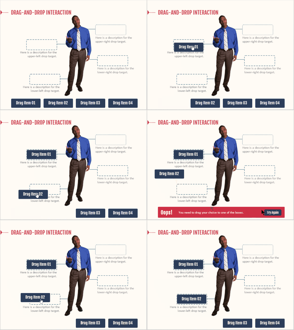
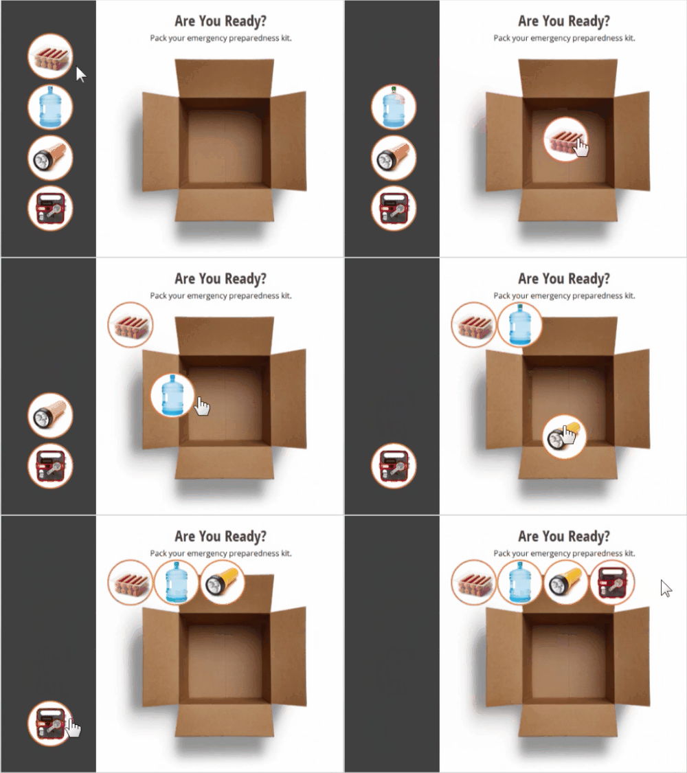
Usually, there’s an obvious correct or incorrect target for drag and drop interactions. But what happens when the object is dropped outside of one of the target choices? In most cases, the object gets kicked back to the starting point as in the image below.

Dropped object snaps back to starting point when dropped outside of the target.

drag and drop

In the above example, the dragged object can only be dropped on one of the targets. If it’s dropped outside of the target, it bounces back to the starting point. This is usually the default setting and most common in drag and drop interactions.

Dropped object triggers an “oops” layer when dropped outside of the target on the catch-all hotspot.

However, the hotspot feature can serve as a catch-all target to provide feedback when objects are dragged and dropped outside of the desired target. When an object is dropped on the catch-all target it triggers the appropriate feedback. In the example below, the catch-all target triggers an “oops, try again” layer.

dragdrop-2

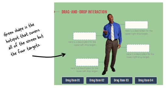
If you create a catch-all hotspot there are two things to do:

  • Put the hotspot underneath all of the other targets. Otherwise, it covers the drop targets and the interaction won’t work.
  • Determine how the dropped object responds. By default the object snaps to the center of the target; and since the target covers the entire screen, it looked weird sitting on top of the guy who’s in the center of the screen. In the example above I let it remain where it was dropped.

drag and drop interaction

Use the Hotspot to Expand and Control the Drop Target

Another great use of the hotspot feature is to better manage the drop target area. Since the hotspot is transparent it can sit on top of other object and be sort of a surrogate drop target. Instead of dropping on what looks like the target, they’re actually dropping on the target hotspot.

By doing this, you can determine where the dropped object is displayed. Here are before and after examples.

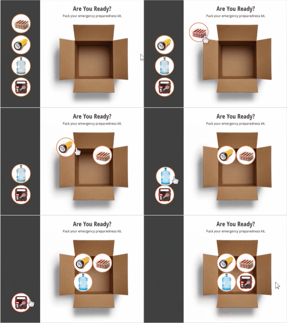
Dropped objects align based on the target image and display outside of the box.

drag and drop interaction target free

The objects are dragged to the box. By making the box image the drop target and tiling the objects, you can see that the objects actually align at the top of the box image.

Dropped objects align based on the hotspot target and align inside of the box.

drag and drop interaction drop target hotspot

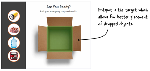
In the example above, the box image isn’t the drop target. Instead, there’s a hotspot placed on top of the box image and centered over the opened box. This allows control of the alignment of the dropped objects to create the desired visual effect.

drag and drop interaction hotspot target

The hotspot is a great feature for creating interactive content. Most of the times it’s used as an invisible button. However, because it’s an easy-to-see green box (for production) and invisible to the end user, it’s a great feature to create large, catch-all targets. And it also works well for controlling how the dropped objects align and display.

Events

Free E-Learning Resources

Want to learn more? Check out these articles and free resources in the community.

Here’s a great job board for e-learning, instructional design, and training jobs

Participate in the weekly e-learning challenges to sharpen your skills

Get your free PowerPoint templates and free graphics & stock images.

Lots of cool e-learning examples to check out and find inspiration.

Getting Started? This e-learning 101 series and the free e-books will help.


subject matter expert e-learning

Subject matter experts play a key role in the success of our courses. This is part three of the series on how to work with subject matter experts based on tips shared by your peers.

First, we discussed how to set expectations and then we looked at how to manage the relationship with your subject matter experts. Today we’ll explore how to get them to help you build great e-learning courses.

Working with Their Subject Matter

  • Ask the subject matter experts to explain things to you in layman terms, as if you have no knowledge about the subject.
  • During the information gathering phase – everything is in. Never say “no” at this stage.
  • Listen and gather as much information as you can before stating what you can or cannot do in the course. You don’t want them to self-edit and possibly neglect critical information.
  • Keep content within the confines of the training objectives.
  • Don’t enter into design, theme, look-and-feel discussions until the raw content is decided upon as it distracts subject matter expert from giving you the information you require.
  • Don’t rely on your subject matter experts giving you the information you need – ask the right questions. Later compose answers and then let them review and make edits.
  • Separate “need to know” versus “nice to know” information and performance-based tasks.
  • If you work with several subject matter expert on the same subject, but with different expertise, let them review and structure each other’s work. That way, they look from a distance at the content, and the overlap between their comments will highlight the most important content.
  • Ask subject matter expert to separate what’s essentials from stuff that can be found elsewhere via other resources. Those can be referenced in the course.
  • If you’re the subject matter expert and the developer, be prepared to be creative, start afresh and don’t be too protective of your course material.
  • If the list of content requirements from your subject matter expert is unwieldy, ask them for the top 3 or 4 things they want the learner to take away from the course. It can help focus on the most important stuff.
  • Don’t expect them to change their content the first time you see it. Take it. Go away. Read it and make notes. Then come back with questions that help them think about the learning experience.

convert PowerPoint into e-elearning subject matter experts

Help Them Think Like an Instructional Designer

  • Help the subject matter expert understand the basics of instructional design. There’s no need to share a firehose of info when all they need is a small sip. Share a few e-learning examples and perhaps a few simple articles on how to build good e-learning.
  • New learners don’t need to know everything that the subject matter expert knows.  A subject matter expert expertise comes from years of industry experience, but the average 20-minute e-learning course is not intended to provide an encyclopedic knowledge of the subject.
  • Offer ideas to show how to transform their knowledge into great interactive content.
  • Help the “expert” to identify the key intentions of the learning activity with the goal of getting them to strip their material down to the bare essentials. And then build up.
  • Keep the end learner in mind. If you don’t understand it, they won’t.
  • Get them to focus on performance goals and not course information. What are people supposed to do?  Use their knowledge to discover work-based scenarios to bring the key learning points to life.
  • Bounce off the information you get from your subject matter expert with your potential learner group.
  • Ask subject matter expert to put themselves in the learner’s shoes (to help them recognize that you might not need to cram all that detail into the course).
  • Remind the subject matter expert to focus on actions – instead of telling us what new learners should know, tell us what actions they should be able to take.

How do you work with your subject matter experts to make sure you get the right content? Share your comments here.

Storyline 0

David Charney does a great job showing his original copy of Storyline 0 from the early 80’s which is great to compare to the newly released Storyline 3.

Events

Free E-Learning Resources

Want to learn more? Check out these articles and free resources in the community.

Here’s a great job board for e-learning, instructional design, and training jobs

Participate in the weekly e-learning challenges to sharpen your skills

Get your free PowerPoint templates and free graphics & stock images.

Lots of cool e-learning examples to check out and find inspiration.

Getting Started? This e-learning 101 series and the free e-books will help.


gamified e-learning gamification

I hear a lot of people ask about gamifying their e-learning courses. And the examples they show are usually simple games modeled after shows like Jeopardy or Wheel of Fortune. Those are fine and have their places in e-learning, especially for quick knowledge checks. But they’re not the same as gamification.

In today’s post, I’ll share a few simple things to help get your brain muscles going.

What Do You Need to Know?

When it comes to building the courses in an authoring tool, you basically need to know how to use variables. Variables allow you to track and evaluate the user to provide relevant feedback, scoring, tokens, and all the other things that make up gamified e-learning courses. And once you know how to work with variables, you can build all sorts of things.

gamified e-learning

Here are some resources to learn more about variables:

Learn More About Gamification

You can do a search and read all sorts about gamification especially now that it’s also a buzzword. Essentially you are taking game concepts and applying them to a non-game context. As you play games, ask what about the game is compelling and what similar element could work in your next e-learning course.

I think the greater challenge in building gamified courses is less in constructing the mechanics and more in building a narrative that integrates gaming psychology. Building things in the authoring tools is relatively easy compared to understanding what to build.

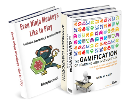
Here are three good books on gamification.

gamification books

The links to Amazon books may produce a slight commission.

What Can You Build in Your E-Learning Course?

When it comes to authoring the courses outside of a management system where you can track multiple users and build things like leaderboards, you’re confined to simple game elements such as:

  • Timers
  • Personalization
  • Progress meters
  • Tokens
  • Rewards management
  • Scoring
  • Autonomous navigation

You can make some very compelling courses that instructive and engaging. However, there’s a lot more to gamification than these simple elements above. How do you motivate learners and create the right tension between boredom and failure? Make sure you invest the right resources and develop a good strategy. Otherwise, your gamified course will transform from game to gimmick.

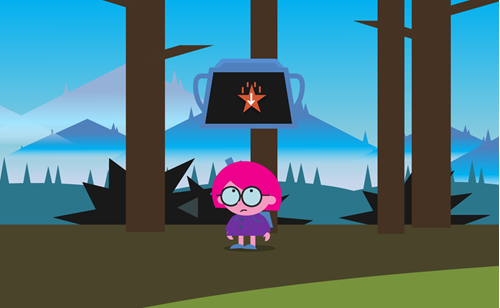
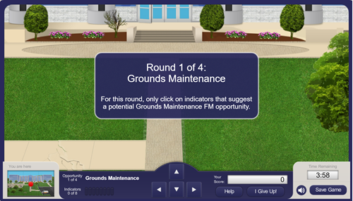
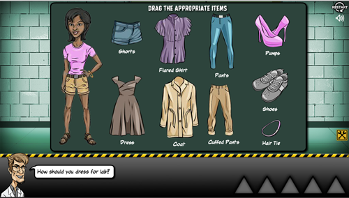
If you’re not quite sure where to get started, check out some of the cool examples in the community. They’ll give an idea of some of what you can do with the authoring tools. Here are three nice examples:

gamification example 1

Click here to view gamified e-learning course.

gamification-example-2

Click here to view gamified e-learning course.

gamification example 3

Click here to view gamified e-learning course.

And there’s nothing wrong with starting simple. If all you need is a Jeopardy-style quiz, then download this free file. It’s a great way to work with a context you know. But make a commitment to learn more about variables and start to add some of those gaming elements above to your courses.

Have you built any gamified e-learning? If so, share a link in the comments.

Events

Free E-Learning Resources

Want to learn more? Check out these articles and free resources in the community.

Here’s a great job board for e-learning, instructional design, and training jobs

Participate in the weekly e-learning challenges to sharpen your skills

Get your free PowerPoint templates and free graphics & stock images.

Lots of cool e-learning examples to check out and find inspiration.

Getting Started? This e-learning 101 series and the free e-books will help.


hotspot

Hotspots are commonly used in e-learning course design. They’re invisible, yet functional. Today, we’ll explore some common use cases for the hotspot in your online training.

Invisible Button Hotspots

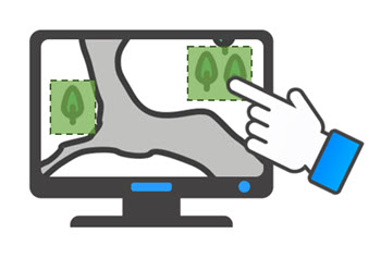
The most common use for the hotspot is the invisible button. Essentially it allows the developer to add an interactive choice on top of another object. This can really speed up production. For example, the image below starts with a single image of a world map. By adding separate hotspots over each continent there’s no need to create separate images with links. This really comes in handy when you start with a single image and don’t have the means to break it into smaller components.

hotspot interaction

Example Screen Space with Interactive Hotspots

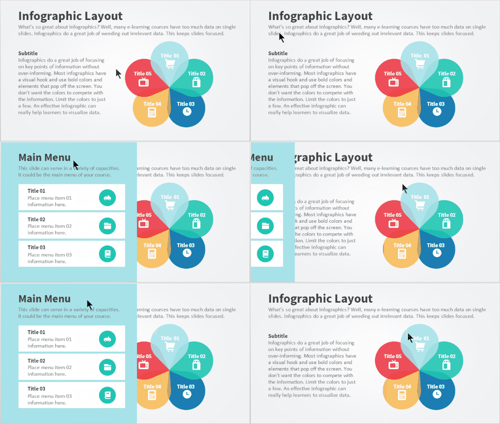
The hotspot can also be used as a means to expand real estate via a mouseover interaction. A click interaction requires a click to activate and then an additional click to deactivate. Whereas a mouseover interaction is a bit smoother. Mouseover the hotspot to reveal content, mouse away to have it disappear.

mouseover hotspot

In the example above, I added access to additional content using a mouseover hotspot. This is content that doesn’t need to be persistent but does need to be available. The mouseover or hover interaction assigned to the hotspot is a great way to expand screen real estate with fluid precision.

Invisible Barrier Hotspot

The two examples above are pretty common and what you’d normally expect for hotspots since the hotspot is usually defined as an invisible button or interaction. However, the hotspot is also good as a barrier to avoid interactions. Think of it like plastic wrap over a piece of cake. You can see the cake, but you can’t touch it because the wrap is covering it.

Here’s a recent example where I used the hotspot as a barrier. In this anatomy interaction, each part of the digestive system is actually a slider connected to the main slider. It’s a great effect to move the pieces in and out of the body using a single slider. However, I only want the user to interact with the main slider, so I placed a hotspot over the body image and the other sliders. The hotspot serves as a barrier and prevents the user from interacting with what’s underneath.

Check out the two examples below to see the difference.

Example with No Hotspot Barrier

no hotspot barrier

Click here to view the demo of no hotspot barrier.

The first demo above has no hotspot barrier which means any of the other sliders are active. Grab one of the body parts and see what happens. It’s not as elegant.

Example with a Hotspot Barrier

hotspot barrier

Click here to view the demo of hotspot barrier.

The second interaction has a hotspot barrier over the body parts which prevents the user from interacting with anything other than the main slider. This makes for a much better user experience and a more elegant interaction.

So there you have it. You can use hotspots to trigger all sorts of interactions or you can use them as a persistent invisible barrier that prevents an interaction.

Events

Free E-Learning Resources

Want to learn more? Check out these articles and free resources in the community.

Here’s a great job board for e-learning, instructional design, and training jobs

Participate in the weekly e-learning challenges to sharpen your skills

Get your free PowerPoint templates and free graphics & stock images.

Lots of cool e-learning examples to check out and find inspiration.

Getting Started? This e-learning 101 series and the free e-books will help.


subject matter experts relationship

This is part two of the series on working with subject matter experts when building e-learning courses. In the previous post, we looked at how to set expectations and some simple project management tips. I also shared a link to the free e-book, Essential Guide to Working with Subject Matter Experts.

Today, we’ll look at what it takes to build a good working relationship with your subject matter experts. I always take a short term and long term view. In the short term, I want to make sure that the project moves forward successfully. And the subject matter expert plays a critical role.

In the long term, it’s all about networking and building relationship within the organization. The more you know and the more people you know, the more valuable you’ll be to the organization. And you never know when you’ll need that person’s help on future projects. A good relationship proves valuable.

subject matter experts are your friends

When asked about working with subject matter experts, here’s what your fellow e-learning developers shared:

  • They are called subject matter expert for a reason – don’t be patronizing because without them we wouldn’t be doing this.
  • Be respectful of their time, especially if they’re not working on the project and only providing assistance.
  • Help them save time. You can do this by reducing their workload. Do some research and pre-work that helps them not have to provide all of the content.
  • Show that you care. They won’t care what you know until they know that you care.
  • Be nice. If that doesn’t work, then bribe with chocolate!
  • Make them feel important. They tend to have big egos. [Tom’s note: not all of them suffer from big egos unless you’re working with doctors and lawyers. 🙂 ]
  • The subject matter experts have a lot of knowledge to impart. They will be keen to ensure that the students have access to that.
  • Keep a poker face when you hear things you do not like or cannot do. Just listen and record. You can fix things later.
  • We may use the same words but they don’t always mean the same things. Make sure that terminology is understood by both developer and subject matter expert.
  • Define your role to them in concise, clear terms so it is less threatening for them (especially when it is time to cut out “nice to know info”).
  • Be ready for them not to recognize your skill set.
  • Praise, praise and more praise for their cooperation, input, and feedback.
  • Get their buy-in at every stage of the process (if they’re involved in that level of detail).
  • Face to face is better than an email sometimes.
  •  This is a different style of learning.
  • Let their managers know how much they’re contributing.

What do you do to manage the relationship with your subject matter experts?

Events

Free E-Learning Resources

Want to learn more? Check out these articles and free resources in the community.

Here’s a great job board for e-learning, instructional design, and training jobs

Participate in the weekly e-learning challenges to sharpen your skills

Get your free PowerPoint templates and free graphics & stock images.

Lots of cool e-learning examples to check out and find inspiration.

Getting Started? This e-learning 101 series and the free e-books will help.


instructional design tips e-learning tips

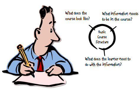
During a recent interview, someone asked about what I’ve learned over the years. It’s a question I get asked a lot by new designers. One point I always make is to not worry about what’s under the hood. Just worry about getting the output you need. All of the other stuff you’ll get as you gain experience and have to make edits.

However, here are a few key points I shared in the interview.

It’s Not Rocket Science

I know this statement irks some instructional designers, but come on, what we’re doing isn’t rocket science unless of course you’re working for NASA or some other space agency. Learning is innate to humans and while we may not all know how to build the best courses, we probably can do a decent enough job to get started. Besides, I’ve seen plenty of bad courses from people who have their fancy degrees (and some have even written books).

instructional design degree e-learning tips

So take a chill pill. Don’t worry about knowing everything about instructional design. Get that first course built. Focus on meeting some tangible objectives and you’ll be on your way. Odds are it won’t be the worst course our industry’s ever seen.

A Course is a Course Unless it’s Not a Course

Not everything we call a course is a course. Sometimes, they’re just more like awareness campaigns, like learning about a new company policy. Some courses do have larger performance expectations but practicing the performance happens outside of the course. And then sometimes courses are heavily focused on performance where real-world decisions can be baked into the course design. The key is knowing what

The key is knowing what type of course you’re building. This way you can commit the appropriate resources. No need to build an elaborate scenario when you all you need is a few screens and perhaps a quick quiz. At the same time, you don’t want to build a click-and-read course when the person needs to learn how to make good decisions. That type of course probably requires some sort of decision-making challenge.

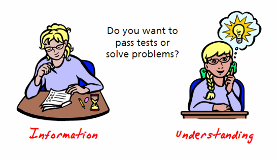
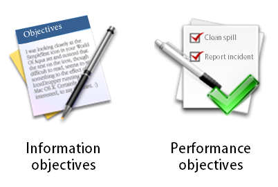
e-learning tips sort by performance vs information

Looks Matter More Than Instruction

For all of our talk about building good courses, often the ones that get the most play are the ones that look good. And this makes sense because e-learning is a mostly visual medium. People are drawn to things that look good. It’s the initial stage of engagement. On top of that good visual design is a key part of communicating ideas.

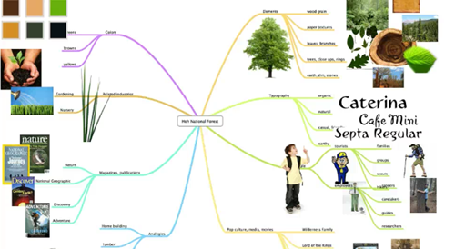
e-learning tips design map

In either case, you get more traction when courses look good and are visually connected to the context of the course. This is something to keep in mind, especially when building a portfolio.

Maintain a Portfolio

It’s important to maintain a project portfolio. This is always easier to say than to do because it does take time. It’s a record of what you’ve done and it’s a way to promote your expertise.

Here’s a common dilemma: a person gets laid off and needs to start applying for jobs. Lo and behold, all of the projects are locked behind a firewall and the person has nothing to show. On top of that, the person also doesn’t own the software to build new demos for a portfolio.

Focus on the Action

Many of the courses I see are mostly information dumps. Step away from the information and focus on the action. What are they supposed to do? How do they demonstrate that they know how to do it in the real world? What activities can you build in your course that mimic those real-world decisions and actions?

e-learning tips three step process

What content do you need to support learning to make those decisions? Build your courses using a backward design approach. Focus on the measurable action and build towards the information that supports it. This is better than a linear information dump. The book, Understanding By Design, is a good place to start.

Sometimes an Information Dump is All You Need

The reality is that a lot of courses are only awareness campaigns or they exist to meet some compliance requirement. In those cases, it makes sense to keep the course simple so that people can get what they need and then get back to work. When I meet with a client I always try to sort courses by their performance requirement. If there are no clear requirements, then it falls in the information bucket which means I spend less time building the course.

e-learning tips information vs performance

Five Meals a Day is Better Than One Big One

I’m not one to focus much on diet (unless it consists of donuts). However, I do see a lot of headlines that extol the virtue of smaller meals spread over time. The same can be said for e-learning. Building a big course takes time, requires more deliberation, and can’t easily be changed.

e-learning tips spaced e-learning microlearning

Often it’s better to build smaller modules and then space the content over time. The smaller modules are easier to build and deliver. They can also be modified much more quickly. And there’s a lot of good research that shows learning spaced over time is very effective.

What Do You Wish You Knew?

I’m leaving this section blank and asking you what’s the one thing you wish you knew when first getting started. Share your thoughts in the comments section.

instructional design tip you provide e-learning tips

Events

Free E-Learning Resources

Want to learn more? Check out these articles and free resources in the community.

Here’s a great job board for e-learning, instructional design, and training jobs

Participate in the weekly e-learning challenges to sharpen your skills

Get your free PowerPoint templates and free graphics & stock images.

Lots of cool e-learning examples to check out and find inspiration.

Getting Started? This e-learning 101 series and the free e-books will help.


subject matter expert tips

At a recent workshop, we had participants share their tips on working with subject matter experts. As expected they shared some really good tips that are practical and will help move your training courses forward.

Since there was a ton of tips I broke them into a series of posts. Today we’ll look at how to manage the relationship with your subject matter experts.

Establish Expectations with Your Subject Matter Experts

tips when working with subject matter experts in e-learning

  • If you can, research your subject matter expert just like you would any other client.
  • Define clearly the communication plan with your subject matter experts. Follow the 5Ws: who, what, where, when and wherefore.
  • Make sure the development process is clearly defined and understood and then define the role of your subject matter expert and how much you expect.
  • Explain the importance of the project you are working on because a lot of times they think whatever you’re working on isn’t necessary.
  • Give clear instructions to subject matter experts as to how you want their information and content submitted to you. This includes any templates, instructions for recording and submitting audio. This helps avoid issues later, especially where there is a minimum of communication and interaction with the subject matter expert due to time and cost constraints.
  • Don’t be concerned if initial meeting is the dreaded information dump. You can always refine from this big list. Sometimes it’s good to just get them to dump everything so you know what they’re thinking.

Simple Project Management Tips When Working with Subject Matter Experts

subject matter expert tips for e-learning

  • Set up a kickoff meeting in which you: declare timelines, set expectations, define the specific roles during which phases and expected outcomes and deliverables.
  • Come up with a service level agreement. And then make sure you get the requirements signed off after each phase to avoid last minute surprises. This also helps keep the project in scope.
  • Get buy-in as soon as possible during analysis and information gathering.
  • Schedule and hold regular progress check-in meetings.
  • Record and document your meetings and then send out so that everyone can see what was discussed and expectations moving forward.
  • Meetings should have agendas with action items. No action items, then no meeting.
  • Don’t miss your own deadlines!!!
  • Document what you have agreed on and refer to that for your milestones and check-ins.
  • Ensure you and your subject matter expert track changes, and ask them to be as specific as possible with their comments and feedback. e.g. writing “Clarification is needed here” isn’t good enough!

free e-book working with subject matter experts

Be sure to check out this free e-book, Essential Guide to Working with Subject Matter Experts. You can find it in the E-Learning Heroes community.

Events

Free E-Learning Resources

Want to learn more? Check out these articles and free resources in the community.

Here’s a great job board for e-learning, instructional design, and training jobs

Participate in the weekly e-learning challenges to sharpen your skills

Get your free PowerPoint templates and free graphics & stock images.

Lots of cool e-learning examples to check out and find inspiration.

Getting Started? This e-learning 101 series and the free e-books will help.


advanced e-learning courses

“I want to learn more advanced e-learning.”

As I conduct e-learning workshops around the world, this is probably one of the most frequent statements I hear. In many of the workshops, there’s a mix of people who are just getting started with e-learning and those who’ve been building courses for a while. So their expectations and experiences are very different.

On top of that, there’s a difference between advanced topics for using the Articulate software and advanced topics when it comes to instructional design and course construction outside of the software you’re using.

The challenge for me is discerning what “advanced” actually means. I’ll share some of my observations but I’m really more curious as to how you define advanced e-learning.

Here’s How I Define Advanced E-Learning

Since I work at Articulate, most of the workshops are focused on using the Articulate applications to build courses. And it’s a lot more interesting now that Articulate 360 gives you every application because it provides a lot of capability and options for how to approach the course content and construction.

basic or advanced e-learning courses

When it comes to software training, here’s how I look at e-learning skills:

  • Basic. Basic level training is learning to use the features as designed. For example, how triggers work is a basic task. You need a basic understanding of the feature so that you can use it to build interactions and functionality within the course.
  • Advanced. The next level of skills training is becoming competent with the advanced feature set like variables. In a sense, they’re just basic built-in features like the rest, but they are a bit more advanced in what they can offer because of the options and structure they provide. The key is you don’t need to know how to use them to build effective courses. However, when you do know how to use the variables features they make your courses more complex and efficient. You can build things like adaptive learning paths unique to each user.

Here is where I like to create a distinction between basic and advanced e-learning: it’s not about the features as much as becoming efficient and combining features to accomplish custom objectives.

  • Production efficiency. In most software applications, there are twenty ways to do the same thing. In that case, it doesn’t matter how you created the course as long as you get what you wanted. However, there are some production techniques that are more efficient than others. An advanced course developer is efficient and does the little things like adding titles to objects in the timeline. And she understands how to differentiate features and when to choose one over the other when they do similar things.
  • Compounding features. Features are created to do specific things and they usually have some constraints. Advanced course developers learn to accomplish their objectives by combining features and working around the constraints they may offer. In a sense, they create new features through production techniques. We usually call these best practices. And advanced developers have a tool chest full of best practices.

What’s missing?

advanced e-learning examples using JavaScript

  • Hacks. Building on the programming skills above, there are some people who have the programming skills to deconstruct the published output of the course and then hack it by adding their own code to modify how the published course functions. Again great skills to have, but they extend outside of the authoring software.

That’s just the software side of e-learning course production. It doesn’t cover what advanced skills are required to actually determine the appropriate content and activities to effectively teach new skills and concepts.

How Do You Define Advanced E-Learning?

So my question for you is two-fold. How do you define advanced e-learning skills when it comes to the software and then how would you define it when it comes to more general topics like instructional design?

Feel free to share your thoughts by adding them to the comments.

Events

Free E-Learning Resources

Want to learn more? Check out these articles and free resources in the community.

Here’s a great job board for e-learning, instructional design, and training jobs

Participate in the weekly e-learning challenges to sharpen your skills

Get your free PowerPoint templates and free graphics & stock images.

Lots of cool e-learning examples to check out and find inspiration.

Getting Started? This e-learning 101 series and the free e-books will help.


rapid e-learning

I’ve been reviewing some of my older blog posts to fix links and update some of the examples. After ten years, most of the posts are still relevant but some are obsolete like using clip art in PowerPoint. Going through ten years of blog posts brings up some interesting observations. For example, some of the media companies I referenced no longer exist. It’s a good reminder for us to not always jump on what’s hot until it’s really proven its worth.  In addition, the industry has changed quite a bit when I first started blogging.

In 2007, when Flash was king, I stated that the e-learning tools would evolve and become easier to use. You’d no longer need to learn specialized skills like Flash and ActionScript. This wasn’t a prediction of Flash’s demise. The key point was that it didn’t matter what underlying technology drove the content, the next generation course designer could build e-elearning with no programming skills required. This would be empowering and disruptive to our industry. And I think it’s fair to say, that is the case today.

Catching the Rapid E-Learning Bug

About 14 years ago, I saw the light. I consulted for a company that serviced non-profits. They needed help figuring out “this e-learning thing” and how to get their training online. One of their Flash programmers built a player that could dynamically load content. It worked but it was not easy to use. I was looking for something a lot easier that anyone could use, something more like PowerPoint. I searched for “PowerPoint and e-learning” and stumbled upon this Articulate company and Articulate Presenter. And it changed my life forever and my perspective on the industry.

articulate rapid e-learning PowerPoint

I couldn’t believe how easy it was to take what I built in PowerPoint and easily convert it to an e-learning course. Back then I even used a hidden notes panel to create a simple learning management system where a person searched their name and the courses they need to take showed up in the menu.

For me the big eye opener was that anyone could build courses. This was going to change the industry and take a lot of course construction away from programmers and put it in the hands of instructional designers. From that point on, anywhere I went I was touting this rapid e-learning stuff. Of course, most people immediately tuned out because they heard PowerPoint (which comes with its own baggage) or they were the Flash programmers (the equivalent to Swiss watch makers during the quartz revolution).

Eventually I prevailed and was able to bring the rapid e-elearning applications to a number of organizations. And at each, the teams that used those tools outperformed the Flash development teams.

Here’s one of my favorite stories. I won’t mention the e-learning company (because they’re really well known in our industry).

Shortly after getting hired at Articulate, I was at a big e-learning conference. Someone from one of the big well-known e-learning companies came by and asked if I knew someone who could take a bunch of courses off their hands. Some of their customers had PowerPoint slide decks and wanted to convert them into courses. Essentially she said that they built “real” e-learning and that this type of work was beneath them. None of their developers wanted to work on the courses.

I challenged her thinking and stated that the PowerPoint slides were just content and that any good course designer could convert the content into an effective and engaging course. Who cares how it’s built? And besides, this rapid e-elearning thing wasn’t a trend but the future of e-learning. She literally laughed at me and walked away. Today, they no longer employ Flash developers and the bulk of their courses are built using a rapid e-learning product.

How the E-Learning Industry Has Evolved

The industry is evolving and the tools are getting easier to use. And that’s not going to change. It started with simple PowerPoint-to-Flash conversions but today you can build some pretty complex interactions with no programming background. Here are a few things I see:

  • Most companies have some sort of investment in rapid e-learning. In fact, Articulate is in over 60,000 companies and most of those have replaced their Flash teams with Storyline developers.
  • Most of the Flash developers I know have shifted to Storyline. They do some customization using JavaScript and other hacks. But they’re still not doing a lot of custom programming because the software has made it easy to do.
  • Most of the complainers of rapid e-learning are e-learning companies who charge a lot for custom development. It hurts them to see you empowered to build your own courses. You know who they are because all of their blog posts complain about what’s wrong with e-learning. I see them as the elephant companies that are big and slow. But the reality is that most companies are looking for cheetahs and not elephants. If you’re an elephant, you’ll have plenty of time to look at your gorgeous mechanical watch.
  • There’s always a need for sound instructional design (which should be part of any course, rapid or not) and custom development. In fact, I think the advent of rapid e-learning has helped our industry grow which has created more opportunity for the custom developers and those who can help organizations build better e-learning and do more than push out bullet point screens.
  • Today, rapid e-learning has progressed beyond simple PowerPoint conversions. Essentially you have a choice between tools like Storyline that allow for custom development or form-based tools like Rise, where you assemble content and drop it into specific forms. Both form and freeform authoring are viable options to meet different needs.

What You Need to Do in 2017

  • Templates are powerful. They get dismissed, but you can build a template for anything and they don’t need to be those simple bullet point templates. They can include all sorts of pre-built interactivity. One of my favorite features in Storyline is to save any interaction as a template. Here’s an example of a simple interaction that could be a template for quick knowledge checks. It’s one slide and no layers. Adding a new card is just a matter of copying and pasting. Super easy to build and make into a template. And it’s a big time saver when you need this type of interaction. Make an investment to build a few interactive templates or download some of the free ones and then you always have a tool chest of interactive templates.
  • Build the right course for the right project. Not every course requires elaborate decision-making interactions. And at the same time, instructional design is more than slapping some content on a screen. Figure out which requires what and then spend your resources wisely. And remember most learning doesn’t happen in the course. Here are a couple of posts to know if you’re building the right course and separating information from performance courses.
  • Smaller courses are easier to consume (and create). There’s a trend towards microlearning as if it’s something new, but it’s not. It’s just that creating the content in smaller chunks is now more viable and the reality is people can only take in so much content. It’s easier to build smaller modules and then deliver them over spaced intervals. You’ll most likely see more impact and you’ll definitely be able to maintain and update the smaller modules more efficiently.
  • Understand the tools. Generally you have a choice between form and freeform applications. Form-based tools allow you to copy and paste content into pre-determined forms; or you build your content in a freeform environment. Both are great options but they each have different requirements. If you use a form, you’re mostly constrained to the form. If you don’t want those constraints, then use a freeform application, but understand you need to determine how things will look and work as opposed to just adding them to forms.
  • Focus on your development. Commit to a few e-learning challenges this year to build your skills and your professional network. Read some e-learning books and then apply what you learn to your courses. Build a portfolio to document your skills.
  • Share what you know and do. I am a big proponent of community and I know that many course developers are either by themselves or on small teams. The community provides a place to interact with and learn from your peers. It’s also a place to trade files and show examples. If you need more help figuring this out, read Share Your Work.

What are your plans for the 2017? Do you have any e-learning goals? How has the industry changed for you? What are you looking forward to?

Events

Free E-Learning Resources

Want to learn more? Check out these articles and free resources in the community.

Here’s a great job board for e-learning, instructional design, and training jobs

Participate in the weekly e-learning challenges to sharpen your skills

Get your free PowerPoint templates and free graphics & stock images.

Lots of cool e-learning examples to check out and find inspiration.

Getting Started? This e-learning 101 series and the free e-books will help.


locked navigation e-learning

“How do I lock navigation?” is one of the first questions we get when showing people how to use our software. In fact it’s one of the questions we had to revisit in a recent Articulate Live webinar where people wanted to see the features used to lock navigation.

I understand the question and why it’s asked, but from an instructional perspective it’s one of the most frustrating questions to answer because locking navigation may inhibit learning and it’s a miserable experience for the person stuck in a boring course irrelevant to their needs.

Why Are We Asked to Lock Navigation?

There are a number of reasons why courses are locked. Most of the time the customer wants some assurance that the course taker isn’t just clicking the next button and skipping important information. Locking the navigation and forcing people to go through the course slide by slide is one way to guarantee that they’ve seen the slide.

But does being exposed to the content meet any real objectives? Doesn’t the content exist to promote some sort of decision-making or performance?

How to Move Past Locked Navigation

There are a number of ways to move past locking your course navigation. Here are a few ideas:

  • See the course in two parts. Part one = information required to make decisions. Part two = the types of decisions they need to make to show they know the information. Focus on how the course takers can demonstrate their understanding.
  • Step away from the solution. The elearning course is a solution to meet specific objectives. My guess is that the business objective isn’t to look at screens of information. Why does the course exist? Build it to meet those objectives and rest assured that locked navigation doesn’t meet them. Activities where they practice and demonstrate understanding is a better way to meet objectives.
  • Avoid linear courses. Most courses are linear, “A to Z” courses. They beg to be locked. If you open them up and make them more exploratory, this makes locking them less critical.
  • Create relevant content & context. People don’t normally make a habit of reading policies at work. But they routinely make decisions that hopefully align with the policies. Convert your content into real world activities where they use the information to make decisions. This requires them to know the information and prove it.
  • Lock the course at decision points. You probably can’t get past some form of locking. In that case, create decision points where the course taker demonstrates understanding of the content to move on. This allows you to give them freedom to explore content between the decision points.
  • Replace locking with rewards. Instead of forcing them through content, provide an incentive to collect information (or make good decisions with the information). This can be in the form of a dashboard where they collect badges to reward completion.
  • Chunk the course into smaller segments. Even with all of these tips, there’s a good chance you still have to create locked navigation. In those cases, chunk the course content into smaller segments. I like to call them coursels (course morsels). No one likes locked navigation, but it’s definitely a lot less frustrating when it’s a quicker experience.

What tips do you have for those who are stuck in the world of locked navigation?

Events

Free E-Learning Resources

Want to learn more? Check out these articles and free resources in the community.

Here’s a great job board for e-learning, instructional design, and training jobs

Participate in the weekly e-learning challenges to sharpen your skills

Get your free PowerPoint templates and free graphics & stock images.

Lots of cool e-learning examples to check out and find inspiration.

Getting Started? This e-learning 101 series and the free e-books will help.


3-ways-guide-learners

Inevitably you have to provide instructions on how to do something in the course. The question is when to provide them and at what level of detail. In this post we’ll explore three ways to guide the instruction process.

Provide Instructions Upfront

The most common way to provide instructions is to do it all up front. This is what I see in most of the courses I review. Generally you share what needs to happen and when. Depending on the complexity, you may provide some details and screen shots. The point though is that all of the instructions come up front and then the person continues through the course.

  • Pros: this is probably the easiest thing to do; the gate screen concept works for this approach. Some people add instructions and help reminders to the player for quick access.
  • Cons: they’re all up front and sometimes people aren’t quite clear on expectations until they’ve had some experience with the course or have made a few mistakes. They probably need more context before they even know what to do with the instructions.

Provide Instructions at the Point of Need

Get what you need as you need it. Why burden them with instructions at the front end of the course when they will most likely forget them anyway? It makes sense to delay instructions until the person needs them.

For example, you provide some context upfront and then have them go through the procedure. Walk them through it. You can also delay the instructions and if no action is taken, then provide instructions after it’s determined they’ve not acted (or possibly done something incorrectly).

  • Pros: you’re not overwhelming them with content, let them build context, and get what they need at time of need
  • Cons: it takes a little more work to build the mechanism to evaluate and time instructions; may be intrusive to the process for someone who gets it. Make sure to not lock the process.

Provide Instructions as Practice Activites

I like the Wii-type instructions where new tasks are presented with practice activities. This builds off of the progressive instructions in option two where the instructions are provided at time of need. However it does introduce the practice element. This allows a person to practice to a level of competence.

Here’s an example: “Address customer issues and input them into the system. Before you begin the scenarios you can practice and learn the proper input procedures. Do you want to practice? Yes or No?”

“Yes” moves them to a practice scenario with step-by-step guidance. “No” moves them into the challenge activity where they are timed and will get feedback later.

Essentially you say: “Here’s what you need to do. Do you want to practice before we get started? OK. Here is a practice opportunity. No? OK. Let’s proceed with the activity.”

  • Pros: instructions are just-in-time and in context with the course; disarms new learners and provides confidence; frees tenured learners to ignore.
  • Cons: the major con to this approach is the time it takes to build instructions that are effective and relevant. Probably requires working knowledge of variables to create an adaptive path.

So there you have it, three ways to guide your learners through the course. Which way do you prefer? What other options do you recommend?

Events

Free E-Learning Resources

Want to learn more? Check out these articles and free resources in the community.

Here’s a great job board for e-learning, instructional design, and training jobs

Participate in the weekly e-learning challenges to sharpen your skills

Get your free PowerPoint templates and free graphics & stock images.

Lots of cool e-learning examples to check out and find inspiration.

Getting Started? This e-learning 101 series and the free e-books will help.