The Rapid Elearning Blog

Archive for the ‘Online Course Design’ Category


Articulate Rapid E-learning Blog - pre-assessment scenario

Organizations operate at the speed of business and don’t like to waste time or money. That’s especially true when it comes to pulling people away from their daily tasks. And this is something that happens every time a person is asked to complete an e-learning course. So it’s important to create the most cost-effective process possible and still meet the organization’s goals.

One way to make e-learning courses cost-effective is by sorting your learners and then pushing them to a successful learning path. Some who take the courses are more experienced and don’t need the same course that the new person does. And the new person probably needs a lot more context and content.

Understand Your Learners Before Building a Pre-Assessment Scenario

People come to the courses with varying levels of experience, skills, and understanding. In an ideal world, you can craft an adaptive learning process where everyone gets a unique learning experience, but that’s usually not an option. Most of the time, you have to create one course that meets the needs of everyone.

  • Experienced learners already have a lot of contexts. And often the e-learning courses act more like a certification process than new learning experience. So, in that sense, let them prove what they know and move on to completion.
  • New learners are new and don’t have a record of accomplishment of experience. Often, they don’t know what they don’t know. Some may know more than others. And some may think they already know the content.

Let Learners Test Out Instead of Using a Pre-Assessment Scenario

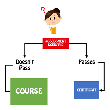
A common option is to let learners test out by successfully completing a pre-test. Present an assessment upfront. If they pass it, they go to the end and are done. If they don’t pass it, they go to the beginning and take the course. This is a viable model and works great for simple compliance training where an annual course completion certificate is the main objective.
Articulate Rapid E-Learning Blog - pre-assessment scenarios let you test out

However, many of those pre-assessment tests are very basic and what do they really prove? They may prove the person knows the content, but it doesn’t mean that they know how to apply it. Or it may prove that they’re good guessers. In either case, they generally don’t prove understanding, especially in a performance environment.

Create a Pre-Assessment Scenario

Functionally a pre-assessment scenario is the same as a pre-test. The goal is to sort the learners and move the experienced and novice learners down different paths. However, the core difference is that the assessment scenario attempts to assess deeper understanding of the content and its proper application.

Pre-tests typically ask a series of multiple-choice questions. And again, this is fine for a simple end-of-year certification. However, if the course is more performance-based, then the scenario allows you to stage an event that lets the learner demonstrate that they can meet the performance requirements by successfully navigating the pre-assessment scenario.
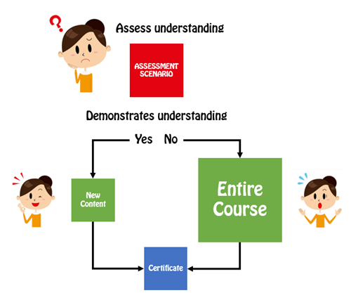
Articulate Rapid E-Learning Blog - pre-assessment scenario flow

A couple of additional benefits is that a pre-assessment scenario helps remind the experienced person of what they need to do and for the new person it helps expose deficient understanding and the types of situations they may encounter in the real world. The pre-assessment scenarios also help cement the objectives for the course. When a person isn’t successful, they’re more apt to pay attention to the course content since they’ve already been proven to lack some of the expected understanding.

A few production tips:

  • Keep it short. Instead of big, long scenarios which take more time to produce, create a series of quick hit scenarios.
  • This is a pre-assessment. So don’t feel obligated to do much to set up or support the assessment with resource content. If they can demonstrate their understanding, they can pass the pre-assessment. If they can’t, well, that’s why you created the course.
  • Create templates. You can create interactive scenario templates and reuse them for quicker production.

Pre-tests are a great way to efficiently and effectively move learners through the training process. However, they are limited in what they can assess. Switching to a real-world pre-assessment scenario provides a better way to assess understanding and application of the training content. It also lets those who don’t pass understand why they need to take the course.

Events

Free E-Learning Resources

Want to learn more? Check out these articles and free resources in the community.

Here’s a great job board for e-learning, instructional design, and training jobs

Participate in the weekly e-learning challenges to sharpen your skills

Get your free PowerPoint templates and free graphics & stock images.

Lots of cool e-learning examples to check out and find inspiration.

Getting Started? This e-learning 101 series and the free e-books will help.


Articulate Rapid E-Learning Blog - free stick images

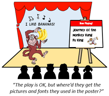
If you do a search online you’ll find all sorts of free assets like free stock images, icons, fonts and other media that work perfectly for your elearning courses. But often you find that free isn’t really free. Instead, free is free with strings attached.

One of my pet peeves is people who give away free assets and then only allow them to be used for personal use. I guess there’s a big demand for free stock images and free fonts for family use. While it’s the asset creator’s prerogative to attach strings, personally I find it kind of lame. Either it’s free or not. Why work to get eyes on your product and then create that sort of friction? However, if that’s the stipulation then we need to stick by it and respect the desires of the content authors. Mostly likely those resources won’t work for your project.

Another issue is that the free content comes with attribution requirements. That’s much better than free for personal use only. But it still creates some friction because the attribution requirement may conflict with your project.

How to give proper credit to the creator of the assets and still maintain a professional looking course is a challenge. Here are a few ways to attribute content to the asset creator.

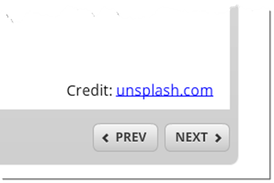
Add Attribution Credits to the Image or Slide

  • Credits on the image. This is the easiest, but doesn’t always look good.
  • Credits as a caption. This is also easy and easy to template. It also creates consistency, but still can be a bit distracting.

Articulate Rapid E-Learning Blog - add attribution links to the image

The two options above are fine for school projects, but don’t look very professional. They also only allow for text descriptions and URLs. But no hyperlink to the creator’s site.

  • Mouseover credits as the person moves the mouse over the image the credits appear. They can be over the image or as a caption box and you can link to the site.
  • Add credits and links at the bottom of the screen. This works but may look a bit busy and not many clients want to see a bunch of outside content in their course screens.

Articulate Rapid E-Learning Blog - add attribution links to the screen

Add Attribution Credits to the Course Player Tabs

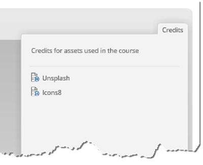
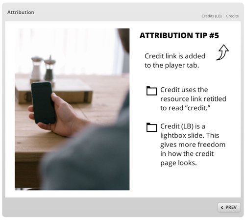
  • Use the player’s resource tab. Change the resource tab to read “credits” and then add links to the sites. This is really easy and looks nice.

Articulate Rapid E-Learning Blog - add attribution links to the resource tab

  • Use Engage to create an “About” player tab. Add information about the organization and course developers. An additional section could be attribution for free resources with a link back.
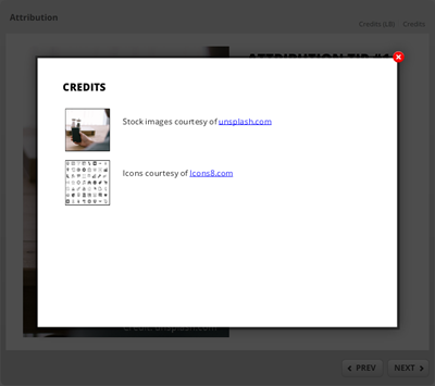
  • Lightbox slides on player tabs. Create a custom slide and insert it using the lightbox feature. This lets you make it look any way you want and add any type of information and links back to the site.

Articulate Rapid E-Learning Blog - add attribution links as a lightbox slide

Personally I like the resource tab and lightbox options. The resource tab is simple and the lightbox means I can make the credit page look anyway I want. Icons8 allows this for their free content. You can find it in their licensing. And I’m sure most of the others would, too.

If you’re not sure, ask the source of the free content. I’ve found that often they’re happy that people are getting use out of the free assets and appreciate that I’ve even bothered asking. Often they’ve given me permission to use their assets. It doesn’t hurt to ask.

Here’s a published version of the different ways to attribute the free resources if you want to see them in action.

Articulate Rapid E-Learning Blog - add attribution links example course

Click here to view the attribution demo course.

What do you do when you get free assets that require attribution? How have you attributed free content in your elearning courses?

Events

Free E-Learning Resources

Want to learn more? Check out these articles and free resources in the community.

Here’s a great job board for e-learning, instructional design, and training jobs

Participate in the weekly e-learning challenges to sharpen your skills

Get your free PowerPoint templates and free graphics & stock images.

Lots of cool e-learning examples to check out and find inspiration.

Getting Started? This e-learning 101 series and the free e-books will help.


Articulate Rapid E-Learning Blog - first step when building interactive elearning courses

On past projects, many of my customers would ask for interactive elearning courses. When I asked them how they defined interactive elearning courses they’d usually list things like fancy mouseovers, drag-and-drop interactions, and a host of other ways to interact with the screen. They rarely described making decisions or using the content.

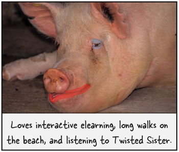
Many times we dismiss this type of interactivity as novel and superfluous. I’ve heard other presenters deride those things as a waste of time and not being much more than lipstick on a pig.

Hey, there’s nothing wrong with a good looking pig. What’s the alternative?

Seriously, I can understand their perspective but I don’t agree with their derision. In fact, that type of interactivity is an important part of building effective and interactive elearning courses.

Interactive E-Learning Courses: Create an Immersive Experience

A key component while building interactive elearning courses is to craft an immersive experience. You start by creating a visually engaging context. If I’m teaching you about the Hoh Rain Forest, I want to bring you INTO the Hoh Rain Forest.

Articulate Rapid E-Learning Blog - before adn after example of visually immersive interactive elearning courses


We discussed that a bit when we looked at how to tap into your visual voice and planning your visual design. Learn to create a visually engaging and immersive look.

Interactive E-Learning Courses: Touch the Screen

The next step is getting the learners to touch the screen. A visually immersive course pulls them in a little. Touching the screen pulls them in a lot more. The reason is because you are engaging their senses and having them actively involved with the course.

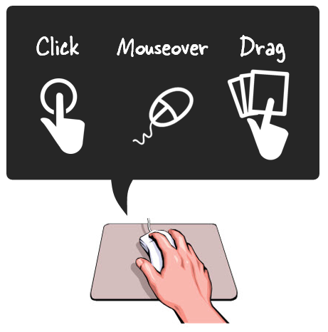
Articulate Rapid E-Learning Blog - three ways to touch the screen when building interactive elearning courses.

A lot of people deride onscreen interactions like dragging and clicking as novel and perhaps even distracting. However, it’s a key part of interactive elearning. A goal is to get the learners to interact with the screen. At this point, it’s not about the cognitive processing. Instead, it’s all about pulling them in. And a great way to do so, is by getting them to do something on the screen.

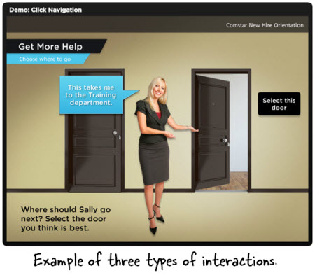
In a previous post we discussed the building blocks of interactivity and identified three key ways to “touch the screen.” They are clicking, mouseovers, and dragging. Here’s a simple example of the three types applied to the same interaction.

Articulate Rapid E-Learning Blog - examples of interactive elearning courses

  • Click version of the office selection scene.
  • Hover version of the office selection scene.
  • Drag version of the office selection scene.

As you can see in the demos above, the types of interactions are somewhat interchangeable. Some make more sense than others depending on the context. However, the main point is to figure out how you’ll get your learners to touch the screen. How can you get them to interact with the screen elements? The more you can do this, the more you keep them engaged as they go through the course.

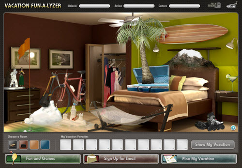
Here’s a cool example I like to show at workshops. It’s an interaction from a travel website and not an elearning course. However, imagine if this site wasn’t interactive. The travel agency could have met its goal with a list of travel choices from which to choose and then compile recommendations for you.

Articulate Rapid E-Learning Blog - travel site that is similar to many interactive elearning courses

Click here to view the interactive web site.

But they decided against that. Instead they get you to explore the site and “touch the screen” in various ways. There are places to click, mouseover, and drag. It’s fun and engaging, and definitely a lot more memorable than a dropdown list. And it helps the agency meet their objective of getting you to select a vacation.

Those who deride the superfluous interactions are correct if all you do is add novelty to your course. The interactions get old fast. And while visual design and onscreen interactivity plays a role in engaging the learners, it’s not the main way to engage the learners. All of those things need to be in concert with a great learning experience and coupled with the course’s content and learning objectives.

However, if you neglect crafting an immersive experience you miss the opportunity to really engage your learners and building effective and interactive elearning courses.

What are some ways you’ve used onscreen interactions to immerse learners in your elearning courses?

Events

Free E-Learning Resources

Want to learn more? Check out these articles and free resources in the community.

Here’s a great job board for e-learning, instructional design, and training jobs

Participate in the weekly e-learning challenges to sharpen your skills

Get your free PowerPoint templates and free graphics & stock images.

Lots of cool e-learning examples to check out and find inspiration.

Getting Started? This e-learning 101 series and the free e-books will help.


Articulate Rapid E-Learning Blog - what do you love and hate about e-learning

The infographic below shows the results of a recent survey we conducted on what people love and hate about elearning and online courses. I’ve included a few of my thoughts.

The E-Learning Industry is Hot!

The industry is growing like crazy. This is good because often the training people are the first to get cut when companies restructure. However, many of the emerging technologies and devices (like mobile apps) are centered on learning. Instead of training being the first group on the chopping block, today it plays a key role in the evolution of online courses and learning moving forward.

E-learning is still relatively new and many organizations are still making the move to online courses. The authoring tools offer plenty of capability, but the next step in the process is making all of these online courses effective. That’s where you come in.

What About Those That Take the Online Courses?

I routinely ask my friends and neighbors what types of online courses they take at work and how they feel about it. Usually the feelings are mixed. They tend to find the online courses boring, but prefer them over going to a class.

The survey shows that most people want relevant content and almost as many prefer decision-making scenarios. One value of elearning is its flexibility to the organization and the learner. However, too often we focus on pushing content out efficiently and lose sight of the other benefits of elearning. However, online courses can be so much more than a bunch of screens of information. What can you do to change that?

What Do YOU Love and Hate About E-Learning?

Share one thing you really like about elearning and one thing you don’t like. Here are a couple of my thoughts.

What I like:

I like that I am part of an evolving industry. Things are changing fast. When I first started we were using overhead transparencies and 35mm slides. Today, not only do the online course creators have more options, but so do those who participate. Virtually everyone carries a small production studio with them at all times via their smart phones and tablets. It’ll be cool to see more of those capabilities integrated with learning and the online courses created.

What I don’t like:

The thing I don’t like about elearning is that the organizations that purchase the software don’t commit adequate resources to help their staff build better online courses. Many of the people I meet stumble into elearning from a more traditional training background. Thus they need more than the software to get up to speed. They also often don’t get a budget or resources to create the appropriate assets like graphics and other media. This just sets them up for failure and perpetuates a lot of the negative feelings people already have about online courses.

That’s what I love and hate. What about you?

love-e-elarning

Click to learn more.

Events

Free E-Learning Resources

Want to learn more? Check out these articles and free resources in the community.

Here’s a great job board for e-learning, instructional design, and training jobs

Participate in the weekly e-learning challenges to sharpen your skills

Get your free PowerPoint templates and free graphics & stock images.

Lots of cool e-learning examples to check out and find inspiration.

Getting Started? This e-learning 101 series and the free e-books will help.


Articulate Rapid E-Learning Blog - offer bribe to avoid course because of bad course objectives

The key to success is having clear goals and then mapping out a way to meet those goals. Without the map, you’ll never know if you got where you intended to go. In a previous post we looked at how to build learning objectives. Today we’ll take it a step farther and look at a simple process that will help structure the objectives around measurable actions.

What’s the Purpose of the Course?

There are many courses that exist for reasons other than performance improvement. For example, a lot of annual compliance or things like sexual harassment training are usually more about the awareness of policies and less about actionable activities.

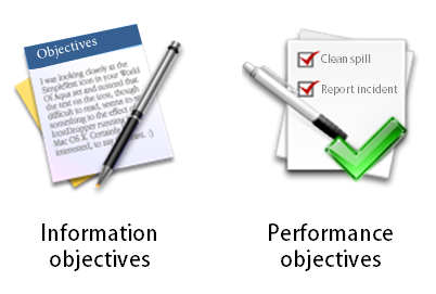
Articulate Rapid E-Learning Blog - course objectives come from understanding the type of course

On the other hand, there are many courses that do expect that upon completion the learner is able to do something specific. Perhaps they’ve learned a new procedure or how to apply a given policy in the work environment.

Understanding the type of course you build is important because it’ll help you craft the appropriate types of objectives, measure their success, and help you manage your resources.

Ask These Questions to Create Your Course Objectives

Once you understand why you’re building the course you can focus on who is going to take it, why, and what expectations exist after the course. One way to begin is by answering the questions below.

  • Who is the learner
  • Why is this important to him?
  • In what situation would he use this information?
  • What is the course objective?
  • How does he prove that he’s met the objective?

I create a simple table to look over the answers. Here’s an example based on my experience working for some large organizations.

Articulate Rapid E-Learning Blog - blank table to build course objectives

As part of our ethics training, there was a course on how to deal with bribes. This course was important because we had a number of international sites and many of our sales and procurement staff had to deal with bribery as part of the business culture. Even though we only had a handful of international staff, everyone who took the ethics training had to take the bribery course, regardless of getting bribed.

For the international staff the bribery course was performance-based. We had specific behavioral expectations. For all of our other staff, the objective wasn’t centered on their performance. Instead the objective was to build awareness of the company’s policies on bribery which fit into the larger context of being an ethical organization.

Here’s an example of how this I could have completed the table for this course and the tow different audiences.

Articulate Rapid E-Learning Blog - example of completed table to identify course objectives

Click on the image to see a larger version.

You’ll notice that I broke out the two types of learners and their course objectives. For those who encounter bribes, we focus on the performance aspect. As we build the course, we want to create the types of situations they encounter and have then make the decisions that are in line with the organization’s policies.

For the IT analyst who is never bribed, we create a scaled down course. There’s no need for them to go through time-wasting situations not relevant to their job expectations. In their case, the objective is general awareness of the policy. Presenting the content in an engaging manner and having them certify their understanding is all we need.

A few key thoughts:

  • Build the course appropriate to the performance expectations of the learner. If none exist, then don’t force them through the same type of course for those who do have performance expectations. Taking a course costs time which is equal to money. And pulling someone from their work to go through irrelevant scenarios is a time-waster.
  • Don’t overstate the importance of the course. Subject matter experts have the tendency to do this. In this example, the temptation is to suggest that everyone needs to be able to make the appropriate decisions so they should all go through the same training. While it’s technically true if presented with a situation everyone should make the right decisions, but forcing people to take certain types of training because of some remote chance that they’ll be bribed is a waste of time.
  • Focus on how the learners will prove their understanding. Are they able to make the right decisions in certain situations? How do you know? If the person needs to make certain types of decisions in certain situations then make that the burden of proof. Create situations like they’ll encounter in the real world and have them demonstrate their understanding through the decisions they make. If they don’t encounter those situations, then the level of understanding centers on general awareness. Instead of a decision-making situation, you can focus on the principles that drive the policies. Perhaps a simple case study would do the trick.

I know that some people say the non-performance courses shouldn’t even be built. They should be job aids. Perhaps. But they do get built and often you’re not in a position to force that change. By understanding what the organization expects from the learner you’ll be able to craft good course objectives and determine the appropriate proof to ensure they’ve been met. If they have performance expectations focus on what you want them to do. If it’s about policy awareness, certify their understanding with a simple quiz.

How do you determine the course objectives in your training programs?

Events

Free E-Learning Resources

Want to learn more? Check out these articles and free resources in the community.

Here’s a great job board for e-learning, instructional design, and training jobs

Participate in the weekly e-learning challenges to sharpen your skills

Get your free PowerPoint templates and free graphics & stock images.

Lots of cool e-learning examples to check out and find inspiration.

Getting Started? This e-learning 101 series and the free e-books will help.


Articulate Rapid E-Learning Blog - do you need an instructional design degree

September is the start of a new school year. So it’s a good time to revisit the ongoing debate about whether or not you need an instructional design degree to build good elearning courses.

Here’s my take.

There’s a difference between teaching and informing.

Because we’re using e-learning applications like Storyline 360 or Rise 360 the assumption is that what we’re building is always e-learning or the objective is some sort of performance improvement.

Instructional design implies instruction. But much of what’s created with the e-learning applications is less about learning and more about sharing information. It’s really more interactive multimedia content than it is interactive instructional design.

Perhaps, the question should be, “Do you need a marketing degree?” since a lot of what is created falls more into that bucket than performance improvement.

Not all course builders are instructional designers.

In an ideal world, the person building the course is also involved in the design of it. But I’ve been in the industry long enough to know that’s often not the case. There are many course builders who have little say in the design of the course they build.

They’re hired to take content as it is designed by someone else and then build out the multimedia part of it. Having instructional design awareness is great and allows that person to offer constructive feedback, but if that’s not what the person is hired to do, then there’s a good chance the feedback goes nowhere.

Articulate Rapid E-Learning Blog - not all course designers are instructional designers

If you’re hired to build courses, but not involved in the strategic design of them, then it may make sense to focus on multimedia design skills over instructional design. From my experience, a course developer with really good graphic and interaction design skills usually trumps a good instructional designer with limited visual design skills and multimedia experience.

College degrees may not build the skills you need in the real world.

There are lots of resources online and informal learning communities to help you learn more about instructional design. It doesn’t require a degree.

I have a master’s in educational technology, a degree in corporate media production, and a degree in organizational management that focused a lot on performance and training. Despite all of that education, most of what I know about e-learning came from the work world.

Quite a bit of what was covered in my academic education was not very relevant to the work I was doing and offered little practical application. On top of that many of my professors had limited experience in non-academic training environments and were so politically charged about education and learning that it made a lot of the academic experience a bit uncomfortable and completely incoherent to my needs in the corporate environment.

Articulate Rapid E-Learning Blog - college degrees may not build the skills you need in the work world

Learning about instructional design doesn’t necessarily require a formal program as much as the desire to learn and then apply what you learn to your course design.

An instructional design degree can help you get a job.

E-learning is hot and a great industry to be in. That hasn’t always been the case for training. In fact, when times are tough, it’s usually the training team that gets the boot. But for right now, e-learning is a growing industry with lots of opportunities.

I took a quick peek at 20 job listings, here’s what I found. All but one required at least a bachelor’s degree. Most preferred a Master’s. And many required a Master’s.

Is that fair? Probably not.

If I was the hiring manager I’d prefer looking at your portfolio and talking to you about how you design courses. However, in many cases the hiring manager isn’t involved in the initial screening of the job applicant. That’s done by an HR assistant who is using the minimum requirements to weed out applicants.

So you may be the most skilled instructional designer, but without a degree you probably won’t make it past the first round.

An instructional design degree can challenge your thinking.

Here’s where I find the most value in pursuing an instructional design degree. It forces you to look at and do things in a different way. It also helps build relationships and a network of peers that has lifelong value.

We tend to get stuck doing the same things the same way. In fact, many of you may have the experience of building courses, but you’ve basically built the same course a hundred times rather than a hundred different courses.

Articulate Rapid E-Learning Blog - college degrees promote thinking in a different way

In a degree program, you get experiences and opportunities that may not exist at work where you have to operate at the speed of business. You learn new things and hopefully get to apply them to projects to see how they work.

You also get to interact with people who are in different fields, with different organizations, and who many not think the way you do. Being challenged in this way is good.

From a purely pragmatic perspective, you don’t need an instructional design degree to build e-learning courses. But a formal education does provide a map towards success. Most of us aren’t disciplined enough to map out the same things and experiences we’d acquire in school.

But Tom, do I need an instructional design degree to build e-learning courses?

I’m going to say “No, you don’t need a degree.”

I’ve talked to plenty of people who told me what they learned in school wasn’t relevant to what they have to do at work. And with the resources available to you, there’s no reason why you need to pay a ton of money to get a piece of paper to confirm the skills you already have.

Articulate Rapid E-learning Blog - do I need an instructional design degree to build elearning courses?

But you do need to know how to build good instruction and that means if you don’t learn it via a formal degree program you’ll need to learn it elsewhere.

My advice is to keep reading about course design and practice building instructionally sound modules. Build good examples to add to your portfolio and stay connected to the e-learning community. That practical experience coupled with knowing someone can help you get past the HR filter when openings arise.

And if you can afford it, go to school because you’re at a competitive disadvantage when looking for work.

What do you think?

Do you need an instructional design degree? For those of you who don’t have a degree, what advice do you have for someone who wants to learn more?

And if you do have a degree, did it help you build good e-learning courses? Is it something you’d recommend to others?

I look forward to your comments.

Events

Free E-Learning Resources

Want to learn more? Check out these articles and free resources in the community.

Here’s a great job board for e-learning, instructional design, and training jobs

Participate in the weekly e-learning challenges to sharpen your skills

Get your free PowerPoint templates and free graphics & stock images.

Lots of cool e-learning examples to check out and find inspiration.

Getting Started? This e-learning 101 series and the free e-books will help.


Articulate Rapid E-Learning Blog - choose the right course background

The single largest visual element in your elearning course is the background. And the right background can set the stage and build expectations for your learners. A course that looks like a converted PowerPoint file isn’t as inviting as one that is aesthetically rich and looks more professionally designed.

Here are some quick examples. Look at the image below. It looks like a typical rapid elearning course screen. It’s not bad, just not very dynamic or rich.

Articulate Rapid E-Learning Blog - basic elearning course slide

Now look at the following makeovers. Just changing the background adds a more polished look. The background images match the course context and they offer a richer visual experience. This approach also doesn’t require advanced graphics skills or creativity to implement.

Articulate Rapid E-Learning Blog - elearning example

Articulate Rapid E-Learning Blog - elearning example

Start with a Good Background

In a previous post, we discussed tapping into the visual voice. It’s the process of crafting the course’s visual elements to meet the expectations of a given course subject or context.

For example, if you are going to build a course on operating room technology, what colors would you use? What would the people look like? What are they wearing? What fonts would you select for that course?

Capturing your visual voice helps identify the key design elements in your elearning course. However many of you aren’t graphic designers. So it can be a challenge to create a course that is visually rich and engaging.

Choosing the Right Image

If you can’t design everything on your own a good substitute is to at least start with the right background. The trick is to find the single image that best represents the elearning course or screen that you’re building. Here are some tips on selecting the right image:

  • Brainstorm a few ideas. Think about the images that bets represent your course content. Write them down and use that list to look for the right image. If not, you’ll go to an image site and waste a lot of time searching. You’re better off having a list and using that to start. From them take note of the keywords used to describe the image. That will help you extend the search.
  • Look for simple images that convey the essence of what you need but without too much detail. The images above suggest hiking but they don’t have a lot of extra information that may distract. Keep in mind that everything on the screen communicates something. The more you have on the screen, the more apt you are to miscommunicate. Thus you want to reduce the amount of information and detail on the background image. The image should provide visual context but not content.
  • Find content holders. The background image is just that—a background. Because you’re putting content on top of the background find images that have some flexibility. I look for images with solid colors or blank areas that work for text or media elements like the two hiking images above. The people in the image suggest hiking, but the snow areas are perfect content holder. I try to stay away from really busy images because I don’t want the background content to conflict with the teaching content.
  • Find more than one image. You’re not limited to a single background for the entire course. You can select different backgrounds per screen or section. As the context changes feel free to change to the appropriate background image.

Starting with a visually dynamic background that is contextual and matches the content can set positive expectations for the course and adds a lot of aesthetic appeal. It’s not going to replace good content, but it is a start to building an engaging course especially if you have limited resources.

Events

Free E-Learning Resources

Want to learn more? Check out these articles and free resources in the community.

Here’s a great job board for e-learning, instructional design, and training jobs

Participate in the weekly e-learning challenges to sharpen your skills

Get your free PowerPoint templates and free graphics & stock images.

Lots of cool e-learning examples to check out and find inspiration.

Getting Started? This e-learning 101 series and the free e-books will help.


The Rapid E-Learning Blog - did the Avengers skip their safety compliance training?

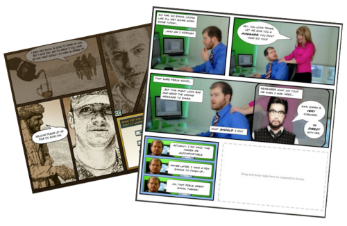
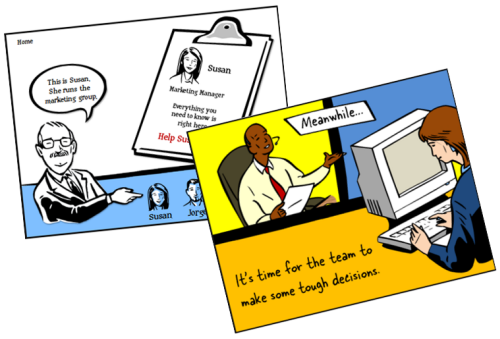
Comic book layouts are pretty popular. And they work well for elearning courses. For one, they look different. It’s that type of contrast that can hook your learners who might be bored with the standard-looking corporate elearning.

On top of that a comic-like layout breaks the content into panels which allows you to control the pacing and flow of information as each panel progressively reveals more. It’s a great way to still have the simplicity of a linear course, but make it seem more engaging.

A while back I shared how to be inspired by others and included links to two comic-style elearning courses. Based on the feedback, the examples were a hit. I got quite a few emails asking how to build a similar type of course.

The Rapid E-Learning Blog - examples of comic book style elearning

In today’s post I’m going to show three ways to build a comic-style layout for your courses. To keep it simple we’ll use PowerPoint, but the ideas should work regardless of the tool you use.

Choose a Layout

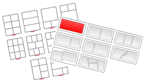
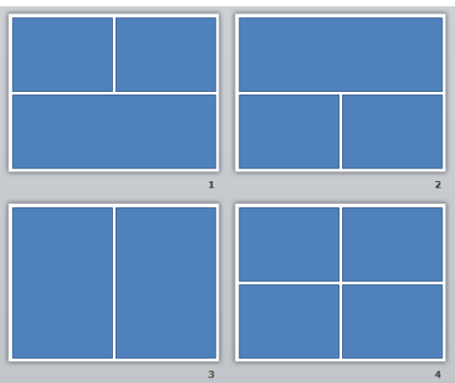
Layouts are the key distinguishing feature for the comic book look. Typically they follow some sort of grid. The good thing is that there’s really no right or wrong way to create the grid. Some comics use straight lines and even sized panels. And some use an assortment of panel sizes.

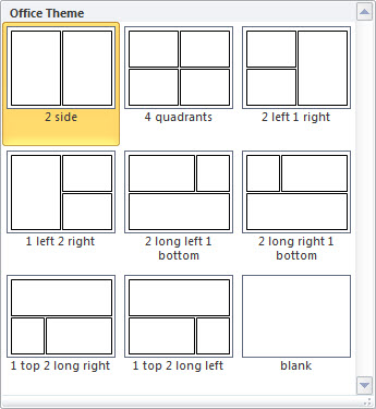
The Rapid E-Learning Blog - layouts for comic book style elearning

If you’re looking for layout ideas, the first place to look is at comic books. You could attend a comic book convention, but you’ll probably have to wear a goofy costume. A better solution is to go to one of those comic creation sites and see what types of layouts they offer. Here are a couple of good sites:

You can also create your own layouts with existing clip art. Here’s an example I shared in this blog post on using Clip Art to create your elearning template. This also lets you build a layout that has that hand-drawn look.

The Rapid E-Learning Blog - build your own comic style elearning using PowerPoint clip art

For this demo, we’ll use a few simple layouts. I created them as shapes in PowerPoint. As you can see below, creating the layout’s pretty simple. Feel free to create as many layouts as you want.

Keep in mind that too many choices can be overwhelming. Instead of building 200 possible layouts, stick with 5-10 common layouts.

The Rapid E-Learning Blog - comic style elearning layouts built in PowerPoint

Another consideration with layouts is determining how you’ll present the content. Review the two elearning examples above and notice how the layouts follow a consistent pattern. For example, you may have one type of layout for information, another for decision-making, and another for feedback.

Deciding how to use the layouts will help you best determine which types of layouts you need.

One last point, the more panels you add to the layouts, the less space you get. If you have too many panels the content make look cluttered and seem confusing. I’d err on the side of fewer panels.

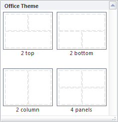
Option 1: Create Master Slide Panels & Layouts

Use PowerPoint’s master slides to create the layouts. You can have as many masters as you like so the best bet is to create all of the possible layouts that you’d use in a single file. And then when you’re ready to go, select a layout for the slide and add your content.

The Rapid E-Learning Blog - build as many layouts in PowerPoint master template as you like

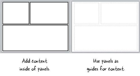
Two ways to work with the master layouts:

  • Create the entire panel look on the slide master. Then apply it to a slide and add content within the panel.
  • Create watermarked panels on the master slide and use them as guides to control placement of your content. The benefit to this is that you have the general layout mapped, but you’re not confined by the panels if your content doesn’t fit perfectly.

The Rapid E-Learning Blog - create two types of layouts

A few tips when working with these types of layouts:

  • Use thick lines and determine how colorful you want the panels to be. Think loud and in your face.
  • Not all of your content will fit perfectly in the panels. That’s OK. Build your content on the panel and get it to fit the best you can. Then copy and paste it as an image. Use the crop feature to perfectly crop it to the panel.
  • Tutorial: this tutorial walks through the template and shows a few production tips.

Option 2: Create Custom-Sized Slides for Each Panel

Instead of building the layouts on the master template, build them on the slides. This gives you more control over the panels because you have direct access to them since they’re not buried in the masters.

Build a master PowerPoint file that has all of the layouts you’d use. Then start with that file when you want to build a comic-inspired course. Make sure to save it with a different name. Duplicate the layouts you want and then add your content.

How to add content to the panels:

  • Instead of creating your panel shapes on the master slide, create them on the slide. This lets you manipulate the shape at the slide level. Add content on top of the panel shape.
  • Create panel shapes with thick lines and no fill color. Then place them on top of the content. The thick lines will cover up anything that doesn’t fit perfectly.
  • Fill the panel shapes with an image. I like this approach because the panels and content will always align perfectly. The only thing that changes is the fill image for the shape.

Bonus tips:

Option 3: Create a Master Panel Image

This is probably the easiest way to create a comic layout. Instead of messing with a bunch of images and trying to get everything laid out perfectly, just create a series of layout images that you place on top of your content.

Essentially, you have one image of the entire page. Then you cut a hole out of the page for each panel. All of the content sits underneath the page image and can only peak through the holes. This guarantees that everything is perfectly aligned inside the panel.

I like this approach because you can move each object in the panel and the overlaid master image masks any overflow to create the illusion of panels.

Extra tips:

  • Add your page images to the master slides so that you have a layout. This will act as a general guide. Your slide for each layout you provide should consist of a master slide with the same page layout and the page layout image on the actual slide that acts as the cover.
  • Be sure to use the selection pane in PowerPoint (starting with PowerPoint 2007). Hide the page image and add your content using the master as a guide. Then unhide the page layout on the slide when you’re ready to publish. Make sure the cover image is always on top in the selection pane.
  • Tutorial: How to create layout mask images to use as panel covers.

To help you out, I created a starter PowerPoint template pack. You can download it in the elearning community. It includes folders for each type of template. You can use them as they are or build your own.

The Rapid E-Learning Blog - example of the free PowerPoint template demo

Comic strip layouts are popular and a nice way to make your courses look a bit different. The trick is to determine the type of layout you want and how to get the content into the panels with the least amount of work.

There are many ways to layout the comic panels. Once you decide the type of layout you want, then you need to determine how you will get the content into the panels.

Events

Free E-Learning Resources

Want to learn more? Check out these articles and free resources in the community.

Here’s a great job board for e-learning, instructional design, and training jobs

Participate in the weekly e-learning challenges to sharpen your skills

Get your free PowerPoint templates and free graphics & stock images.

Lots of cool e-learning examples to check out and find inspiration.

Getting Started? This e-learning 101 series and the free e-books will help.


The Rapid E-Learning Blog - be intentional about your elearning design

Typically elearning courses start from existing content. And often that content dictates how the course is structured and how it looks. And that may not always be best.

The guiding principle for rapid elearning design is to be intentional. Everything you do while developing your course should be planned and exist for a reason. You don’t want existing content to dictate the design of your course. This seems obvious but often isn’t the case.

Getting to Intentional Design

Many elearning courses start as classroom content that needs to be converted and put online. Or subject matter experts hand you a bunch of PowerPoint slides that they want to turn into elearning courses.

This type of content already has some instructional consideration, albeit for a classroom. And it has some visual design that usually comes from a template with specific colors, schemes, and fonts.

Instead of being intentional about the instructional and visual design of the course we allow the existing content to determine how we build it. What we should do is take a step back, think about general course design, and then map our content to the design that’s appropriate to the course objectives.

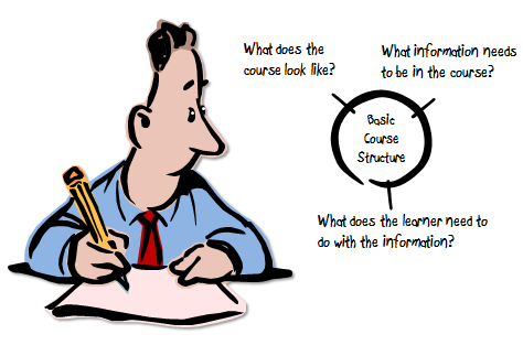
The Rapid E-Learning Blog - three parts to an elearning course

As I’ve mentioned in the past, elearning courses have three essential elements. I like to frame them as questions.

  • What will the course look like?
  • What content needs to be in the course?
  • What will the learner do with this content?

These three questions help to drive the intentionality of your course design.

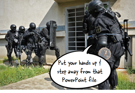
Put Your Hands Up & Step Away from that PowerPoint File

Here’s a typical scenario. You’re handed a PowerPoint file and some other documents. The subject matter expert has been using that content for years in a successful classroom setting and now wants that converted to elearning.

Easy enough.

The Rapid E-Learning Blog - step away from the PowerPoint slide

In this scenario, we typically open up the existing PowerPoint file and make decision on a slide-by-slide basis. We start on slide one, make some adjustments, and then move on to slide 2. Make a few more adjustments, and then move on to the next slide.

The challenge with this approach is that you’re letting the existing content and instructional structure drive how you build the course. That may work on some occasions but for the most part it’s not ideal.

Be Intentional about the Course Design

Even if the existing content looks right, don’t start there. Take a step back and start with a blank screen. Then determine how the course needs to be built and what content you need.

If the existing content you have works, great. If not, then you’re not letting it dictate your course design. In either case, you want to be intentional in how the course is designed. This will ensure that you’re moving in the right direction.

Let’s revisit the three essential questions.

What will the course look like?

The course is going to look like something. Even if you are in a hurry and decide to do nothing but a simple conversion, the course is still going to look like something.

Most likely the look that isn’t right for the course is the one that comes from the existing content. But, there is a look that is right for the course. It’s just a matter of finding it.

Be intentional about the visual design of your elearning course.

What content needs to be in the course?

Subject matter experts tend to think everything’s important. And it probably is in the proper context. But “important” content is not the same as the “right” content that is appropriate to the goals of the elearning course.

Not all of the information about a given topic needs to be in an elearning course. I prefer a backwards design approach. At the end of the course, what change should I expect from the learner? What does it look like if I see it? Then build the course so the learner can practice and demonstrate that desired change.

Be intentional about the aligning the course content to the course objectives.

What will the learner do with this content?

This question builds off of the second one. The content in the course is structured to meet specific objectives. As the learner goes through the course, what is she supposed to do? This question helps focus on the interactive component of the course.

Do you want her reading and reflecting on content? Is there a place for her to do something, to make some decisions? Once she’s exposed to the course content, what s she supposed to do?

Sometimes the course content is simple refresher material and doesn’t require a lot if interactivity. But often the content is new and is tied to some sort of performance expectation. What can you do to get the learner to practice using the information in a setting similar to what they’d do in the real world?

Be intentional about aligning the course’s interactivity to meeting the course’s objectives.

As I mentioned earlier, the capabilities of the authoring software has evolved. This has opened the doors to do more with elearning. But easy course creation is not going to replace being intentional about how you design your courses. It just makes it easier to build what you intend to build.

The trick is to intend to build the right type of course. It requires that you answer those three essential questions: What will the course look like? What content needs to be part of it? And what is the learner supposed to do with this course?

If you can answer those questions you’re on your way to building effective elearning.

Events

Free E-Learning Resources

Want to learn more? Check out these articles and free resources in the community.

Here’s a great job board for e-learning, instructional design, and training jobs

Participate in the weekly e-learning challenges to sharpen your skills

Get your free PowerPoint templates and free graphics & stock images.

Lots of cool e-learning examples to check out and find inspiration.

Getting Started? This e-learning 101 series and the free e-books will help.


The Rapid E-Learning Blog - do you need an instructional design degree

Just finished back-to-back conferences in San Jose and San Diego.  As always, it’s fun getting to meet the blog readers and Articulate customers.  Many of them are working with limited resources and it’s interesting to see how they approach their work.  I also get lots of good questions.

One of the most frequent questions asked is whether or not they need instructional design degrees.  I get this question quite a bit and it seems I’m getting it more frequently.

If I hire someone, I put less emphasis on the formal education they have and focus more on their tangible skills.  I’m interested in seeing a portfolio of work that represents their technical skills as well as their instructional design skills.  I don’t care if they acquired the skills in a formal or informal setting. I’m just concerned with them having the skills.

However, I do appreciate what it takes to get a degree in instructional design and know that what’s learned is valuable and can only enhance a person’s base of knowledge.  Because of this, I usually tell people “No, they don’t,” and “Yes, they do.”

You DON’T Need an Instructional Design Degree

You don’t need a formal degree to learn the skills required to build good elearning courses.  There are many books and resources available that will provide the same information you’d get in any formal program.  Combine that with the easy authoring tools and rich informal learning networks available today and you’re all set. Besides many people with degrees tell me they didn’t learn how to apply what they learned in their programs.

If you do want to forego a formal education, here are a few tips to help you get started:

  • Read books and apply what you learn to your projects. If you can’t apply them to real projects, create little mini modules where you practice different techniques.  Add them to your portfolio with an explanation of what you did and why.
  • Connect with others so you’re always exposed to new ideas and challenged in your thinking.  One of the great things about social media is the access you have to all sorts of expertise.  Be prepared to connect in a genuine way.  People will tune you out if all you do is take.
  • Develop a portfolio that demonstrates your understanding of instructional design.  I also recommend combining your portfolio with a blog.  The portfolio could be the formal environment to display your work.  Whereas the blog is like the sandbox where you can flesh out ideas.

The key to success if you go this route is to continually practice your craft.  It’s not easy staying on top of your learning.  I recommend looking over the descriptions of some instructional design programs and then mapping out a plan of your own.  Expose yourself to the same books and topics and just do them at your own pace.

You DO Need an Instructional Design Degree

The reality is that many employers require an advance instructional design degree.  If all things are equal, the person with the degree will probably always be considered first.

Whether you like it or not, you’re competing in the marketplace with other qualified instructional designers.  So you want to make sure that your skills and qualifications are equitable.  That means if you don’t have a degree you might never be considered for different jobs.

The Rapid E-Learning Blog - you do need an instructional design degree

Keep in mind, that many applications aren’t screened by the hiring managers.  There’s usually some HR assistant who quickly skims resumes and the one who doesn’t meet the minimum requirements goes to the bottom of the pile.

That’s the pragmatic reason for getting a degree.  Here are some other reasons:

  • Broaden your horizon.  You’ll be exposed to resources you may never ever consider or bother reading.  It’s easy to say that you can read the book on your own, but HAVING to read and think through a book is completely different.  The degree programs will force you to think, write, and apply what you’re learning.
  • Challenge your thinking.  You’ll connect with others who probably don’t think like you (and they may even be people you don’t like).  You may not agree with others but wrestling with their ideas and debating different instructional concepts will help solidify what you know and give you a broader perspective on things.  Besides, you may meet some lifelong friends through the program.  Either way, it’s important to test what you think you know.
  • Do new things.  You can be an elearning developer with ten year’s experience who basically does the same type of course over and over again.  Or you can be an elearning developer with three years, who’s worked on 10 diverse projects.  Which one has the deeper understanding?  In a formal program you’ll get to work on diverse projects and you never know where they’ll take you.  One of the reasons for my employment with Articulate is because I was working on a communities of practice research project.  That forced me to be more intentional about my involvement with the Articulate community, and eventually led to my job.

Getting Started.

If you are asking this question about instructional design degrees here’s what I‘d do:

The Rapid E-Learning Blog - comparing desirable skills to current skill set

  • Look at current job listings.  Go to industry job boards or sites like monster.com and look for instructional design positions.  What are they looking for?
  • Make a line item list of skills and qualifications.  Next to each item, add details based on your current skills and experience.  Compare what’s desired and how well you meet those needs.  You’ll see where you have skills and where you have gaps.
  • Make a plan to fill the gaps.  This can be a formal approach like an instructional design program or something informal.  Either way determines what you need to learn and work towards learning it.
  • Connect with others.  Jump into an elearning user community and ask what others have done.  Find out what they’re reading.  Ask questions and exchange ideas.  Whether you choose a formal education or not, much of your future success depends on your network.

There are a lot more reasons why you may or may not need a formal instructional design degree.  Whatever you do, you have to continue to push your development to stay competitive and to continue building effective elearning courses.

I’d love to hear your thoughts.  Feel free to share them in the comments section.  If you do an instructional design degree or certificate, tell us where you went and what you see as the most valuable reason to do what you did.

Events

Free E-Learning Resources

Want to learn more? Check out these articles and free resources in the community.

Here’s a great job board for e-learning, instructional design, and training jobs

Participate in the weekly e-learning challenges to sharpen your skills

Get your free PowerPoint templates and free graphics & stock images.

Lots of cool e-learning examples to check out and find inspiration.

Getting Started? This e-learning 101 series and the free e-books will help.


project management tip header

Managing elearning projects requires good communication between the instructional designers and subject matter experts.  In most cases, this communication happens via email.  Thus, better email communication ultimately leads to better project management, which most likely means better elearning courses.

At a recent ASTD conference, I ran into Mike Song, the author of The Hamster Revolution.  It’s a book on how to effectively manage emails.  Mike gave me a free copy which I skimmed through on the plane flight home.

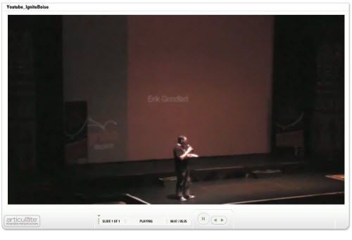
It’s a quick read and very practical, but I’ll have to admit, I kind of ignored it until I saw a funny video on Youtube a couple of weeks ago.  The video is of a presentation at Ignite Boise, one of those fun 5 minutes and 20 slide events.  The title is “You Don’t Know How to Email.”  Check it out.

The Rapid E-Learning Blog - video from the IgniteBoise event

Click here to view the video.

At about the 1:48 mark, Erik introduces his friend Dan and Dan’s emails.  It’s both funny and eye-opening.  After watching the video, I looked through my sent emails and sure enough, there were dozens that began with “Hey…”

I am Dan!  And perhaps you’re Dan, too.

Here’s the deal, if you’re swamped with emails, so are your co-workers, manager, and most important your clients and subject matter experts.  By following some of the tips from the Hamster book, you’ll communicate better, your subject matter experts will be happier, and you’ll do a better job managing your emails.

Use Descriptive Titles in Your Email Subject

In the book, Mike recommends that you use categories to provide context to the email subject line.  Look at the image below.  “Action” is one of his recommended categories.  It alerts the reader that there’s an action item associated to the email.

Outside of the Action category, you can also see that the there’s enough information in the subject line to let the reader know the email’s important and requires a response.  A descriptive subject line communicates clearly and is a lot easier to search, as well.

The Rapid E-Learning Blog - actionable email subject line

Just this tip alone will make your subject matters happy.  But wait, there’s more.

Email is Money

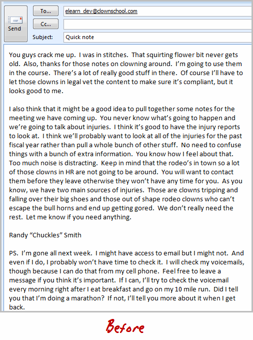
As Erik in the Youtube video said, “Time is money.  Email takes time.  So email is money.”  Everyone’s busy; so you need an easy way to clearly communicate and manage emails.  Below is an example of a typical email.

The Rapid E-Learning Blog - email before applying the ABCs

This email is kind of typical of the types of emails we get.  They can be a bit long-winded and pointless.  It’s hard to quickly pull out the important information.  And the action items (if any) are not clearly discerned.

Reviewing the email above, you’ll notice a few key issues:

  • The subject line is not specific so you’re not quite sure if the email is critical or not
  • The formatting of the email makes it hard to quickly scan
  • It’s difficult to identify any action items
  • The key points are not easily found
  • Expectations and next steps are not clear

Break the Body of the Email into Three Sections

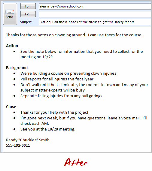
As I mentioned earlier, a good email starts with a specific subject line.  This helps the reader know the purpose of the email and what’s expected.  From there, you implement the A-B-C approach which is:

  • Action summary: Think of this like the abstract of the email.  It’s a quick summary of what you expect the reader to do based on the email.
  • Background: This is the body of your email.  Use bullet points or numbers to focus on key points.  It’s an email, not Salinger’s next great novel.
  • Close: This is where you can add incidental notes that might distract at the beginning of the email.  And you can also highlight some expected next steps.

Now let’s compare the email below to the one above.  It’s essentially the same email, only by using the A-B-C approach you’re able to quickly get to the point, focus on what’s important, and identify any expectations or pending actions.

The Rapid E-Learning Blog - email reformmated using the ABCs

I think you’ll agree that the format of the second email makes communicating with your subject matter experts a lot easier.  Odds are that you’ll exchange a lot less email and that your projects will run much better.

So if you’re inbox is overrun with emails, there’s hope.  It just takes a little practice.  You’ll have less email stress and your subject matter experts will love you.  What tips do you have to make managing the emails for your elearning projects easier?

Events

Free E-Learning Resources

Want to learn more? Check out these articles and free resources in the community.

Here’s a great job board for e-learning, instructional design, and training jobs

Participate in the weekly e-learning challenges to sharpen your skills

Get your free PowerPoint templates and free graphics & stock images.

Lots of cool e-learning examples to check out and find inspiration.

Getting Started? This e-learning 101 series and the free e-books will help.


branched scenarios

In a previous post, I wrote about a simple way to structure a scenario by using the 3C model.

  • Challenge: This could be something as simple as a question or a very involved case study.  The goal is to get the learner to think through the content and make a decision.
  • Choice: Once the learner is ready to make a decision, you provide choices.  A good scenario is nuanced and not completely black or white.  You want to engage the learner and really get them to think through the scenario.  You don’t want the choices to be too obvious.  If they are, then a scenario might not be what you need for the course.
  • Consequence: Each decision the learner makes produces consequences.  At this point you can provide feedback.  It could be simple text with instructions to continue.  Or you could advance the learner to another decision-making challenge.

The 3C model is an easy way to build the scenario infrastructure.  You can save this as a scenario template.  That’s easy enough to do.  Where a lot of people struggle is how to create the visuals for the scenarios.  That’s because most of us don’t have the technical skills to build out the right graphics.

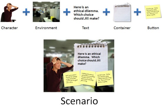
To make the task easier, I broke the graphics for scenarios into five parts: characters, environment, text, containers, and buttons.  Using that approach makes it easier to think through the visual design.

Here’s a quick overview.  The image below shows a scenario screen with the five elements.  You have characters.  The are in an environment.  The scenario usually has some text.  It’s either going to be on the slide or in some sort of container like a box or callout.  Then you’ll have the choices for the learner to activate.  These can be actual buttons or hotspots.


The Rapid E-Learning Blog - all of these parts added together make a scenario

Those five parts together make up the visual elements of your scene.  Now let’s look at them in a bit more detail.

Interactive Scenario: Characters

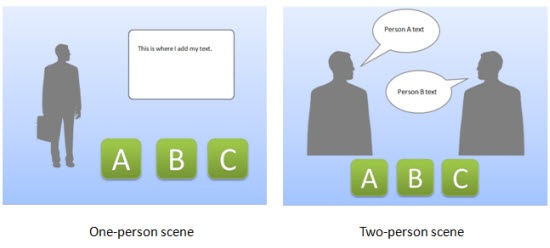
Characters are the people or avatars you use for the scenario.  You can have a single character or multiple characters.  I prefer to build a few different templates from which to work.  In the examples below, there’s a single person scene and one that represents two people talking.  As you can see, nothing fancy, just a bunch of placeholders.

The Rapid E-Learning Blog - create various templates with different character placeholders

Interactive Scenario: Environment

The environment is the backdrop for the scenario.  Is the character in an office, public area, warehouse, or a production environment?

The environment sets the tone for your scenario.  If you add some ambient background noise, that will lend to the reality of the scene.  For example, if it’s a business environment you could add some office machine sounds or people murmuring the background.

The Rapid E-Learning Blog - easily swap out your environments

Interactive Scenario: Text

In most cases you have onscreen text.  There are all sorts of ways to add the text so you want to consider the font you use and how it’s positioned onscreen.

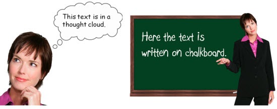
Keep in mind, the text not only conveys the written word, it’s also a graphic that conveys its own meaning and helps set the tone for the scenario.  For example, in the thought cloud below, I used Comic Sans because it’s more personal than something like Times New Roman.  It fits a text bubble.  On the chalkboard, I used a handwritten font to look like it was written on the board.

The Rapid E-Learning Blog - the text can be represented in many ways

Interactive Scenario: Containers

Containers are the boxes you use for the text or scenario-specific content.  For example, a text bubble or call out is a container.  You might have other containers on the screen such as an instruction box, or one of those text boxes that contains key points or a call out.  These containers will change based on the layout and look of your course.

In the examples below you can see a number of containers from paper strips to a picture frame.  There’s really no limit to the type of container you can use.

To keep with the visual theme make sure to pick images and fonts that go with the theme.  You want everything to be cohesive and look like it belongs together.

The Rapid E-Learning Blog - containers can be simple text boxes or elaborate images

Interactive Scenario: Buttons

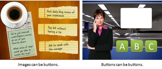
A button is where the learner clicks to activate the choice.  It could be an actual button or it could be a place on the screen where the learner is going to click (like a hotspot).  If it’s a hotspot, you usually have to design a unique graphic or text that indicates that is part of the choice.

In the first example below, the “button” is actually a hotspot over the paper strips.  However, in the second image, I used real buttons.

The Rapid E-Learning Blog - what's the learner going to click on and how will it look?

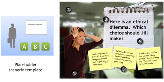
I use this simple framework to build my scenario templates which contain placeholders for all of the five visual elements.  When I know that I am going to use a scenario template, then I know what elements I have to custom build for that scenario.  Once they’re built, all I have to do is swap the placeholder graphics with the real course assets.  However, it doesn’t mean that the screen is going to look exactly like the placeholder.  Look at the example below and compare the placeholder screen to the final screen.  You’ll notice that while all five elements are represented, the layout isn’t verbatim.

The Rapid E-Learning Blog - template before and after

  1. Character:  The character isn’t full body like the placeholder.
  2. Environment: I added an office environment.  I blurred the image so you can tell it’s in an office, but I didn’t want too many details that might distract.
  3. Text: I pasted in my content.
  4. Container: In this case the container isn’t a text box.  Instead I chose to go with a note theme and used the grid pad for the container and sticky notes for the choices.
  5. Buttons: The buttons are made to look like sticky notes.  The learner clicks on them to make a choice.

Here are some considerations:

  • You want to be able to right click and swap out the placeholder content without a lot of tweaking.  Because of that, make sure your assets are the same size.  Otherwise, when you make the switch, you’ll have to scale and move the inserted assets around.
  • On the other hand, it’s just a template.  The template is just a guide.  You’re not locked into the way it’s initially designed. Don’t worry about having to move stuff around or changing your content.  Feel free to delete items you don’t need.  Or adding additional assets.
  • Keep it simple.  Don’t over complicate the scenario.  Remember, the elearning course is just one facet of the learning process.  I’d rather build a simple scenario and get it out to my learners in a few days, then spend weeks (or months) building out a more complex scenario.
  • Remember good visual design.  It’s easy to add too much to the screen when building a scenario.  Only add what you need and make sure that it’s clear to the learner what you want them to do.

Building elearning courses can be quite the undertaking.  Most people I know are one person shops or work on small teams with few resources and usually no graphic design support.  Hopefully these tips will help you the next time you need to build out a quick scenario.

Events

Free E-Learning Resources

Want to learn more? Check out these articles and free resources in the community.

Here’s a great job board for e-learning, instructional design, and training jobs

Participate in the weekly e-learning challenges to sharpen your skills

Get your free PowerPoint templates and free graphics & stock images.

Lots of cool e-learning examples to check out and find inspiration.

Getting Started? This e-learning 101 series and the free e-books will help.