

Tom, I appreciate you providing a counter perspective, and I see what you saying. eLearning is about so much more than making slides pretty and having users interact with the screen in novel ways, but a little lipstick when applied well (enhancing rather than distracting) doesn’t hurt.
I agree that cosmetic treatments make a learning product more professional in appearance and that this can build trust with both clients and learners.
But I feel like a BIG caution is in order when you say “This is the first step when building interactive courses.” It is surely not the first or the most important step. A beautiful woman doesn’t need lipstick to shine, and a pig with lipstick is just that.
The problem is that the majority of clients, developers, and yes, even designers – who should probably know better – EQUATE flashy development with a quality learning product. They just don’t know what else they need to look for when evaluating elearning. I think you have a responsibility to remind your readers that this isn’t advertising, where the objectives are attention and superficial recall, this is learning. Behavioral change.
Build trust and context with attractive, exciting, “immersive” visual experiences – yes – but let that not be the extent, or the focus, of your design and development.
Here’s the First Step When Building Interactive E-Learning Courses
September 16th, 2014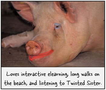
On past projects, many of my customers would ask for interactive elearning courses. When I asked them how they defined interactive elearning courses they’d usually list things like fancy mouseovers, drag-and-drop interactions, and a host of other ways to interact with the screen. They rarely described making decisions or using the content.
Many times we dismiss this type of interactivity as novel and superfluous. I’ve heard other presenters deride those things as a waste of time and not being much more than lipstick on a pig.
Hey, there’s nothing wrong with a good looking pig. What’s the alternative?
Seriously, I can understand their perspective but I don’t agree with their derision. In fact, that type of interactivity is an important part of building effective and interactive elearning courses.
Interactive E-Learning Courses: Create an Immersive Experience
A key component while building interactive elearning courses is to craft an immersive experience. You start by creating a visually engaging context. If I’m teaching you about the Hoh Rain Forest, I want to bring you INTO the Hoh Rain Forest.
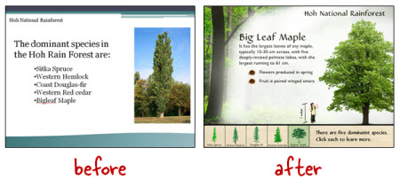
We discussed that a bit when we looked at how to tap into your visual voice and planning your visual design. Learn to create a visually engaging and immersive look.
Interactive E-Learning Courses: Touch the Screen
The next step is getting the learners to touch the screen. A visually immersive course pulls them in a little. Touching the screen pulls them in a lot more. The reason is because you are engaging their senses and having them actively involved with the course.
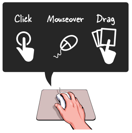
A lot of people deride onscreen interactions like dragging and clicking as novel and perhaps even distracting. However, it’s a key part of interactive elearning. A goal is to get the learners to interact with the screen. At this point, it’s not about the cognitive processing. Instead, it’s all about pulling them in. And a great way to do so, is by getting them to do something on the screen.
In a previous post we discussed the building blocks of interactivity and identified three key ways to “touch the screen.” They are clicking, mouseovers, and dragging. Here’s a simple example of the three types applied to the same interaction.
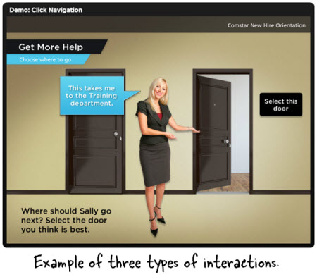
- Click version of the office selection scene.
- Hover version of the office selection scene.
- Drag version of the office selection scene.
As you can see in the demos above, the types of interactions are somewhat interchangeable. Some make more sense than others depending on the context. However, the main point is to figure out how you’ll get your learners to touch the screen. How can you get them to interact with the screen elements? The more you can do this, the more you keep them engaged as they go through the course.
Here’s a cool example I like to show at workshops. It’s an interaction from a travel website and not an elearning course. However, imagine if this site wasn’t interactive. The travel agency could have met its goal with a list of travel choices from which to choose and then compile recommendations for you.
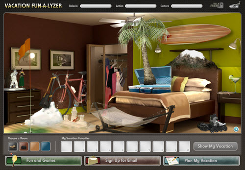
Click here to view the interactive web site.
But they decided against that. Instead they get you to explore the site and “touch the screen” in various ways. There are places to click, mouseover, and drag. It’s fun and engaging, and definitely a lot more memorable than a dropdown list. And it helps the agency meet their objective of getting you to select a vacation.
Those who deride the superfluous interactions are correct if all you do is add novelty to your course. The interactions get old fast. And while visual design and onscreen interactivity plays a role in engaging the learners, it’s not the main way to engage the learners. All of those things need to be in concert with a great learning experience and coupled with the course’s content and learning objectives.
However, if you neglect crafting an immersive experience you miss the opportunity to really engage your learners and building effective and interactive elearning courses.
What are some ways you’ve used onscreen interactions to immerse learners in your elearning courses?
Events
- Everyday. Check out the weekly training webinars to learn more about Rise, Storyline, and instructional design.
Free E-Learning Resources
 |
 |
 |
|
Want to learn more? Check out these articles and free resources in the community. |
Here’s a great job board for e-learning, instructional design, and training jobs |
Participate in the weekly e-learning challenges to sharpen your skills |
 |
 |
 |
|
Get your free PowerPoint templates and free graphics & stock images. |
Lots of cool e-learning examples to check out and find inspiration. |
Getting Started? This e-learning 101 series and the free e-books will help. |
You might also like:
17 responses to “Here’s the First Step When Building Interactive E-Learning Courses”
I’m one of the people who has talked about putting lipstick on a pig, as you can see in several posts on my blog and my video “The Big Mistake in Elearning.”
I don’t know about the others using the term, but what I mean by that phrase is the extremely common practice of simply converting content into an “online course” without first determining that (1) training is actually the solution to the problem and (2) the content we’re being asked to “convert” is really going to change people’s behavior.
Often people skip (1) and assume (2).
I think nice-looking interactions are dandy when those interactions help people practice making the decisions they need to make on the job. But even then I’d argue that the best way to engage learners is by challenging their brains; the slick interactions just make the challenge more appealing.
Thanks for the wonderful guide. I have recently launched an online learning and test-centered website and working on some e-learning courses. Thanks again for your help
I totally get what you mean in this article. ARCS model of motivational design starts with ATTENTION. TO get the learner motivated you need some sort of stimuli to draw them in, and visual stimuli, for me, would be the first way to do it. I am a graphic designer and an instructional designer so I am a little biased. Even if a course has excellent learning activities and writing—if the visual design isn’t there—I’ll have trouble absorbing the information.
I agree. One of the best ways to add meaningful interactivity to your courses is to challenge your learners with realistic scenarios.
Hi, I found this a fun post, but I’m wondering what the accessible alternatives are? I’ve spent the better part of today reading about making sure an online learning experience is accessible to everyone, including people with a wide range of abilities/disabilities. What does this look like when you build in accessibility? What are the keyboard alternatives to mousing?
Thanks!
Do you think that polls and asking learners to participate by sharing comments about an example are useful tools in blended learning?
Also, there is a grammatical error in posting of upcoming events:
October 7 & 8: Dallas (ASTD). Two rapid elearning workshops. Sign up here.
Day 1: PowerPoint’s for E-Learning
Common error in using the ‘s for plural noun, when only the s is needed. One cat, two cats. One Powerpoint, two PowerPoints.
‘s is for possession.
Grammar is an important component of training presentations. Incorrect items can leave doubt in the learner’s mind that the source is credible.
Thanks for all the informative postings. They are wonderful and I love ALL of them.
However, I have a question about the interactive activities compatible with Section 508. The problem is that most the interactions by mouse (drag-and-drop, mouse-over, and clicking) are not keystroke equivalent. In government agencies, you can not include this type of interaction if they are not accessible.
Do you have a work-around way to make it both interactive and accessible? We are dying for such solutions. I will really appreciate it if you can provide some advice.
Many thanks.
You are absolutely right about the lowest denominator. However, it is required by law. That’s why I am looking for a less time-consuming method for the alternative, so the majority of the learners can still have the opportunity to be engaged in learning.
The audio/VoiceOver and the note tab are the current alternative to attach to the course. A text (PDF or Word) file could be another option. I truly believe that those learners who are in need of accessible contents will appreciate straight forward text or audio contents rather than clicking here and there or drag-and-drop activities.
I hope that more people will share the best practices in Accessibility. It will be greatly appreciated.
That’s a very informative Guide. Thanks for it.
I really like your idea to make online courses more interactive. Your examples are really informative. Thanks for this post full of inspiration.


0
comments