The Rapid Elearning Blog

Archive for the ‘Uncategorized’ Category


Rapid E-Learning Blog - custom colors for PowerPoint

A favorite feature added to PowerPoint 2007 is the design theme. This lets you quickly modify your slides by changing templates, color schemes, and fonts.  It opens the doors to thousands of quick customizations.

Today, I’d like to share a free PowerPoint add-in that lets you expand your color scheme options.  It’s built by Shyam Pillai, the same guy who gave away the free animation add-in I featured in the blog post, PowerPoint Animations Made Easy with This Free Tool.

Quick Look at Color Schemes

The Rapid E-Learning Blog - PowerPoint's custom color themes

Starting in PowerPoint 2007, you get a bunch of built-in color themes.  These are handy because with one click you can change multiple colors in your slides.  In fact, I usually build my PowerPoint templates with the color themes in mind.  I start with the default color scheme and then when I want, I can quickly apply a custom theme.

The Rapid E-Learning Blog - create custom color

How to Get More Power Out of the Custom Color Schemes

One of the challenges with the custom color themes is that you’re limited to twelve colors.  But what if you have a color scheme that requires more than twelve?  Well that’s where this free PowerPoint add-in comes in handy.

PowerPoint MVP Shyam Pillai shares a simple add-in that lets you create your own custom color schemes.  Basically, here’s how it works.  I also included a tutorial below if you want to see it in action.

First, you create a swatch of colors based on the current color scheme.  This produces a slide that contains all of the colors assigned to the current themes.  It even gives you the RGB values.  By itself this is a handy tool because you could print it out and save as a reference document.

The Rapid E-Learning Blog - add custom colors to the tiles

The power of this add-in lies in the blank objects.  You’ll notice that there are twelve additional swatches.  This is where you can add your additional colors.  Add your colors to the shapes; give them titles; and then click on the “Apply Swatch to Color Theme” button.

The Rapid E-Learning Blog - up to 12 custom colors

The color theme gets updated and the extra twelve colors are assigned to the custom color palette.  This is a great way to add your organization’s brand to the color scheme, as well as any other colors that you may be able to use for accents or miscellaneous shapes.

This color theme add-in makes working with your themes easy.  First, updating all of your colors with a single click is simple.  And then being able to add a host of additional colors is a plus.

Here’s a quick tutorial on how to use the color scheme add-in.

Click here to view the color scheme tutorial.

I can see where this would be useful for custom color schemes around corporate branding.  All you do is create a single color scheme that’s built into the template taking all of the guess work out of the process.  Being able to add additional colors is nice because you can include accents to augment elements of the organization’s branded colors.

How would you use this is add-in?  Feel free to share your thoughts by clicking on the comments link.

Events

Free E-Learning Resources

Want to learn more? Check out these articles and free resources in the community.

Here’s a great job board for e-learning, instructional design, and training jobs

Participate in the weekly e-learning challenges to sharpen your skills

Get your free PowerPoint templates and free graphics & stock images.

Lots of cool e-learning examples to check out and find inspiration.

Getting Started? This e-learning 101 series and the free e-books will help.


The Rapid E-Learning Blog - free PowerPoint template based on the Airdropper.com site

I like syncing services like Dropbox because I can keep my files synced across multiple computers.  And, if you’re an elearning developer or freelancers, Dropbox makes sharing files with your customers super easy.  In fact, the community team here at Articulate uses it for all of our collaboration and file sharing. 

One of the challenges with Dropbox is that it requires the other person to download and install the Dropbox application.  Quite a few organizations don’t allow the installation of outside applications.  Plus, many people are blocked from accessing the Dropbox site because it’s a file sharing site.

Airdropper: A Simple Way to Request Files

This is where Airdropper comes in.  It’s a service that lets you create a way for people to upload and send files to your Dropbox without requiring that they actually sign up or download any Dropbox applications.  Essentially, you share a folder with Airdropper and they send the files to you via that folder. 

Here’s a quick screencast tour of how it works.  If you’re a Dropbox user, you’ll find the service valuable. Personally, I find it to be a great service that complements what I do with Dropbox.

Click here to view the Airdropper tour.

Free PowerPoint Template

Not only do I like the Airdopper service, I really like their website.  It’s got a clean interface that could easily be adapted to an elearning course.  So I used the site to inspire a new free PowerPoint template.

Here’s a demo of the Airdropper-inspired template in action.  And you can read some tips below on doing something similar.

The Rapid E-Learning Blog - demo of the free PowerPoint template as an elearning course

Click here to view the demo.

  • Use PowerPoint to build your graphics.  When I create templates like this, I like to separate the graphics development from the PowerPoint file.  In this case, I built all of the objects in PowerPoint and then saved them as images.  Then I imported the images into the slides.  This makes it easier to work with the files and speeds up the publishing time.

The Rapid E-Learning Blog - save your PowerPoint objects as .png files

  • Store PowerPoint graphics on the master slide. In a previous post, I shared how you can use the master slide as a repository.  In this template, I placed all of the envelope shapes I created in PowerPoint on a few master slides.  They don’t interfere with the course, but if you want to make edits to the originals, they’re always available to you.

The Rapid E-Learning Blog - save images on your PowerPoint slide master

  • Improve your PowerPoint skills.  As always, I encourage you to do these types of templates.  They’ll help you come up with some elearning course templates.  In addition, you’ll become more proficient using PowerPoint and your rapid elearning tools.  You’ll also become more comfortable in your graphic design skills.

Here’s a screencast that gives a quick tour of the template and some ideas on how to create animated pages that move in and out of the envelope.

Click here to view the template tour.

I hope you enjoy the template.  Feel free to use it as you wish for your elearning projects.  You can download the free PowerPoint template here

Events

Free E-Learning Resources

Want to learn more? Check out these articles and free resources in the community.

Here’s a great job board for e-learning, instructional design, and training jobs

Participate in the weekly e-learning challenges to sharpen your skills

Get your free PowerPoint templates and free graphics & stock images.

Lots of cool e-learning examples to check out and find inspiration.

Getting Started? This e-learning 101 series and the free e-books will help.


The Rapid E-Learning Blog - not enough branding

Are your elearning courses starting to look like they belong to NASCAR?  Are they plastered with all sorts of slogan, logos, and other corporate branding?  If so, you’re not alone.

One of the biggest complaints I hear is that of branded elearning templates.  Your client or organization wants them; but the templates can really make your courses look kind of junky.

E-learning templates and corporate branding is one of those issues where you can go round and round and never really end at a place where everyone’s happy.  I wrote a little bit about this a while back when I discussed how to change your presentation template to an elearning template.

Personally, I think the branded templates are mostly pointless.  But my personal feelings don’t pay the bills.  So when working with clients, I do my best to convince them.  But at the end of the day, I do what they want, branded template or not.

So today, I want to offer a few ideas that I’ve shared with clients in the past.  Perhaps they’ll help you on your next course.

The Case for Branded E-Learning Templates

Let’s take a quick look at why we have branded templates.  This isn’t an exhaustive overview, but it covers the most common issues.

  • There are a lot of bad looking elearning courses out there.  So it only makes sense that the organization demands the uniformity that a branded look can bring.  Unfortunately, many of the bad courses have the branded template as one reason they look bad.
  • PowerPoint authored elearning isn’t separated from PowerPoint presentations.  While you’re using the same tool, authoring an elearning course in PowerPoint is different than using it to build presentations.  Yet, many people don’t see a difference.  For many customers anything created in PowerPoint has to look the same.
  • People mimic what they see.  Many elearning courses are plastered with corporate brands.  So when a client wants to have a course built, they lean on what they know and have seen.  The expectation is that courses have to be branded and to request anything different is heresy.  Besides, who’s going to know where they work if the company logo is missing from the elearning course?

Whatever the reason for the branding requirements, they tend to be entrenched.  Changing the mindset when it comes to branding issues is a challenge.  However, here are some tips that may help.

Make Sure Your Courses Look Great

A lot of the branding issue is about quality and consistency.  If you want to challenge the branding mindset you have to show that your courses stand out as what’s good and not representative of why the issue exists in the first place.  If your courses look like crap, odds are that no one will listen to you.

The Rapid E-Learning Blog - crappy is still crappy, brand or not

Create Alternatives to the Branded Course

Because people are stuck in a certain mindset you have to show them alternatives.  Visual models work better than a bunch of talk.  Have a few treatments prepared.  The first is the branded look that is typical of many elearning courses.  Then create a non-branded look so you can show them the difference and explain why it matters.  I’ve found this approach to be quite successful.

Don’t Tell Them You’re Using PowerPoint

I rarely ran into the branding issue when I worked in Flash.  But when I did work in PowerPoint, branding was almost always an issue.  The secret is to not tell them that you are working in PowerPoint.  All they need to know is that you are going to deliver an elearning course.  They don’t always need to know how you’re authoring it.

If you ask for PowerPoint files from them, never use the original to publish.  Create a very different look.  A good tip is to just ignore the branding on the PowerPoint file.  Wait for them to bring it up and then deflect them using one of the tips below.

Don’t Waste Prime Real Estate

The slide area is prime real estate.  Don’t waste it on a logo or a big design element that essentially steals all of your space.  You don’t want the branding elements to compete with the elearning content.  Treat the slide as elearning content only.  All other branding goes outside on the player.

The Rapid E-Learning Blog - branded templates take too much real estate

Minimize Branding on the PowerPoint Master

Sometimes you’re stuck using a branded PowerPoint file.  In those cases try to work with the client to create a PowerPoint “elearning” template.  Talk to them about maximizing screen space and making the branding less intrusive.

The Rapid E-Learning Blog - use minimal branding if you have to

Instead of Graphics Use Colors for the Brand

Most organizations that talk about branding requirements will typically have an approved color scheme.  Instead of creating a literal brand where you have logos and catch phrases plastered all over the place, use the brand’s color scheme.

That’s what we did with the Christian Aid course which you can learn more about here.  We used their web color schemes and some design elements to create a template that looked like it was part of the brand, but wasn’t littered with brand pollution.

The Rapid E-Learning Blog - make the color scheme and desing elements part of the brand

Brand the Player Template

Keep the slide area free of distracting clutter by moving all of the branded elements to the player.  There are many ways to do this.

The Rapid E-Learning Blog - brand the player template

  • Colorize the template to match the organization’s color scheme.
  • Add the logos and taglines in the logo area.
  • Add your branding to the html page outside of the course and player.  Look at the way it was done on this course about diabetes.  They also used the tip below for the intro screen.

Create a Single Slide Introduction

Treat the branding like you would a movie introduction.  Start with a single slide that says something like “this training brought to you by XYZ.”  Keep in
mind that if the learners can’t remember where they work and need all of the branded reminders, you may have more than a training problem on your hands.

The Rapid E-Learning Blog - single screen branding ideas

Click here to view the branding demo.

In the demo above I offer three ways you can create a single-slide brand.  The key thing is that you can add branded elements to the intro screen and then get rid of them on the rest of the screens.  This keeps the screen space free of all of the clutter that the branding creates, but lets you appease those customers who want some branding.

Create an E-Learning Style Guide

Be proactive.  Don’t let others tell you how to do your job.  Create an elearning style guide and determine how you will brand the courses. When someone wants to include the branding and it looks like crap, tell them you can’t do it because of the style guide.

Think about it this way, when you want to use the company logo, there’s some marketing and PR group that has a style guide on use of the logo.  Did they call and ask for your input?  Probably not.  Instead, they used their professional expertise to determine what is appropriate and what isn’t.

The Rapid E-Learning Blog - create an elearning style guide

You should do the same.  Use your professional expertise to create the organization’s elearning style guide.  It’ll save you lots of headaches and any time you don’t want to do something, just write a prohibition into the guide.  [By the way, that’s a joke for those who are about to email me and complain.]

My only warning about the style guide is make sure you don’t become what you hate about the branding police.

There are a lot of ways to deal with the branding issue and the branding fascists in your organization.  You could try the Aldo Raine method, but the tips above are a little less controversial…and probably more practical.  How do you deal with the branding issue in your courses?

Events

Free E-Learning Resources

Want to learn more? Check out these articles and free resources in the community.

Here’s a great job board for e-learning, instructional design, and training jobs

Participate in the weekly e-learning challenges to sharpen your skills

Get your free PowerPoint templates and free graphics & stock images.

Lots of cool e-learning examples to check out and find inspiration.

Getting Started? This e-learning 101 series and the free e-books will help.


The Rapid E-Learning Blog - questions from blog readers

When I’m on the road, I try to squeeze in some informal Articulate jam sessions to answer quick questions or offer a tip or two.

For example, I’m going to be in Baton Rouge next week.  I’m doing a session for the local ASTD.  And the next day, I’m hanging around for an informal Articulate jam session where I’m available to answer questions.  So if you’re interested, let me know.  Space is limited so it’s first come, first serve.

Many of these jam sessions produce interesting discussions with some tips and tricks that don’t require a full blog post.  So today, I’m going to share a few of them from a recent meeting.

The Rapid E-Learning Blog - keep losing my elearning files

This was an interesting question.  In this case the person didn’t lose files.  Instead he was moving things around and broke the connections.  It’s something that happens because some people have this habit of moving and deleting files.

I had a customer once delete all of her files because she was “cleaning up the folders.”  I showed her how to get them back by going to the recycle bin, but she had already emptied it.  She said, “It was getting full.”

If you’re one of those people, here’s a tip: Don’t mess with your files; especially once the course is published.  If the course’s player is looking for a file and it’s missing, your course won’t work.

To keep things organized, create a consistent process by which you manage your folders and elearning assets.  I start with the same default folder and this way all of my projects are structured the same way.  I wrote a post on how to organize and manage your project files.  That may help.

The Rapid E-Learning Blog - the big image files make my computer slow

Working with multimedia applications can tax your computer.  This is especially true when you have a bunch of large images on your PowerPoint slides.  You’ll find that things kind of bog down.  This happens to me when I’m working with high resolution stock images.

Here’s a simple solution, you can compress your images in PowerPoint.  So if you have high resolution images that are hard to work with, use PowerPoint’s compression feature to make them smaller.

Another option is to start with placeholder images.  Instead of using the high resolution images during production, use low resolution versions to begin.  When everything is set, swap them out for the higher resolution images.

The Rapid E-Learning Blog - how can I resize my images

Batch editing images is not that difficult.  In fact, many of the image editing applications have this type of feature.  If you don’t have one, you can always download Image Tuner.  It’s free and makes resizing and converting your images super easy.  Here’s a quick screencast to show you how it works.

Click here to view the screencast.

Here’s a bonus tip tied to the previous question.  Do a batch edit on the entire image folder.  Use the smaller resolution images for production.  Then when you’re ready to publish, swap the low for high.

The Rapid E-Learning Blog - what size stock images should I buy?

That’s a good question and really depends on your project.  I find that when I go to a place like istockphotos, I can select images that run anywhere from $1 to $30 or more.  For the most part, I choose the $1-3 images.  You don’t really need the highest resolution for your elearning courses.

While I’m on the subject, when I am at computer stores or places like Half-Price Books, I’ll look in the discount bins.  Sometimes you can find disks with fonts, clip art or photos for just a few dollars.  It’s a worthwhile purchase if you can find them.  I’ve also found nuggets in old graphics applications.  They usually come with some fonts and images.

The Rapid E-Learning Blog - here's a PowerPoint tip

Not sure if I shared this before or not, but it’s something I shared in a recent conversation.

It’s always easy to remember what you’re doing when the elearning project is current.  But revisit the project six months later and it can be a challenge to recall the little tweaks you made here or there.  Because of this, it’s a good idea to keep a few notes with your projects.

Below are a few tips and a quick tutorial.

 Click here to view the tutorial.

  • Slide Notes. The most obvious place to add notes is in the slide notes area of the slide.  But of course many people use this area for their course transcript.  In that case, slide notes doesn’t work.
  • Use comments on the slide.  It’s an easy way to make notes.  And they don’t show up when you publish with the rapid elearning tools.
  • Add off-slide content.  Create a text box with notes or a
    dd extra images to the slide.  What you don’t need move off screen.  They don’t show up when you publish, but they’re always available in the PowerPoint file.
  • Hide the notes and extra stuff.  Starting with PowerPoint 2007, you can hide and unhide screen objects via the selection pane.  What you have hidden won’t be published.  You can also hide slides, too.  But I don’t do that very often because sometimes it can introduce issues when converted to Flash.
  • Move your junk to the trunk.  Create a slide in your slide masters to just hold notes and extra stuff.  This way they’re not part of the course at all, but available to you in the master slides if you ever need them.  It’s a great place to hold all of those extras, even slides not used.

The Rapid E-Learning Blog - what's the difference between a ppt and pptx file

Without getting into a bunch of wonky detail, the new .PPTX format in PowerPoint started with 2007.  PowerPoint uses an XML-based file format, thus the X at the end of the extension.

If you want to open PPTX files, you can use the links below:

You can save PowerPoint 2007+ files to .PPT format so people can open them in older versions of PowerPoint.  But it is possible that you can run into problems with your PowerPoint files if you’re going back and forth between versions.  Just something to keep in mind when building rapid elearning courses.

The Rapid E-Learning Blog - free PowerPoint template

I created the graphics in PowerPoint using some clipart.  The heads come from Style 109 and the rectangular box is from Style 802.  Below is a link to the PowerPoint file with the images in them.  They’d probably make great call outs or talking point boxes on your slides.

The Rapid E-Learning Blog - free PowerPoint call outs

Download the .ppt file here.


The Rapid E-Learning Blog - any bonus tips

Ok, so here’s a bonus tip based on two of the tips above.

It would be great to have an easy way to get the images used in a PowerPoint file without opening it and looking through the slides.  Here’s one way to do that.

  • First, it only works in PowerPoint 2007+ with the .PPTX file extension.
  • The .PPTX file is a zipped file.  So you can unzip it with a free product like 7zip.  I’ve even played around with changing the extension from .PPTX to .ZIP.  Then you can right click and select “extract all” to unzip it.
  • Once the file is unzipped, all of the images are available to you in the ppt/media folder.
  • You’ll notice that the name of each image is generic.  Use Image Tuner (which I described above) to rename the files to match the project name.  Then you have all of the images from your course in a single folder with a common naming structure.

This is an easy way to create a collection of just the images from your PowerPoint files.  This way you don’t need to open the PowerPoint file to find them.  Here’s a quick demo of how to do what I described above.

Click here to view the demo.

If you have any additional questions that you’d like answered in the blog, feel free to contact me.  I also recommend jumping into the user forums.  Some of the best tips and tricks come from people like you who are doing real work and have figured out how to make it all happen.

What tips would you share with your rapid elearning peers?  Add them by clicking on the comments link.

Events

Free E-Learning Resources

Want to learn more? Check out these articles and free resources in the community.

Here’s a great job board for e-learning, instructional design, and training jobs

Participate in the weekly e-learning challenges to sharpen your skills

Get your free PowerPoint templates and free graphics & stock images.

Lots of cool e-learning examples to check out and find inspiration.

Getting Started? This e-learning 101 series and the free e-books will help.


The Rapid E-Learning Blog - lift off using PowerPoint's motion path animation

PowerPoint has some great animation features.  They’re simple and easy to use.  I covered animation tips in a previous post, but want to focus a little on motion paths in today’s post.

Using the motion path feature is straightforward.  However, it can be challenging when you want to add to a motion path. For example, it’s hard to discern where the object is at the end of the animation.  So you end up doing a bunch of manual tweaks which can be a bit frustrating.

Today, I’d like to introduce you to a simple PowerPoint add-in that makes working with motion path’s a cinch.  Before we get started, let’s look at how motion paths work for those unfamiliar, and then we’ll look at the add-in.

PowerPoint Motion Paths 101

The motion paths are found in the animation section of PowerPoint.  There are a few pre-determined paths and then you have the ability create your own custom path.

The Rapid E-Learning Blog - motion path animation choices

Once you add a motion path, it’s like any other animation.  You can easily change the settings in the animation pane.  There you can determine when the animation is triggered, how fast you want it, and the timing.

The Rapid E-Learning Blog - PowerPoint's animation pane

A few things to keep in mind when working with motion paths:

  • The motion path start and stop points are always centered on the object.
  • You can click and drag the motion path to where you want.  You can also click and drag the start and stop points.
  • The object’s motion starts at the beginning of the motion path regardless of where the object is on the screen.
  • Right click on the motion path to edit its points.

Here’s a quick tutorial that shows how to create and edit motion paths in PowerPoint.

Click here to view the tutorial.

Get More Control of PowerPoint Motion Paths

Working with motion paths can be a challenge because it’s not always easy to align the stop point of one to the start point of another.

For example, let’s say on slide one, you want an image to move from one side of the screen to the other.  Then on slide two, you want to start with the image in the new position.  Figuring out what that position is can be a hassle.  Or at least it used to be.

PowerPoint MVP Shyam Pillai created a PowerPoint add-in for motion paths.  It lets you do three things:

  • Add a duplicate object at the end of the animation.  The add-in will duplicate your object at the end point.  You can copy and paste that onto the next slide and the object will be aligned to the end point of the animation on the previous slide.

The Rapid E-Learning Blog - motion path stop point

  • Align motion paths.  You can quickly connect the start and end points of your motion paths for one smooth animation.

The Rapid E-Learning Blog - motion path aligned

  • Convert multiple motion paths to a single path.  Let’s say you create an object using three different motion paths.  But you want them play in sequence.  You don’t really need three paths.  Instead combine them to a single path and you’re all set.

The Rapid E-Learning Blog - motion path consolidated


Here’s a quick tutorial that shows how to install and use the motion path add-in.

Note:  When you install the add-in, you may get a macro security warning, just click ok to install it. 

Click here to view the tutorial.

I think you’ll find that this motion path tool really comes in handy when building your rapid elearning courses.  It definitely takes a lot of the trial and error out of aligning your animated objects.  Be sure to thank Shyam for his generous contribution to the PowerPoint community.

How do you use motion paths in your PowerPoint files? Feel free to share your thoughts via the comments link.

Events

Free E-Learning Resources

Want to learn more? Check out these articles and free resources in the community.

Here’s a great job board for e-learning, instructional design, and training jobs

Participate in the weekly e-learning challenges to sharpen your skills

Get your free PowerPoint templates and free graphics & stock images.

Lots of cool e-learning examples to check out and find inspiration.

Getting Started? This e-learning 101 series and the free e-books will help.


I get a lot of questions about how to get started with building e-learning courses.  I’ve covered that a bit in previous posts on why you need to create a portfolio and simple ways to get started.  I’m also a big advocate of participating in your learning community to build relationships and improve your skills.

However, in today’s post I want to introduce a simple framework to help develop your elearning skills.  It’s based on what I see as a common evolution in the skills of the people I meet at conferences.

Let’s start with what I like to call the “Rapid E-Learning Story.”

Put This Course Online

You get a PowerPoint file that was used in the classroom and are asked to convert it to an elearning course.

The Rapid E-Learning Blog - original course from the subject matter expert

The Rapid E-Learning Blog - simple but viable elearning course

So you clean up the slides a bit because it’s wordy and full of odd clip art.  Then you publish it to quickly convert it from PowerPoint to Flash.  Once published, it’s uploaded and released the world.  Everyone’s happy and you’re the hero.  In fact, your hands hurt from all of the high-fiving.

Make This Course Look Better

After a while people tell you that the courses all kind of look like PowerPoint slides.  They want something that looks different and “less PowerPointy.”

You put on your graphic designer hat and start to make courses that look really good.  No one would know that the courses were ever built in PowerPoint.  Once again, you’re the hero.

The Rapid E-Learning Blog - a visual design that fits the elearning course

We Need More Interactivity

While they love your elearning courses, you start getting requests for more than presentation of information.  They want courses that focus on action and help people do something better.  They ask for more interactivity with a focus on performance.

This means that you shift your focus away from presentation and more towards learner-centric interactivity.

The Rapid E-Learning Blog - interactive elearning course

Steps to Getting Started

When I talk to people, they usually have a similar evolution of skills.  They start by pulling content together in a clean and logical structure.  Then they improve their graphic and visual design skills.  And eventually they start to focus on more interactivity.

If you want to learn how to build elearning courses, I think it’s a solid framework from which to start.

  • Do the basic things as you learn to use the software.
  • Focus on creating the right aesthetic and immersive visual design.
  • Build interactive and learner-centric courses.

1. Do the Basics

Start with a simple framework.  The goal here is to learn how to pull content together and organize it.  What are the learning objectives and what do you need to do to meet them?

I recommend starting with a simple training structure like the ones you find in those generic training-specific PowerPoint files at the Microsoft Office site.  It’s not going to be the world’s most sophisticated training, but it’s a start and a place from which to build.

The Rapid E-Learning Blog - start with a basic course template

Don’t stop there, though.  Interact with others and read some books.  Here’s a good forum thread about instructional design with lots of good ideas and meet other instructional designers.  While there are a lot of good elearning books, if I could only recommend one, it’s William Horton’s E-Learning By Design.  I like it because he covers a lot of the core areas and it’s practical.  It’s definitely a good book for those just getting started.

At this point you want to focus on organizing content and learning to use your authoring software.  When you feel comfortable, focus on the visual design.

2. Visual Design

The look and feel of your course plays a critical role to its success.  It contributes to communicating the message and it pulls the learner into the content.  This isn’t about eye candy and only making the content look good.  Instead, you want a course where the visual look and feel are immersive and match the course’s context.

This isn’t always easy because it’s part technical skill and part artistic ability.

Start with the basics of graphic design and visual communication.  Practice using them in your slide design.  To learn the art of design, find designs you like and try to replicate them.  This helps you learn your software and build some of the artistic skills.

The Rapid E-Learning Blog - create the right look and feel for your elearning course

Here are a few good resources to get started:

  • David offers great ideas on mindmapping the visual design for you elearning courses.
  • A must-have book on basic graphic design is Robin Williams’ Non-Designer’s Design Book.
  • If you want to learn more about visual communication, you can start with Dan Roam’s Back of the Napkin where he talks about selling ideas.  There are a lot of parallels between his ideas and elearning design.

3. Create Interactivity

Good elearning courses are meaningful to the learner.  They’re relevant and interesting.  A great way to accomplish this is to frame the course from the learner’s perspective.  What will they do with the course’s information?

When I start working on a course, I visit the learners and ask them how they’d use the information.  Then I take
their comments and use that to build decision-making scenarios that frame the course around their day-to-day lives.

This type of interactivity can be simple, branched decision-making scenarios to complex, real-world simulations.  It all depends on your time and resources.  At the most basic level, take the learner right into an environment that mirrors how they’d use the course info.  Instead of telling them what the information does, give them an opportunity to practice using it.

Here are a few posts where I share a bit more on building simple scenario-based interactions:

Cathy Moore’s action mapping is a good way to focus on this.  She also shares a nice scenario-based course on which she recently worked.  While I believe her example was built in Flash, there’s no reason why that couldn’t be built in a rapid elearning tool.

The Rapid E-Learning Blog - example of an interactive scenario from Cathy Moore's blog

Some Final Thoughts

Some people might ask, “Why not just jump into the interactivity part of the design?”  That’s a good question.  You can do that.  But what I’ve found is that many elearning course authors are one or two-person teams.  They have limited resources and usually no formal training.  They have to wear multiple hats that include instructional design, graphic design, and course authoring.

Jumping right into building interactive content is a challenge because it requires both good instructional design and more advanced familiarity with the authoring software.  Considering this, I recommend starting with the basics and building from there.  But you can start from the place where you’re most comfortable.

I like to think of it like learning a sport.  You’re not going to be a pro the first time you pick up a basketball.  You have to learn how to dribble and some of the other basics first.  Eventually, it all comes together and you develop into a good player.  The same goes for elearning.  Learn the basics and build from there.

How did you develop your elearning skills?  What would you recommend for the one-person team who has limited resources?  Share your thoughts via the comments link.

Events

Free E-Learning Resources

Want to learn more? Check out these articles and free resources in the community.

Here’s a great job board for e-learning, instructional design, and training jobs

Participate in the weekly e-learning challenges to sharpen your skills

Get your free PowerPoint templates and free graphics & stock images.

Lots of cool e-learning examples to check out and find inspiration.

Getting Started? This e-learning 101 series and the free e-books will help.


The Rapid E-Learning Blog - get more life out of your clip art

The truth for a lot of people is that if it weren’t for Microsoft’s clip art library, you wouldn’t have any graphics to work with.  So the trick is learning to get the most out of your limited resources.

In earlier posts, I’ve shared how to ungroup clip art to create your own images.  I also showed how you can use a clip art style to create a custom elearning template in PowerPoint.  Those are two examples of how you can get more out of the limited resources you have.

Another way to get more life out of your clip art is to modify it using simple filters found in most graphics editors.  Here are a few ideas to help you think about clip art in a new way.

Create a Hand Drawn Look

Hand drawn and organic designs are very popular today.  So why not apply that type of look to your clip art? 

Ungroup the clip art and break it down to a few basics pieces.  Then, save it as an image file (preferably .PNG).  After you save it as an image, you can apply a filter to it.

The Rapid E-Learning Blog - original clip art images

In this case, we’re looking at filters that convert the image to something hand drawn.  In the example below I used PowerPoint 2010’s pencil drawing filter.  But you can use almost any graphics editing program to do the same since that type of filter is standard.

One you have some hand drawn images, place them on top of a piece of paper and you could have a pretty cool interface design for your next elearning course.

The Rapid E-Learning Blog - modified clip art images

If you need some inspiration for designs that could work with this approach, check out this collection of hand drawn templates. Combining hand drawn images with the original opens the doors to all sorts of cool design ideas.  With some practice, you could become the elearning version of the 80’s mega band, a-Ha.

The Rapid E-Learning Blog - David Anderson's favorite band from the 80'sClick here to watch video or a better one.

Don’t stop with the hand drawn look!  Play around with other filters and see what you get.  Remember, contrast is a foundational graphic design technique.  By including some filtered images with originals you can help direct what the learner looks at.  That’s what I discussed in this post on the blur filter.

There are all sorts of ways you could use these modified clip art images in your elearning courses.  Perhaps you could use them as a progress meter where the hand drawn image is the start and it builds a more complete image as the learner progresses.

To help you get started, I took one of the template ideas from the link above and created a notebook-style PowerPoint template for you to use.  Click here to download the PowerPoint file.  Feel free to use it as you wish.

The Rapid E-Learning Blog - example of a notebook PowerPoint template

By applying simple image effects to your clip art, you can extend your resources.  Your only limitation is your creativity.  What are some other ways this could work for you?  Share them by clicking on the comments link.

Events

Free E-Learning Resources

Want to learn more? Check out these articles and free resources in the community.

Here’s a great job board for e-learning, instructional design, and training jobs

Participate in the weekly e-learning challenges to sharpen your skills

Get your free PowerPoint templates and free graphics & stock images.

Lots of cool e-learning examples to check out and find inspiration.

Getting Started? This e-learning 101 series and the free e-books will help.


The Rapid E-Learning Blog - handpicked resources

It’s hard to believe that we’re approaching the last quarter of 2010.  This year seems to have flown by. I’ve had fun with travel across the country and getting to meet so many blog readers at various conferences.

This past week I dedicated a little bit of time trying to catch up on some reading.  As I looked over my feed reader, I realized just how much good stuff I missed.  If you’re like me, you’ve probably been busy, as well.

Odds are that during the summer months elearning wasn’t on the top of your list.  So I decided to weed through some rapid elearning information and pull out a few posts that you may have missed.  They’re full of practical tips that you can use.  And of course, there are some free PowerPoint elearning templates, too.

Handpicked E-Learning Tutorials

  • 50 practical how-to tutorials. At the recent ASTD conference we demonstrated a bunch of elearning tips and tricks.  For those who couldn’t make the conference, you can view the tutorials here.

Going into the Articulate Guru Awards, I thought it would be a good idea to put together some information that would help those who weren’t sure what to do.  I also wanted the tutorials to be somewhat generic so they’d have value outside of the guru awards.  Here are the links to those posts framed in a new way.

Free PowerPoint Templates

Let’s face it: everyone loves free stuff!  So here are links to some free PowerPoint templates.

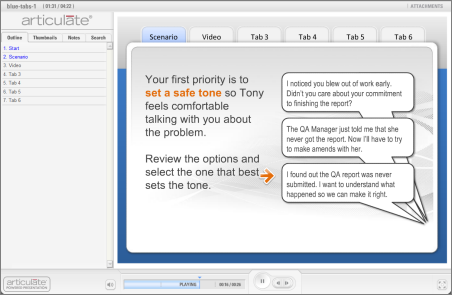
Tabbed PowerPoint Template

The Rapid E-Learning Blog - tabbed template demo


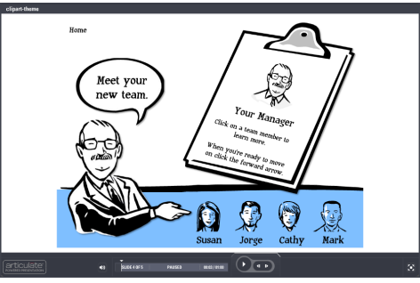
Clipart-based PowerPoint Template

The Rapid E-Learning Blog - elearning tutorial using PowerPoint clip art style 802


Flip Card PowerPoint Template

The Rapid E-Learning Blog - flip card PowerPoint template

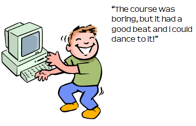
10 Free Audio Applications

The Rapid E-Learning Blog - the elearning course was boring, but it had a beat and I could dance to it

Following are the ten audio sites that I profiled.  You can get more detail from the original post.

Remember if you want good audio, starts with a good mic like the Samson Go Mic (a deal at less than $50) and then learn to do some basic audio production.

From the Community

If you’re an Articulate user and want some free templates and resources, check out these following discussion threads from the community forums.

Vegas-inspired Flash Cards

The Rapid E-Learning Blog - Vegas style Quizmaker demo

Click here to view the demo.

Free Navigation using Icons

The Rapid E-Learning Blog - icon-based navigation panel

Click here to view the demo.

Animated Image Assessment

The Rapid E-Learning Blog - Animated image in Quizmaker assessment

Click here to view the demo.

This is one of my favorite Quizmaker demos.  I like the way David used the slide view to create an image-based assessment.  The technique can be used in a number of ways.  Like the two previous examples, the community discussion has all of the tutorials and files you need to replicate this.

It’s been a busy summer.  I’m looking forward to helping you and seeing many of you as the conference season starts in September.  What’s one thing you’ve learned from the Rapid E-learning Blog these past few months? Share by clicking on the comments link.

Events

Free E-Learning Resources

Want to learn more? Check out these articles and free resources in the community.

Here’s a great job board for e-learning, instructional design, and training jobs

Participate in the weekly e-learning challenges to sharpen your skills

Get your free PowerPoint templates and free graphics & stock images.

Lots of cool e-learning examples to check out and find inspiration.

Getting Started? This e-learning 101 series and the free e-books will help.


The Rapid E-Learning Blog - How to organize your course files

I was on the phone with someone who had problems with her elearning course.  It seemed that nothing was working right.  As I dug a little deeper, it turned out that she was deleting some of her files.  She told me she did so to keep her files organized.  Apparently the folders were looking a bit messy.  What she didn’t realize was that all of those files she was moving and deleting actually broke her course.

My advice to her was to leave the published folders alone.  In addition, we had a great conversation about file management in general.  And I shared with her a few ideas so that she didn’t feel like her folders were disorganized.

Part of what I shared was that there are many ways to organize your folders and manage the elearning content.  It all depends on your personal work preference, what you need to do with the files, and if you share your work with others.

Create Separate Master Folders

I like to start with a project folder that has all of my notes, resources, and production files.  For example, the folder includes all PowerPoint, Quizmaker, and Engage files.  I also include all of the original material from my subject matter experts.

However, I like to keep the assets (like videos and images) in separate master folders.  The master folders hold all of the assets regardless of the projects they belong to.  I do the same for my published courses.  I like to have all of my assets and published courses in master folders so it’s easy for me to find them.

The Rapid E-Learning Blog - simple course folder structure

I do this because I do a lot of product and course demos.  I need quick access to course assets and the published output.  I don’t work with my production folders as frequently.  I also don’t share my files much, so this workflow works fine for me.

But what works for me, probably doesn’t work for most people.  So here’s another idea.

Keep All of the Files Together

This next approach is one that probably works best for most people.  Create a single folder for each project.  And inside that folder, place all of the files needed for your course.  This includes your assets and published output.

The Rapid E-Learning Blog - keep all of the course files together

With this approach, everything’s in one place, making it easy to manage and share files.  In addition, products like Picasa and Windows Live Gallery allow you to tag and search for the media assets on your computer.  You can also tag files in Windows Explorer.  So my goal of keeping similar assets in a master folder is no longer relevant.  I can just tag the assets and do a search of the tags.

Create a Generic Folder Structure

Regardless of the approach you use, it’s important to be consistent.  This is especially true if you share your files with others.  In fact, in a recent team meeting with the Articulate community team, we had a conversation about how we want to manage our production folders going forward since we share our files.

The Rapid E-Learning Blog - example of a generic course folder

We opted for the all-in-one option above because it’s easier to manage and share files.  We also decided on using a generic folder structure like the image above.  We start with a pre-built folder structure that includes all of the key folders.  When we start a project, we copy the generic folder structure, rename it, and then add our project files.

Using a consistent process means that as we collaborate and share files, we’ll always know where things are.  Below is a quick tutorial that walks through the basic process we’ll be using.

The Rapid E-Learning Blog - tutorial on creating a generic elearning folder

Click here to view the elearning demo.

If you want additional ideas, check out Kevin Thorn’s post where he shares six tips for managing elearning courses.  He covers how he manages his elearning courses and includes a quick tutorial.

Keep in mind that there’s not a right or wrong way to manage your course files.  So you have the freedom to do what’s best for you.  However, there are things you want to consider.

The main thing is who else gets to see and work with your files?  If it’s just you, then whatever works for you is probably fine.  But if you make the files available to others, then you need to consider a workflow that has more universal appeal.  Not everyone can bear with our idiosyncrasies.  Personally, I like a simple structure that’s not so rigid that I spend more time managing workflow than building courses.

How do you structure your folders and files?  Do you have a generic folder structure to start?  Share your thoughts and any tips by clicking on the comments link.

Events

Free E-Learning Resources

Want to learn more? Check out these articles and free resources in the community.

Here’s a great job board for e-learning, instructional design, and training jobs

Participate in the weekly e-learning challenges to sharpen your skills

Get your free PowerPoint templates and free graphics & stock images.

Lots of cool e-learning examples to check out and find inspiration.

Getting Started? This e-learning 101 series and the free e-books will help.


The Rapid E-Learning Blog - tour of player interface

In the late ‘90s the company I worked for was installing a new network in anticipation of the Y2K bug.  I was responsible for training how to use the computers on the network.

Back then most people didn’t have computers.  So before we could teach them how to use the computers, we had to teach simple things like using a mouse.  I recall a few people who actually waved the mouse in front of the monitor hoping to get it to work.

E-learning has a similar history.  Because it was new and there wasn’t a lot of consistency around interface design, most courses started with a “how to navigate this course” course.  It made sense back then.

I’m not sure if it makes much sense today because most people are familiar with computers; so figuring out how to click a play button or forward arrow isn’t too hard.  And besides, many elearning courses use a similar layout which makes it easy to know what to do.  Because of this, it’s probably not necessary to have a mini course on how to navigate the course within your course.

The Rapid E-Learning Blog - this is a play button

With that said, the majority of the courses I see do offer the mini course.  I think that in most cases they can be eliminated or at least simplified.  Here’s an example from a recent course I previewed:

This is the volume button.  Some slides may or may not have audio.  Those that do have audio can be adjusted using the volume control button.  If you want to increase the volume, place your mouse over the volume control.  To turn the volume up, drag the mouse to the right.  To turn the volume down, drag the mouse to the left.  Find a volume level that is comfortable for you.

Do I really need a thirty second explanation of the volume control?  This same course continued through explanations of all of the player features.  They even went on to explain the logo panel.  It probably took about 5 minutes just to get through the user interface.  I’m not sure exactly, because I fell asleep.

Obviously, you want to let the user know how to get around the course.  However, in many instances the navigation is obvious and needs no instruction, or just something real simple.  They definitely don’t need a full course on how to navigate the course.

The goal is to create a frictionless experience.  A mini course on navigation impedes the flow and pacing of your course.  So here are a few tips:

  • Get rid of the navigation instructions. When you watched your first YouTube video, did you have problems figuring out how to get it to play?  If your course player follows convention, then it’s usually not hard to figure out what’s a play button and what’s a back arrow.
  • Follow conventions and don’t customize every course you build.  It’s more fun to create a custom look and feel for your elearning courses.  But, there’s a lot of value in having a consistent player structure.  It means people know where things are and where to look for help.  This lets them focus on the content and not how to navigate the course.
  • Provide clear instructions if you do have unconventional navigation. Ideally, the interface should be comfortable and intuitive…and shouldn’t require a lot of instruction.  But if you do violate some conventions, then be sure to provide clear instructions.  Something to keep in mind is that if you have to offer a lot of navigation tips, you may want to rethink how you built the interface.
  • Offer just-in-time prompts.  Instead of throwing all of the navigation tips out at once, just offer them at the point where they need to be used.  For example, the first time you want them to click play, just add a “click play now” prompt.  After the first time, they should get it.  This is a better approach than offering 30 navigation tips and a long, boring tour of the interface upfront.  Most people won’t even remember all of that stuff, anyway.
  • Create a “voluntary” player tour.  You may not be comfortable offering no navigation tips.  And some clients will demand it anyway.  So instead of forcing everyone to go through the tour at the front end, just add a help section where they can get some tips if they’re stuck. Many people who use Articulate Engage will create a drop down tab with detailed instructions for those who need them.
  • Consider your audience.  Personally, my choice is to avoid building the “how to take the course” tour.  But I still have to think about the audience needs.  If you work with a pool of people who are not familiar with computers or seem intimidated by taking a course online, then you want to do everything you can to make it easy for them.  This is where convention and just in time prompts are valuable.
  • Don’t hire people who can’t figure out how to press a play button.  It’s one thing if the elearning course has some novel interface that is a bit confusing.  But most elearning courses have the same basic structure.  If the person can’t figure out how to advance the screen without help, they might not be the right person for the job. 🙂

Below is a quick demo with a few different ideas on how you can approach the slide navigation instructions.

The Rapid E-Learning Blog - examples of different navigation tips

Click here to view the tutorial.

There are a lot of ways to build navigation tips and prompts into your elearning course.  There’s really no right or wrong way.  In fact, in reviewing the recent Articulate Guru Awards, it’s interesting to see some of the ways this is dealt with.  I’ll share more later.

How do you deal with this in your elearning courses?  Share your thoughts by clicking on the comments link.

Events

Free E-Learning Resources

Want to learn more? Check out these articles and free resources in the community.

Here’s a great job board for e-learning, instructional design, and training jobs

Participate in the weekly e-learning challenges to sharpen your skills

Get your free PowerPoint templates and free graphics & stock images.

Lots of cool e-learning examples to check out and find inspiration.

Getting Started? This e-learning 101 series and the free e-books will help.


The Rapid E-Learning Blog

In last week’s post, I offered some tips for building rapid elearning courses when you’re short on time and resources.  In today’s post, I’ll discuss some of the production techniques we used.  I especially got a lot of emails about how we used Engage, so I’ll cover that as well as discuss how to do a quick pilot test and rework your objectives list.

Here’s a link to the original course, if you haven’t seen it yet.  Check it out and then read the rest of the post.

Step Away from the Default Solution

Software companies build software with specific features.  You’re not required to use the software as prescribed.  The trick is to understand what you can do with the software and then find your own uses.

For example, we chose to build all of the technology pieces in Engage because it’s a form-based elearning tool.  They’re easy to create and maintain.  But we didn’t want the built-in title bar that’s part of the Engage player design.  And we wanted to give the learners freedom in choosing the interaction they wanted to see and not have to go through them one slide at a time.

The Rapid E-Learning Blog - insert Articulate Engage as a .swf

Our Solution

We were able to use PowerPoint’s hyperlinking for the free navigation.  However, when you publish Engage using the default method, the interactions sits on the top layer and blocks the hyperlinks.

Our solution was to publish Engage outside of the course.  Then insert the engage.swf as a Flash file on the slide.  After doing that, we moved the .swf up and uncovered the PowerPoint hyperlinks.

  • After you publish the course, you need to move the engage contents folder over to the same location as the inserted .swf.  Here are some screencasts that explain how to add Engage as a Flash file and working with multiple Engage files.
  • To keep the .swfs aligned, figure out how far up you need to move it.  Then add a visual stopper on your master slide.  This way to don’t need to worry about alignment issues across multiple slides.  Here’s a quick tutorial that shows how to do so.
  • David has a detailed thread in the community on how we created the hyperlinked menu bar on the bottom of the slide.  You can check it out here.

Regardless of the software you use, the key point is to not limit yourself to the default use of the tool.  By stepping away from the prescribed solution, you open the doors to more creativity and customization.

Pilot Test Your Course BEFORE Final Production

Between David and me, we’ve built hundreds of hours of elearning.  With that type of experience, we have a sense for what works and what doesn’t.  And for the most part, we’re right.

However, it’s easy to get comfortable to the point that you lose the user’s perspective.  What seems obvious and intuitive to you may not be the case for those who go through the actual elearning.  This is especially true for people who are less tech-savvy and not familiar with taking online courses.

Because of this, it’s a good idea to build a simple prototype that is the essence of your course.  Then run it through a quick review by the types of people who will use the course.  Just sit back and watch them navigate it.  Observe how they interact with the screen and what they do.  Also, time how long it takes them.  You may think a screen is simple and only requires a minute or so; but when observing the learner, you find that it takes much longer for them to get past the information.

Our Solution

We didn’t have a lot of time, so our pilot test was conducted in my family room with my wife as the volunteer (in between commercials during Top Chef).  She’s actually a good candidate because she had no vested interest in the course and doesn’t come with a lot of preconceived ideas about the way elearning courses should be designed.

As she made her way through the course, I watched what she read and where she was clicking.  There were a few places where she didn’t do what she was supposed to do. Or she kind of froze looking over the screen, not sure what to do next.

What’s funny is that to me everything seemed clear.  So my initial response to her was a bit condescending (as if the problem was hers and not the course design).  The reality though was that our instructions weren’t always clear and that caused some confusion.

We went back to the course and made some modifications.  We added better instructions.  Made sure the visual elements and how they were used was consistent.  And we compressed some of the screen content.

The Rapid E-Learning Blog - modifications after pilot testing

The key point here is that even if all you have is one person review the course, you’re better off than no one reviewing it.  A few tips:

  • Build a quick prototype and get it tested.  Rapid elearning tools are great because you can build a course close to the final version quickly.
  • Recruit people who are like the learners.  Pull in people who have no vested interest in your course.  They’ll give good feedback from a different perspective.
  • Don’t recruit the subject matter experts (or IT people who think they know usability design).  They tend to overplay minor issues and focus on the wrong things.

Lose the Bullet Point Objectives

One thing many elearning courses have in common is the bullet-point list of objectives.  We wanted to step away from a list of objectives.  Besides, most people just click the next button when they see a list of objectives.

Ultimately the goal is to connect the learner to the course.  It’s to help them see how the course content is relevant to what they do. To accomplish this, you don’t need a bullet-point list of objectives.

Our Solution

Our objectives list could have looked like this:

The Rapid E-Learning Blog - stating objectives in an elearning course

Instead, we dropped the list and offered a simple statement that tied the objective of the course to the organization’s mission.  It told them what the course covers and why.  They’ll get the rest of the details as they go through the course.

The Rapid E-Learning Blog - modified objectives

Even if you’re forced to create a bullet-point list of objectives, there’s no reason why you can’t offer a more compelling screen up front that invites them to learn more.  Start with a scenario that reveals a gap in understanding.  Or show an example of what happens without the course information.

I like the way e-Mersion states the objectives in this CPR demo.  It’s starts with a little drama and then reveals the objectives.  It’s a simple way to offer a compelling reason why the course is important and what is being covered.

Like many courses, there’s a lot more to share from what we learned during this project.  I haven’t even covered how to work with virtual teams or what we did to quickly implement changes.  I’ll work some of that into future conference presentations.

When you’re under pressure to deliver a good course with limited time and resources, what tips do you have?  Feel free to share your ideas by clicking on the comments link.

Events

Free E-Learning Resources

Want to learn more? Check out these articles and free resources in the community.

Here’s a great job board for e-learning, instructional design, and training jobs

Participate in the weekly e-learning challenges to sharpen your skills

Get your free PowerPoint templates and free graphics & stock images.

Lots of cool e-learning examples to check out and find inspiration.

Getting Started? This e-learning 101 series and the free e-books will help.


The Rapid E-Learning Blog - deconstructing the LINGOs course

In December, LINGOs announced the first global giveback campaign, which paired elearning developers with humanitarian organizations that needed some elearning courses produced.  Like many of you, David Anderson and I took up the challenge and volunteered to create a course for Christian Aid.

For this project, we had no budget with limited time and resources.  So I thought I’d share a little about how we built the course and some of the decisions we made because they’re common to many rapid elearning courses.

Check out the course we built and then look at my notes below.

The Rapid E-Learning Blog - Christian Aid course

Click here to view the Christian Aid demo.

Course Structure

We only had a couple of weeks to work on the course.  This didn’t leave a lot of time for production.  Typically this type of constraint dictates a simple course like a linear, click-and-read.  But we wanted to have some interactivity.  The approach we took was to offer two tracks.  One was information specific, and the other was a bit more interactive and learner-centric.

The Rapid E-Learning Blog - two tracks for elearning

  • Information track: Some people just want information and prefer a linear flow.  So on one track we offered the core information.  But we freed it up so they only had to click on the information they needed and not go through each piece.
  • Interactive track: This track was designed to present the information technology through some simple interactive decision-making scenarios.  The choices they had to make were similar to the choices they’d make at the organization.  It didn’t require that the person know anything about the technology.  We gave them the additional information as feedback.  To take away some risk, we also provided an option of reviewing the technology before making a choice.  

Essentially both tracks were the same; they just presented the information in slightly different ways, giving the learner some options and freedom in navigation.

Tip: Give the learner as much control as possible in how they get their information.  On top of that, the approach we used is a good one if you want an interactive course, but your client wants an information dump.

Dry Content?

Our course content was about communication technology and probably not that interesting in comparison to Christian Aid’s core mission of humanitarian aid.  We felt that it was important to tie the course into the organization’s larger mission.

The Rapid E-Learning Blog - tie course objectives to larger mission

So the course we designed was less about technology and more about making cost-effective choices that impacted the mission in the field.  In between the communication technology pieces, we added Christian Aid success stories.  It was an easy way to humanize the technology focus.

Tip: It’s important that the courses you build connect the learner to the overall mission or objectives.  It’s a reminder that they’re part of something bigger and a celebration of the organization’s accomplishments.

Reusability & Maintenance

One concern for us was how the client would maintain and edit the course after we were out of the picture. So we focused on easy maintenance and re-use of the content.  Here are a few things we did:

  • The course was built in a PowerPoint-based rapid elearning tool.  This meant that long after we were gone, they could easily update & repurpose the course.  To help them, we built a clean and easy-to-use template.

The Rapid E-Learning Blog - PowerPoint is easy for editing and maintenance

  • All of the technology information pieces were built in Engage.  Engage is a form-based tool and requires no programming at all.  That makes them easy to maintain and edit.  In addition, all of the interactions could be pulled from the course and added to other web sites within the organization.

The Rapid E-Learning Blog - form-based elearning example

  • The interactive track is a simple template structure that cycles through two core slides on the master layout, even though it looks more complex. That means if they wanted to add additional content, they could do so in minutes.

The Rapid E-Learning Blog - master slides in PowerPoint

Tip: Create templates and models that can be reused.  It makes editing and maintaining the course easy.  It also makes your client feel empowered.  The more the client can do on their own later, the more time you save.  Also, don’t spend time building custom Flash pieces if a form-based tool can do the job faster.

Visual Design Ideas

Clean look and feel.  One concern is that many elearning courses get crowded out with too much visual data.  There are logos, buttons, boxes and instructions all over the place.  We had two goals with the visual design: lots of whitespace and non-technology look.

The Rapid E-Learning Blog - visual design

  • We wanted a course that was clean and aesthetically appealing.  Definitely didn’t want anything that looked like a PowerPoint slide.  So we went with a lot of open space and white background.
  • We also didn’t want the course to look like a typical technology course.  We actually had one design treatment where everything was outside in a field.  It looked cool, but probably was a little too “out there” for this course.  We opted for a simple floor and wall background with nice clean icons.  It gives the screen depth, a consistent look, and seems richer than just a flat background.

Integrate the organization’s brand.  Branding is one of those frustrating parts of elearning design.  But it’s hard to get around it.  The temptation is to create screens with logos and bra
nded elements plastered all over the place.  But the trick is to incorporate the brand ideas without having to look like you’re entering the course in a NASCAR race.

The Rapid E-Learning Blog - integrate branding

We chose a color scheme and design elements that integrated with Christian Aid’s brand.  For example, the orange and red colors come from the branded web site.  You’ll even notice that our direction arrow is tied to the Christian Aid logo.

Tip: Branding doesn’t mean you have to have a logo on every screen.  Instead, it’s more about associating the course with the organization’s visual identity.  Find ways to incorporate colors, fonts, and design elements into the course interface.

Course Navigation

Navigation.  The published course comes with the default player.  But there are times where we ask the learners to navigate by clicking on the screen instead.  Since it was different than the default player, we used animation to accentuate the navigation option.  We also clarified what the learner should do on the screen with explicit instructions.

The Rapid E-Learning Blog - explicit navigation instructions

Tip: Make sure the navigation is clear and that you are consistent in how you use the screen elements.

The Christian Aid course is a good example course for us because of the tight timeline and lack of budget.  Are there things we could have done differently?  Probably.  But given the constraints, it demonstrates that you can still build effective and interactive elearning courses with limited resources and time.  And we actually learned some new production techniques which I’ll share in an upcoming post.

Events

Free E-Learning Resources

Want to learn more? Check out these articles and free resources in the community.

Here’s a great job board for e-learning, instructional design, and training jobs

Participate in the weekly e-learning challenges to sharpen your skills

Get your free PowerPoint templates and free graphics & stock images.

Lots of cool e-learning examples to check out and find inspiration.

Getting Started? This e-learning 101 series and the free e-books will help.