The Rapid Elearning Blog

Archive for the ‘Uncategorized’ Category


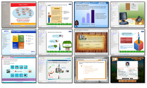
The Rapid E-Learning Blog - 12 free elearning tutorials

It’s a fact that you CAN build effective elearning with rapid elearning tools.  You’re not locked into linear, click and read content.  All it requires is that you craft a sound learning strategy and get the most out of your tools.

To demonstrate this, I deconstructed an effective elearning course originally built in Flash and then built a mock up in PowerPoint.  In a previous post I shared how to create the graphic elements for that course in PowerPoint.

In today’s post, we’ll look at how to assemble the course and some of the production techniques I used.  While you may never build one exactly like this course, you can still learn a lot about how to build elearning courses using PowerPoint and your rapid elearning tools. 

While the tutorials give you a quick tour of what I did to build the prototype, your best bet is to download the PowerPoint file and break it apart to see how it was assembled.  So let’s get started by looking at the general course structure.

Deconstruct the Course Structure

The course places you in a situation where you determine the threat level of various employees.  The goal is to find the most threatening person.  When you look at the course elements you have three basic stages: review, interview, and refer.  Let’s look at them in more detail.

Review

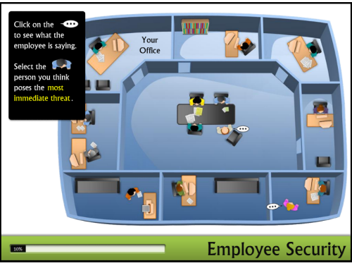
The first stage is the overhead office where you review the threat level of all of the characters. The actions are to review the statements and then select a person that is sent to the office for an assessment interview.
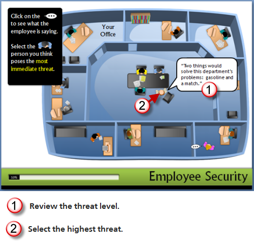
The Rapid E-Learning Blog - review security threat

Production notes:

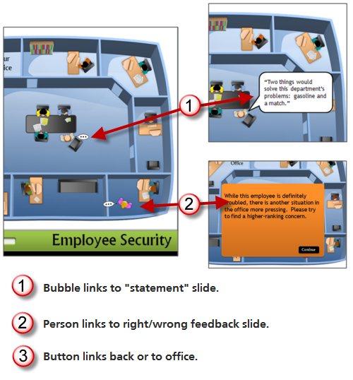
  • Clicking on the text bubble links you to another slide with the character’s text on it.
  • Clicking on the person links you to a slide with a feedback box.  The feedback box has a link that either takes you to the next step (correct) or back to the scene to make a different choice (incorrect).

Interview

The second stage is the office interview, where your goal is to determine how much of a threat the person is.  The actions are to click on interview questions and then determine to refer or not.
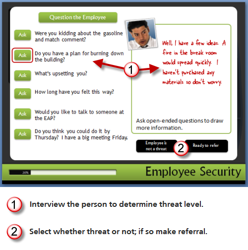
The Rapid E-Learning Blog - interview employee

Production notes:

  • When you make a correct choice, you are advanced to a slide where you can select interview questions.
  • Clicking the “ask” button links to different slides that provide answers. 
  • Clicking on the two black buttons link to different feedback slides.

Refer

The third stage is to refer the threatening person to the best department.  You actions are to review the departments and make the appropriate selection.
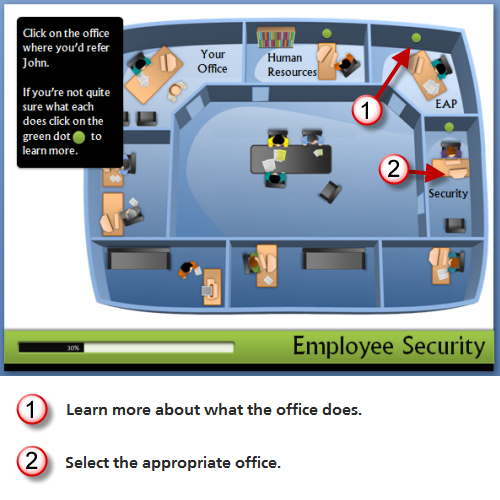
The Rapid E-Learning Blog - refer to an office

Production notes:

  • Clicking on the green dots links you to a slide with information about that group.
  • Clicking on the office links to a slide where the character (using a motion path animation) moves to the office for feedback.

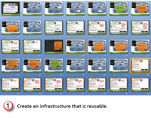
As you break down the PowerPoint file, you’ll notice that while the learner only sees one screen, you might actually be linking to a number of screens that look the same.  The interview questions are a good example of this.  It’s made up of seven slides, but when the learner reviews the questions it only looks like one slide.

Leverage the Master Slides & Layouts

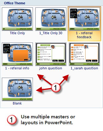
You can decrease production time and make it easier to maintain and update the course by using master slides and layouts.  The first thing is to consider what content is persistent across the slides.  That’s the content you want to place on the master slides.  Keep in mind; you can have as many masters as you want.  You’ll notice that I have a few different layouts.

The Rapid E-Learning Blog - use master slides in PowerPoint

Click here to view the tutorial.

Use the Slide Titles to Identify Slides

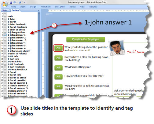
I like to move the slide title up and off the screen.  Then I can use it to identify the slide and add notes.  This comes in handy when I have to add hyperlinks and work with slides that all look the same.  It also makes it easy to work with groups when you’re building scenarios because you can quickly scan the slides in outline mode.

Because it’s off screen, the learner will never see the notes and titles.

The Rapid E-Learning Blog - use titles for meta data

Click here to view the tutorial.

Think of Slides as Layers

The original course had rollovers.  Since this isn’t possible in PowerPoint-to-Flash, I used hyperlinks to branch to slides that looked the same, but had different data.  This was used in a number of plac
es.  Doing this lets you create a trigger that can reveal new information or animations. 

I used it in the first stage where you click the text bubbles or the people, as in the image below.  I also used it when you click on the interview questions to get the employee’s answers.

You can hide the layer slides so that the learner never sees them in the menu (if you use one).  In Articulate Presenter, you can do this via the slide properties manager.

The Rapid E-Learning Blog - think layers not linear

Click here to view the tutorial.

Create Reusable Content

When you break the course into chunks you can see that there are a lot of areas where you can reuse the content or structure.  The interactions with the characters are a good example.  Each character has a series of events:

  • Click on text bubble.
  • Click to choose.
  • Interview character.
  • Send character to the office.

When you review the PowerPoint file you’ll see that once I built the first character slides, all I had to do was copy them, change the slide titles, and swap out the character-specific details and content to have a series of slides and interactions specific to the character.

The Rapid E-Learning Blog - create reusable content

Click here to view the tutorial.

Adding a new character to the module would only take a few minutes.  The key is to map out what you want to do first and then build the content so it’s easily reused.  Another consideration is building an infrastructure you can use in other courses by just copying and pasting the slides.  It takes a little practice, but once you build that way you’ll find that it’ll save you time.  It also helps you build more interactive content because you’ll know how.

Here are some other tutorials that help you learn some of the production techniques used in the prototype:

Building these types of courses is not difficult.  But you’re not going to develop the skills to do so if you don’t practice.  Go through the tutorials, break down the PowerPoint file, and play around with your own ideas.

Since the questions about some of the production techniques might be a little bit more involved, we started a thread in the community forums. It allows for better discussion than the blog comments.

Events

Free E-Learning Resources

Want to learn more? Check out these articles and free resources in the community.

Here’s a great job board for e-learning, instructional design, and training jobs

Participate in the weekly e-learning challenges to sharpen your skills

Get your free PowerPoint templates and free graphics & stock images.

Lots of cool e-learning examples to check out and find inspiration.

Getting Started? This e-learning 101 series and the free e-books will help.


The Rapid E-Learning Blog

In a previous post, I showed that when you use rapid elearning tools (as well as PowerPoint) you can build effective elearning courses. I’d even argue that PowerPoint provides some extra benefits because of its easy authoring and graphics development.  You get a lot of features and capability inside one application.

Below is a link to the demo I built based on Allen Interaction’s original course (with their permission).  In today’s post, I want to walk through how I built the graphics in the course.  They’re easy to do.  And once you have the techniques down, you can surely use the isometric office or room technique in your own elearning courses.  It’s definitely a great way to create an immersive elearning experience.

The Rapid E-Learning Blog - demo course

Click here to view the course.

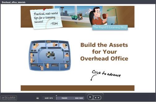
How to Create the Graphics

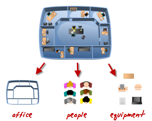
When you look at the office graphics, you’ll notice that it’s made up of three core groups.  They are the office walls, the people, and then all of the equipment.

The Rapid E-Learning Blog - overhead office assets

Here are a few quick tutorials that walk you through how to create the graphics:

Once you have your assets built, you want to place them in your scene.  Here’s a quick tutorial and a few tips when working with these assets:

  • Vary the colors of the objects to give it more variety.  Unless you’re doing a course for the top-secret MIB you are better off adding some color to the outfits people wear and to the office equipment.  Not all of the furniture needs to look the same, either.
  • Place the objects at angles to give them a more natural look.  You’ll notice that some of the characters are turned a bit and keyboards are in different positions. Using angles helps make the scene look more active.
  • Little details add more interest.  I like the way the pieces of paper look in the scenes.  Experiment with other items, like coffee cups, water coolers, and plants.  The more detail you add to the scene the more interesting the image becomes.

I pulled all of the tutorials into a single module for those who want them all in one spot.

The Rapid E-Learning Blog - combined elearning tutorials

Click here to view the tutorials.

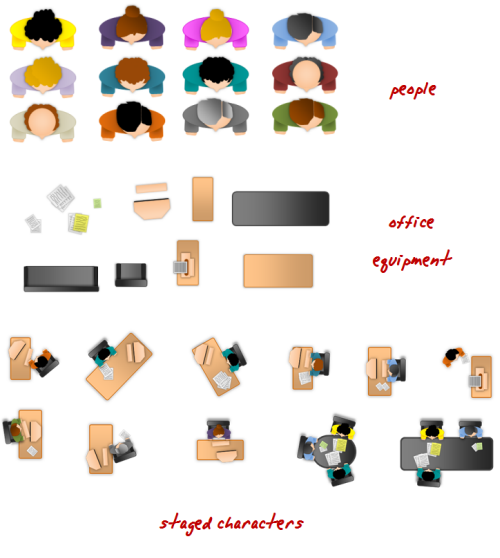
For those who want the assets that I created, you can download the people and equipment as images, as well as the PowerPoint file.  Perhaps that will save you some time.  Feel free to use them as you wish.

The Rapid E-Learning Blog - download these free assets

Download:

In the next post, I’ll walk through how to build the course, the animations, and branching.

If you use these ideas, or create your own assets, I’d love to see them.  Feel free to share them via the comments link.  Also, share how you created them by doing your own quick tutorial.

Events

Free E-Learning Resources

Want to learn more? Check out these articles and free resources in the community.

Here’s a great job board for e-learning, instructional design, and training jobs

Participate in the weekly e-learning challenges to sharpen your skills

Get your free PowerPoint templates and free graphics & stock images.

Lots of cool e-learning examples to check out and find inspiration.

Getting Started? This e-learning 101 series and the free e-books will help.


 The Rapid E-Learning Blog - 200 free rapid elearning tutorials

A few weeks ago I offered some advice on how to become an elearning pro without spending a dime.  The essence of that post is:

  • You have access to a lot of free tips and tricks.  So there are plenty of opportunities to learn and it doesn’t cost you anything more than your time.
  • Practice doing what you learn.  The learning is only going to happen if you do more than watch the tutorials and read information.  Apply some of the tips and tricks to your projects. 
  • Share what you know with others.  One of the best ways to learn is to share what you’ve learned and done.  It doesn’t need to be perfect.  Trust me, there are more people getting started looking for simple tips than there are experts looking for advanced help.  What you learn and share is really important to a lot of people.

I also offered up a small challenge and your peers responded by creating a number of tutorials.  Here’s one of my favorites because it offers a clever use of PowerPoint and what you end up creating can easily use as the design for your course.

Click here to view the tutorial.

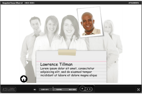
Here’s a quick mock up using the ideas from Linda’s tutorial.  In this case, it’s designed as a way to meet new team members.  However, the same idea could be used a number of ways.

The Rapid E-Learning Blog - meet team members prototypeClick here to view the prototype.

Below is a list of great tips and tricks that you can apply to your elearning courses right away. Also, if you’re an Articulate user, we had a month-long series of helpful posts in the Word of Mouth blog.

Creating PowerPoint Graphics

Some of these tips are really practical and probably work right away.  Others are cool and interesting.  However, even if you can’t use those specific tips, it does help to practice the tips in the tutorials.  You’ll improve your PowerPoint design skills and odds are you you’ll use the techniques in ways that do work for you.

PowerPoint Animation Tips & Techniques

You might not need to use all of these animation tips, but it’s a good thing to practice them because the techniques can be applied in all sorts of circumstances.  They’ll also help you think about the PowerPoint features in a different way.

Rapid E-Learning

Miscellaneous Tips

Course Management

There are a lot of really good tutorials in this list, especially if you’re just getting started.  Go through them and practice some of the techniques.  Do you have some tips you want to share?  If so, add your practical tips and tricks to the comments section.

Also, congratulations to Linda Lor who won an autographed copy of the Essential Articulate Studio ‘09.

Events

Free E-Learning Resources

Want to learn more? Check out these articles and free resources in the community.

Here’s a great job board for e-learning, instructional design, and training jobs

Participate in the weekly e-learning challenges to sharpen your skills

Get your free PowerPoint templates and free graphics & stock images.

Lots of cool e-learning examples to check out and find inspiration.

Getting Started? This e-learning 101 series and the free e-books will help.


The Rapid E-Learning Blog - LINGOs Global Giveback

LINGOS is a consortium of over 45 international humanitarian aid organizations.  The LINGOs mission is to provide learning technologies and courses to the member organizations.

Last December, LINGOS announced the eLearning Global Giveback Competition.  It was an opportunity for the elearning community to help fill the gap for those organizations that lacked some resources.  And the community came up big.  All of the courses listed were filled.

What makes the accomplishment even more amazing is that all of them were done in a very short period of time, some of the volunteers were unfamiliar with the authoring tools, some were even new to elearning, and many of the LINGOs organizations had to divert their attention because of the devastating earthquake in Haiti.

Despite these obstacles, over 40 courses were developed.  And there are still additional courses in the works.  That’s pretty impressive.

The Rapid E-Learning Blog - LINGOs finalists

I’d like to personally thank all of those who volunteered and made the first event a great success.  I’d also like to encourage others to volunteer to continue to support the LINGOs organizations.  Here’s why:

  • If you’re a smaller elearning vendor or freelancer and trying to get your name out, this is a great way to do so.  You get to do a project that not only helps people, but it also gets a lot of visibility.
  • If you’re a student and want a valuable internship or learning experience, this is a good opportunity.  You’ll gain a lot of experience, learn while working on a real project, network and meet people, and have a nice project for your portfolio.
  • Speaking of portfolios, a lot of people tell me they can’t show their projects because of proprietary issues.  Volunteering for LINGOs is a way to solve that.  You can show off your elearning muscles and have a solid project for your portfolio.

The Rapid E-Learning Blog - global giveback competiton

Here’s a link to the LINGOs projects that were submitted and made it to the finalist round.  Hopefully, there’ll be a place to see the other projects, as well.

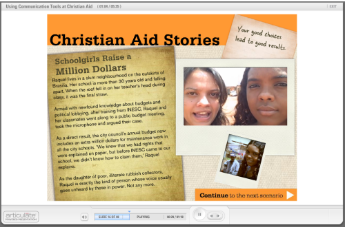
By the way, David and I took up the challenge of creating a course because we wanted to give back and be able to use the course as a teaching project.  The LINGOs projects present some interesting dynamics. For us is working with a compressed timeline and limiting ourselves to PowerPoint, Engage, and the resources that most of the blog readers deal with.  On top of that, David’s in Phoenix, I’m in the Seattle area, and our client is in the UK.  You can see our project below.

The Rapid E-Learning Blog - Christian Aid exampleClick here to view the Christian Aid course.

It was an interesting experience.  In addition, we tried out a few ideas.  I’ll write more about that soon where I discuss some of our strategic decisions, working virtually, and give away some assets based on the course design.

Events

Free E-Learning Resources

Want to learn more? Check out these articles and free resources in the community.

Here’s a great job board for e-learning, instructional design, and training jobs

Participate in the weekly e-learning challenges to sharpen your skills

Get your free PowerPoint templates and free graphics & stock images.

Lots of cool e-learning examples to check out and find inspiration.

Getting Started? This e-learning 101 series and the free e-books will help.


The Rapid E-Learning Blog

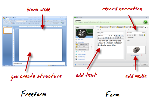
Rapid elearning tools generally fall into one of two groups: freeform and form-based authoring.

PowerPoint-to-Flash publishing is freeform.  You start with a blank slide and then build your structure and interactivity.  And the other type of tool is form-based where the application has a pre-designed structure and the developer only needs to add content like text, narration, and multimedia.  Hit publish and you have clean, professional output.

The Rapid E-Learning Blog - form and freeform authoring

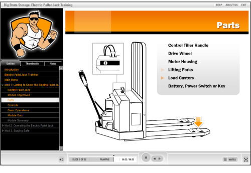
Most rapid elearning courses use a combination of form-based modules and PowerPoint.  A good example of this is the Pallet Jack demo.  It combines content created in PowerPoint (freeform) with interactions built in Engage (form).

The Rapid E-Learning Blog - Pallet Jack rapid elearning demo

Click here to view the Pallet Jack demo.

As you can see, it doesn’t have that “PowerPoint” look and the integration between form and freeform generated content works well.

The Truth About PowerPoint

Most PowerPoint criticism is misguided.  It’s not hard to find critics of PowerPoint because it’s an easy target.  Who hasn’t had to sit through boring PowerPoint presentations?  Unfortunately, much of the criticism is off target because bad content is the result of poor design and not the application you use.

Books like Beyond Bullet Points and Slide:ology have done more than enough to show how to use PowerPoint for more than bullet point presentations.  If you’re critical of something created in PowerPoint tell the person who created it and spare us the tearing of shirts and sprinkling of ash as you lament the inevitable collapse of our industry. 🙂

PowerPoint is a multi-faceted application and used for more than presentations.  So a carte blanche dismissal of PowerPoint is ridiculous. As proof to PowerPoint’s versatility you don’t need to go very far.  In recent posts, I’ve shown how to use it to build graphics as well as interactive elearning.  I even met someone recently who used PowerPoint to publish a book.

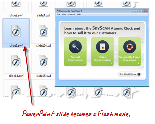
Here’s what’s true about PowerPoint and rapid elearning.  Your slide starts as a blank slate.  You can add animations, narration, interactivity, and multimedia to create a pretty dynamic elearning course.  When you publish your course, that PowerPoint slide becomes a Flash movie.

Do you build the Flash movie in Flash?  Or do you build the Flash movie in PowerPoint?

Here’s the deal, you can learn Flash and actionscript to build elearning content.  Or you can leverage PowerPoint’s flexible and easy authoring environment to create Flash-based elearning.  Either way, the output is still Flash.  The only difference is that with PowerPoint you get to create your Flash movie (with animation and audio) in an environment you already know.  All without having to be a programmer.

The Rapid E-Learning Blog - PowerPoint slide becomes a Flash movie

While actionscript programming does provide more control over the Flash content, rapid elearning generally gives you a lot more convenience.  And for most courses, I’ll take the convenience over the time and cost associated with the extra programming.  It’s part of the rapid elearning strategy I recommend and similar to what Kevin Maney discusses in his book, Trade-Off.

Keep in mind that while rapid elearning gives you the ability to create good courses at a fraction of the cost and time, it doesn’t mean that you skip instructional design.  Regardless of your tool, the course is only going to be as good as you designed it. But because you use rapid elearning tools doesn’t mean that you can’t build a quality elearning course.

Rapid E-Learning Doesn’t Mean Low Quality

If you read this blog, then you know that there are more than enough examples to show how you can build high quality elearning using rapid elearning tools.  In fact, here are a couple of quick examples I built based on the demos in Michael Allen’s Guide to E-Learning. The first uses a form-based module and the other is built entirely in PowerPoint.  They both demonstrate the power of rapid elearning and that you can create viable courses without being a programmer.

Form-based Authoring Example

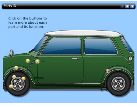
The example below is an excerpt from one of the Allen Interaction courses.  The original is an information-based interaction.  I replicated the interaction using Engage, a form-based rapid elearning tool.  It took less than 10 minutes to build it.

The Rapid E-Learning Blog - Engage rapid elearning interaction Click here to view the rapid elearning demo.

This form-based example demonstrates the benefits of the rapid elearning approach.  You don’t need any advanced programming skills, yet you can still create a rich media experience.  In addition, because you cut the programmer out of the process, you cut out all of the associated meetings and project reviews.  That’s a big time savings.

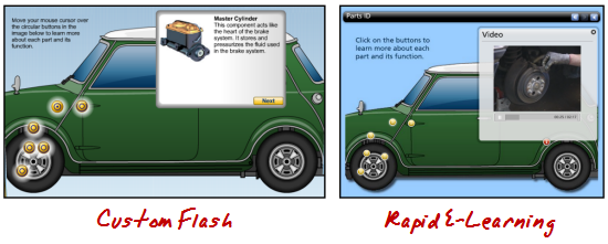
The Rapid E-Learning Blog - custom Flash versus rapid elearning

Click here to see a comparison between the Flash and rapid elearning versions.

In the comparison video, you’ll see that working in a form-based application is pretty easy.  That’s because everything’s pre-built and you just need to add content.  The key to using the interaction effectively is in how you structure the learning experience.

PowerPoint E-Learning Example

The first example is more like reading through a manual than active learning.  You get good information, but you don’t really do anything with it.  This second demo has more interactivity.

Here’s the original built by Allen Interactions.  Typically this type of policy training would be your standard click-and-read course where you see page after page of corporate policy about workplace violence.  I like the way Allen Interactions built the course.  It’s designed in an environment that’s more real life and relevant.  Instead of reading about workplace violence, you are a manager who has to analyze the situation, make a threat assessment, and then refer the people to right departments.  It’s a great learning environment.

Below is the demo version I that I built in PowerPoint.  I scaled it down a bit because I was less concerned about the content and more focused on showing that you can craft a very similar learning environment.  I also challenged myself to use only PowerPoint for the graphics so that it was all done in a single tool.

The Rapid E-Learning Blog - rapid elearning makeover

Click here to view the rapid elearning example.

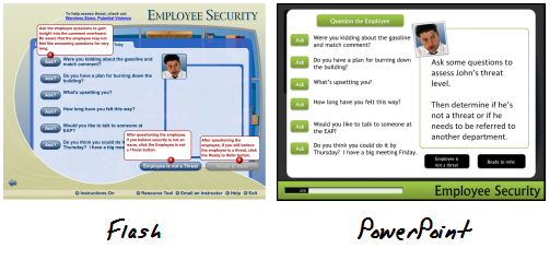
When you compare the two examples, you’ll notice that the original offers a drag and drop; and there’s some logic built into the questioning process.  I had to modify that a bit in PowerPoint because of the limitations when converting PowerPoint to Flash.

The Rapid E-Learning Blog - rapid elearning makeover  Click here to view a comparison between Flash and PowerPoint versions.

However, I can live with the differences because the course content and learning interaction are essentially the same.  Don’t believe me? Ethan Edwards from Allen Interactions said, “…even with the compromises, the PowerPoint piece still has 90% of the impact of the original or more.”

I can live with the compromises.  Here’s why and where I make up for it.

We’ll assume that the same effort was applied to the instructional design regardless of the tool used.  So that’s a wash.  Once I had the content and course structure, it took me about 10 hours to build the prototype from scratch.  That includes building all of the graphics, which was most of the time.

A less experienced person would require a bit more time, but in the long run you still get easy authoring at a good price. And that’s where rapid elearning shines.

Rapid elearning doesn’t mean you skip instructional design and the process of designing a good learning experience.  That still has to happen.  But it also doesn’t mean that you can’t design a good learning experience.  Even if all you have is PowerPoint, there’s no reason why you can’t build engaging and effective elearning courses.  All it takes is a little practice.

Events

Free E-Learning Resources

Want to learn more? Check out these articles and free resources in the community.

Here’s a great job board for e-learning, instructional design, and training jobs

Participate in the weekly e-learning challenges to sharpen your skills

Get your free PowerPoint templates and free graphics & stock images.

Lots of cool e-learning examples to check out and find inspiration.

Getting Started? This e-learning 101 series and the free e-books will help.


The Rapid E-Learning Blog

Last week I was at the Learning Solutions Conference in Orlando and got to spend a few minutes with my mentor, Dr. Werner Oppelbaumer.  I asked him for a quick interview to share what’s happening in his world of elearning and business in general.

The Rapid E-Learning Blog - Tom

The last time we talked, you were working on some new technologies at Werner Labs.  Is there anything that you can share with us today?

The Rapid E-Learning Blog - Dr. Werner

As you know, we’re a research lab and many of our projects are confidential.  However, there are a few that are close to completion that I can share with you and your readers.

With the current economic conditions, every business is trying to cut expenses and maximize the money they make.  This is especially true for the airline industry.  If you’ve done any recent travel then you’ll know how tight the seats are getting.  It’s so bad that you can hardly breathe, let alone do any work.  There needs to be an easy way to capture more personal space.

The Rapid E-Learning Blog - cramped airplane seating

We’ve developed a solution that we’ll be marketing as the Toot-N-Scoot™.  Whenever someone sits too close to you, all you do is press a button and it emits a flatulent sound.  The immediate response is for the close-sitter to scoot away from you—giving you plenty of room to work or eat.

We’re currently working with a few companies like Scentsy to make a fragrance to go with the Toot-N-Scoot™.  We believe that this could be a winner.  We also feel that it can be used for more than just travel issues.  So we’re exploring other industries and have already gotten it into the hands of some movers and shakers.

 The Rapid E-Learning Blog - movers and shakers testing the Toot-N-Scoot


The Rapid E-Learning Blog - Tom

That sounds interesting. I sure could have used it on a recent flight.  But, I have to ask, “How does that relate to elearning?”

The Rapid E-Learning Blog - Dr. Werner

Good question.  We believe that the device has many potential uses.  For example, the current rage in the training industry is informal learning.  This means that many organizations will abdicate the responsibility to train you.  In turn, they will be unleashing a horde of ignorant and pesky co-workers who will be seeking you out for information.

You’ll need a device like the Toot-N-Scoot™ to maintain your privacy and personal space so that you can remain productive.

The Rapid E-Learning Blog - Tom

Interesting concept.  You mentioned informal learning as something that’s currently hot in our industry.  Do you have any advice for those who want to implement informal learning programs in their own organizations?

The Rapid E-Learning Blog - Dr. Werner

I’m glad you asked.  While there is a lot of conversation about informal learning, there are few who are offering practical tips on implementation.  With today’s technology, the successful implementation of informal learning programs is critical to most organizations.

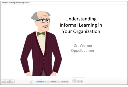
Here’s a recent presentation I gave on how to bring informal learning into your organization.

The Rapid E-Learning Blog - Dr. Werner's presentation on informal learning

Click here to watch Dr. Werner’s presentation.

With the increased use of social media tools, it’s inevitable that the burden to be trained falls into your lap.  Make sure that you stay on top of the emerging technologies and how to manage your organization’s informal learning.

If you want to learn more about Dr. Werner, check out these previous interviews:

If you want to learn even more about informal learning (although from a less pragmatic perspective) check out Informal Learning by Jay Cross.

What tips do you have for starting informal learning networks?  Share them by clicking on the comments link.

Events

Free E-Learning Resources

Want to learn more? Check out these articles and free resources in the community.

Here’s a great job board for e-learning, instructional design, and training jobs

Participate in the weekly e-learning challenges to sharpen your skills

Get your free PowerPoint templates and free graphics & stock images.

Lots of cool e-learning examples to check out and find inspiration.

Getting Started? This e-learning 101 series and the free e-books will help.


The Rapid E-Learning Blog

Just got back from the Learning Solutions Conference in Orlando.  It was a great time.  By nature, I’m a little introverted, but I can tell you that I am truly energized when I get to meet the blog readers.  I love the excitement people have for what they’re doing and glad that we can help.  I also like hearing about the different projects and learning how people with limited resources get their jobs done.  So for all of you who attended the sessions or came by the booth, it was great meeting you and thanks for the encouragement.

One of the questions I get asked a lot is about graphics and visual design.  Most of the elearning developers I meet have to wear multiple hats.  So they’re doing all of the instructional design and graphic design, too.  And they have to work with limited resources. Which means if they can’t create it, it won’t get done.

Here’s what I shared with those who came by the booth and asked about improving their graphic design skills.  I also built a couple of mock ups.  I’ve included the PowerPoint templates for you to download and use as you wish.

Look for Inspiring Design Ideas

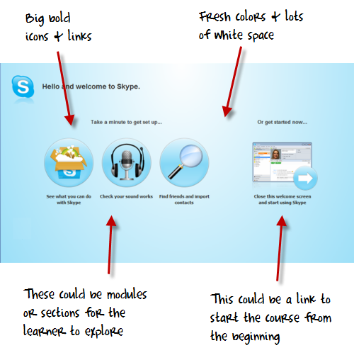
When I find something I like, I do a screen capture and save the image to a “design ideas” folder.  For example, I recently installed Skype and came across their welcome screen.  I liked the layout and colors.  There’s a lot on that screen that could be used in an elearning course template.

The Rapid E-Learning Blog - Skype inspired design

Recreate Good Design

The best way to learn about design is to recreate the design you like.  But your focus isn’t really on a literal recreation.  You don’t want to copy the design.  Instead, you want to think through what it is that you like about it and why.  Then try to use those things you identified and build out your own design.  Doing this has a few benefits:

  • You’ll become more fluent at different design ideas.  This is important because we tend to get good at something and use it over and over again.  Eventually all of our designs start to look the same.  To keep your work fresh you need to be exposed to different creative ideas.
  • Your production process becomes more efficient.  For example doing a few of these templates in PowerPoint will help you get faster using the drawing tools and master layouts.  That will help you in other areas of your elearning course development, as well.
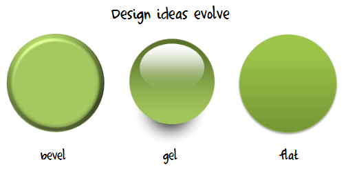
  • Your designs will stay fresh.  A few years ago, bevels were all the rage.  But today, those courses look stale.  Then the Apple gel-look was hot.  Now, it seems like the hot thing is a flatter look.  By being inspired by fresh, new design you’ll always have a contemporary look.

The Rapid E-Learning Blog - graphic design evolves


Create Your Own Interpretations of the Design Elements

Once you build out a prototype based on the original, feel free to play around with the colors and layouts.  I usually move the various elements around to create my own ideas.

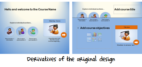
For example, in the images of my prototype below you can see how the first image looked close to the original design.  Then I moved the icon circles around to create a different look.

 The Rapid E-Learning Blog - elearning derivatives

I created a quick screencast that walks through the process of how I built the prototype and some of my considerations when I work in PowerPoint.

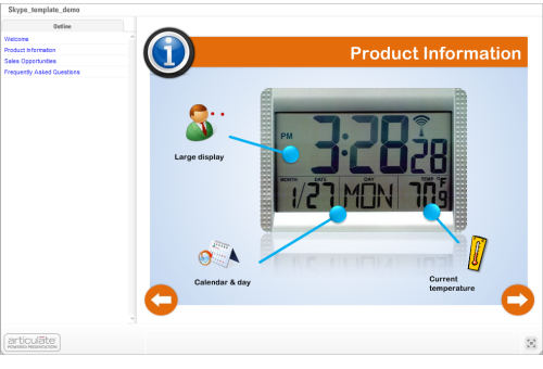
Since I had time on the flight from Orlando to Seattle, I played around with the prototype template a bit more and came up with the design you see below.  I added some course content to it so you can see how it might work in a real course.

image Click here to view the demo.


Since this is a bit more complete of a design, I created a second screencast to walk through how it’s built and what you might need to do if you wanted to customize it yourself.  I’ve also included the PowerPoint templates for you to download.

Click here to view the PowerPoint template tutorial.


The reality for many who design elearning courses is that they have to wear multiple hats, and one of those is graphic designer.  It’s hard to be great at everything.  But by following the techniques above, you can develop skills that will be good enough.

You’ll have fresh designs, learn new production techniques, and approach your courses a different way each time.

If you want to download the templates, you can do so here.  If you use the template design and can share them, feel free to add a link to the comments section.  Or better yet, create your own template and share it with the rest of us via the comments link.

Events

Free E-Learning Resources

Want to learn more? Check out these articles and free resources in the community.

Here’s a great job board for e-learning, instructional design, and training jobs

Participate in the weekly e-learning challenges to sharpen your skills

Get your free PowerPoint templates and free graphics & stock images.

Lots of cool e-learning examples to check out and find inspiration.

Getting Started? This e-learning 101 series and the free e-books will help.


 The Rapid E-Learning Blog - 3 free tools for elearning courses

Who doesn’t like a free application that’s going to make work easier?  Today, I’ll share three free applications that might come in handy as you work on your elearning courses.

Two of the applications come courtesy of a couple of screencast tutorials I saw the other day.  And one comes from a need I recently had publishing a SCORM course.  These three applications are a great complement to this post I previously shared on nine free tools to build better elearning.

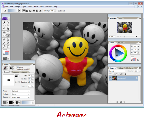
Artweaver

Artweaver is designed as a “painting program,” but for basic graphics editing it’s more than capable and works great.  It lets you control layers, create transparent backgrounds, add text, and apply filter effects.  After making edits, you can save the images in all standard image formats.

The Rapid E-Learning Blog - Artweaver

So if you’re on a budget and looking for a free graphics editor, give Artweaver a try.  Brian Batt has a couple of Artweaver tutorials: creating a transparent background and applying a blur effect.

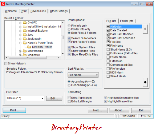
Karen’s Directory Printer

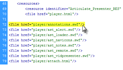
The other day I had to add a bunch of data files to a course that was already published to SCORM.  Adding the files was easy because all I had to do was open up the data folder and drop them in.  The challenge was adding the folder contents to the resource manifest which is a list of all of the files in the SCORM package.

The Rapid E-Learning Blog - ims manifest

Each file in the data folder has a line like the ones in the image above.  Adding one line is no problem.  But in my case I was adding almost ten multimedia elements which equated to about one hundred separate files.  That would have been a lot of tedious work.

My challenge was to create a list of the all of the files I had in the separate data folders and then modify that list with the <file href=”__________”/> code.

The Rapid E-Learning Blog - Karen's Directory Printer

That’s where Karen’s Directory Printer really came in handy.  It let me create a list of the folder contents.  I saved it as a .txt file and then did a quick Find & Replace to add the required <file href…> code.  It made a cumbersome task very easy and fast.

So if you ever have to create a list of the files in a folder, Karen’s Directory Printer is a great way to go.  Here’s a quick screencast to show you how it worked for me.

Poladroid

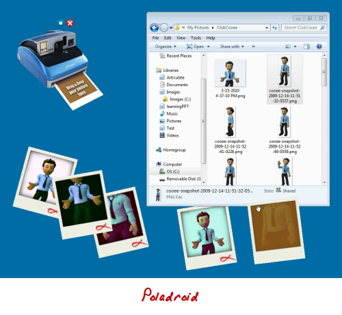
Use the free Poladroid application to create a Polaroid™ image that you can use in your elearning courses.  The application’s really easy to use.  Basically, it opens a camera on your desktop.  All you have to do is drag and drop pictures on the camera and then wait a few minutes as it develops.  Click on this demo to see it in action.

The Rapid E-Learning Blog - Poladroid

Once you have the image you can easily use it in your elearning courses.  It would work well with that folder template I shared a while back.  If you do use the Poladroid application, be sure to look at these two tutorials to get ideas on dressing up the images:

The Rapid E-Learning Blog - folder demo

So those are three free applications for which you can probably find real-world practical uses when building your elearning courses.

What other free applications would you recommend to those who build rapid elearning courses on a budget?  Feel free to share them in the comments section.  Include a practical tip on how you’re using it.

Events

Free E-Learning Resources

Want to learn more? Check out these articles and free resources in the community.

Here’s a great job board for e-learning, instructional design, and training jobs

Participate in the weekly e-learning challenges to sharpen your skills

Get your free PowerPoint templates and free graphics & stock images.

Lots of cool e-learning examples to check out and find inspiration.

Getting Started? This e-learning 101 series and the free e-books will help.


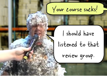
 The Rapid E-Learning Blog - tarred and feathered elearning developer

It’s amazing how fresh eyes can find things you might have overlooked during production. So, before launching your elearning course, it’s a good idea to have others review it.  You want to discover any hidden issues before the big launch.  

Most of the times you find simple issues like typos or broken links.  However, there are times where you run up against larger technical issues.  In either case, it’s good to expose those issues prior to releasing the course for consumption, where you could be exposed to ridicule, and possibly tarred and feathered.

In this post, we’ll explore some ideas around the review process and getting your course ready to go.  Keep in mind that we’re at the end of the production process.  Ideally, somewhere at the beginning of your project you created a prototype course.  This is where you present the general flow and content of the course, and your client affirms that it’s all good.  It’s also when you want to invite some learners to review it as well.

You’ll always have to make some adjustments, but during the final review, there really shouldn’t be any major surprises.  It’s more about a final quality review check, making sure the course is tight, and that everything is going to be ready for the live implementation and launch.

Client Project Review

Prior to piloting the final course with your learners, the elearning developer, client, and subject matter experts should go through the course.  At this point, you’re almost done, so there shouldn’t be major changes.  What you’re looking for is stuff like this:

  • Are there any typos and grammatical errors?  You should do this before you meet with the client so you don’t appear sloppy.  But when you look at the same content over and over again, it’s easy to miss those things.  I’ve also found that sometimes you’re better off having a couple of “missed” typos to distract the client so they don’t nitpick things or throw a wrench in the process by suggesting additions.
  • Are links and external resources working? Is the contact information correct?  All links working and going to where they should?  Review anything that the learner will click on outside of the course content to make sure they work and go to the right places.
  • Is all of the content there?  There are some things you don’t learn about the course until you’re almost done.  This is especially true of some clients who don’t fully understand what’s going on until they see the final product.  Make sure the flow is right and that the course content supports the information in the course.  I’ve been on projects where we found that too many assumptions were made about the content and we didn’t see the gaps until after the course was ready to go.
  • Is the content accurate?  Sometimes information changes prior to the course launch.  This is especially true of policy and compliance training.  I was on a project once where some regulations changed near the end.  I’ve also been on projects where we were building technical training at the same time as developing the technology.  In that environment, sometimes the content is a moving target.
  • Are implementation plans in place?  What has to happen once you have a complete course ready to go?  Each organization is different but there’s usually some sort of marketing component that goes with a course launch.  You also need to make sure that the IT or LMS folks are onboard.  There’s nothing worse than delivering a really cool elearning course and learning that none of the PCs are equipped with speakers or headsets yet.

If you’re lucky, the client review will be smooth and you’ll make minor adjustments.  Unfortunately, these types of projects can start to get screwy at the end.  To avoid some of this, set clear rules.  The first being that at the forefront of the project you get an official sign off on what will be delivered and by when.

Another suggestion is to not bring in a new person for the final review.  Here’s a common situation.  The client is so happy with the course that she invites her boss to attend the review.  During the review, the boss who has not previously looked at the content starts to recommend changes.  Since he’s the boss, you’re kind of stuck.

Learner Project Review

The review you do with your client is going to be different than the one you do with your learners.  With your client, you review the project goals and agreed upon deliverables.  On the other hand, when you review the course with your learners you’re testing the course’s effectiveness.  Here are some things to pay attention to:

  • Is the navigation clear?  Does the learner know how to go from A to B?  While you don’t need to go overboard with instructions, you need to make sure that it’s clear what the learner has to do to advance through the course.
  • Have you provided the right instructions?  If you want the learner to do something that’s a little different than the normal navigation, make sure to provide clear instructions.  This is especially true of interactions and scenarios where they need to make choices or interact with content on the screen (like a drag and drop).
  • Is your course too sexy for its body?  Sometimes we want to go outside the box to create something unique.  While there’s nothing wrong with that, using non-conventional navigation and course structure can be confusing to the learner.  If you have to build a training module on how to use your course, that might be a sign to revisit the user interface.  In either case, be careful to listen to your learners if they complain about the structure. What’s obvious to you might not be to them.
  • Watch the learner go through the course?  Often we solicit feedback by sending a course link and having the learner forward their thoughts.  However, it’s valuable to sit and watch them go through the course.  You can see how many times they click, what they look at, and get a sense if anything in the design is confusing.  At a minimum, find at least one person who you can watch go through the course.
  • Does the course meet the learning objectives?  I’m not a fan of waiting to test this on the final run through.  Your best bet is to prototype the course and test its effectiveness before investing the time building it.  However, you want to make sure that the final product produces results.  Does the learner meet the learning objectives?  Does the assessment provide the information you need? 

A challenge with learner reviews is that they can be ego crushers.  You put in a lot of time to craft the course, perhaps trying a few new things.  And in just a few minutes, all of your joy comes crashing to the ground at the first criticism. 

Because of this, it’s tempting to discount the feedback you get from the reviewers, especially since they’re not “trained instruc
tional designers” and probably don’t always understand what you’re trying to do.  Don’t fall for it.  Be humble and really consider their feedback.  It’ll help you build better courses.

Even if all you have is one person with which to test your course, that’s fine.  My advice is to find someone who has no interest in elearning and might even be a bit technically challenged.  Definitely stay away from people who build courses or know something about UI or usability design.  They tend to complicate things with their professional opinions. 

These are some basic tips for your final project review.  I see the client review as a way to do one final quality control check and to celebrate your success; and the learner review as a way to test that everything works as planned for those who have to take the course. 

Like I said earlier, you don’t want to wait until the end of the project to find out if your course works or not.  A good practice is to quickly mock up the course in PowerPoint and then test out your ideas, navigation, and flow of content.  If there are any major issues, they’ll surface there.  That will save you a lot of time down the road.

What are some of your experiences during the final review process?  What types of issues have you run into and what would you have done differently?  Please share your thoughts by clicking on the comments link.

Events

Free E-Learning Resources

Want to learn more? Check out these articles and free resources in the community.

Here’s a great job board for e-learning, instructional design, and training jobs

Participate in the weekly e-learning challenges to sharpen your skills

Get your free PowerPoint templates and free graphics & stock images.

Lots of cool e-learning examples to check out and find inspiration.

Getting Started? This e-learning 101 series and the free e-books will help.


The Rapid E-Learning Blog - who should decide

The Learning Solutions Conference & Expo is only a couple of weeks away.  And I can say that I am really excited!  A few weeks ago, I wrote about how you can change the world by volunteering to build an elearning course for one of the LINGOs organizations. 

Thanks to all of the blog readers who volunteered.  From what I understand, they’ve filled all of the requests and have gotten hundreds of thousands of dollars in free course development.  That’s what I call changing the world!  I’m anxious to see all of the LINGOs courses.   

Rapid E-Learning Blog - LINGOs link

David Anderson and I also took on the challenge and volunteered to help.  Just like many of you, we had a short period of time to assemble the content and build an elearning course.  It was interesting to collaborate with a client who was in a different country and we were both working from different locations.  I can say we learned a lot on this project.  You’ll hear more about that after the conference. 

However, during the design process we had an interesting discussion about some course navigation and when to provide access to resources during a decision-making scenario.  It’s a conversation that’s common to course design so I thought I’d share the gist of it. 

The Set Up

Part of the course puts the learners in a situation where they have to make decisions.  At this point they might not know all of the information to make the right choice.  That’s OK because it’s kind of like real life.  We’re always faced with decisions where we don’t have all of the information.

However, we did want to create a way for the learner to get information prior to making a decision.  So we added a “learn more” feature.  We liked the flexibility.  A confident learner could skip the information and go right to making a decision.  But if she wasn’t confident, she had resources available to make an informed choice.

Before deciding on our path, we wrestled with when and where to offer access to additional information.

Here’s the Dilemma

Suppose you create a similar type of interaction.  You want the learner to make a decision.  The decision will produce feedback that provides more detail.  Here are your design choices:

  • Give the learner access to “more information” prior to making the decision.  But don’t provide it afterwards outside of the feedback.
  • Don’t provide access to information prior to the choice.  Force the learner to make an educated guess.  Add a “review information” option after the decision.
  • Offer access to additional information before and after the learner makes a choice.

Option 1: “More information” available prior to choice

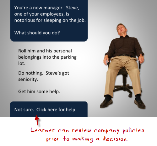
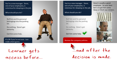
In the image below, you are challenging the learner to make a decision.  Some people already know what to do (or think they do) so they’ll just go ahead and make a decision.  Others aren’t sure, so they’ll want to look up the organization’s policies and then make their decision.

The Rapid E-Learning Blog - offer access first

What’s good about this approach is that the learner gets to assess her level of understanding first and then determines whether or not she needs additional information.  And a more experienced learner isn’t required to go through a bunch of extra information prior to making a choice.

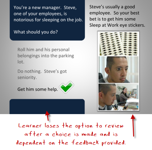
After the choice is made, you provide feedback with no offer for additional information.  If the learner gets it wrong, you provide the right information in the feedback and encourage her to make “more informed decisions” on future decisions. 

The Rapid E-Learning Blog - offer access after

If you have the right type of scenario, you can use this approach to reinforce being certain of decisions prior to making them.  My guess is that the learner would become more aware of her uncertainty and want to research her choices prior to making a decision.  It allows her to assess what she knows and then build the level of understanding she needs to continue. 

Option 2: Add a review option only after a choice is made

This next option is to not provide a “more information” feature prior to the choice.  The learner has to make a decision based on her current level of understanding.  If she’s not sure, she has to make an educated guess.  This ambiguity creates some tension which you can leverage to encourage learning.

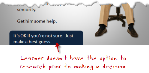
 The Rapid E-Learning Blog - don't offer access

It’s not easy to make a choice like this because it puts the learner in a vulnerable position.  No one likes the risk of being wrong.  However, that risk is motivation to learn.  And there’s nothing wrong with a little tension and uncertainty.  You should have the freedom to fail in an elearning course.

Many elearning scenarios and choices are kind of lame; and the learner can quickly spot the correct answers.  But if you created choices that are challenging and not easy to guess, it causes more reflection on the viability of the choices.  This in itself is a great learning vehicle, regardless of whether or not the right choice is made initially. 

Option 3: Provide information before and after the choice

This third option is the safest.  You provide a feature to access additional information for the learner who wants to make an informed decision first.  And after a decision is made, you provide access to additional information.  Thus, the learner always
has access to the information and resources to help her learn.  And that’s a real benefit.

 The Rapid E-Learning Blog - offer access before and after

This approach definitely helps with navigating the course content.  The truth is that many elearning courses can be tedious.  In most cases, the learner’s not asking to take the course and just wants to complete it.  So it makes sense to provide as much freedom to the learner as possible.  And offering access to additional information at all stages in the course is valuable.

Personally, I like the ambiguity angle.  Life isn’t tidy like the third option.  And many of us just tend to make decisions and then learn from the consequences.  Given the right type of scenarios and course content, I prefer a “throw them into the pool” approach, where they make decisions and learn through the consequences.

Which approach do you prefer?  When would one be more valuable than another?  Share your thoughts by clicking on the comments link.

Events

Free E-Learning Resources

Want to learn more? Check out these articles and free resources in the community.

Here’s a great job board for e-learning, instructional design, and training jobs

Participate in the weekly e-learning challenges to sharpen your skills

Get your free PowerPoint templates and free graphics & stock images.

Lots of cool e-learning examples to check out and find inspiration.

Getting Started? This e-learning 101 series and the free e-books will help.


The Rapid E-Learning Blog - contrast to communicate

Contrast is a key part of your course design.  In fact, it’s one of the foundational principles in visual design.  Many people know the acronym, CRAP (or CARP if you’re an ichthyolatrist) which stands for: contrast, repetition, alignment, and proximity.  They are the four essential design elements.

Contrast allows you to distinguish the content on the screen.  It helps the learner navigate what’s there, discern relationships, and determine what’s most important.  There are a lot of ways to create contrast.  Let’s look at a few simple examples.

Contrasting Text

The images below are from a previous where I discussed a few graphic design principles.  Both images have the same information.  However, by creating titles, body text, bold text and underlines I’m able to organize the information and provide direction for the learner. Without more than a few design elements I communicate how the information is organized.

The Rapid E-Learning Blog - all the text is the same

The Rapid E-Learning Blog - contrast can create distinction and order

Contrasting Size & Proximity

There are other ways to create contrast—size being one of them.  One way is by changing the font size.  You can see it in the image above and in the text of this blog post.  The heading title is larger than the rest of the text.  This lets you quickly scan the titles and make an assumption about how the information is organized and what it contains.

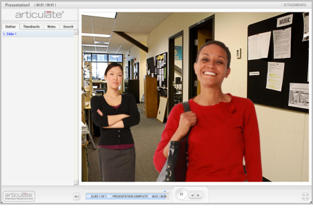
In the image below, there are two characters.  However, most people are first drawn to the lady in the front because of her position and size in relationship to the other person.  She is the focal point of the scene and can communicate being the main character.  Most likely the first question is, “Why is she so happy?”

The Rapid E-Learning Blog - size and proximity

Contrasting Color

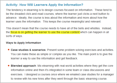
Another great way to create contrast is through the use of color.  In the example below, I used the bright yellow highlight to focus on a single point of information.  This could be a good technique for those times when your client gives you a text heavy slide and isn’t willing to budge.  This would really work well combined with animation and audio.

The Rapid E-Learning Blog - use color for contrast

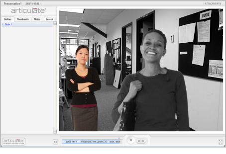
To show how color can change the meaning of the content, let’s revisit the earlier image.  By turning the color off of everything but one character, the point of focus now is the colorized person.  So instead of asking why the first lady is happy, we might be wondering what’s wrong with the second lady and why she appears upset.

The Rapid E-Learning Blog - contrasting color can draw your attention

A bonus tip is emotion.  In the image one person is happy, while the other has a smirk.  What’s the story there?

Contrast is a powerful way to communicate ideas and an effective way to use your graphics.  There are all sorts of ways to use contrast in your design, and not just with your graphics.  With your next course, make a deliberate attempt to use it and see what happens.

What are some ways you’ve used contrast in your elearning design?  Do you have any good examples?  Feel free to share them via the comments link.

Events

Free E-Learning Resources

Want to learn more? Check out these articles and free resources in the community.

Here’s a great job board for e-learning, instructional design, and training jobs

Participate in the weekly e-learning challenges to sharpen your skills

Get your free PowerPoint templates and free graphics & stock images.

Lots of cool e-learning examples to check out and find inspiration.

Getting Started? This e-learning 101 series and the free e-books will help.


The Rapid E-Learning Blog - roadmap for elearning

When we’re new and just getting started with elearning, we need templates and project plans to guide us.  On the other hand, experienced developers rely less on those resources because they have more experience and a deeper understanding of what it takes to create an elearning course.

Think of it like driving around town. When I first moved to town, I needed a map.  But today, I don’t use a map.  In fact, even when I look for streets with which I’m unfamiliar, I can avoid using a map because I have a big picture understanding of the town’s layout and crossroads.

On top of that, if I run into a road block, I can quickly make adjustments to my route.  However, if I was following a print out with directions, once I hit a roadblock, I’d be stuck.  And as my wife would say, I’d be stuck there a long time reluctant to ask for directions. 🙂

Templates are fine, but they’re based on practiced routines rather than solving problems.  This is OK when getting started, but practiced routines can be constricting because the focus is on conforming to the routine rather than solving the problem.

We see that a lot of this in our industry that relies so heavily on templates, ADDIE project plans, style guides, and stringent branding requirements.  Reliance on these rigid guidelines doesn’t always fit the needs of the elearning project and in many cases leads to inferior course design.

The Rapid E-Learning Blog - 3 part overview of course design

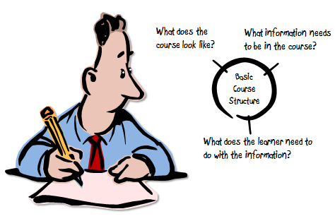
Today, instead of offering a project plan or template for elearning, I thought I’d offer a basic project structure for a course.  Think of it like a big picture project plan.  To keep it simple, let’s break the course structure into three main chunks.

  • Visual design: determine the look and feel of the course
  • Information design: determine what content belongs in the course
  • Activity design: how the learner applies or interacts with the course content

Visual Design: How Will The Course Look?

The two images below come from a recent CrunchGear article.  Don’t worry about what the products do or the merits of one product over another.  If you only had five minutes to play with one device, which one would it be?

The Rapid E-Learning Blog - Apple iPad compared to Amazon Kindle

If you’re like me, you’d choose the one on the left.  It’s colorful and inviting.  I want to pick it up and start playing with it.  The other one just doesn’t look as inviting.  Think about your course design.  Is it inviting from the start?

Design matters.  It conveys to the learner that what they’re doing is important and worth their time. Consider yourself a set designer for a Broadway play.  You are given a limited amount of space, and in it you need to create an immersive experience.  Your goal is pull the learner into the course first by capturing their attention and then by creating a learning environment that is both relevant to the content and engaging to the senses.   I like this quote about set design:

“The scenographer visually liberates the text and the story behind it, by creating a world in which the eyes see what the ears do not hear.”

This doesn’t have to be complicated.  We’re not all professional graphic artists.  But there is room for us to place more emphasis on the visual design of our elearning courses.

Below are before and after examples both created in PowerPoint.  The first example is typical of what you might see in a rapid elearning course.  The second version is the same content.  The design is more interesting and relevant to content.  In addition, instead of a sterile white slide, it’s more like walking into the forest to learn more.

The Rapid E-Learning Blog - before and after examples

Information Design: What Do People Need to Know?

A great looking course is only one part of the process.  You need to have great content to go with it.  Assembling the content rests on a few core areas:

  • Clear objectives: understanding desired results and how to get there
  • Appropriate content: information that supports the learning objectives
  • Relevance: information is meaningful and relevant to the learner

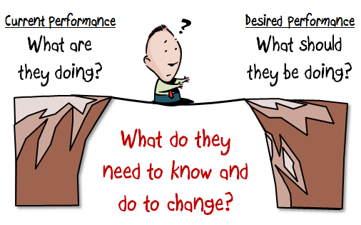
There are all sorts of models and ways to collect the information you need for a course.  Your course content is determined by your objectives.  To determine your objectives, you look at your current results and compare them to where you need to be.  The comparison should identify a gap.  This helps keep your objectives performance-based and is the basis for how you measure success.

The Rapid E-Learning Blog - filling the gap between current and desired performance

Once you know where you need to be, you determine why you’re not getting there.  What does the learner need to do that’s different than what they do today?  This information helps you gather the right content for the course and build the right type of course.

The Rapid E-Learning Blog - determine what the learner needs to know and do to change performance

Activity: How Will Learners Apply the Information?

The tendency in elearning is to design courses focused on information.  These tend to be the dreaded click-and-read courses, where the learner just clicks a next button to advance.  Ideally, the course is less about the information and more about how the learner uses the information.  This keeps the course meaningful and relevant.

This doesn’t mean that the course needs to have all of the bells and whistles.  Instead, the focus is on getting the learner to use the course content which can happen in all sorts of ways.

Ways to Apply Information

  • Case studies & scenarios: Present some problem solving exercises and activities.  You can make these as simple or complex as you like. The main point is to give the learner a way to use the information and get feedback.
  • Blended approach: Mix elearning with real-world activities where they get the core information online and then it’s integrated in some team or class discussions and exercises.  I designed a courses once where we emailed case studies for a manager to review with his new hires after they went through the basic elearning course.
  • Social media: There are all sorts of ways to make social media part of the elearning process.  Have the learners work through exercises via a wiki or discussion forum.  You could challenge each learner to present one new thing learned and how it can be applied on the job.

This is a basic overview of designing an elearning course.  The three areas are not exclusive.  They go hand-in-hand; and together they make a complete course.  When you build your next course, ask:

  • Is the course inviting? Does the look and feel of the course support the content?
  • What information does the learner need?
  • What do I expect them to do with that information? Can they do it in the course?

If you keep this simple framework in mind, you’ll be on the road to creating effective and engaging elearning courses.  What other tips would you offer to someone just getting started?  How about good book ideas? Click on the comments link to share your thoughts.

Events

Free E-Learning Resources

Want to learn more? Check out these articles and free resources in the community.

Here’s a great job board for e-learning, instructional design, and training jobs

Participate in the weekly e-learning challenges to sharpen your skills

Get your free PowerPoint templates and free graphics & stock images.

Lots of cool e-learning examples to check out and find inspiration.

Getting Started? This e-learning 101 series and the free e-books will help.