The Rapid Elearning Blog

Archive for the ‘Uncategorized’ Category


The Rapid E-Learning Blog - create silhouettes from clip art 

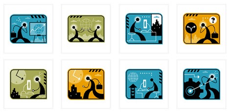
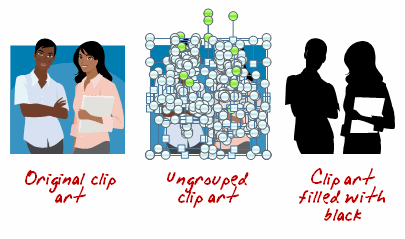
In a recent post, I showed how to easily create your own silhouette characters.  Today I share show some ways to use those silhouettes in your elearning courses.  Something to keep in mind is that the silhouette doesn’t need to be confined to people.  You can use them on objects, as well.

Create a Progress Meter

As a visual cue, use silhouette characters or objects to create a progress meter.  As the learners advance, the silhouettes change to real images.  This lets them see their progress through their course and where they’re currently at.

The Rapid E-Learning Blog - silhouettes as a progress meter in your elearning course

Create Section Breaks

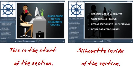
Use silhouettes as a way to divide sections within the course.  In the example below from Helmsmanship, you can see that the start of the section has the image and shares a core idea or theme.  The following slides contain a silhouette of the core section image.

The Rapid E-Learning Blog - silhouettes as section indicators

Isolate Information

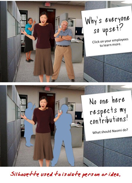
Silhouettes are great to draw the learner’s focus and isolate information.  For example, in the first image I introduce a group.  However, when I want to focus on just one character, I use silhouettes and only show the character of interest.

The Rapid E-Learning Blog -

Create Contrast

A great way to get a person’s attention is to create contrast.  This is easy to do with silhouettes.  I like the example below from a Goodwrench ad.  By removing the car, you can tell something’s missing.  You can apply the same effect to an elearning course. 

First, the contrast draws your attention.  Second, it can become a mechanism to find out what’s missing.

goodwrench

Be Politically Correct

It never fails that when you build elearning courses, HR shows up to make sure no one’s offended.  While there’s obviously a lot of value in diversity, it can still be one of the most frustrating parts of building courses as you navigate which ethnicity gets to represent the good manager and who gets to be the bad example.  A good way to work around this is to use silhouettes for your characters.  This way you can be race and gender neutral and make sure no one’s offended. 🙂

diversity

Creating silhouettes is pretty easy.  And using them in your elearning courses can add a little bit more visual intrigue and help make your courses more engaging.  What are some other examples of how you’d use silhouettes?  Click on the comments link to share them with us.

Events

Free E-Learning Resources

Want to learn more? Check out these articles and free resources in the community.

Here’s a great job board for e-learning, instructional design, and training jobs

Participate in the weekly e-learning challenges to sharpen your skills

Get your free PowerPoint templates and free graphics & stock images.

Lots of cool e-learning examples to check out and find inspiration.

Getting Started? This e-learning 101 series and the free e-books will help.


There’s a lot of debate about interactivity in e-learning.  You have some people who think e-learning is not valid unless it has a high level of interactivity. Anything that’s not interactive is just a “boring click-and-read course.” On the other hand, there are a lot of people who equate interactivity with nonsensical games. So to them, any interactivity is just extra time and expense.

The Rapid E-Learning Blog - excited elearning customer

I’ve worked with clients who thought interactivity was adding a rollover or slick animations.  They’d “ooh” and “aah” over the dumbest things.  It was easy to mask poor instructional design with cool effects and animations.  On the flip side, it’s easy to go overboard and build a lot of interactivity, that while interactive, isn’t really necessary or effective.

I was at a conference once where someone was demoing an e-learning course.  It was integrated with a game.  The goal was for the learner to master levels in the game to get to new pieces of information.  While the game was pretty cool, it was out of context for the learning.  Since the game was irrelevant to the learning objectives, I’d agree with one of the bystanders who said that it “was expensive and a waste of time.”

A common challenge we face in building courses is that the content owner has put a lot of effort into creating the content (like a 300 slide presentation) and is reluctant to lose any of the data or look at ways to rework it and make it more interactive because to them, everything is equally important.

In fact, when I get emails asking about interactivity, it usually involves the person trying to convince a customer or subject matter expert to make their courses more interactive.  I usually advise them to take a step back and build a foundation for the discussion about interactivity.

All E-learning Projects Are Not Equal

The first thing I like to address is that not all e-learning projects are the same.  Some are designed around only sharing information.  They don’t have any performance expectations tied to them.  How you approach interactivity in this type of course is a lot different than what you’re going to do in a course where you have very clear performance expectations and are looking for specific results.
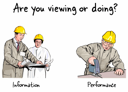
 The Rapid E-Learning Blog - When it comes to elearning, are your learners viewing or doing?

There’s also a big difference between a project commissioned by a high level executive who has $100,000 or more to spend and the ones most of us have to build with no budget.  So, while you have a whole gamut of interactivity to choose from, you still have to work within the context of your skills and resources.

The good thing is that even if you’re working with just PowerPoint, you can still build effective levels of interactivity.  You just don’t have the same programming capabilities.

Here’s a simple way to look at interactivity.  It doesn’t represent a progression of interactivity.  Instead it’s more like three ways to view interactive content.  This is how I usually discuss it with my subject matter experts and clients.

Design an Interactive Look & Feel

If you’ve ever gone to a Broadway play, I’m sure you’ve walked way amazed at the brilliance of the set design and what they can do to pull you into their story, except for Cats, of course. 🙂 In the same way, when you build your course, you have to determine how to pull the learner into the “story.”  You’re the set designer.

Look at the image below.  At this point we don’t see any interactivity.  Which screen is more inviting?  Couple the right graphics with an interactive user interface and you have the foundation for a good course.
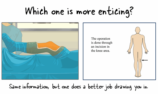
The Rapid E-Learning Blog - entice your learners with good course design

You’re responsible for crafting the ambience and feel of the course that draws the learner in.  This is all part of the user interface and visual design.  Everything from colors, images, and animations.  All of the rollovers, effects, and transitions contribute to the look and feel of the course.  How your learner interacts with the screen elements is part of the course’s interactivity.  It’s not the critical part, but it does play a key role in how the course is perceived.  And for many people, perception is reality.  It’s a great way to have your learner get into the content rather than just hearing and seeing it.

Create Exploratory Content

Most people don’t learn in a linear fashion.  They tend to explore their environment.  In fact, exploration is a critical part of learning.  Despite this, many e-learning courses do two things that are contrary to what’s best for learning: force learners on a linear path and lock navigation that doesn’t allow for exploration.

I know that there are times when you’re required to lock the course navigation.  In those cases, you do what you have to do.  However, most of the times the rationale for locking navigation is misguided.
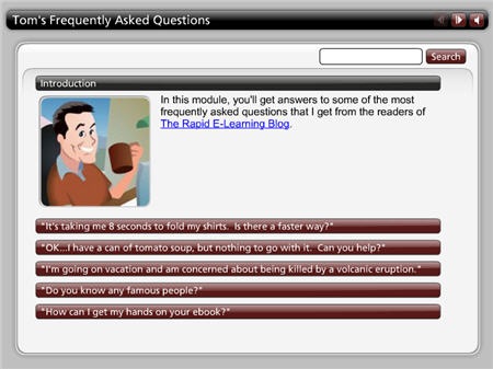
The Rapid E-Learning Blog - Ask Tom FAQ

Click here to view the dem

Even if you have to lock the navigation, there’s no reason you can’t at a minimum throw in something like an Engage interaction or something else that allows the learner to click around on the screen and collect information.  The example above is from a previous blog post.  Something like this could be inserted on a single slide.  What would be five slides of information could be one slide with five areas for the learner to explore.

If you want them to learn, free up the navigation and let them discover information.  They’ll feel empowered and more in control.  And that sets the stage for better learner.

Provide a Reason to Use the Information

Regardless of the technology you use, the essential part of interactivity is relevance.  In fact, the more relevant the content is, the less you have to rely on interactivity because you’re better able to tap into the learner’s motivation.

Considering relevance, what you want is an environment where they need to do something based on what they should understand about the information in the course.  A great way to do this is to just “throw them into the pool,” so to speak.

Are you teaching them about a new policy?  Give them a situation where the policy applies and let them work through it, with your course as a guide.

Teaching them math? Give them a reason to use math.

Want them to learn some history?  Make them a character of the time and have them deal with the issues critical to that time period.

The subject matter shouldn’t limit what you can do.  If it’s something that needs to be learned, there’s a reason why.  Use that reason as the basis for the interaction.
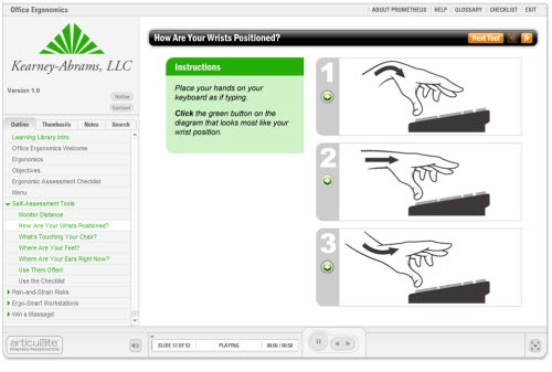
The Rapid E-Learning Blog - ergonomics example from Prometheus

One of my favorite examples of a simple, yet interactive rapid e-learning course is the one above, created by the crew at Prometheus.  It’s an ergonomics course and they used the Engage interactions (that most people use just to share information) as self-assessment tools.  The learner has to assess her personal ergonomics and then interact with the course content.  It’s an effective use of a rapid e-learning tool to do more than click and read.

Your Limitation is Creativity Not Technology

There’s a difference between my neighbor’s Mercedes and my Nissan.  Considering that I paid about 20% of what he paid, I don’t expect the same product.  However, if I need to go from one place to the next, my solution works just fine.

The same is true when it comes to your e-learning course.  Even if all you have to use is PowerPoint, there’s no reason why you can’t build some level of effective interactivity for your e-learning course.

As I said earlier, interactivity can mean many things and what you can do depends on your budget.  With all that said, there’s really no reason why even a simple low budget course can’t have interactive elements.  What tips do you have for those who want their e-learning courses to be more interactive?

Events

Free E-Learning Resources
Want to learn more? Check out these articles and free resources in the community.

Here’s a great job board for e-learning, instructional design, and training jobs

Participate in the weekly e-learning challenges to sharpen your skills

Get your free PowerPoint templates and free graphics & stock images.

Lots of cool e-learning examples to check out and find inspiration.

Getting Started? This e-learning 101 series and the free e-books will help.


Sometimes we get so busy that we lose sight of the great resources available to us.  It’s not until you pull your head up from your desk and look around that you realize what’s available.  That’s why it’s important to be connected to other people who have similar interests or do similar work.  You’ll learn from them and have access to all sorts of information.  If you think about it, there’s really not much that you know (if anything) that you didn’t learn from someone else or because of someone else.

Last week I was at PowerPoint Live 2009 in Atlanta where I spent some time with people in the PowerPoint community.  The thing that impressed me the most was the power of connecting with others.  I met a few blog readers, many of the PowerPoint MVPs that I’ve followed over the years, and was reminded of a few tips and tricks that I can use in my rapid elearning courses.  I’ll share some of the tips and tricks in some future posts.

Today, I’d like to share a little of what I learned from the PowerPoint community and provide some great resources and tools that will help you do a better job building your elearning courses.

The Community Inspires New Ideas 

  • PowerPoint MVP Glen Millar shared quite a few animation tips.  His session inspired a few ideas that could work well for rapid elearning courses although some of the animations may be a bit too much.  In either case, the session inspired a few ideas, you’ll see them in some future posts.
  • Lesa Snider, Chief Evangelist for iStockphotos, talked about graphic design in your PowerPoint slides.  She has a site with some free Photoshop Elements tutorials and tips.    During her session she was zooming in and out of her application.  This made me consider how I’d do that in Screenr and possibly during my own presentations.  So I found a couple of free screen zooming applications.  You can find links below. 
  • The Twitter stream for the conference was a great way to meet people and to get some additional information about the other sessions. In fact, I had a bunch of people ask for some PowerPoint info so I put together a free blog that contains the Twitter stream for #pptlive, some blog posts, and free PowerPoint tutorials.

Free Software

  • AlacrityPC: allows you to shut down unnecessary services and programs before you run a resource intensive application.  This comes in handy doing screencast tutorials, working with multimedia authoring applications, or freeing resources during conference presentations.  Thanks to Glenn for the tip.
  • ZoomIt (PC): ZoomIt is screen zoom and annotation tool for presentations that include application demonstrations.  Click here to view the ZoomIt demo.
  • OmniDazzle (Mac): a set of fun and useful enhancements that help you highlight certain areas of your screen, create visual effects, and track the location of your mouse pointer.  Click here to view the OmniDazzle demo.

PowerPoint MVPs

One of the best resources to learn more about PowerPoint comes from the MVP sites.  These are people who are noted for helping the community of PowerPoint users.  They have all sorts of tips and tricks.  It’s worth bookmarking their sites.  Here are some of the MVPs I met.  You can find more at the PowerPoint MVP site.

Microsoft PowerPoint Help & Resources

PowerPoint is a versatile tool.  I can think of few applications that have as many diverse uses.  People use it to create presentations, storyboards, elearning, animations, graphics and much more.   The trick in getting the most out of PowerPoint is to tap into the community of resources.

The Microsoft site has all sorts of resources for those who want to learn more about PowerPoint.  There are tips and tricks, tutorials, blog posts, and templates.

The Rapid E-Learning Blog

I’ve also included a few of the posts that I’ve written concerning PowerPoint.

Being around others who share similar interests is inspiring.  First, you always walk away with great information that will help you do a better job.  Most important though is that you feel connected to something bigger.  And it’s this connection that is exciting and keeps you motivated to learn more.

What do you do to stay networked to other elearning developers?  Share your thoughts in the comments section.

Events

Free E-Learning Resources

Want to learn more? Check out these articles and free resources in the community.

Here’s a great job board for e-learning, instructional design, and training jobs

Participate in the weekly e-learning challenges to sharpen your skills

Get your free PowerPoint templates and free graphics & stock images.

Lots of cool e-learning examples to check out and find inspiration.

Getting Started? This e-learning 101 series and the free e-books will help.


A few weeks ago we launched Screenr, a free screencasting application that is easy to use and great for quick tutorials and elearning courses.  I like it because it’s easy for me to quickly answer the many questions I get in the user community and through the blog.  Not only can I answer the questions quickly, but I now can share those same tips with other blog readers and members of the community.

And it’s not just me doing the sharing.  There are many others also sharing their tips and tricks.  In fact, on the Word of Mouth blog, we compiled over 100 rapid elearning tutorials that have been created with Screenr since its launch.  Check them out.

The Rapid E-Learning Blog - 101 Rapid E-Learning Tutorials

Screenr’s pretty easy to use.  However, like any new application, the more you use it the more you learn a few time saving tips and tricks.  Today, I’d like to share some tips and tricks that are going to help you create the best screencasts possible.  While I’m focusing on Screenr, many of these tips are relevant regardless of your screencast application.

Prepare Your Environment

Your success begins before you start recording.  You want good quality audio and the right work flow.  This only comes with preparation.

  • Record the best audio you can by using a good microphone.  You can get a decent microphone for less than $100.  And if you do a lot of recording, it makes sense to invest in a good one.   Here’s an example of two different microphones on the same laptop in the same room:  $30 headset and $72 desktop (with no pop filter or any other type of adjustment).  You’ll notice that the headset microphone doesn’t sound as good.  You also hear the pops of air and movement of the mouthpiece.  That’s why I use a desktop microphone. It just sounds better, which most likely means less editing and retakes.  Plus bad audio is worse than a bad screen.
  • Control the ambient noise.  Turn off the A/C and fans.  Turn off the office machines.  Sometimes you’ll pick up some noise or humming when the microphone is too close to the computer, speakers, or other electronic devices.  If you have a lot of ambient noise, try screening it out by playing some music in the background while you record.  No Metallica.  Just something soft with no vocals.
  • Get rid of distractions.  Is there a flickering light overhead or one coming from a nearby electronic device?  Does your chair squeak?  Is your phone ringer off?  Get rid of those things that might make noise, flash lights, or do something else to get your attention while recording.  Put them out of sight while you record.

Prepare Yourself

It’s all about having a plan and executing it.  Focus on what you’re going to say and make it brief.

  • Have some water handy.  I find that I do a lot of retakes on that opening line, so I tend to start and stop my screencasts.  This causes my throat to get dry really fast.  It’s easy for me to go from sounding like a smooth rapid elearning coach to Lauren Bacall in just a few takes. 🙂
  • Get comfortable.  Position your microphone and screen so that you’re comfortable while doing the recording.  Two problems I always run into:  I tend to lean into the screen which impacts my breathing.  And my mouse runs out of room or gets tangled with other cords on my desk.  These things distract me.  And when I lose focus I mess up the recording; which means I have to stop and start over.
  • Try to use less than 5 minutes.  Screenr gives you 5 minutes.  That doesn’t mean that you have to take all 5 minutes for the screencast.  An ideal screencast is 2-3 minutes.  If you find that the screencast is long, just break it into chunks.

General Recording Tips & Tricks

Good screencasters make it seem like they just press record and start talking.  But that’s usually not the case.  It just looks and sounds that way.  Here are some general tips that will help you record better screencasts.

  • Set up your screens.  Do a quick walk through and make sure that everything you need is available.  Many of my demos require that I jump from one application to another.  I have them all open and sized to the record window so that when I go back and forth it looks seamless and flows well.  I also make sure that all of my assets and files are easily available.
  • Supersize!  Sometimes the screencasts are of a larger resolution and get scrunched down to a smaller window, which means you might lose some detail.  To help make things more visible, you can increase the font size, make your icons bigger, and even increase the size of your mouse arrow.  Sometimes I’ll change the resolution of my computer and do a full screen capture at a lower resolution.  When I bring it back up, it looks great and I was able to leverage a full screen for the capturing.  Play around with some techniques that work for you.
  • Get right to the point and stick with it.  A good habit is to have an opening line that states what the tutorial or screencast is about, and then jump right into it.  You only have a few minutes and you want to make it flow well and not bog it down with a bunch of chatter or dead space where you’re talking and the screen shows nothing new.  If you do have to explain something, create an image you can jump to with some text on it.  I like the way, David Anderson does that in this screencast on audio settings.
  •    The Rapid E-Learning Blog - good example of text in your screencast videos

  • Tell the viewer what they should be looking at.  You only have a few minutes and most likely the user is a little slower following you because they don’t always have the same context and can’t anticipate where you’re going.  It’s easy enough to follow the mouse, but make sure to point out what they should be looking at when you change screens or focus on a new area.  This is especially true if you’re doing things they can’t see like using a keyboard shortcut.
  • Get rid of the visual noise.  The learner can only see what you show.  There’s no need to show some stuff that could conflict with your message.  Frame your recording window only around what’s important for you to share the information.  If you have to do full screen videos where you show your desktop, try a product like Stardock’s Fences.  It’s free and can quickly hide your icons while you do your recording.  Here’s a tutorial to show how to use Fences to hide your desktop icons.
  • Hide personal or proprietary information.  If you find that you’re doing a lot of screencasts, then create another user account on your PC.  Just use the default settings and folders.  When you do screencasts from this account you don’t need to worry about hiding personal information like folders or toolbars in your browser.  I’d also make your desktop image a solid color rather than a distracting background image.  You can also try a virtual desktop.  Set one up just for screencast videos.  Here’s a demo of how to use a virtual desktop.
  • Control your mouse movement.  I have the habit of moving my mouse back and forth while I talk.  This is both annoying and distracting to the viewer.  If you do the same, take your hand off the mouse while you’re talking so you don’t drag the pointer all over the place.  When you do move the pointer, make sure to guide the viewer’s attention so she understands where you’re going.

Extra Screenr Tips

Here are some recording tips that are unique to Screenr.

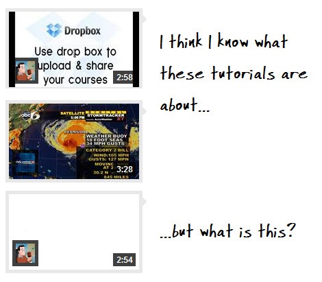
      • Create interesting thumbnails.    In Screenr, the first frame of the screencast becomes your thumbnail and visual cue.  Use that to your advantage.  Consider how you start your video.  One trick is to start with the final output.  Tell the viewer that this is what you’ll create and then jump to the tutorial and a different screen.

The Rapid E-Learning Blog - use good thumbnails

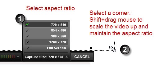
      • Select the right aspect ratio.  You can capture any size screen.  However. Screenr does come with some default settings that work well in your rapid elearning courses.  For example, 720×540 is the aspect ratio for a PowerPoint slide.  980×560 is perfect for videos in the no sidebar view mode in Articulate Presenter.

The Rapid E-Learning Blog - Screenr aspect ratios

  • Use pause (Alt+D) to create screencasts that flow well.  If you find that you have to click on buttons and open other screens during your demos, then you want to use Alt+D to pause your recording between mouse clicks.  This will let you set up your screens and create a faster screencast that will look more polished.  Here’s a demo where you can see the difference and how much nicer it looks using the pause feature.

Click here to view the Screenr demo.


  • What message does your avatar communicate?  Nothing tells people you’re an amateur than by using the default avatar that comes with Twitter.  At the same time, you want your avatar to communicate the right message.  In most cases, you’re probably better to err on the side of conservative than going with a wild avatar that confuses or offends your audience.

The Rapid E-Learning Blog - use appropriate avatars

See These Tips in Action

We created before and after versions of a simple screencast.  Watch both and see if you can tell the differences.  Not only is the after version a big improvement, it also takes a lot less time.

The Rapid E-Learning Blog - screencast before and after videos

Do you have any tips to help make screencasting easier and better for the learners?  If so, feel free to share them in the comments section.

Events

Free E-Learning Resources

Want to learn more? Check out these articles and free resources in the community.

Here’s a great job board for e-learning, instructional design, and training jobs

Participate in the weekly e-learning challenges to sharpen your skills

Get your free PowerPoint templates and free graphics & stock images.

Lots of cool e-learning examples to check out and find inspiration.

Getting Started? This e-learning 101 series and the free e-books will help.


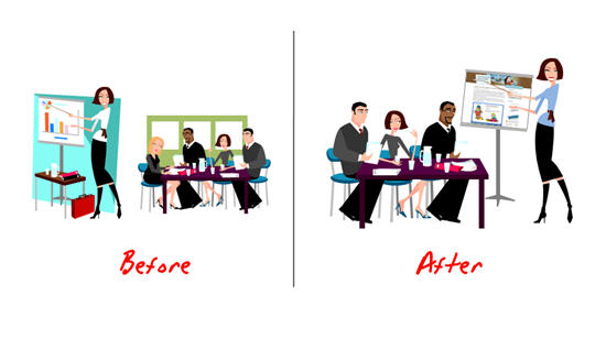
If you’re like many of us, you don’t have a lot of money to buy stock images or hire a graphics designer.  So that means you’re stuck using the free resources that come with PowerPoint.  In previous posts, I’ve discussed ways to ungroup your clip art and create your own clip art.  It only takes a few clicks to get from one image to the next.

The Rapid E-Learning Blog - before and after clip art

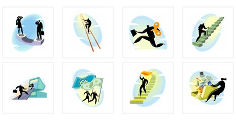
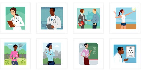
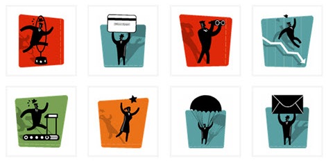
Even with those free resources available, it’s still time-consuming to find the right clip art to use.  So what I’m doing today is helping you get started by listing fifteen of my favorite clip art styles.  These are the ones that I commonly use for my elearning courses.

About Clip Art Styles

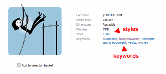
The Rapid E-Learning Blog - clip art styles

As you search, you’ll notice that not all of the clip art belongs to a “style.”  The reason I like to use clip art from the same style is because I can mix and match them and they’ll look like they belong together.  It gives your course a much more professional and polished look.

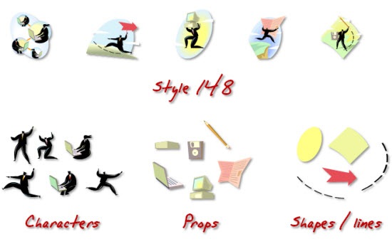
I like to find styles that have a lot of variety.  For example, I may not be interested in all of the clip art images in a particular style.  However, by ungrouping them, I can create an assortment of assets like characters, props, and shapes.  And since they’re all from the same style they’ll look like they go together.

In the example below, you can see how images from “style 148” provide characters, various props, and some shapes that I can use in my elearning courses.

The Rapid E-Learning Blog - pillaging styles for assets

Tips on Finding the Right Clip Art

Here’s a post that shows you how to create a consistent look for your courses.  It covers some of what I’m talking about today.   I also created a video that shares a few tips about how to search clip art. Those might come in handy.

Click here to view the Screenr video.

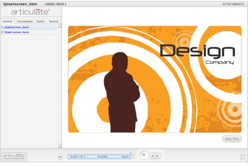
Below are some of my favorite clip art styles.  I’m fond of some because of the characters.  However, some I like only because of their colors and shapes.  For example, “style 1592” doesn’t have a lot of images, but here’s an example where I ungrouped one and used parts of the clip art to create a Flash intro screen demo in Quizmaker ‘09.

splashscreen

Click here to view the intro screen demo.


15 of My Favorite Clip Art Styles


The Rapid E-Learning Blog - clip art style 148 

Style 148


 The Rapid E-Learning Blog - clip art style 741 

Style 741 


    The Rapid E-Learning Blog - clip art style 1252 

Style 1252


The Rapid E-Learning Blog - clip art style 1280  

Style 1280


The Rapid E-Learning Blog - clip art style 1366   

Style 1366 (no longer available)


The Rapid E-Learning Blog - clip art style 1368

Style 1368


The Rapid E-Learning Blog - clip art style 1402

Style 1402


The Rapid E-Learning Blog - clip art style 1423

Style 1423 (no longer available)


The Rapid E-Learning Blog - clip art style 1426

Style 1426 (no longer available)


The Rapid E-Learning Blog - clip art style 1441

Style 1441 (no longer available)


The Rapid E-Learning Blog - clip art style 1445

Style 1445 (no longer available)


The Rapid E-Learning Blog - clip art style 1541

 Style 1541


The Rapid E-Learning Blog - clip art style 1568

Style 1568


The Rapid E-Learning Blog - clip art style 1576

Style 1576


Update (6/8/10): Apparently some of the styles are no longer available. Here are some additional ones to replace the ones missing.

Sometimes it’s fun to just type in a style and see what comes up.  For example, the clip art images in “Style 13” turned out to be lucky. :)  They’ll work great in a future elearning course.  Do you have any favorite clip art styles that you’d like to share?  Add them to the comments section.

Events

Free E-Learning Resources

Want to learn more? Check out these articles and free resources in the community.

Here’s a great job board for e-learning, instructional design, and training jobs

Participate in the weekly e-learning challenges to sharpen your skills

Get your free PowerPoint templates and free graphics & stock images.

Lots of cool e-learning examples to check out and find inspiration.

Getting Started? This e-learning 101 series and the free e-books will help.


Years ago, I was a finance specialist in the U.S. Army.  Every year we had to pass a pretty tough finance exam.  To prepare us, each person was assigned the task of teaching part of the exam to the others.  To this day, I can still recall some of the topics I had to teach.  This makes sense since a great way to learn is by teaching.  So why not get your learners involved in the teaching?

What I’ve done in the past is assign a project where instead of me teaching, the learners had to teach.  They were given an assignment and my role was to act as guide.  I helped keep them on track, set some guidelines, and provided access to resources.  The output for them was a multimedia product that could be shared with others.

This is where the rapid elearning tools come in handy.  They’re easy to use and allow the learners to create simple projects without stressing over programming.  In fact, to prove the point, I had my children put together a quick presentation on teeth (that was their punishment for climbing on my car).  They created this simple demo in just a little over an hour.

tooth

Click here to view the demo course.

There’s a lot of power in getting your learners involved this way.  It’s a fun way to learn and people enjoy adding their own creative flair.  Plus, you can be guaranteed that the learning experience will have impact and be memorable.

So the main considerations are the right type of project for the learners to do, where they can find resources, and then how to assemble the multimedia.  If you’re interested in this approach, here are a few ideas:

  • Assign a video project. Video cameras like the Flip & Kodak Zi6 are relatively inexpensive and easy to use.  The cameras even come with simple editing tools. Have your learners shoot quick videos that can easily be added to a web page or rapid elearning product.
  • Build a rapid elearning module. Using a form-based application like Engage makes it easy to create simple multimedia projects.  The goal isn’t that these are crafted by trained instructional designers.  So don’t expect the world’s best elearning, but don’t be surprised by what some people can produce.  Not having to do the multimedia programming frees them up to focus on the teaching part of the part. Set some stipulations for what they have to cover; and then let the content research and production process become their learning experience.
  • Leverage social media online. There are a lot of free tools online that help you create content.  I’ve been playing with Dipity for a family history project.  Something like this could work for your learners.  Screenr is also an easy application for your learners to share information, especially something like how to use a software application or navigate a web site.  Below is an example from another site, VuVox, where I quickly created a demo using content from my blog.


Click here to view demo.

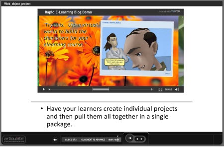
Many of the free sites like Screenr and the one above give you an embed code.  You can use that to put the projects on a web site or wiki.  I took the embed code from the example above and placed that into my rapid elearning course using the web object feature.  This is a great way to aggregate the individual projects into a group project; and then host it on your own site or even in your LMS.

vuvox1

Click here to view the web object demo.

There are a lot of ways to engage your learners.  Leveraging your rapid elearning tools and their ability to create multimedia content is just one way.  Regardless of your approach, you’ll find that the learners are much more engaged in the process and become very passionate about what they’re doing.  That’s because you’re empowering them and not just dumping a bunch of information in their laps.  This is also a great way to leverage the expertise of your learners and build a network of relationships that extends beyond the formal training.

So on your next project, rethink how you’re using those rapid elearning tools and see if there might be some value in giving more control to your learners by getting them involved in teaching others.  What do you think?  Share your thoughts by clicking on the comments link.

If you liked this post, you’ll like these:

Events

Free E-Learning Resources

Want to learn more? Check out these articles and free resources in the community.

Here’s a great job board for e-learning, instructional design, and training jobs

Participate in the weekly e-learning challenges to sharpen your skills

Get your free PowerPoint templates and free graphics & stock images.

Lots of cool e-learning examples to check out and find inspiration.

Getting Started? This e-learning 101 series and the free e-books will help.


The other day I was looking at the AI Vault web site.  I ran across a tutorial on creating an envelope icon.  It’s a great tutorial and relatively easy to do.  However, the tutorial is targeted for Illustrator users.

  The Rapid E-Learning Blog - AI Vault icon

Looking over the tutorial, I wondered if I could follow the steps to recreate the icon in PowerPoint.  So I went through the Illustrator tutorial and came up with the image below.  It was easy to do and only took a few minutes.

The Rapid E-Learning Blog - PowerPoint icon  

Obviously the steps are a bit different and since PowerPoint is not as robust as Illustrator, you have some limitations.  However, with all that said, it proves that PowerPoint can be an effective graphics tool when building your rapid elearning courses.

Another benefit to this exercise is learning to use PowerPoint in new ways.  While you may never need this envelope icon, if you practice building it, you will learn how to use PowerPoint’s features.  And you’ll have an experience that you can rely on for future design ideas.

Here’s a quick tutorial where I walk through the process of creating the icon in PowerPoint.

Click here to view the tutorial at Screenr.


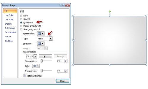
1. Create the envelope.

The Rapid E-Learning Blog - Create the envelope in PowerPoint

  • Create a rectangle
  • Add a radial fill. 
  • Color the border a bit darker than the gray you use for the fill.

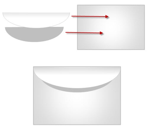
2. Create the envelope flap.

The Rapid E-Learning Blog - Use PowerPoint shapes to create the flap.

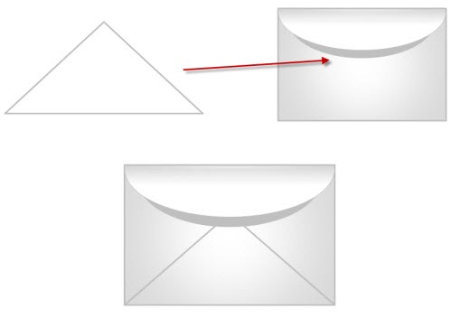
  • You can draw the flap and create a curved tip like the original tutorial.  I chose to use a PowerPoint shape to speed things up.  You could use a triangle or a shape with a rounded edge. 
  • Fill flap with a linear gradient fill.  Light on the bottom, dark on top.
  • To create the flap’s shadow, duplicate the flap shape and size it down a bit.  Then fill with solid gray.  Place it behind the flap.

3. Create envelope lines.

The Rapid E-Learning Blog - Use the triangle to create the lines in PowerPoint.

  • Instead of drawing the lines individually, I just used a triangle shape.
  • Place the triangle under the flap shapes.
  • Use no fill color and then color the lines to match the envelope line and thickness.

4. Create the arrow.

The Rapid E-Learning Blog - Create the swish effect by editing the points.

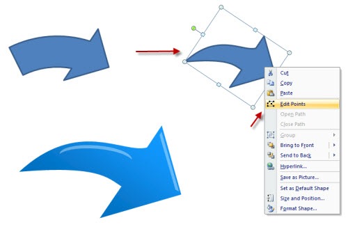
  • You could just use one of the default arrows, but you don’t get that swish.
  • I started with a default arrow.  Then I edited the points to create more of a swish look.  I filled the arrow with a linear gradient.
  • To add the highlight, I used some default shapes.  I filled them with white and made them about 60% transparent. 

The Rapid E-Learning Blog - Final icon image from PowerPoint tutorial.

I used a partially transparent oval that has a gradient fill to make my shadow under the envelope.  Put them all together and you have a nice envelope icon.  When you’re all done select the objects, group them, and save as an image.

  • Save as PNG to maintain the transparency.
  • Save as EMF to keep it as a vector so you can scale it up or down.

As I said earlier, even if you don’t need the icon image, get in the habit of practicing these types of tips.  They’ll help you become more fluent with PowerPoint.  And as we all know, when it comes to rapid elearning, the more you know about PowerPoint, that much better you’ll be able to make your courses.

Now it’s your turn.  Find a tutorial and give it a go.  If you do create something, make a quick Screenr video and post it to the comments section.  If you find a cool tutorial, send it my way.  I’ll see what I can do for another blog post.  Also, feel free to share your comments by clicking on the comments link.

If you liked this post, you might also find these interesting:

Events

Free E-Learning Resources

Want to learn more? Check out these articles and free resources in the community.

Here’s a great job board for e-learning, instructional design, and training jobs

Participate in the weekly e-learning challenges to sharpen your skills

Get your free PowerPoint templates and free graphics & stock images.

Lots of cool e-learning examples to check out and find inspiration.

Getting Started? This e-learning 101 series and the free e-books will help.


You may have heard the news last week that Articulate launched a new screencasting tool called Screenr.  It is a free web-based tool that lets you create screencasts without installing any software.

screenr_logo

I really like Screenr.  If you haven’t tried it out yet, you should give it a whirl.  Here’s what I like best:

  • Screenr is super easy to use and there’s nothing to download. You just click the record button on the website and you’re recording your screen activity and your narration.
  • The image quality is pretty darn good.  You can even watch the screencasts back at HD-quality and they look great.
  • Screenr gives you multiple ways to use your screencasts.  It works with Twitter and the screencasts play as Flash on the web.  You can also upload the screencasts to YouTube.  And you can even download the videos as MP4 files.  They also look nice on the iPhone.  All these options give you a number of ways to reach your learners.
  • My favorite…there’s no branding on the downloaded MP4 files.  Since you can download the videos, you’re free to use them as you wish.  That means you can use it in your elearning courses without looking like one of those MLS soccer players.  Go Sounders
  • And of course, Screenr is free.  Free is always good.

With that said, let me share some ideas on how you can use Screenr with your rapid elearning courses.

1. Add Screenr Videos to Your Blogs, Wikis, and Slides

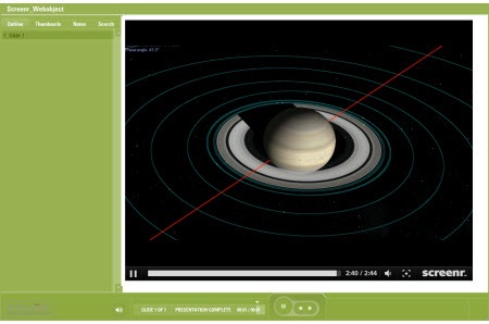
Screenr gives you an embed code.  That means you can create a video and easily add it to your blog, wiki, or website (or any other place that takes HTML).  If you use the Articulate products, you can the web object feature to add videos to your slides.

Here are a couple of tutorials on how to embed the Screenr videos in Moodle and how to embed them in Blackboard.  Below is an example of the Screenr video embedded in a slide using the web object feature.

The Rapid E-Learning Blog - Screenr video inserted into an elearning course as a web object.

Click here to view the web object demo.


2. Download Screenr MP4 Files & Add to Your Course

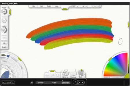
As I mentioned earlier, one of my favorite things about Screenr is that I can download the videos as MP4 files and not have the Screenr logo in the video. That means I can easily use them in my courses.

Here’s an example of a Screenr MP4 file inside an elearning course.

The Rapid E-Learning Blog - Screenr video as MP4 in an elearning course.

Click here to view the MP4 demo.


3. Create a Virtual Whiteboard

Use a tablet PC or something that lets you do pen input to simulate a whiteboard.  All you need is a blank area to write and capture the video.  Here’s a demo of a whiteboard screencast in an elearning course.

The Rapid E-Learning Blog - Use Screenr to create virutal whiteboards for elearning courses

Click here to view the whiteboard demo.


4. Put Screenr in the Hands of Your Learners

There’s no reason to hog all of this goodness for yourself.  Have your learners do screencasts to demonstrate their skills.  It’s a great way to reinforce their learning and assess their level of understanding.

Screenr works with Twitter and Youtube.  And as I stated earlier, the embed code means your learners could make videos and put them on their own blogs or wikis.

Here’s an example where both teacher and learner are going through the process together.  It gives you an idea of how Screenr can add value to the learning process.

 Click here to view the demo.


5. Make it Mobile

Many mobile video devices and smart phones can play MP4s or videos from a website.  That means you can take your courses mobile.  All you need to do is use the URL in your mobile device’s web browser.

Here’s an example of what it looks like if you view the Screenr videos from an iPhone or iPod Touch.

 Click here to view the iPhone demo.

When I first heard about playing back screencasts on the iPhone, I was a bit skeptical about what it would look like.  But I’ll have to tell you tha
t I was pretty impressed with the image quality considering the size of the screen.  I thought that it would be too hard to see what’s going on, but that wasn’t the case.

Of course, you can also download the MP4 video and then upload it to your device manually. 

So that’s about it.  Screenr’s a pretty cool application.  It’s easy to use.  Free.  And can be used with your elearning courses.  What are some other ways you can think of to use Screenr videos for your elearning?  Click on the comment links to share your thoughts.  (And better yet, share your screencasts!)


Tutorials

If you want to learn more about some of the ideas I covered in this post, I added a few quick Screenr tutorials to help you get started.

Events

Free E-Learning Resources
Want to learn more? Check out these articles and free resources in the community.

Here’s a great job board for e-learning, instructional design, and training jobs

Participate in the weekly e-learning challenges to sharpen your skills

Get your free PowerPoint templates and free graphics & stock images.

Lots of cool e-learning examples to check out and find inspiration.

Getting Started? This e-learning 101 series and the free e-books will help.


This is a trick I kind of stumbled upon a few months ago.  I was attempting to zip up a PowerPoint 2007 file and accidentally unzipped it to reveal a media folder that held all of the images I was using in my course.  Now, keep in mind that this only works for PowerPoint 2007, but it’s still a cool trick, nonetheless.

Here’s a quick screencast I did to show you how easy this is and how you can use it to manage your course images. 

 The Rapid E-Learning Blog - 7-Zip demo

Click here to view the 7-Zip demo.

Download 7-Zip.  It’s Free!

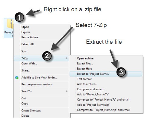
The first step is to download 7-Zip.  It’s a free application that you can use to compress or extract files that are compressed.  For example, if you get a presentation.zip file, you can right click on the file and choose to extract it.

The Rapid E-Learning Blog - steps to extract a .zip file using 7-Zip

Extract the PowerPoint 2007 File

Once you have 7-Zip installed, you can extract the contents of your PowerPoint 2007 file.  What happens when you extract the .pptx file is you’ll get a folder with a matching name.  Inside that folder, there’s a media folder than contains the images that you used in your elearning course.

The Rapid E-Learning Blog - compare a .ppt file to the extracted folder

Locate the Media Folder

Let’s see this in action.  I created the FTC demo course below.  It was built with PowerPoint 2007.  If you notice, I have quite a few images on the various slides. 

After I extracted the .pptx file, I locate the media folder which has all of the course’s images in one location. The media folder is one level down inside the ppt folder.

The Rapid E-Learning Blog - FTC demo course

Click here to view the demo.

If you look at the image below, you’ll see the contents of the media folder.  What you’ll notice is that all of the images I added to the course are in that one folder.  This really comes in handy.

The Rapid E-Learning Blog - example of images in the extracted media folder

Tips on Using the Media Folder

Here are a couple of ways that you can use the media folder to save time.

  1. Keep all of your images in one location.  Many people aren’t very organized when it comes to managing their course’s assets.  When you’re done with your course, just use 7-Zip to extract the media folder.  Move the media folder to a place where you save your images.  Rename it to match the course and all of your images are now in one place.  You can quickly scan the folder with an application like Picasa or Windows Photo Gallery.
  2. Quickly save clip art images to your slides and then save the .pptx file.  It’s easy to just drag and drop images to a PowerPoint 2007 slide.  Normally, you have to right click on the image and then save as a picture to have it outside of the slide.  Not with this technique.  Add images to your slides and then extract the file to have quick access to all of the images.

Here’s a link to IrFanView.  This is a free application that you can use to quickly view your .WMF files.  It has a lot of other useful features, but you can learn about that on their web site.

What are some other ways that you can use this approach to your advantage?  Feel free to share your thoughts by clicking on the comments link.

If you liked this post, you might find these interesting:

Events

Free E-Learning Resources

Want to learn more? Check out these articles and free resources in the community.

Here’s a great job board for e-learning, instructional design, and training jobs

Participate in the weekly e-learning challenges to sharpen your skills

Get your free PowerPoint templates and free graphics & stock images.

Lots of cool e-learning examples to check out and find inspiration.

Getting Started? This e-learning 101 series and the free e-books will help.


I once had a job where I was a one-person media department with a budget of about $11.17.  This didn’t go very far so I learned to be creative with my resources and the things I had to do. 

One of my favorite tricks was using overhead projectors to light my video interviews.  I printed colors and designs on the overhead transparencies for my background and shadows.  And then I printed various shades of gray on the transparency for my diffusion.  Here’s a frame from one of the videos. Considering what I had to use, I am still proud of what I accomplished.

The Rapid E-Learning Blog - example of 3 point lighting with overhead projectors

While I didn’t enjoy working with limited resources, I will say that some of my best ideas and learning experiences came from this environment.  In fact, we usually tend to be the most innovative and creative when we don’t have resources.  It forces us to think in new ways.

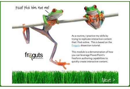
I get to meet quite a few elearning developers and blog readers at the conferences.  One of my favorite experiences is when they have questions about how to do this or that.  I like to brainstorm with them some ideas and then build quick prototypes to test them out.

In fact, the frog dissection post I did a few months ago came as a result of a conference discussion.  I wanted to show that because you’re using PowerPoint doesn’t mean you have to be stuck with something that looks like PowerPoint.

The Rapid E-Learning Blog - frog dissection demo

Click here to view the demo.

At another conference, someone wanted to know how to create an assembly line concept.  That’s where I quickly prototyped the moving box.  And the glossary post came as a result of someone asking about different ways to add a glossary to a rapid elearning course.

This week I received some questions that let me play around with a few ideas; so I thought I’d pull them into a post.  While I hope you can use the tips I share today, what I really hope is that you feel encouraged to test ideas and come up with your own creative solutions. 

Add Multiple Videos to One Slide

The Rapid E-Learning Blog - add multiple videos to one slide

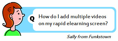
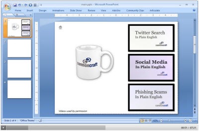
Sally wants to add three videos to her PowerPoint slide and then publish it as a rapid elearning course.  Here’s a demo of a slide with three videos on it and following are the basic steps.

The Rapid E-Learning Blog - 3 videos in one slide tutorial

Click here to view the tutorial.

  • Create four slides.  On slide 1, add screenshots of each video.  The learner will click those to play the video.
  • Link each video image to one of the slides.  When the learner clicks the video image, it will link to the slide with the actual video on it.
  • Copy the images to the other slides. On each of the other slides (2-4), replace one of the images with its respective video.
  • If you use Articulate Presenter, hide slides 2-4 and set the branching on the player controls to go back to slide 1 and forward to slide 5 (if you had one).

Create a Slide Rewind Button

The Rapid E-Learning Blog - crate a slide rewind button

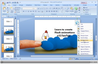
Bill wants the learner to be able to replay the slide.  This is pretty easy to do.  Essentially, you add a hyperlink to the slide you’re currently on and it reloads the slide.  Here’s a demo of a slide with a replay button.  Following is a tutorial.

The Rapid E-Learning Blog - slide replay tutorial

Click here to view the tutorial.

  • Add a replay icon to the slide.  You can find one in this free icon pack from the Webdesigner Depot.
  • Add a link to the icon that goes to the slide it’s on.  For example, if you want slide 2 to replay, set a PowerPoint hyperlink on the icon to slide 2.  This will reload the slide.
  • You’ll want to experiment with the template’s navigation settings so that the replay button works without getting a message box.

Add Rollover Buttons

The Rapid E-Learning Blog - add rollover buttons

Freda saw a demo that I did a few years ago.  It had an animated back
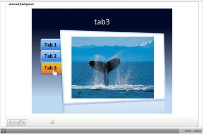
ground and some rollover buttons.  This one is a bit tricky.  Essentially, it’s smoke and mirrors.  I used transparent PowerPoint hyperlinks and added some rollover Flash files that gave the appearance of having a rollover effect on the link. 

As far as the background, after publishing the course, I swapped out the background .swf with a custom .swf.  It’s similar to what Dave Moxon describes in this blog post about adding animated backgrounds.

For today, I am going to give you the best of both worlds.  I’m going to show you an easy trick to add some umpf to your rapid elearning course and I’ll give you the free files so that you can use them in your own course.  They’re also designed to match the template I gave you in this post on building your own PowerPoint templates.

Click here to see a demo of the rollover tabs and then read on to learn how to build it.

The Rapid E-Learning Blog - swap background swf tutorial

Click here to view the tutorial.

  • Create a master slide using the background template image.  This will help you line up your PowerPoint hyperlinks.
  • Build your course using PowerPoint hyperlinks for the tab sections.  Make sure to line them up over the appropriate tabs.
  • Publish the course and go into the data folder and locate the background swf file.  If you have multiple background .swfs then you’ll need to click on them to see which the right one is.  I use the free application SWF Player to easily preview the .swf files.
  • Replace the background .swf with the rollover .swf.  Make sure to give it the same name.  Now when you play the course, you’ll have the animated background.  It looks like the tabs are rollover links.  Keep in mind that every time you publish the course, you’ll need to swap out the background, but that really only takes a few seconds.  I usually don’t swap anything until I am completely done.

If you have some Flash skills or access to a Flash developer, these rollovers .swfs are pretty easy to create.  And as you can see, they can radically change the way your course looks and feels.

The Rapid E-Learning Blog - download files here

You can download the files here.  I added some for three, four, and five tabbed sections.  Enjoy.  If you do have some Flash skills and want to build some others to share with the blog readers, feel free to send them my way.  We’d appreciate it (especially those of us who only have $11.17 to work with). 🙂

One final tip I’d like to share is that there is a lot of value in joining a user community.  Social media tools like Twitter are good, but the real value isn’t in the tool.  It’s in the community.  This is especially true for those of you with limited resources because being part of a community is like being on a virtual team.  There’s always free technical help.  And it’s a great way to bounce around ideas and learn to build better elearning courses.  Sometimes you’ll even get free downloads like the one today.

I hope these tips help you with your next elearning course. What do you think?  Share your comments by clicking on the comments link.

*Common Craft videos used by permission. 

David Anderson put together a quick tutorial on how to create the Flash rollovers for those who are interested in learning to do this. Of course, you’ll need Flash.

Events

Free E-Learning Resources

Want to learn more? Check out these articles and free resources in the community.

Here’s a great job board for e-learning, instructional design, and training jobs

Participate in the weekly e-learning challenges to sharpen your skills

Get your free PowerPoint templates and free graphics & stock images.

Lots of cool e-learning examples to check out and find inspiration.

Getting Started? This e-learning 101 series and the free e-books will help.


The Rapid E-Learning Blog - Twitter and elearning can co-exist

Twitter’s all the rage.  Some people love it.  Some people hate it.  But many people really don’t know much about it or don’t do much with it.

I’ll have to admit, I have mixed feelings about Twitter (and much of the other social media).  On one hand, I really love to play around with all of the new social media tools and am excited about what’s going on and the potential for learning.  On the other hand, much of their value is exaggerated.  A lot of this social media stuff can be distracting and a waste of time.  But that’s not so much the fault of the social media tools as much as it is their newness and not quite knowing what to do with all of the them and the content they create.

For me it’s all about context.  I am bombarded by so much info that I tend to tune out quite a bit.  I like to focus on the more practical information that I can use.  For example, the Articulate twitter page is a good resource for Articulate users since it provides news, tutorials, and links to helpful tips and tricks. 

While I do follow people, I tend to focus on topics and keywords.  This helps me get more pointed information and not be bombarded by a bored tweep who’s retweeting and posting links every 5 minutes. You know who you are. 🙂

With all that said, Twitter is a useful tool.  It can also be incorporated into your elearning courses.  Today I’d like to share a few ideas to whet your appetite.  However before I share some tips, it’s probably a good idea to explain some Twitter basics.  So I asked Dr. Werner Oppelbaumer to share some of his insights regarding Twitter.

The Rapid E-Learning Blog - Dr. Werner Oppelbaumer explains Twitter

Click here to watch Dr. Werner’s presentation.

In addition to Dr. Werner’s brilliant insights, here are some additional ideas about how to use Twitter.

Follow the Subject Matter Expert

Suppose you’re doing a course on organizational leadership.  Inevitably, some learners will have questions of the subject matter expert (SME).  You could incorporate a subject matter tweet that lets people ask questions or follow the SME after the course is complete.  Consider it a post-course consulting tool.  It also humanizes the course and makes it seem more personal, which can contribute to its perceived value.

Here’s another idea for those in the education world.  Create a twitter account for a famous person who represents the topic you teach.  Then have the students follow the tweets.  For example, it would be fascinating to read the tweets of someone like John Adams responding to some of the debate in Washington D.C. today.  Or keep the tweets in context to the historical character’s time.  Perhaps you can teach about the D-Day invasion via the tweets of a soldier crossing the channel and storming the beach at Normandy.  You could even include media using sites like Twitvid.  What a great way to make history come alive!

Another angle is to have each student represent a historical character and then they have to tweet and follow the other student characters of the time.  Based on their tweets, it would be a great way to assess their level of understanding of the subject you’re teaching.

The Rapid E-Learning Blog - John Adams Twitter page

Follow the Subject

You can assign and follow tweets via a hashtag.  What you do is something like this:

I look forward to September and watching the Seattle #Seahawks play.

Someone tracking #Seahawks can now see my tweet.  If you wanted people who take your course to continue the conversation or keep on top of a particular subject, then use a hashtag. 

Let’s say you were teaching a course on fire safety.  The hashtag could be #fs or #fire.  Then anyone can track the hashtag and stay up on the latest info.  Of course you want something that is both somewhat unique and short so you don’t take up all of your characters.

Once you have a course hashtag, you can use Twitter to provide additional content after the course.  You can also use it to get your learners to respond and provide feedback.  They could add some thoughts or tips that they learned.  They could also go back to their jobs, apply the course information, and then comment on how it worked for them.  This helps you make adjustments to the course content and it’s a good way to get an extra level of evaluation that’s more than the standard “smile sheet.”

The Rapid E-Learning Blog - Example of a Twitter hashtag

Build a Community

There’s no reason why you couldn’t use Twitter to help facilitate a community of practice.  The real value in social media is in community building where you’re able to connect people who share similar interests and get them to exchange ideas.  And Twitter is great for that.

Have the learners use Twitter to share their thoughts.  For example, instead of giving them an assessment, make the assessment their Twitter stream.  They need to reflect on what they’re learning in the course and then share that with others.

Another way to get them involved is to have them share links and other information relevant to what they’ve learned.  Even if the course content is proprietary, there’s no reason why they couldn’t go out and look for other thought leaders or groups in the same industry to build on what they’re learning in your course.

For example, if I were teaching on the Truth in Lending Act, I’d have them look for some news stories about lending relevant to the Truth in Lending Act.  Or perhaps have them do some research on why we have a Truth in Lending Act.  Or share their thoughts on what would happen if there was no Truth in Lending Act.

To build the community use hashtags or sign up for a site like Twibes whe
re you can create communities around mutual interest.  Two things to consider.  First, not everyone will jump on the community bandwagon.  That’s fine, you only need a few enthusiastic learners.  Secondly, Twitter kind of started as a microblogging tool.  If you want better organized conversation it might not be the best tool to use.  In that case, you could look at a chat application or a forum where you could have threaded comments.  They tend to be easier to follow.

Those are just a few ways you can use Twitter.  Of course, this doesn’t work for everybody.  Some of you are behind corporate firewalls and don’t have access to Twitter.  However, if you do have access to Twitter (or an enterprise equivalent) then these tips might come in handy.  If not, then change Twitter to wiki or some other social media tool you do have access to and see if these ideas work for you.

What are some other ways that you can think of blending Twitter with your elearning courses? Share your thoughts by clicking on the comments link.

*The free Twitter icons came from Gopal Raju at ProductiveDreams.

**Dr. Werner’s avatar came from AMC’s MadMenYourself.com.

Events

Free E-Learning Resources

Want to learn more? Check out these articles and free resources in the community.

Here’s a great job board for e-learning, instructional design, and training jobs

Participate in the weekly e-learning challenges to sharpen your skills

Get your free PowerPoint templates and free graphics & stock images.

Lots of cool e-learning examples to check out and find inspiration.

Getting Started? This e-learning 101 series and the free e-books will help.


PowerPoint is an important part of the rapid elearning world.  If you want to build good elearning courses, you really have to learn to use PowerPoint and it’s many features.

The challenge for many rapid elearning developers is that you have limited time to learn the tools because the expectation is that since you have rapid elearning software you’ll be able to get your work done rapidly.

A great way to learn to use PowerPoint and to get better at building your courses is to look for other work that inspires you and then try to replicate it.  The process of replicating the work teaches you new techniques that you’ll have for the rest of your rapid elearning career.

I regularly scan the Internet for interesting Flash animations or web sites.  When I find one I like, I’ll see what I can replicate in PowerPoint.  Sometimes I can and sometimes I can’t.  It doesn’t always matter.  The real value is in the process of trying.  That’s where the learning happens. 

The other day, I was moving some files around and found an old screenshot I took of a web site.  I liked the colors and layout.  I thought it might make an interesting PowerPoint slide show, so I saved it to play around with at a later date.  Well, today is the later date.

Today, I will show you how to create a PowerPoint elearning template.  We’re going to use the screen shot as a starting point, but this isn’t about copying the image.  Instead, it’s about the process you go through as you copy it.  The idea is to grow in your visual design skills, learn some techniques, and then learn to build it in PowerPoint.  The production process in PowerPoint helps you become more efficient and faster when building courses.

Original Screen Capture

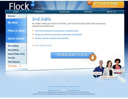
Here’s our starting screen shot.  It’s from the web site for the  Flock browser (which is pretty cool by the way).  I liked the blue color.  I also like the transition from light to dark in the background.  It gives the image depth and it helps the main part of the screen pop out.  I also like the orange accent.  It’s a great way to draw attention to key points.

The Rapid E-Learning Blog - inspiring design from Flock

PowerPoint Template

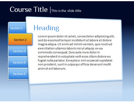
Here’s the PowerPoint version of the Flock design.  You can see that it’s not an exact duplicate.  Instead, I brought in the elements that I liked, which was mainly the colors.  Also, I had two main goals with this.  I wanted to build it all in PowerPoint and I wanted to keep it simple so that I can make it quickly.

The Rapid E-Learning Blog - PowerPoint template design

The Rapid E-Learning Blog - iterations for elearning PowerPoint template 

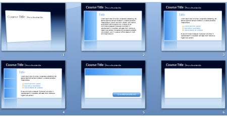
When I built templates for elearning courses, I usually build variations of the screen.  What I want is a few iterations of the general look and feel so that I can accommodate different kinds of content.  For example, the first image I’d use for a title or section screen.  However, the last image might be what I use for a screen where I insert multimedia like a video or Flash file.

For this demo, I built everything inside the PowerPoint file and saved it as a .ppt. However, your best bet is to build it as a master file and then save as a PowerPoint template (.pot).

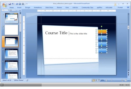
I put together a demo that shows you how I built it in PowerPoint.  I also attached the file and made some images out of the PowerPoint objects so you can use them as you wish.

The Rapid E-Learning Blog - tutorial on how to desing PowerPoint templates for elearning

Click here to view the tutorial (30 min).

Feel free to fast forward through the tutorial.  Here’s what’s covered:

  • Analyze the visual design and determine what you like and why
  • Build the template graphics in PowerPoint
  • Save what you build as graphic files
  • Create a few iterations of the design to accommodate different needs
  • Build accent pieces and boxes
  • Use design color schemes in PowerPoint 2007
  • Share with others and they’ll share with you…hopefully.

Click here to download the PowerPoint template and images

As promised, here’s a link to download the files I created.  The folder contains .ppt and .pptx files and some graphics.  I used the Philosopher font which is free and you can download it here.

Got any tips and tricks you’d like to share when building rapid elearning courses in PowerPoint?  Share them by clicking on the comments link.

Here’s another post about building PowerPoint templates:

Events

Free E-Learning Resources

Want to learn more? Check out these articles and free resources in the community.
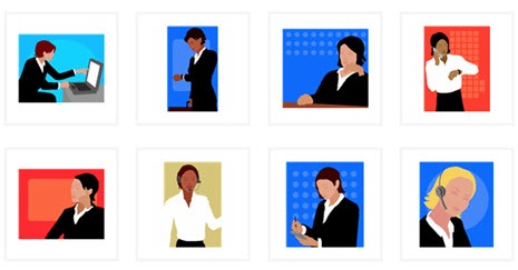
Here’s a great job board for e-learning, instructional design, and training jobs

Participate in the weekly e-learning challenges to sharpen your skills
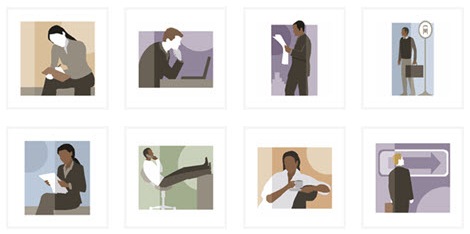
Get your free PowerPoint templates and free graphics & stock images.

Lots of cool e-learning examples to check out and find inspiration.

Getting Started? This e-learning 101 series and the free e-books will help.